Week One: websites
This week was an intro into the production of websites. I set up the basic skeleton of the website and played around with themes.
WEEK TWO: PHOTOSHOP
In this session the basics of photoshop were covered including document settings, resolution, file types and colour modes. The task was was to set up four documents and to save them in different formats:
- Print image 11.5 x 18.5 (colour)
- Print image 9 x14 (B&W)
- Web banner 728 x 90 pix
- Instagram image
WEEK THREE: PHOTOSHOP/ SELECTIONS & LAYERS
Week three was another Photoshop session, but specifically selections. The first task was to create a basic illustration with the selection tool of our favourtite dog. I used a combination of the lasso and selection tool and used the bevel image filter to create depth in the illustration. The second task was cut out the ssubject from a photograph using the lasso tool. The third task was to create a silkscreen-esque image using two colours.


week four: Photoshop / selections & scanning
This week was all about how scanning in textures can help improve your illustrations. The task for this week was to scan in your own texture with the scanners at university and use the texture in an illustration of your choice.

|
I used a sugar paper texture to give a grainy effect all over the illustration.

|
Week five: illustrator intro
This session was a basic introduction to Illustrator. We watched a video by Aaron Draplin which showed his process in the software. This weeks task/mini brief was to create a Draplin inspired logo in Illustrator with an object as the subject matter. I chose "teapot". It was asked to show the document that showed your process of making the logo as well as the final piece. I've embedded the video below for my own refernace.


|
|
|
week six: illustrator logos
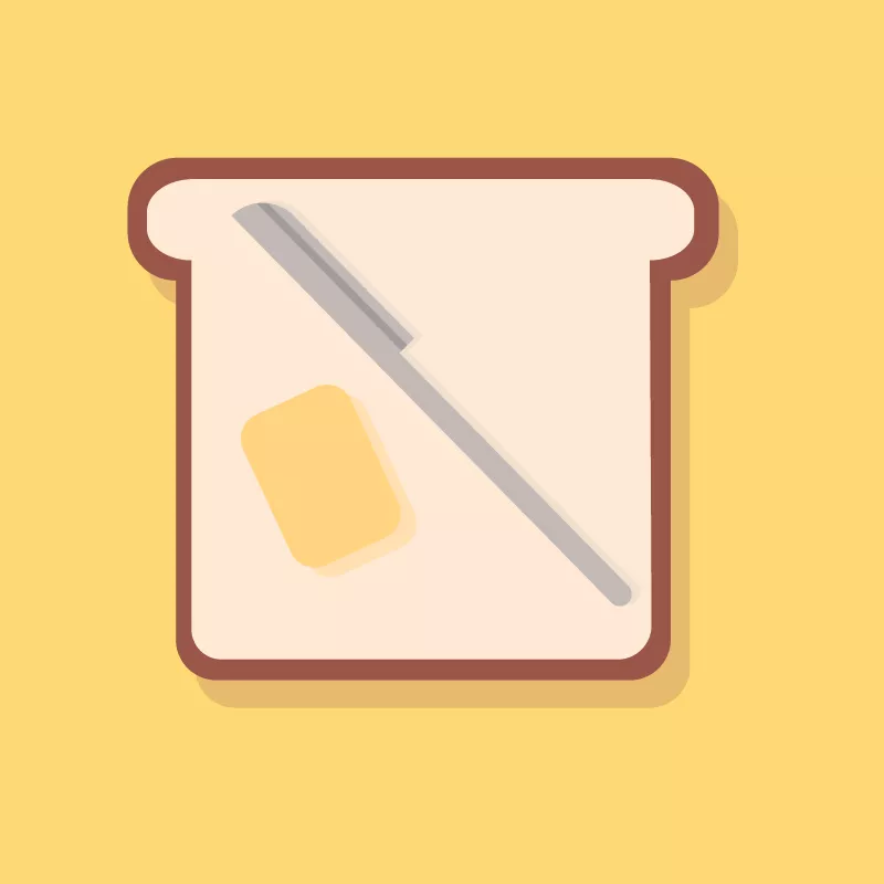
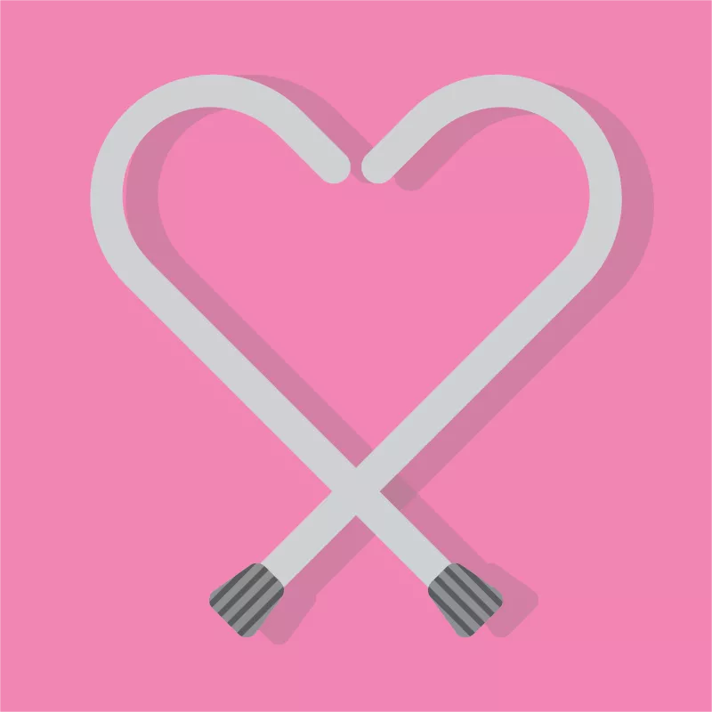
In this session we were tasked to make logos for made up brands to test our skills in Illustrator. I tried to focus on shape colour to effectiefly communicate ideas. From left to right reads: "Buttery" prebuttered bread for the modern proffesional that doesn't have time to waste, "K(after)9" eveningwear for dogs, "O.A.PLEASE" a dating app for over 80's, "Pia-NO" is someone playing crap piano in your canteen at lunchtime? Pia-no is the answer and "Toesla" intellegnt self driving shoes.
|


|

|
WEEK SEVEN: BADGER TASK

|
This was my favoutite task so far to complete in these tutorials. The task was to create a set of four pin badge designs in Illustrator that reflect our hobbies, interests or personalities. I chose to design pins refleceting my pet cat, my love of tea, the shoes I wear ever day and a basic self portrait of me listening to music. I think these designs are effective as basic vector illustrations. I tried to incorporate shapes and basic shading to make them see more 3D and realised. I stuck to a limited colour palette so that they seemed like a set of badges you would buy together.
I also added drop shadows to the back of the circles to better communicate that they are pin badges. 
|
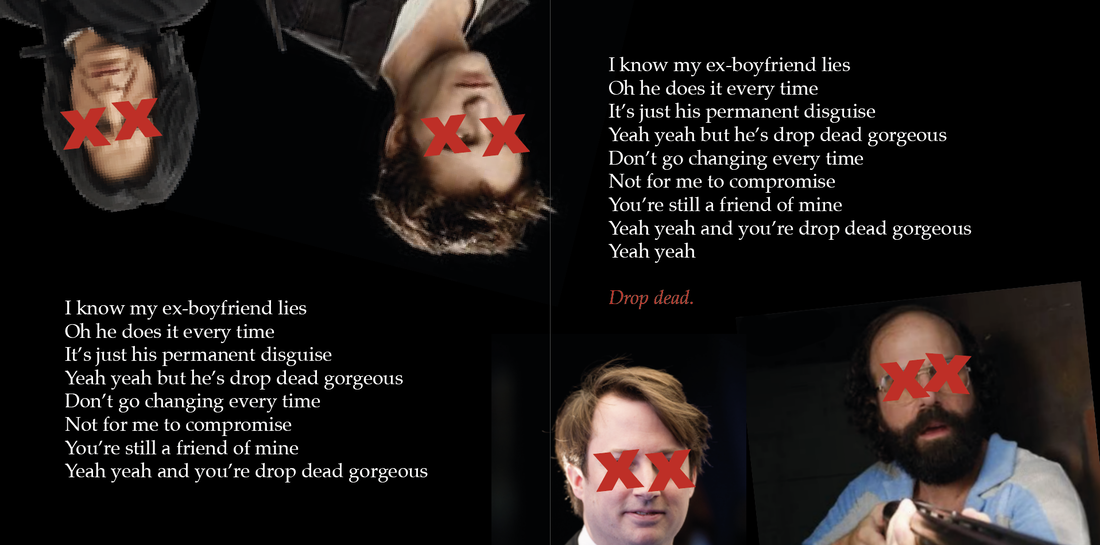
Week eight: indesign intro & task
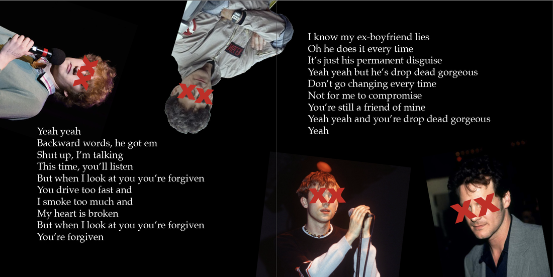
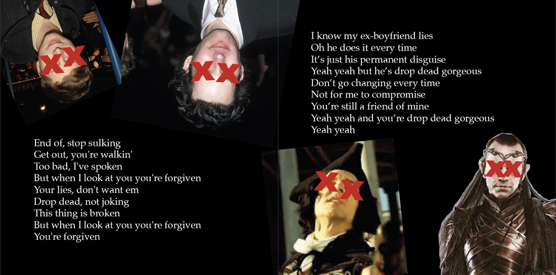
This week was in intro into InDesign. We were tasked with creating a CD inlay booklet. The design element wasn't the focus, instead we were learing about using type and image together and getting used to the program. I chose to make an inlay for the song "Drop Dead Gorgeous" by Republica. I've included screenshots of the work and also it in PDF format as asked for in the brief.
|
|
|
| dro[_dead_girgeous.pdf |