WHAT'S THE BRIEF?
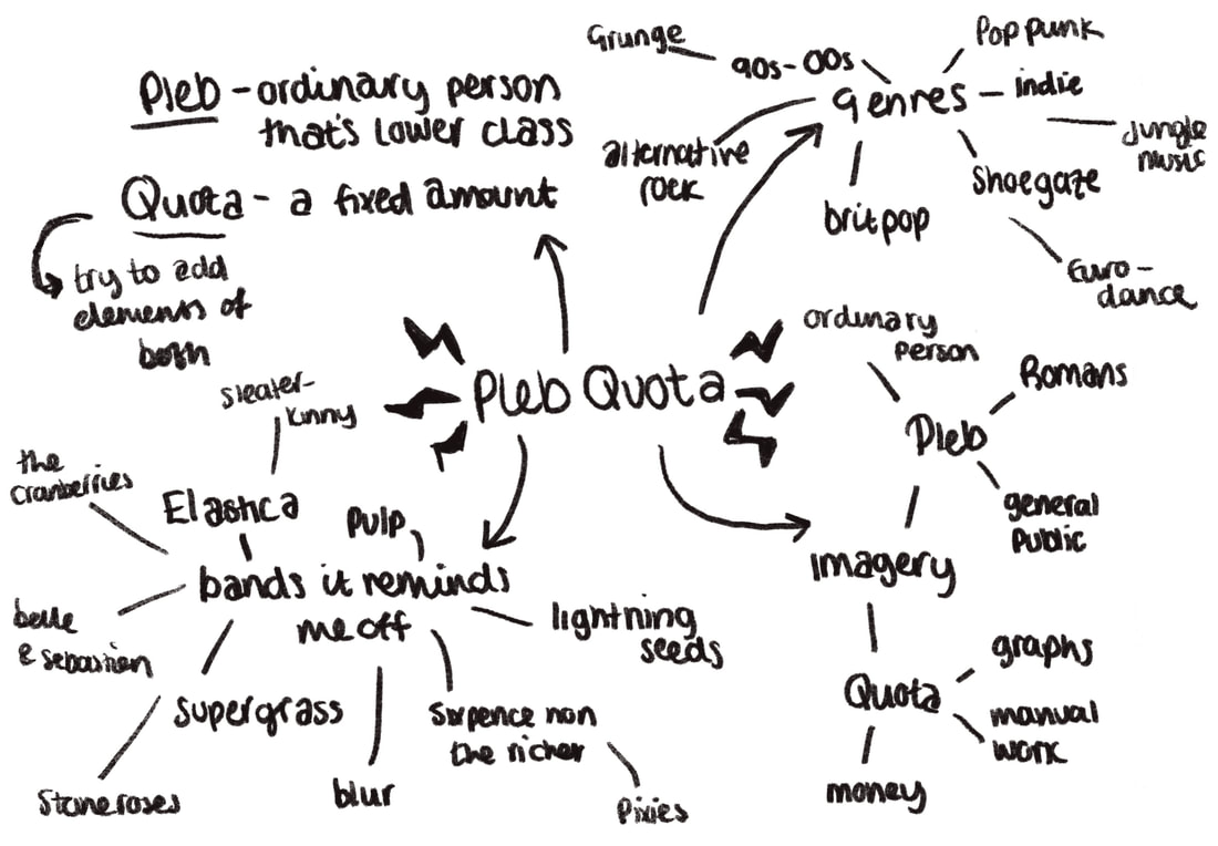
Create a logo/ brand identity for a band. Band names where provided usiing a random generator. I was given "Pleb Quota".
RESEARCH stage
This week was all about research. From mind maps to moodboards to further reading.
|
|

|

|
|
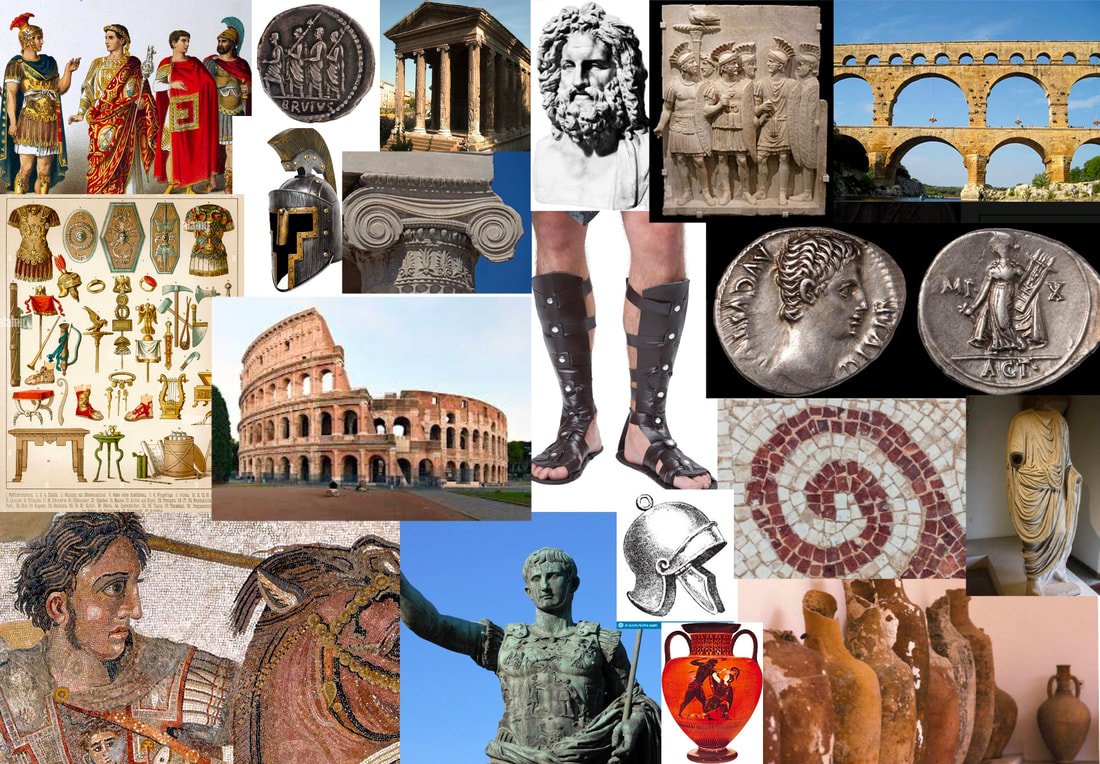
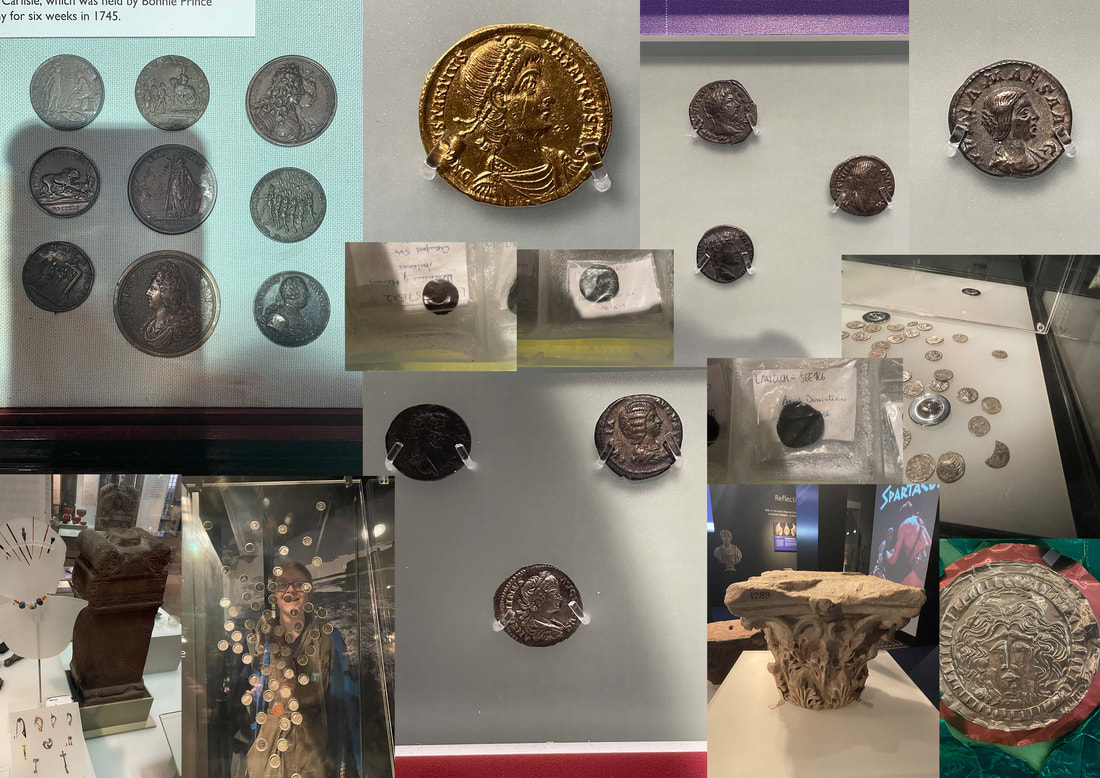
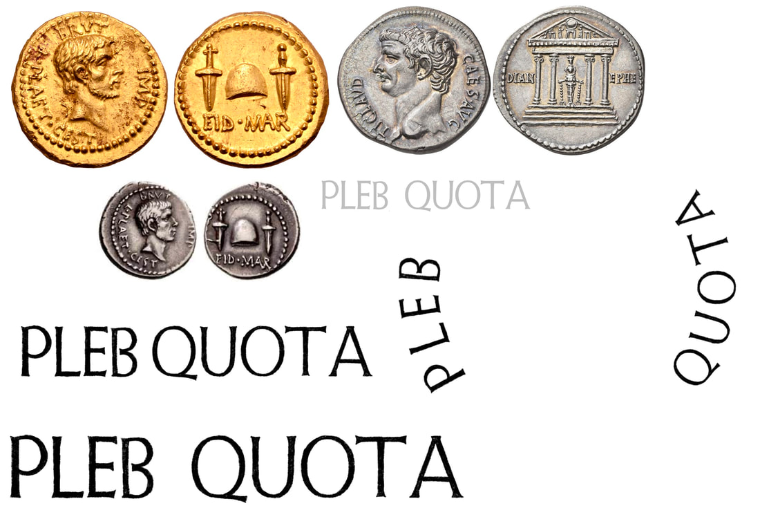
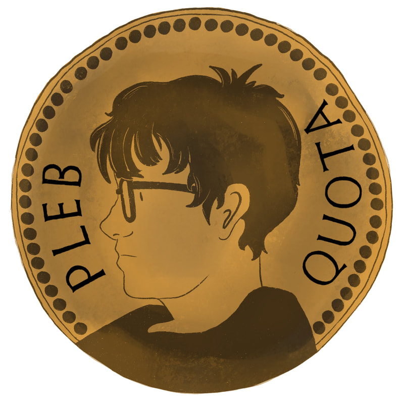
After doing my preliminary research and deciding on the Roman motif and exploring with secondary images, I decided to do a visit to the Roman exhibition at Tullie house to get a look at some genuine Roman artefacts in person. I was specifically insired by the coins. After asking one of the staff at the museum, I was actually able to handle some coins and get a feel for there texture. I learnt that due to the way they were made they are not exact in shape. I was also intrested in the Roman columns, looking at example of corinthian and ionic collumns found in the local area.

I also made sure to listen to losts of music in the genre and adjeacent to the genre to keep the feeling of the project on the right track.
Idea one: development

|

|

|
After seeing all the Roman coins at the museum, I got the idea to create one with the face of the main singer from my fictional band. I began sketching tiny thumbnails of potential ideas. I also used modelling clay to create a physical coin to experiemnt with materials.
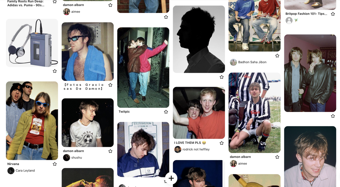
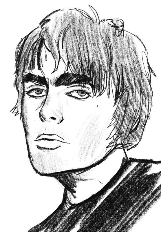
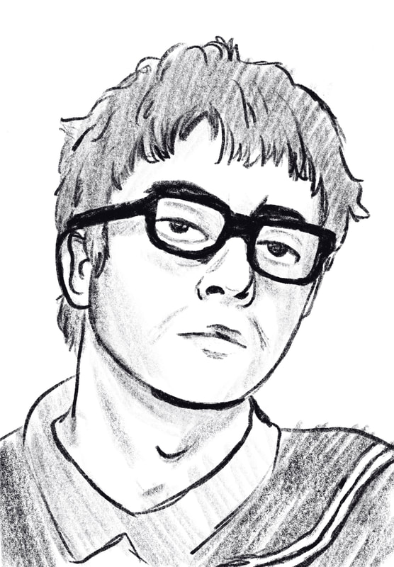
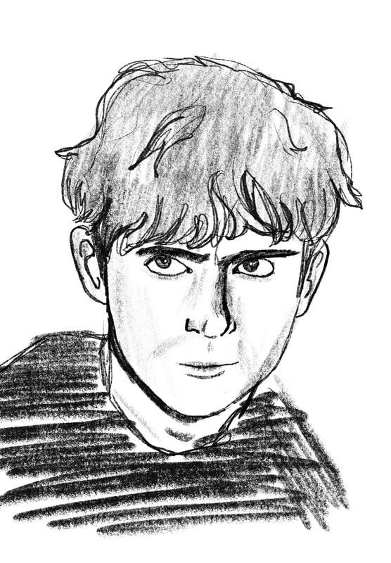
I collected many images of iconic Britpop front men and began sketching them before creating the fictional front man for Pleb Quota. A link to the full Pinterest board is here
|
|
|
Idea one: Initial design

|
|
|
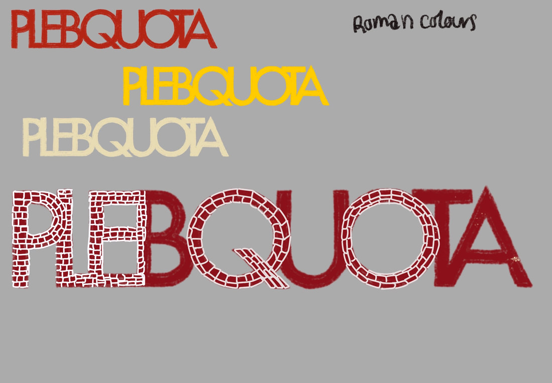
I began sketching out my idea using Procreate and made a basic outline of what I wanted it to be first before later moving into Illustartor to create a vector based design more sutible for logos. I used my research from Tullie House and my secondary research while designing the look of the coin, trying to keep it imperfect and old looking. I consulted the moodboard of 90s Britpop men and tried to frankenstien parts of each of them. I also tried to include the dotted motif present on most of the coins. I deisgned the typograhy to be remencient of the lettering found on Roman coins also.
Idea one: vectorising
|
|
|
|
Using the line art from my previous Procreate design and the image trace feature on Illustrator, I created the first logo idea. I then used that and created two other more detailed designs. I think the the centre is my favourite as its simple but still reads as a coin.
|
|

|
I wanted to try a silver finish on the coin. I felt that most of the coins seen in my research were this colour and it would read more grungy and fir more with logos of the genre.
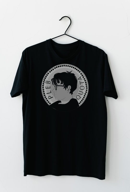
IDEA ONE: IN CONTEXT
|
|
Idea two: development
|
|
|

|
IDEA TWO: initial design

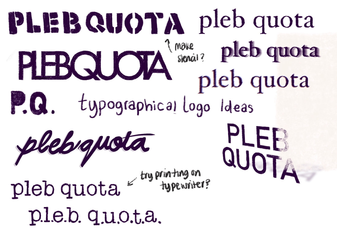
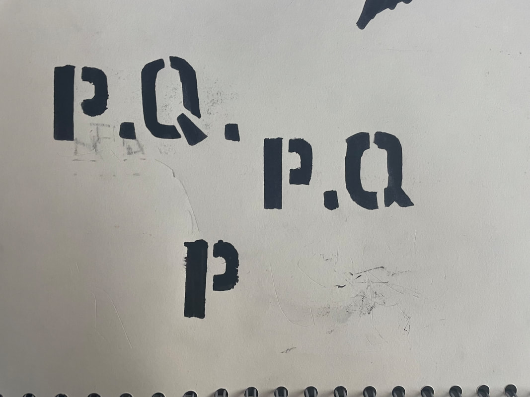
First I sketched out the finalised typeface for the logo.

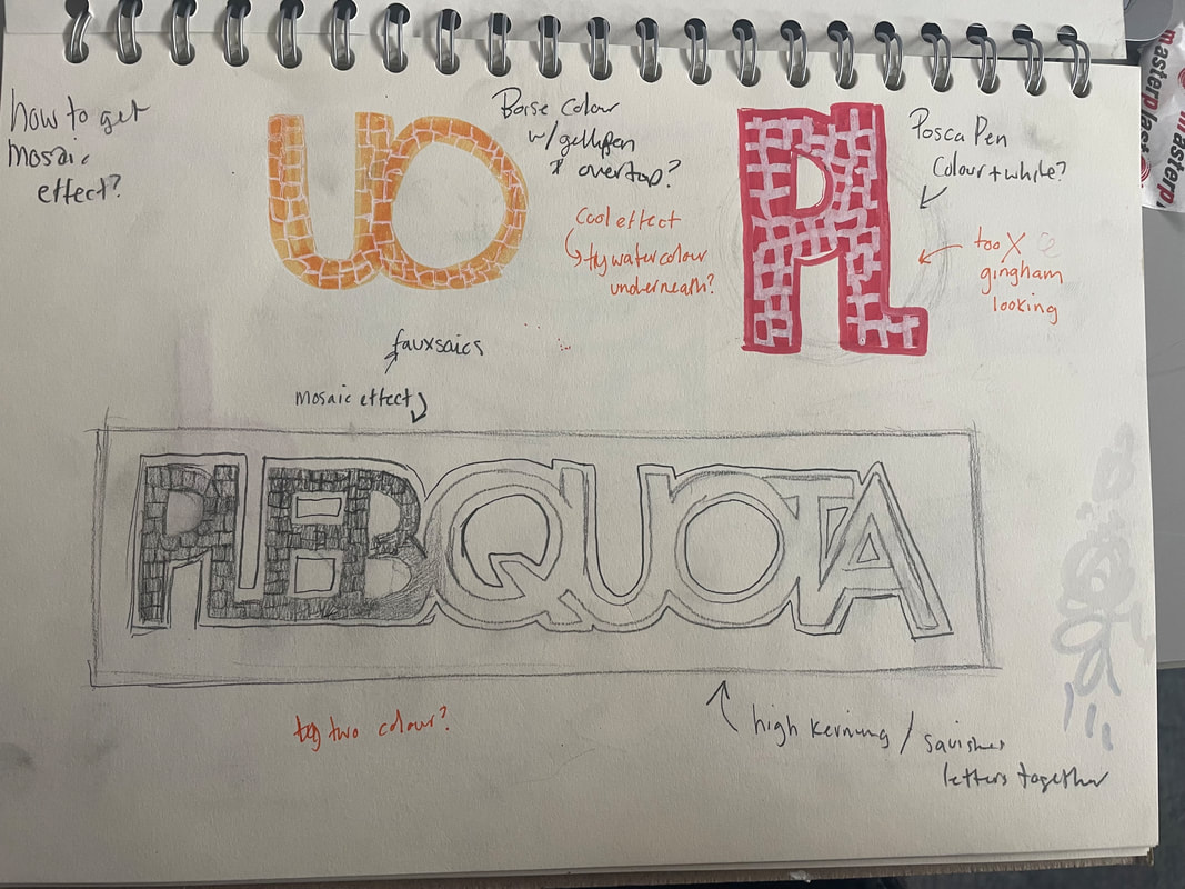
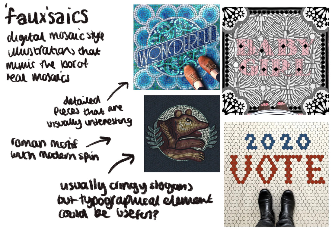
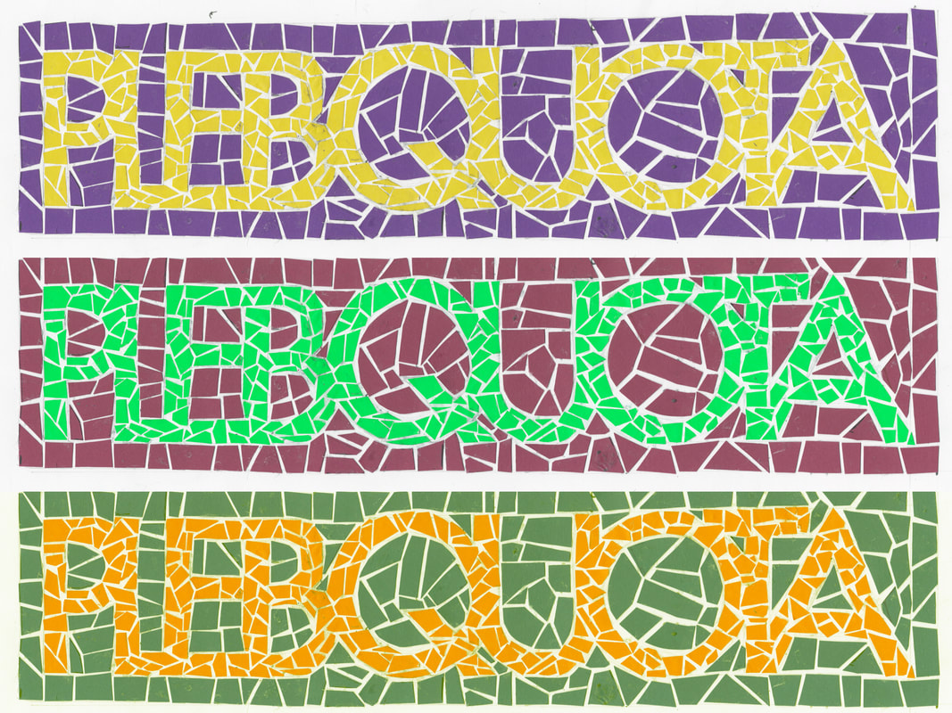
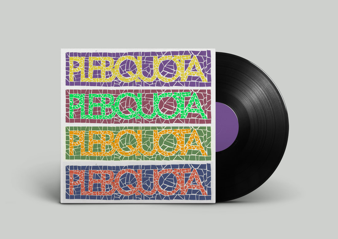
I forgot to take photographs while making this. I first used orange card and cut it into small pieces to replicate the look of mosaic pottery. I then cut slightly bigger and more squared pieces from blue card for the background. This helps separate the text from the background.. This was tedious and took quite a long time so when when making colour variations I used Photoshop and digitally edited them.
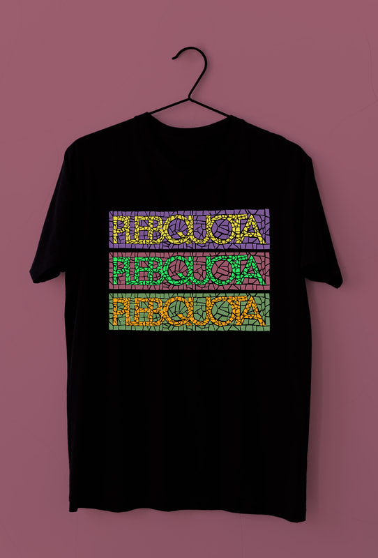
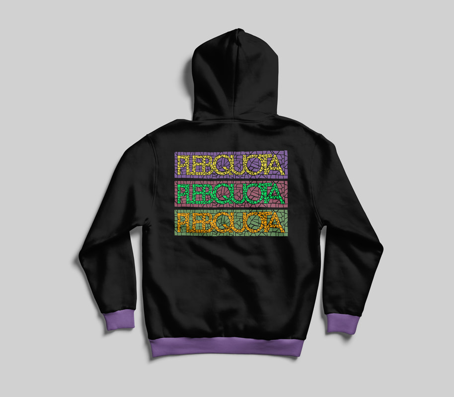
idea two: in context
|
|
IDea three: initial development

|

|
|
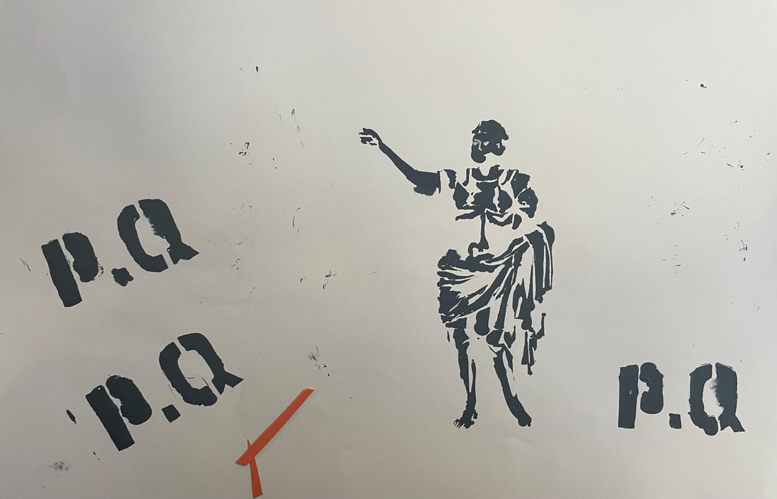
I experimented with the another silhouette idea but I felt happy enough with the others and founf this wasn't working as well.
final logo