WEEk one: colour and composition
What's the brief?
This week is all about learning the basics of colour and composition with a combination of manual and digital activities.
|
Task One:
|
Task Two:
|
Task Three:
|

|

|

|
This first task was to create a copy of the colour wheel provided.
The next task was to create a tonal scale using a secondary colour from the wheel.
The third task was to complete a Bauhaus colour and personality exercise and explore the potential of colour to comunicate. Each square is filled with a unique colour I find visually appealing. I enjoyed this exercise, enjoying trying to mix the appropriate colours.
Task Four:
|
|
|
|
|
|
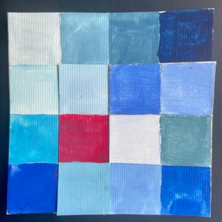
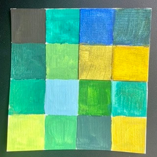
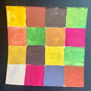
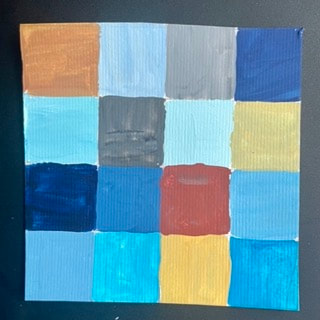
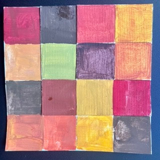
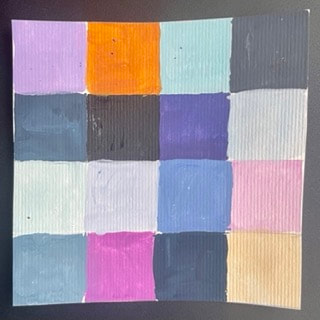
This task was to create six coloured square grids, each filled with colours to communicate specific themes. From left to right: Hospital Ward, Rainforest, Mumbai, Blackpool, Autumn and Misty Morning. I think the most successful are the Hospital Ward and Mumbai, with Misty Morning being the least successful.
Task Five:

|
|

|

|

|

|
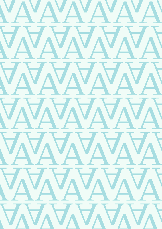
This task was to create six digital typographical designs. The focus was ment to be contrast, using abstract letterforms to communicate certain themes. From left to right the themes are: Scale and Helvetica, Pattern and Clarendon, Masculine and Rockwell, Power and Calibri, Playful and Myriad Pro and Feminine and Bodoni.
WEEK TWO: composition
Task Six:
|
|
|
|
|
|
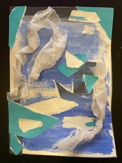
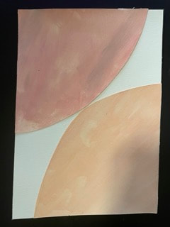
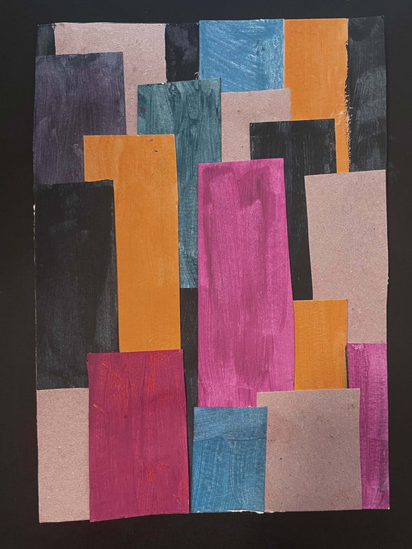
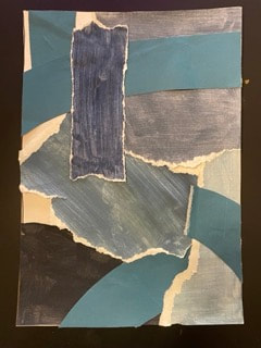
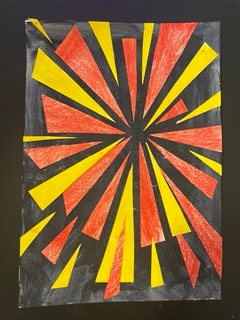
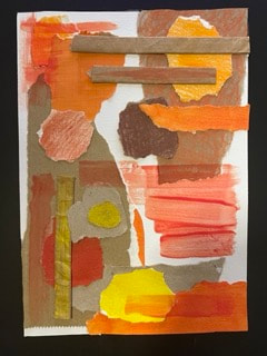
This task was to complete six abstract compositions made with collage. Reads from left to right: On the Ice Shelf, Sensual, Mumbai, Storm at Sea, Threatening and Autumn. I found this a fun task, experimenting with materia and finding interesting ways to comunicate ideas in an abstract way. For example, I teared the blue painted card so the white edge would show, making it reminicent of waves. I tried to experiment with scale, material, colour and shapes as much as possible.
While doing this I looked at the work of abstract artist Conny Lehmann as I find her work have very exciting compositions. Her work in collage can be found her: https://www.aquarelle-connylehmann.com/collage/collage-2020/ but I also looked at a collection of her abstract paintings found on the Saatchi Gallery here: https://www.saatchiart.com/connylehmann
While doing this I looked at the work of abstract artist Conny Lehmann as I find her work have very exciting compositions. Her work in collage can be found her: https://www.aquarelle-connylehmann.com/collage/collage-2020/ but I also looked at a collection of her abstract paintings found on the Saatchi Gallery here: https://www.saatchiart.com/connylehmann
Working in the style of...
What's the brief?
This week is about working in the style of other illustrators. Thinking about they use composition, colour, media and imagrey, we had to make three book covers in the style of Anne Yvonne Gilbert, Charles Keeping and Brad Holland for three genres of books: Chidlren's, Sci-fi and Pschological Horror.
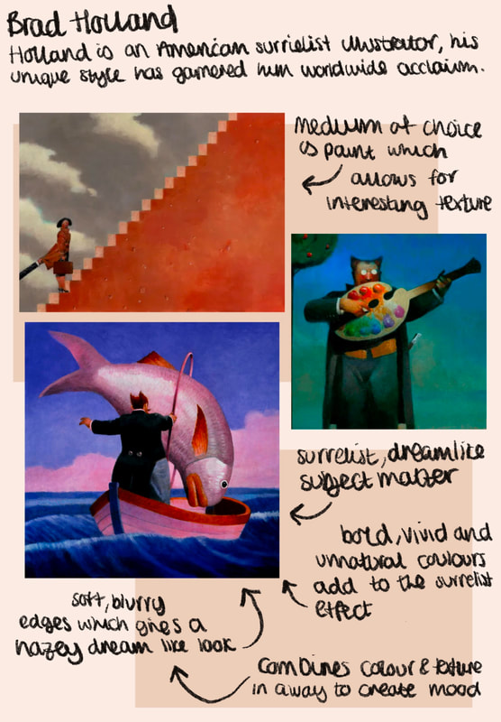
Artist Research:
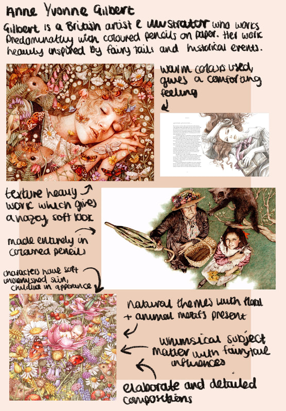
|
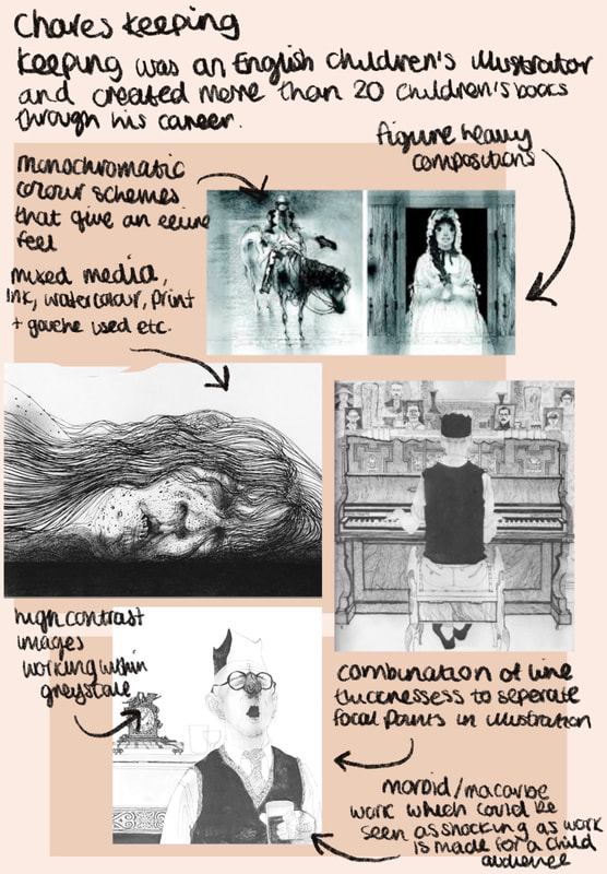
|
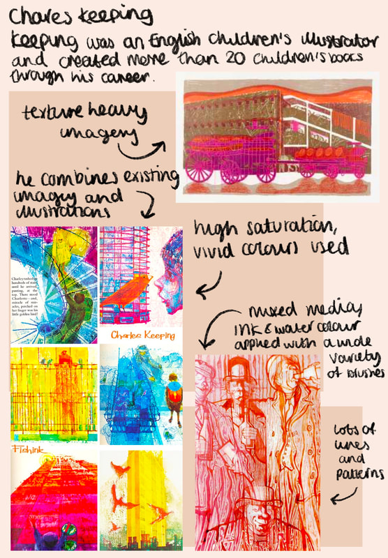
|
|
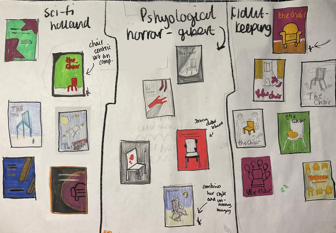
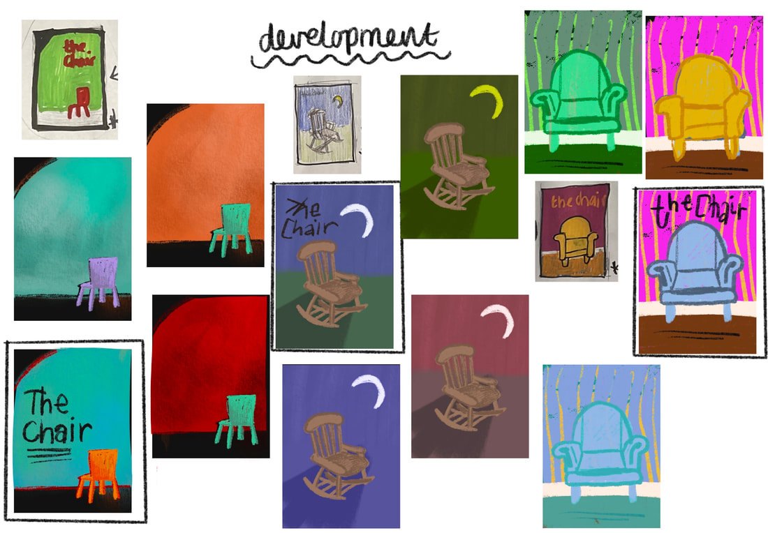
Developmental Work:

|
|
|
To start, I began mindmapping ideas of how a shair could be adapted to the three genres: psychological horror, children's book and sci-fi. I then moved onto the thumbnailing stage before developing my best ideas into compositions for the final idea, test colourways and type placement.
Finished Artwork:

|

|

|
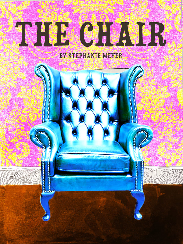
These are my final designs for the book covers. The first one is a psychological horror cover in the style of Anne Yvonne Gilbert, the second a children's book cover in the style of Charles Keeping and the last a sci-fi cover in the style of Brad Holland. I was inspired by the backgrounds and texture of Gilbert's work, as well as the realistic way she drew the figures for the realistic depiction of the chair. I find this works well as a psychological cover as the lone rocking chair in the field hass unsettling connotations. I also included the cresent moon as I saw it as a repeating motif in Gilbert's work. For the sci-fi cover, I was inspired by Keeping's mixed media work, being highly influnced by his contrasting colour pallettes and collage-like techniques. I created the background in ink and edited the work in photoshop, overlaying patterns and image to create a collaged peice. And finally, for the sci-fi cover, I was inspired by Hollands gradient backgrounds and surrealist composotions. By making the chair small in scale, it emphasises the largeness of the planet in the background and makes the sci-fi theme more obvious. I used acrylic paint as the medium.
Adding typography:

|
|

|
Choosing the right typography can make or break if the design fits the genre. I think my choice work well. The font I chose for psychological horror cover is jagged and wonky, giving a horror tone. It is also in italics, emphasising the title. The font for the children's book is a serief font with a handdrawn look with some slanted crossbars which gives it a fun and childlike appearnace. For the sci-fi cover I chose a futuristic sans serief font, with symmetrical shoulders. This gives it a space-age look.
Final bookcovers in context:
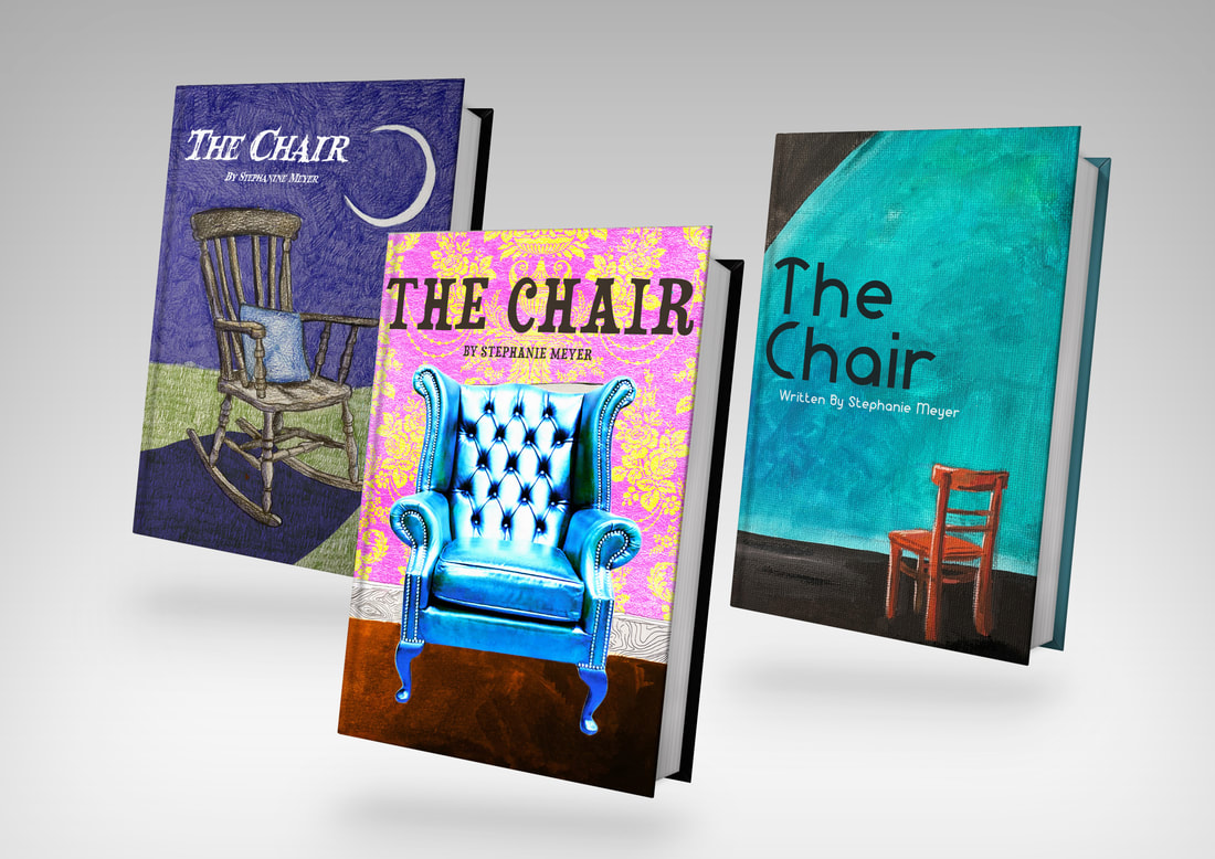
To display my final designs, I used a free mock up to show what the covers would look like in context. I think this helps effectivly visualise the final product.
WEEK three: telling stories
what's the brief?
The brief for this last project is to create an eight page ISSUU book. The book should be a personal response to a lyric from the provided list. We are expected to forualte a response in our own illustrative manner. A full lyric should appear in the book and have a front and back cover.
Artist research:
|
|
|
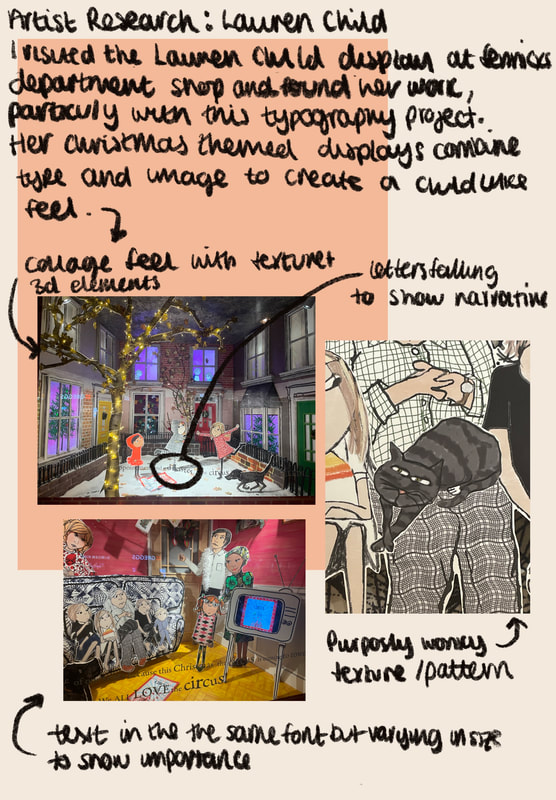
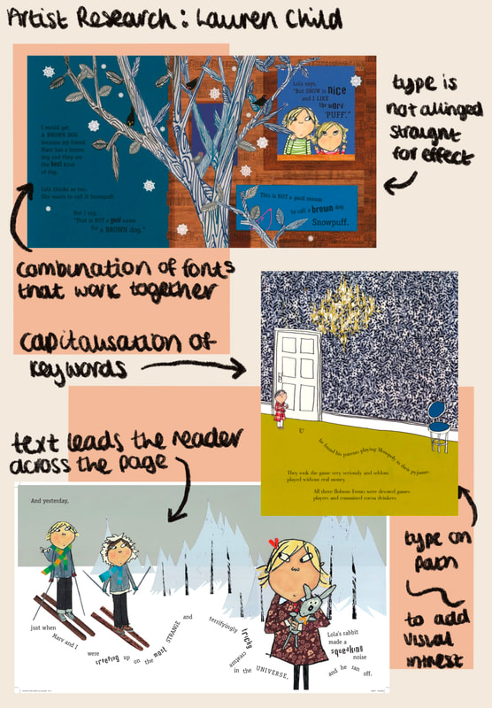
I researched two artists for this task. I wanted to take specific influence from Lauren Child and her approach to children's book illustration. I went to her display at Fennicks in Newcastle to gather research.
initial research and development:

|

|
For initial research, I looked through the list of lyrics and chose one I thought was most interesting. I decided on Sport the Oddboy. I then mindmapped possible interpretations of the lyric "it's an oddboy who doesn't like sport". I went down the children's book route and an optamistic look at a father and son's reltionship despite their differneces.
|
|
|
Before thumbnailing, I also had a look at these videos by Anoosha Syed, a contempory children's book illustrator who is very open about her processs online. I found her discussion on dimesnions and layouts important to hear before moving onto the thumbnailing stage.
thumbnails:
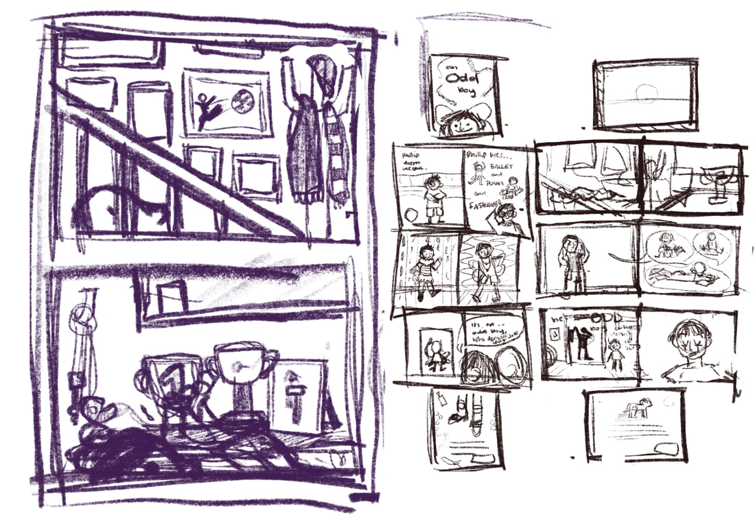
|

|

artwork:

|
|

|
|
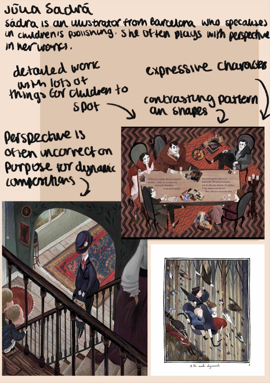
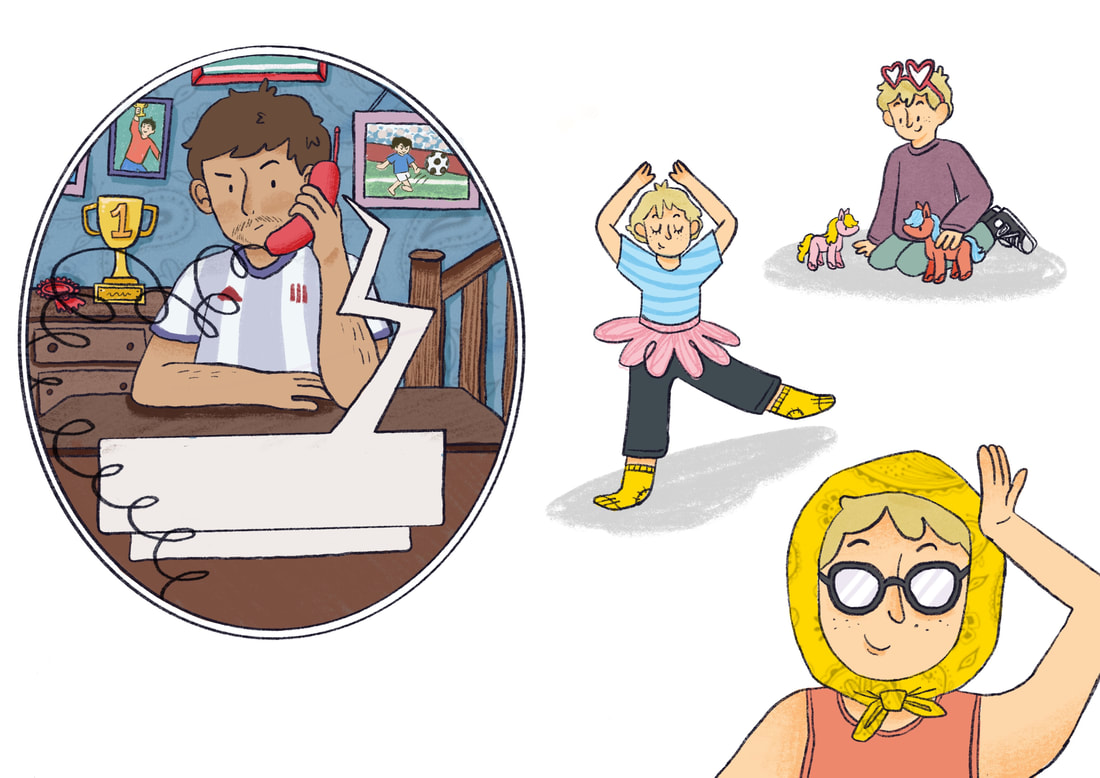
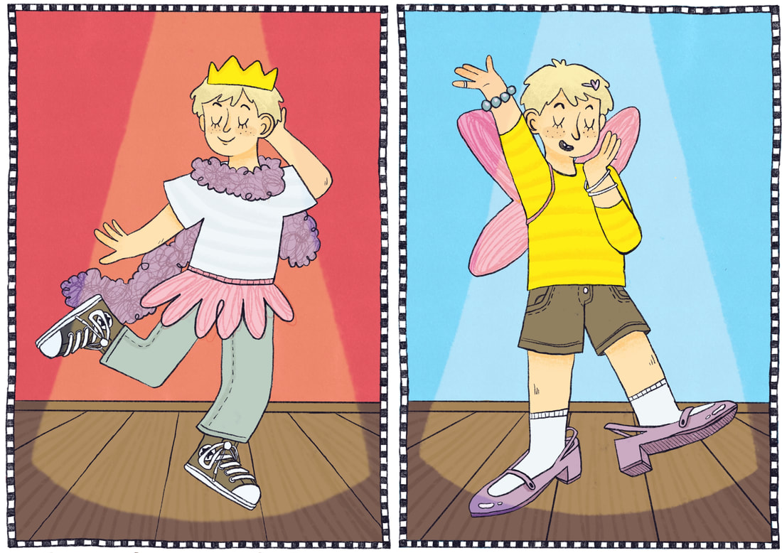
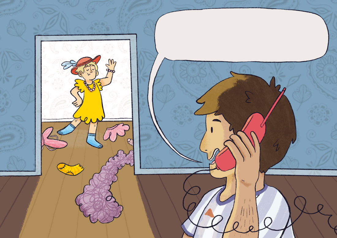
This is the final artwork I created for the book. Through the initial reseach and development stage, I decided on making the book a children's picture book. I wanted to include a combination of spot, vignette and full bleed formatted illustrations, to give visual variety. I tried to use lighting to guide the eye in the last last two spreads, making the intense light source to shine on "Phillip", showing him as the star of the narrative. I incorporated a paisley motif throughout the book, featuring in the front & back cover, the wallpaper in the setting and the headscarf. I did this as homage to the way Lauren Child incorporates scanned patterns in her work. I think it breaks up the large amount of blank space in the backgrounds and also makes the finished artwork seem cohesive. To further add to the child-like look of the work, I used clipping masks of scribbles. This also added texture to the work and helped make the pieces seem more interesting too look at. I used a checker print border for a few pages in the design, I was inspired to this by the contrasting patterns and shapes in Julia Sadra's work. I think it breaks up the pages and adds another effective visual element.
I tried to stick to a limited colour palette throughout the work, sticking to a few shades of blue, pink, yellow, red and purple. This combination of femmine and masculine colours I hope added to the narrative, the differneces between a masculine father and more effeminate son. I alo tried to do this with the costume of the characters. The dad wears a football shirt and has facial hair, playing into sterotypes of the masculine British father, while the young boy wears bright colours and is shown dressing up with typically girly items. To show the dad liked sports, I set dressed the background in the first illustration with sports photographs and awards on the background. For the cover I wanted show the narrative of the book by combining masculine and femeniine elements. I chose to use the image of a dress with a football pattern overlayed on top. I think this effectively gets the messgae across and matches the narrative.
I tried to stick to a limited colour palette throughout the work, sticking to a few shades of blue, pink, yellow, red and purple. This combination of femmine and masculine colours I hope added to the narrative, the differneces between a masculine father and more effeminate son. I alo tried to do this with the costume of the characters. The dad wears a football shirt and has facial hair, playing into sterotypes of the masculine British father, while the young boy wears bright colours and is shown dressing up with typically girly items. To show the dad liked sports, I set dressed the background in the first illustration with sports photographs and awards on the background. For the cover I wanted show the narrative of the book by combining masculine and femeniine elements. I chose to use the image of a dress with a football pattern overlayed on top. I think this effectively gets the messgae across and matches the narrative.
Adding typography:

|
One of my favoutite elements of Lauren Child's work is her use of type. I wanted to take inspirtaion from this in my book, so I tried to replicate this look in the font choice and formatting of the type. I think this page shows off the influence best. The font I used is a serief font that has a hand written look to it. I used a combination of bold and regular font and underlined the most important word on the page and formatted each individual word to guide the eye across the page.
|


Final book:
This is the final book design including the typography. I think overall this is an effetive piece that follows the brief while showing my own personal response to the subject matter. I think the typograghy works well with the illustrations and helps keep the work in the area of children's illustration. I'm proud of the output and think it shows areas of improvemnt from the first project in some ways. However, I feel as if the front cover isn't as effective as the back cover which I think works very well in showing the theme, havving an interesting composition an being vidually appealing. However I am proud of this piece of work and hope to be able to make work like this in the projects to come.
Issue link: here