WHAT'S THE PROJECT?
This is a live brief project (exciting!), exploring the use of illustration in contributing to and enhancing a brand identity. We must create four can designs and four matching tap badges.
RESEARCH

NICK SLATER
|
|

|

|
|
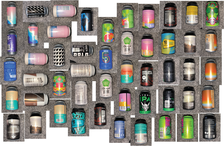
BEER CAN SCAVENGER HUNT AT MY BOYFRIEND'S HOUSE
INITIAL ILLUSTRATOR DESIGN
|
|
|
|
|
|
|
|
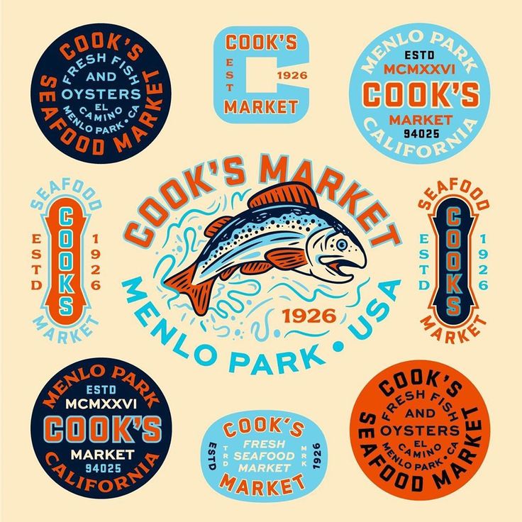
FURTHER ARTISIT RESEARCH
I feel like I need to look at some other artists to further my ideas along.
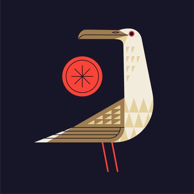
CHARLEY HARPER

Charley Harper is best known for his highly stylised wildlife prints, posters, and book illustrations, using silkscreen printing, and was a big inspiration for contemporary vector artists.
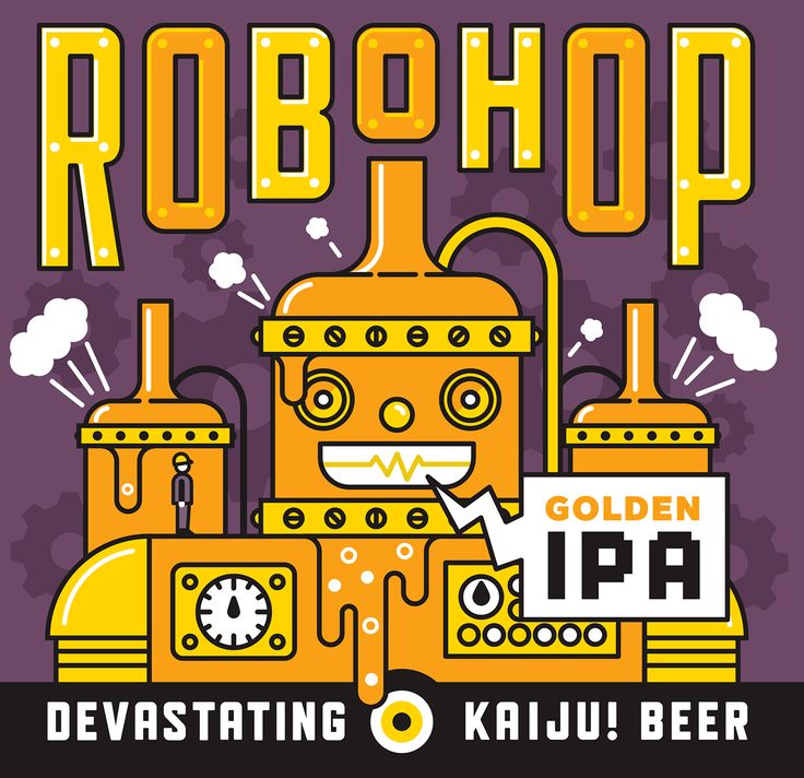
MIKEY BURTON

|

|

|
|

|
Mikey Burton is an graphic designer that works in vector styles. He creates graphics for the company Kaiju Beer.
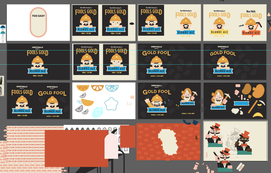
FURTHER DEVELOPMENT
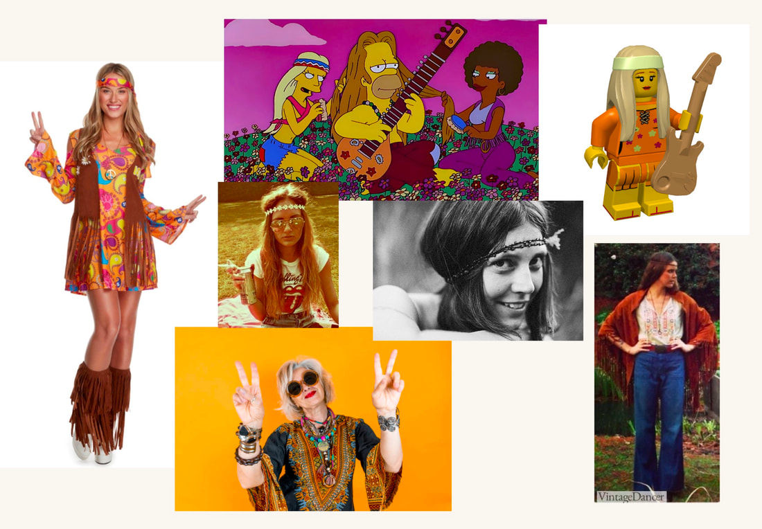
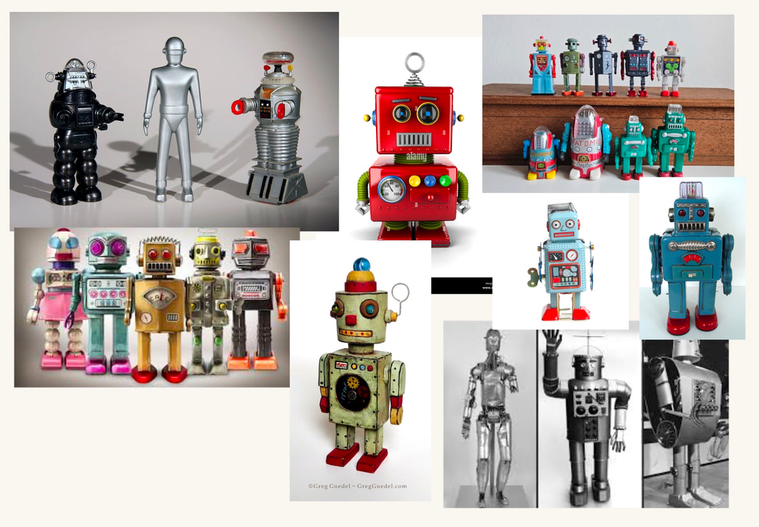
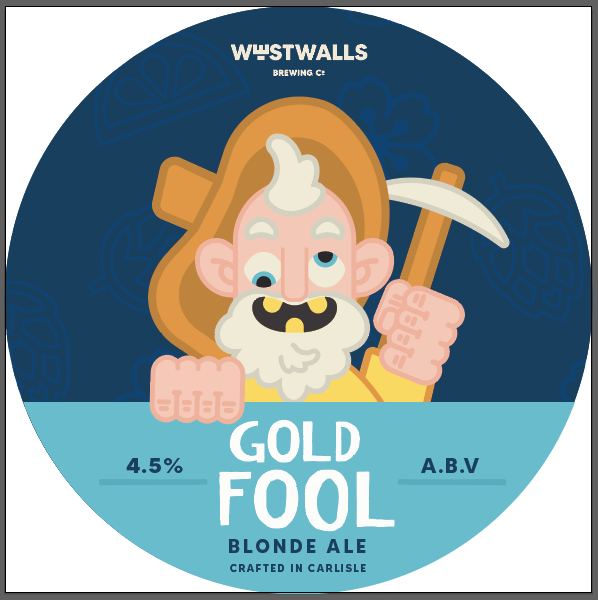
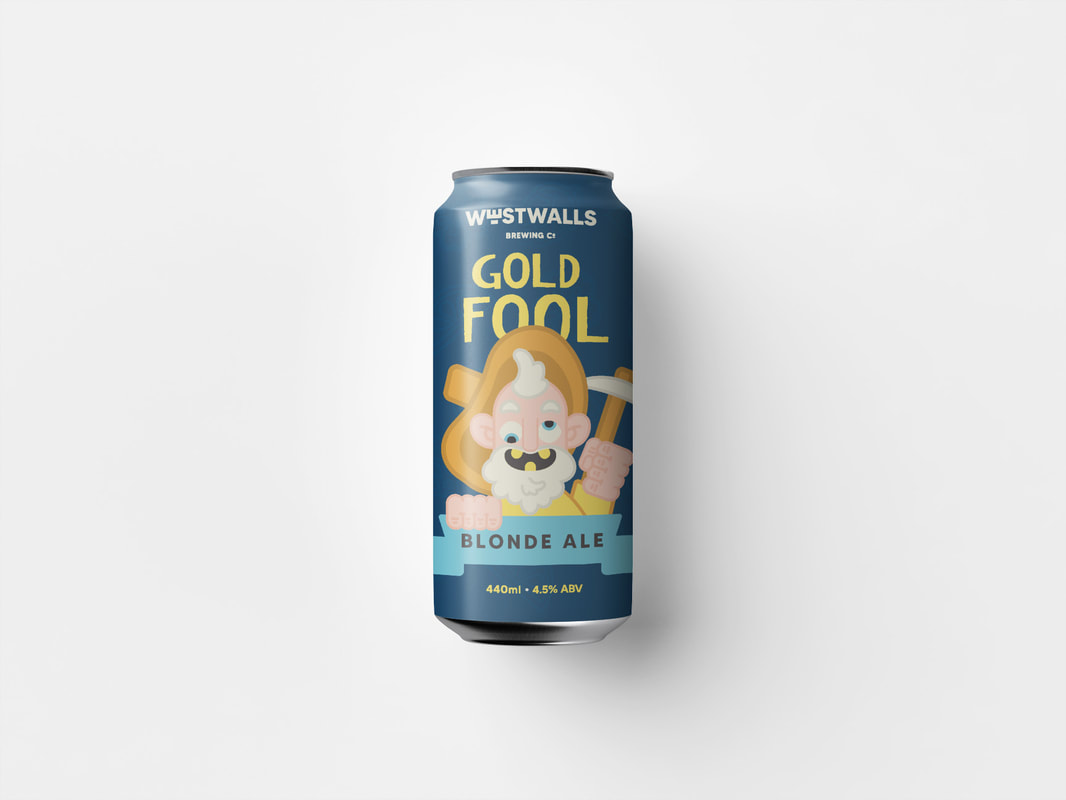
I felt like I although jumping into Illustrator got me going on the project, I needed to move back to paper and sketch some ideas if I wanted to move forward with character based designs. I created a mood board of iconic characters and pictures of prospectors, so I can see what shared elements they have. A big hat, a pickaxe, a beard and missing or gold teeth. I created a sketch I could bring into illustrator and work next to.

|

|
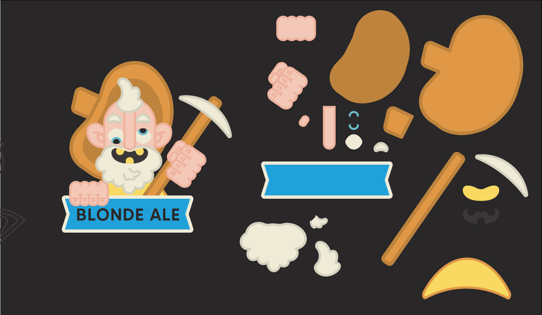
This is the design I created with the use of a sketch. This is a massive improvement. I also discovered the shape builder tool for the first time, thinking nobody had ever heard of this before. I was very embarrassed to know this is common knowledge....... so I watched some tutorials on it. This has really increased my work flow.
|
|
|
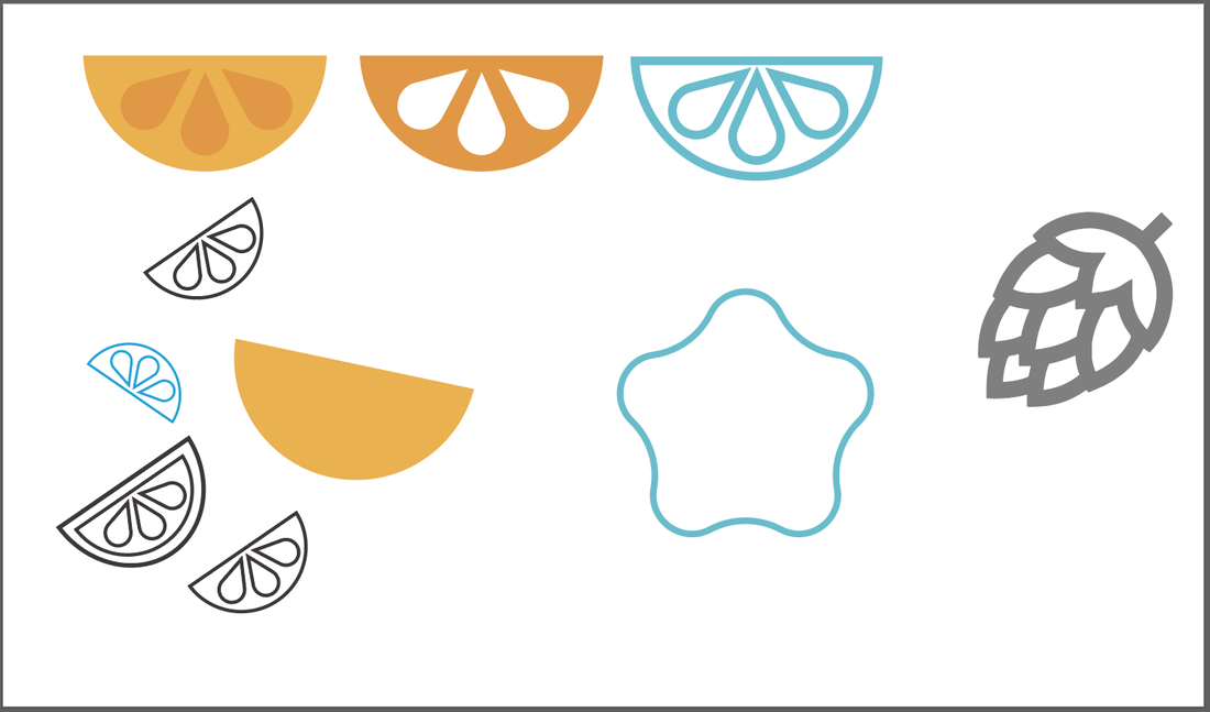
MAKING ICONS
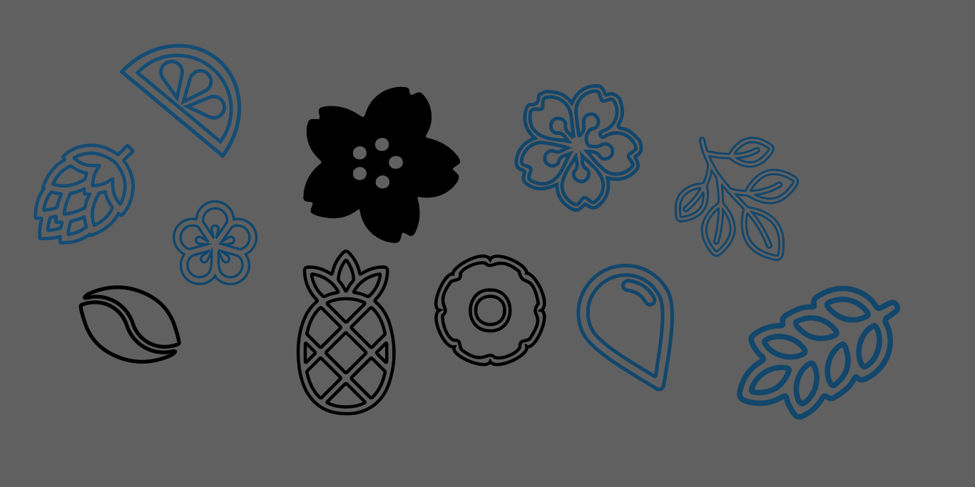
I wanted to create icons to use on the can designs that show the flavour notes of the beers. I used this as practice with the new shape builder tool.
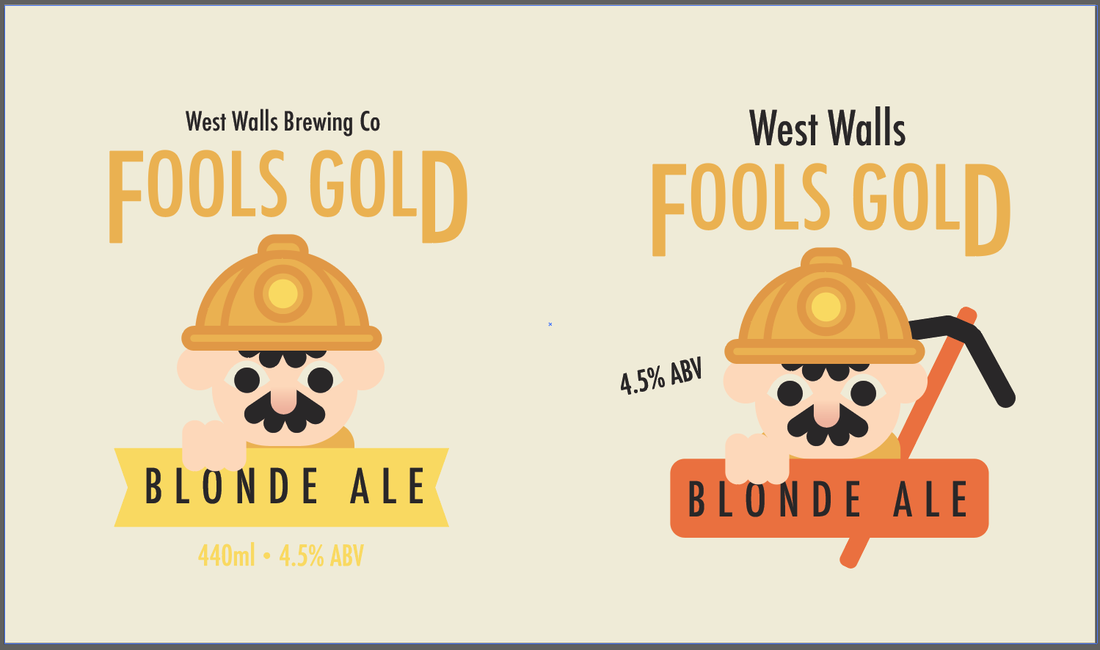
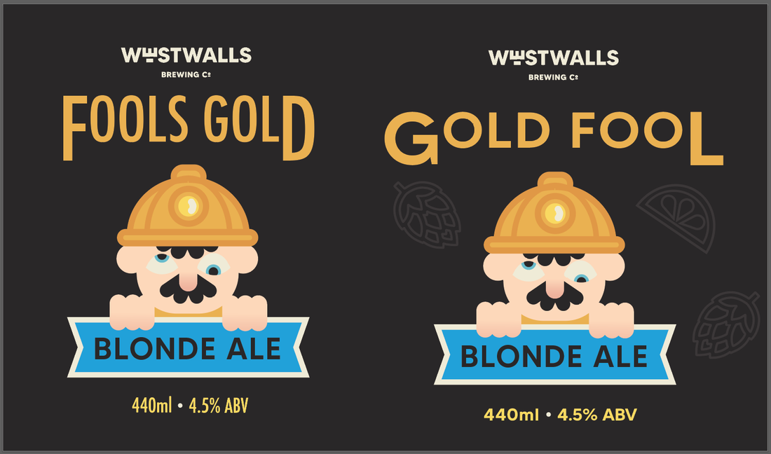
PLAYING WITH TYPE AND LAYOUT
I began experimenting with fonts, seeing if stacking the style, using the warp function or using a different type face would make the design more fun. I like the font of the first design and the placement of the last design.
|
|
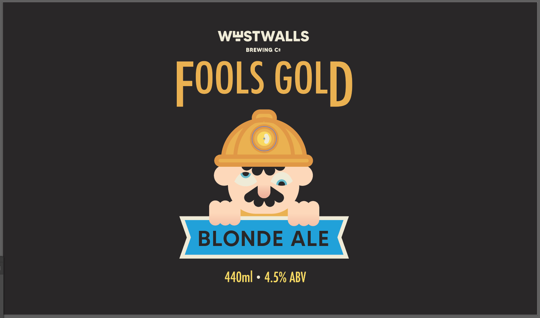
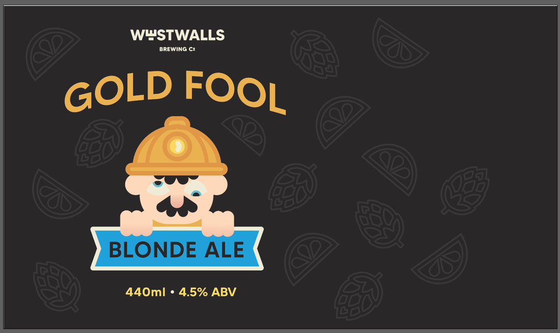
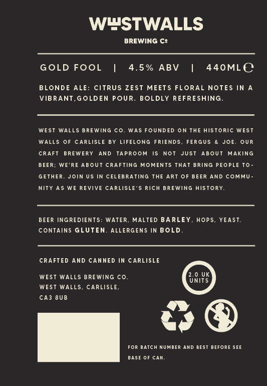
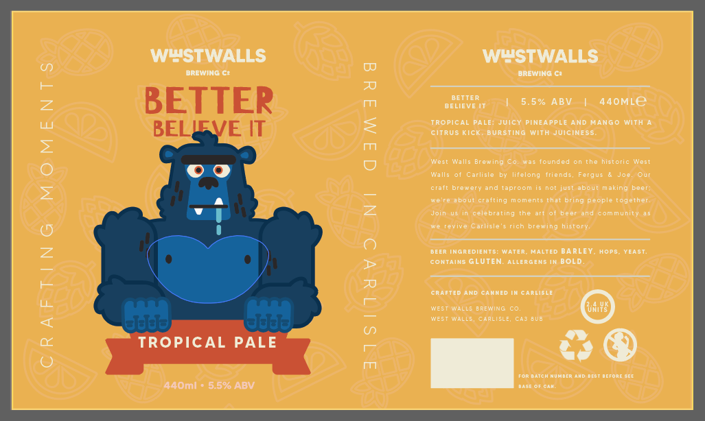
LAYING OUT THE INFORMATION
|
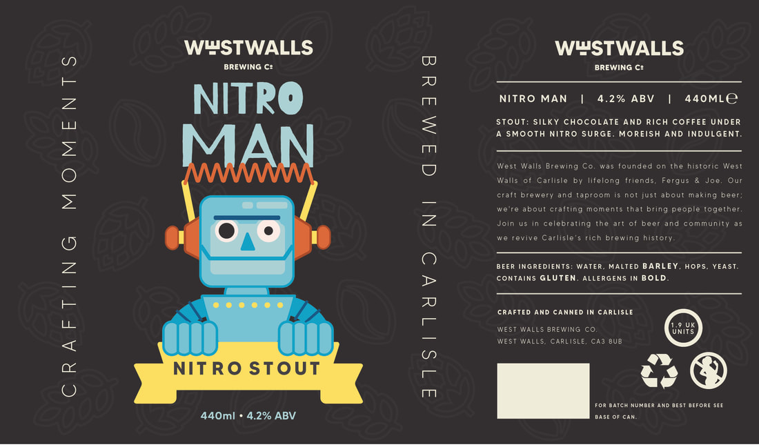
Using my research and collection of beer cans, I created a layout for the important text and bits of information on the cans. I used the "Made Tommy" provided by the company. I recoloured the symbols needed to match the design. I think it was very successful. 
|
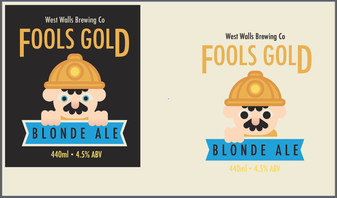
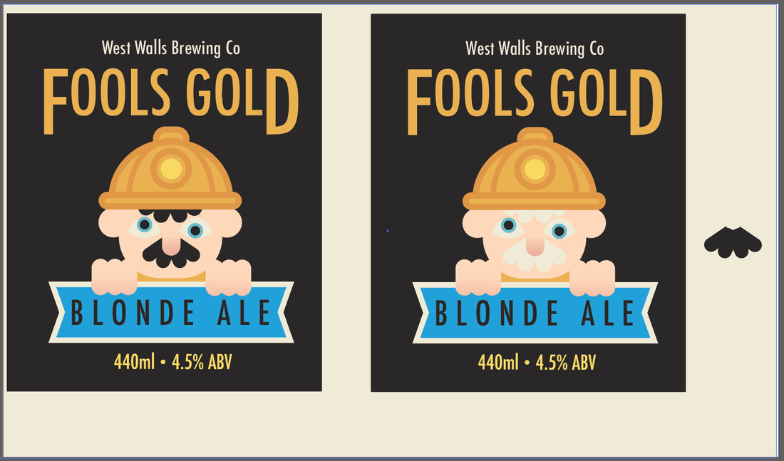
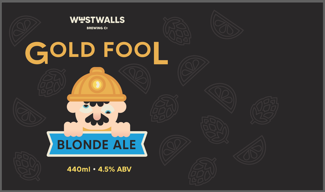
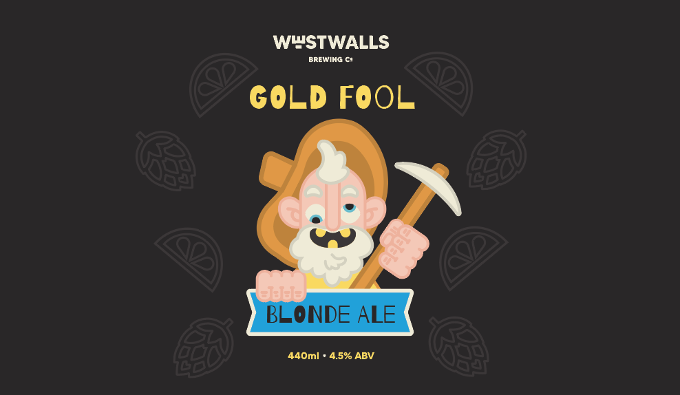
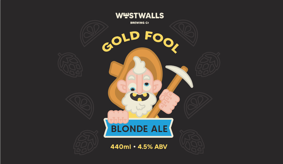
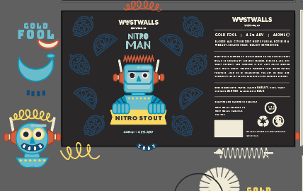
FINISHED TEMPLATE

|
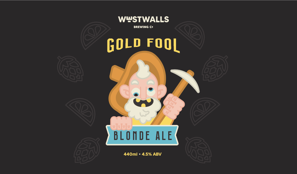
I tested the layout on a crude can mockup. I thought the design worked, but I was loosing his pickaxe and the font would work better as the more hand drawn example.
I moved forward with the design on the right, using it as a template for the next three designs. |
|
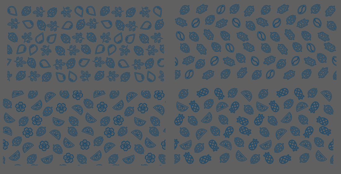
MAKING PATTERNS
Using the icons I made, I wanted to create a pattern to use as a subtle background element on the cans. I watched a few tutorials on how to do this in illustrator.
|
|
|
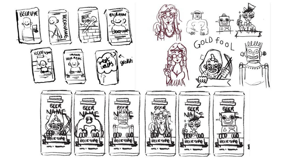
DESIGNING THE OTHER CANS
SKETCHES

|
|

|
|

|
|
CAN DEVELOPMENT
|
|
|
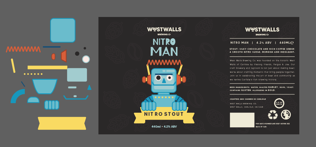
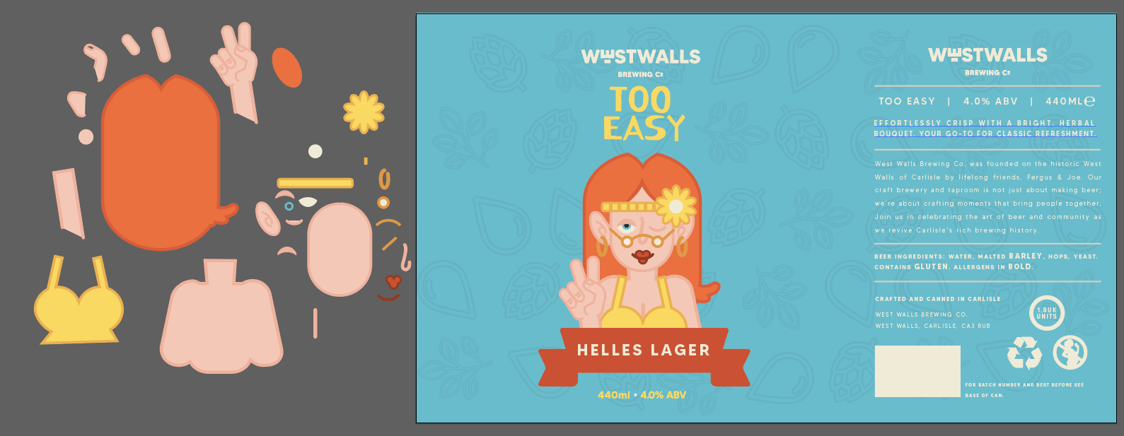
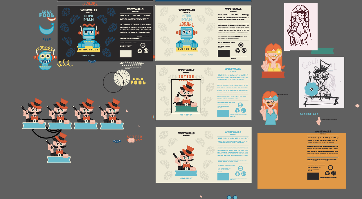
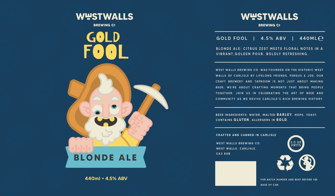
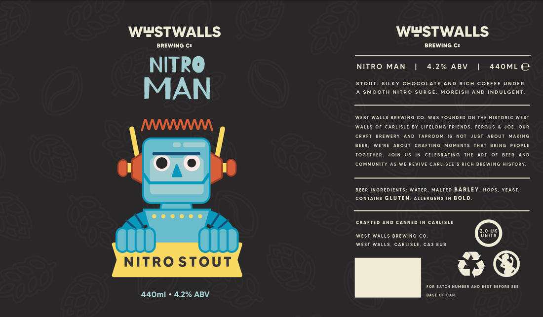
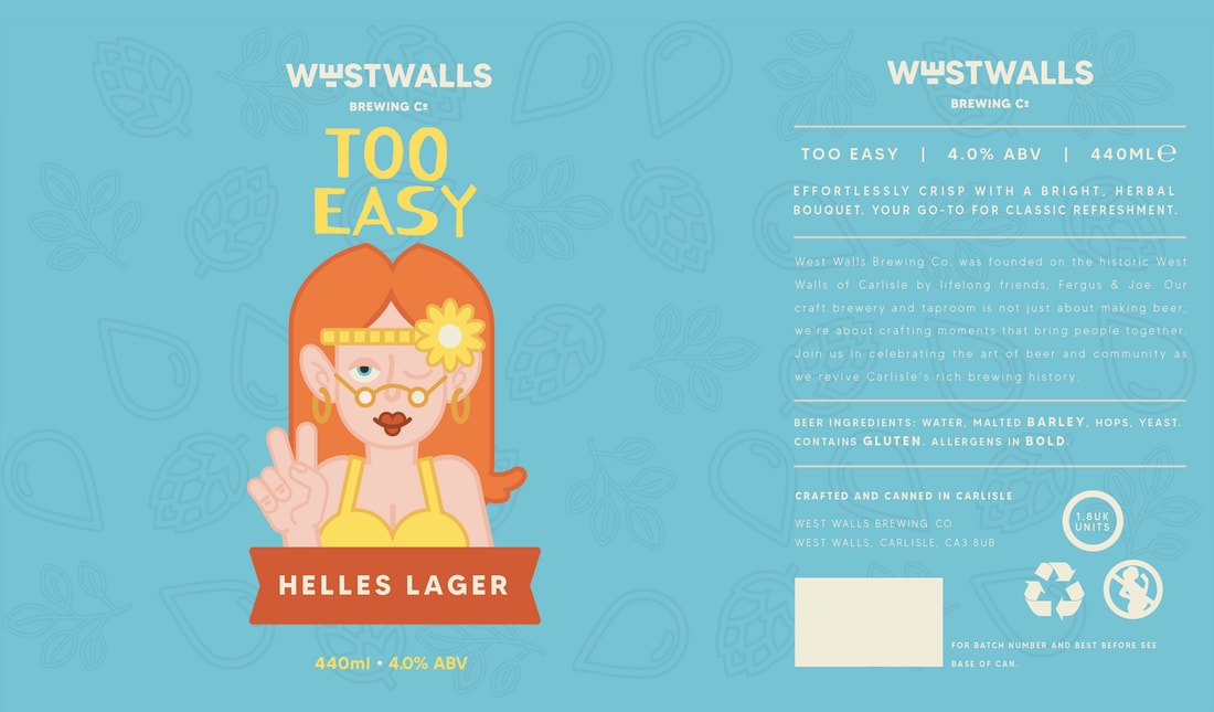
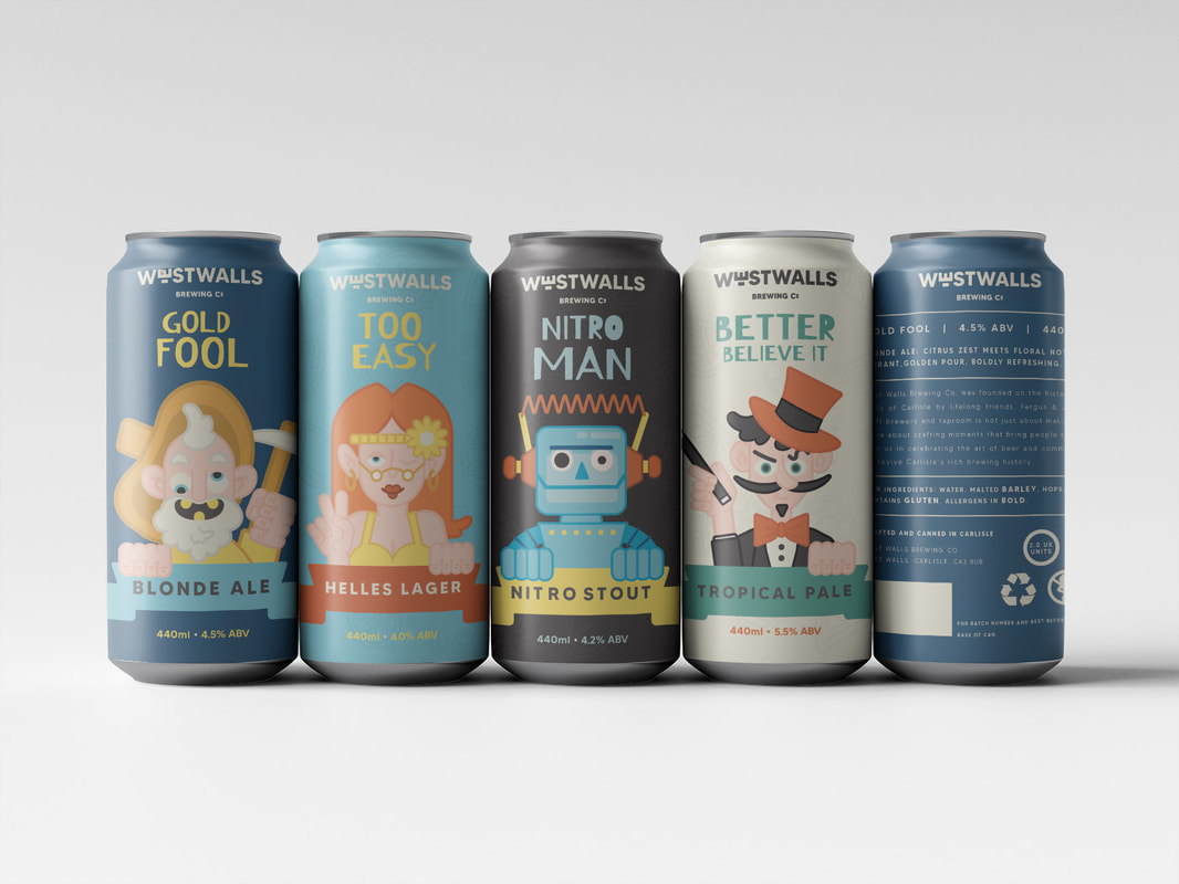
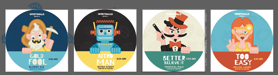
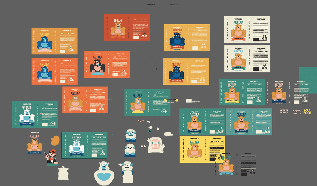
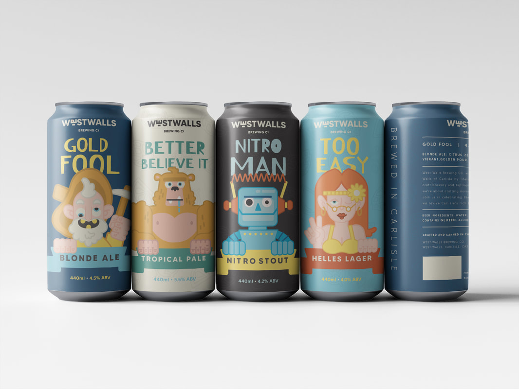
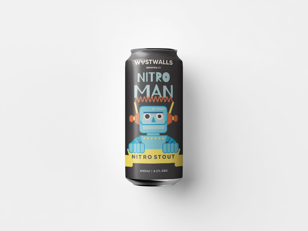
FINAL DESIGNS
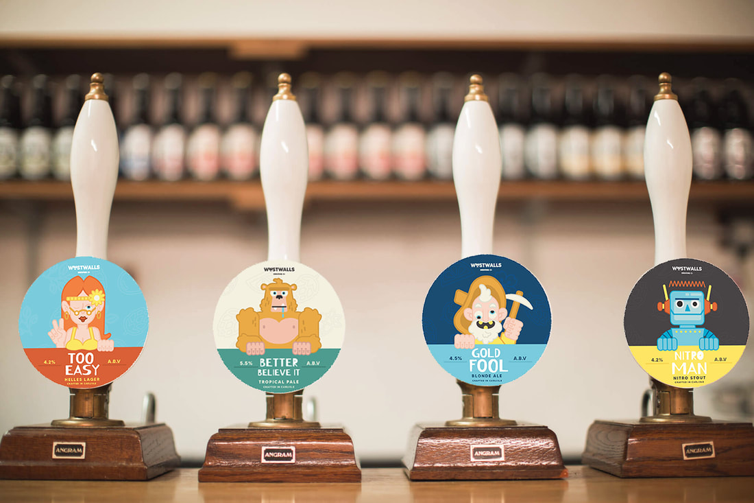
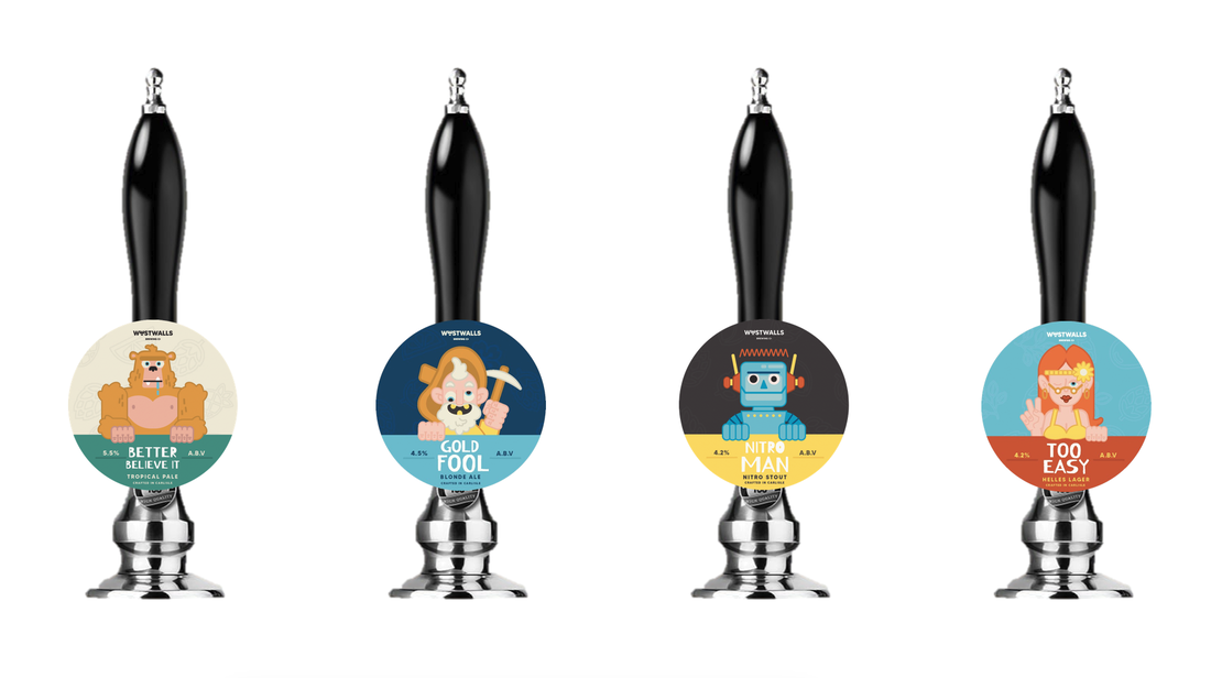
CREATING KEG BADGES
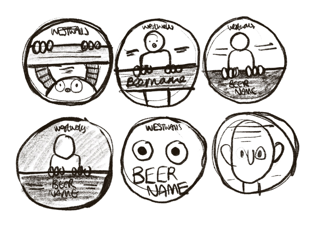
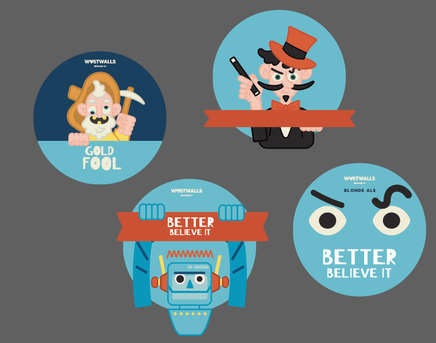
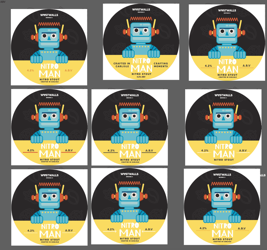
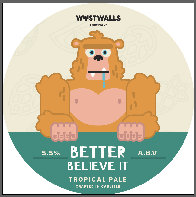
FINAL KEG BADGES

|
|
|
|
IMPROVING
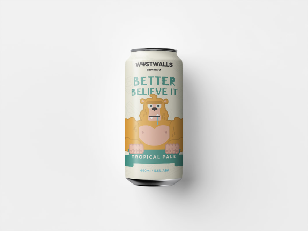
As this is a live brief, I really wanted to push myself and make the best work I could. So, i'm going to make improvements. While the final designs aren't bad, I can do better.
TWEAKING THE TYPOGRAPHY
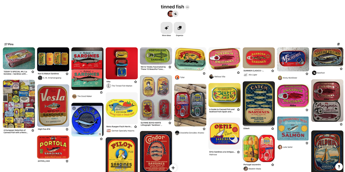
After critique with Tony, he gave me some advice to layer the type and make the design feel more put together rather than stacked, like in my tinned fish inspiration.


WHAT I CHANGED:
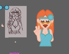
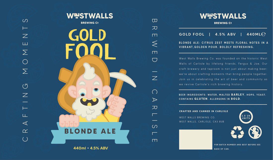
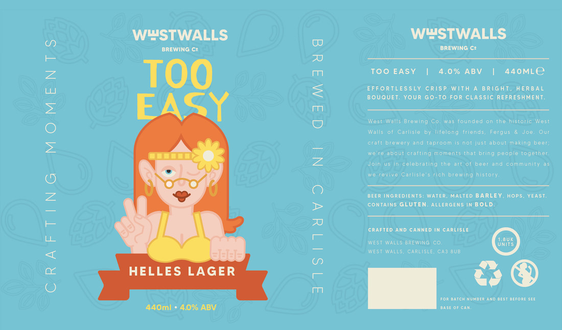
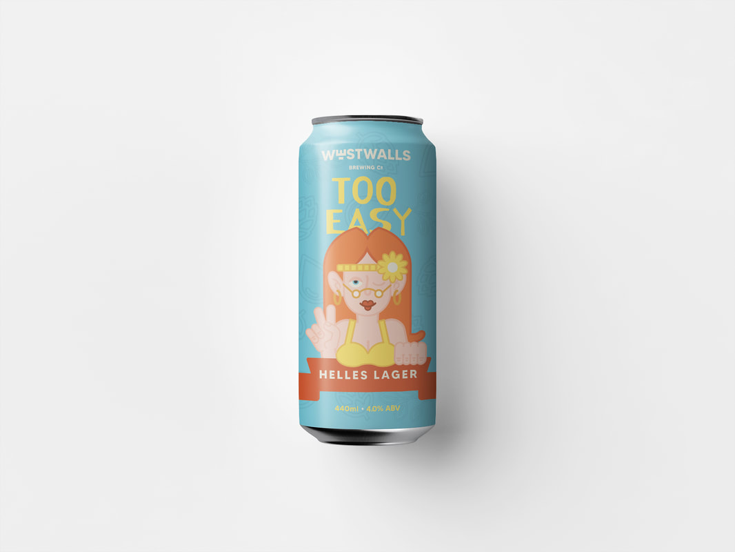
- overlapped the character with the type, making the design feel more together
- added "crafting moments" and "brewed in Carlisle" as a design element to fill empty space on the side of can
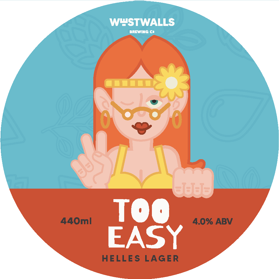
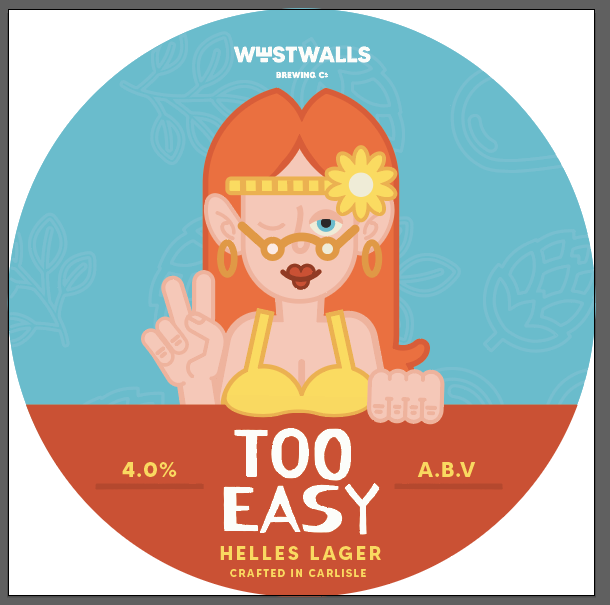
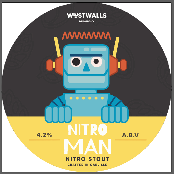
- Slightly edited chactaers to make a more fun, made the Too Easy woman's breasts over hang the banner, made robots eyes different sizes.
- Made the banners more bannerish, by adding ribbons to the ends.
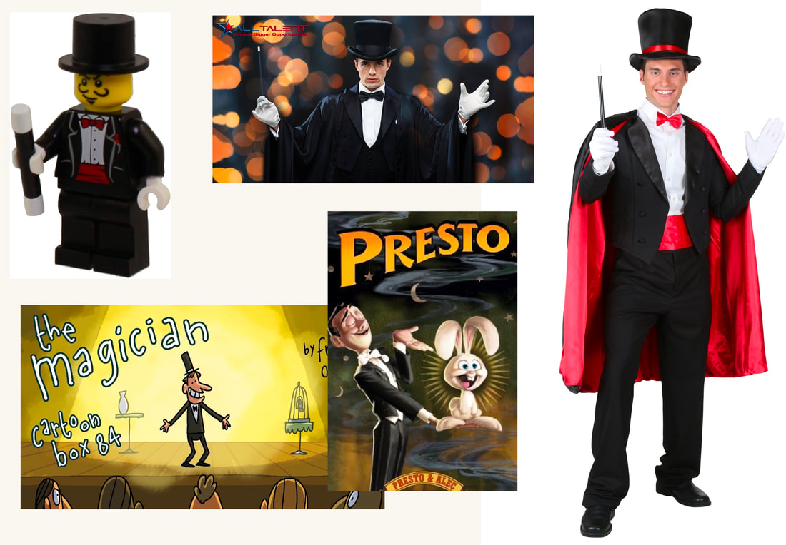
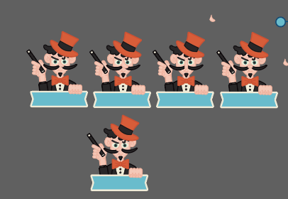
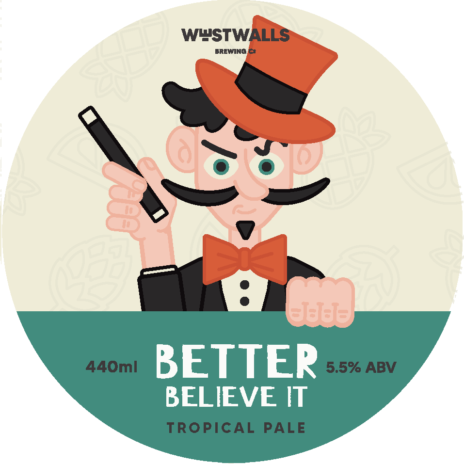
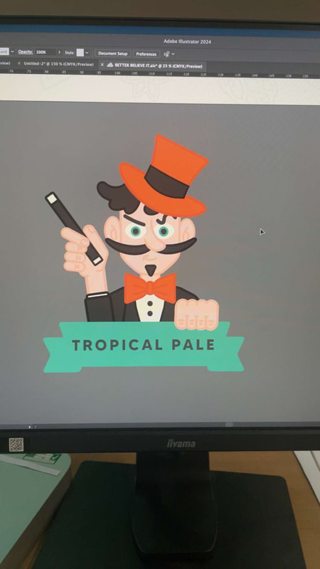
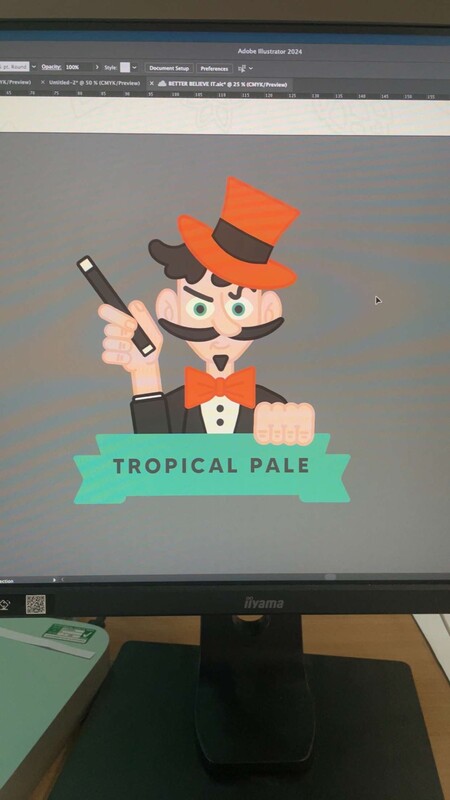
CHANGING THE MAGICIAN
|
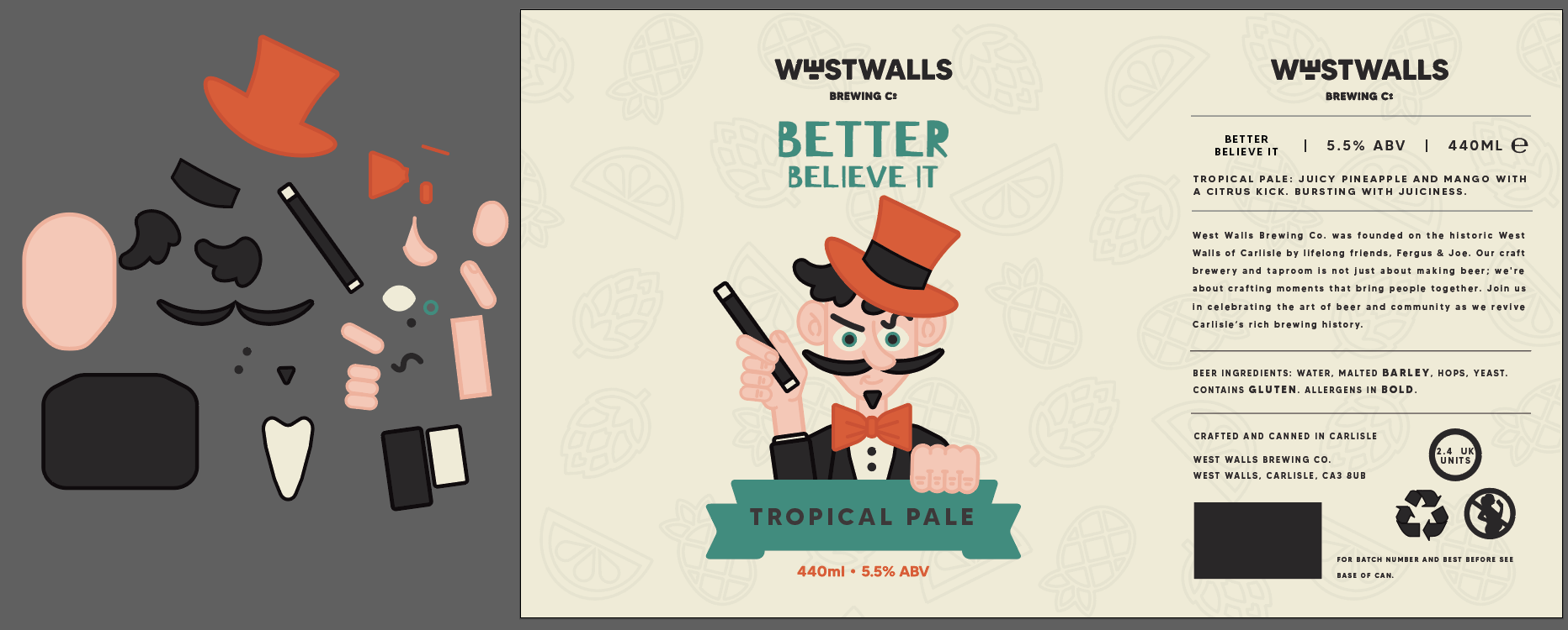
The weakest can design I have is the magician. He doesn't really work for a beer can, makes the overall designs to masculine and I feel just looks off. I tried editing him but I just felt he wasn't working.

|
|
|
SKETCHING OUT A NEW CONCEPT
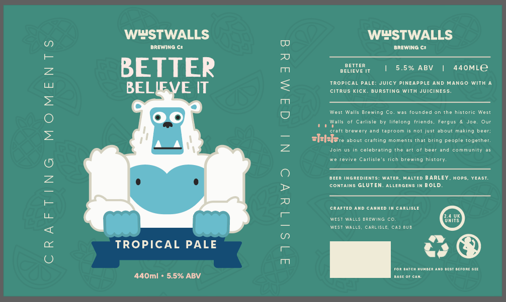
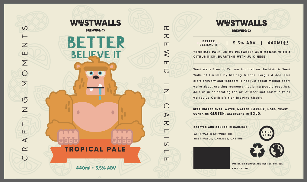
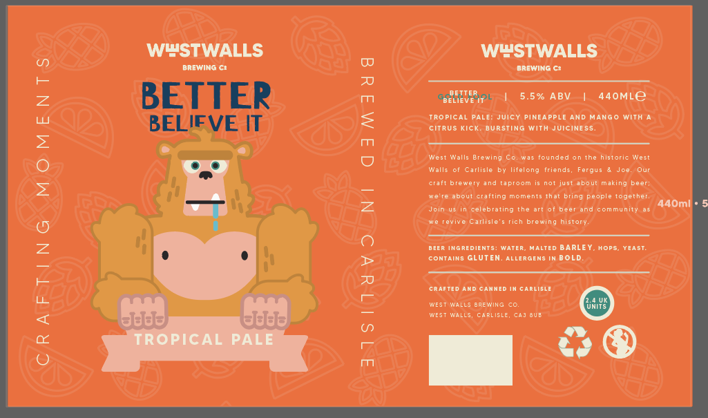
EXPLORING COLOURWAYS
|
|
|
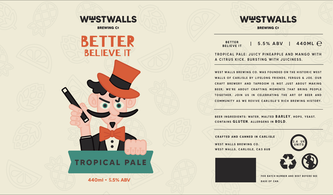
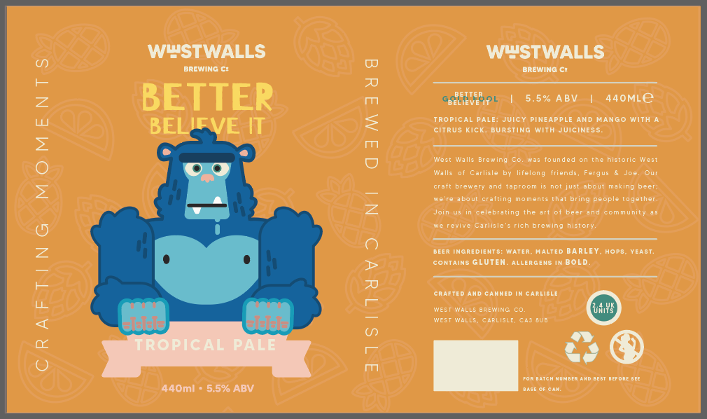
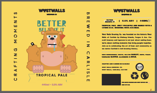
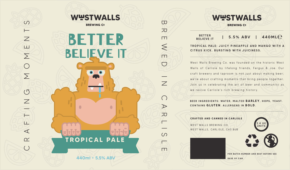
FINAL CHANGED BETTER BELIEVE IT DESIGN
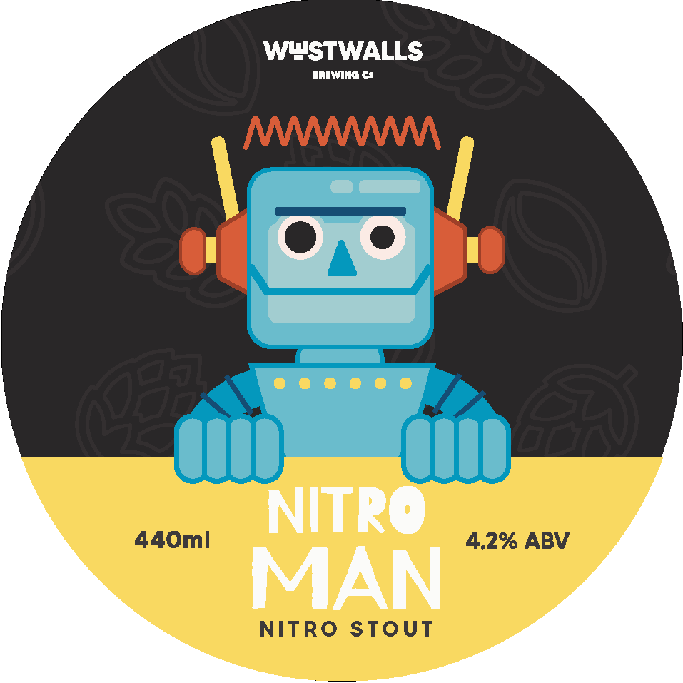
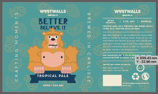
EDITING THE KEG BAGDES
I realised I included the ml amount of the can on my beer labels, so I needed to find a way to balance the type after I changed this. I also needed to include "crafted in Carlisle" as per the brief.
|
|
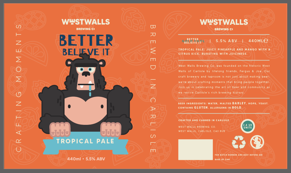
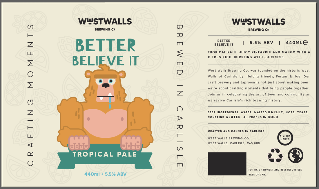
FINAL DESIGNS


|

|

|

|
|
|