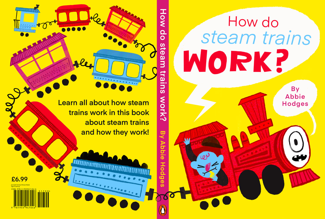
HOW STEAM TRAINS WORK
What's the project?
This project is about explaining how steam engines work. I chose to aim the project at 3-6 year olds and create a children's book.
RESEARCH
RESEARCH INTO HOW STEAM TRAINS WORK
This is a crucial part of the process. I need to KNOW how these things work before I can start illustrating.
YOUTUBE VIDEOS
These are really simplified explanations into how steam engines work. Helps to see them animated.
|
|
|
WEBSITES
These websites were useful in finding ou what the real name for parts of the trains were. There's a lot of niche terms.
|
|
|
|
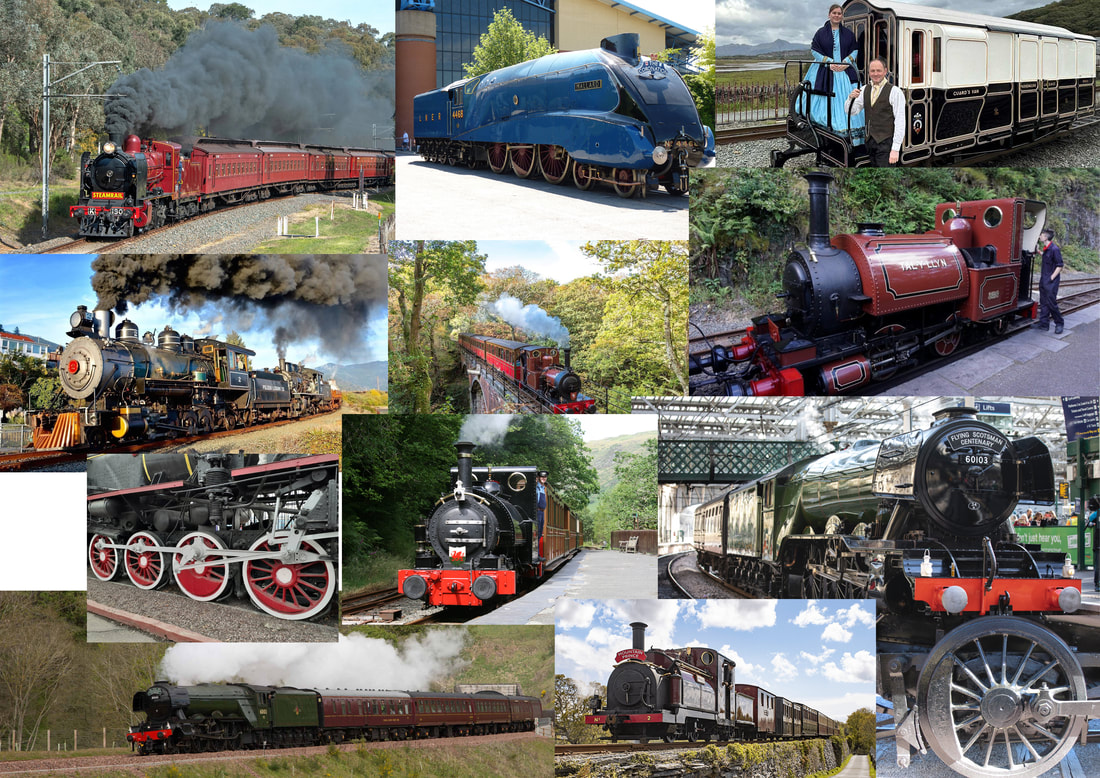
REFERANCE IMAGES
These are examples of the refernace imagery I will use when drawing the trains. I wanted to take inspiration from narrow gage and a
American steam trains mostly, as I found them the most visually intresting.
American steam trains mostly, as I found them the most visually intresting.
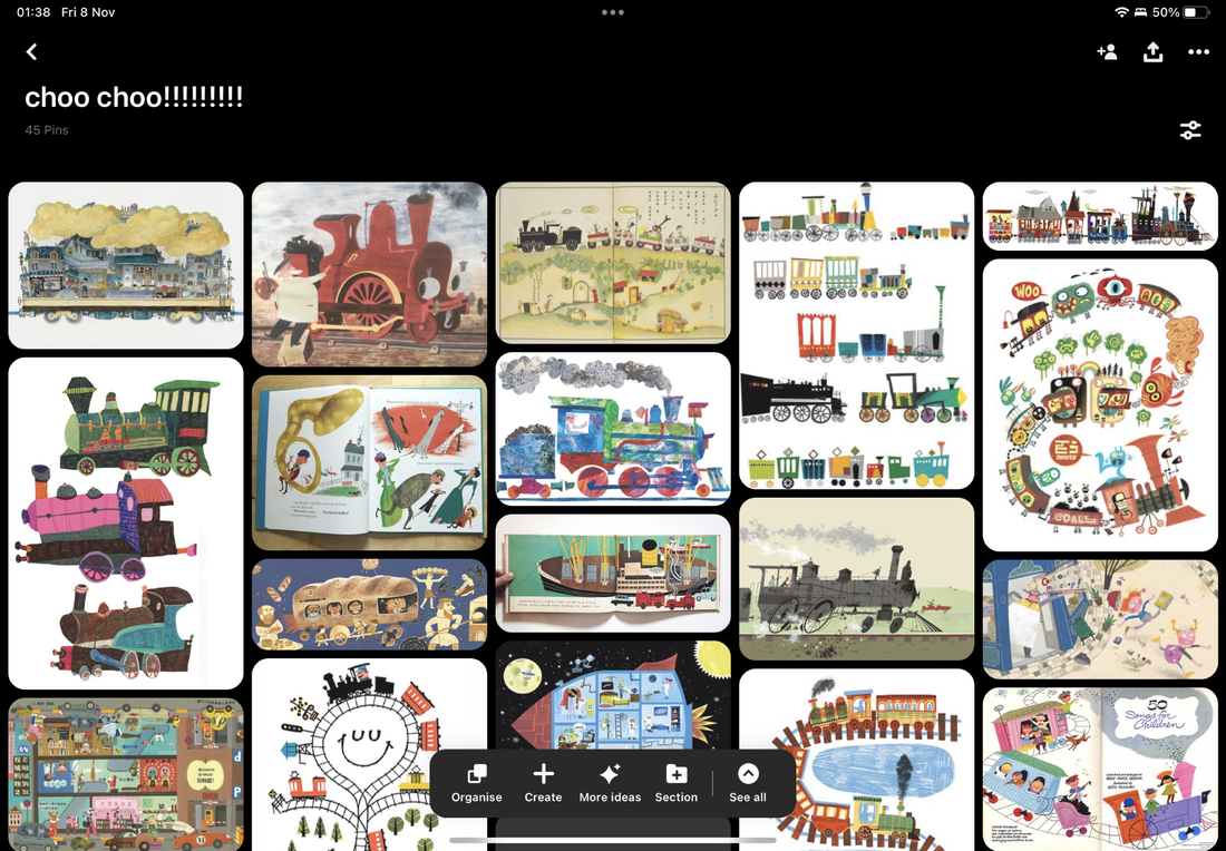
PROJECT PINTEREST BOARD
I also made a Pinterest board that shows examples of tonely what work to be like.
ARTIST RESEARCH
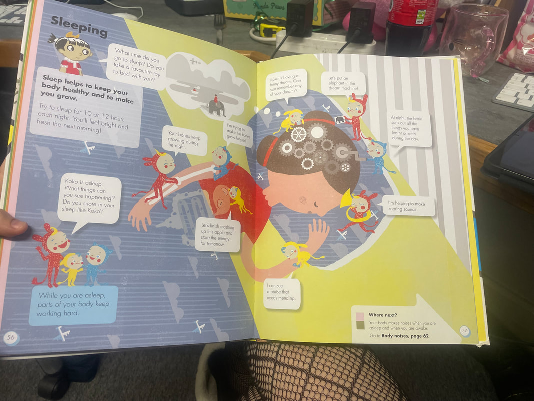
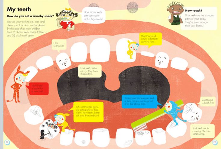
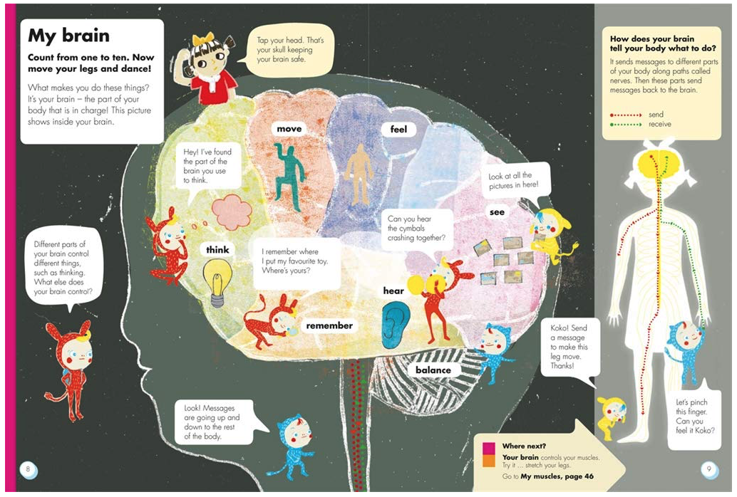
OKIDO HEAD TO TOE BODY BOOK
I bought this book recently and thought it was a great example of bringing complex subjects to a child audience in a fun and exciting way. Bit of absurism goes a long way.

|
|
|
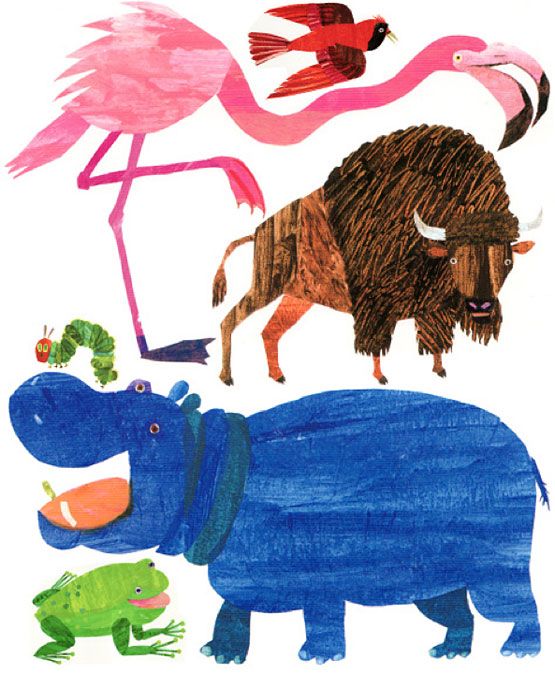
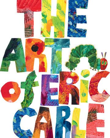
ERIC CARLE
I love the texure in Eric Carle's work. I find using the selection tool in Photoshop and Procreate can get the same paper cut effect.
|
|
|
MARC BOUTAVANT
Marc Boutavant is one of my all time favourite illustrators. I'm really inspired by his use of texture and colour. His use of type is also great. It doesn't take away but enhances his work.

|

|

|
THEY MIGHT BE GIANTS - SCIENCE IS REAL
I loved this album/ dvd thing when I was little. The mid century inspired illustrations and comedic tone of the songs made science really engaging for someone who didn't really care about it.
|
|
|
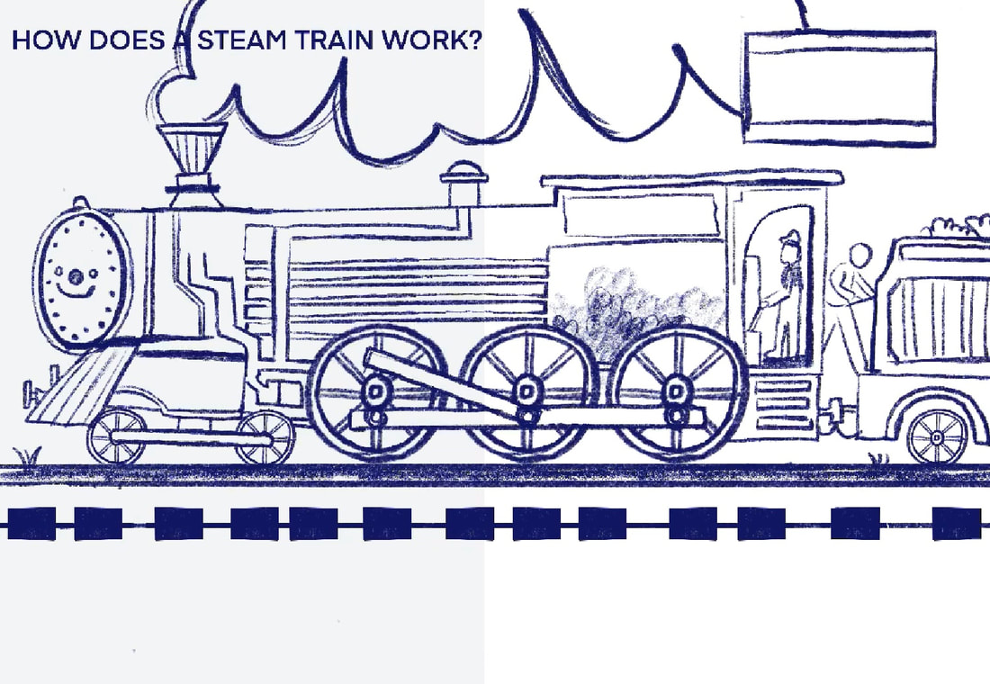
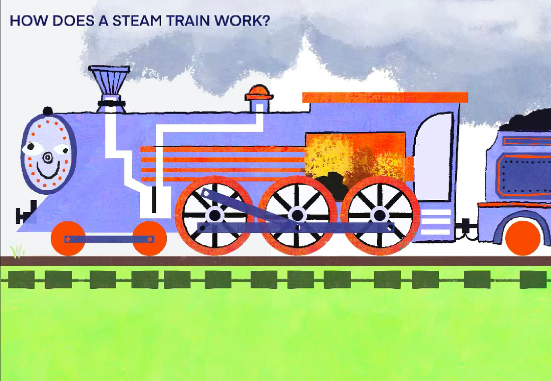
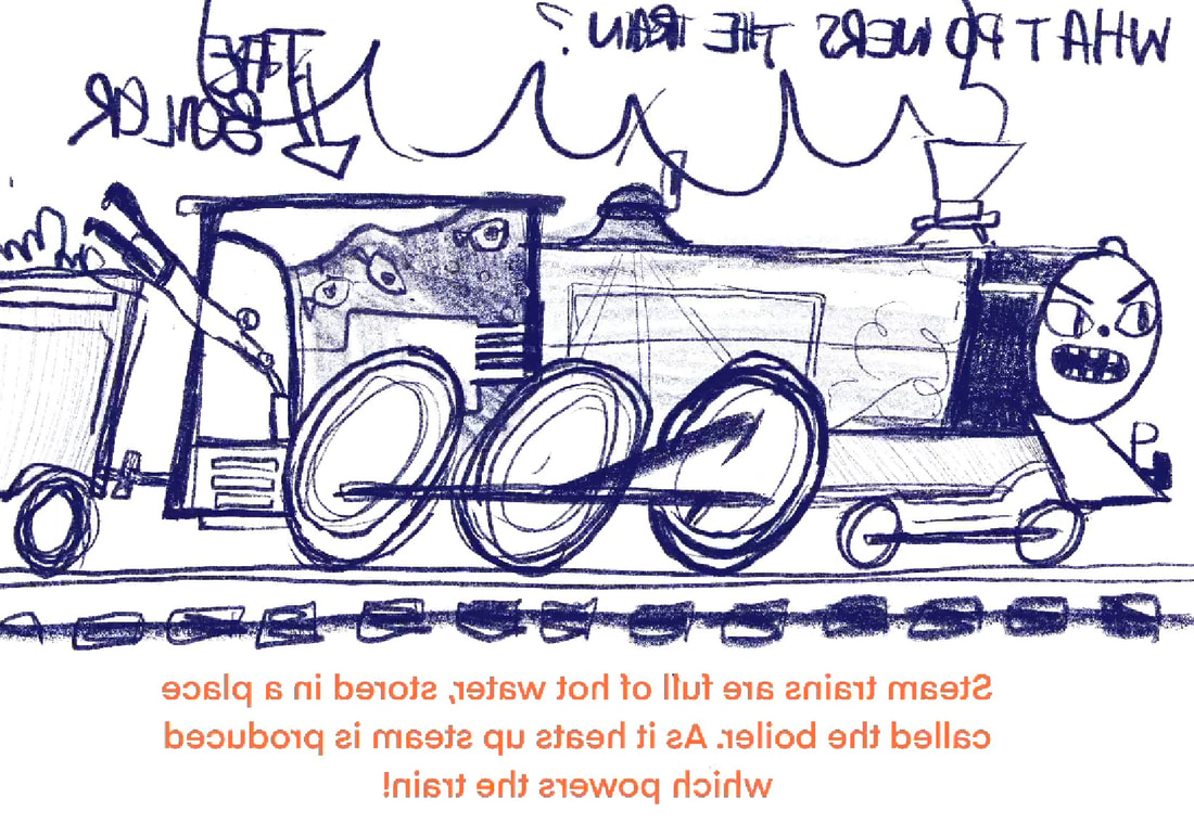
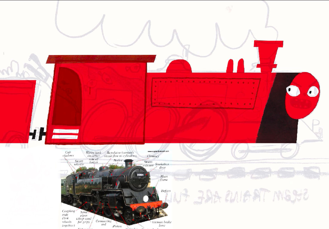
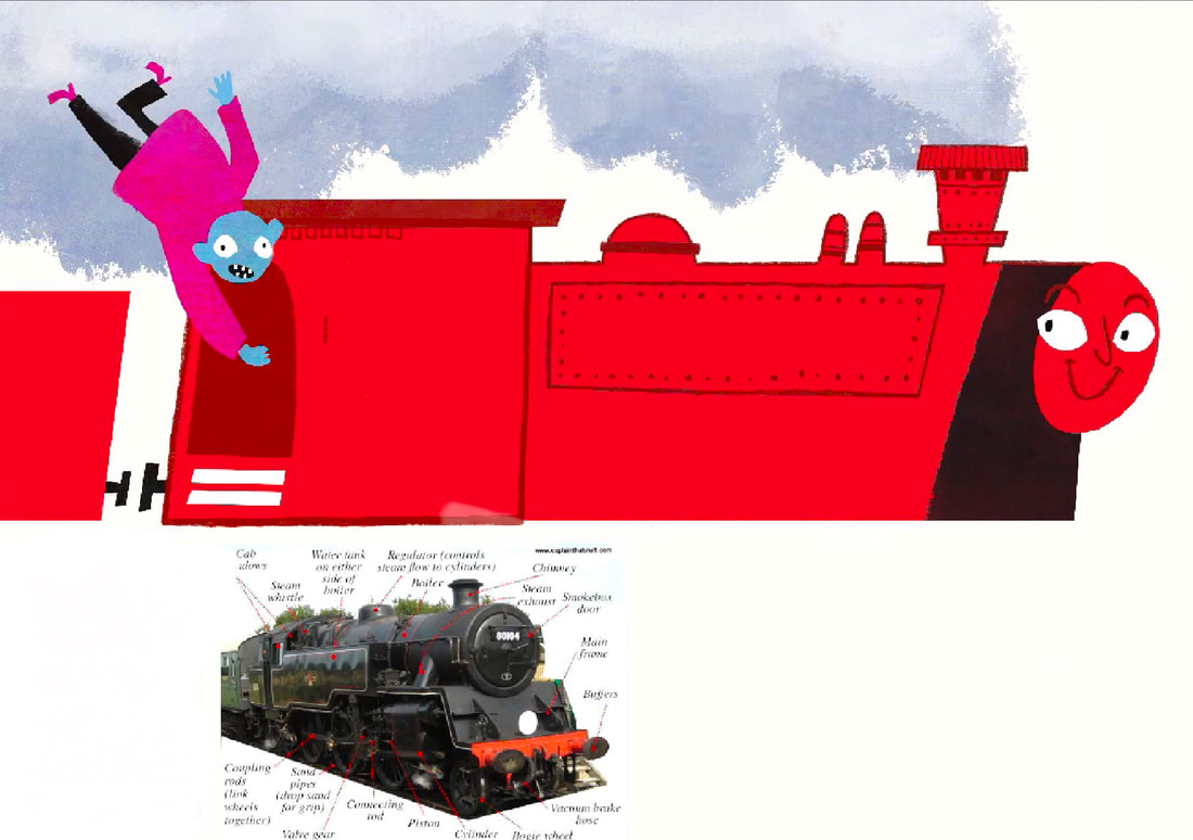
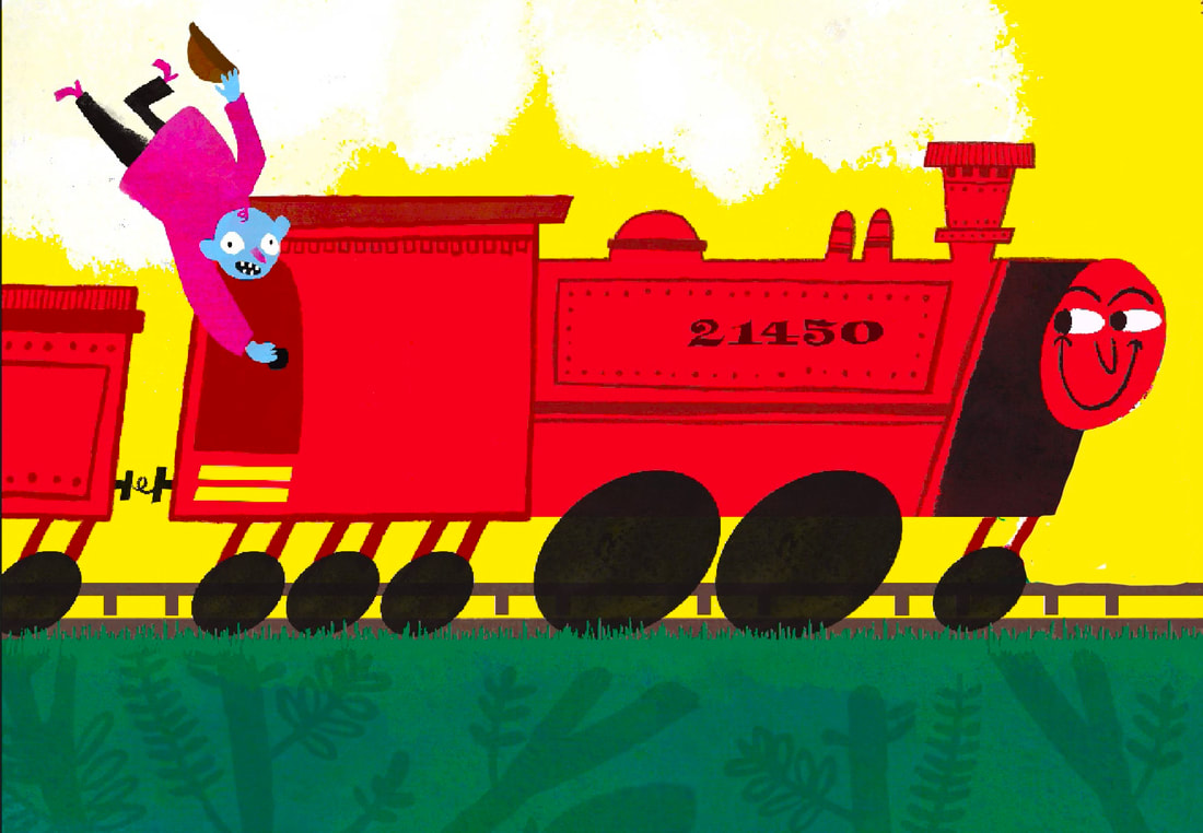
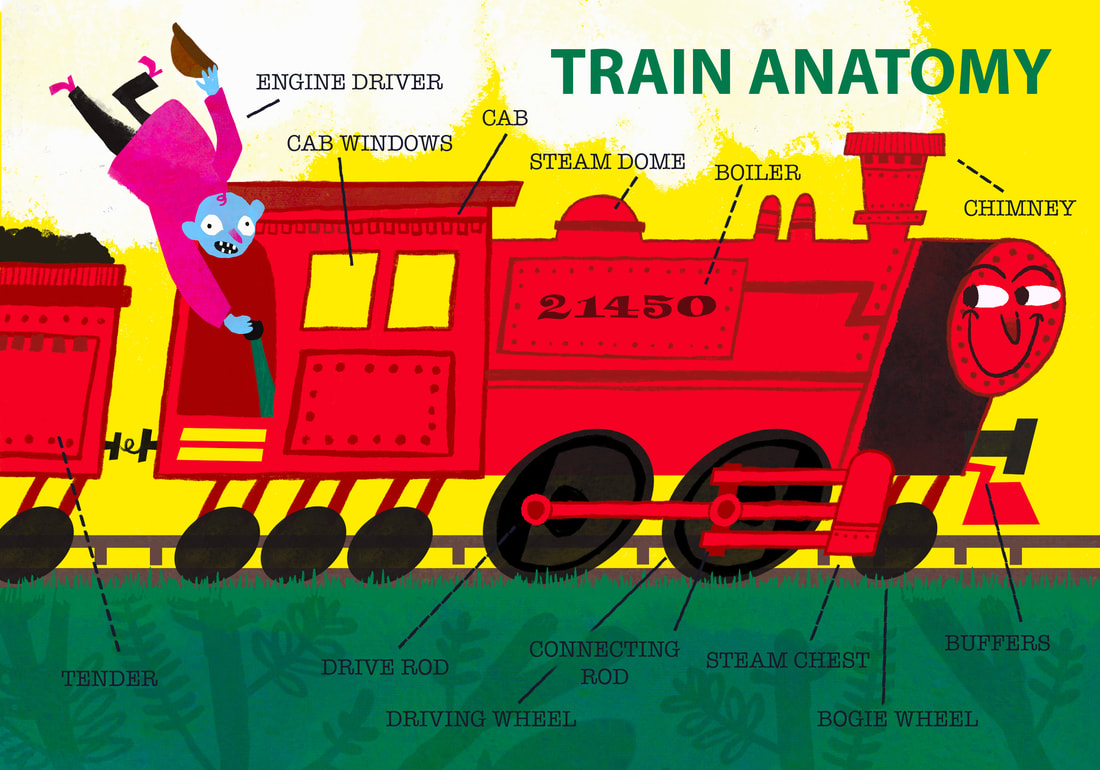
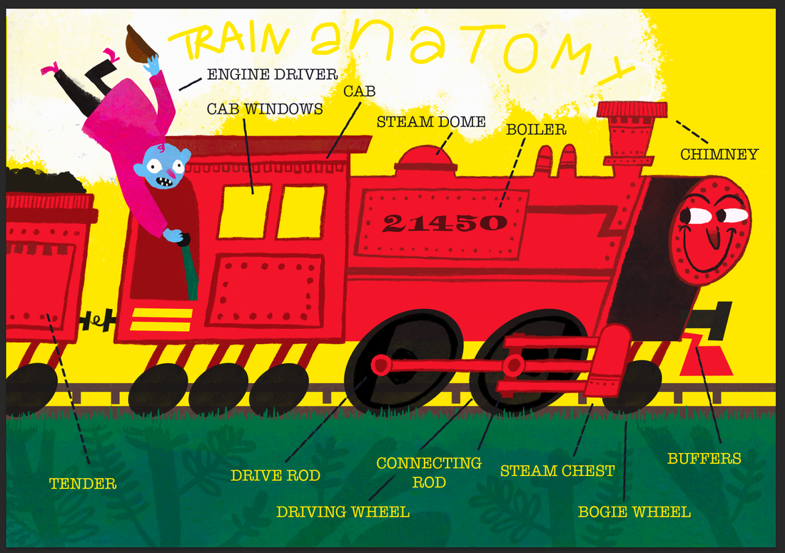
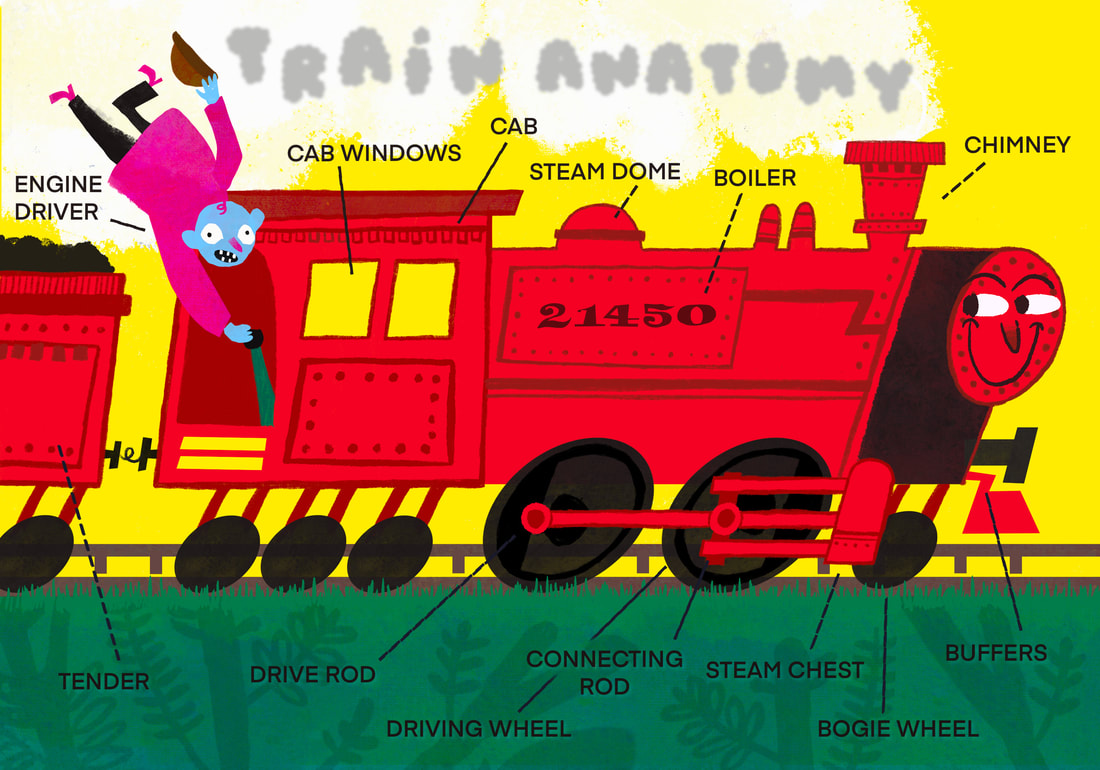
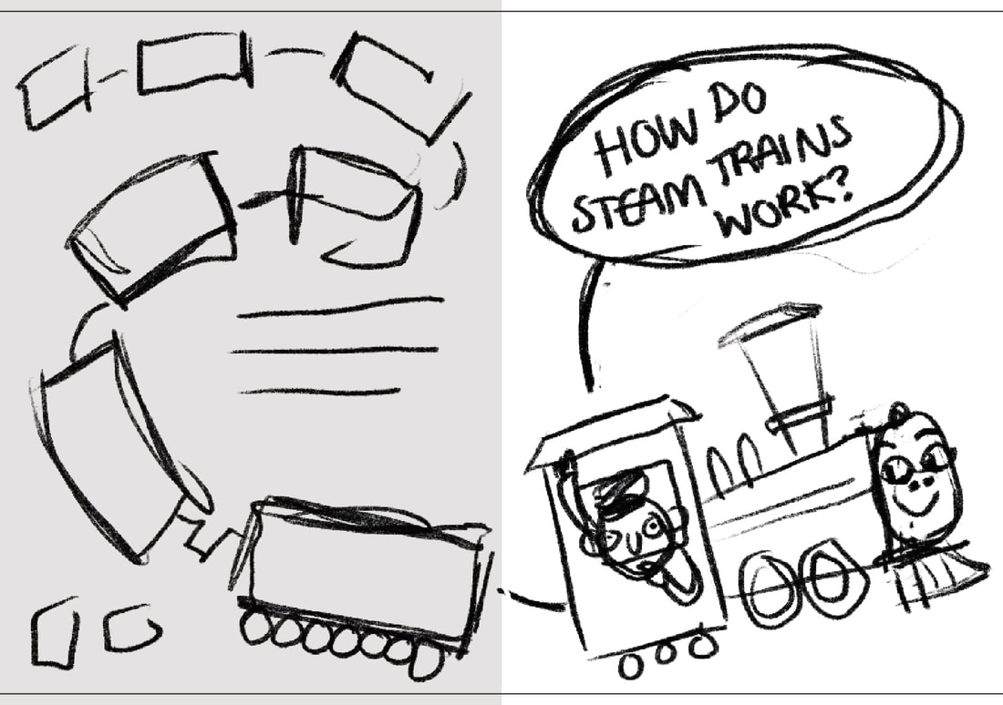
IDEA ONE: LABELLED TRAIN
I want to create a page labelling the outside elements of a steam train.
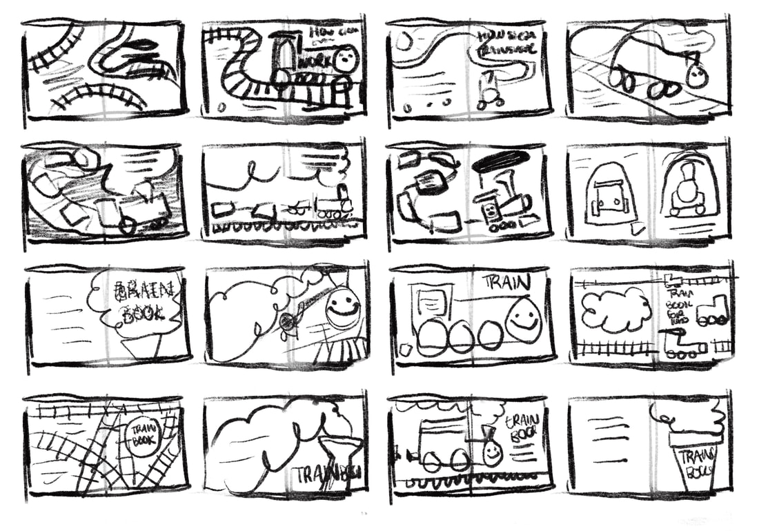
THUMBNAILS
REFINED SKETCH
DEVELOPMENT
|
|
|
PLAYING WITH TYPE
|
|
FEEDBACK ON INITIAL IDEA
|
GOOD
|
BAD
|
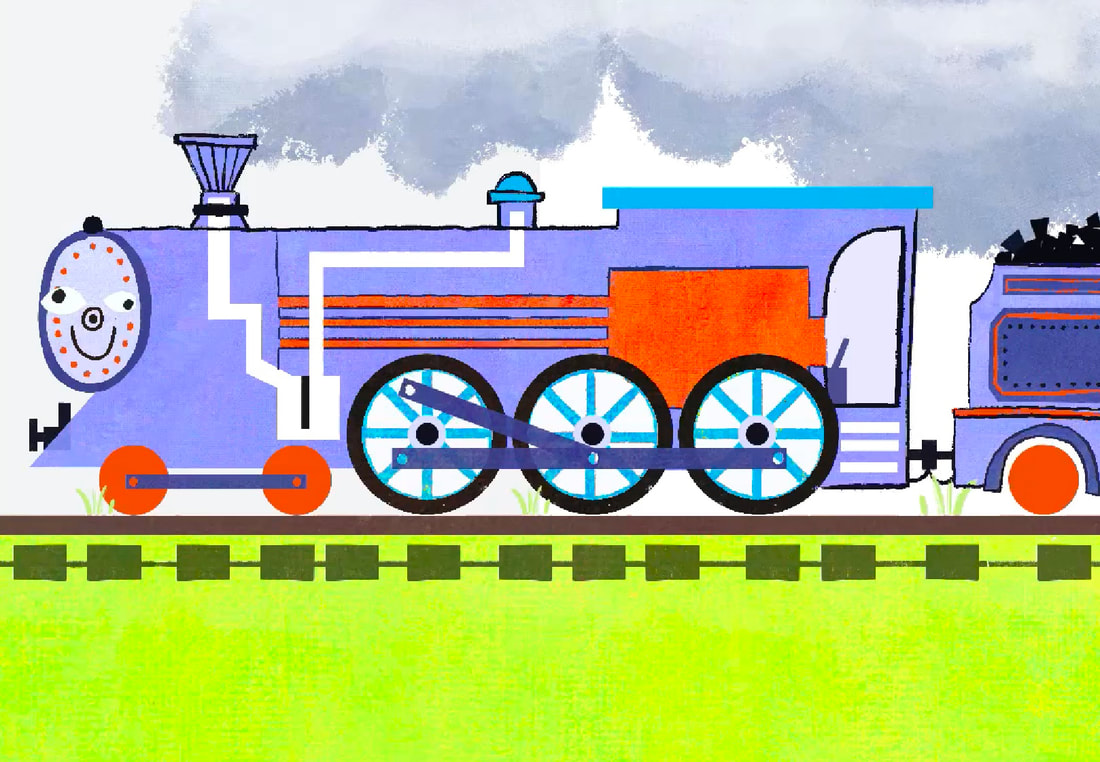
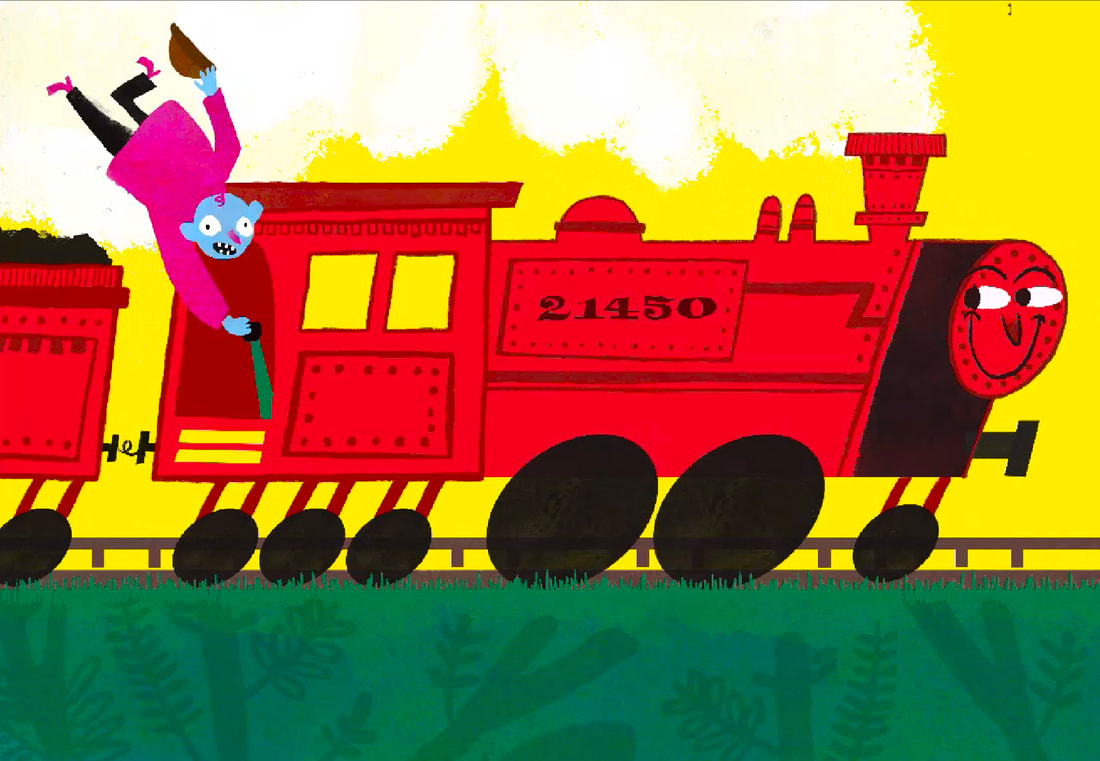
DEVELOPING FURTHER WITH FEEDBACK IN MIND
|
|
I like elements of this but it feels unpolished and clumsy. I like the comedy and the character of the illustration however the execution is off. I'm going to try a different approach.
|
|
|
|
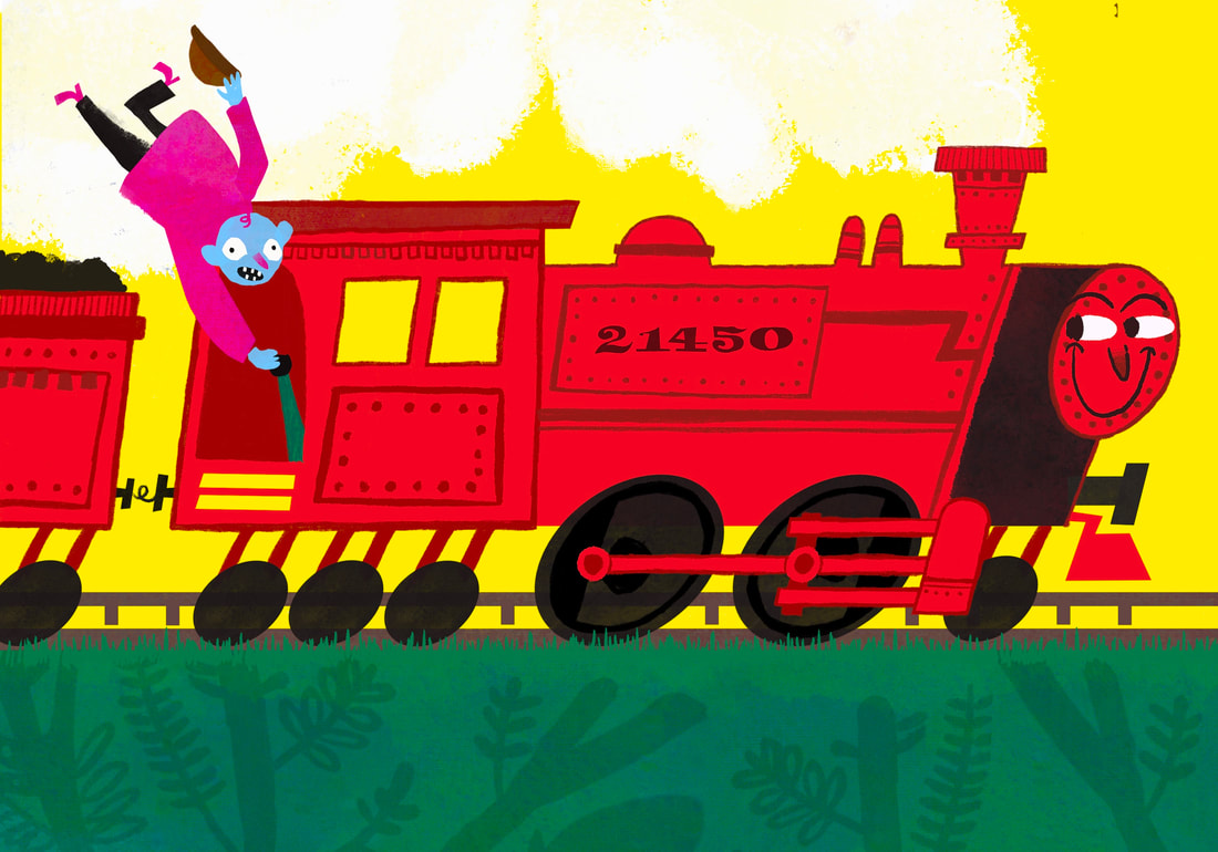
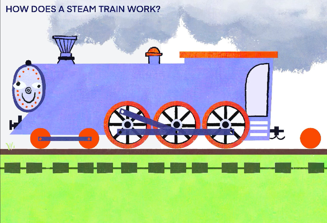
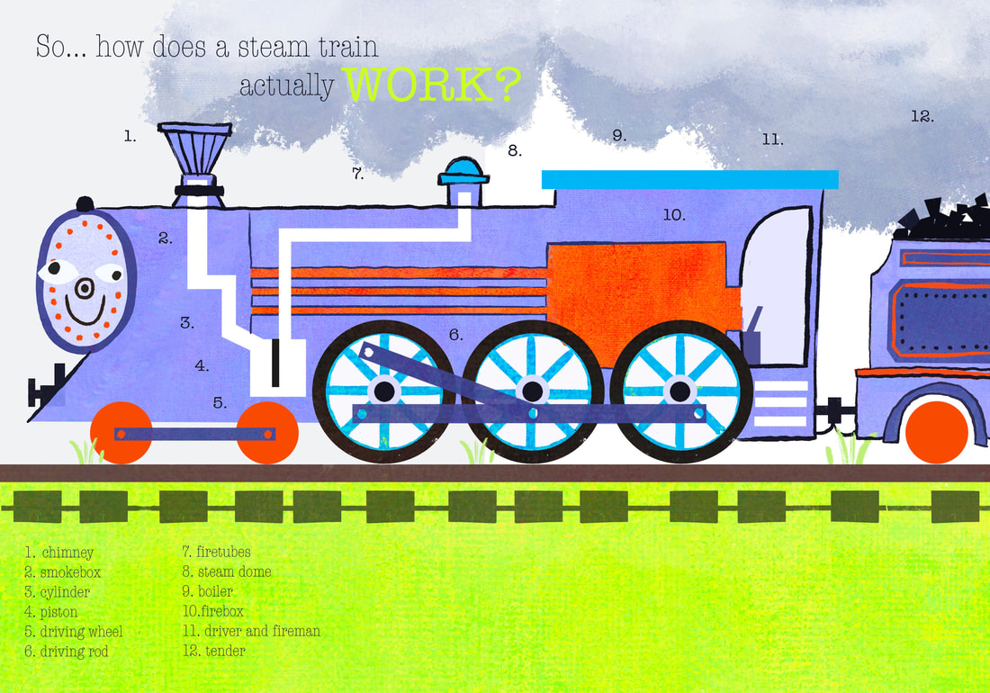
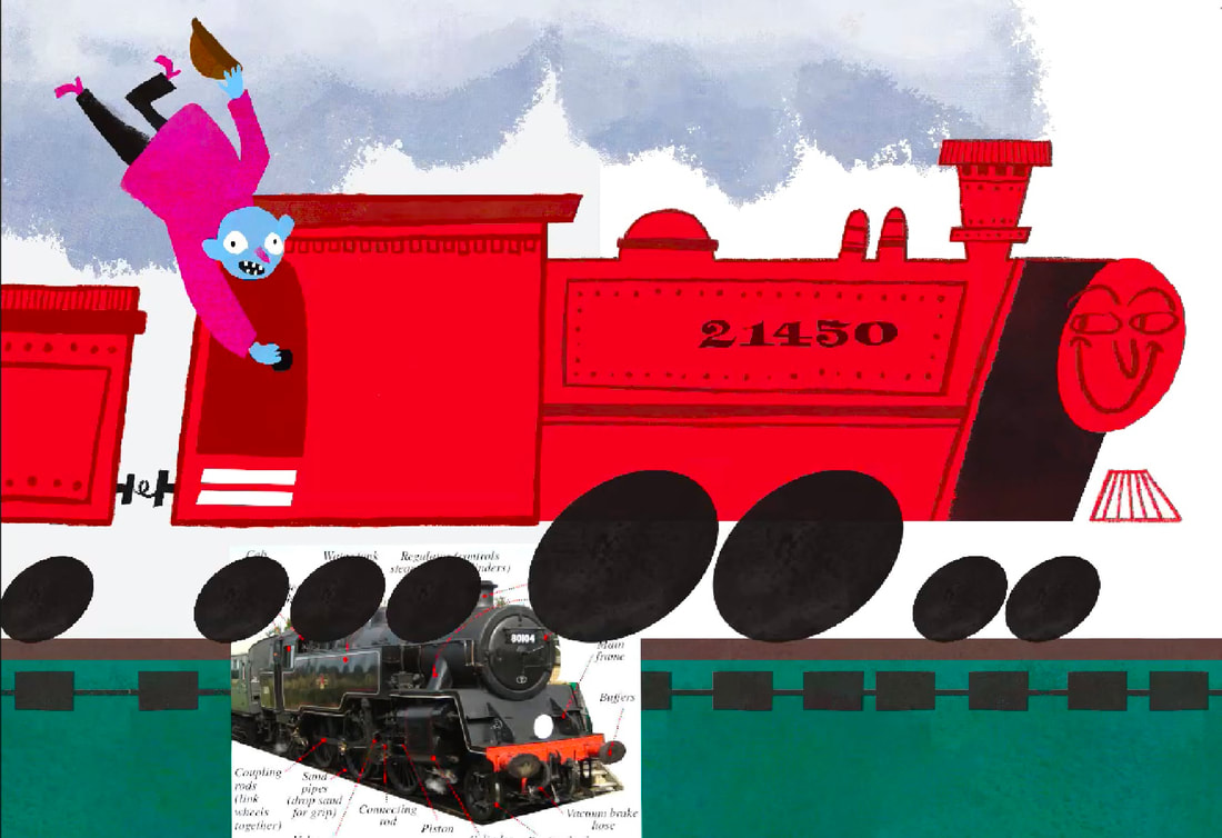
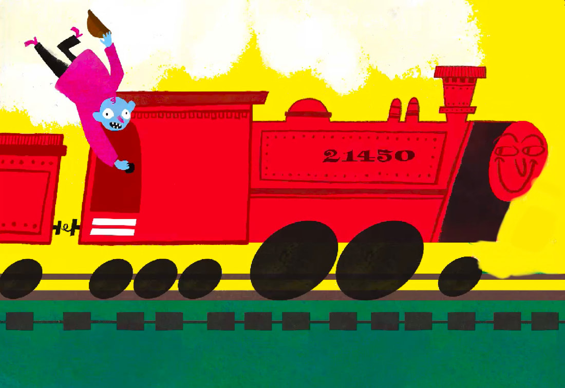
I'm much happier with this outcome. Here's what I liked about it:
- THE COLOURS - I used a similar approach to colour as Marc Boutavant, an artist I looked at earlier.
- TEXTURE - I added a lot of texture to my work through using differant brushes and overlays, adds a handdrawn feel.
- IT'S SILLY - I just like how silly it is. I'm a big fan of making weird silly work and I accomplished that in this work.
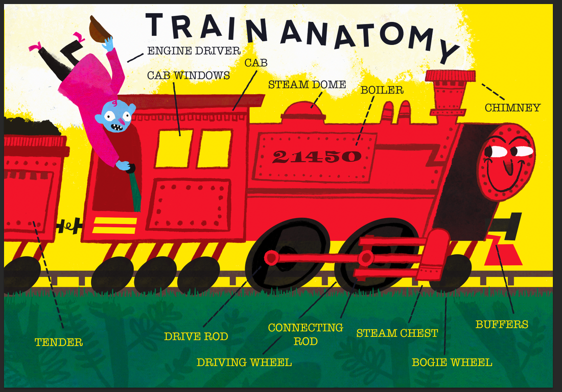
ADDING TYPE
This is how I sumbitted the illustration for formative feedback. I think the type could be a lot better.
SKETCH/ really quick example
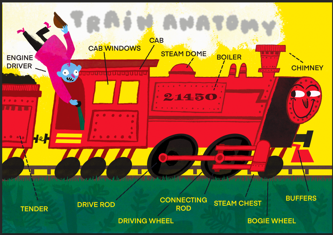
Zoe said this looked good. Snake. Never trusting her again. This was a sketch to show I wanted to try and make the title look like its coming out of the chimney maybe?
DEVELOPING
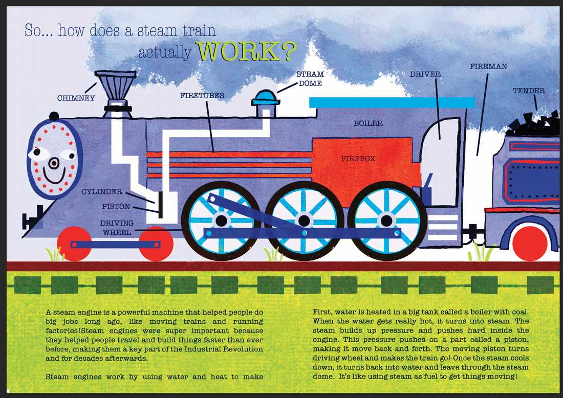
I definety improved the type, but still think its the weakest part of the design. Its a thing I need to get better at for semester 2
|
|
FINAL PIECE
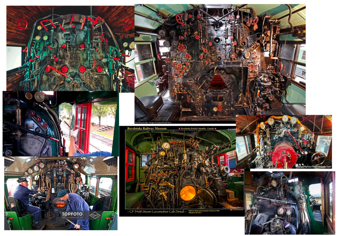
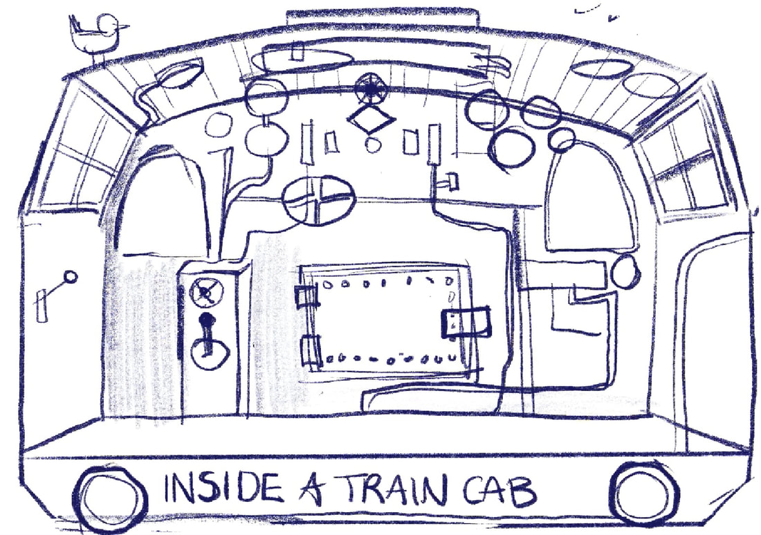
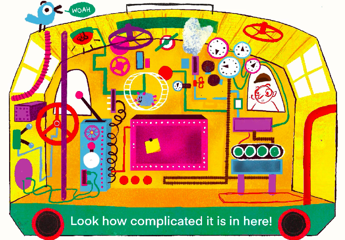
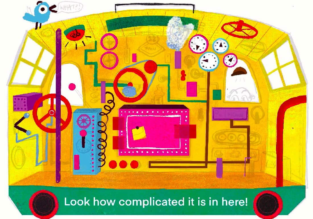
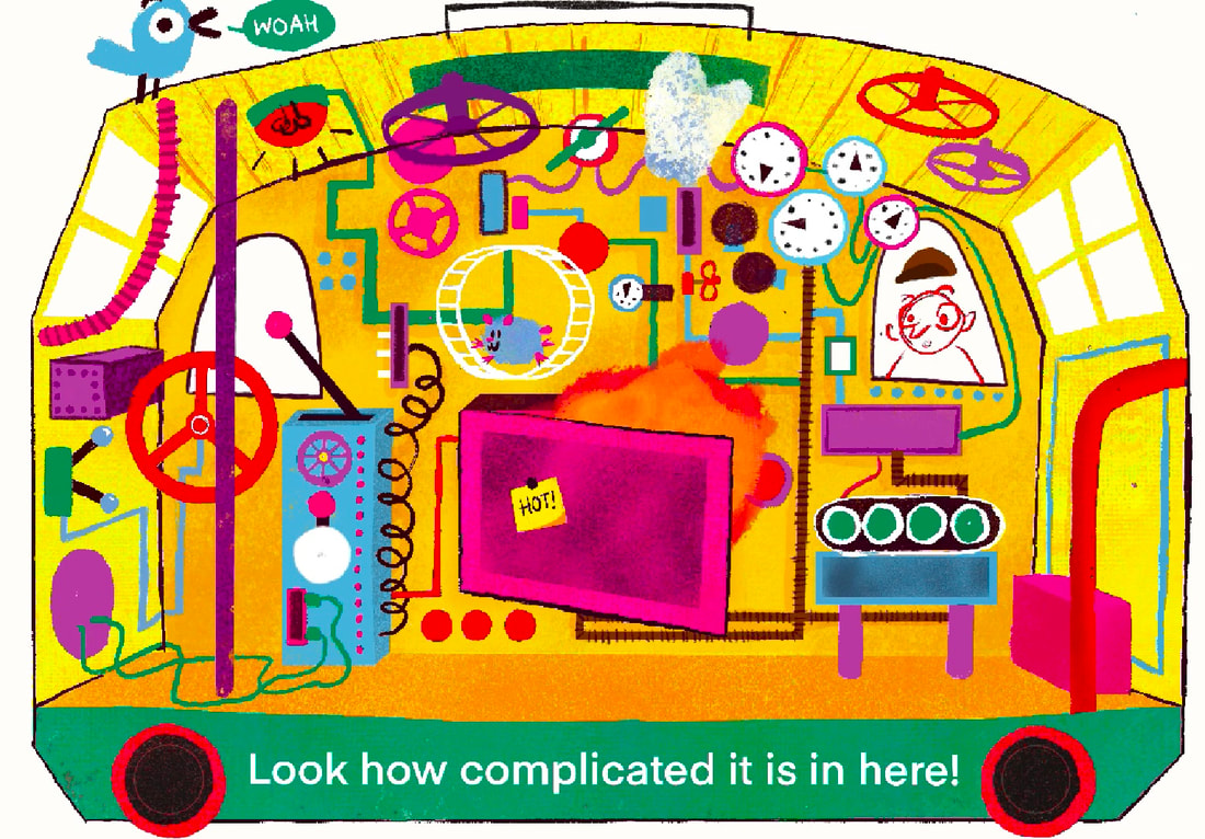
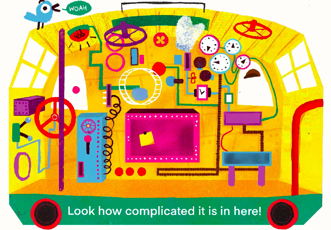
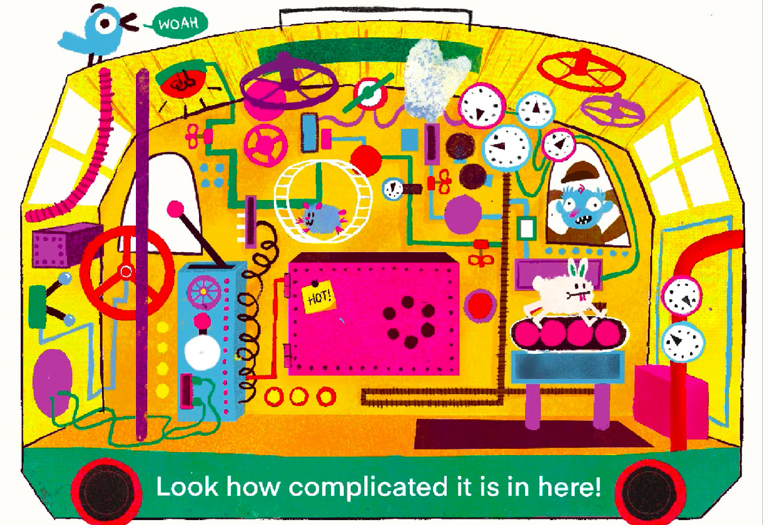
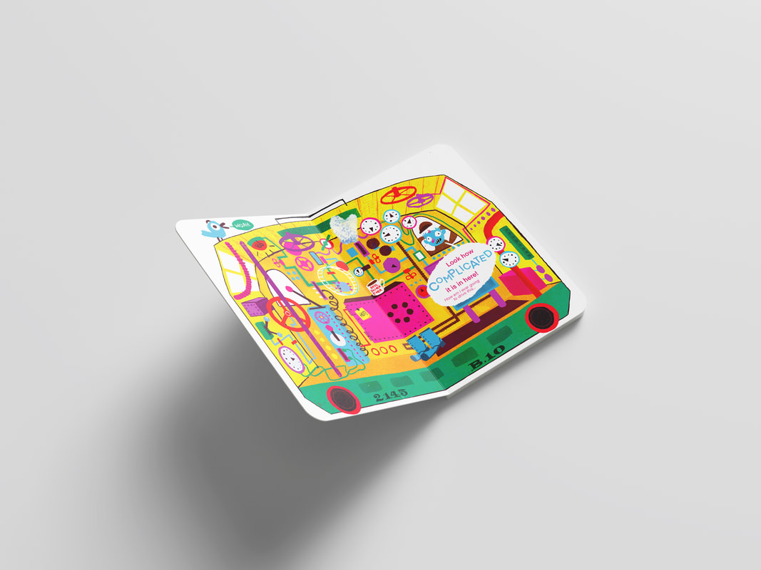
SPREAD TWO: INSIDE THE TRAIN CAB
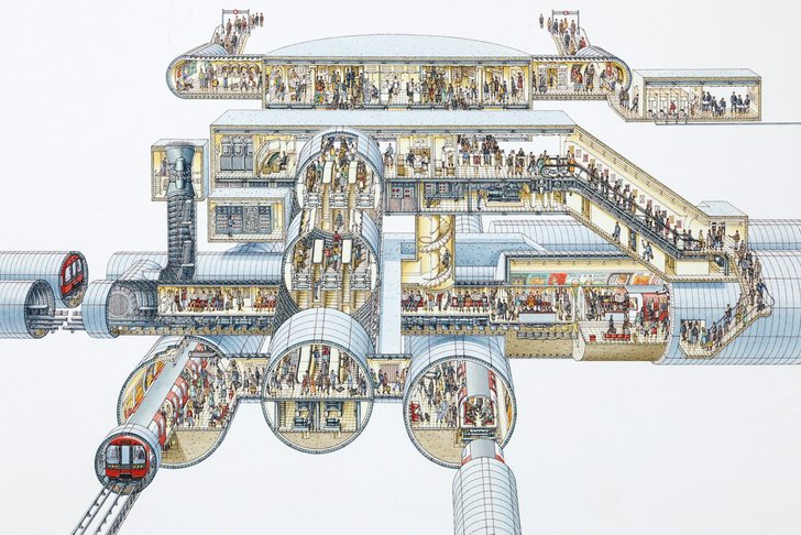
Through my research, I found these intricate steam engine controls. They have so much detail1 I want to explain how complex steam train cabs and controls are.
RESEARCH
ARTIST RESEARCH
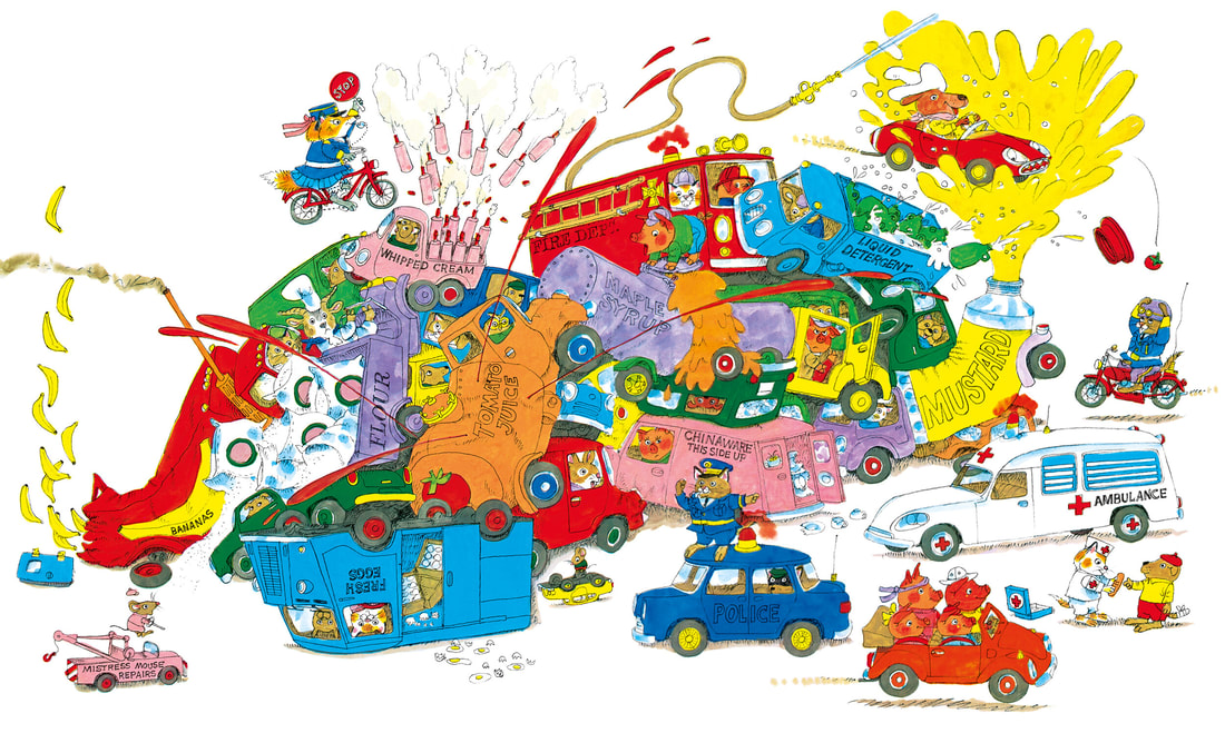
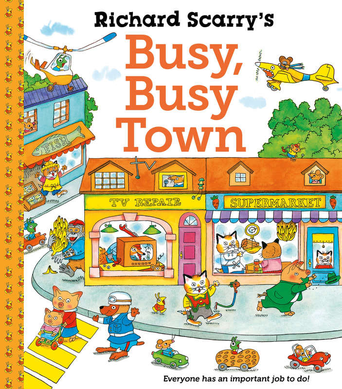
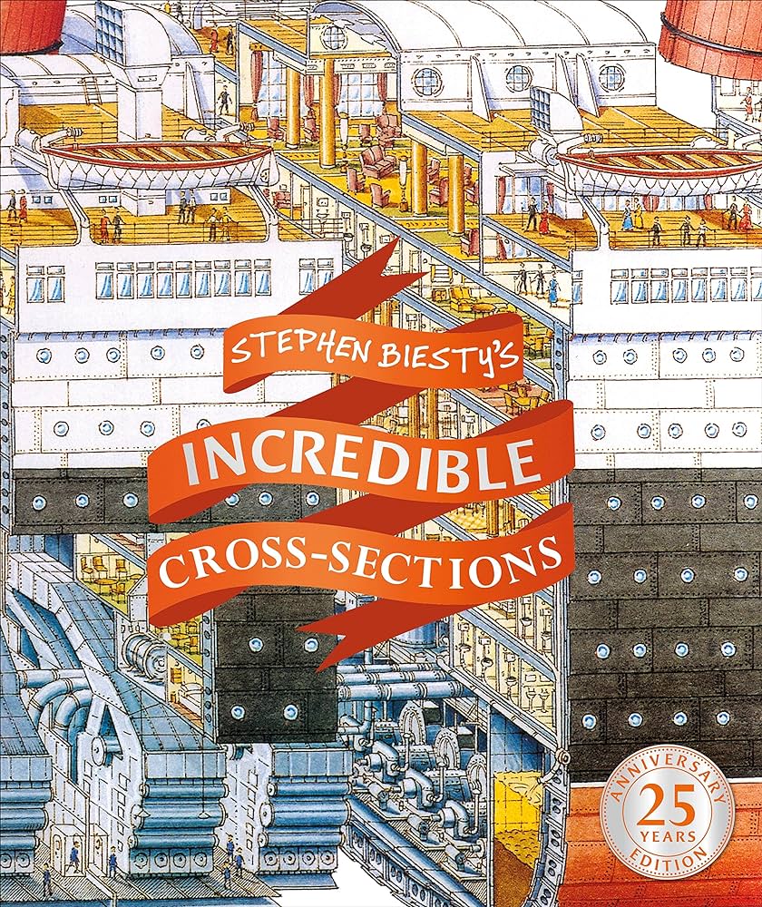
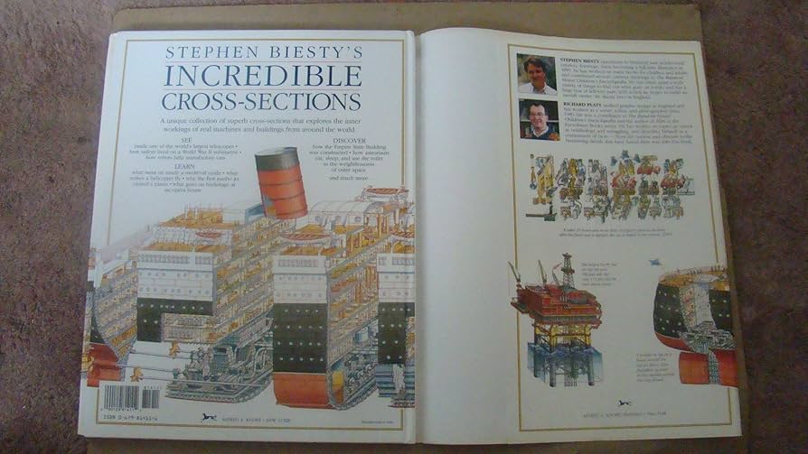
I wanted this illustration to be one of those really complicated illustrations with loads of stuff going on. I looked a artist that I think do this really well .Biestly's work is iconic but a bit drab, shows intricate cross sections of complex mechinaisms. Great to look at. Scary's stuff is so good. It's so whismical and silly, so many funny little gags going on in one image.
RICHARD SCARRY
|
|
|
STEPHEN BIESTLY
|
|
|
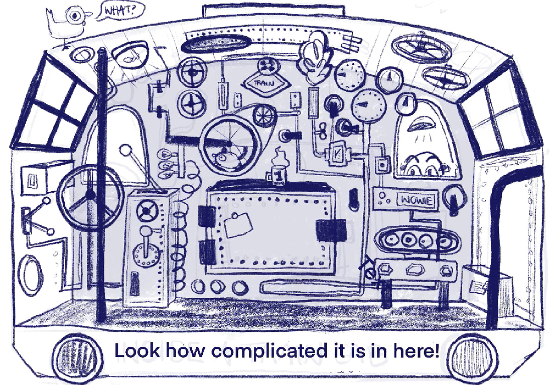
SKETCHES
I knew from the beginning I wanted to draw the insde of a train cab. I sketched this idea quickly and felt it was solid. I moved forward with it.
|
|
DEVELOPMENT

|
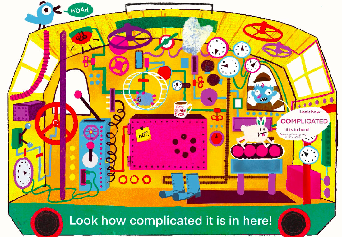
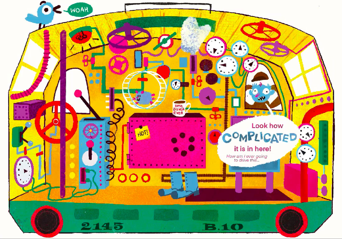
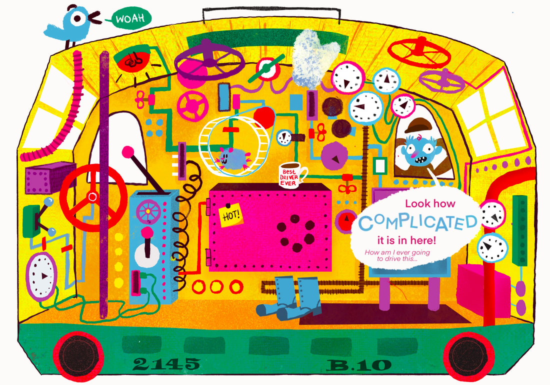
The development process for me really sped up with this project. I use the selection tool and map out the simple shapes in the illustration with flat colour. Then I go in with sooooooo many differnant brushes and just have fun adding detail. I've attached the brushes I used the most throughout this project here, they have become some of the tools I use the most in my work now.
|
|
|
|
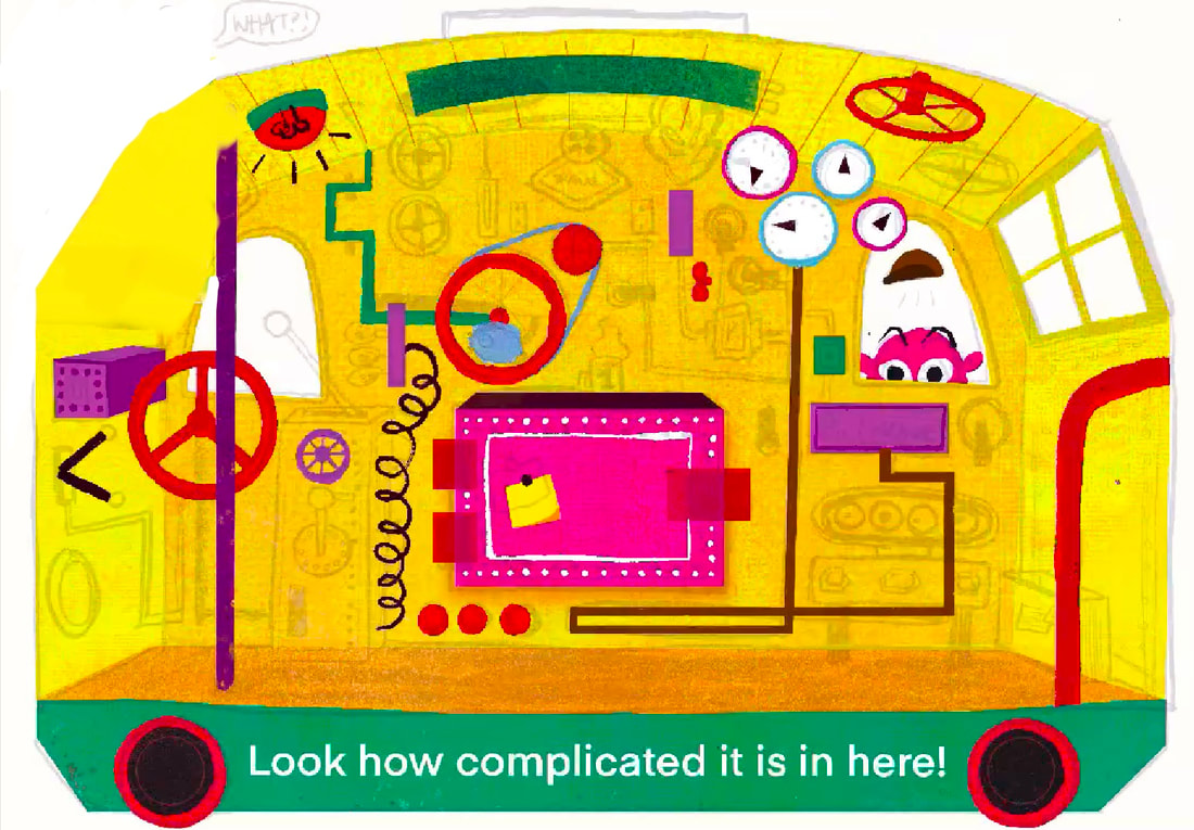
ADDING TYPE
I wanted the text to be shown in the speech bubble. I also added buts of type showing train numbers on the buffers.
|
|
FINAL OUTCOME
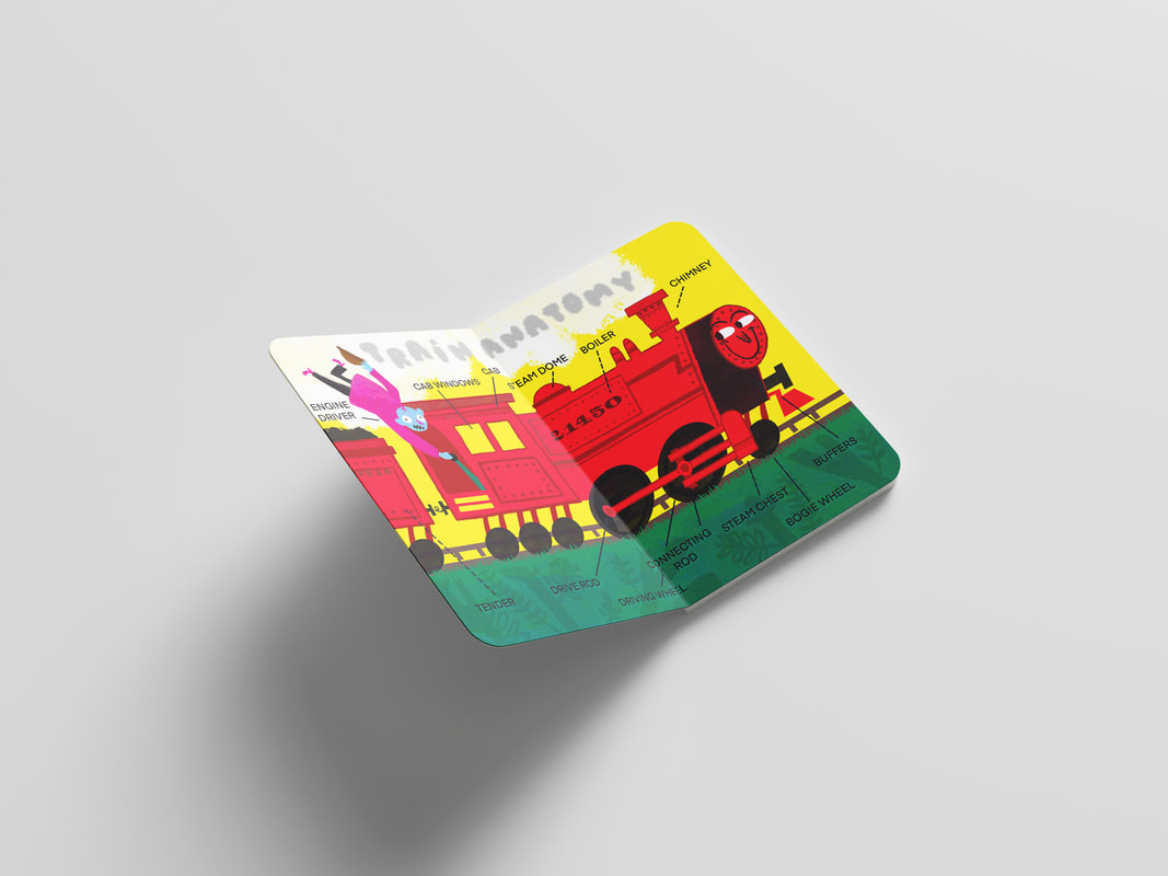
MOCKUPS
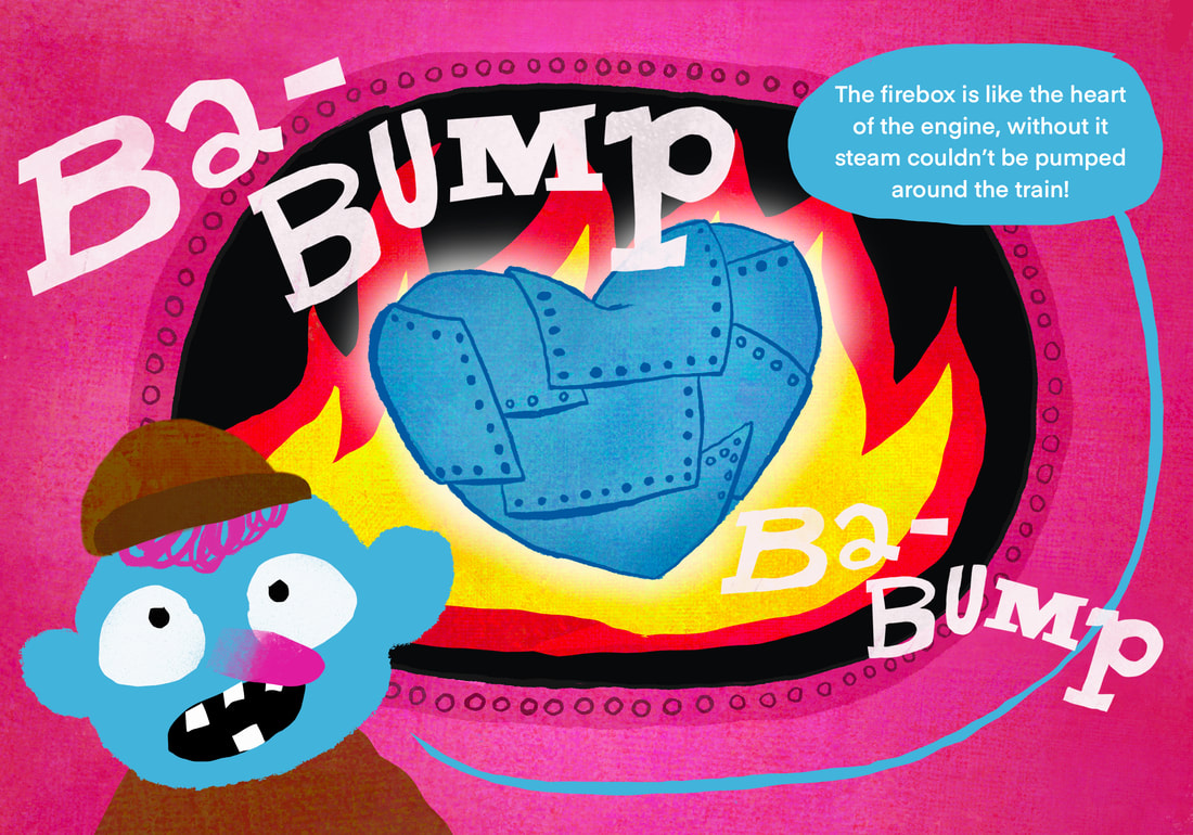
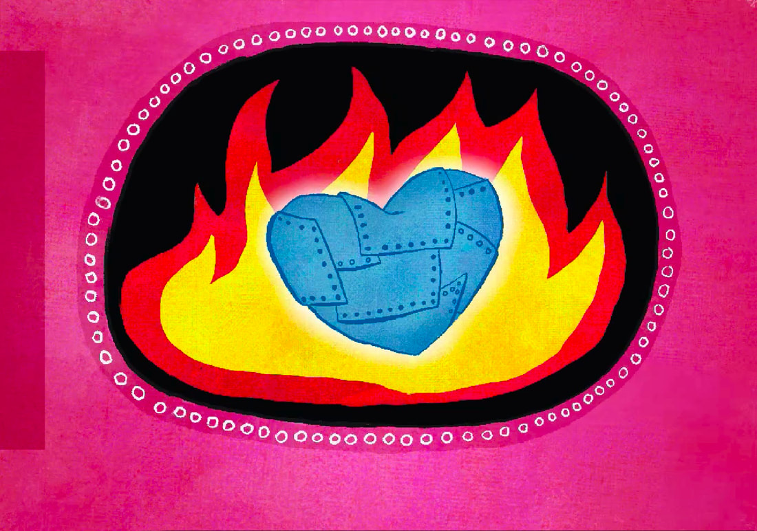
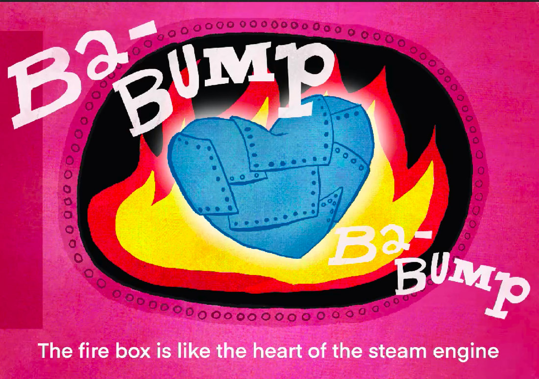
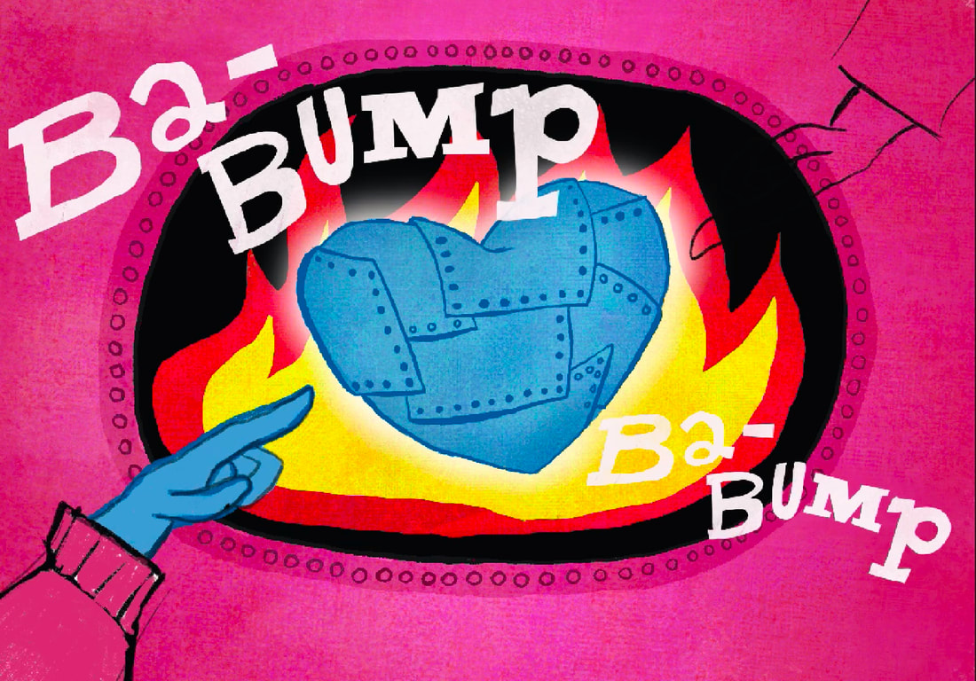
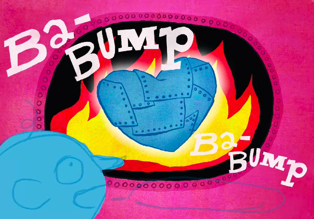
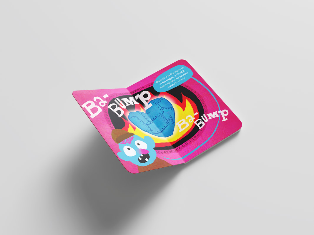
SPREAD THREE: FIREBOX
I want to create an illustration explaining the concept of a firebox.
RESEARCH

|
|
|
THUMBNAILS
Because I've anthropomorphised the train by adding a face to it, I came up with the idea to make the firebox like the heart of the train. This was aslo ispired by the body book above. Had how the human body worked on my mind.
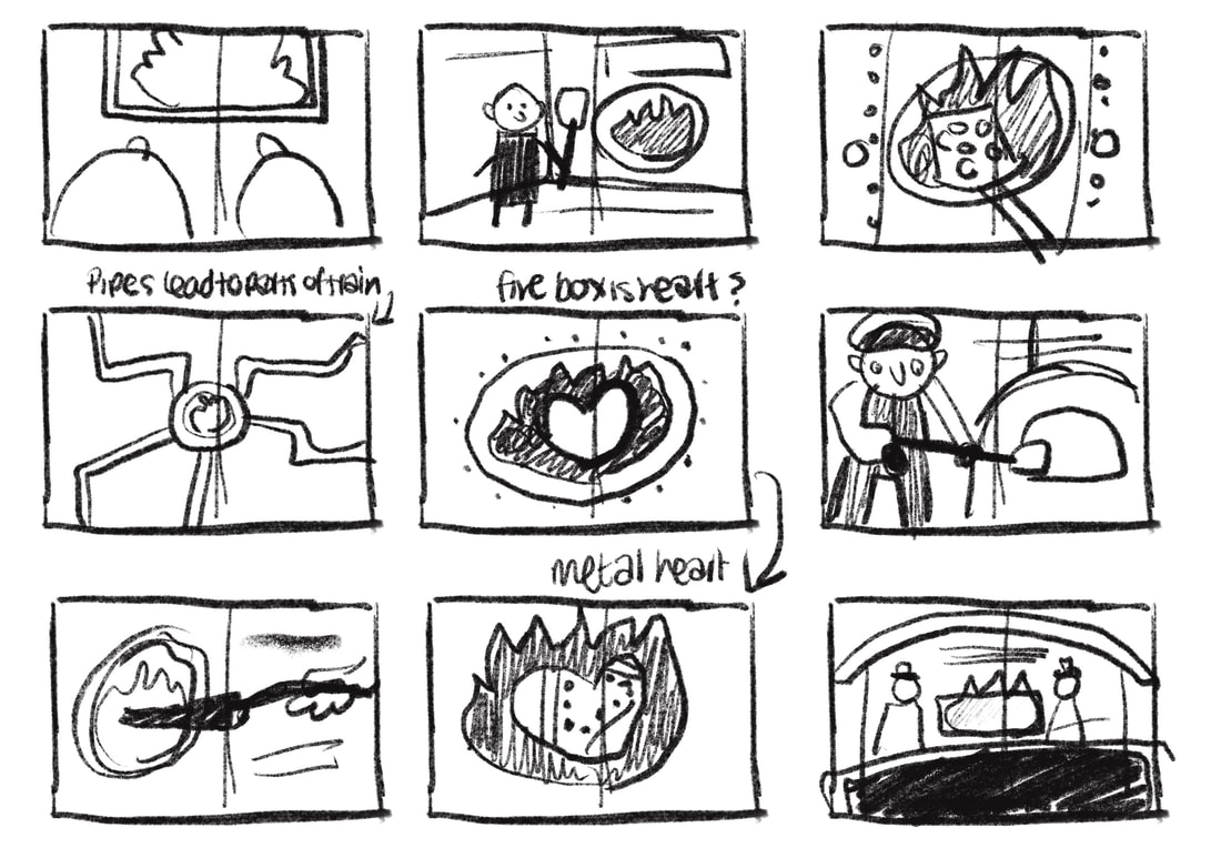
SKETCHES
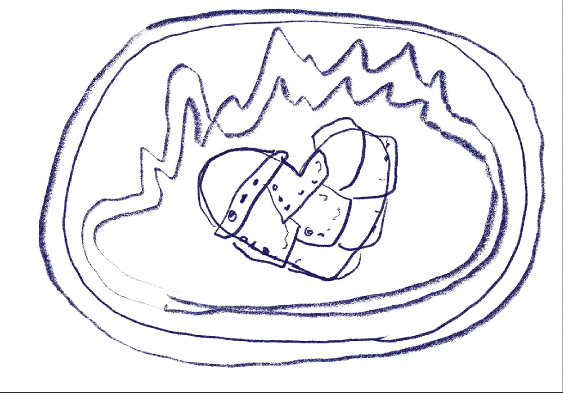
|
|
DEVELOPMENT
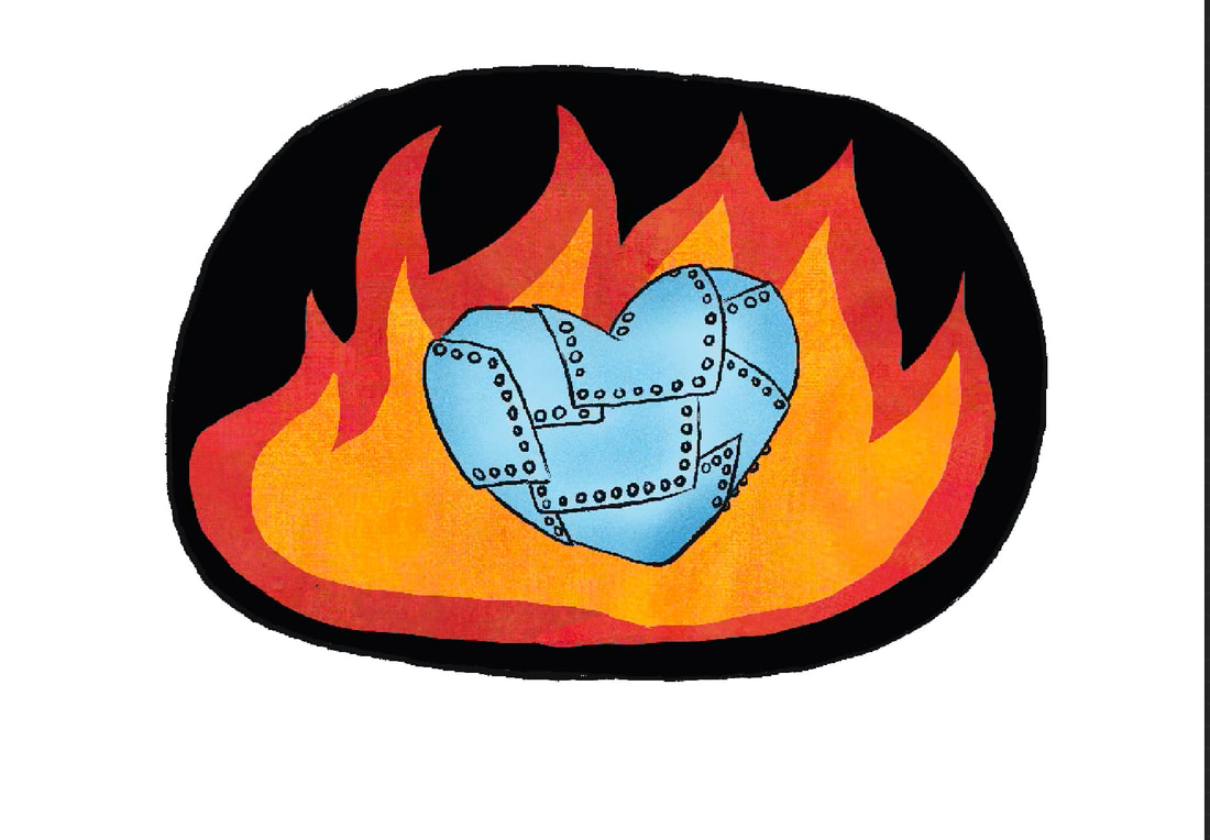
|
|
|
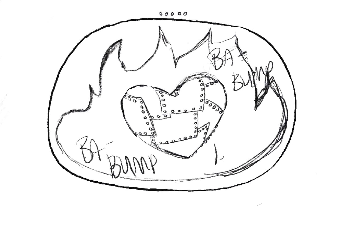
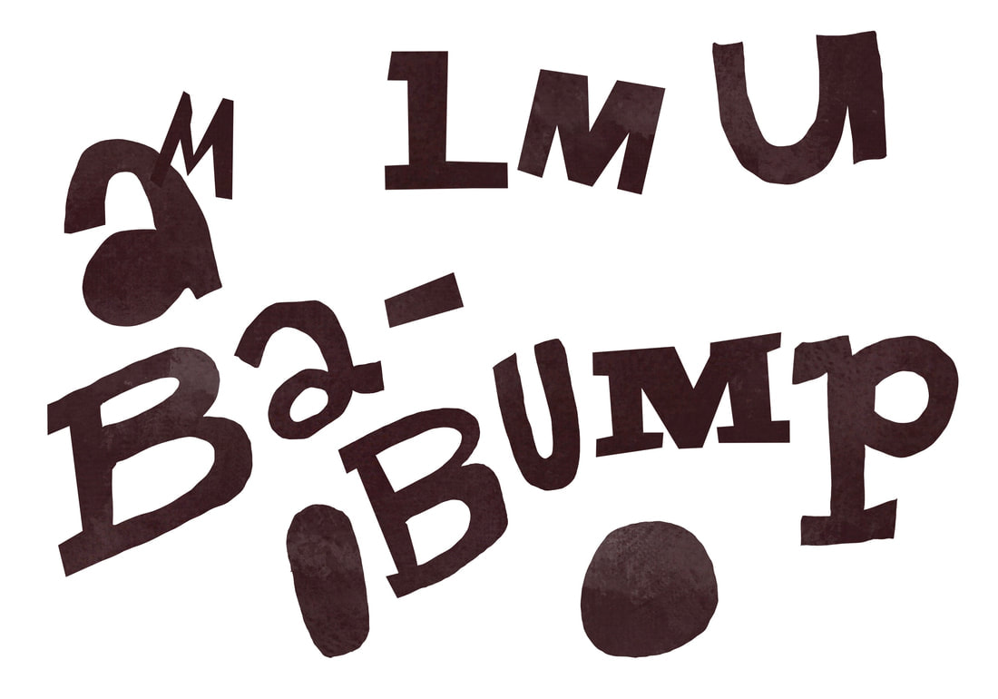
TYPE
I really wanted to do some hand written type in the book. I just used the selection tool to draw the letters fre hand and positioned them on the canvas.
|
|
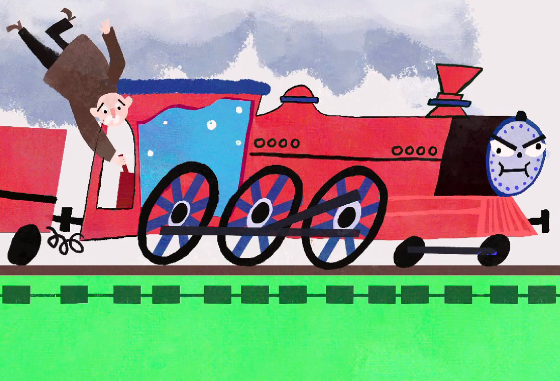
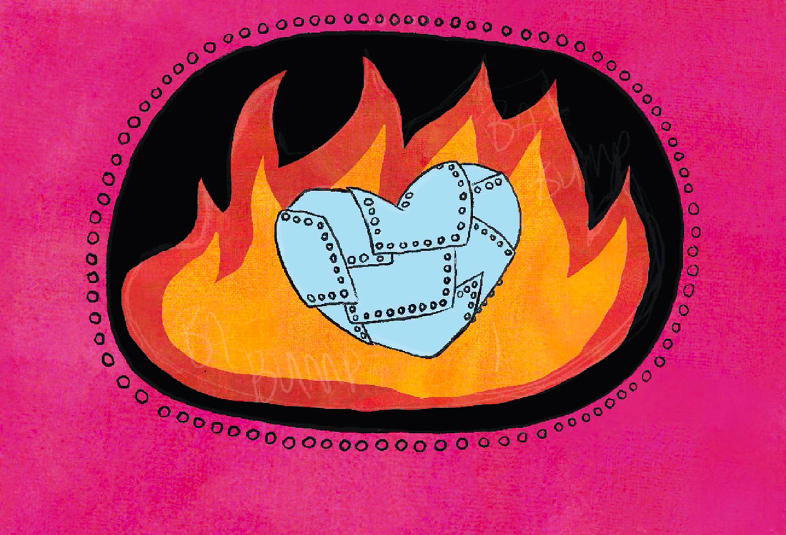
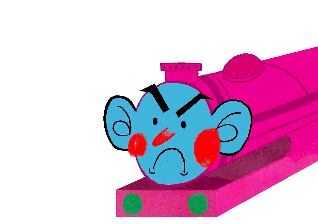
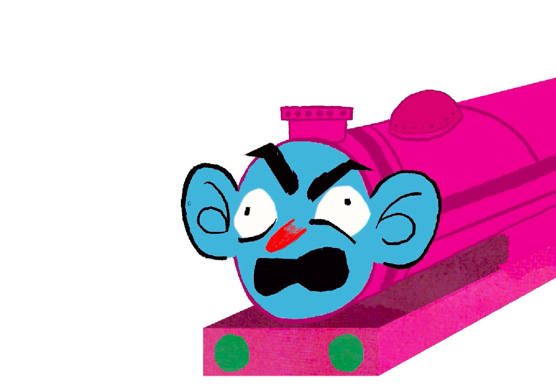
ADDING A FIGURE/ ANOTHER ELEMENT
The composition felt plain. I felt in needed some kind of human element to explain whats going on. I emded up adding this blue guy whose been in the illustrations to it as hes been a guide through the book so far. The speech bubble makes the type seem more intentional too.
|
|

MOCKUPS
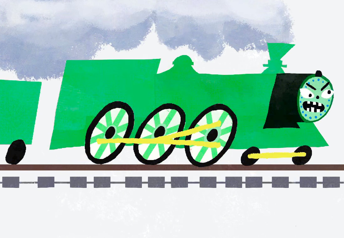
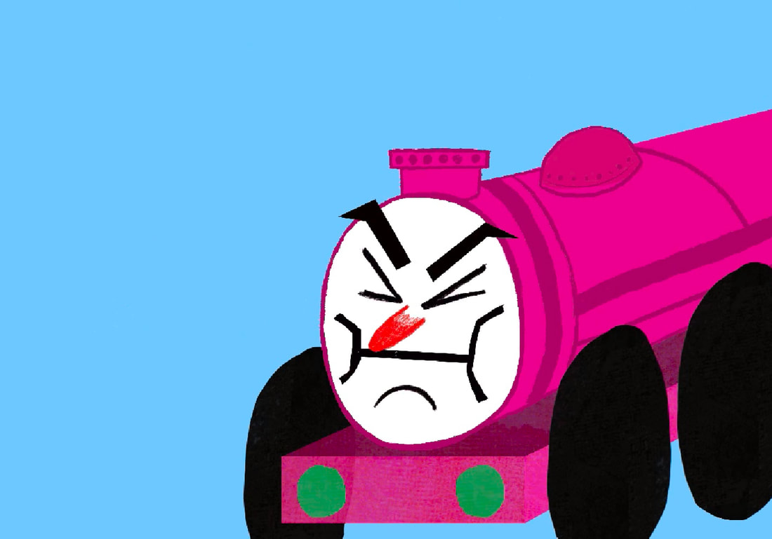
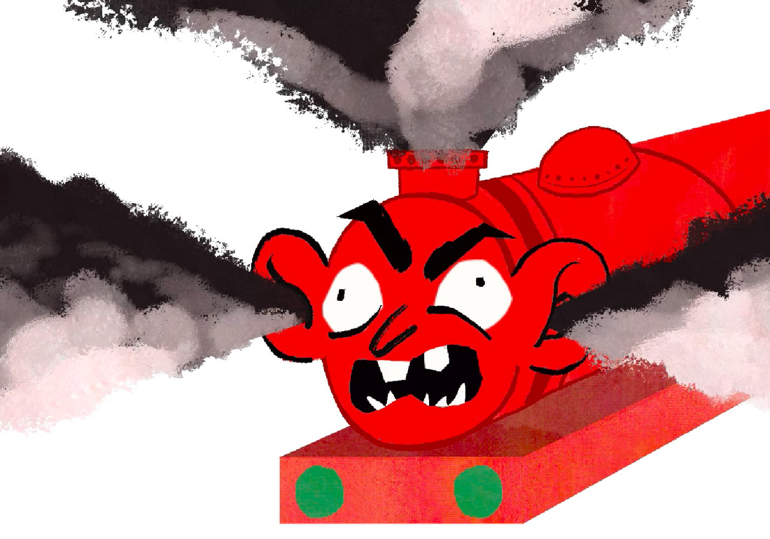
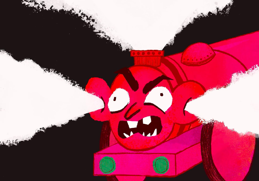
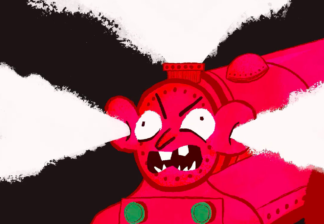
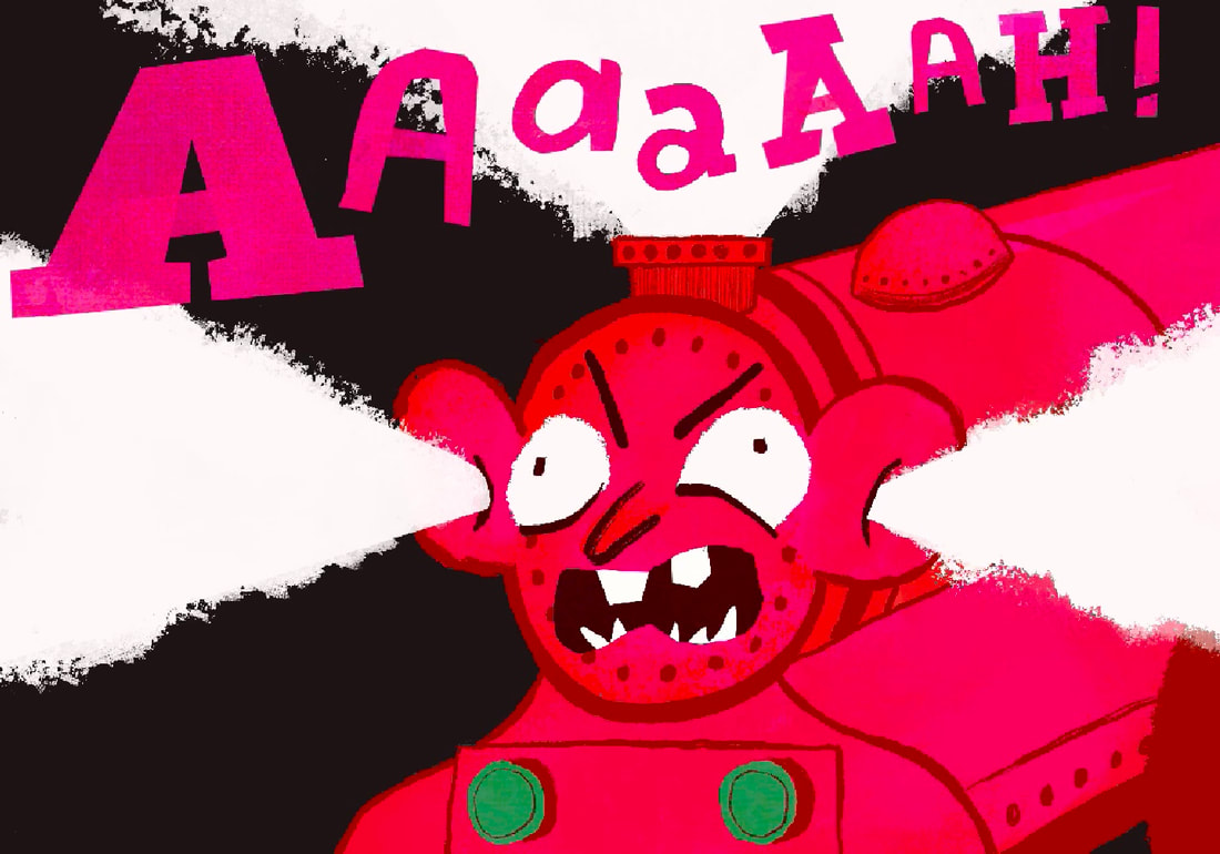
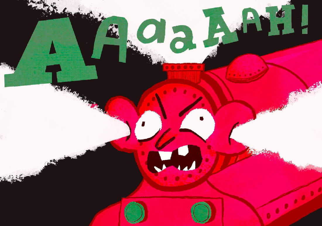
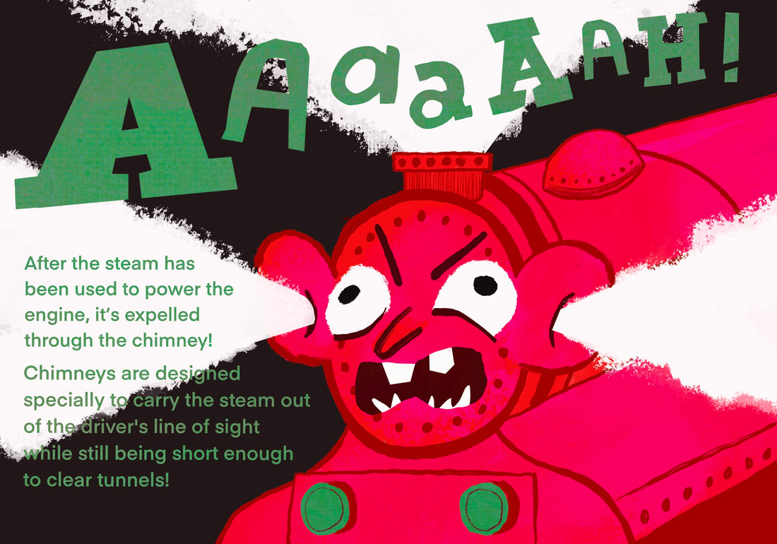
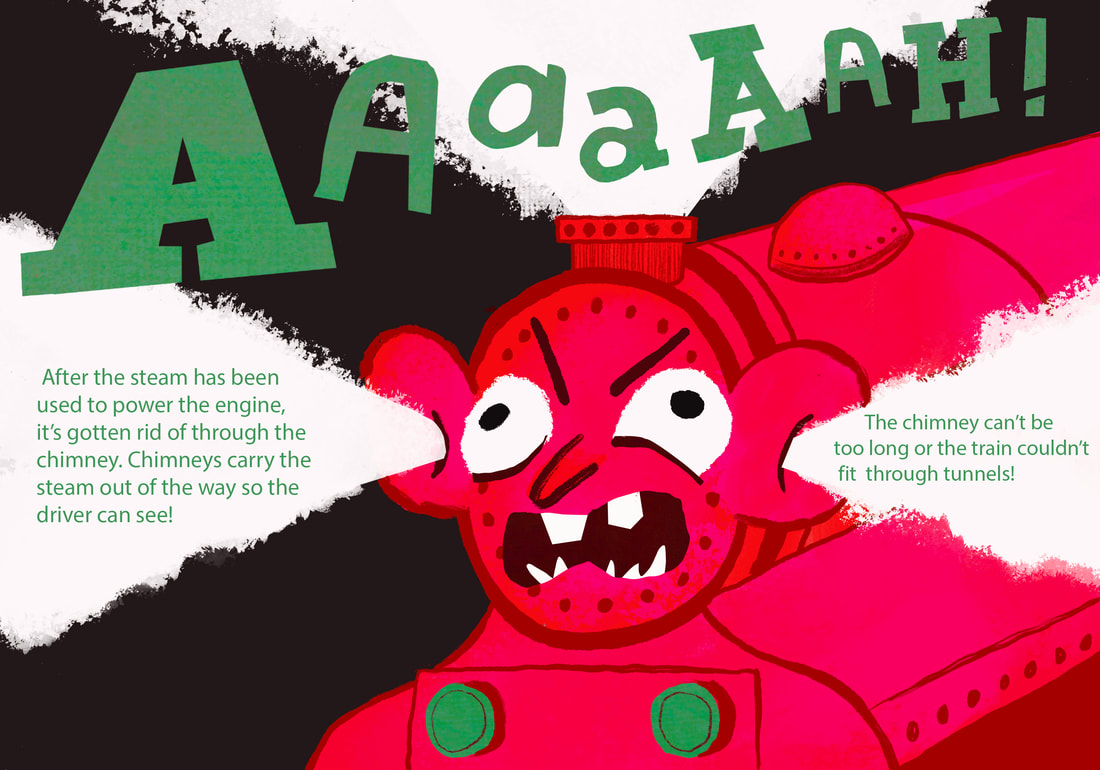
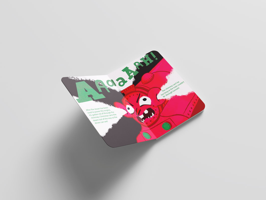
SPREAD FOUR: CHIMNEYS
The thing you picture when you think of steam trains is the chimney. Its the most recognisable feature. I felt I needed to explain this in a spread.
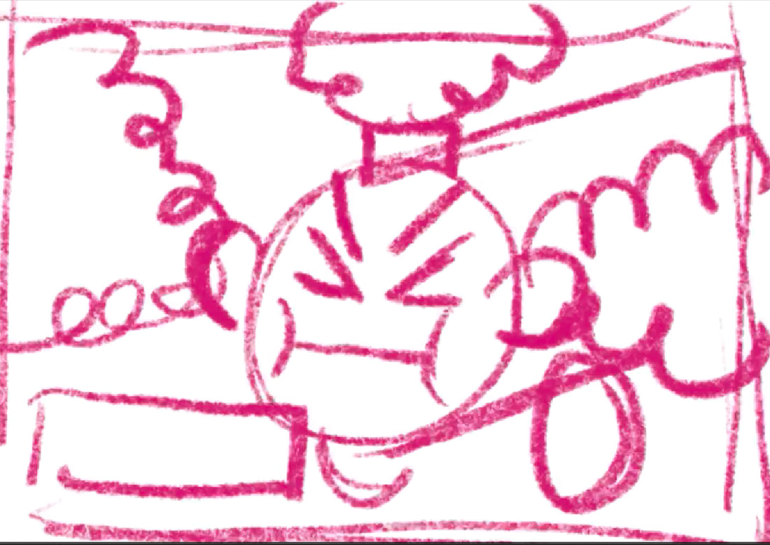
THUMBNAILS

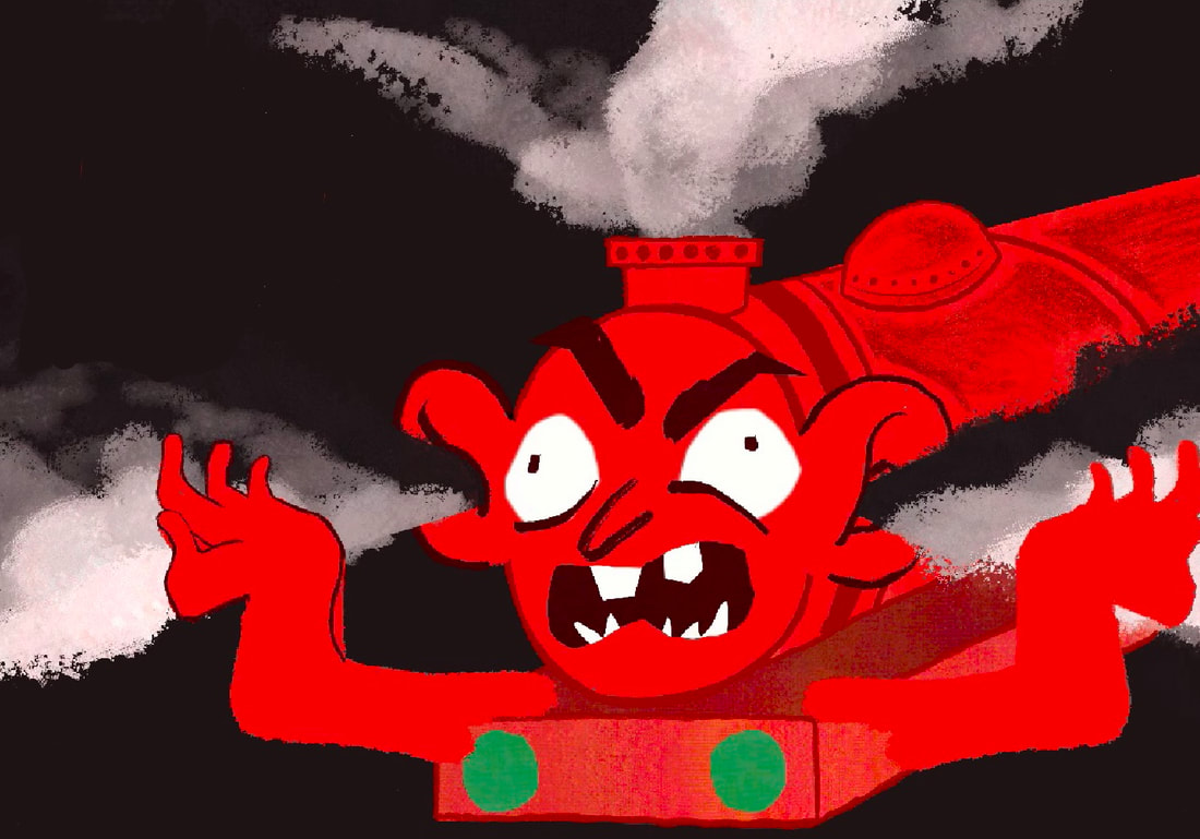
I started just by drawing a chimney. This was okay but a bit bland. I remebered those bits of Thomas the tank engine where the trains would get angry and go red in the face, and began to experiment with different ways of making him "blow off steam".

|

|

|

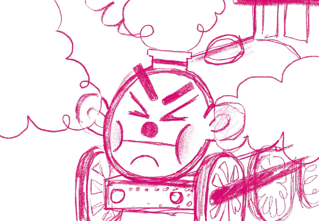
SKETCHES
I liked this direction a lot more. I sketched some more worked up thumbnails from this idea, thinking out the composition of the page and leaving room for type.
|
|
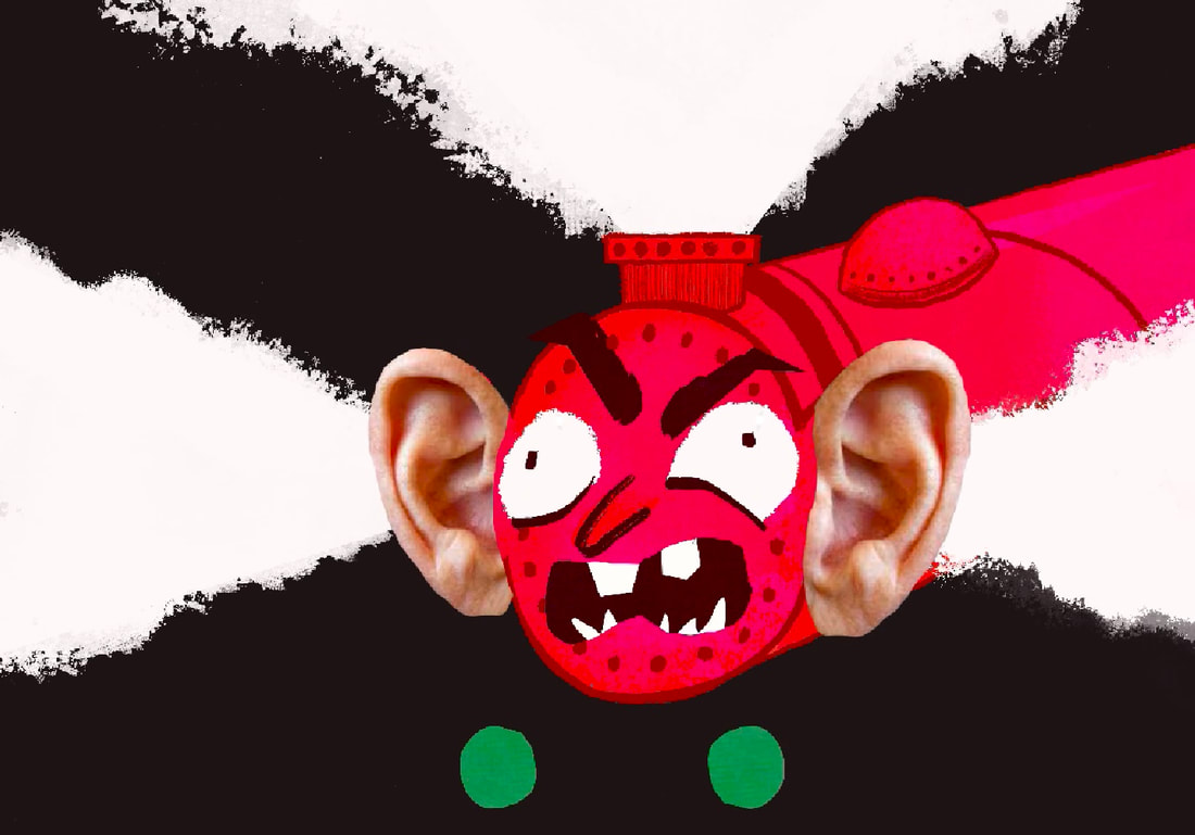
GATHERING REFERNACES
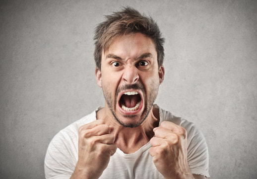
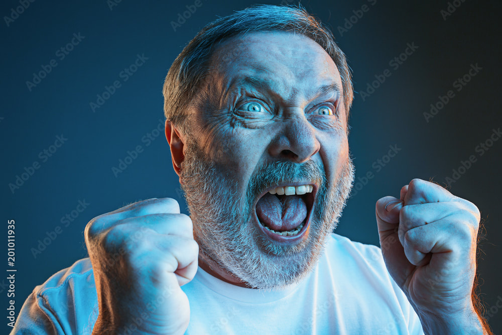
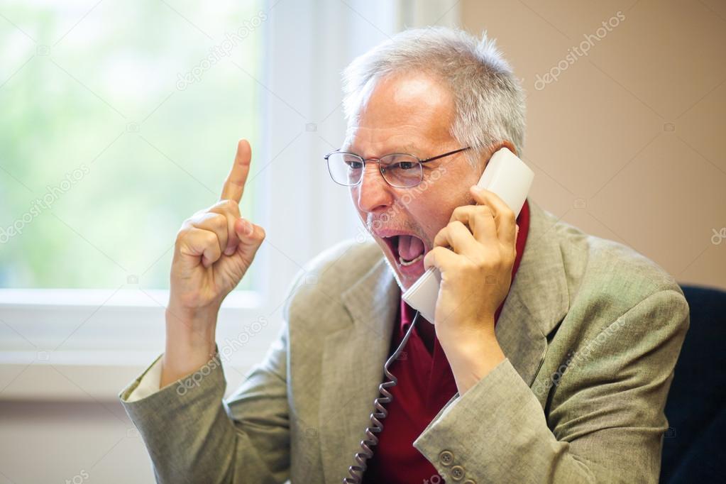
One hack I use for finding expressive refernaces if I don't want to embarress myself by taking weird selfies is using stock images. I'm not sure why theyre so expressive but they are. I gathered a few to use draw the angry expression of the train
|
|
|
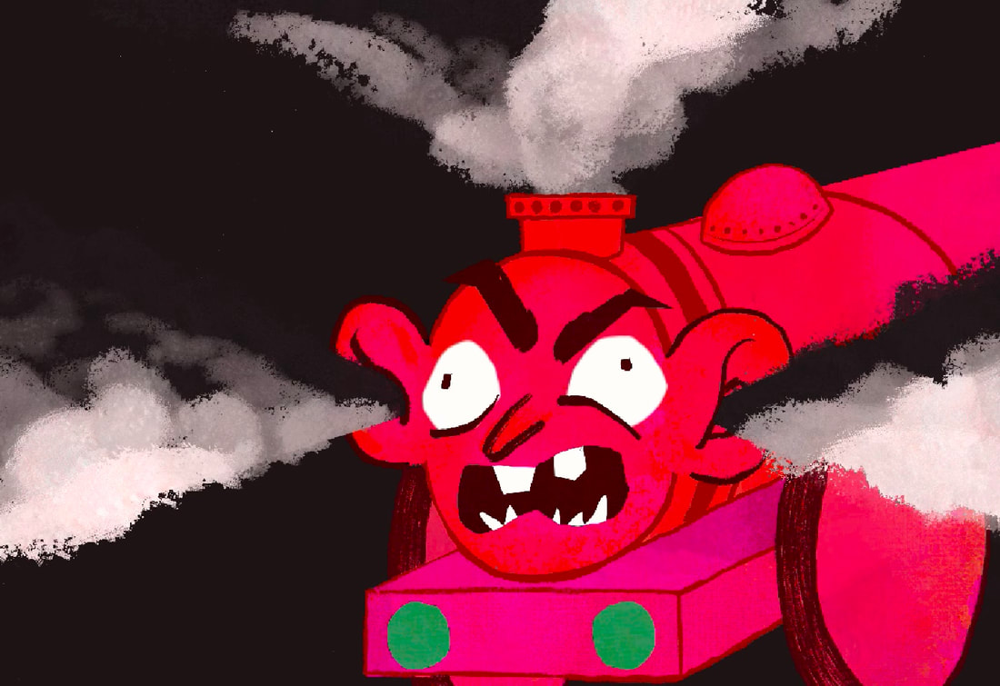
DEVELOPMENT
Had real good fun with this. Gave it a good kicking, but it only took me a couple of hours to complete. Even though I loved his realistic ears, I couldn't find a way to impliment them in. Big fan of adding bits of collage into illustratiosn though. I used the same texture brush from the labelled train to make the steam here.
|
|
|
TYPE
I really had a good time making my own text using the selection tool, so I did it again here. I think it really elivates the work. I places the body copy into the steam coming out of his ears so it would be easy to read. Makes the type sit bettwe with the illustration too.
|
|
|
MOCKUPS
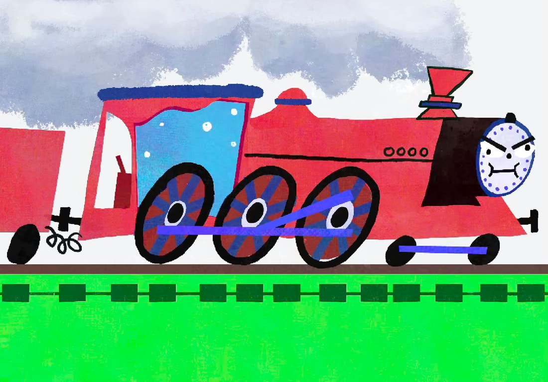
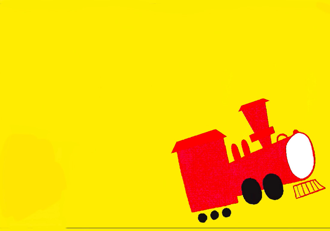
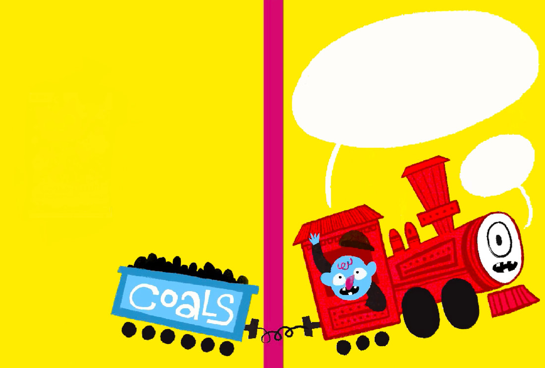
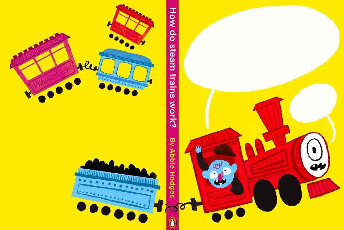
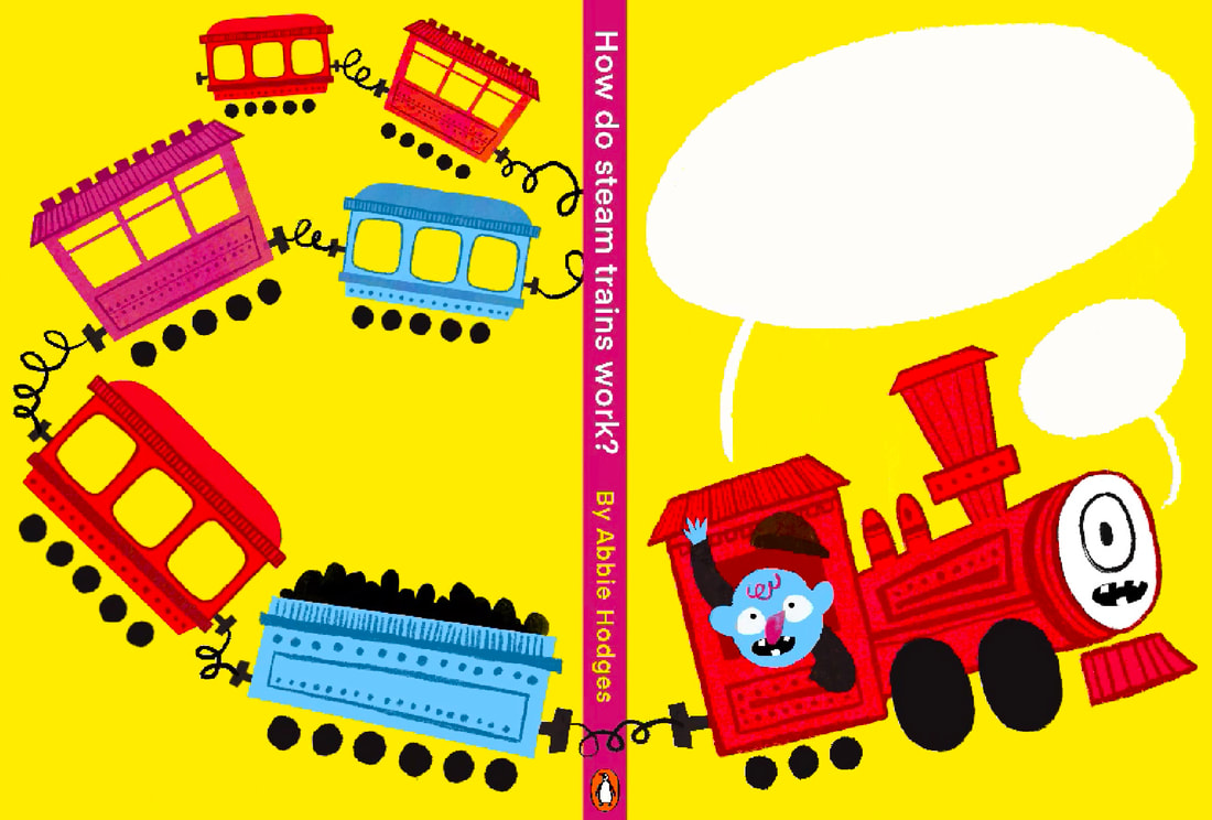
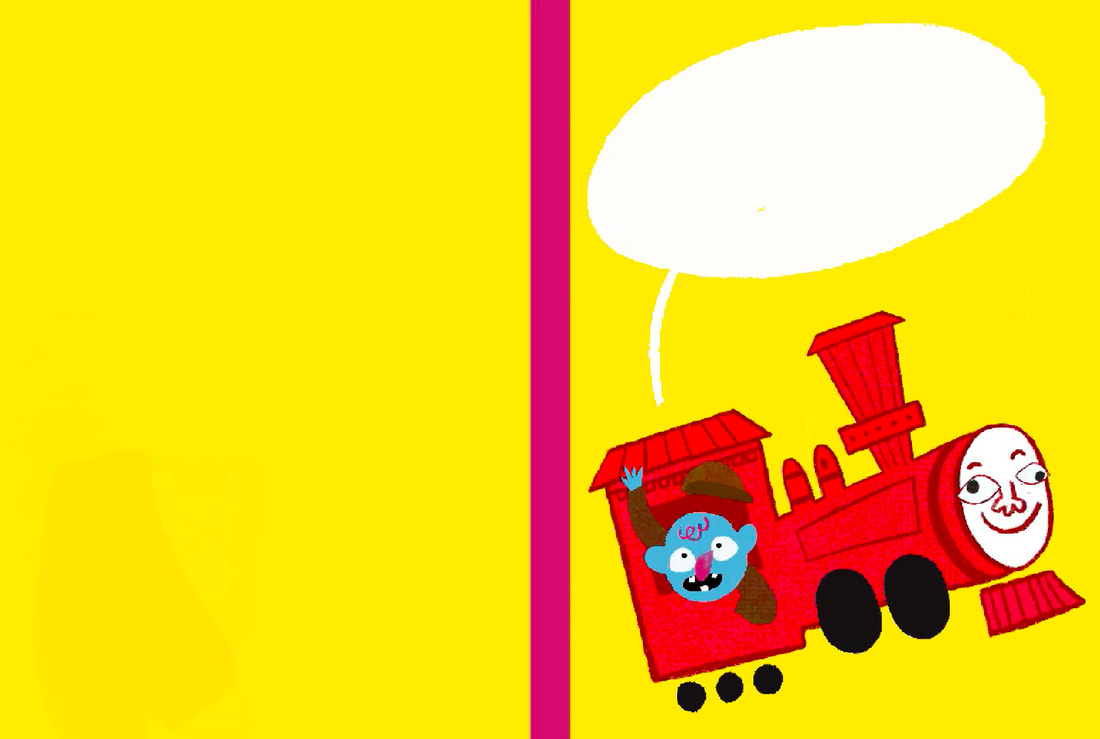
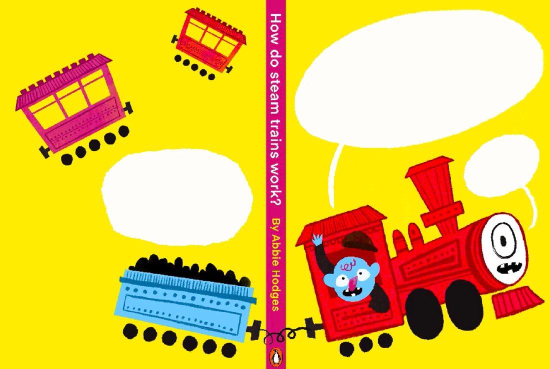
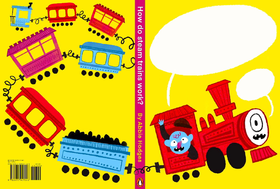
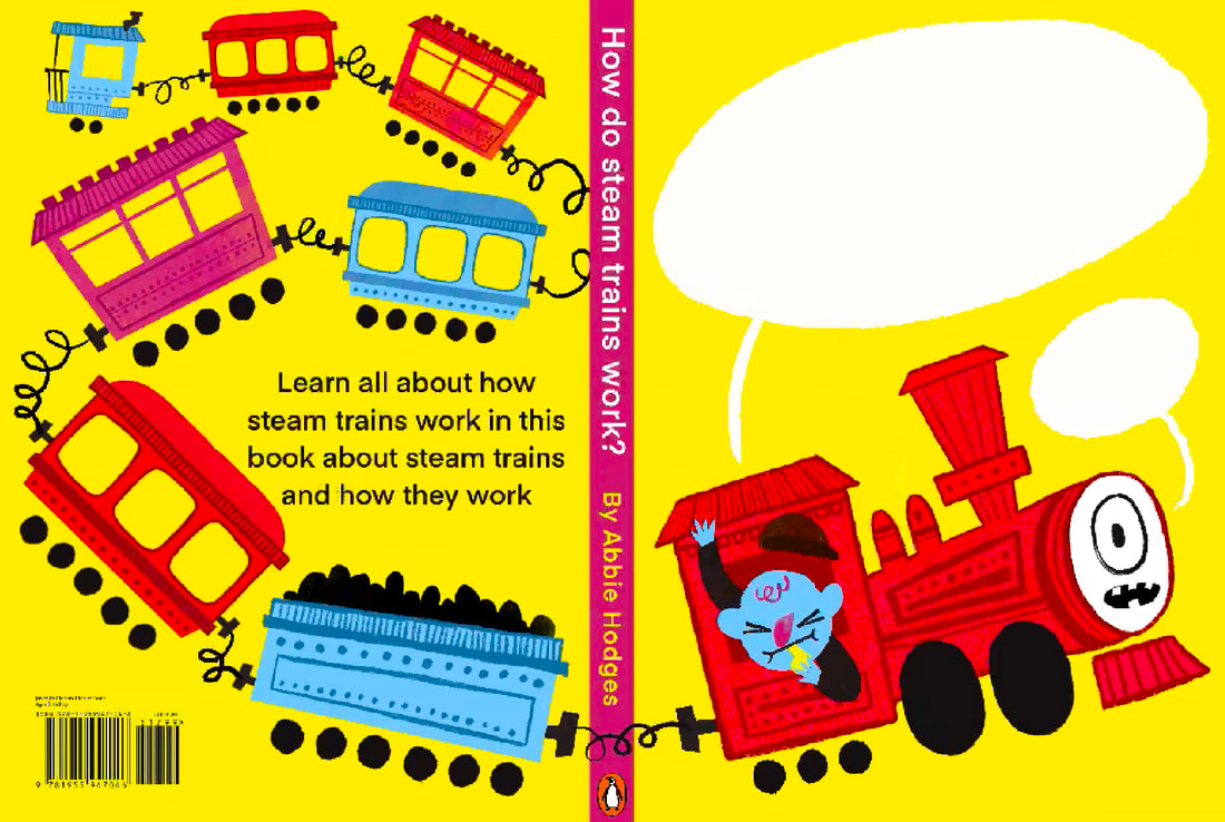
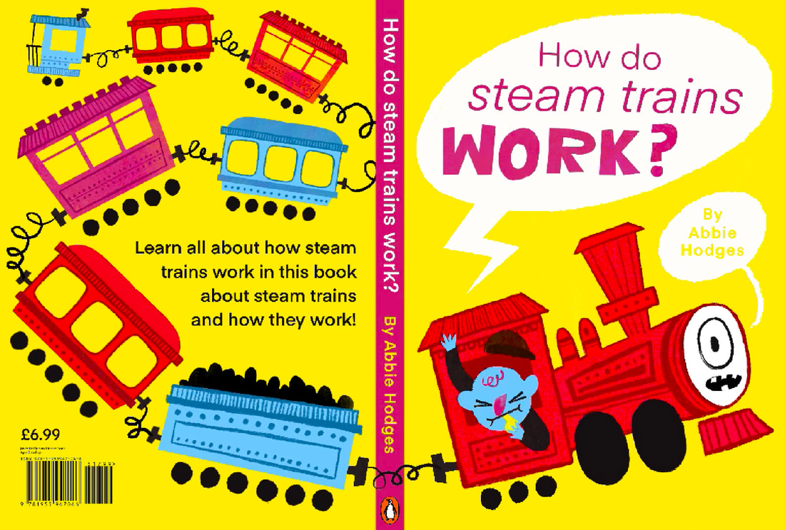
COVER DESIGN
The final piece I want to make for this project is cover. I think it will behelpful in showing the tone I'm trying to create in the work.
THUMBNAILS
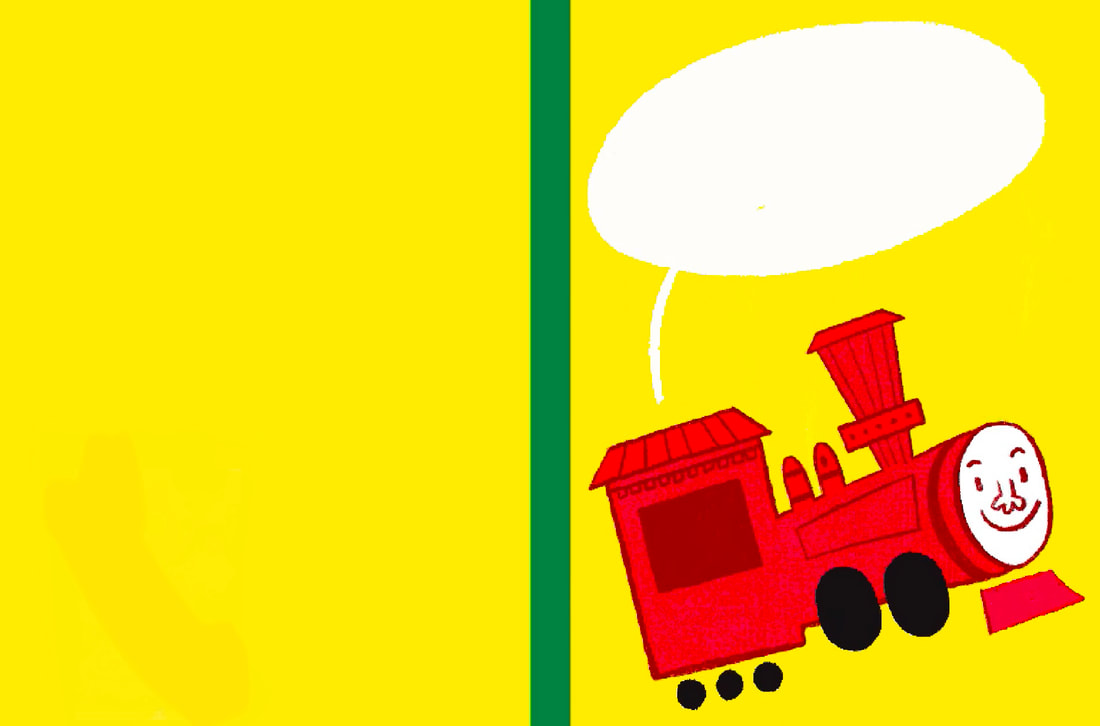
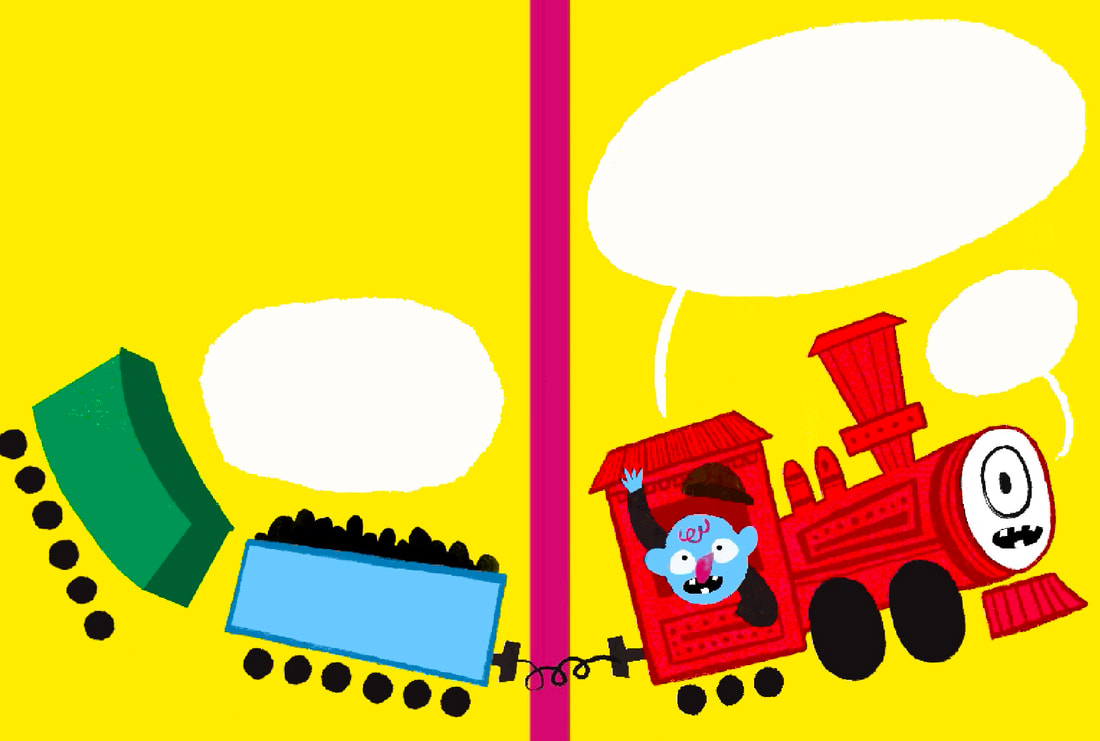
SKETCH
I chose my favourite thumbnail and worked it up a bit more beofre moving on.
DEVELOPMENT
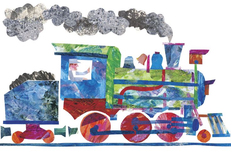
The process of making this came really naturally. I used simailr techniques that I used for the inside spreads to make it cohesive. For example, I used the same brushes to add detail to the train carriges as I did with the labeled train page. I also drew the blue guy in the same way, actually copy and pasting elements from other documents to render him faster.
|
|
|
TYPE
I used the same proccess for type as I did for the other pages. I used the same font for the bodycopy and then used the selection tool to hand draw certain elements.
|
|
FINAL DESIGN
I'm really happy with this final outcome. I think it works so well as a cover and I think you can see i've really mastered working in this way for the project. I'm really proud of my output from this project.

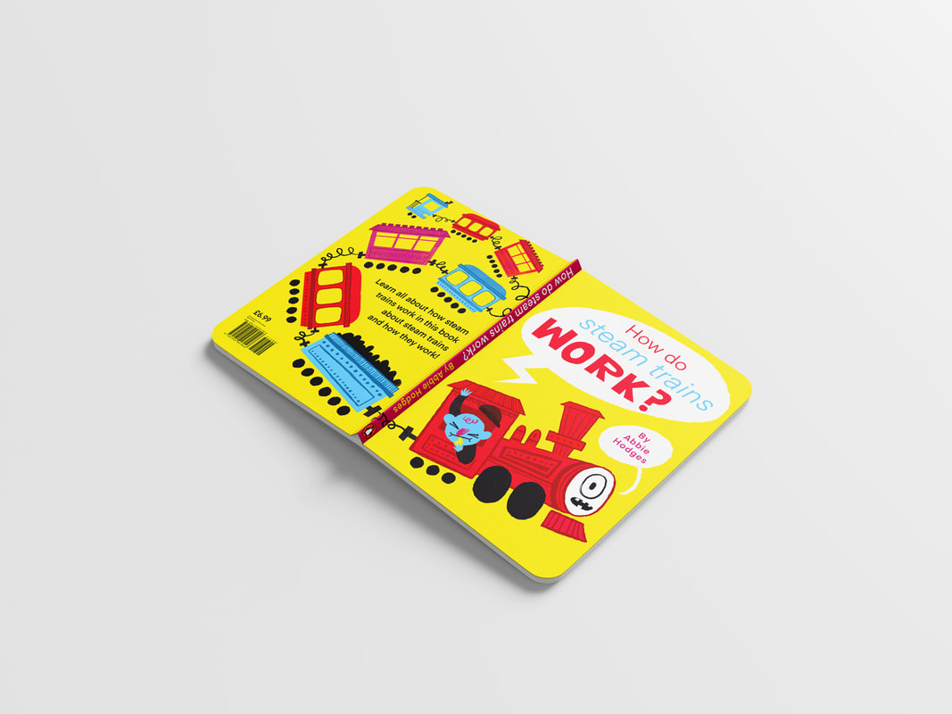
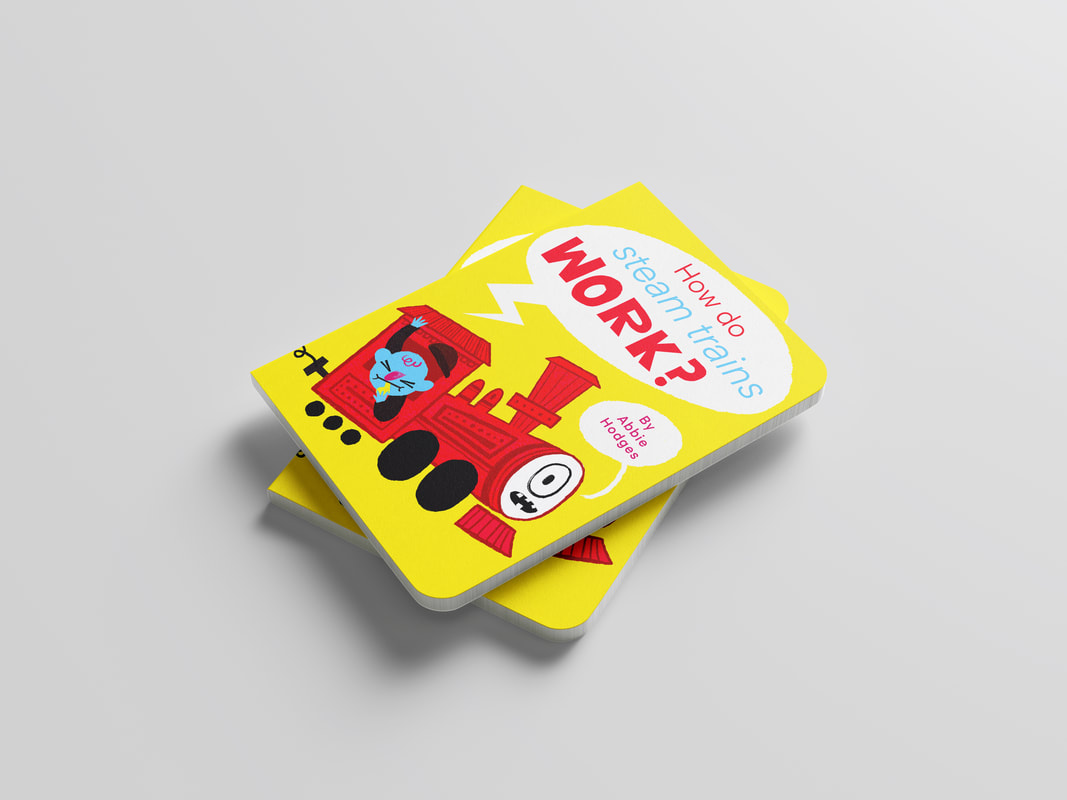
MOCKUPS
FINAL DESIGNS