STUDENT CHARTER
WHAT'S THE BRIEF?
Create some illustrations to go alongside the student charter.
RESEARCH
WHAT EVEN IS A STUDENT CHARTER?
This apparently...
|
|
WHAT IS THE UNIVERSITY DESIGN PHILOSOPHY?
|
|

|
I WILL IMPLIMENT THESE IDEAS INTO MY WORK WITHOUT BRINGING THE QUALITY DOWN....
- BOLD COLOURS
- BLOCKY SHAPES
-SLIGHTLY ABSTRACT
-MODERN
-NOT GREAT BUT NOT THE WORST
- BLOCKY SHAPES
-SLIGHTLY ABSTRACT
-MODERN
-NOT GREAT BUT NOT THE WORST
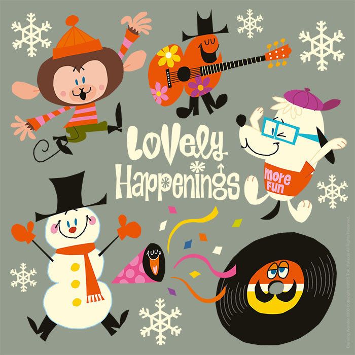
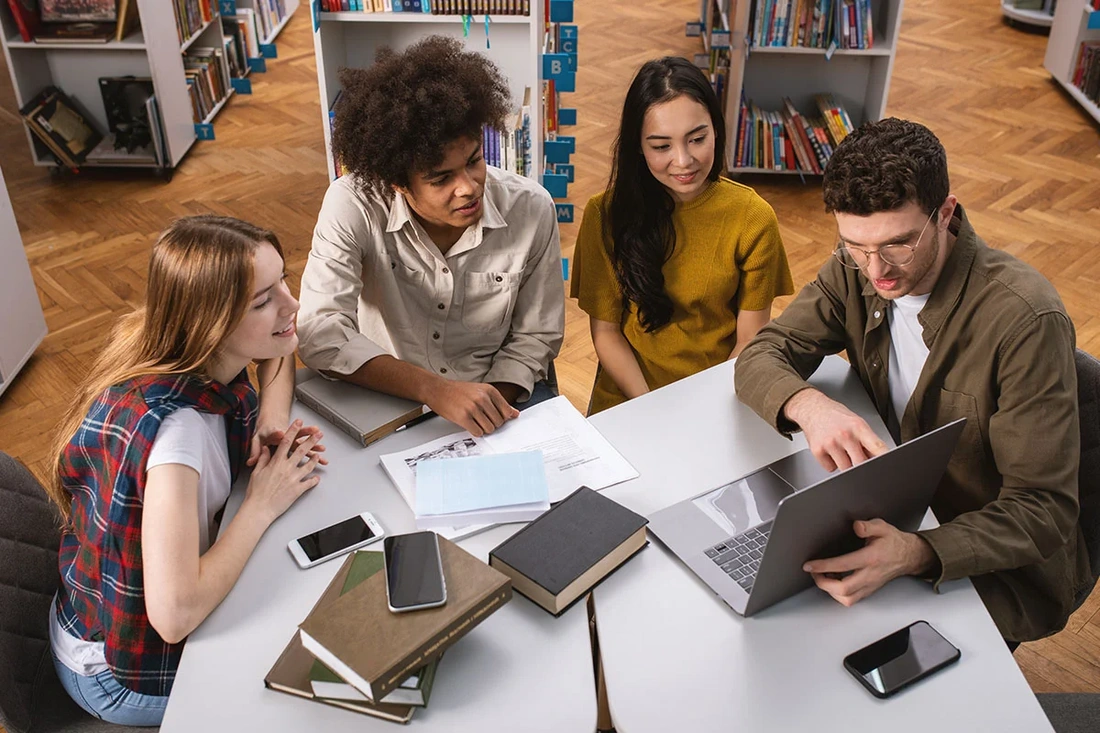
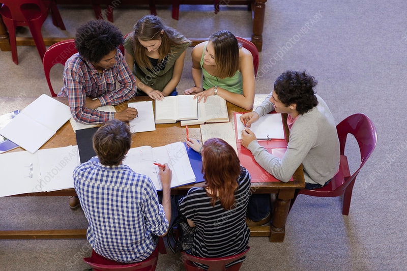
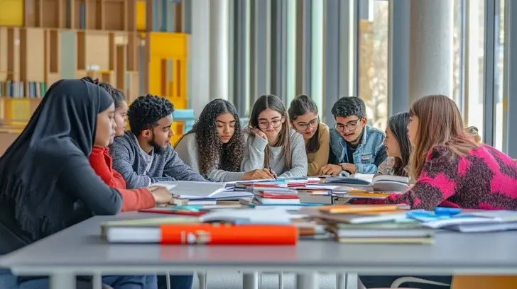
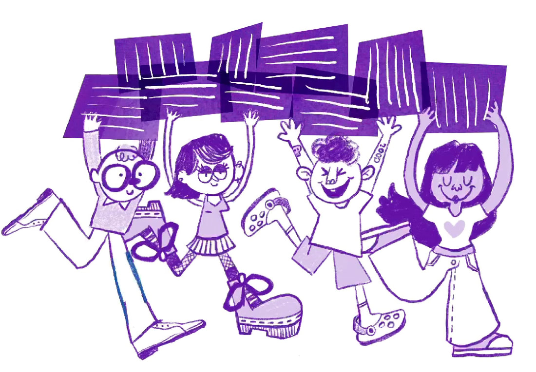
PINTEREST BOARD
Like every project, I started by making a pinterest board of images that refelect the tone I can visualise for this brief.
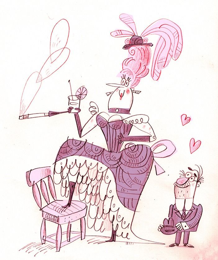
SPECIFIC ARTISTS RESEARCH
In the Tuesday morning briefing, it was recommended by the lecturers to focus on making assests for this project. I geared my artist reseacrh into great artists whose work is asset based.
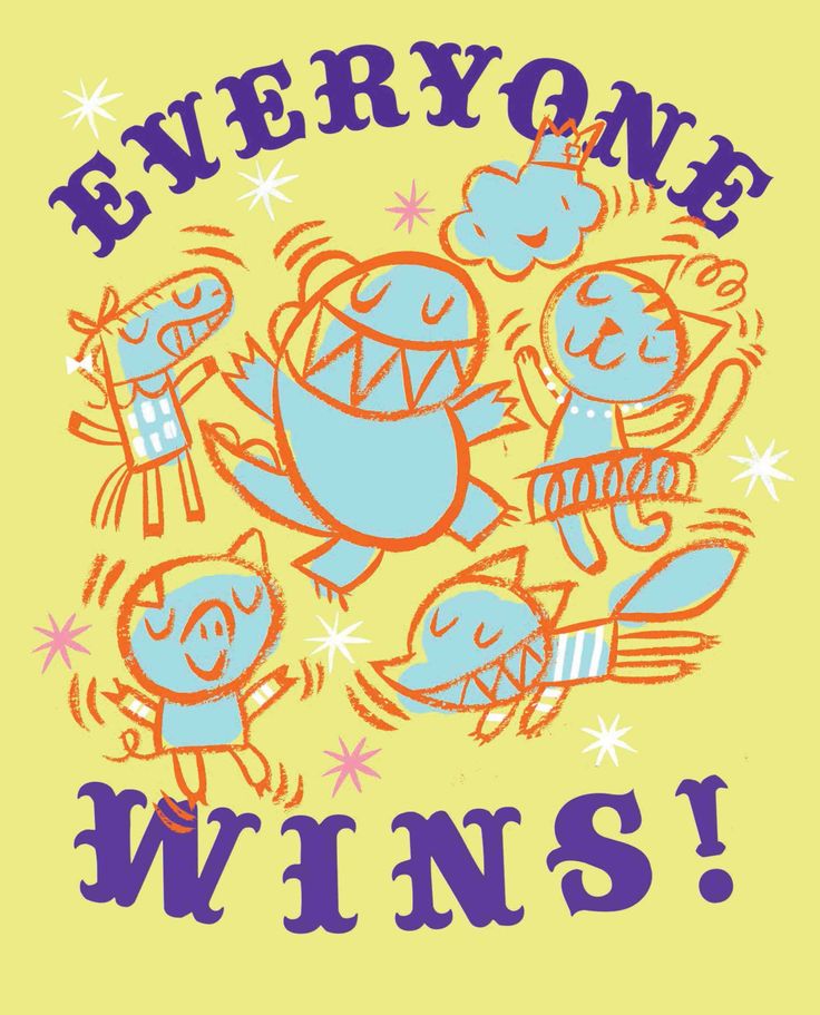
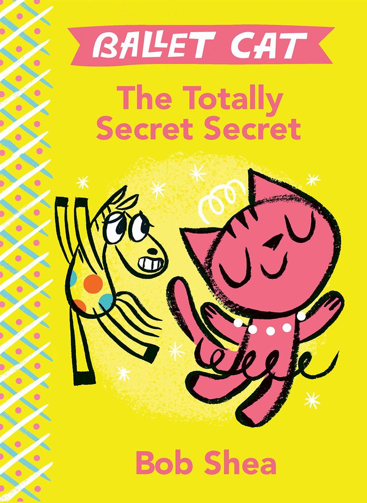
BOB SHEA
Bob Shea is great at making seemingly naive illustrations look proffesional and polished. I love the textured outlines of his work, wonky lines and the use of colour.
|
|
|
PIERRE COLLET-DERBY
Derby's work is reminicent of mid century illustration. He uses a lot of flat colour that is enhanced by texture. He also used patterns in his work effectively. I want to ustalise methods of using colur like this in my work.
|
|
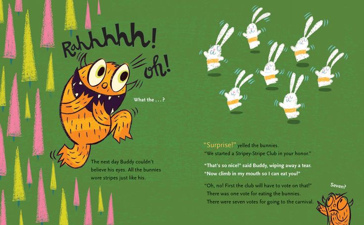
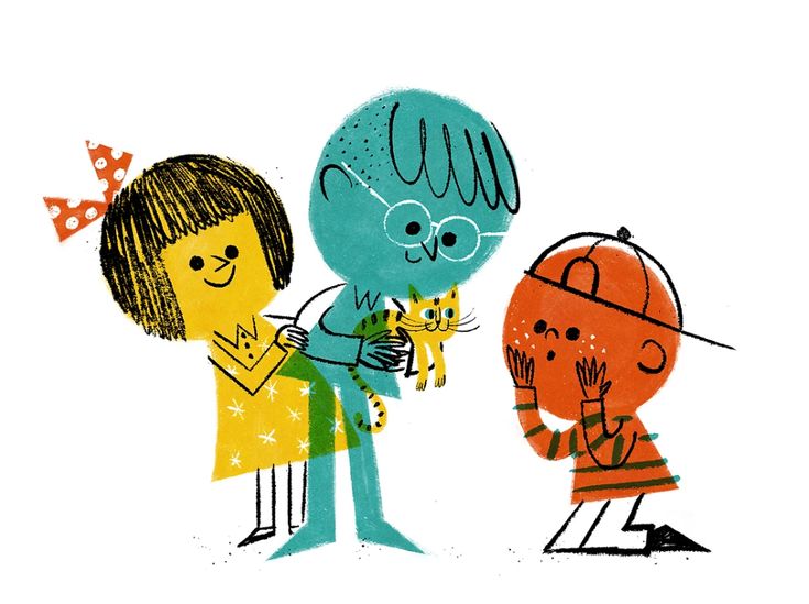
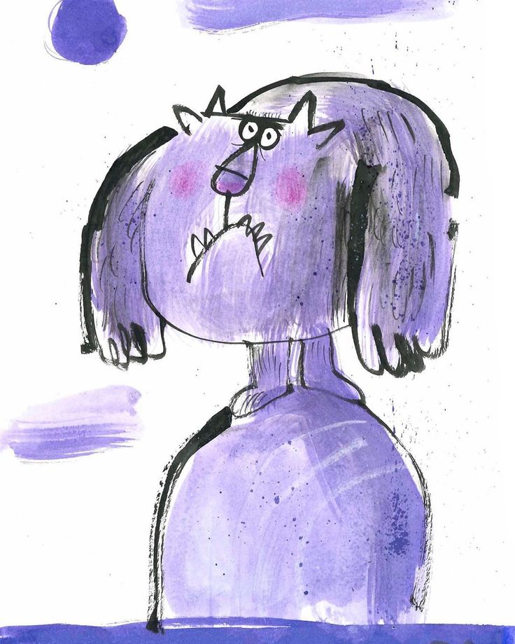
FRED BLUNT (not to brag, but he follows me on Instagram)
Fred Blunt is a huge inspirtaion for me. I love his stylisation and chracter designs. I also love how he makes his illustrations comedic without using words. He relies on expression and scale a lot. I will take inspiration from this.
|
|
|
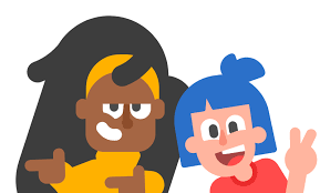
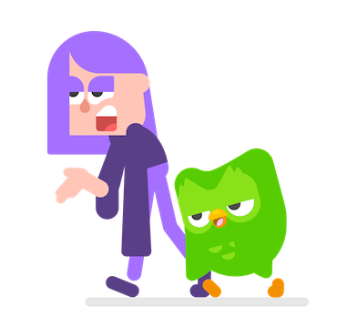
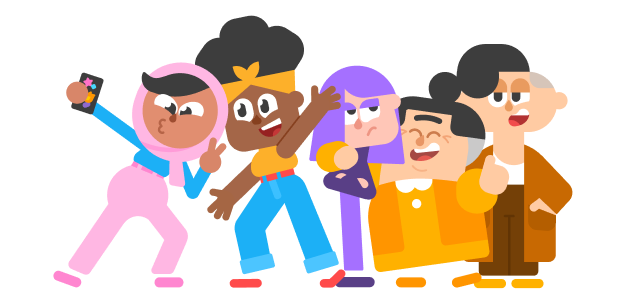
DUOLINGO CHARACTERS
Not the most exciting illustration, but a great example of humanising a brand. These characters make the language learning app seem friendly, current and fun. I want a simialr tone in my illustrations.
|
|
|
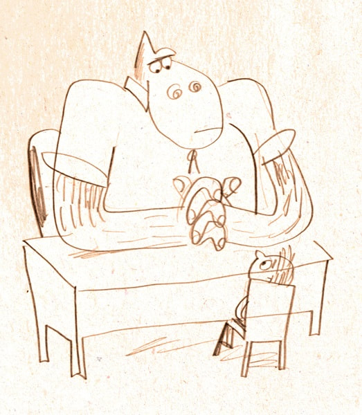
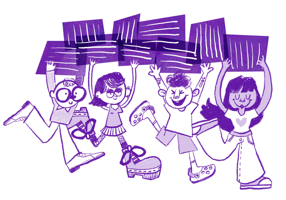
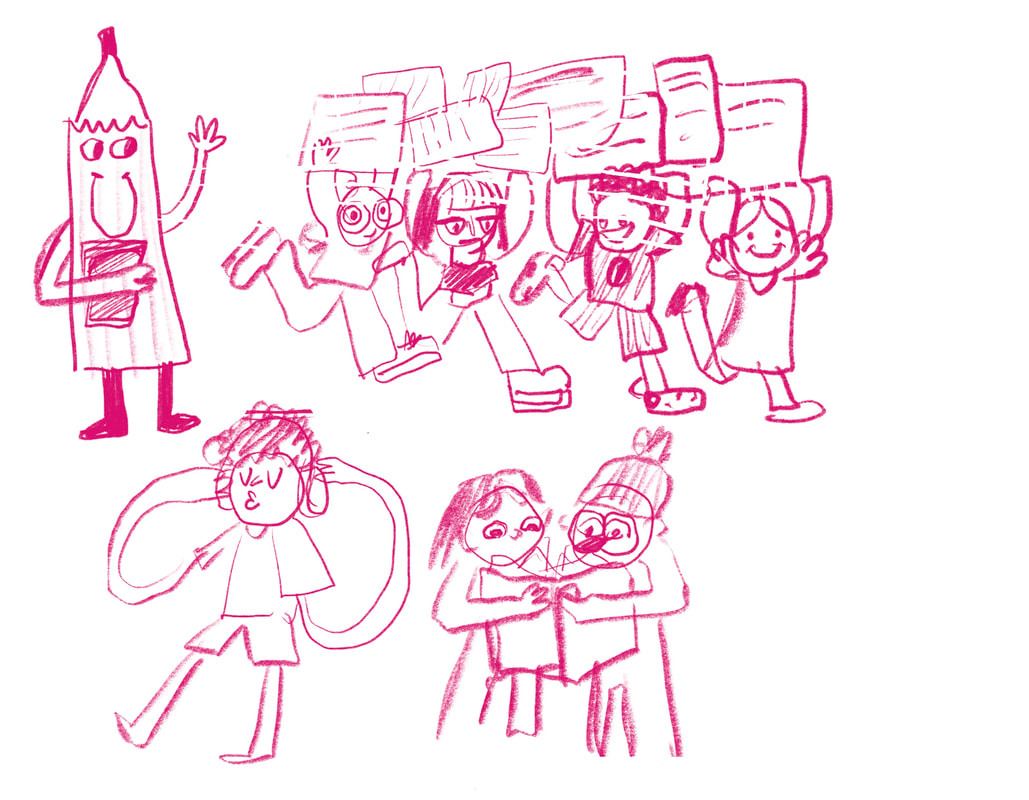
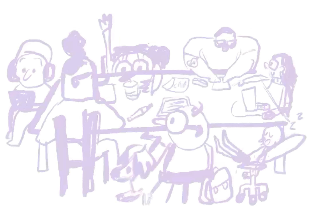
INITIAL SKETCHES
I started this project by just sketching out as many ideas to do with the student charter as possible. I wanted to keep it fun and keep it really student based. Having a variety of different people was really important. I didn't just focus on drawing young hot people. I toyed with the idea of using animals in the sketches, but it moved the ideas further way from university. I think using people is the best play.
|
|

|
|
|
WHAT AM I GOING TO MAKE?
As this brief is reaaaaaaaaaaaaally broad, I set perameters for myself before I started making assets. I want to create:
- A set of three posters that the university could use
- A couple of examples of the assets used on social media
- An example of how the illustrations could be used around the university in ways other than posters.
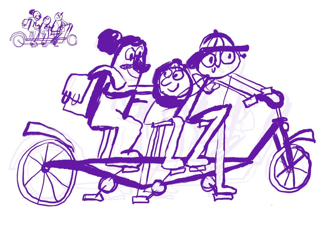
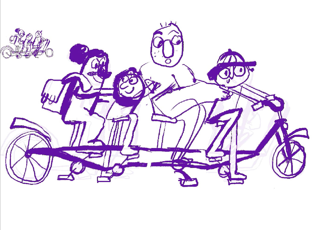
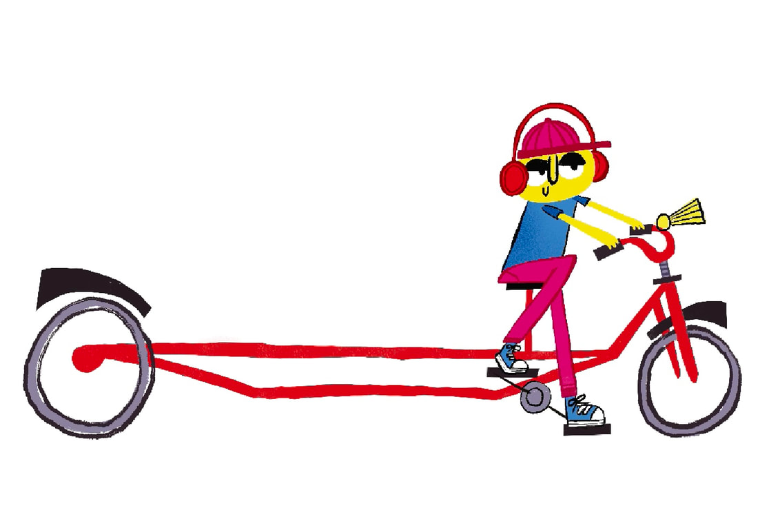
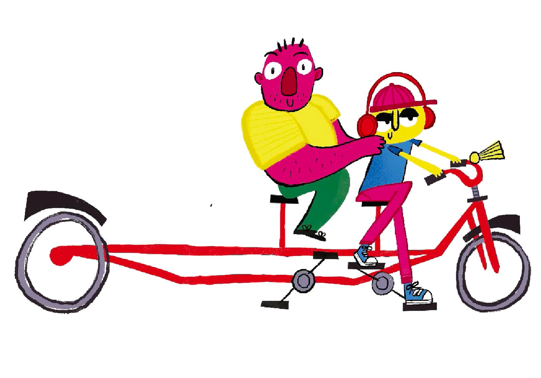
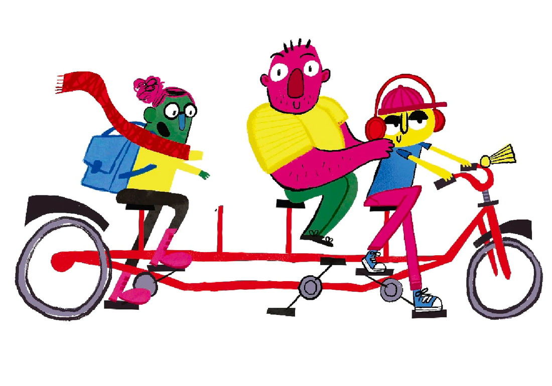
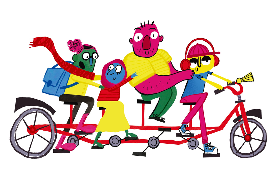
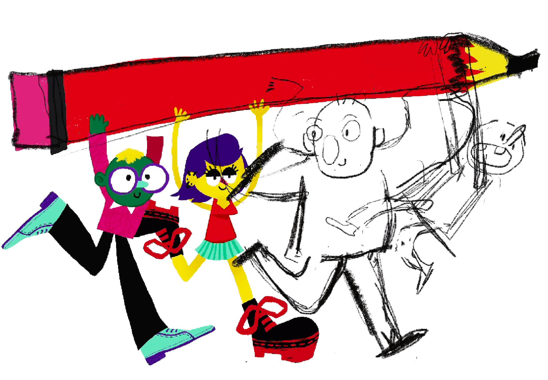
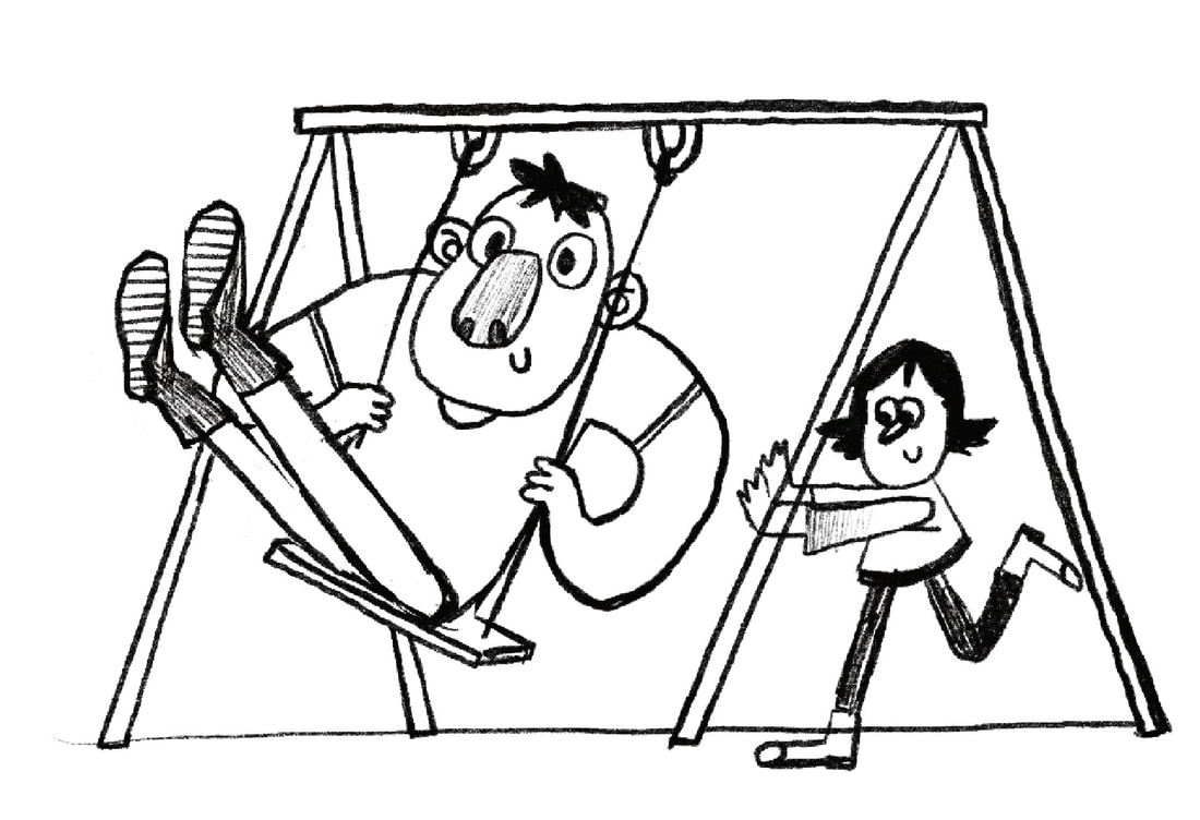
TANDEM BICYCLE IDEA
People working together? Tandem bicyle it is.
SKETCHES
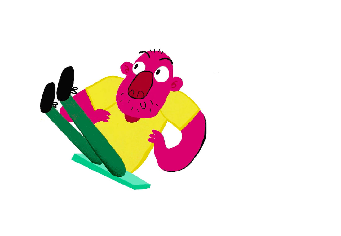
I started this illustration with only three characters, but added another larger character for scale and to create a more diverse set of characters.. Also the longer the tandem the funnier it is. I made the big guy not pedal the bike, thought that was silly.
|
|
|
DEVELOPMENT
As my process for these illustrations didn't work well for screenshotting, I uploaded time lapse videos to Youtube.
|
|
|
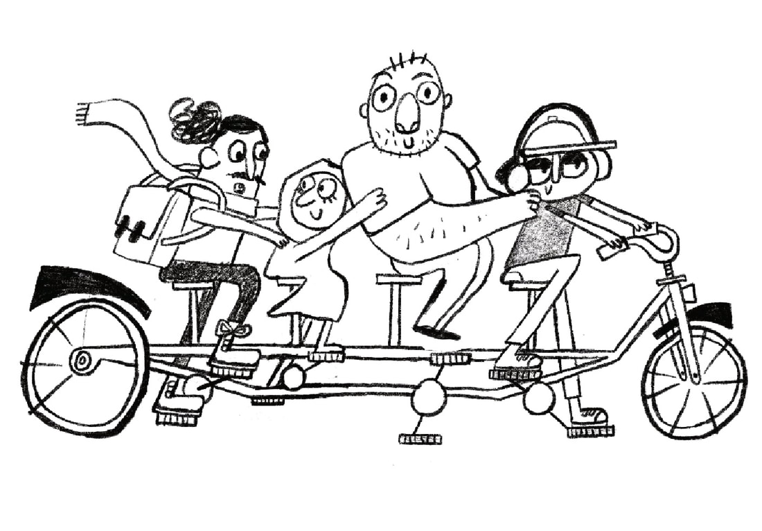
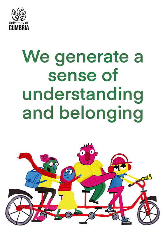
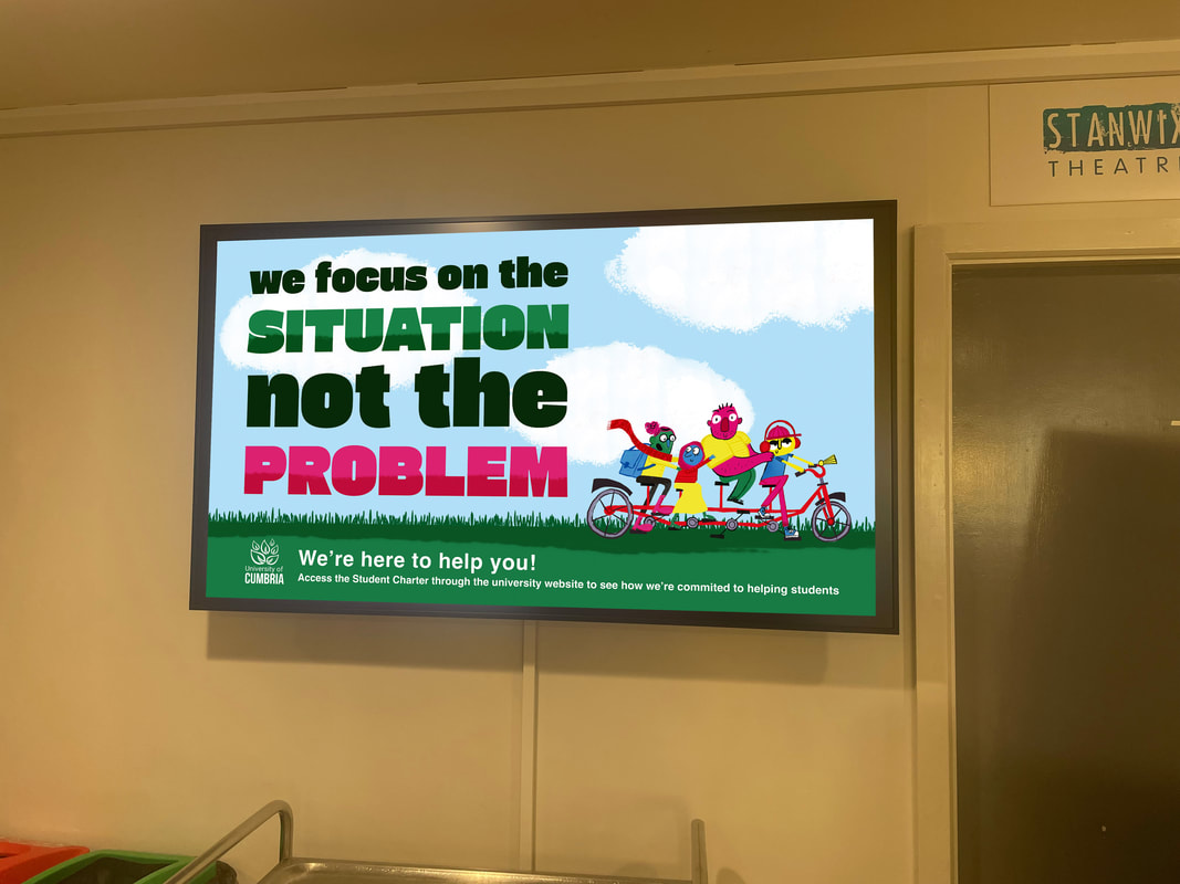
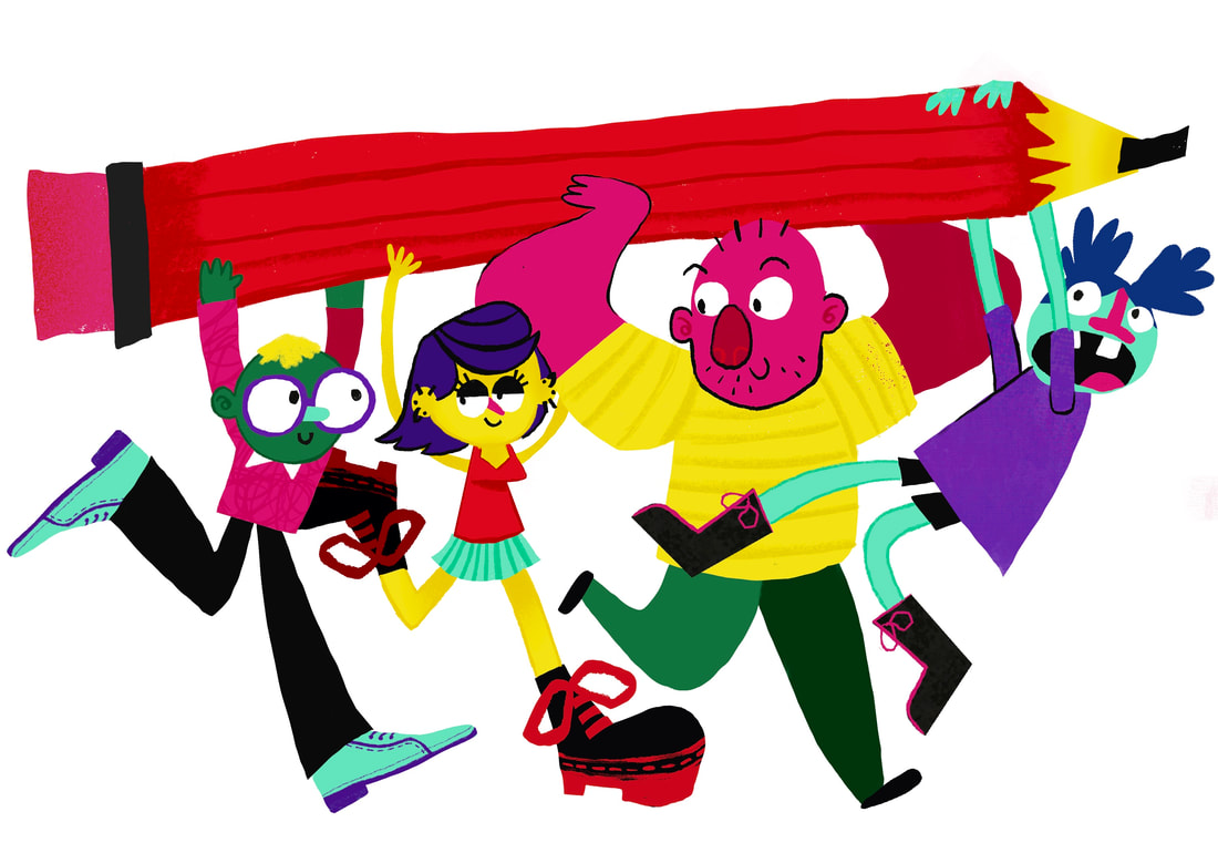
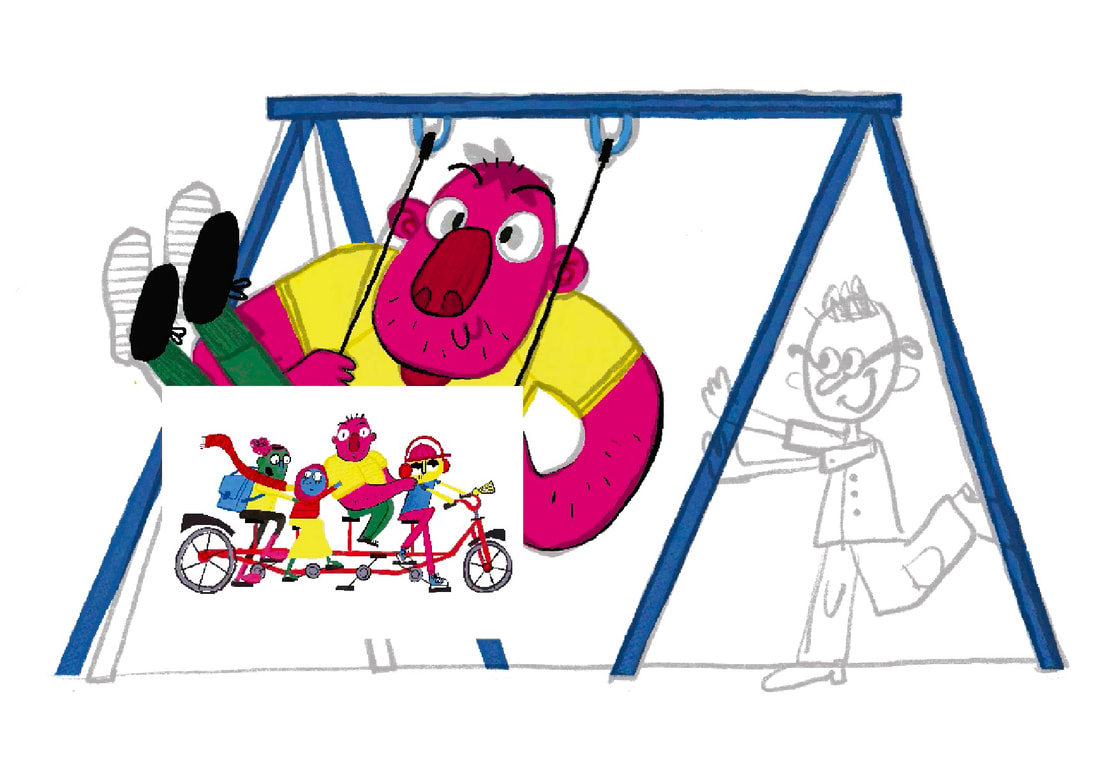
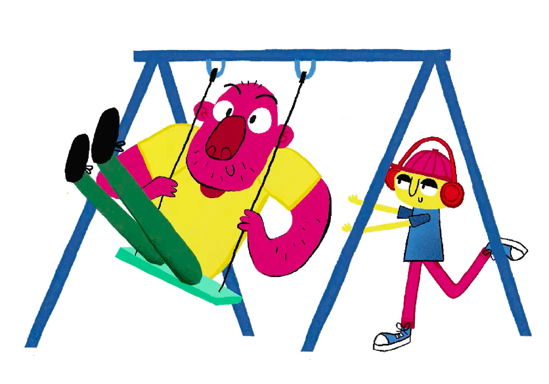
FINISHED ILLUSTRATION ASSET:
This is my first final asset created. I think I balanced my way of working with a more corporate style. I enjoyed adding textures, patterns and gradients for visual interest. Using a mix of no outlines and linework really combines the analoge and digital which is what I'm going for.
HOW WOULD THE ILLUSTRATION WORK FOR A POSTER?
I want to use this illustration on a poster design.
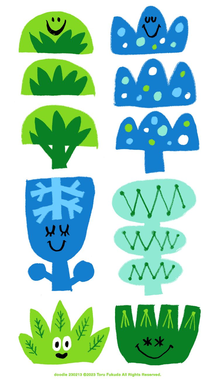
TORU FUKUDA POSTERS/ ILLUSTRATIONS WITH TYPE
I like the simple blocky look of Fukuda's illustrations and type. She uses bold colours mixed with black and white to make effective designs.

|

|
|
DEVELOPMENT POSTER
TYPE
I used Adobe Fonts to find this big blocky font to use as my main type face.
|
|
|
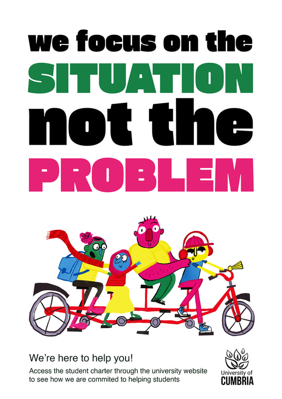
POSTER LAYOUT
I started with a really simple composition layout on Procreate before quickly moving to Photoshop. I intigrated the illustration by adding grass to the bottom of the poster and adding blue in the background like a sky. I added a texture clipping mask over the "situation" and "problem" text to make it more punchy.
|
|
|
|
|

|
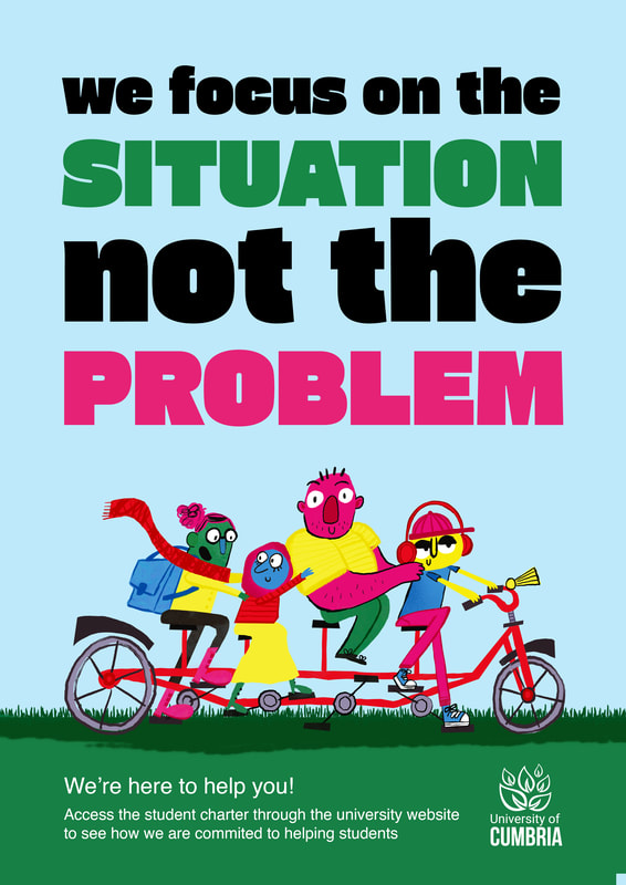
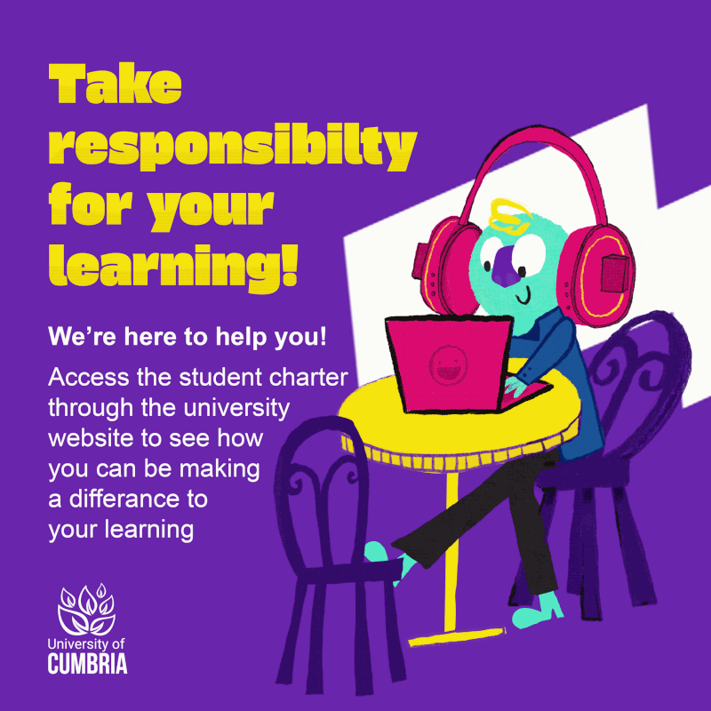
FINAL POSTER DESIGN
These are the final designs. I'm going to use this as a template for the next few posters.
|
|
|
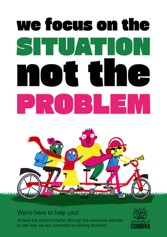
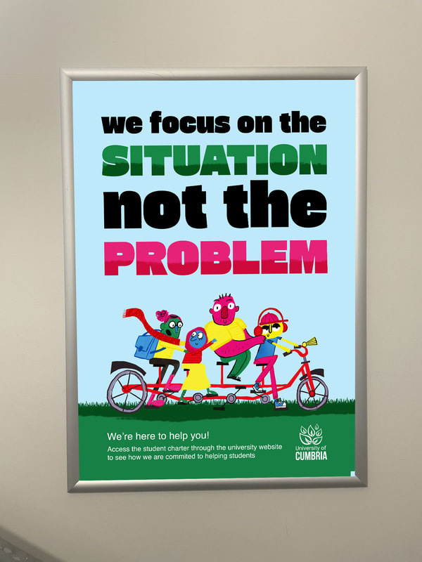
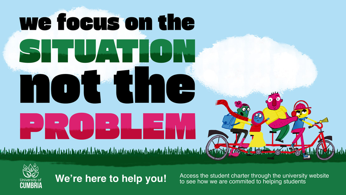
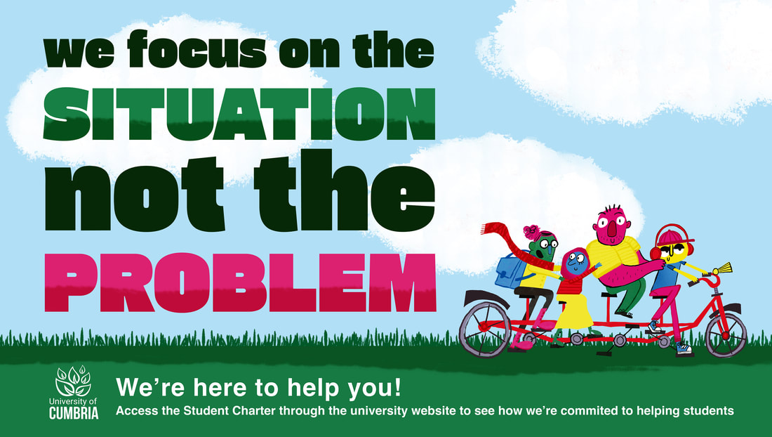
ADAPTING FOR SCREENS
TRYING TO FIX TYPE ISSUES AFTER FEEDBACK
I made edits after feedback to the poster:
- Moved the awkward cloud placement on the right and added another cloud to fill negetive space.
- Made the "we focus on the" and "not the" less harsh by changing the colour to very dark green instead of straight black
- Changed the layout to the type on the bottom, making it stretch across the whole illustration so it feels more connected.
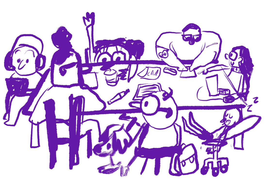
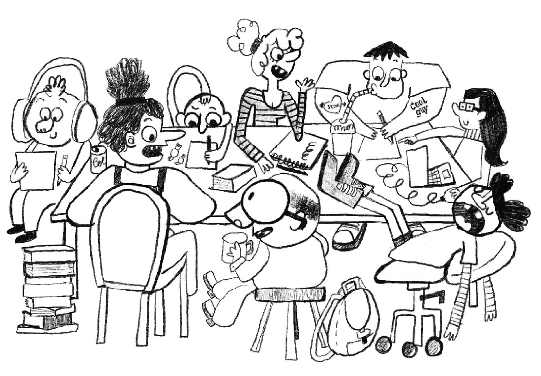
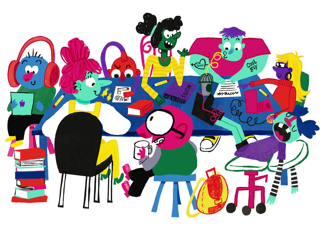
IDEA 2: STUDY GROUP
RESEARCH
TORU FUKUDA
I looked at Toru Fukuda again for this illustrations. I focused on her illustrations this time.
|
|
|
REFERNACE IMAGES
|
|
|
SKETCHES
My main goal was to include as many different kinds of people in this illustration as possible. Different ages, genders, races and personalities.
|
|
DEVELOPMENT TIME LAPSE
I included a time lapse again instead of regular screenshots for this illustration.
FINAL ILLUSTRATION ASSET
i enjoyed again adding texture to this illustration I looked at the artists from my research while making this, and I think you can definetly see the inspiration.

TURNING THE ILLUSTRATION INTO A POSTER
This poster came together really easy. Using my first poster as referance, I used similar tecniques to create this one.
|
|
|
|
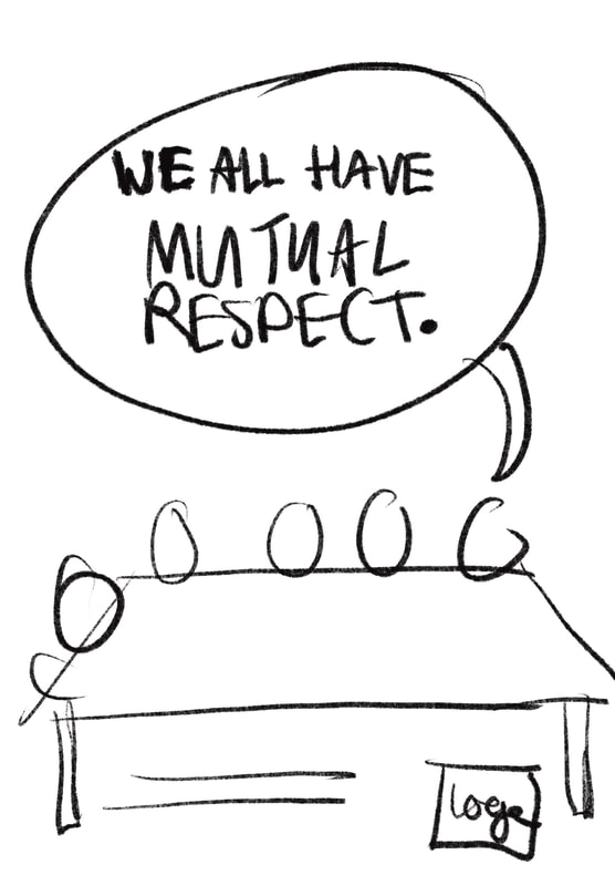
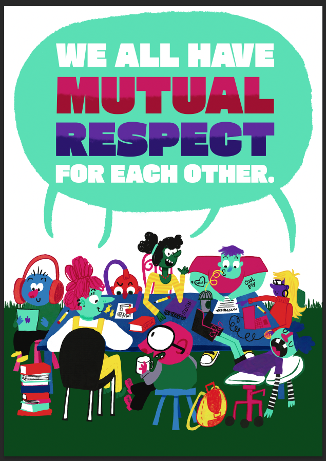
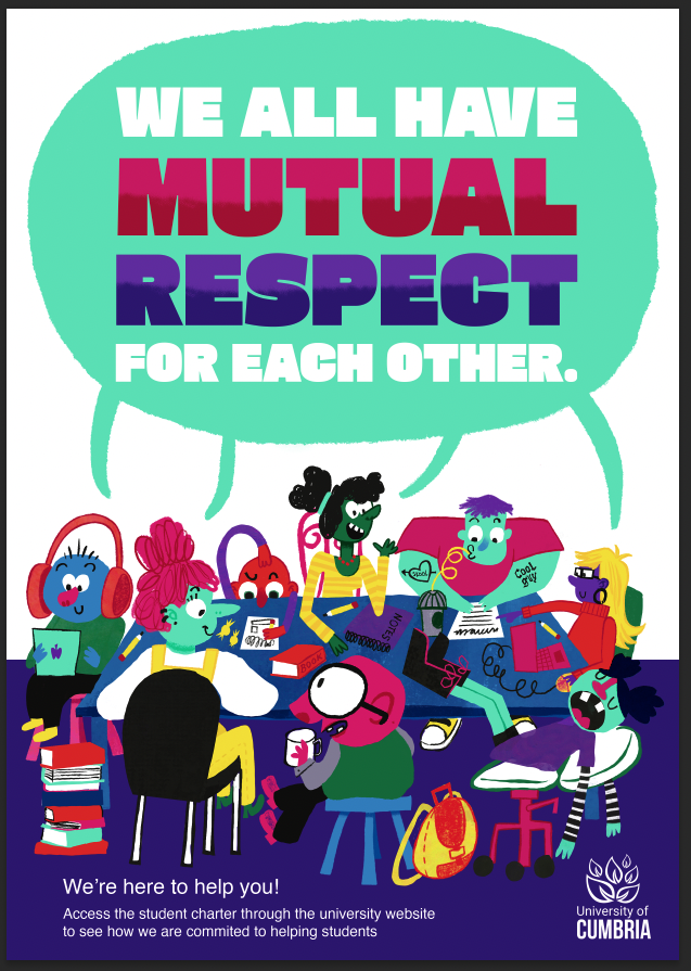
FINAL POSTER
I think this poster works really well. The text in the speech bubble is really effective.
|
|
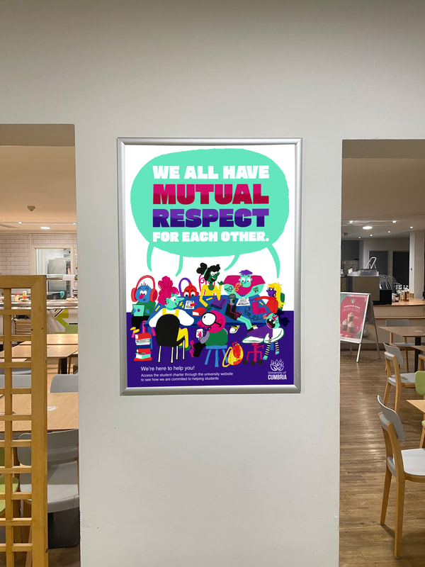
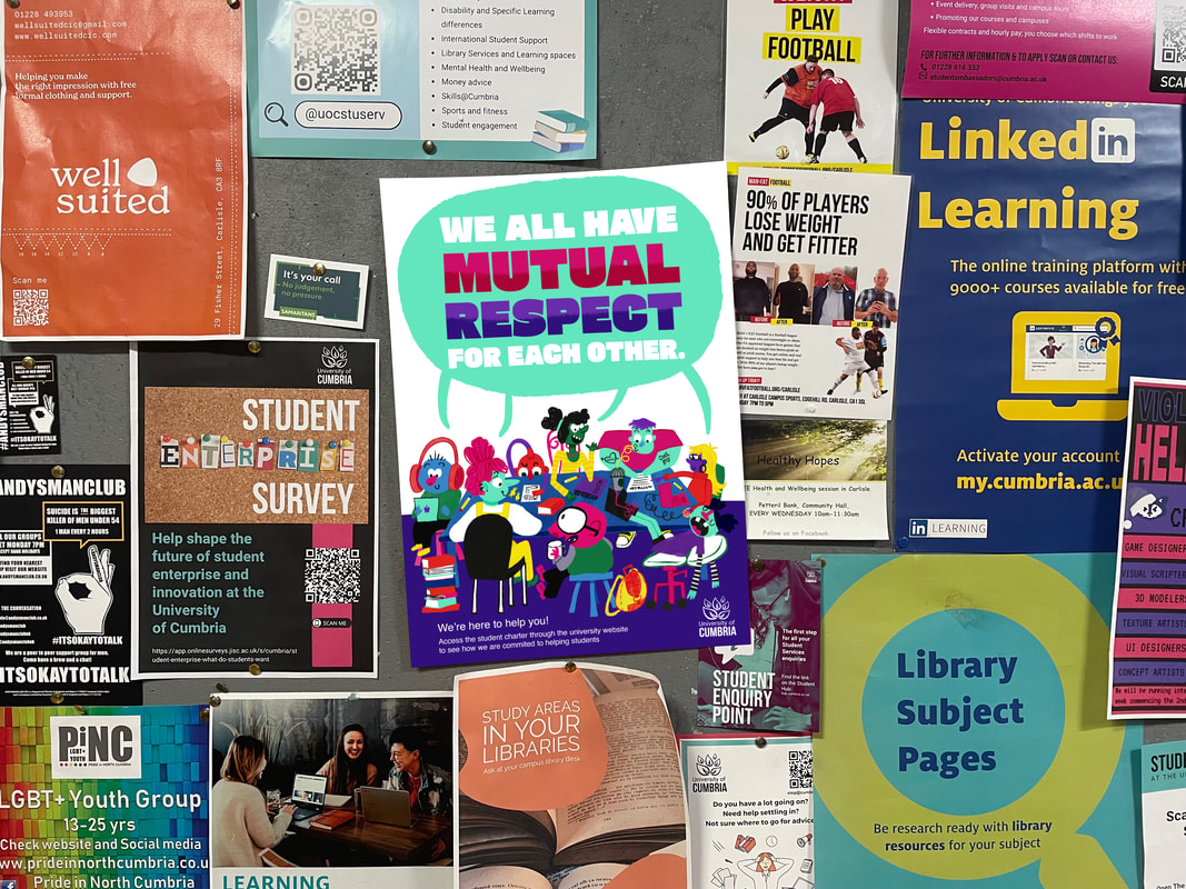
POSTER MOCKUPS
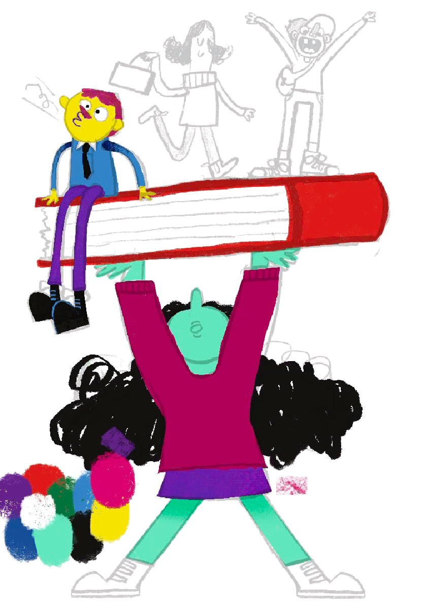
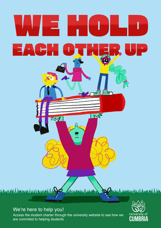
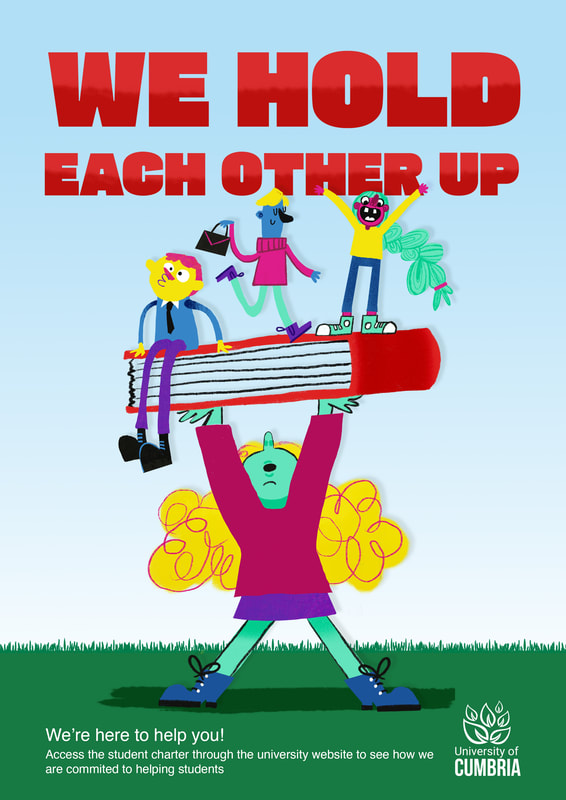
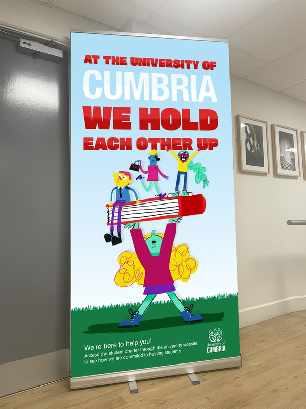
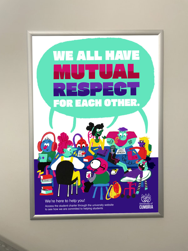
IDEA 3: WE HOLD EACHOTHER UP
I want to make an illustartion showing that students support each other
DEVELOPMENT
This shows the sketch to final design
|
|
|
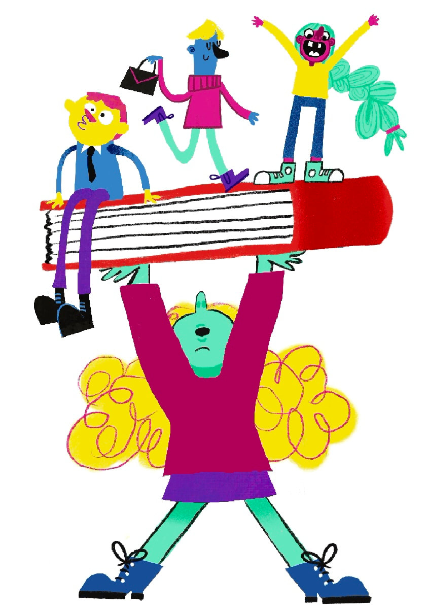
FINAL ILLUSTRATION
DEVELOPING ILLUSTRATION INTO POSTER
I used a gradient in this final design to link the white and blue backgrounds of the other two posters.
|
|
|
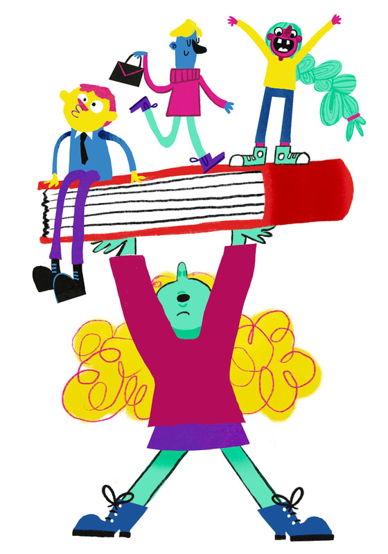
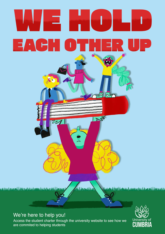
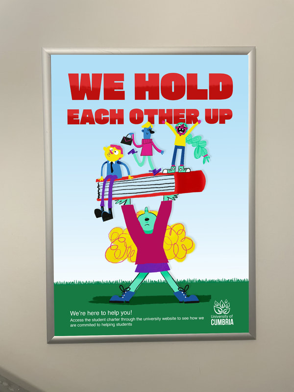
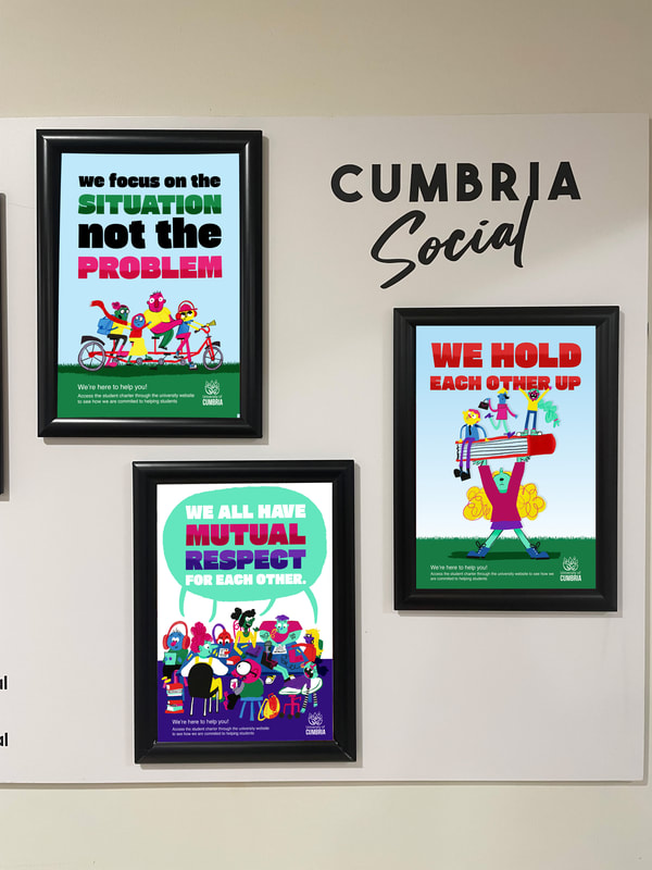
MOCKED UP AS A POSTER
This shows the mock up of the "hold eachother up" poster with the other two posters together. This shows them as a set and how they wokr toegther.
|
|
ADAPTING TO BE USED AS A BANNER
I thought this poster would work well as a banner due to its vertical composition. I mocked up the banner in photoshop by overlaying my work over the Wildlife Media banner at Uni. If the uni was to use this, the font for "CUMBRIA" would be the same as the font from their logo.
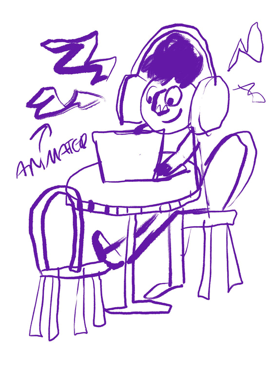
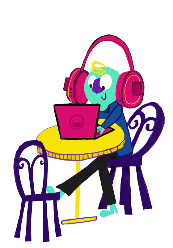
IDEA 4: WORKING HARD
SKETCH
This illustration was really quick to make. I've included the time lapse below.
youtube.com/shorts/I5-a7tsCARE?feature=sharedhttps://youtube.com/shorts/I5-a7tsCARE?feature=shared
I want an illustration that shows a single student working. This is the kind of illustration that can be used in lots of different ways.

FINISHED ILLUSTRATION AND GIF
I looked a Fred Blunt's work a lot for this illustration. I turned it into a really simple GIF so it could add a bit of intrest if used on the web.
|

|
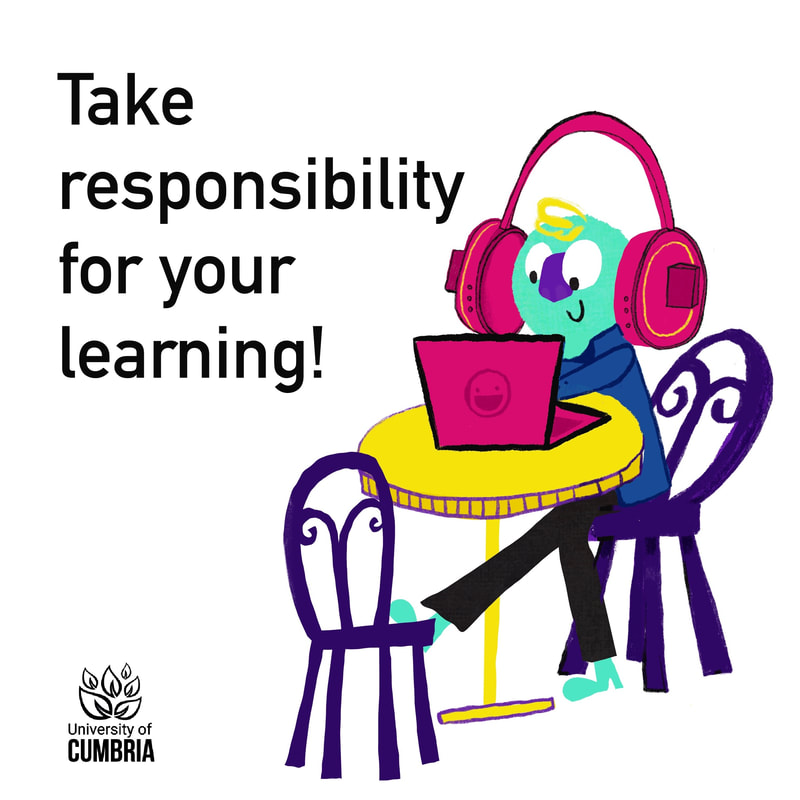
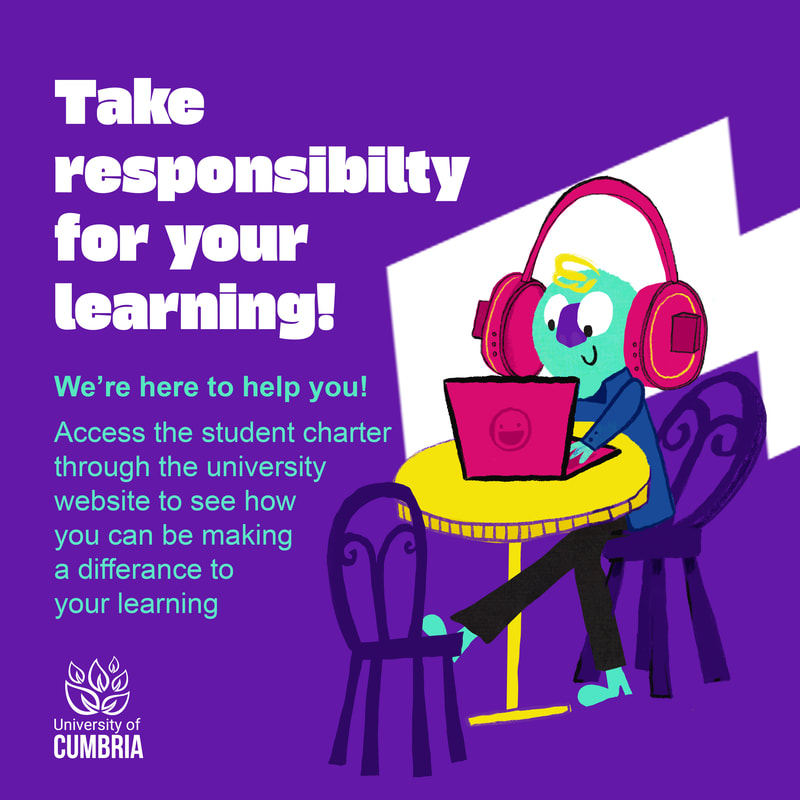
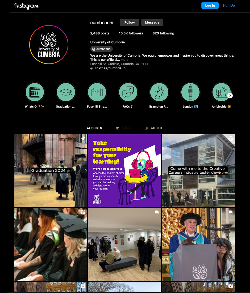
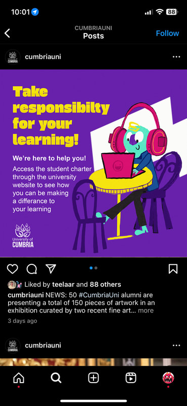
ADAPTING FOR A SOCIAL MEDIA POST
This shows the development of using the illustration in an example of a social media post. I used the same design method as the posters to create a uniform design language.
DEVELOPMENT
|
|
|
EXAMPLES OF IT USED IN CONTEXT ON INSTAGRAM
|

|
FINAL GIF

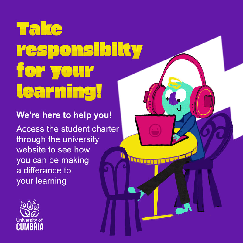
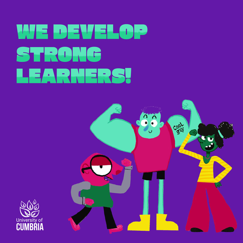
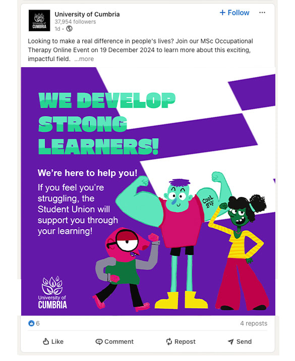
IDEA 5: STRONG LEARNERS
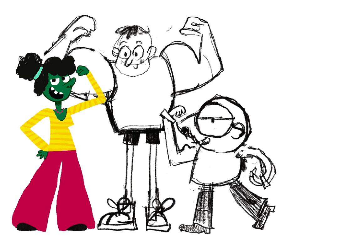
SKETCHES

|
|
DEVELOPMENT

|
|
FINAL SOCIAL MEDIA POST
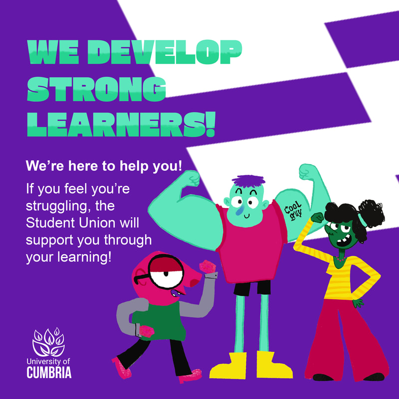
|

|
ASSETS FOR STUDENT CHARTER WEBSITE
I want to create a couple of illustrations that could be added to the uni website.
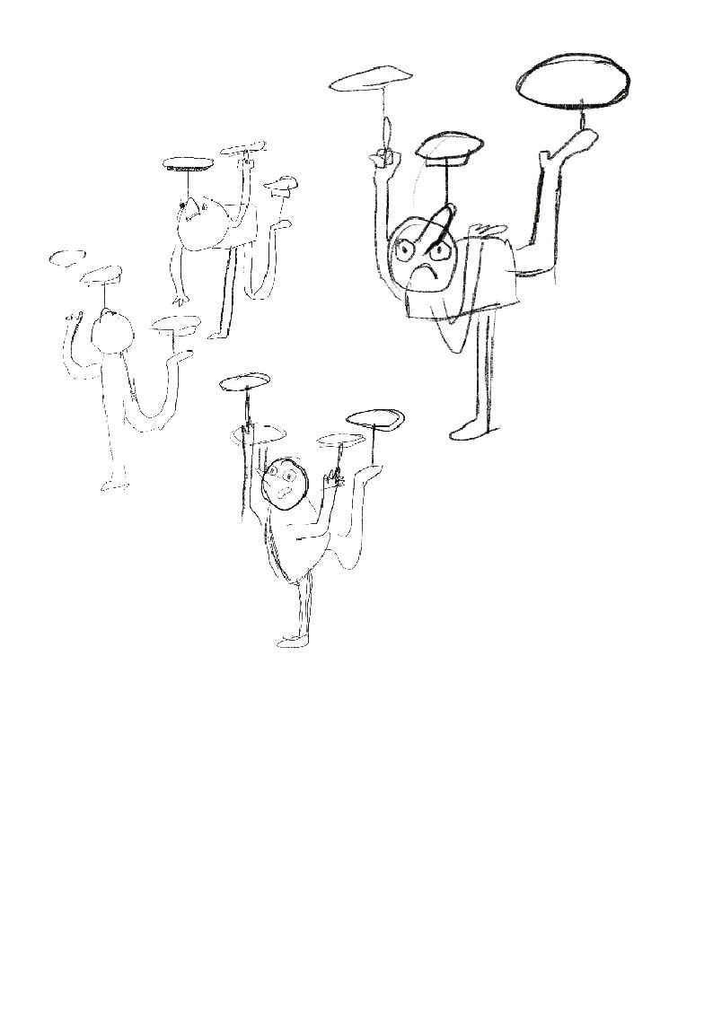
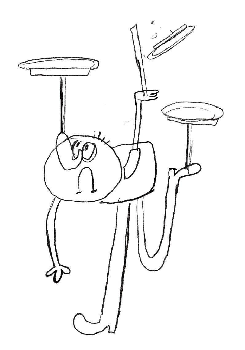
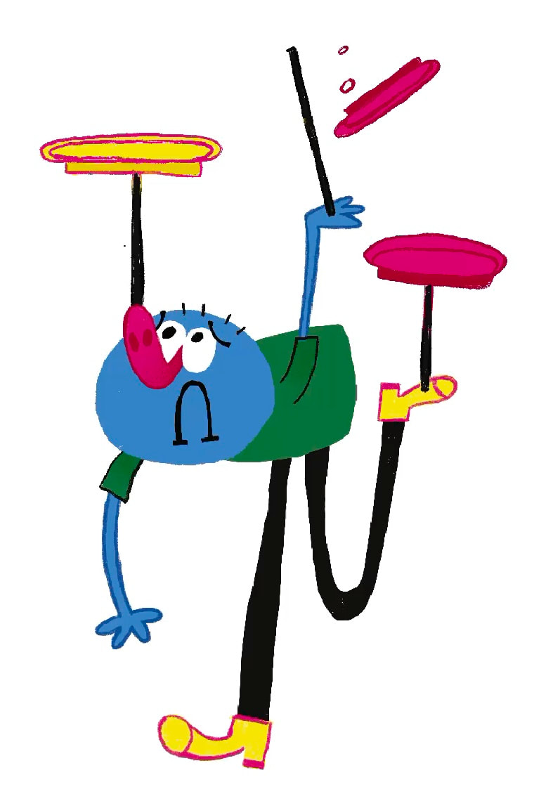
IDEA 5: SPINNING PLATES
I want to illustrate the ideas of students "spinning plates"
DEVELOPMENT
|
|
|
|
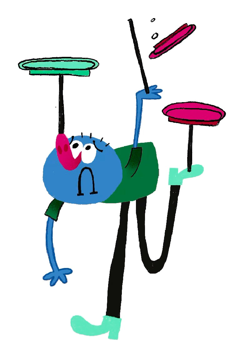
FINAL ILLUSTRATION ELEMENT

ILLUSTRATION ILLUSTRATION IN CONTEXT

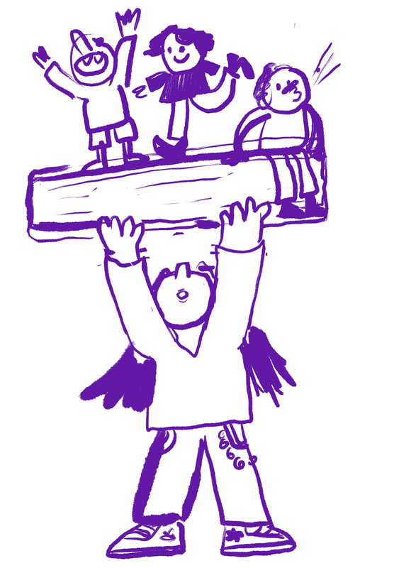
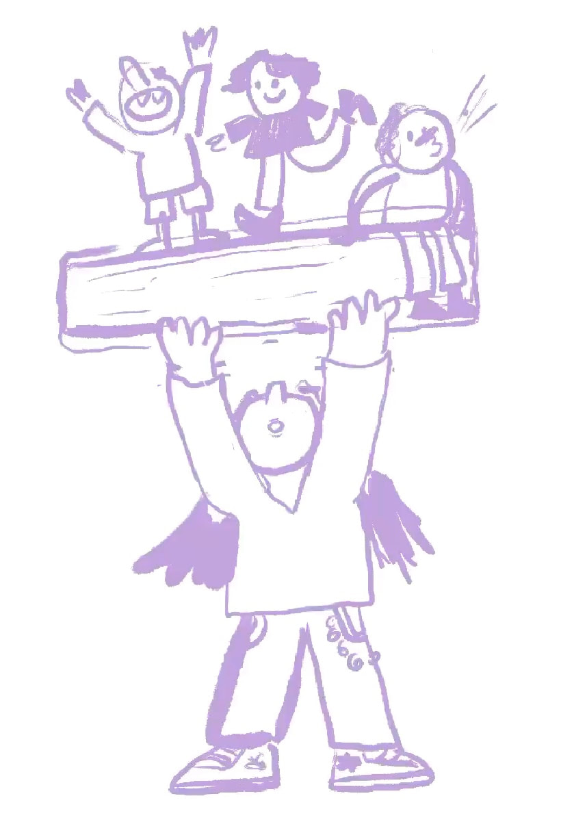
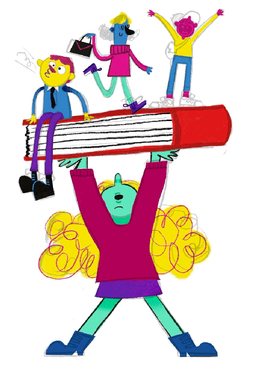
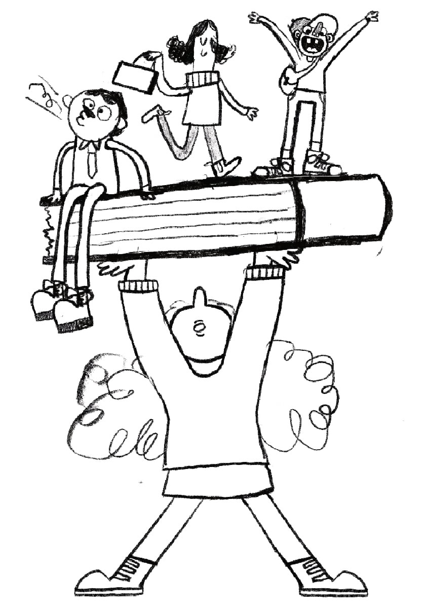
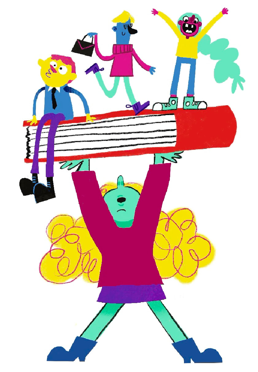
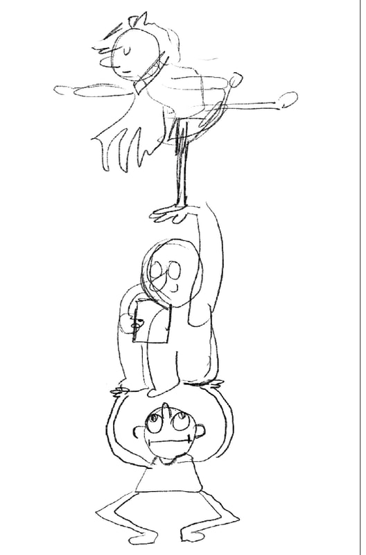
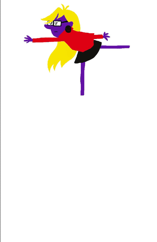
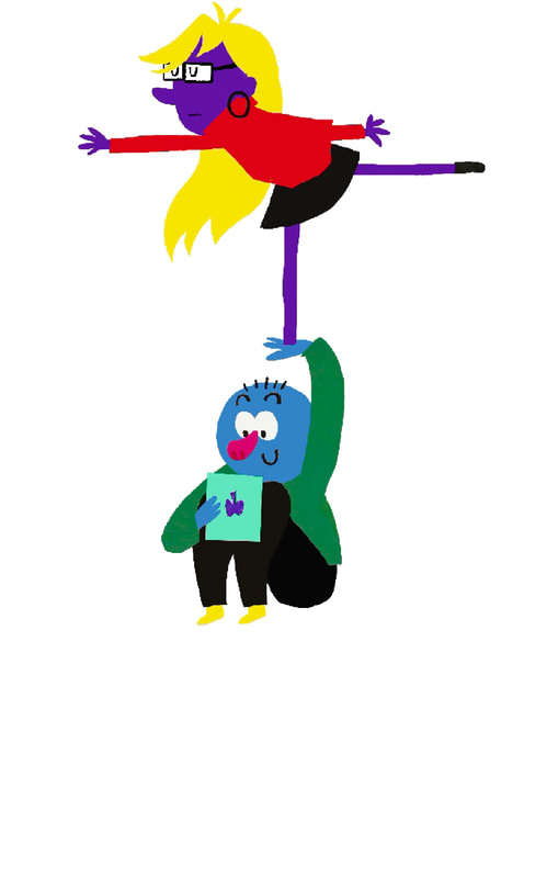
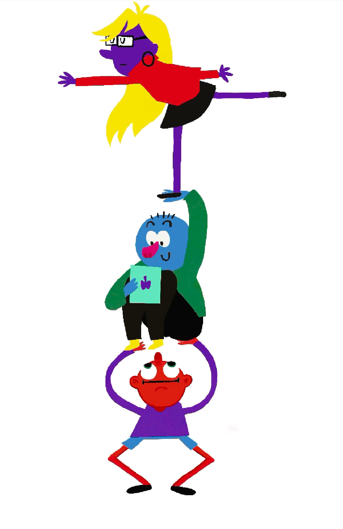
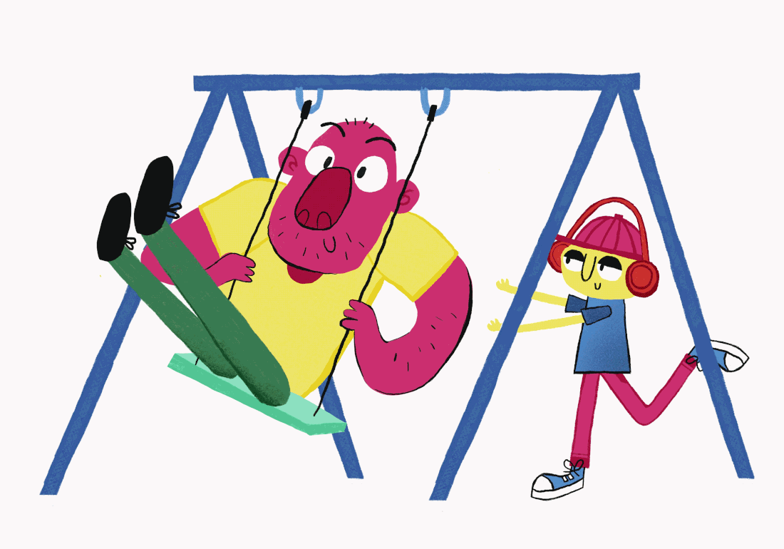
IDEA 6 : PEOPLE TOWER
DEVELOPMENT
|
|
|
|
FINAL ILLUSTRATION
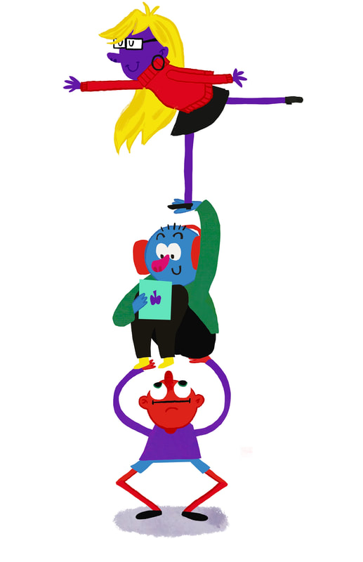
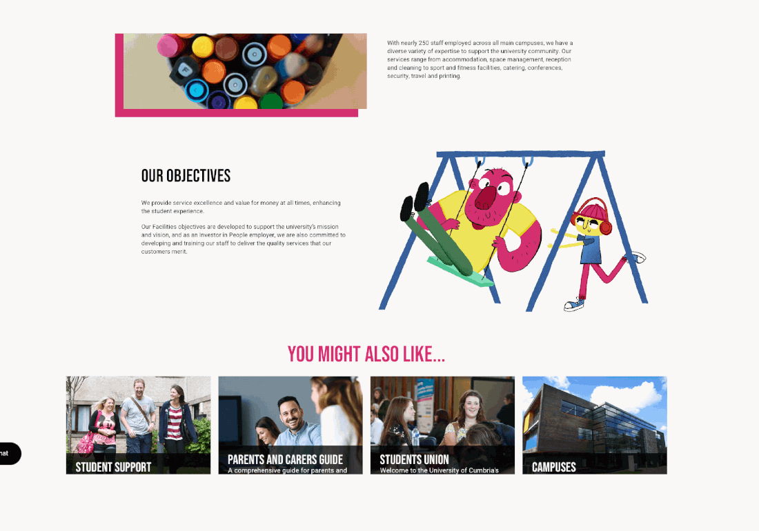
ILLUSTRATION IN CONTEXT ON CHARTER WEBSITE

IDEA 8: WE WORK TOGETHER
SKETCHES
|
|
|
DEVELOPMENT
FINAL ILLUSTRATION
FINAL ILLUSTRATION IN CONTEXT
IDEA 8: GETTING ALONG
I want to create another illustration that shows students getting along together
|
|
DEVELOPMENT
|
|
|
FINAL ILLUSTRATIONS AND GIF

|
|
ILLUSTRATION IN CONTEXT
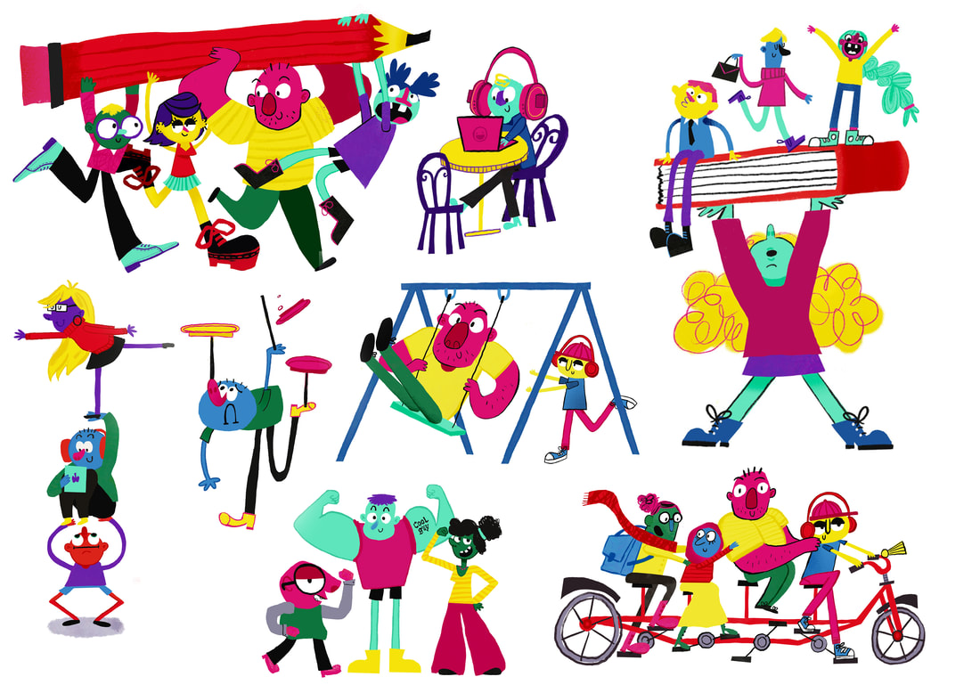
ALL FINAL ASSETS
ALL FINAL IN CONTEXT ILLUSTRATIONS

|
|
|

|
|
|
FINAL OUTCOMES MOCKED UP
|
|
|
|
|
|
|
|
|