What's the brief?
Create and 8 page comic in response to the nursury rhyme "Little Tommy Tucker". I must be structured using the 9 panel grid and there should be no less than 3 panels on any single page. Text should be legibly included within the comic with no additional text permitted (other than onomatopieic sound effects).
artist Research
I reserached two artists for this brief, Quentin Blake and Briony May Smith but I took most inspirtaion rom Briony May Smith and the comics she makes for her Instagram. I also created a Pinterest board of work that inspired me throughout the creation process found here: https://pin.it/5H7fP6l

|

|
initial design development
I utlised my digital sketchbooking to create fast and legibale notes documenting the inital ideas phase. I first began looking at the key words from the nurusry rhyme and mind mapping ideas I got from it and thinkng of word asssociation. After deciding on wanting on the idea of making Tommy Tucker small in scale, I had a look at other works that have small characters such as the Borrowers and the game Little Nightmares. I decided to make the main setting of the comic a kitchen, so I collected primaryimagrey of kitchens to use as refernace, using them to make concepts and colour studies for the background. I then started exploring possible character designs for Tommy and cover deisgns for the comic.

|

|

|

|
Concept art
Here are the main concept pieces in larger scale to view.


|

|

|
Thumbnails
I moved on to thumbnailing. I made multiple sets of thumbnails and experimented with different narratives and camera angles within them.
Thumbnail Storyboard One:
Thumbnail Storyboard One:

|

|

|
I enjoyed the action in this thumbnail set but found that I was squishing too much content into the eight page format. I found the narrative wwas confused and didn't work to well. However, some pannels such as the close up on eyes I found interesting and would develop upon in the next set of thumbnails.
Thumbnail Storyboard Two:

|

|

|
I found this set a lot easier to follow, with the action following the narrative of the rhyme a lot better. Also the inclusion of the other character added more intrest to the story. I included more close up shots in this section as I liked how I used them in the previous set. I procceded with this idea and developed it further.

|

|
These are the digital sketchbook pages I made developing the thumbnails

|
final artwork
This is the final artwork of the comic, without the text implimented. The inspiration from Briony May Smith is apparent in the colour scheme of the comic. I went with a purple and yellow palette, with the use of purple only used to highlight the characters amongst the yellow background and create focal points, whihc I find really effective. I also utalised the ue of texture within the illustrations, using a textured brush and cross hatching to create a grain to the work and give it a hand draw effect ven though the work is digital. I used a combination of solid black and lined pannel borders to create visual intrest and add extra elements to the design. I used stripes as a continuing motif in the comic itself and continued it in the back and front cover, making them seem unified and less of an after thought.

|
|
|
|
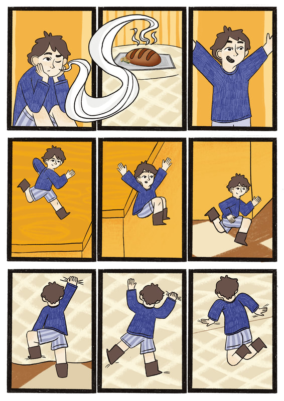
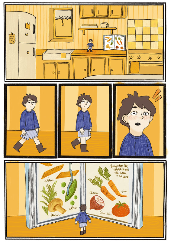
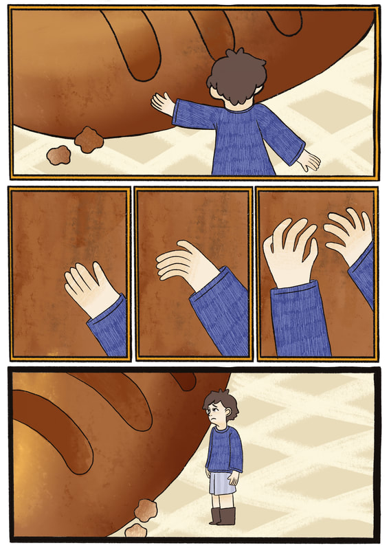
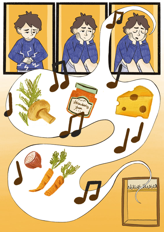
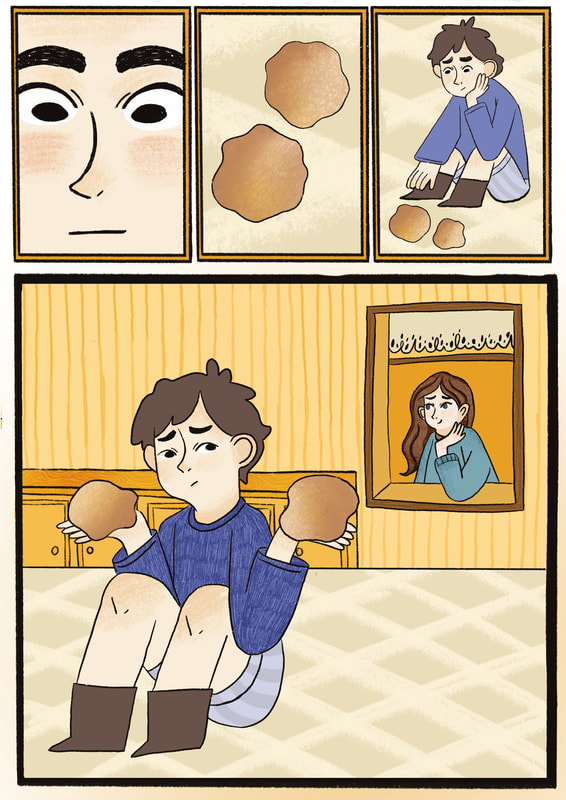
final comic
I used a legible, comic friendly font for the bodycopy in the comic called Courier. This kept with the children's book theme while also being easy to read. I also used a simple sans serief font for title and written by portion. I used the wrap text function to curve the text into the side of the shape of the plate, helping aid the composition.
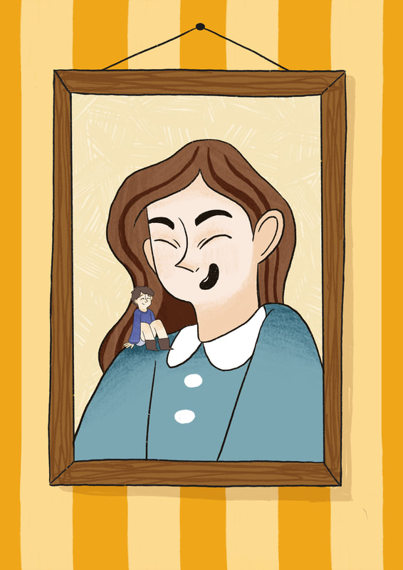
One of the weaker areas of the work I would change of I did this again would be the implications for the maternal figure. I wanted her to come of as a matronly figure who looks after Tommy like a child but can be read as romantic when paired with the "wife" part of the rhyme.
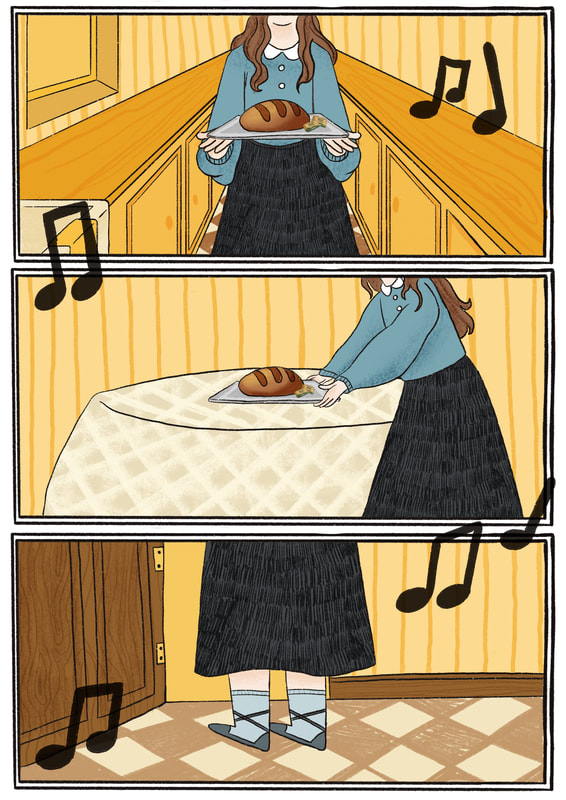
I'm very pleased with the final outcome of the comic considering I created this group project by myself. I think the flow of the pannels works very well, guiding the viewers eyes in an organic way. I think the use of colour is also effective, the combination of yellow and pops of purple help seperate the character from the background well. The differnet illustrative style when drawing the food in the cook book helps show it's an illustration in the story which I also like.
In conculsion, I am proud of this first piece of work I have created at univeristy and hope to create more work like this in the future.
One of the weaker areas of the work I would change of I did this again would be the implications for the maternal figure. I wanted her to come of as a matronly figure who looks after Tommy like a child but can be read as romantic when paired with the "wife" part of the rhyme.
I'm very pleased with the final outcome of the comic considering I created this group project by myself. I think the flow of the pannels works very well, guiding the viewers eyes in an organic way. I think the use of colour is also effective, the combination of yellow and pops of purple help seperate the character from the background well. The differnet illustrative style when drawing the food in the cook book helps show it's an illustration in the story which I also like.
In conculsion, I am proud of this first piece of work I have created at univeristy and hope to create more work like this in the future.
Issuu link here.