WHAT'S THE PROJECT?
I am going to make an 32 page children's picture book from my own original story along with some promotional material for the project.
Project Type: Children’s Picture Book
Format: 32 pages (including cover, spine and intro pages)
Audience: Children aged 4–6
Project Type: Children’s Picture Book
Format: 32 pages (including cover, spine and intro pages)
Audience: Children aged 4–6
STORY TEXT
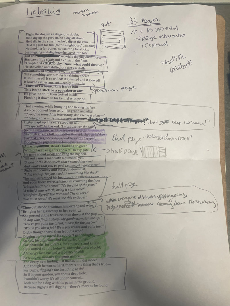
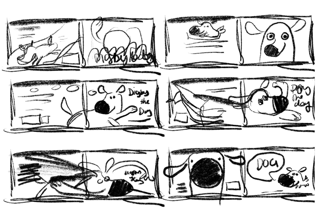
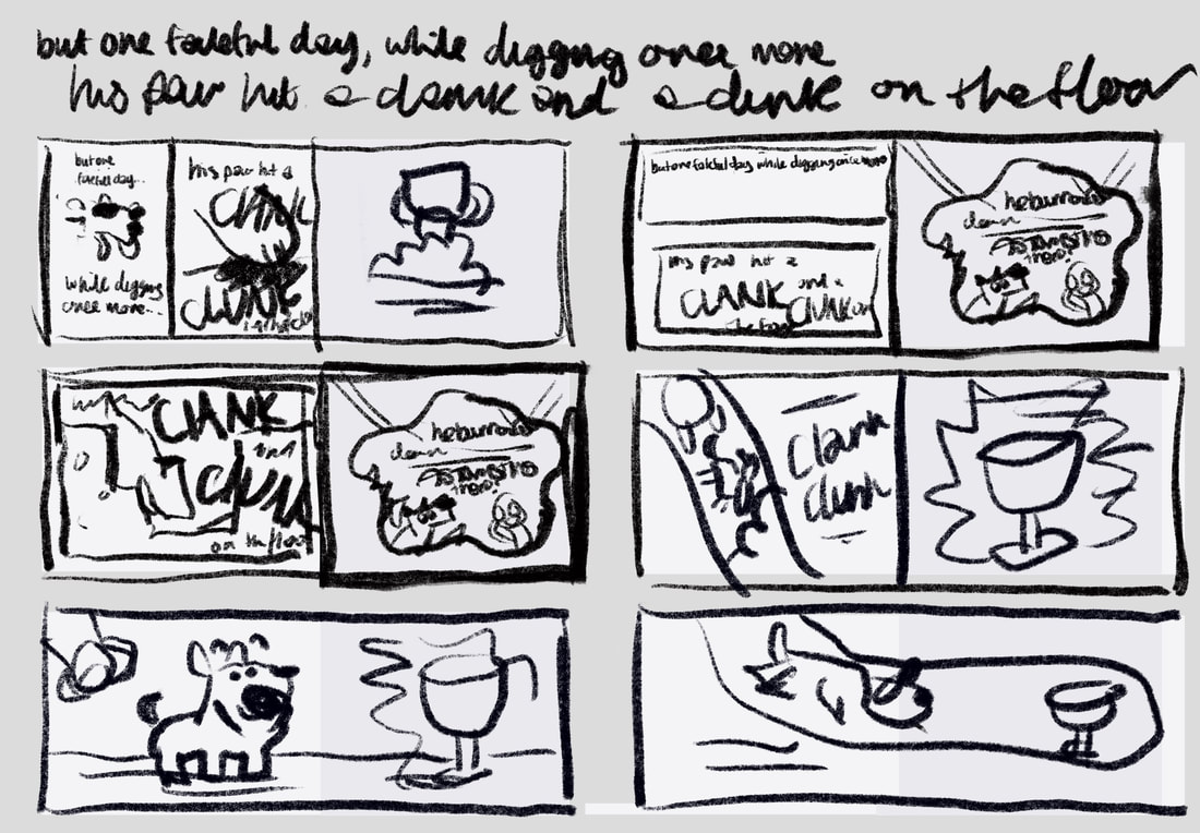
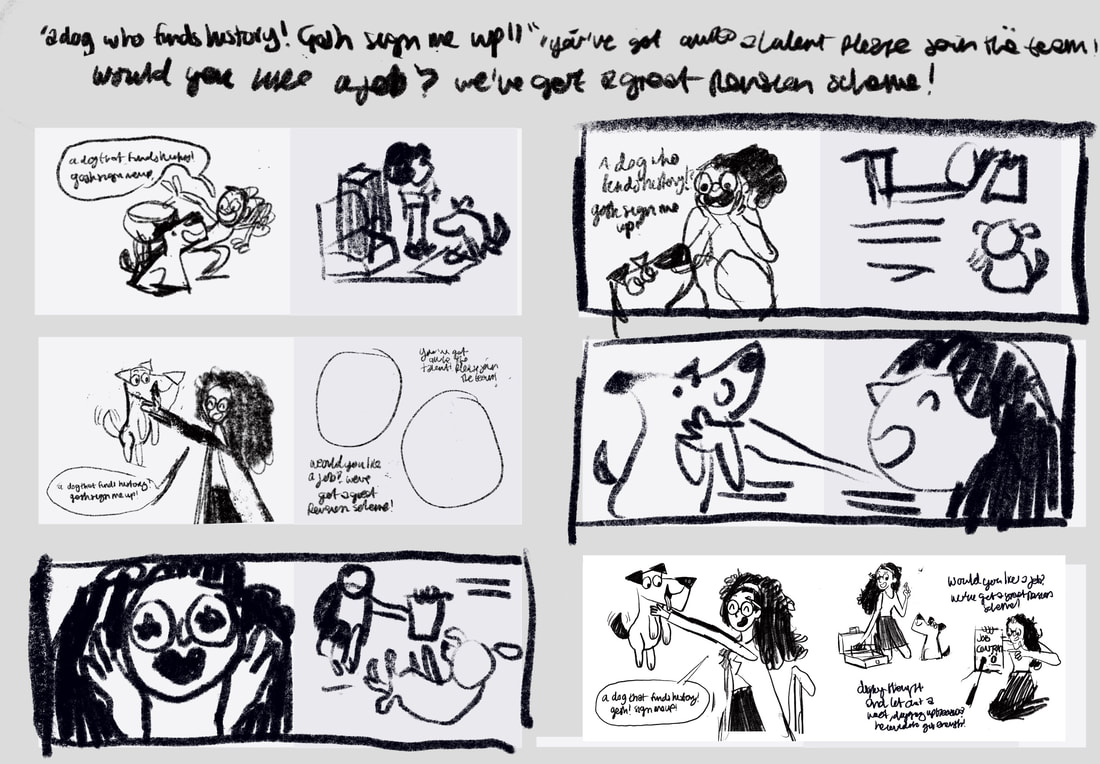
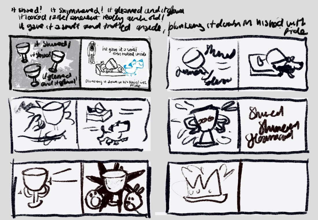
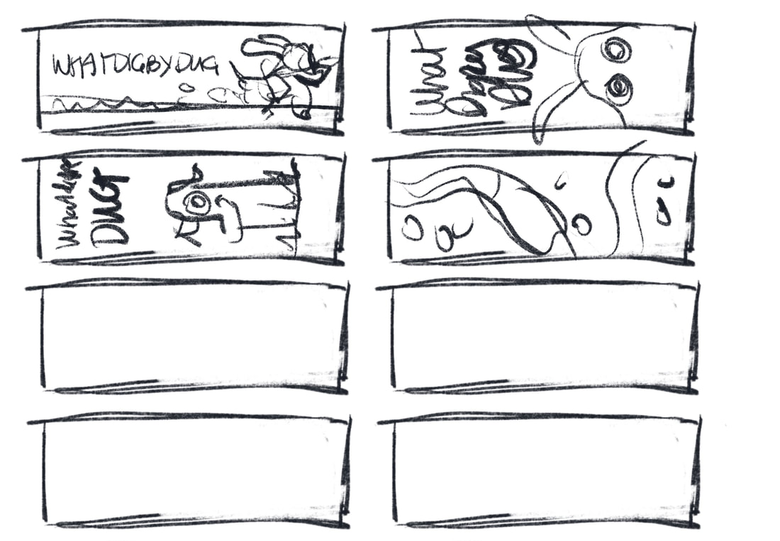
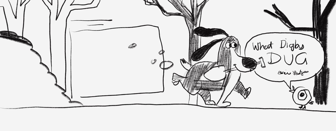
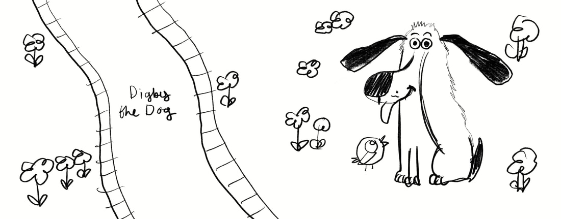
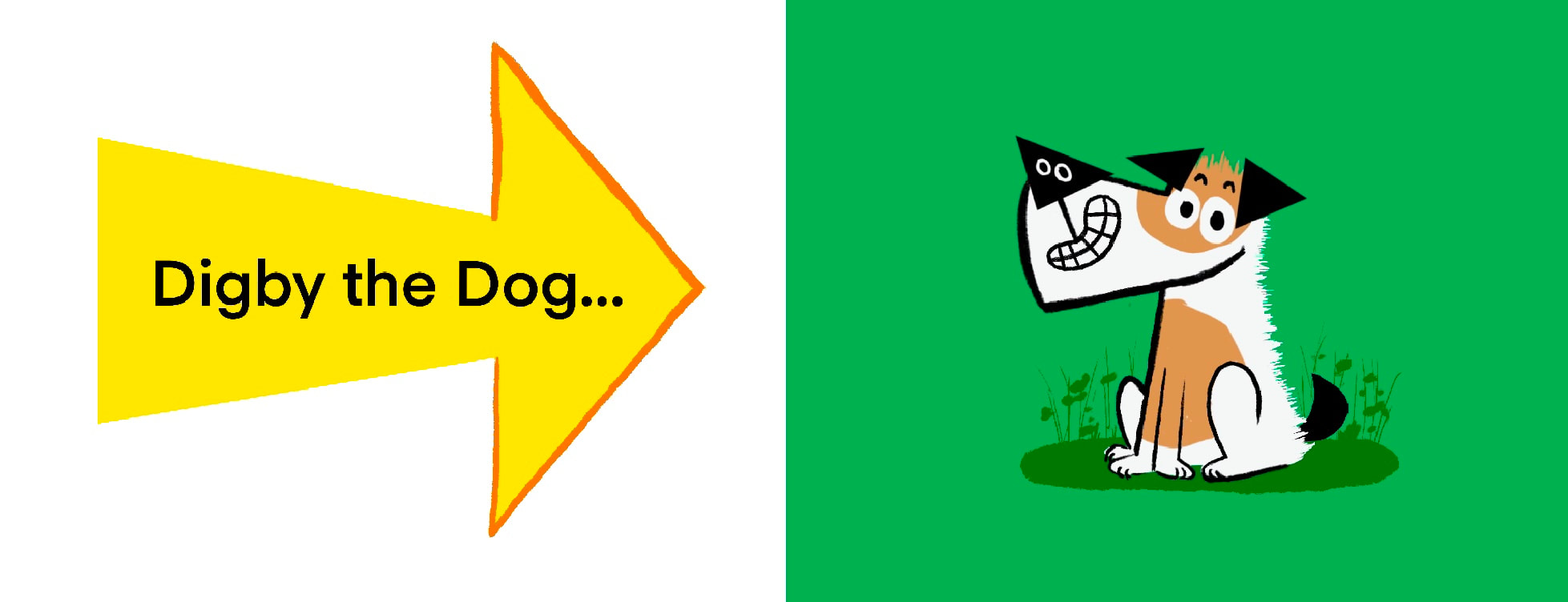
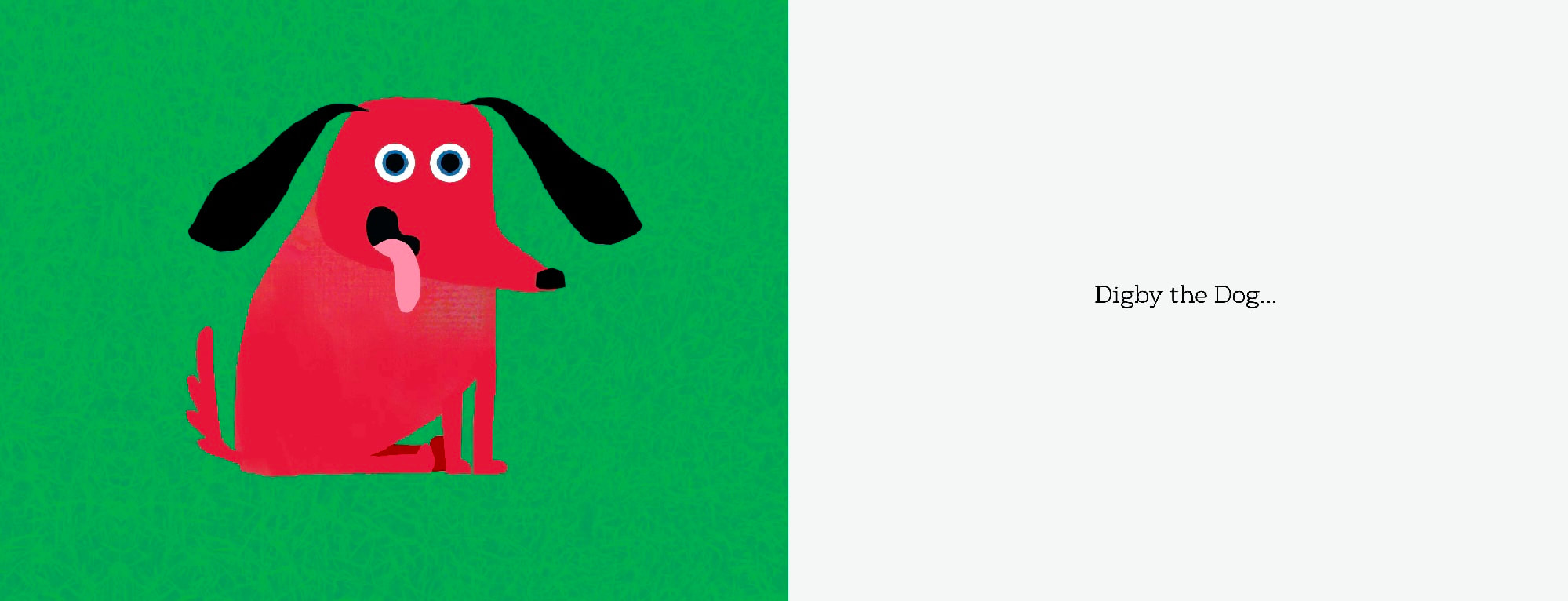
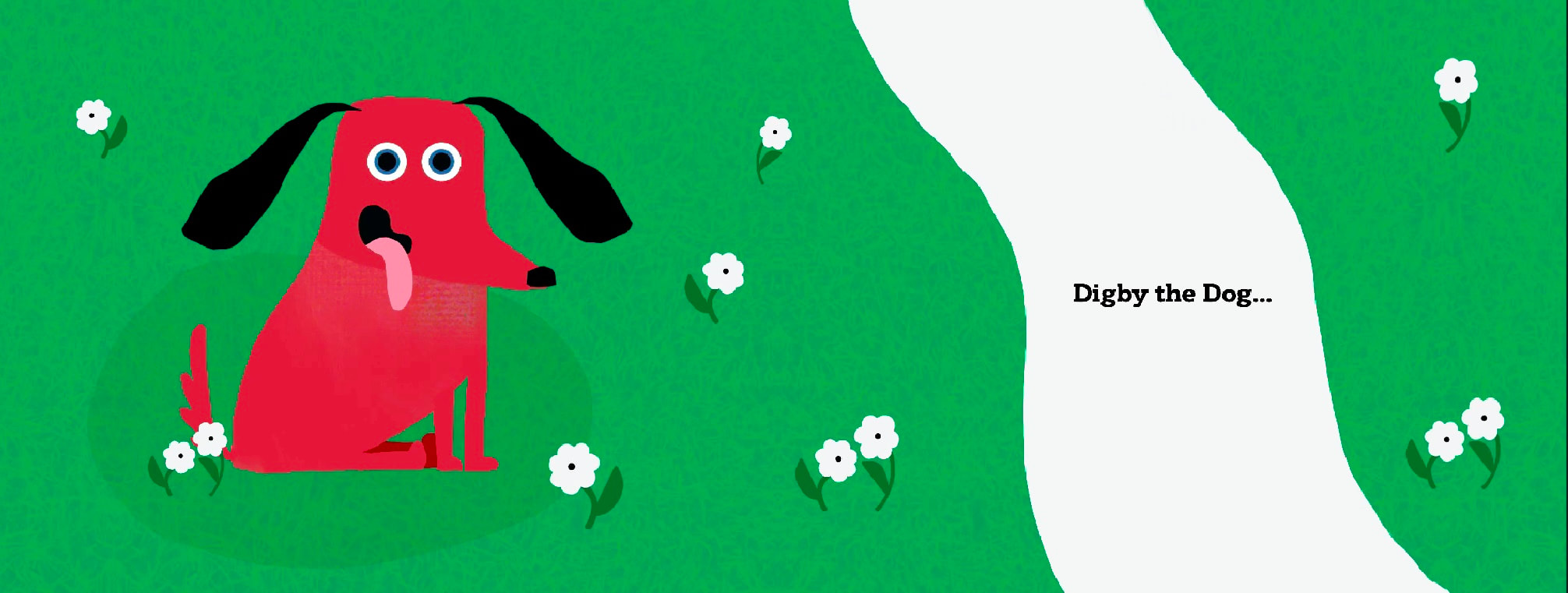
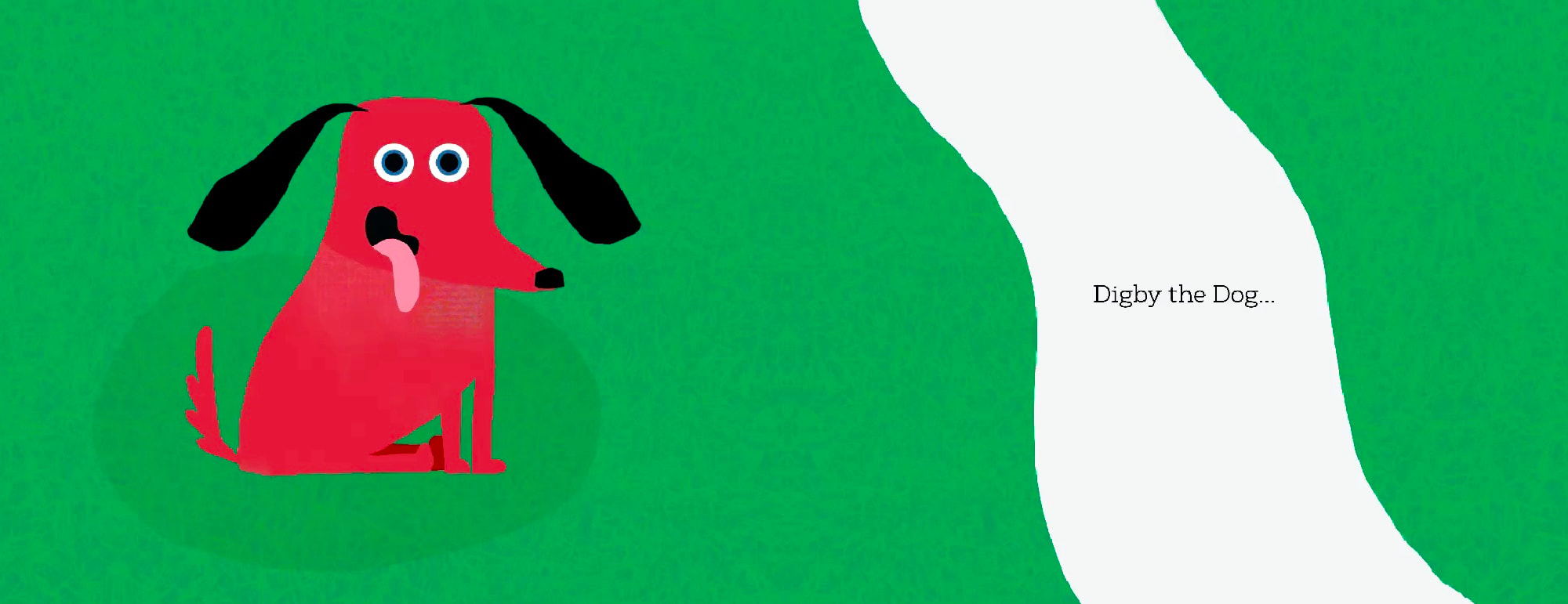
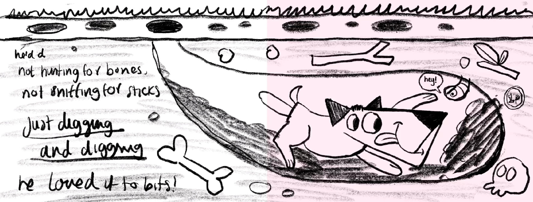
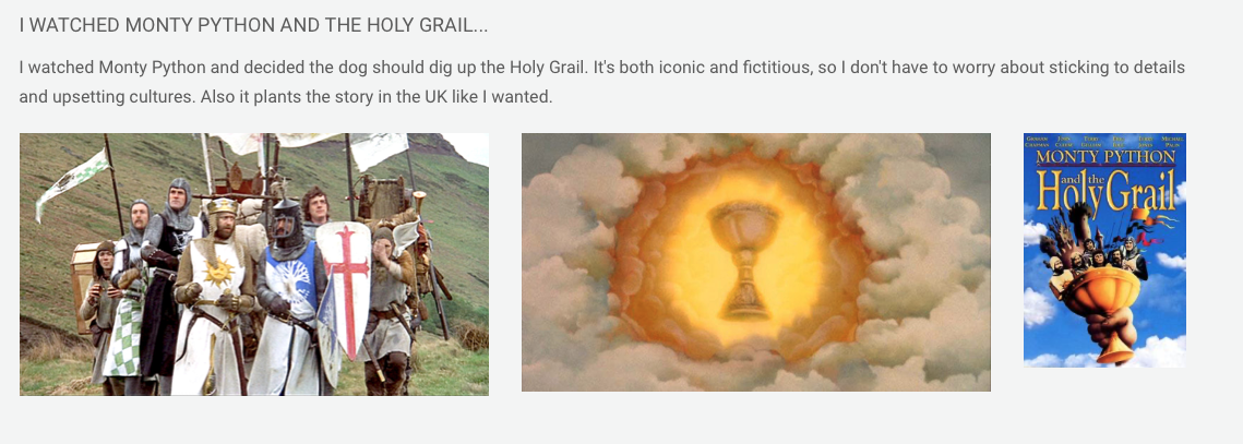
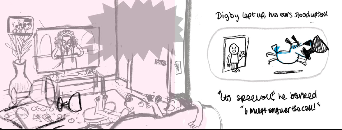
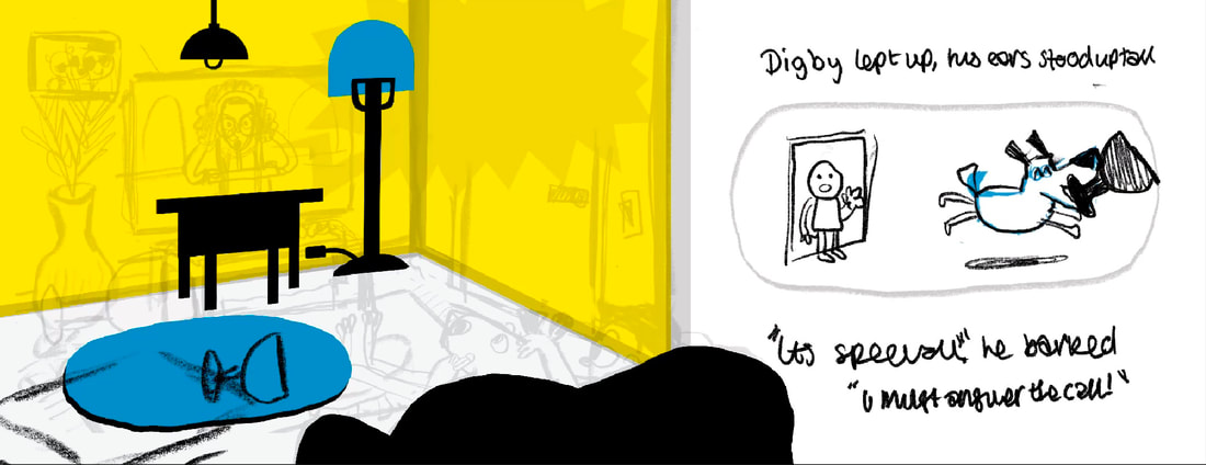
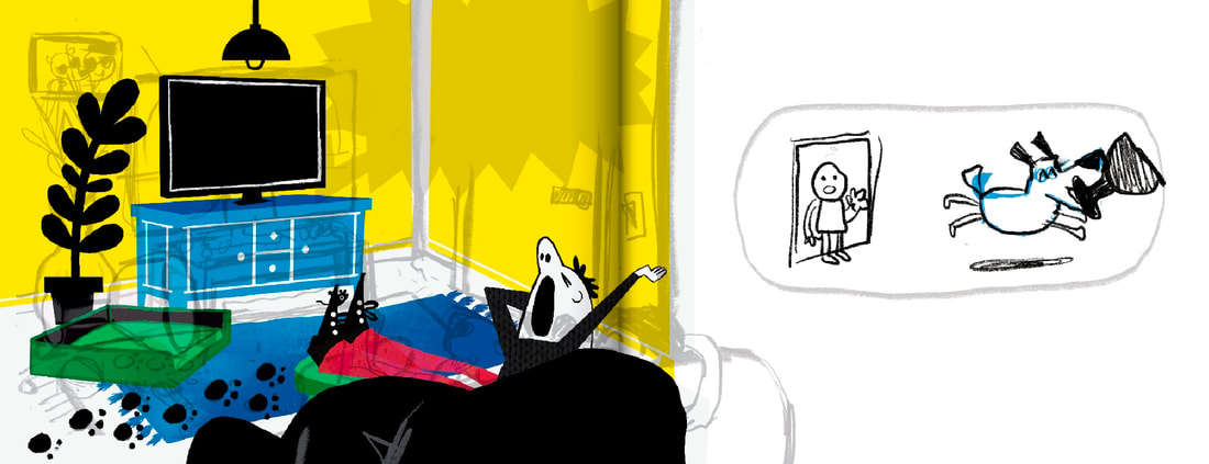
This is he story I wrote. Each highlighted section is a spread that will be illustrated. I included the piece of paper I used to plan the tsory on the left
|
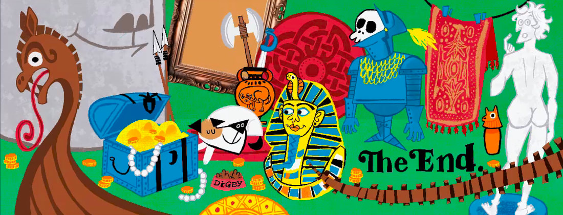
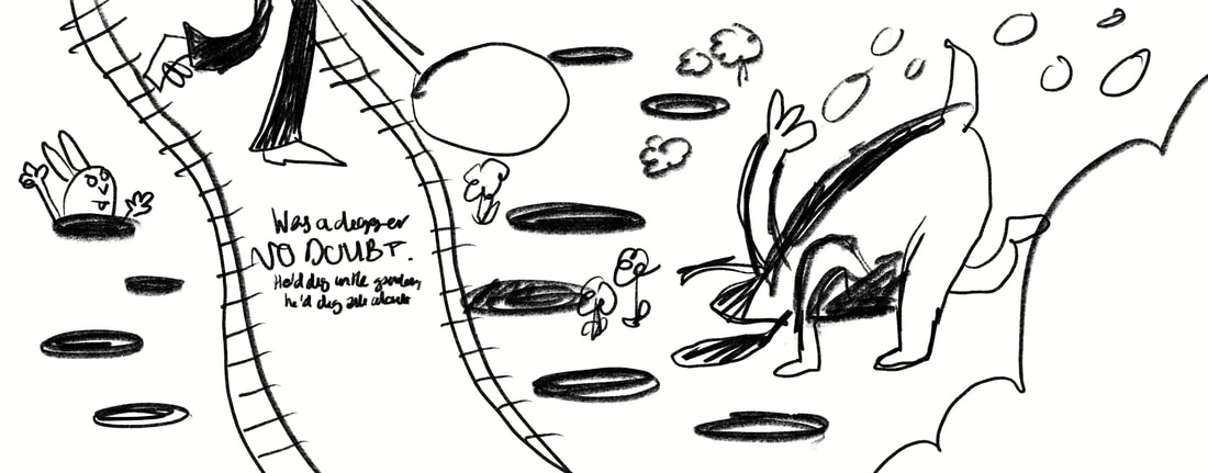
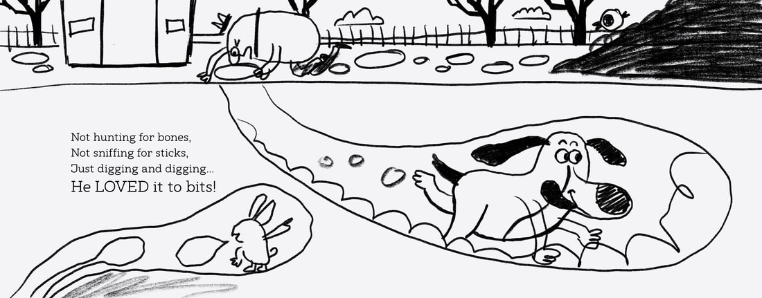
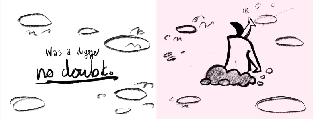
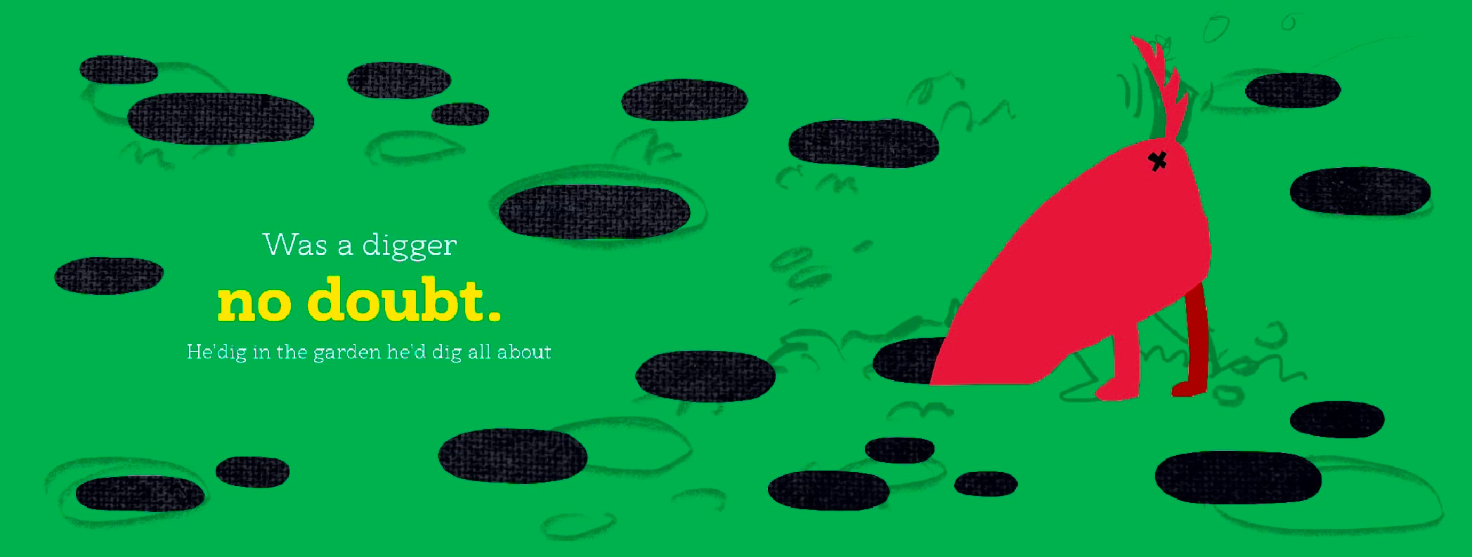
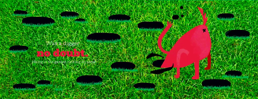
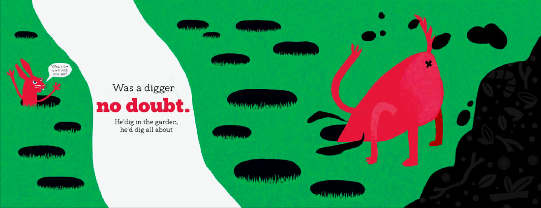
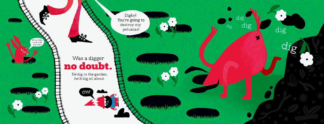
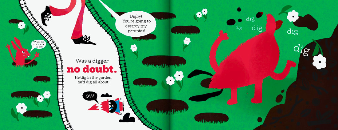
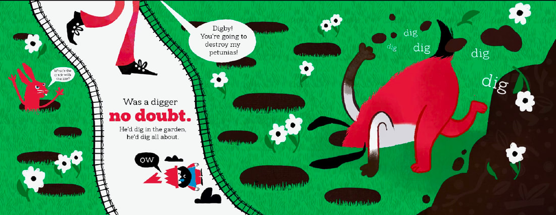
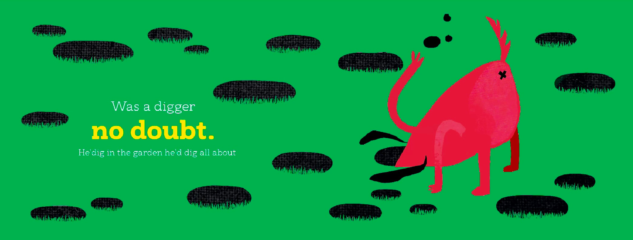
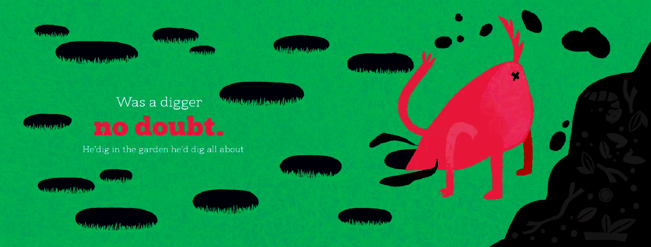
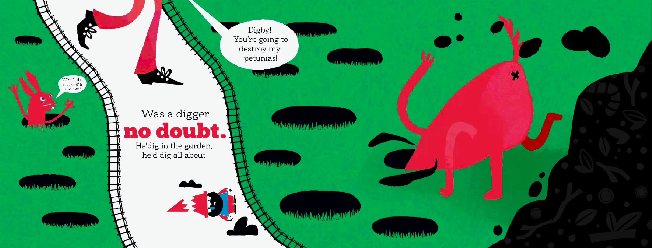
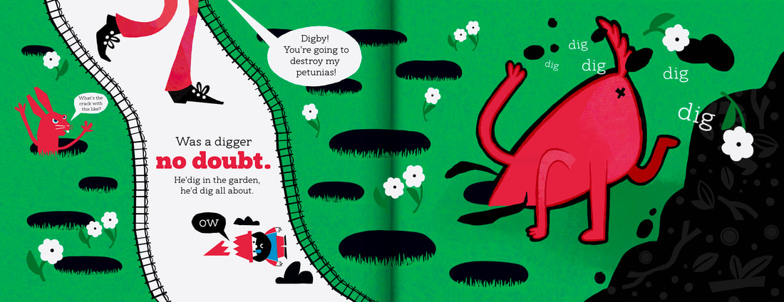
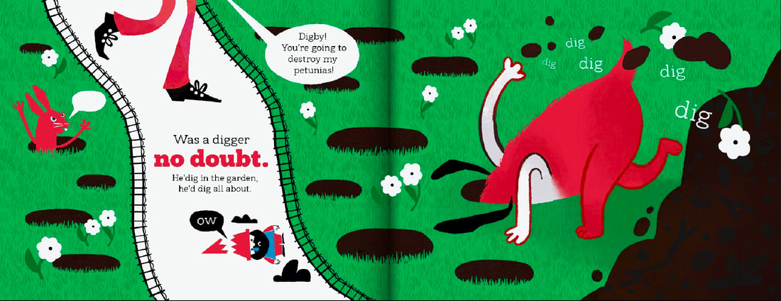
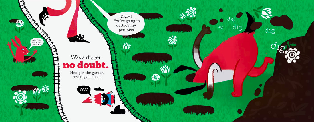
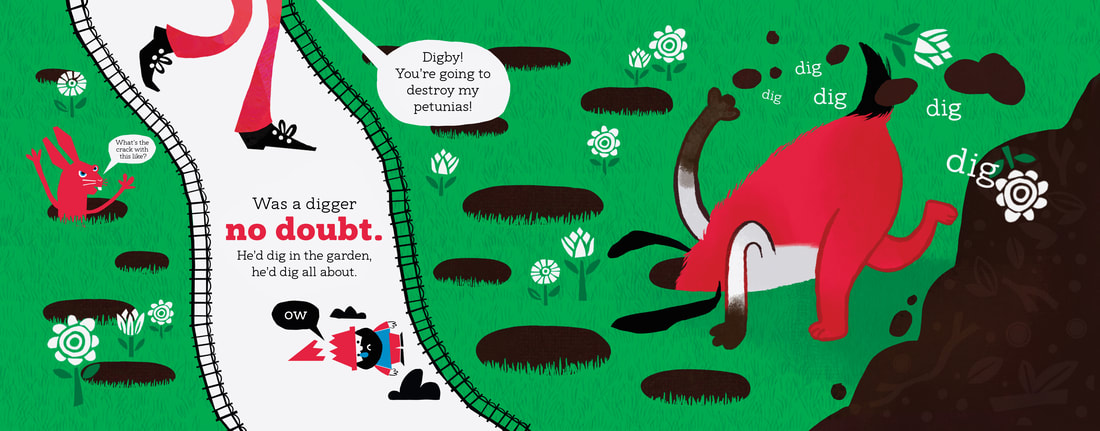
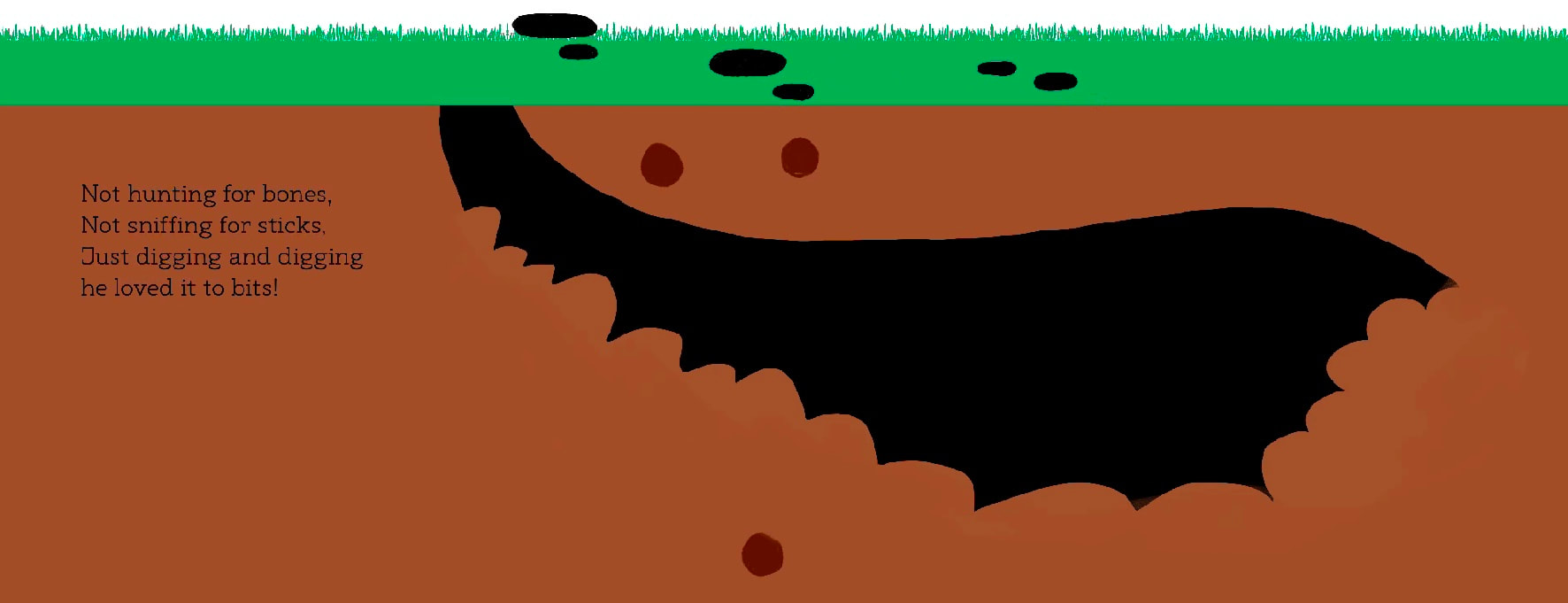
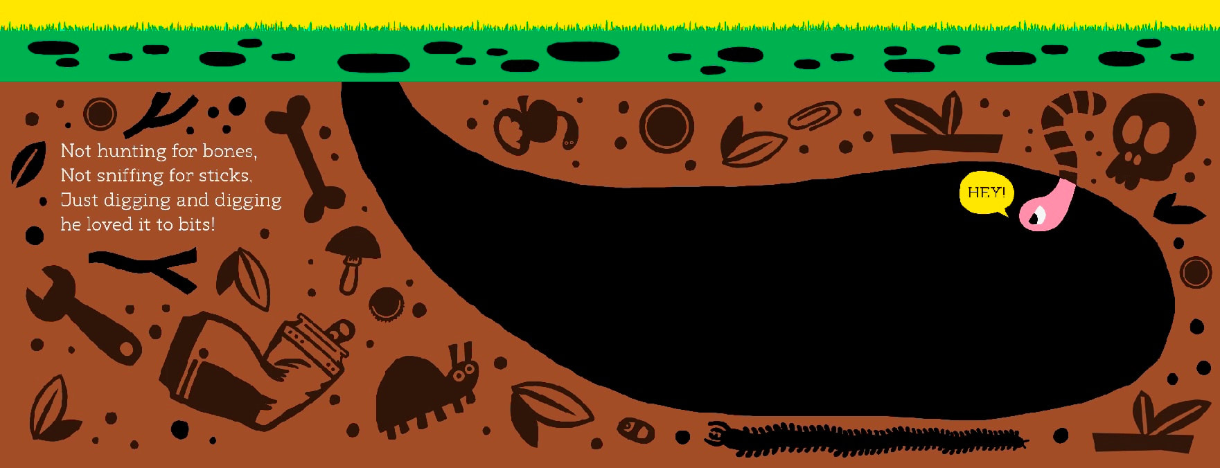
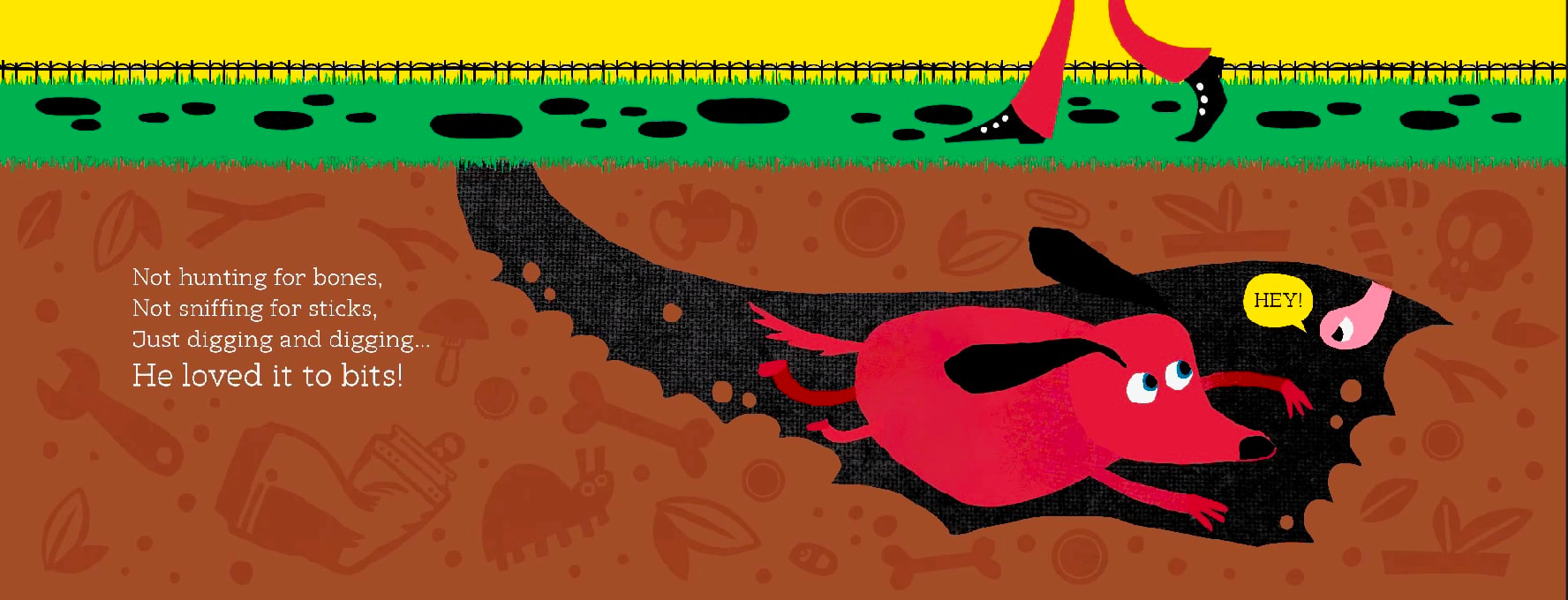
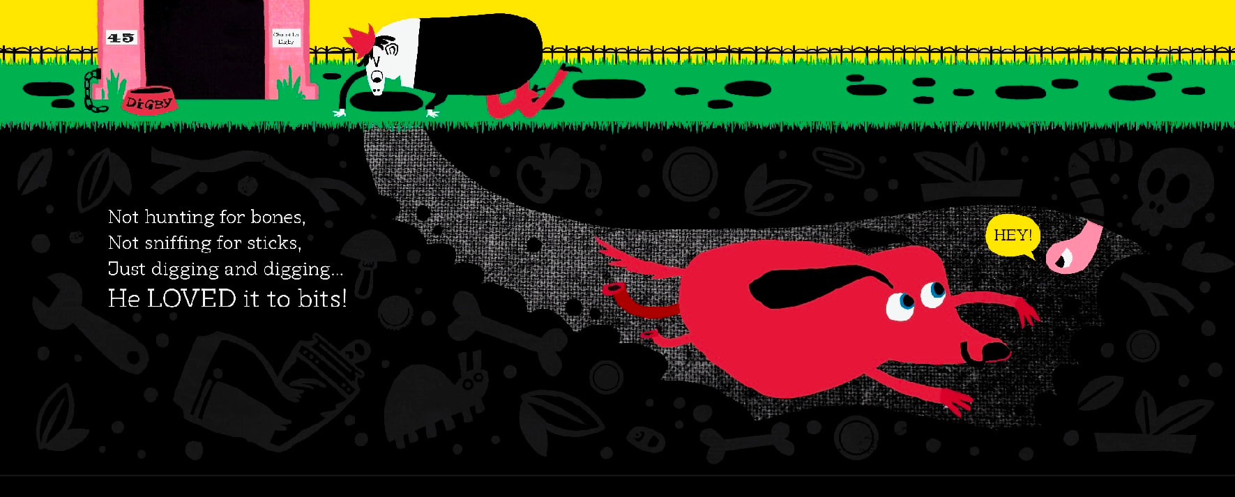
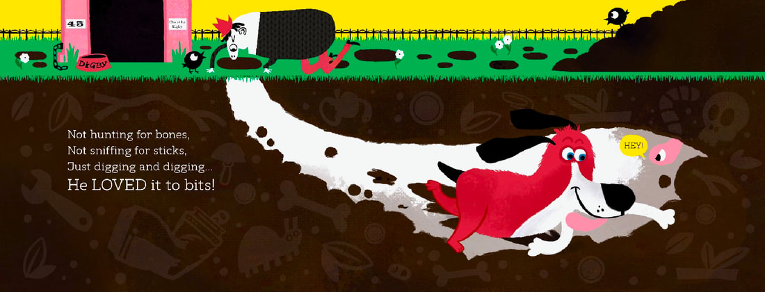
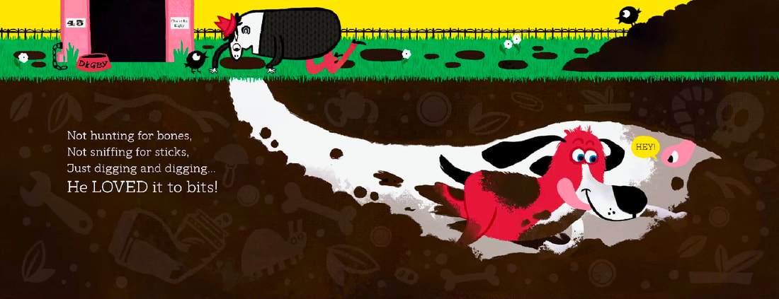
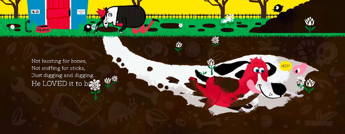
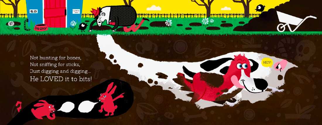
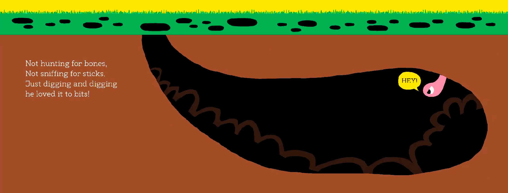
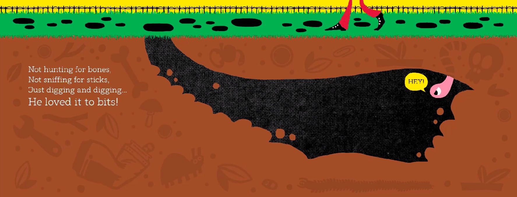
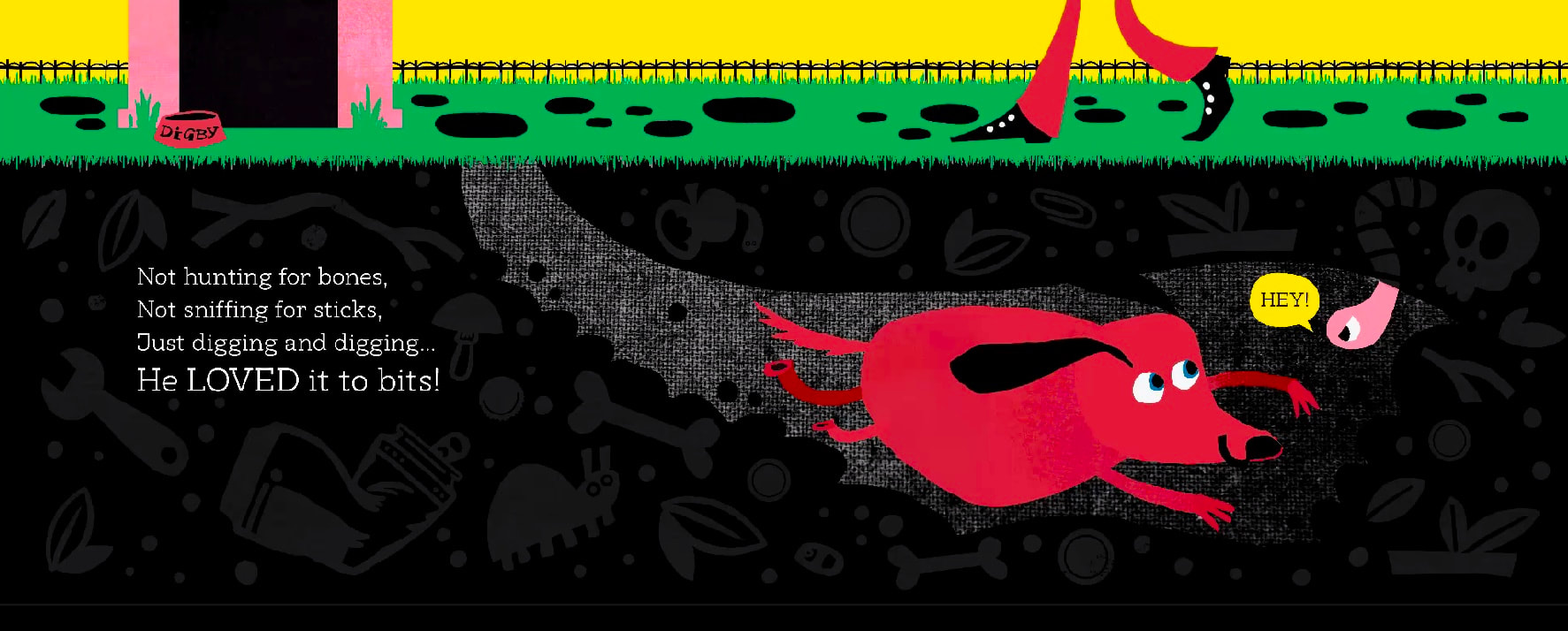
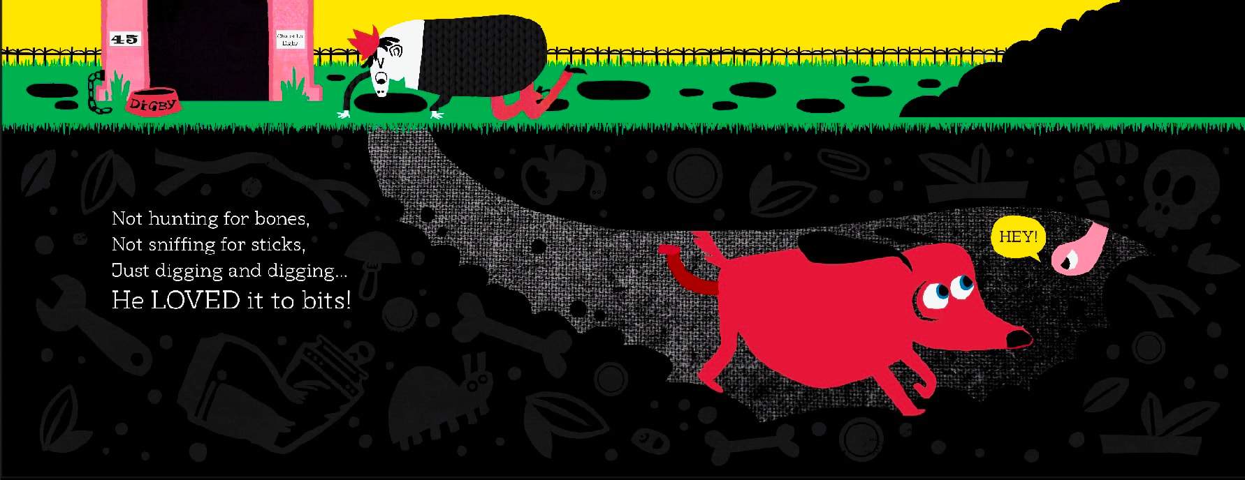
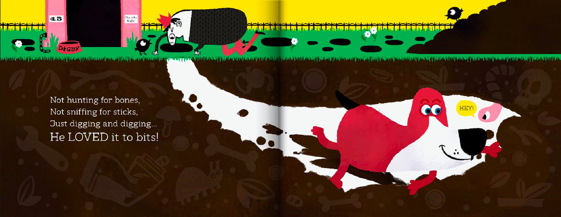
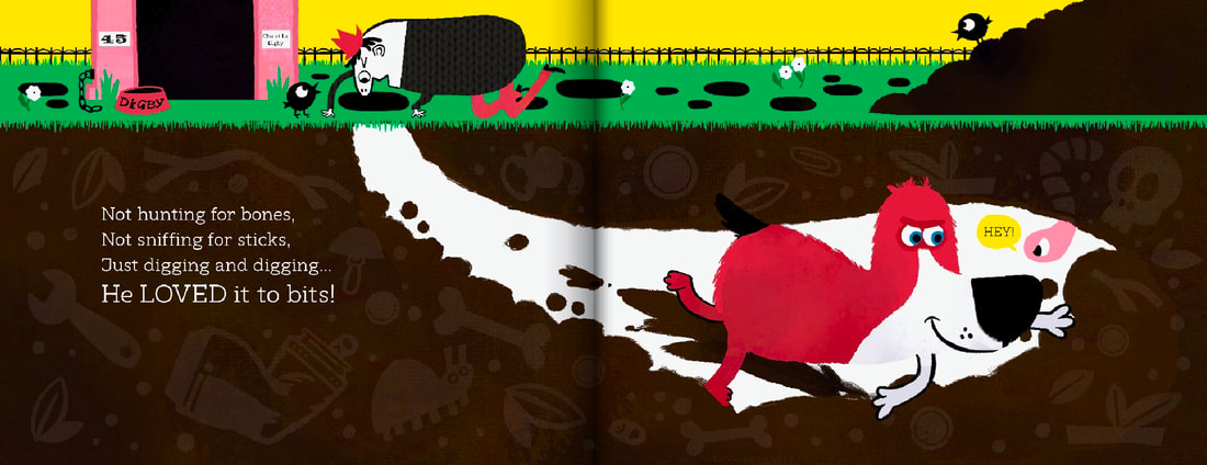
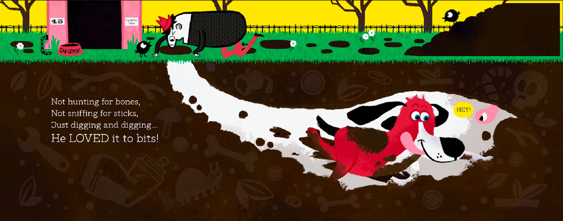
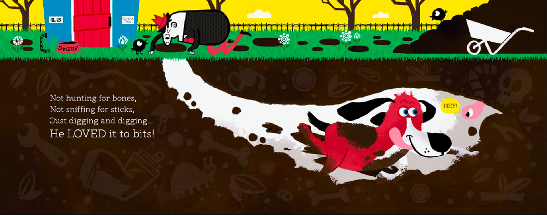
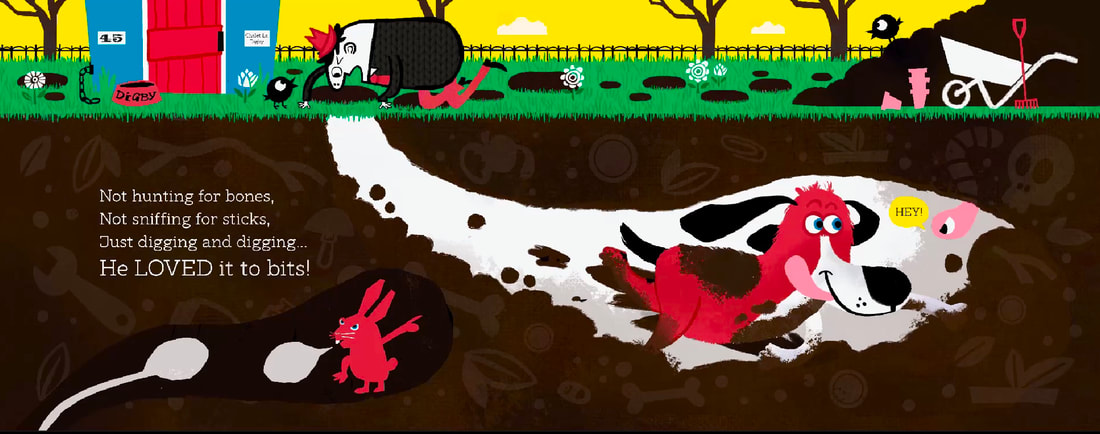
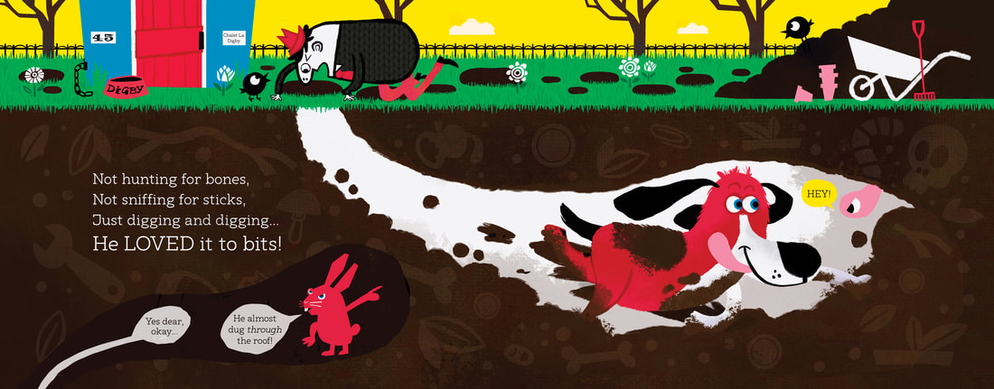
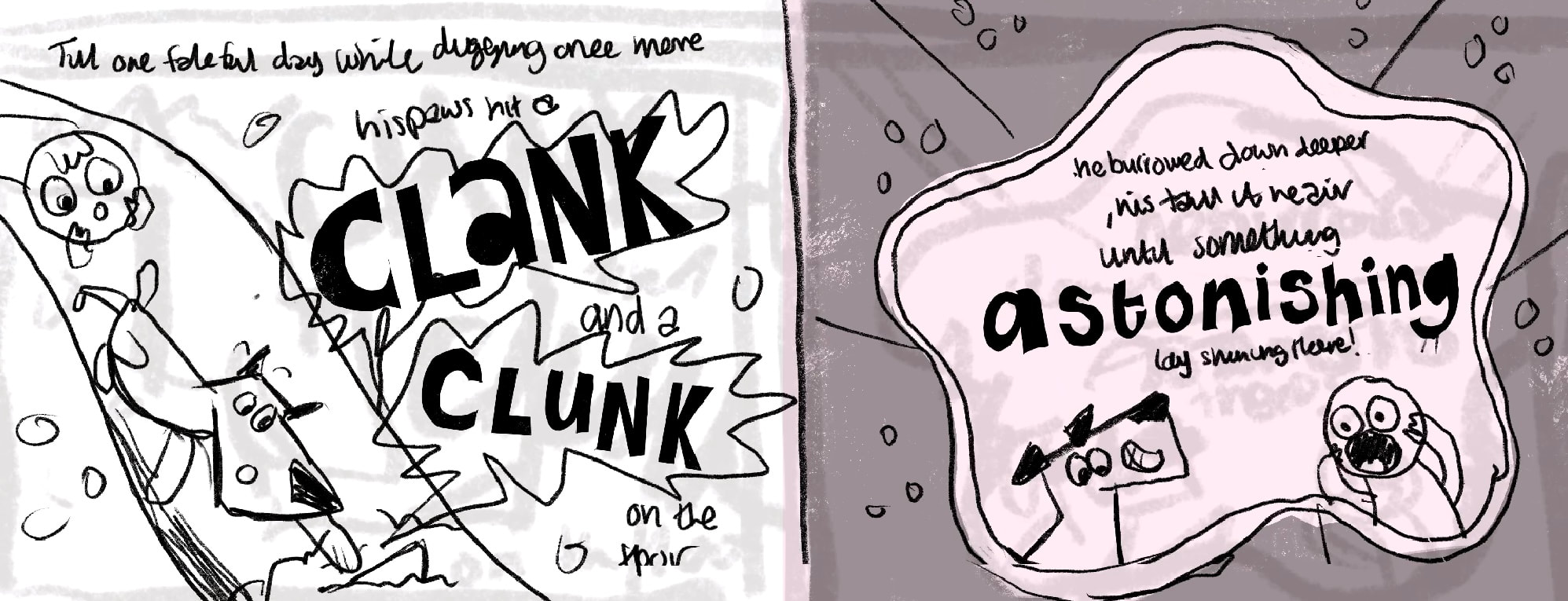
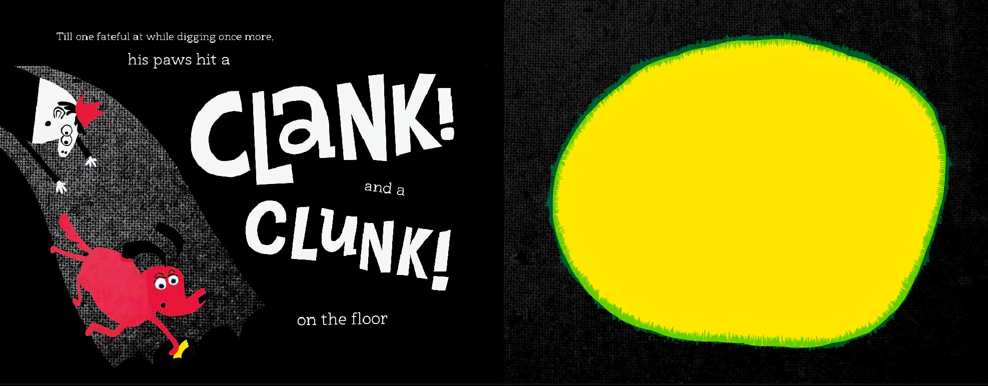
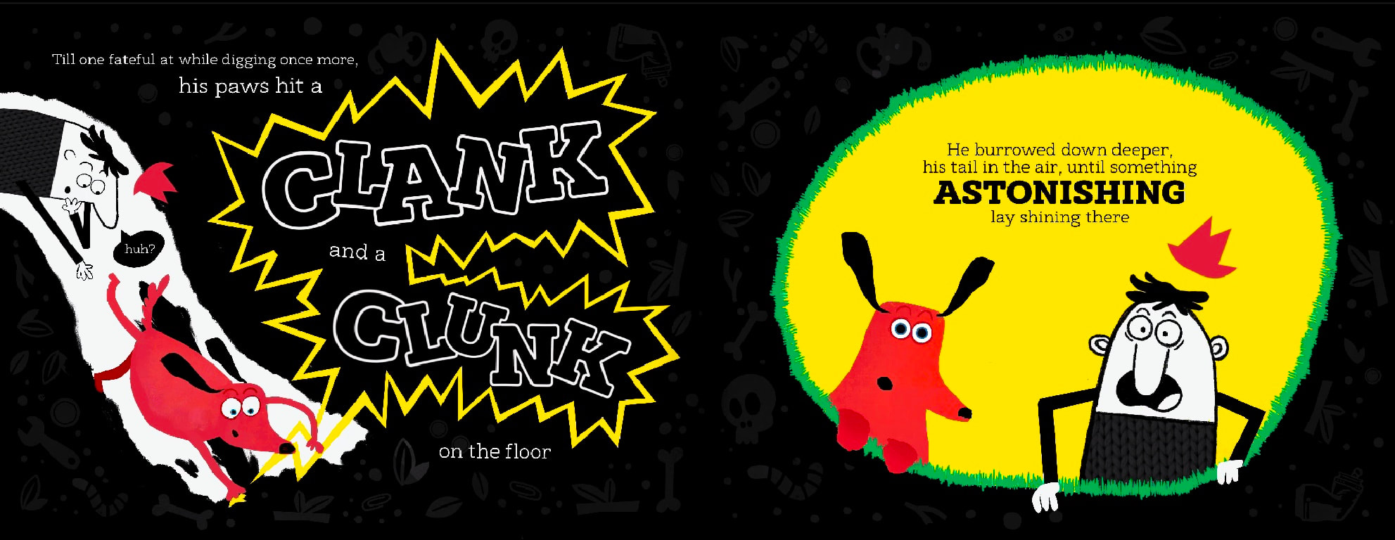
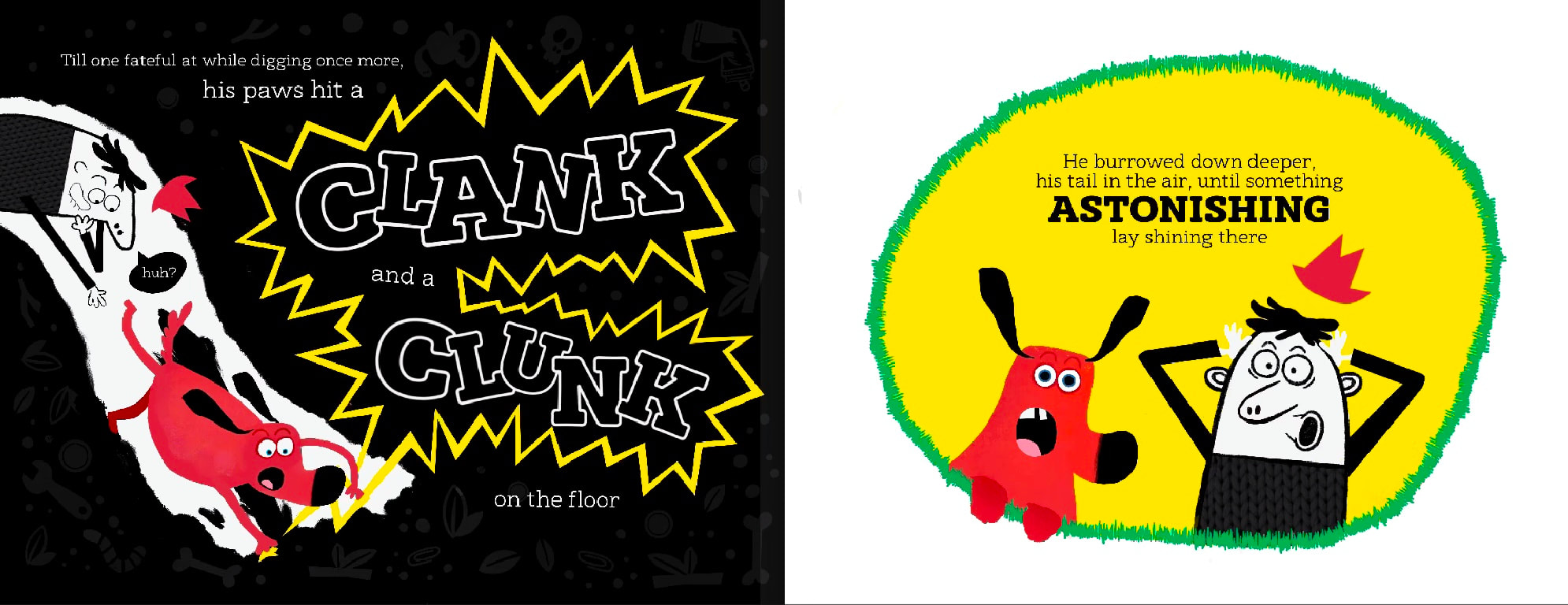
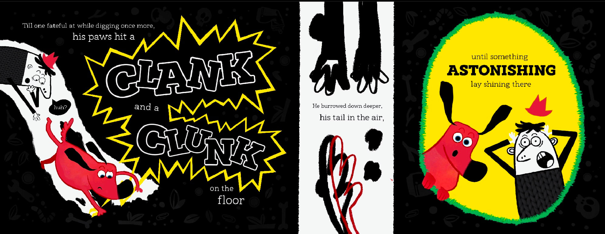
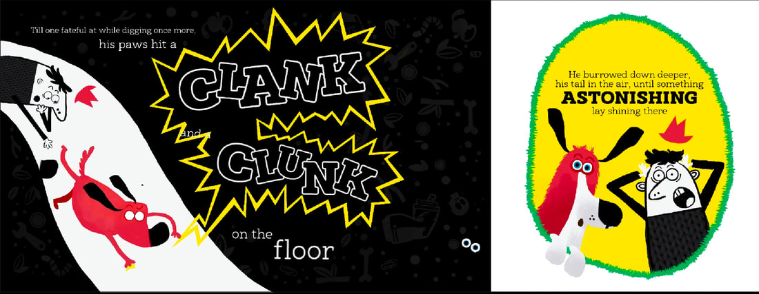
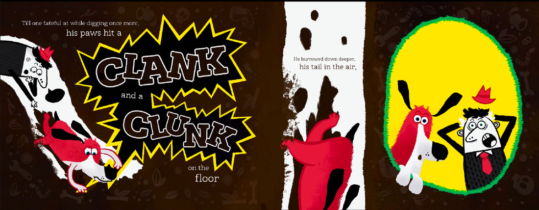
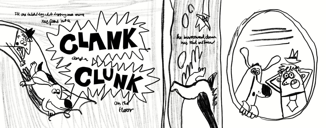
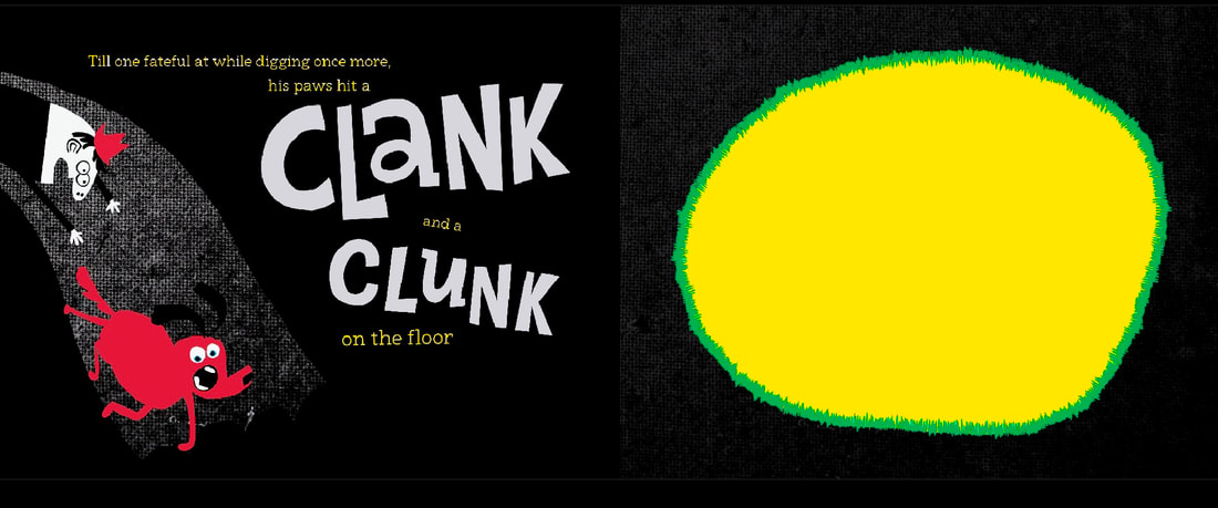
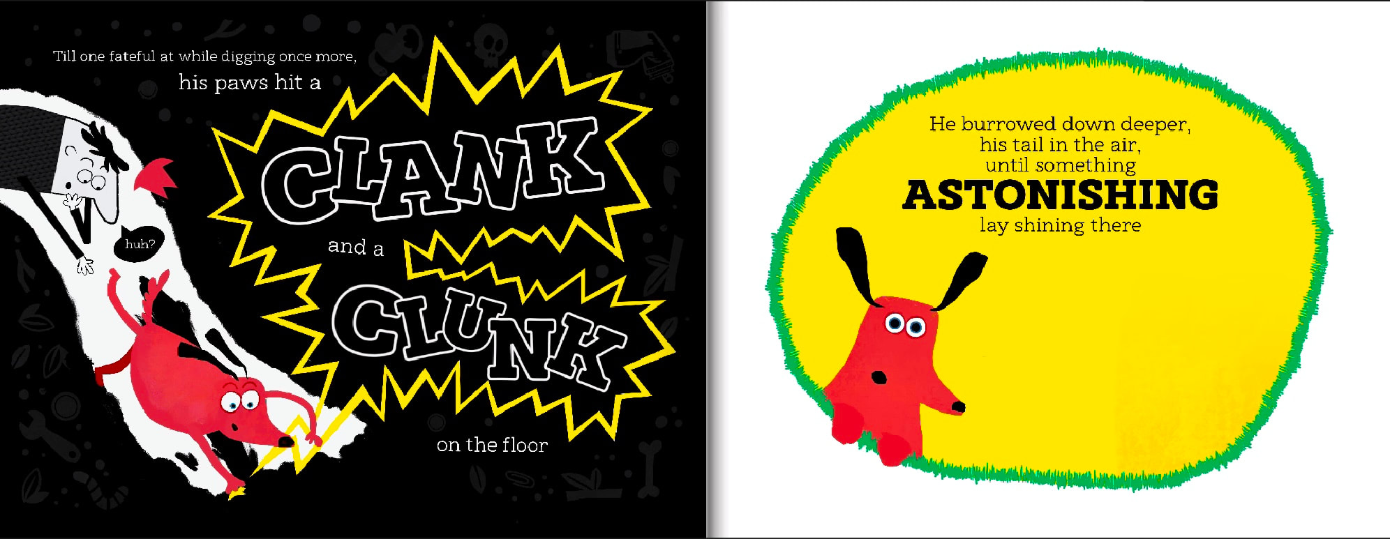
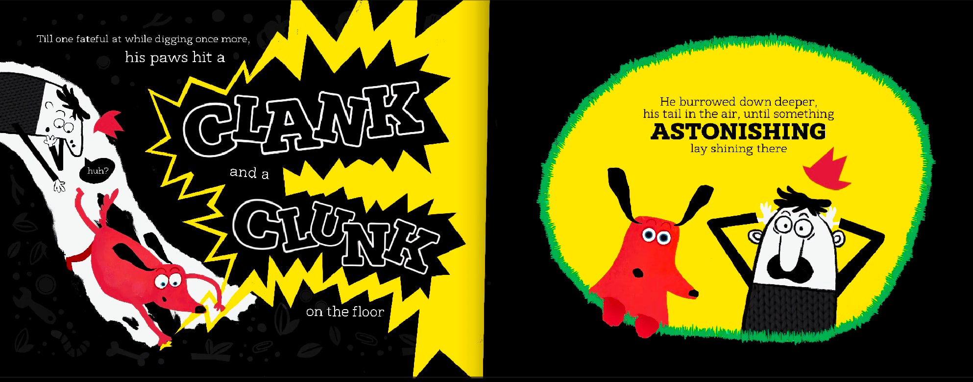
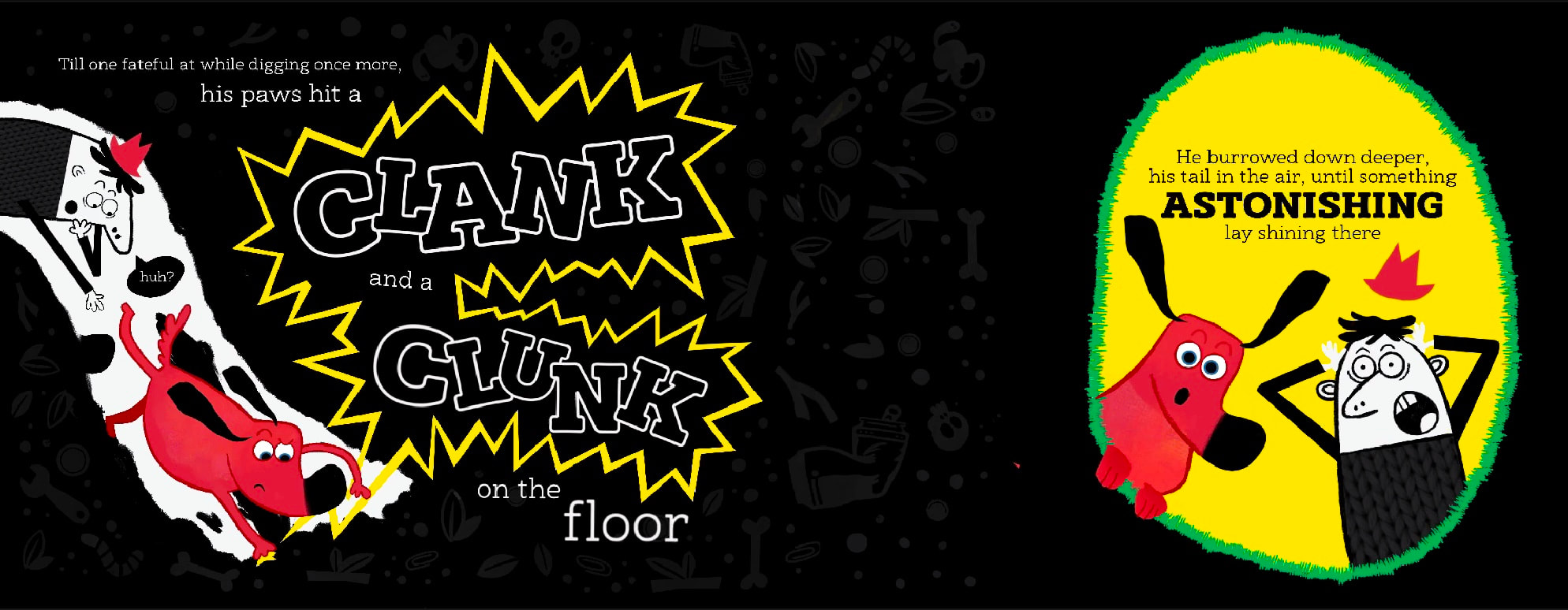
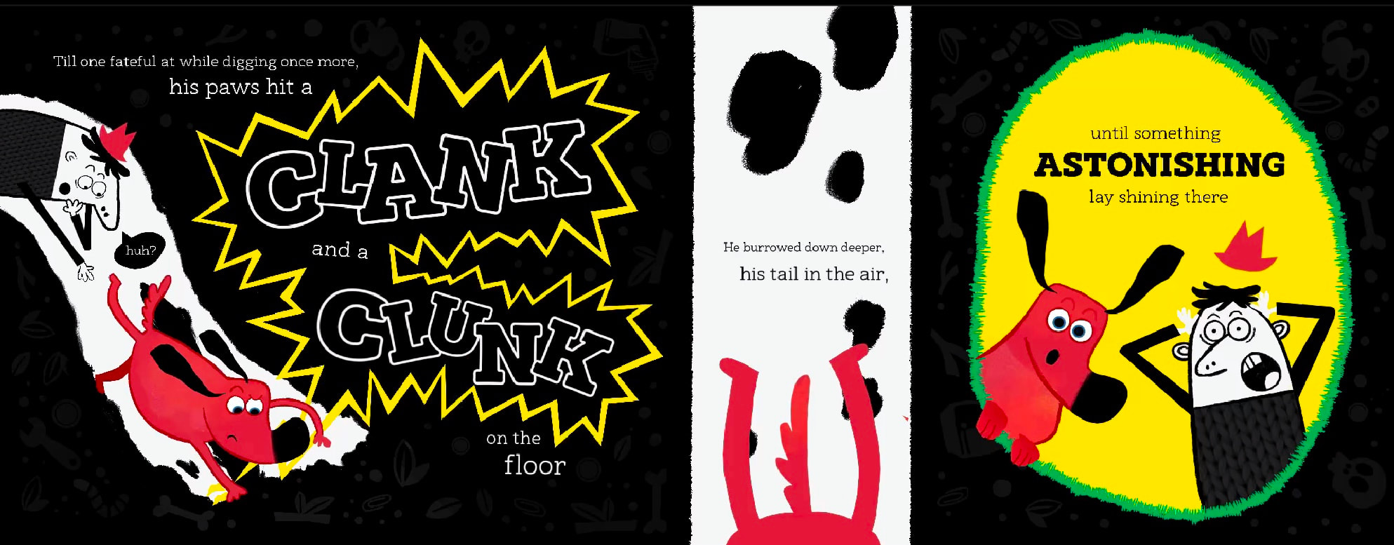
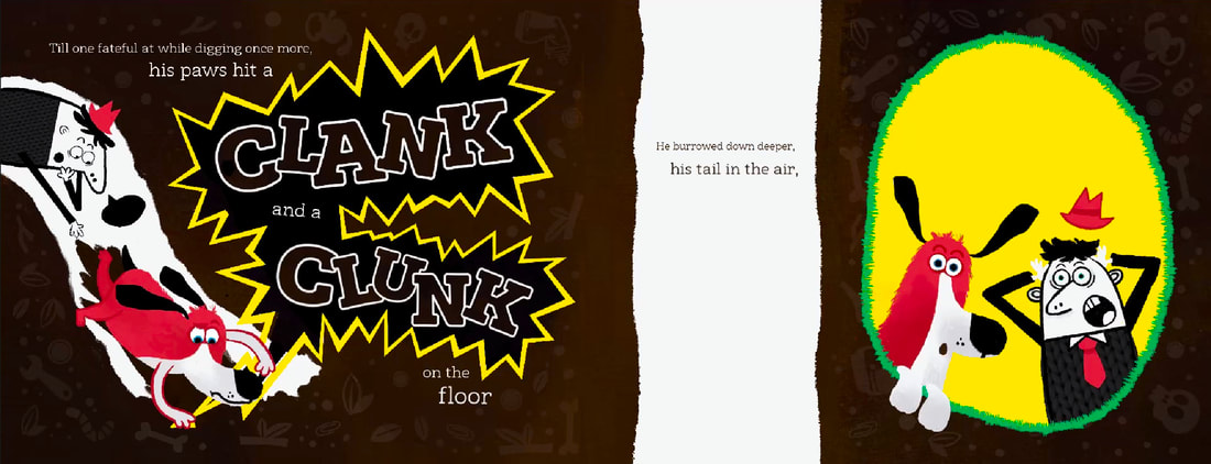
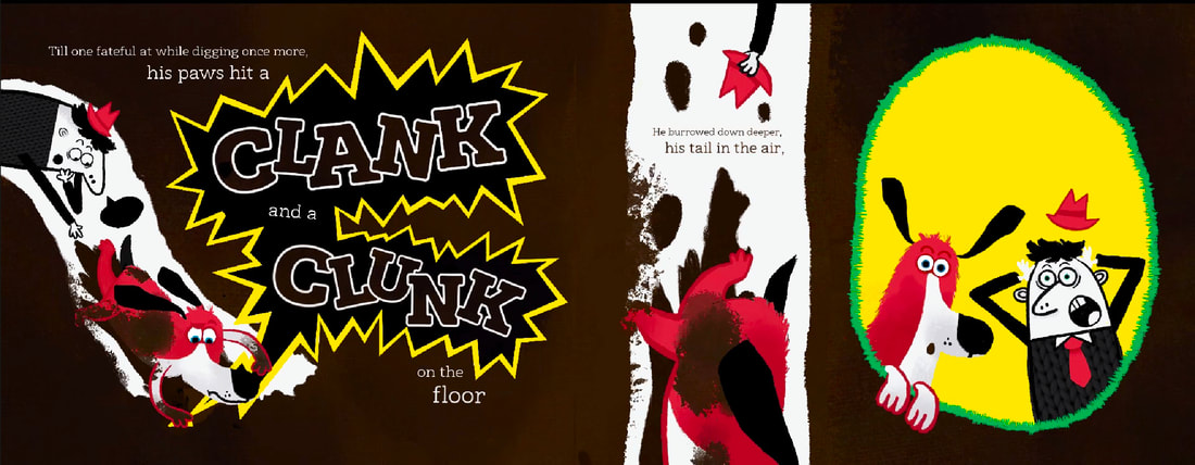
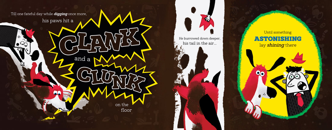
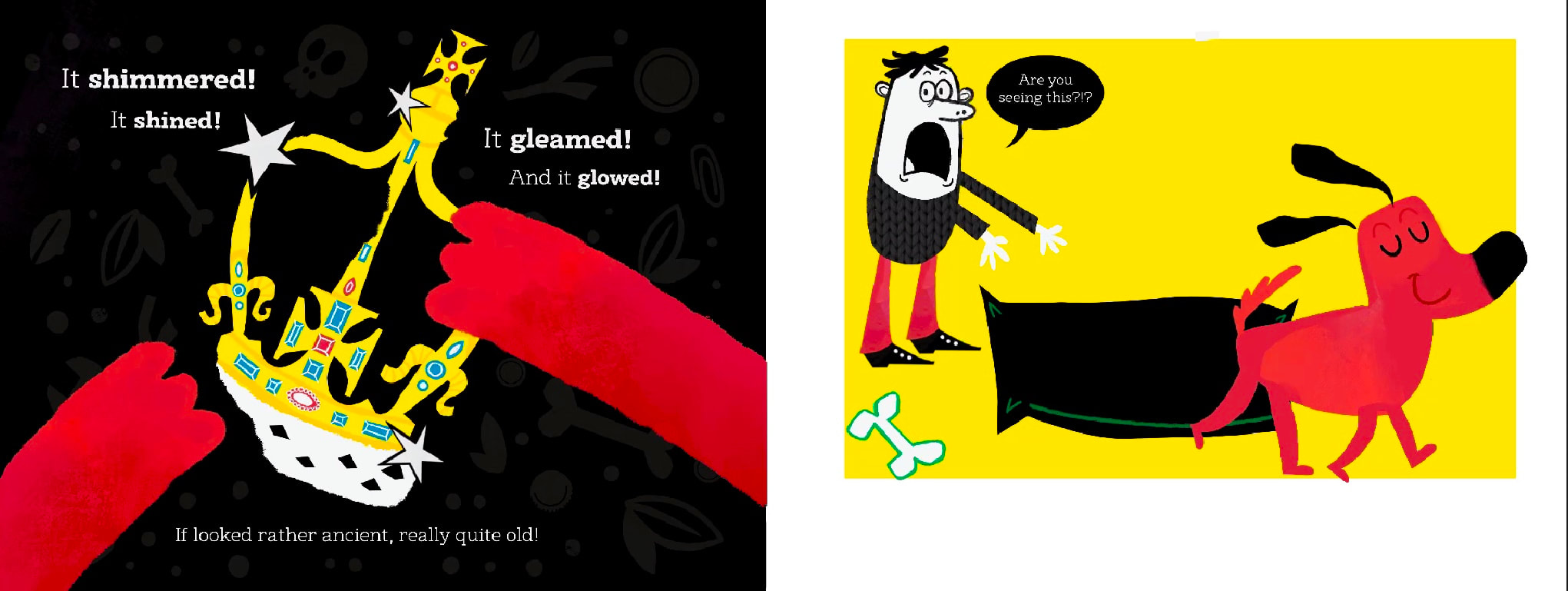
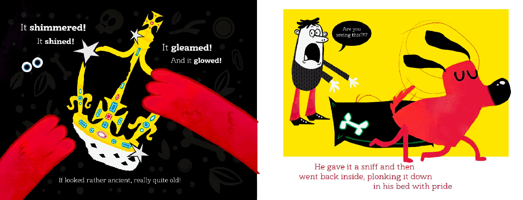
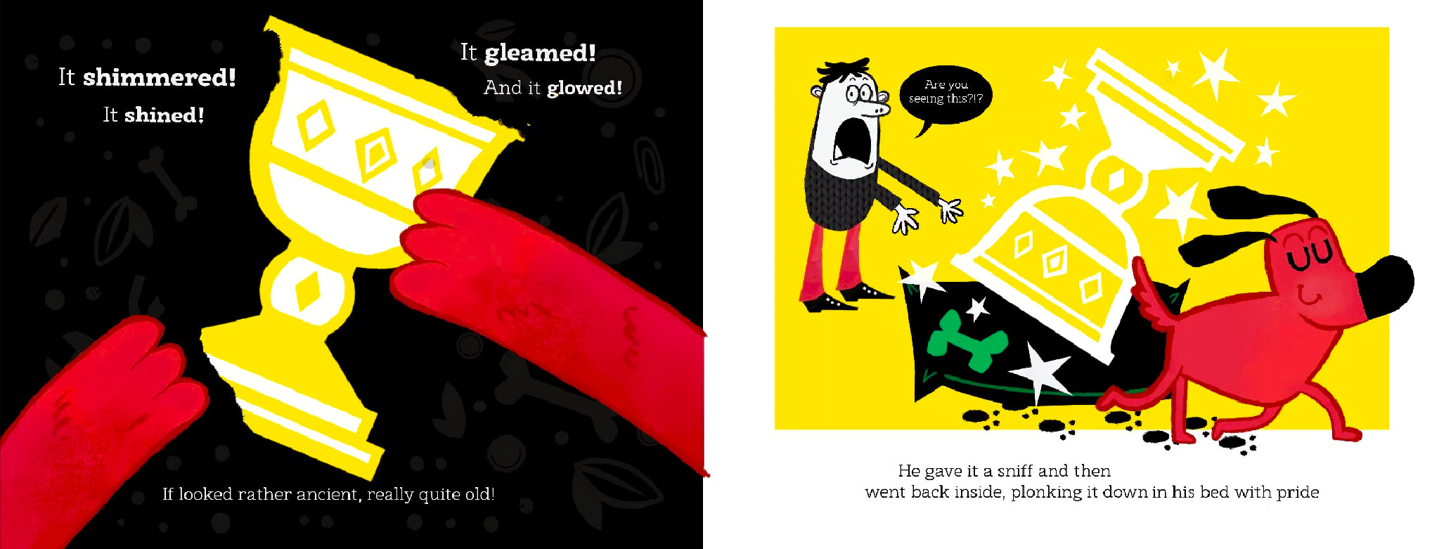
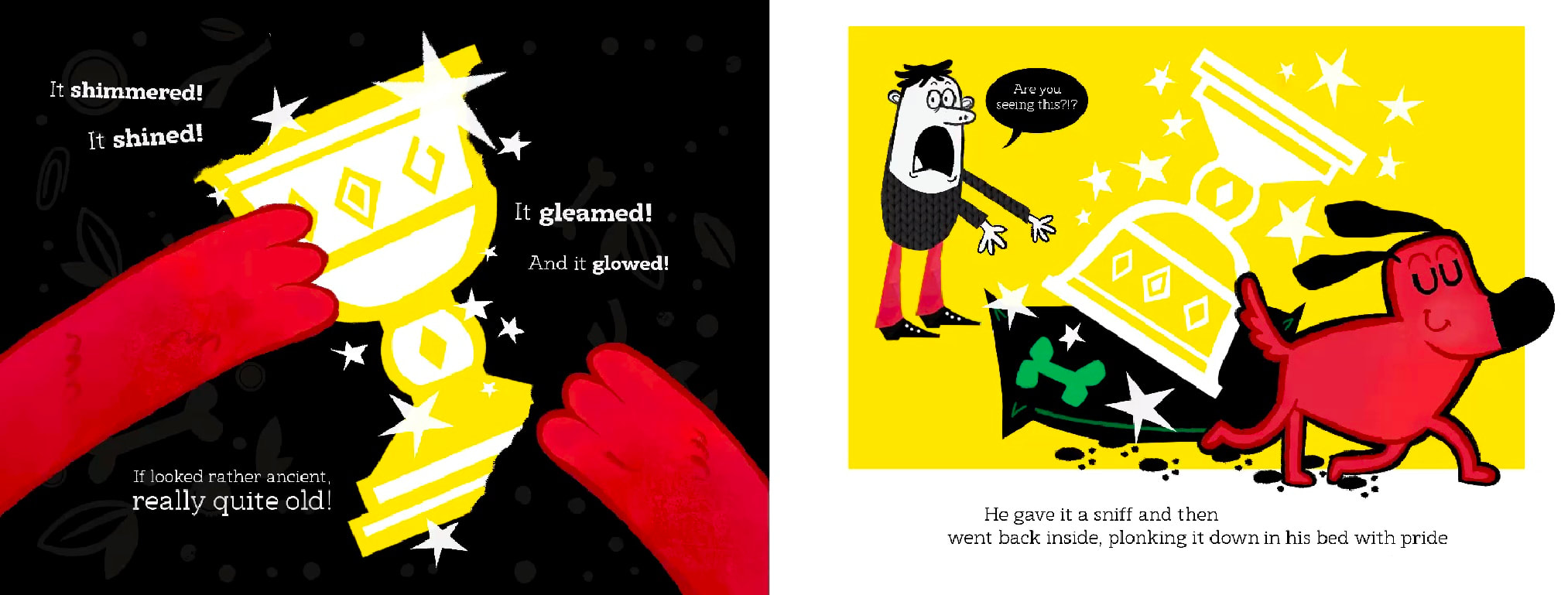
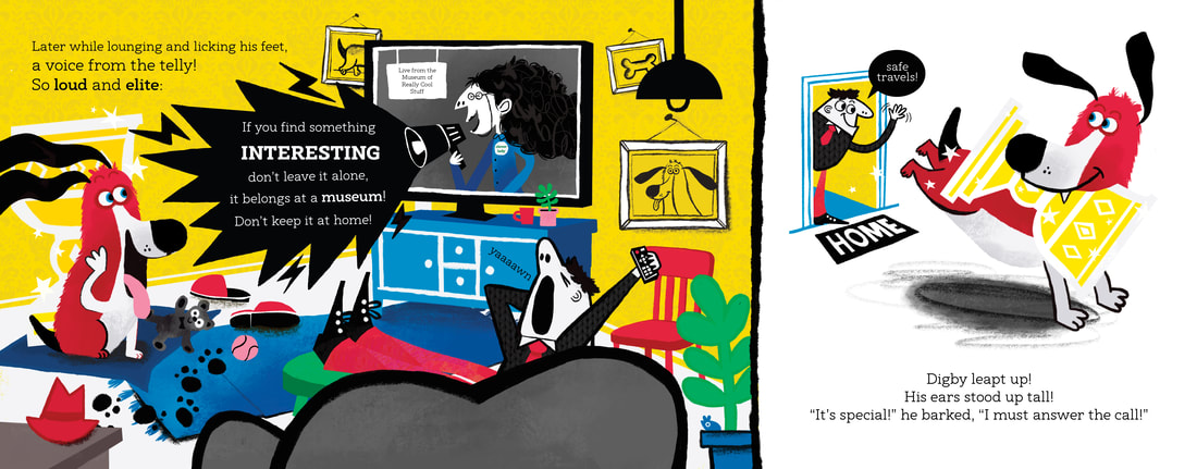
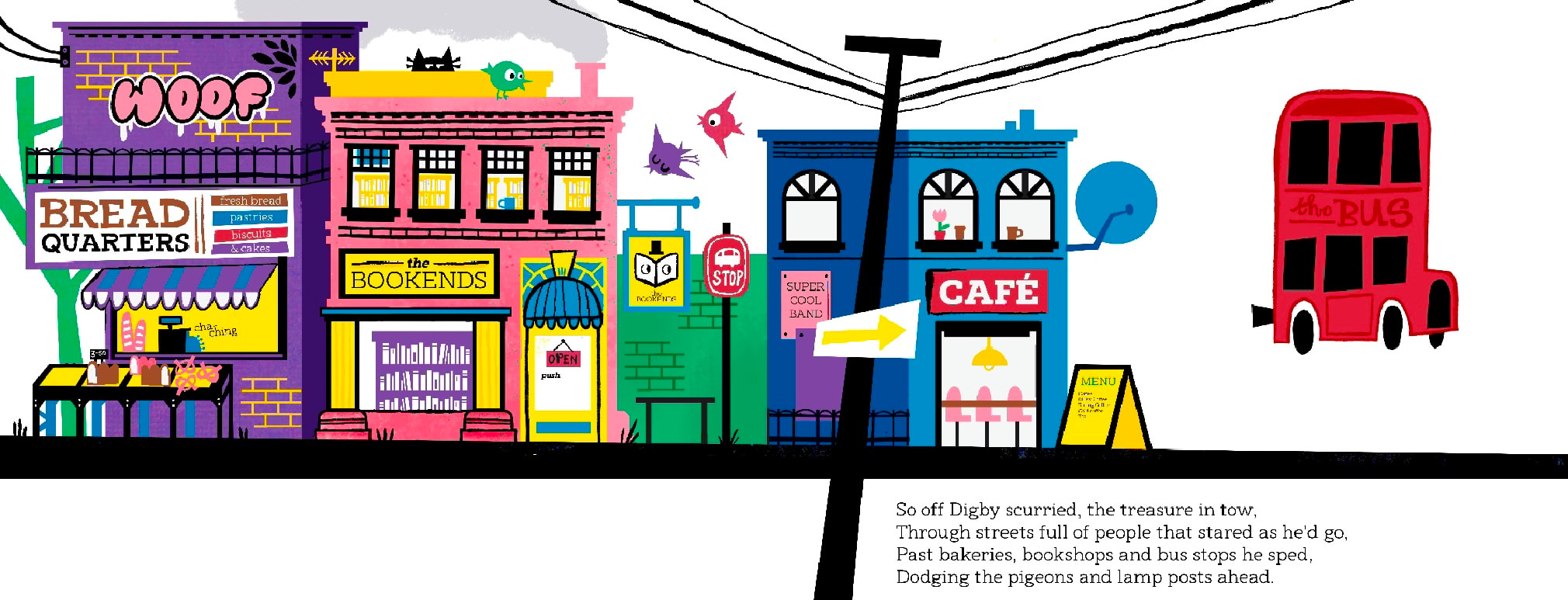
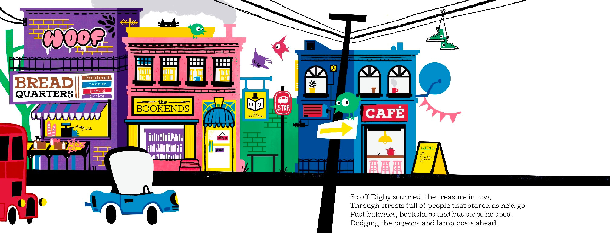
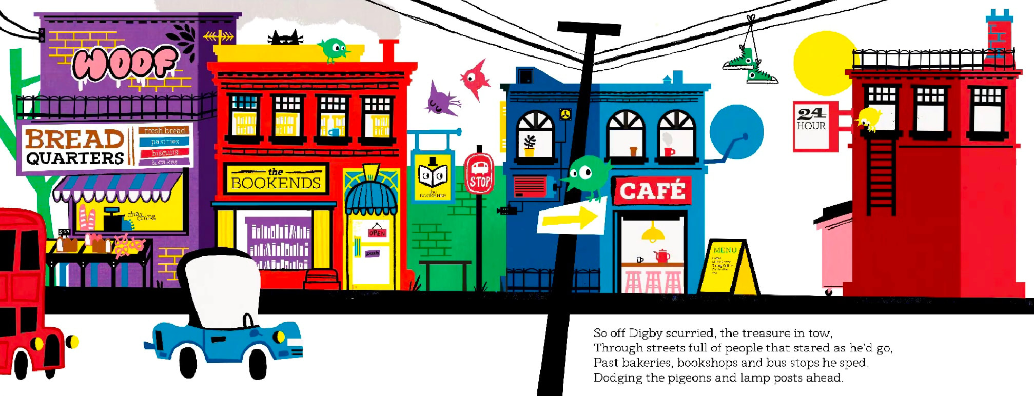
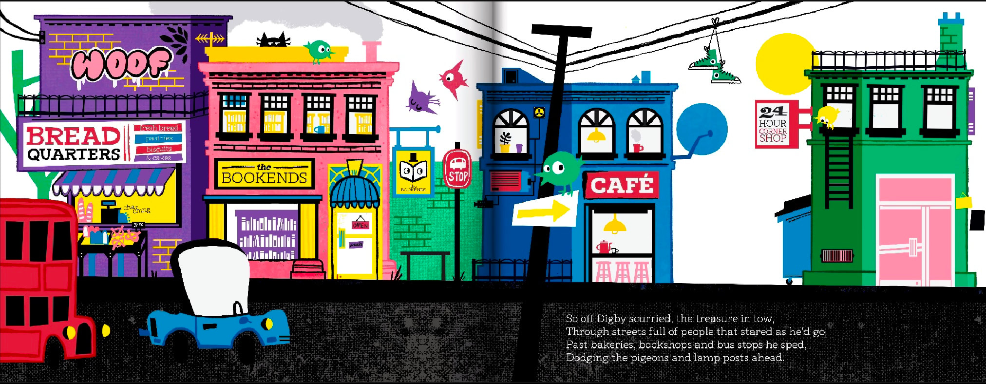
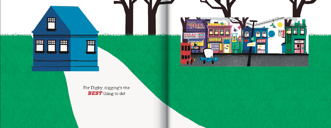
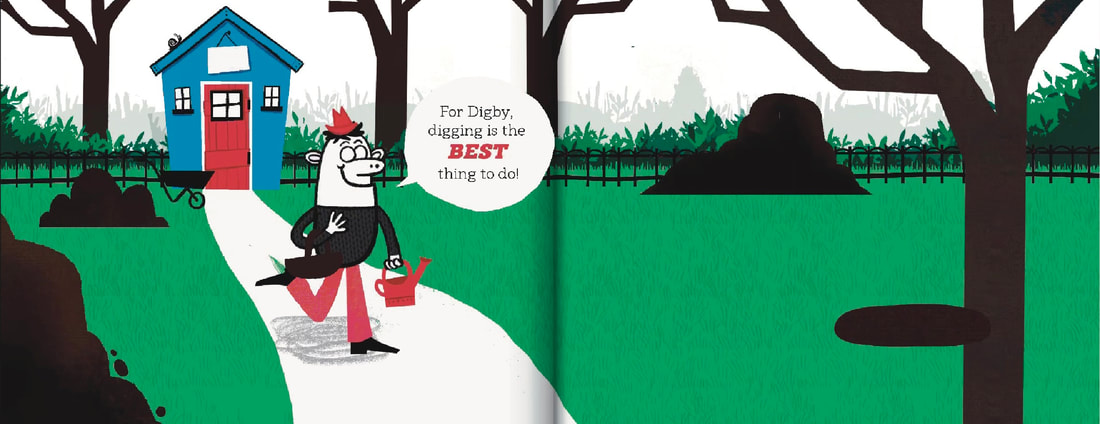
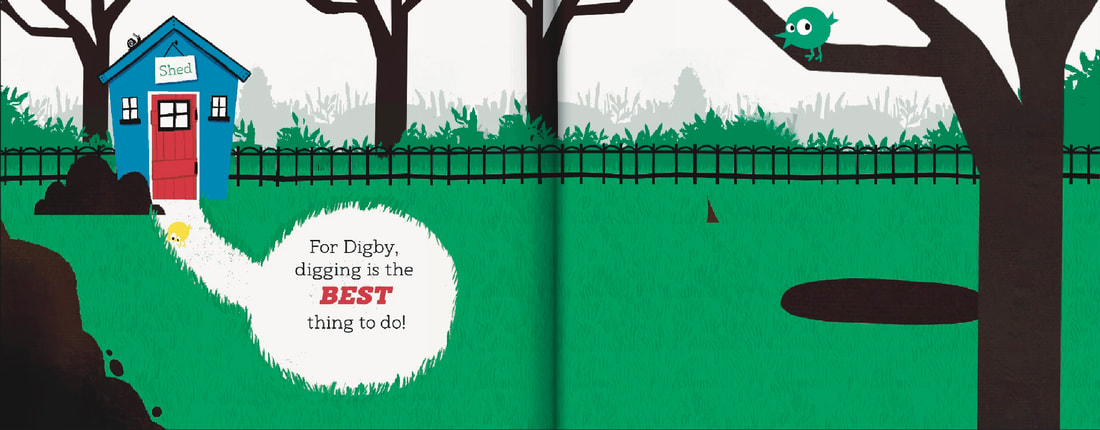
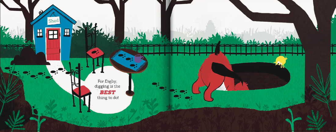
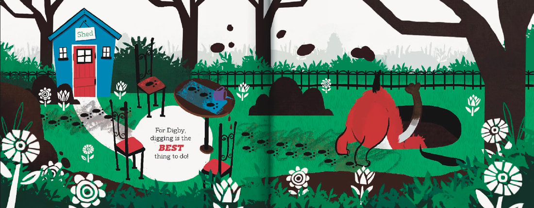
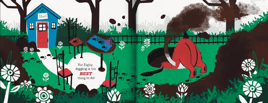
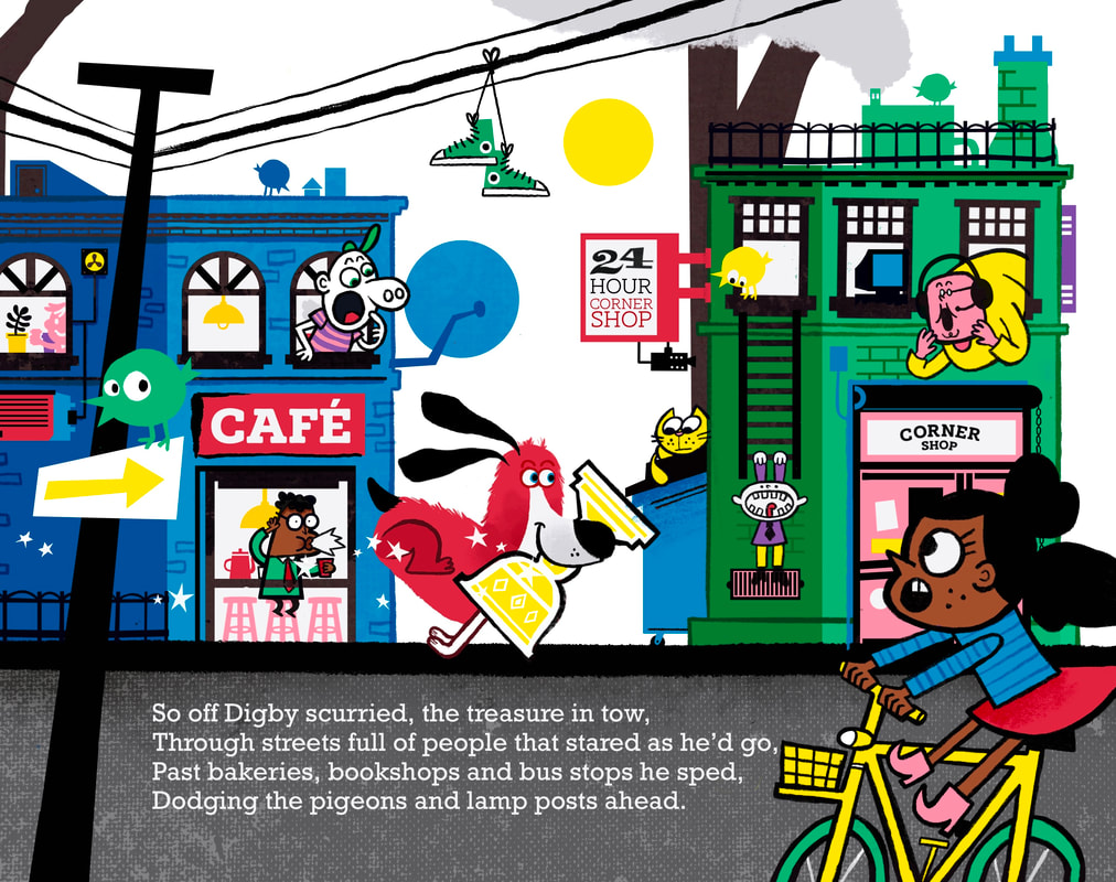
Digby the dog was a Digger, no doubt.
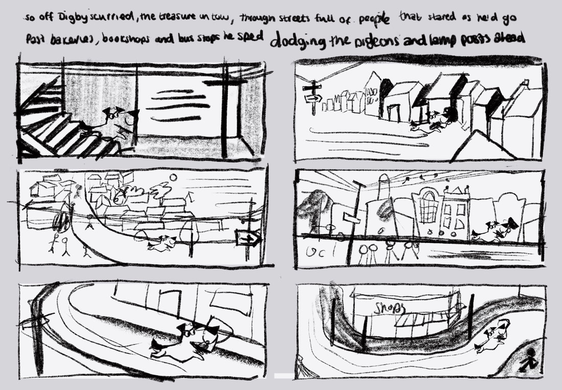
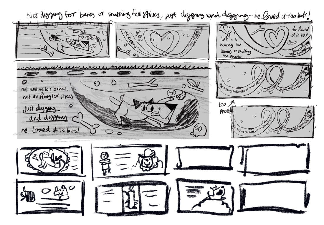
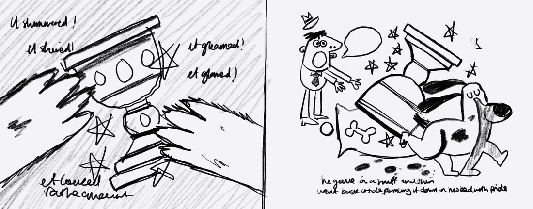
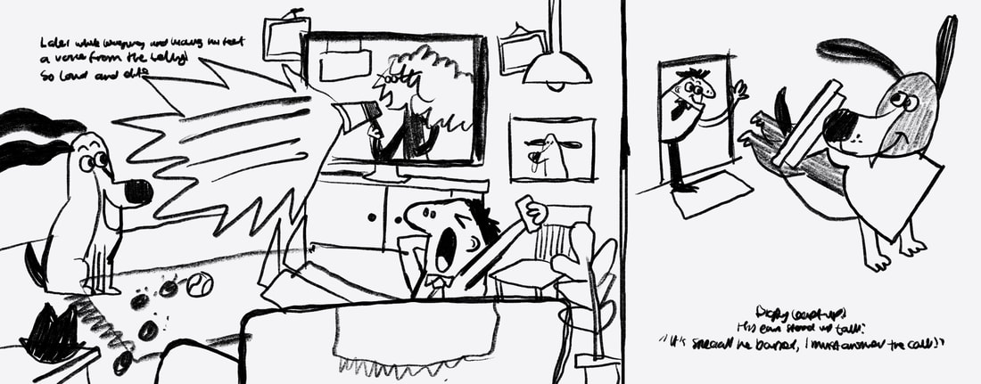
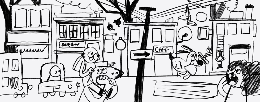
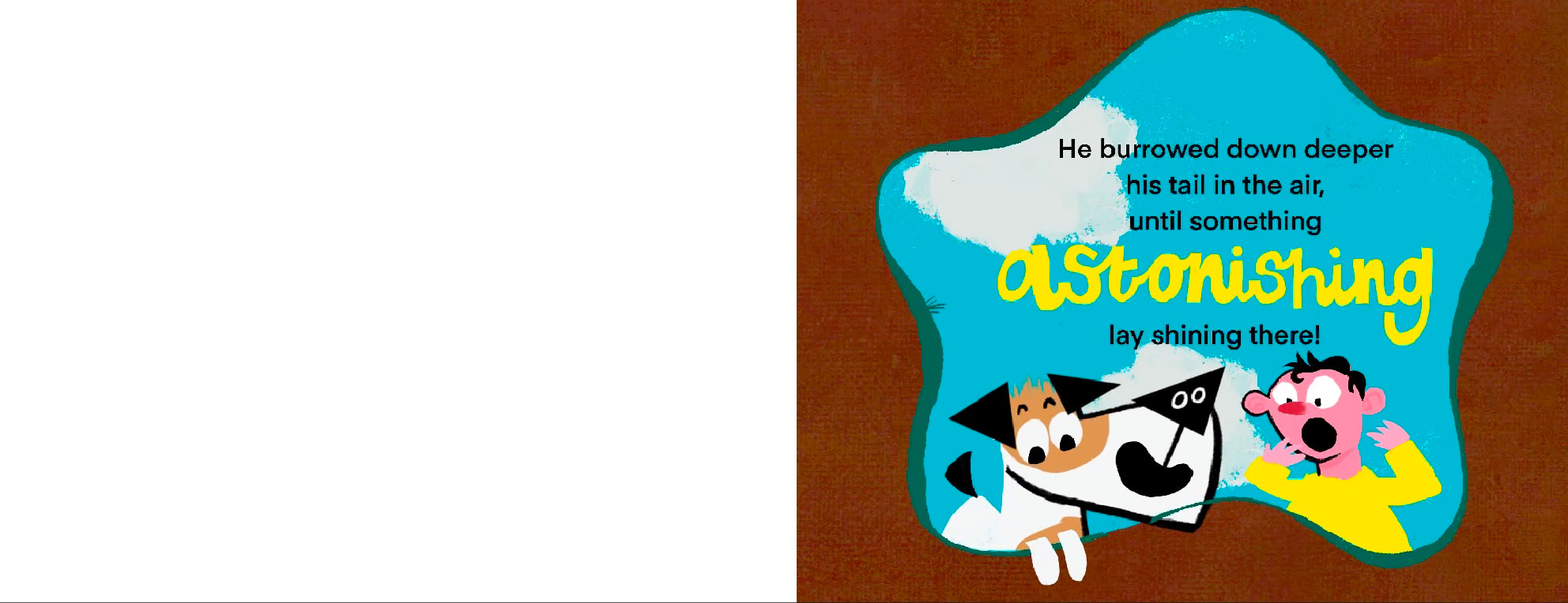
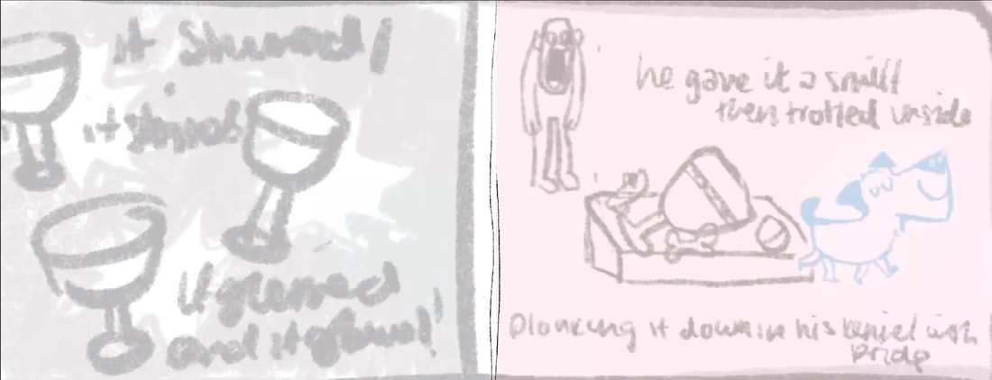
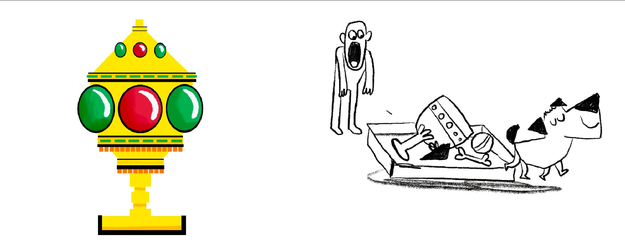
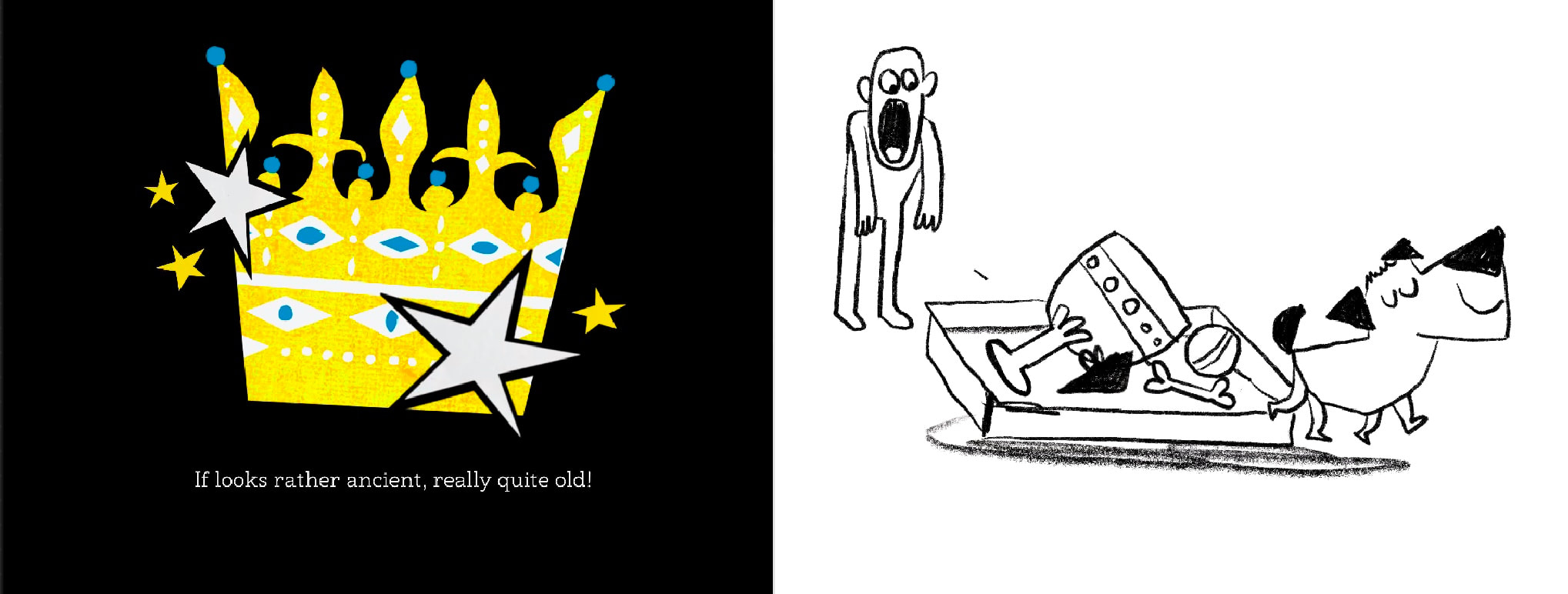
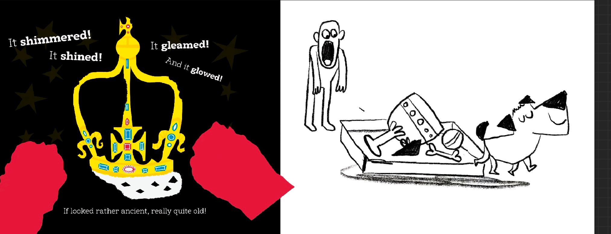
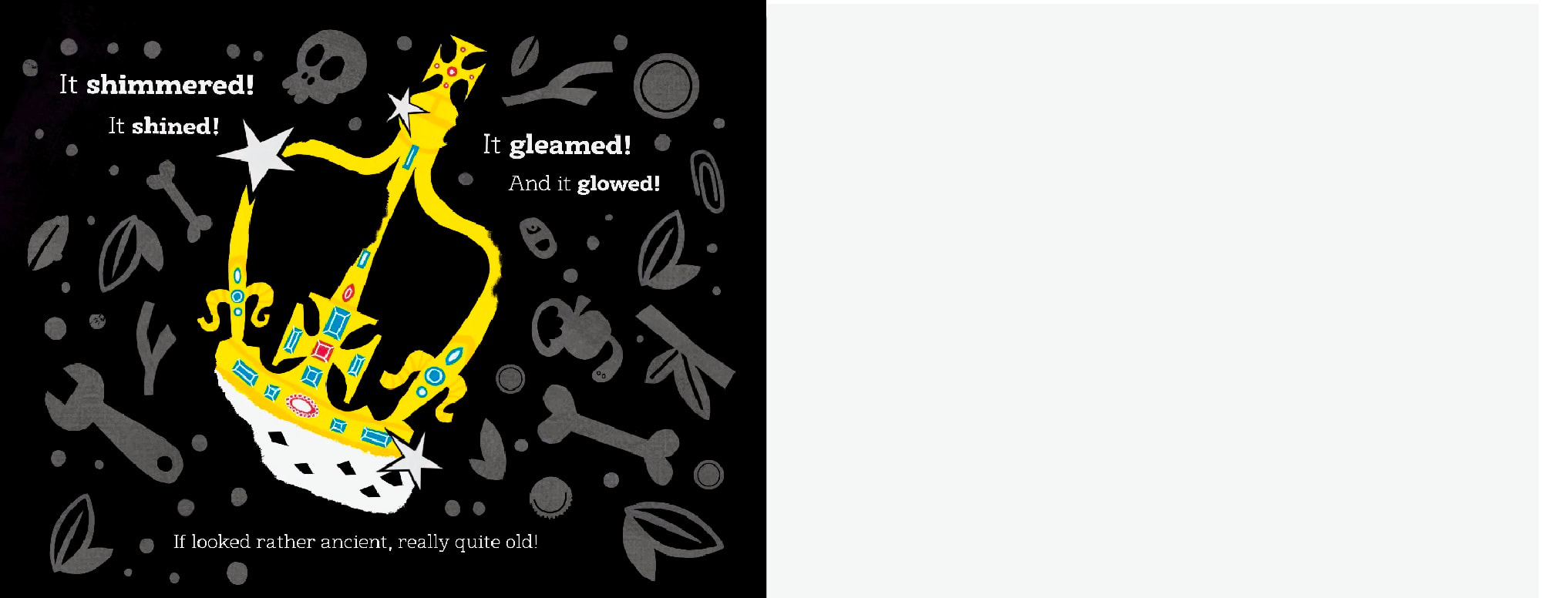
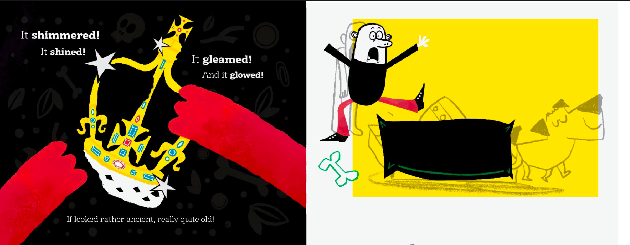
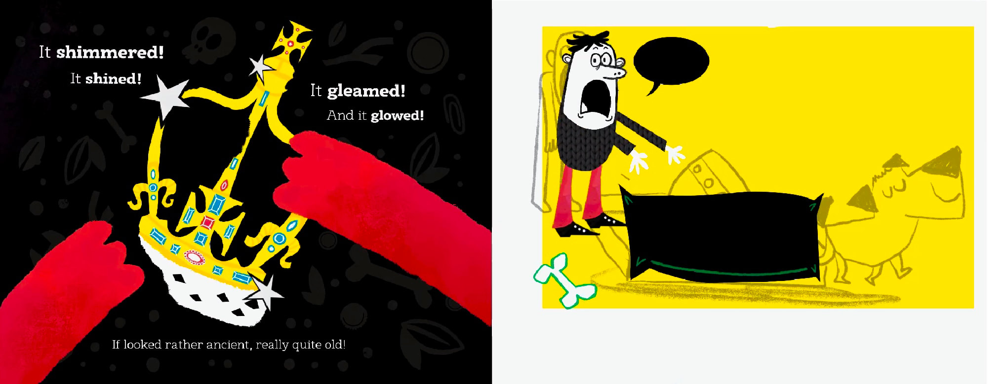
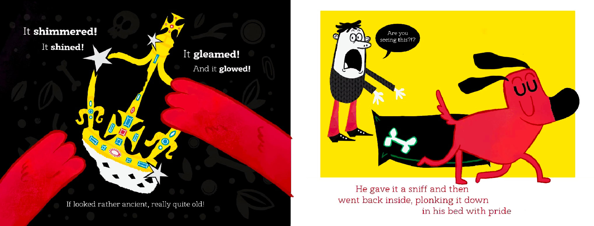
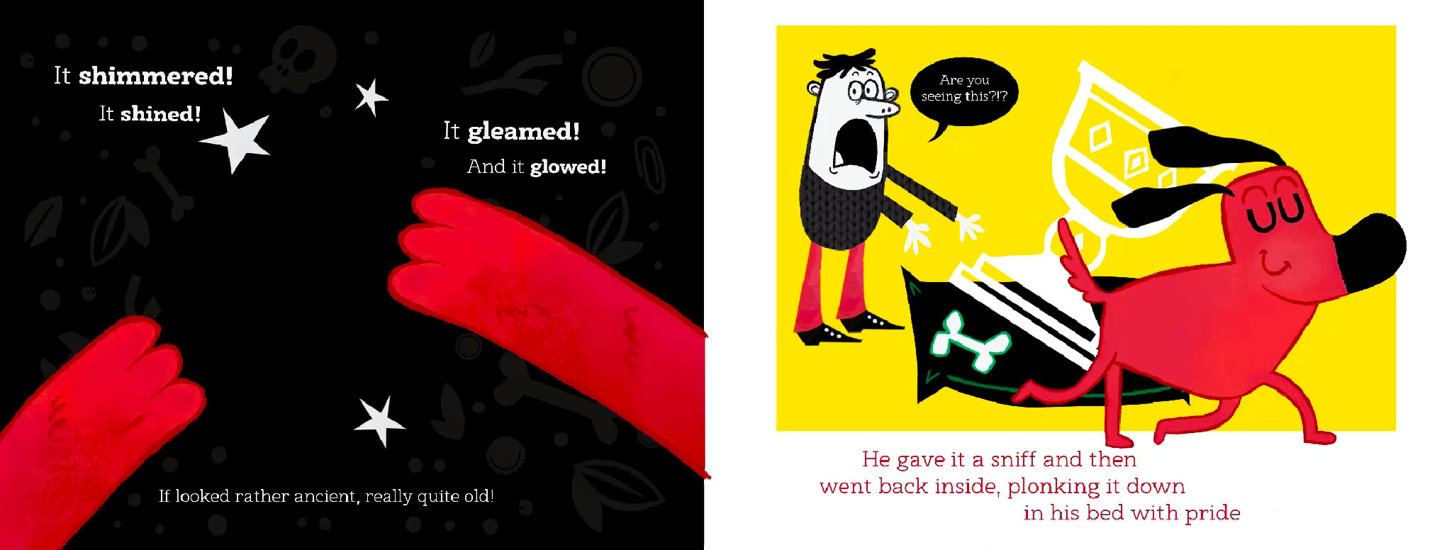
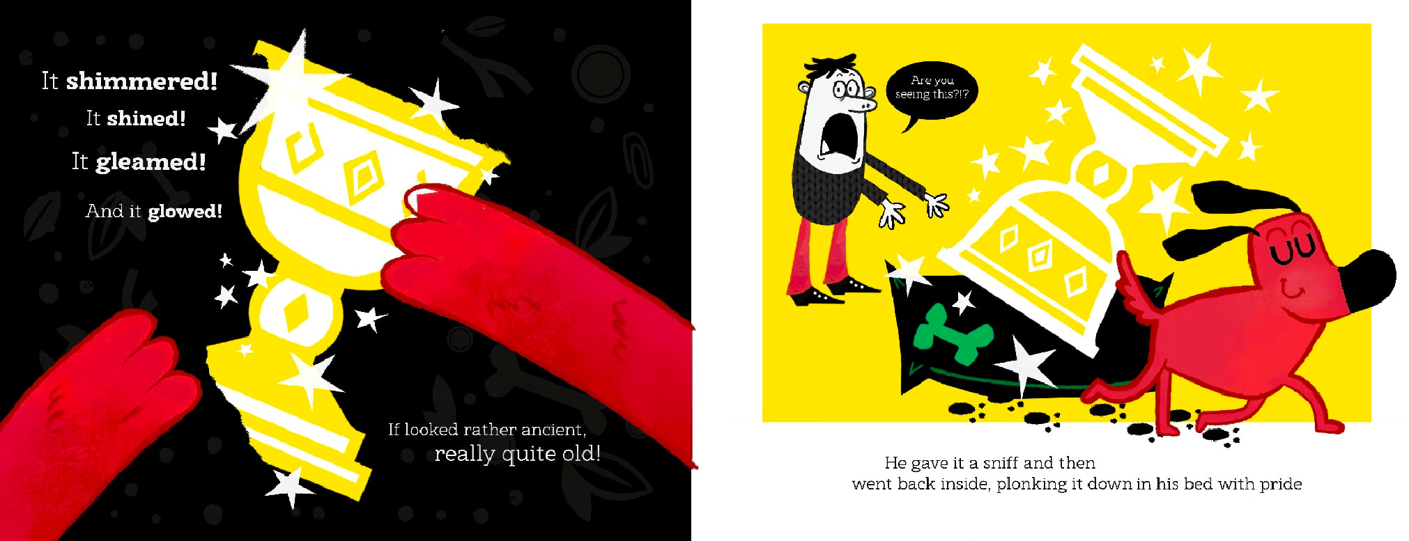
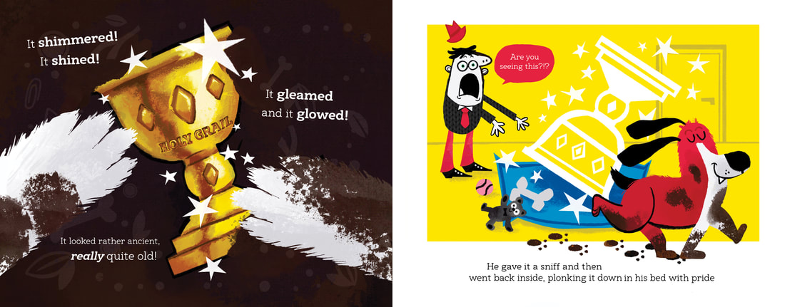
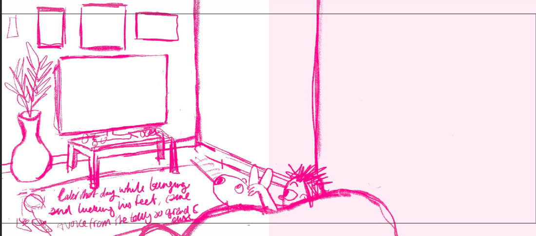
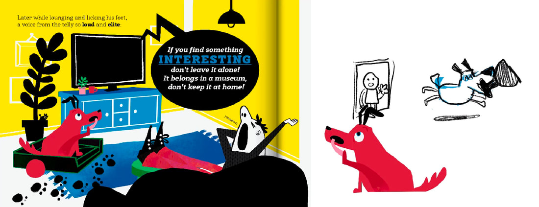
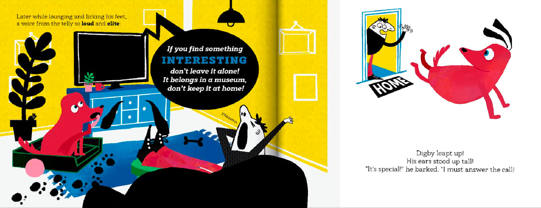
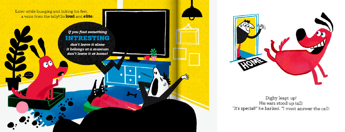
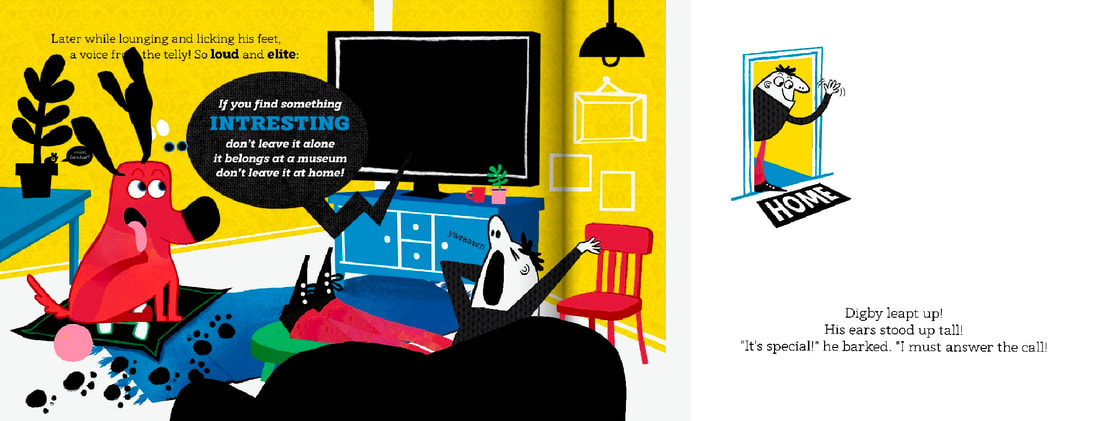
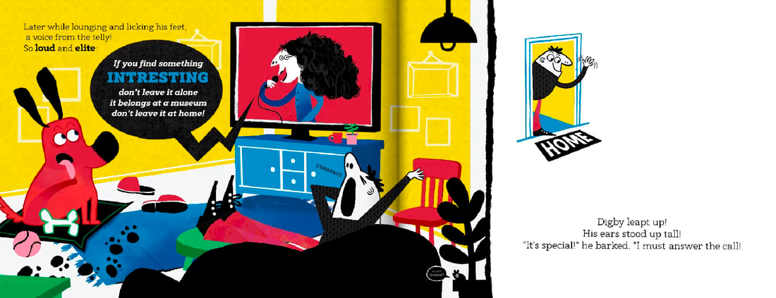
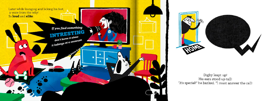
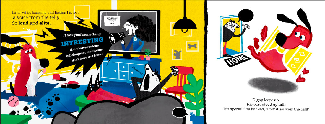
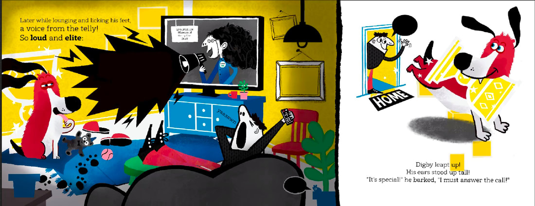
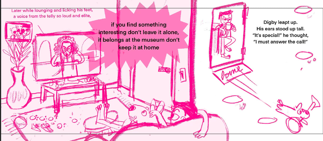
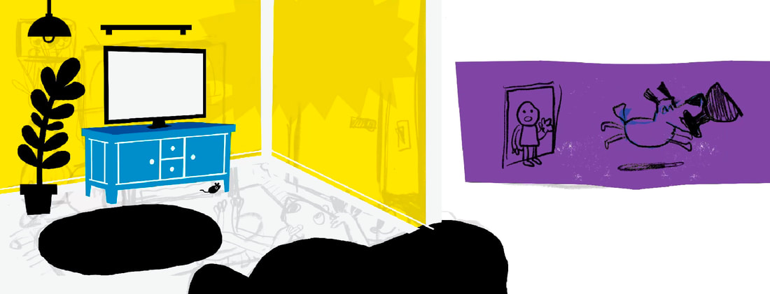
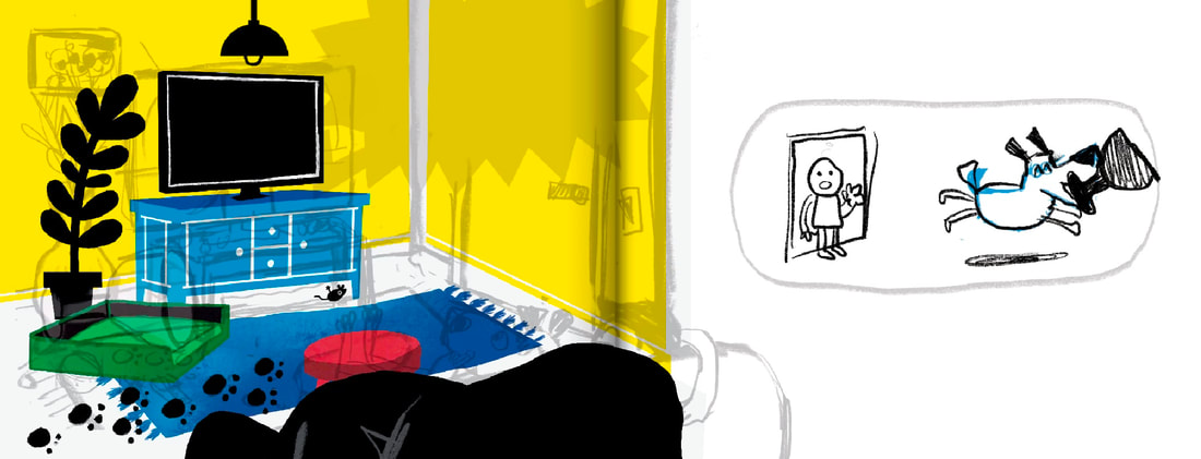
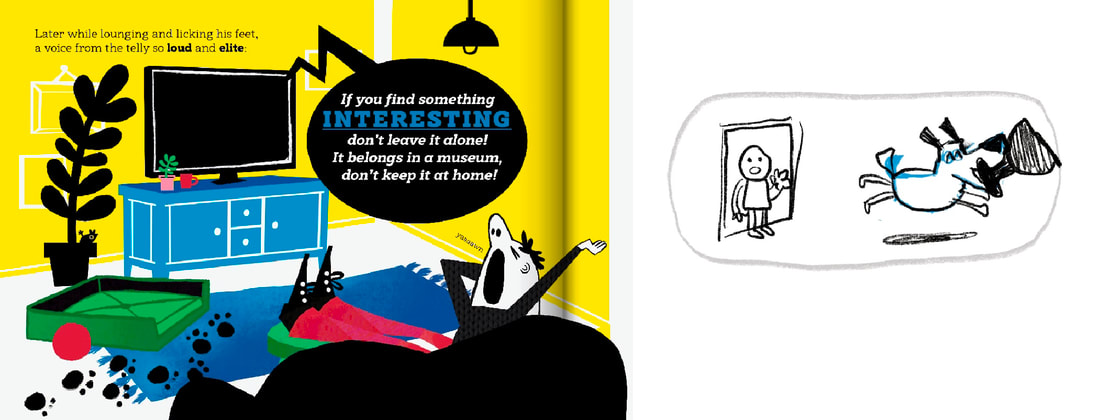
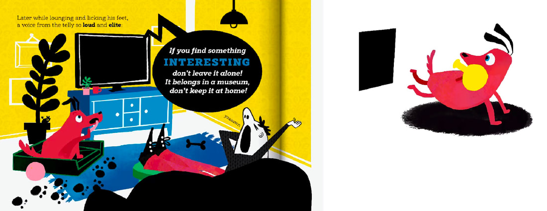
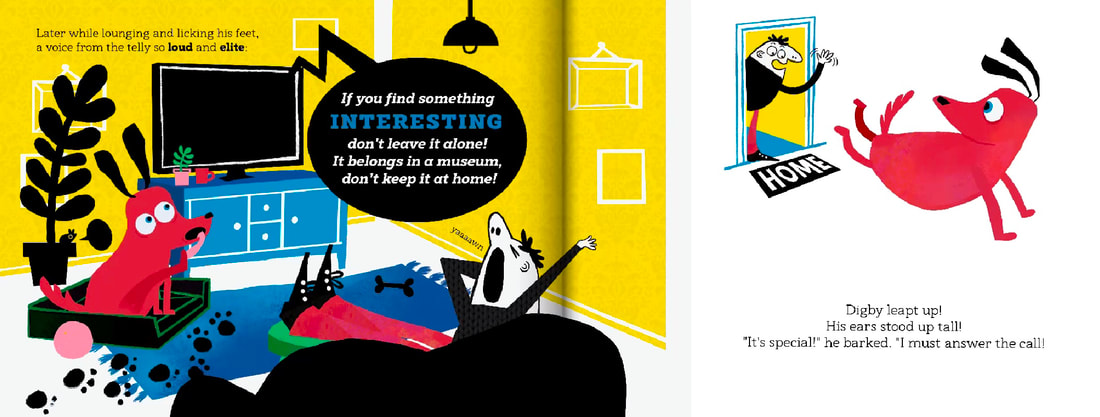
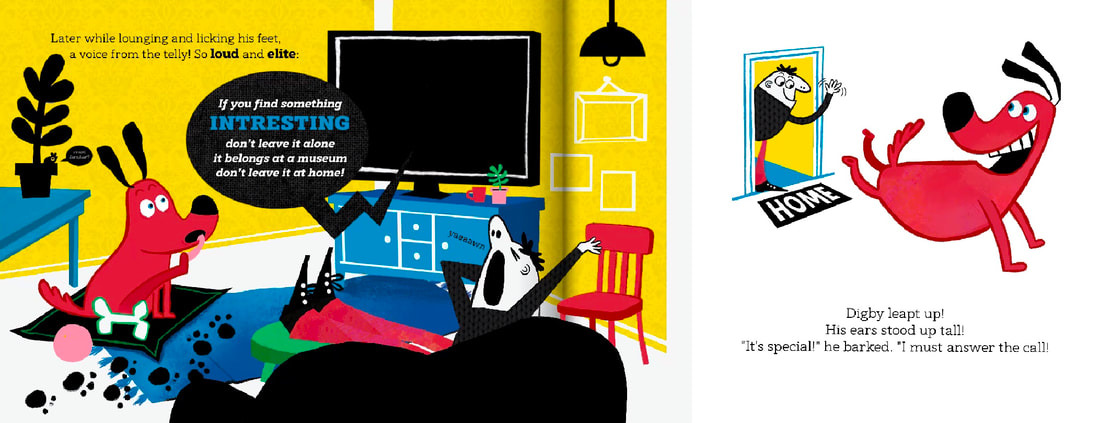
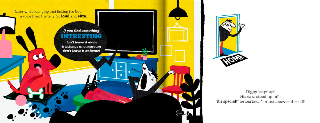
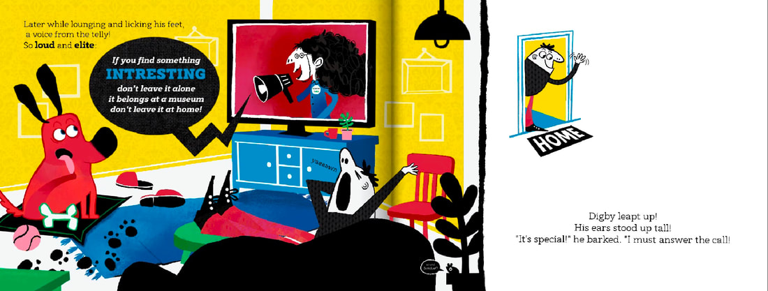
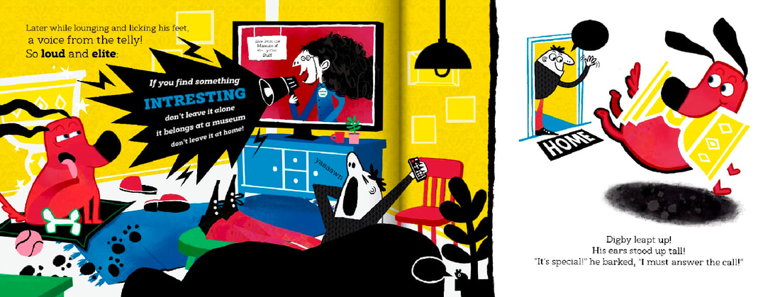
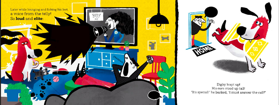
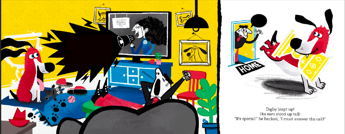
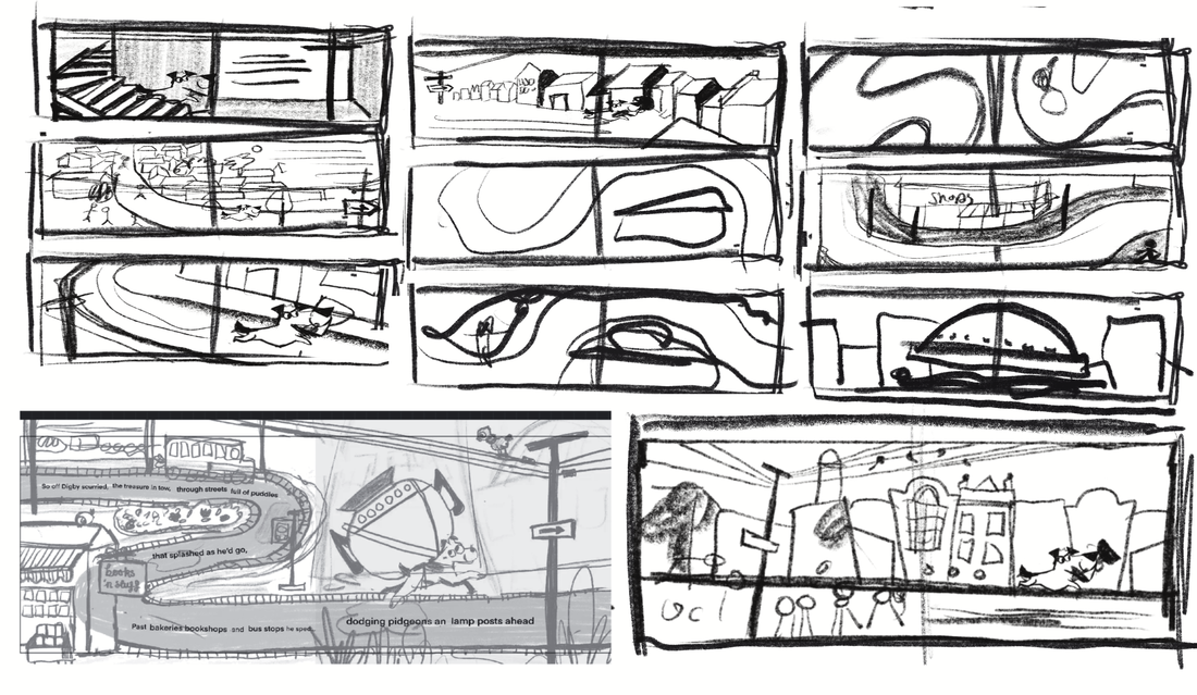
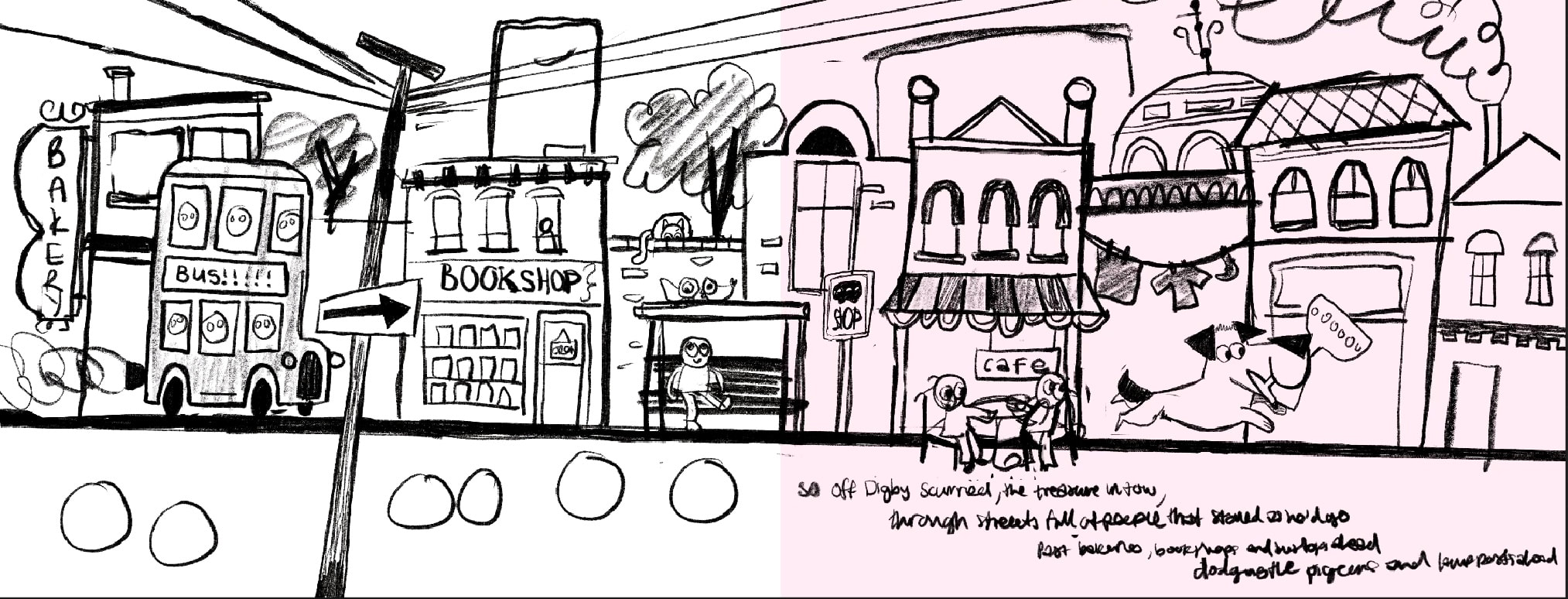
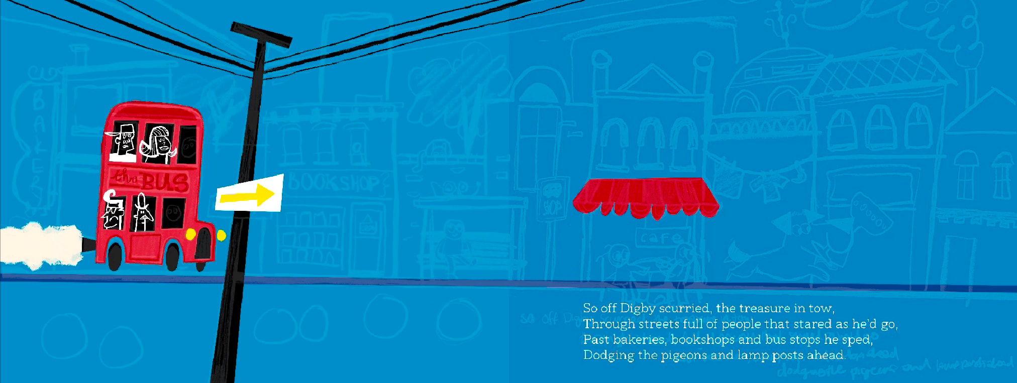
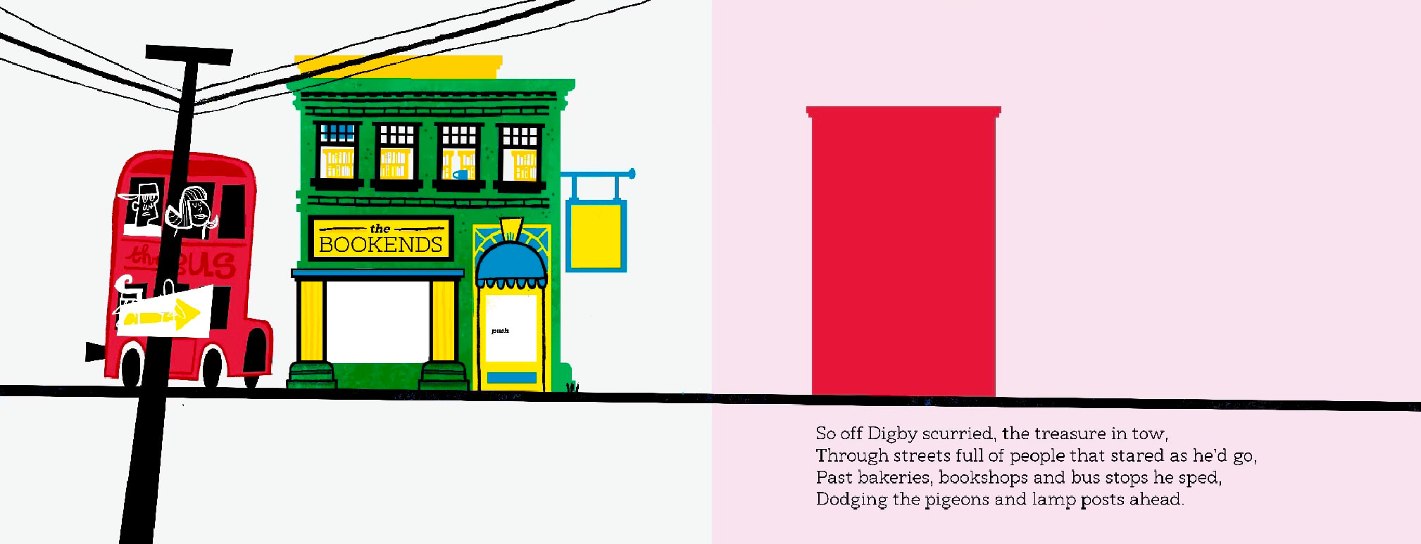
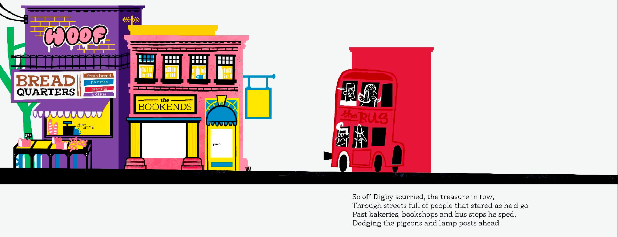
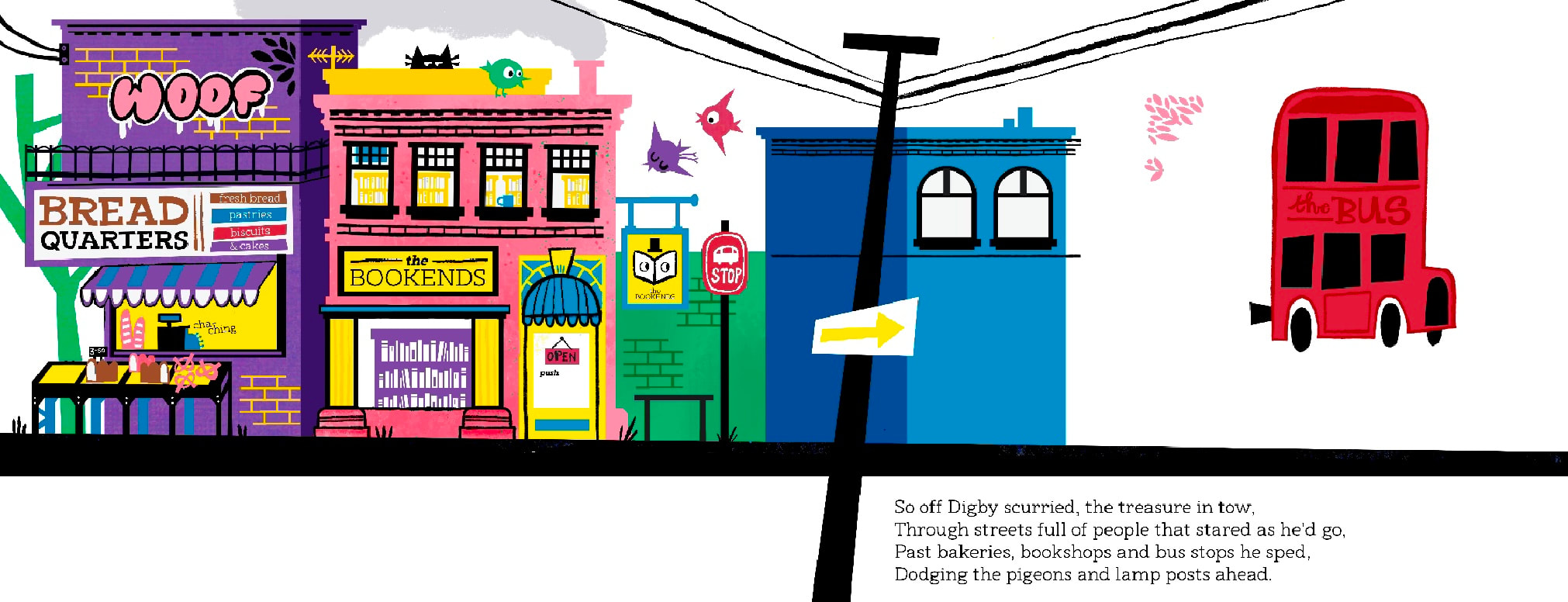
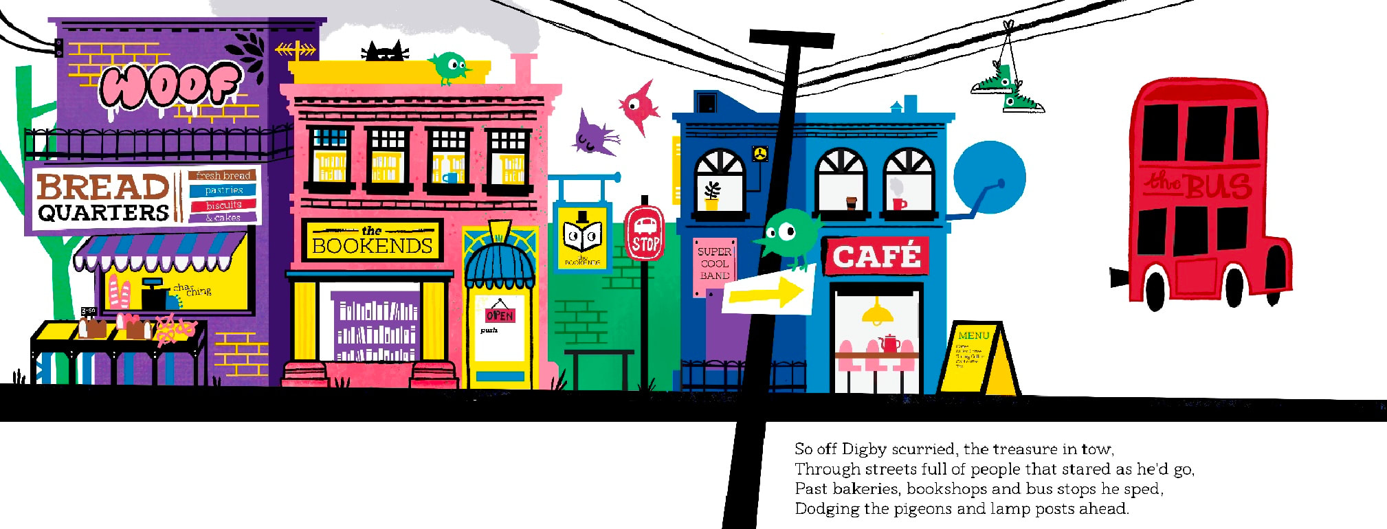
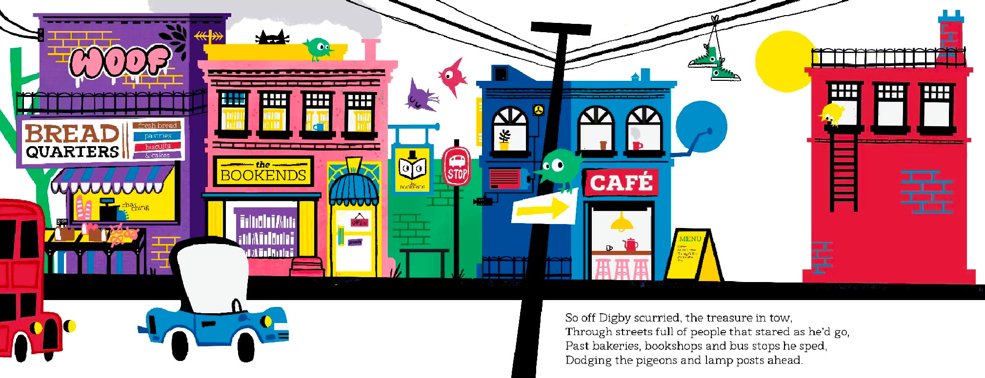
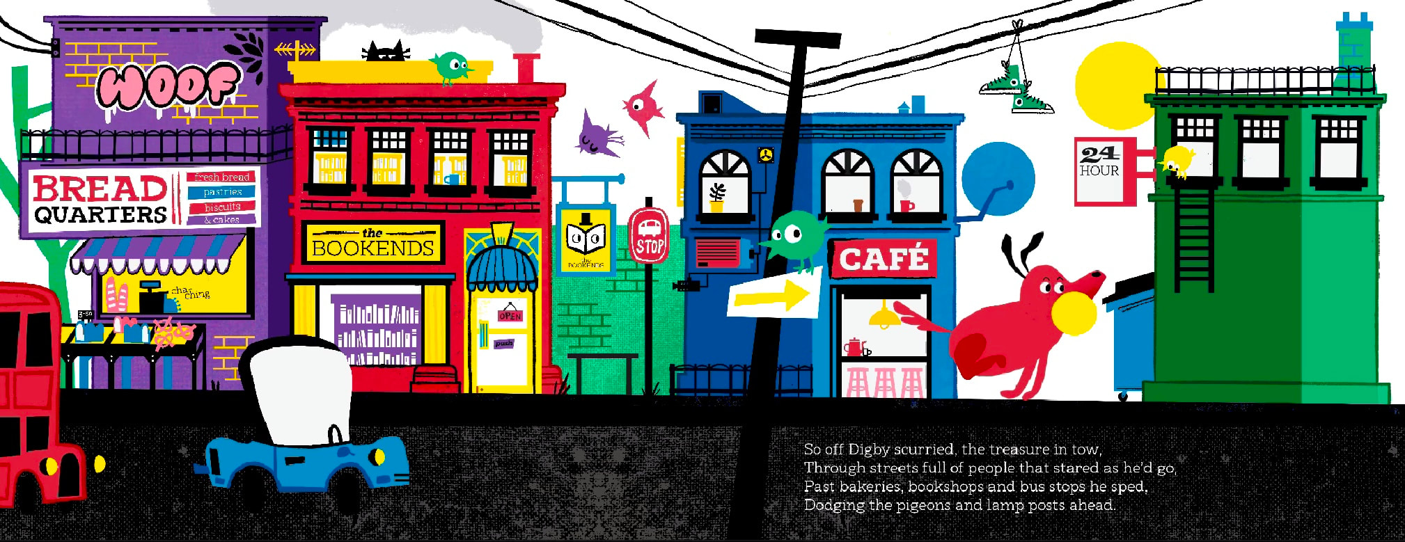
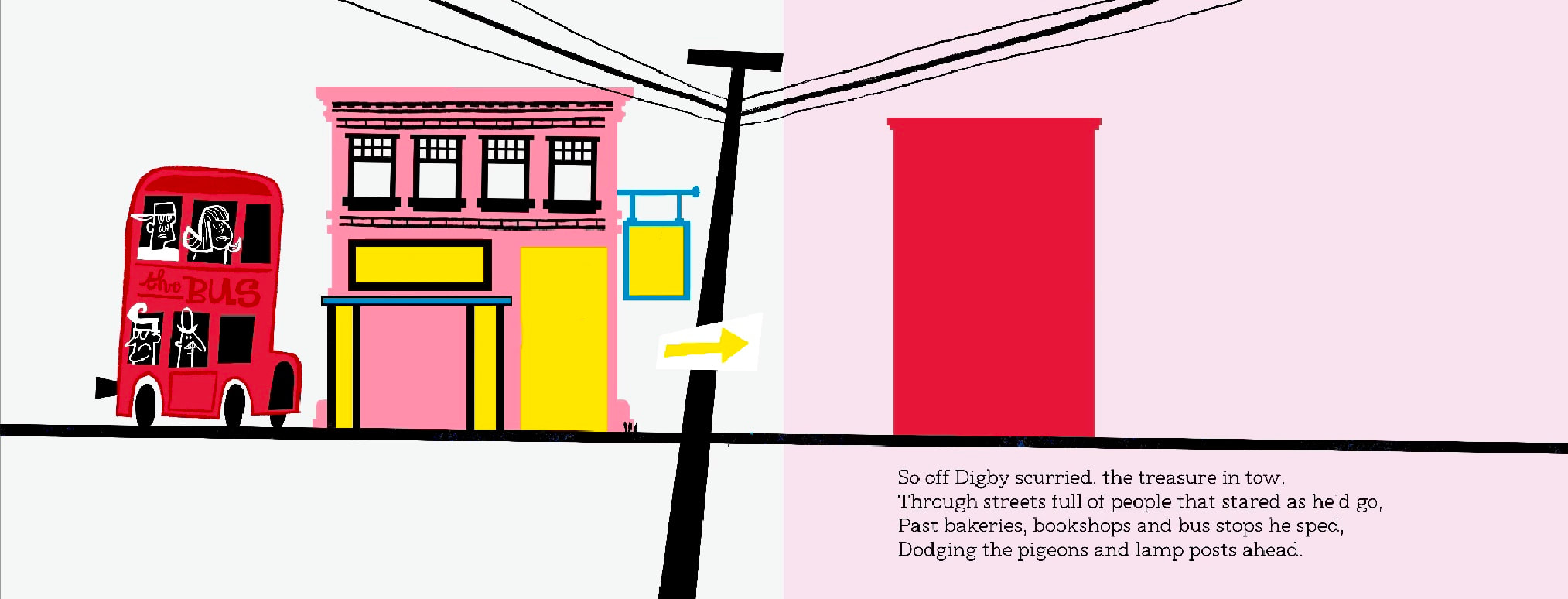
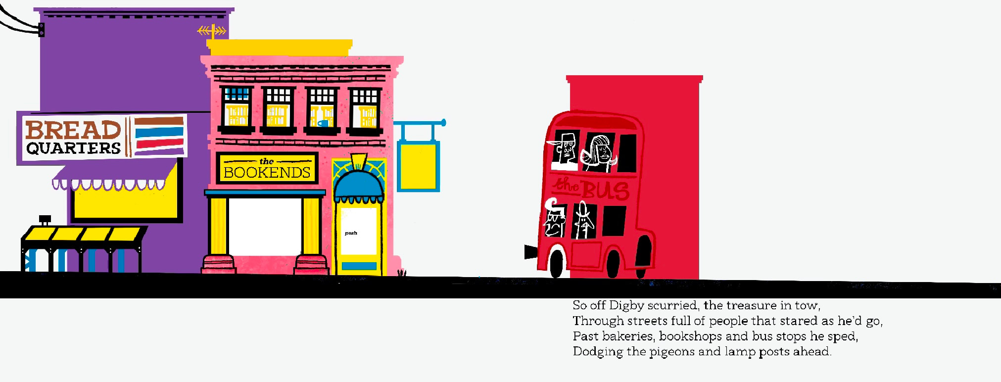
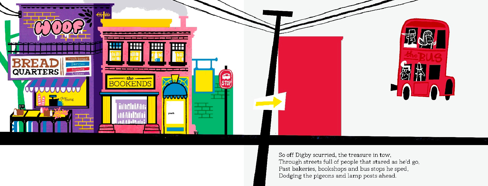
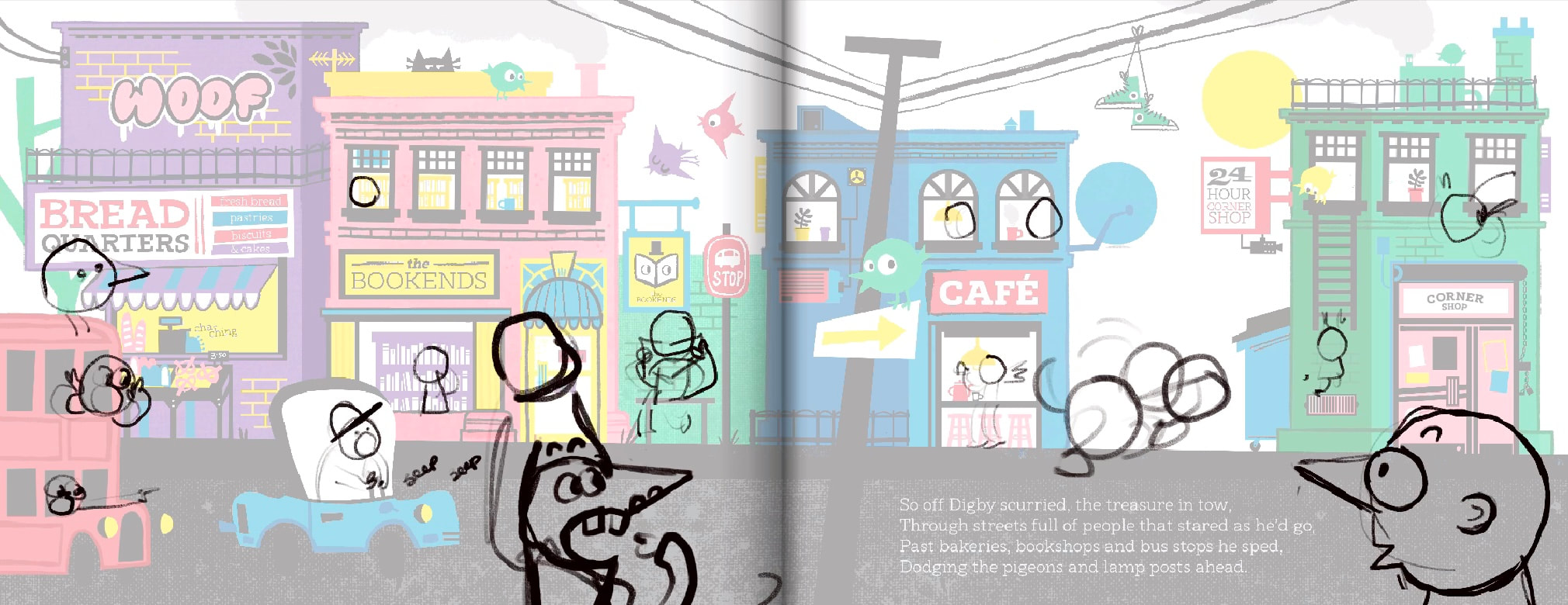
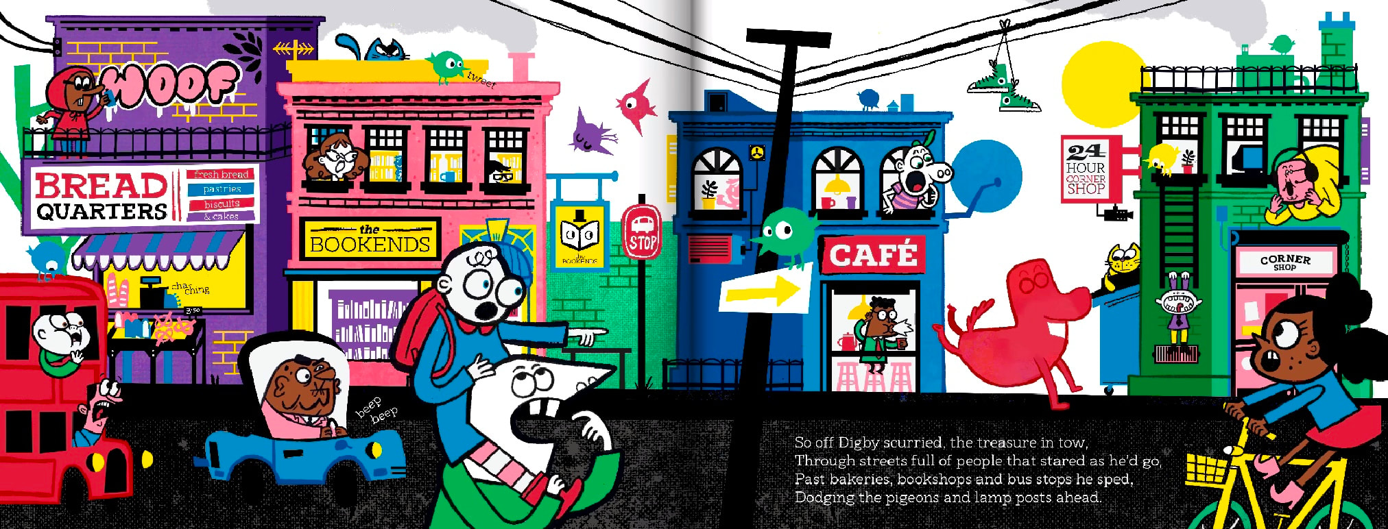
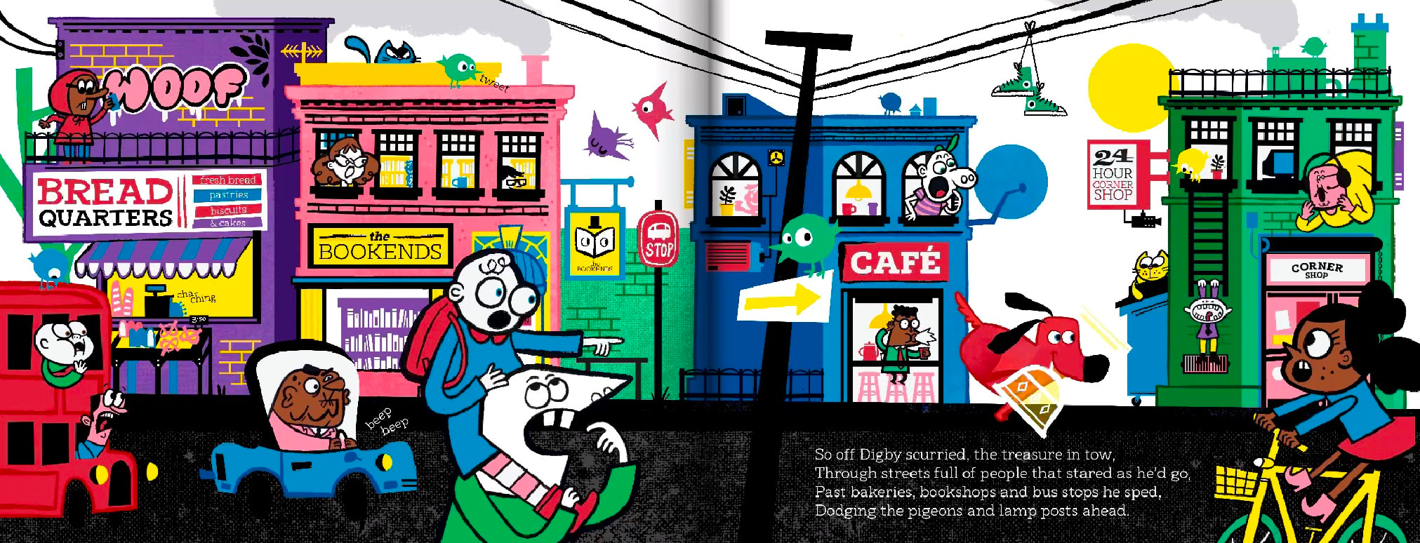
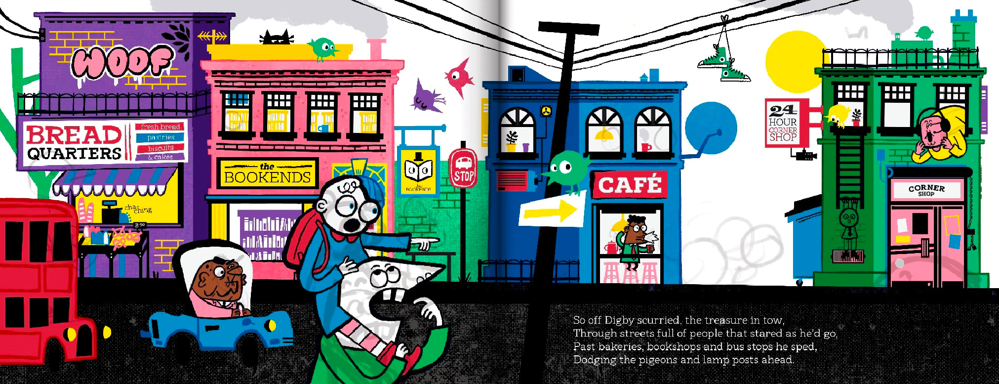
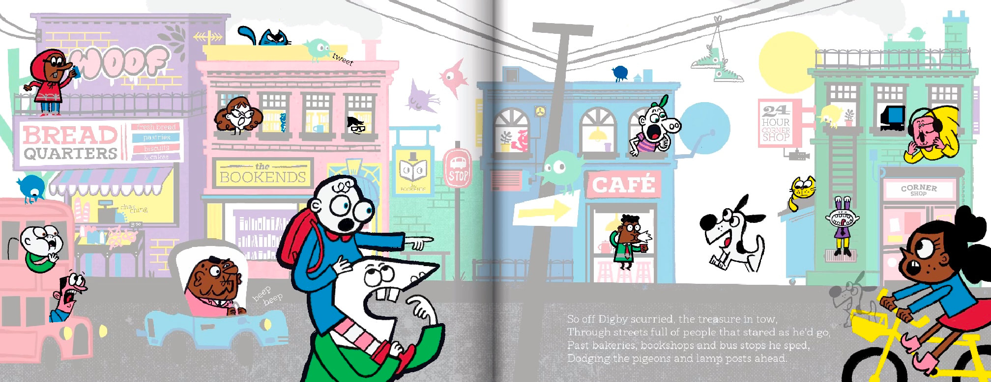
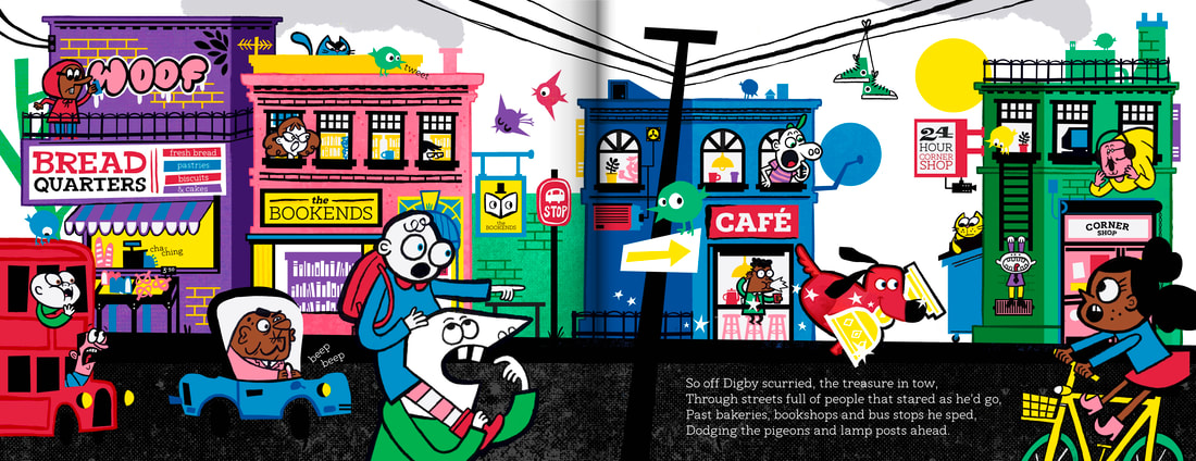
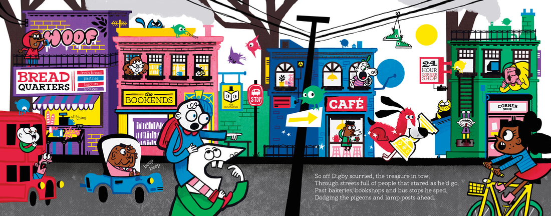
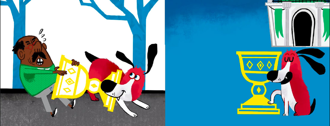
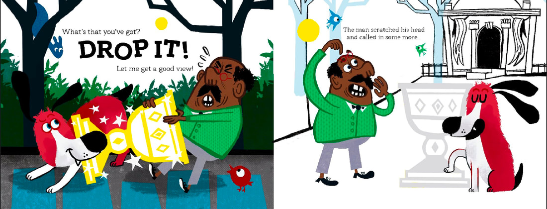
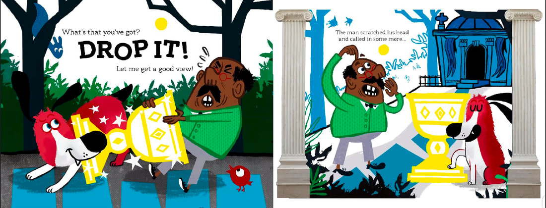
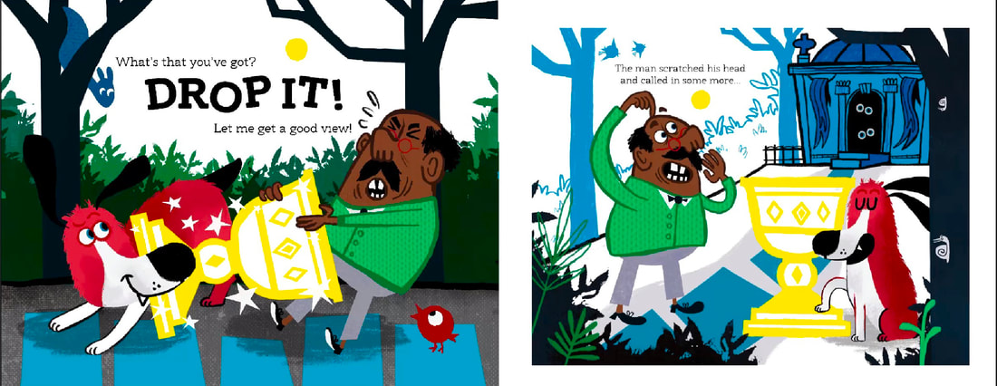
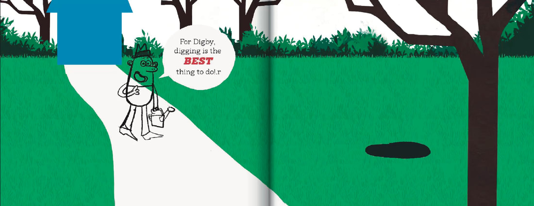
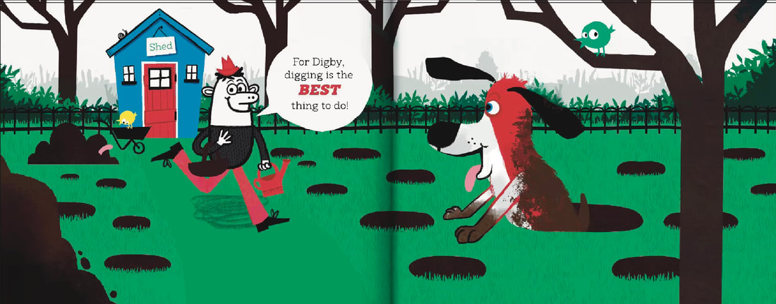
He'd dig in the garden he'd dig all about. Not looking for bones not sniffing for sticks, Just digging and digging... he loved it to bits! But one fateful day while digging once more, His paws hit a clank and a clunk on the floor. He burrowed down deeper his tail in the air, Until something astonishing lay shining there. It shimmered! It shined! It gleamed! And it glowed! It looked rather ancient, really quite old. He gave it a sniff and then trotted inside, Plonking it down in his kennel with pride. That evening while lounging and licking his feet, A voice from the telly so loud and elite! "If you find something interesting don't leave it alone, It belongs at a museum don't keep it at home!" Digby leapt up. His ears stood up tall. I's special he barked! I must answer the call! So off Digby scurried, the treasure in tow, Through streets full of people who stared as he'd go, Past bakeries, bookshops and bus stops he sped, Dodging the pigeons and lamp posts ahead. |
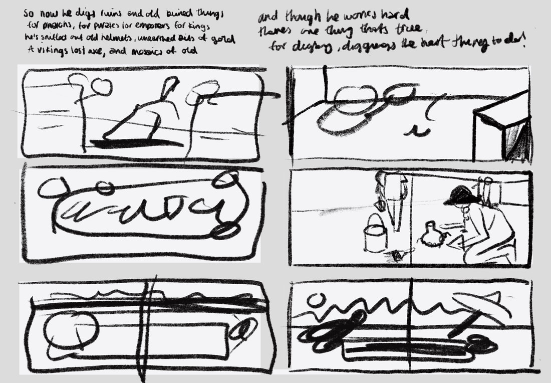
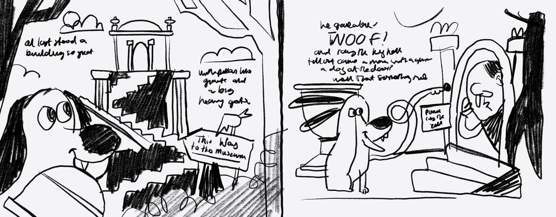
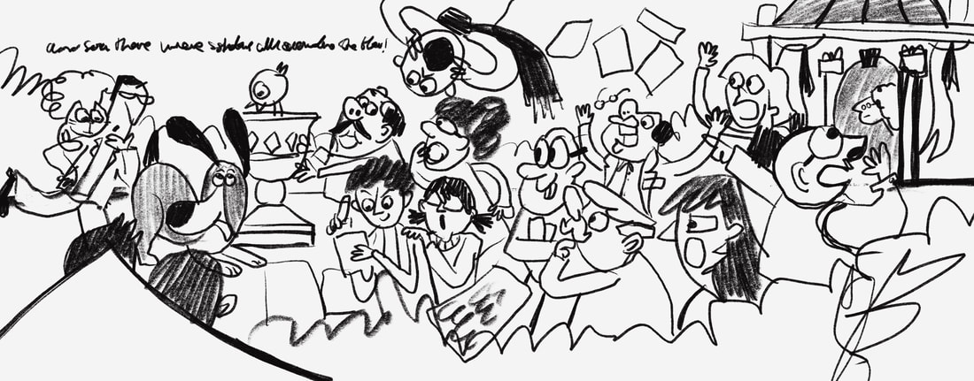
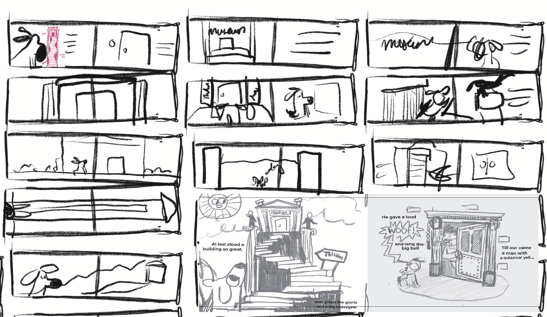
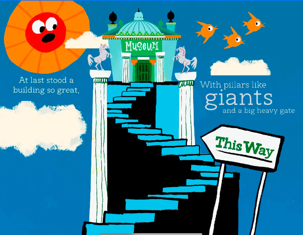
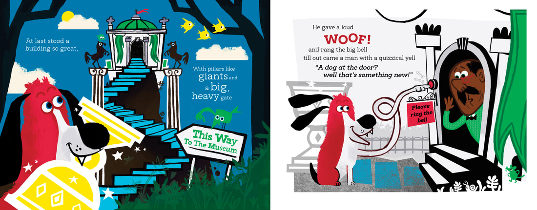
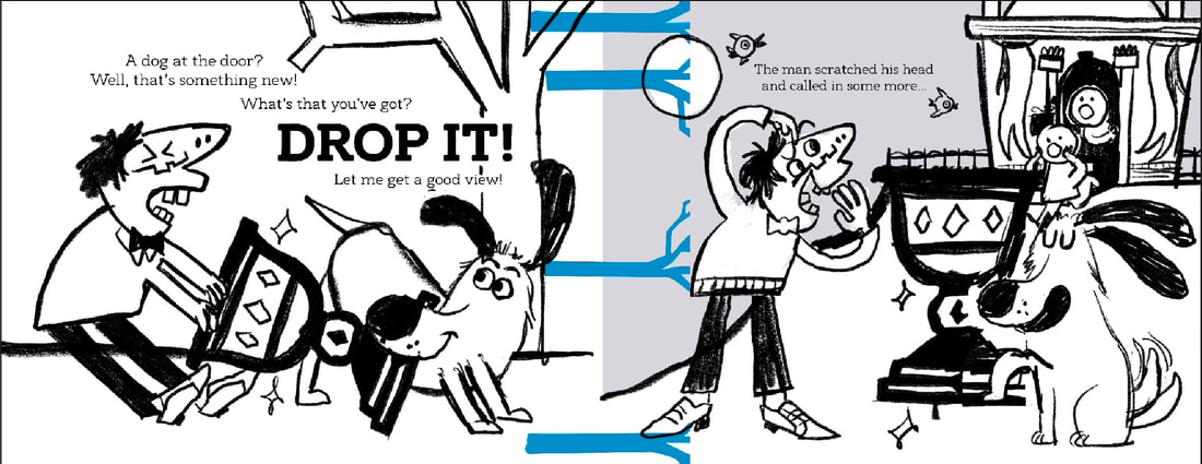
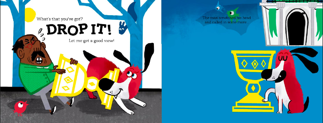
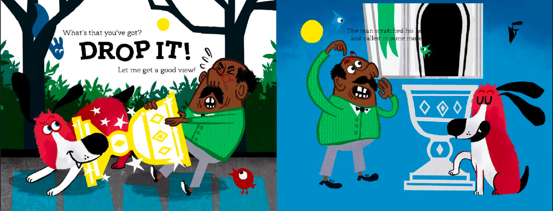
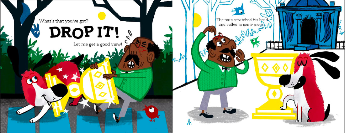
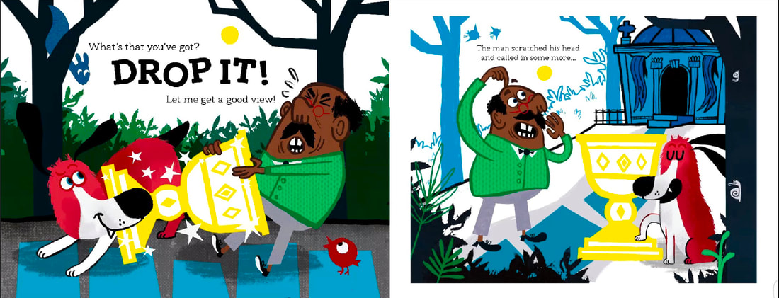
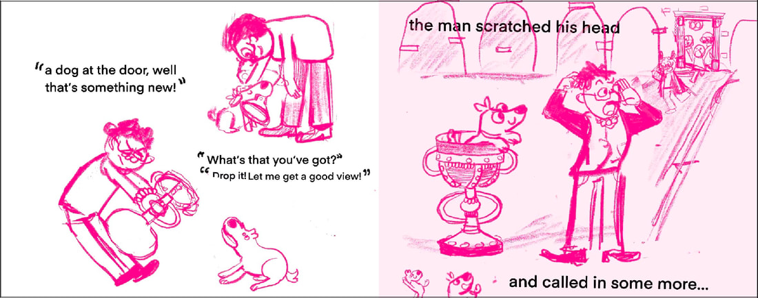
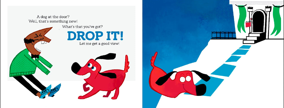
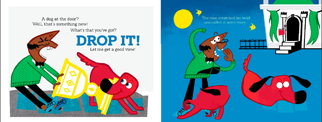
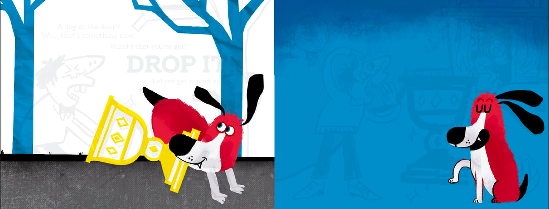
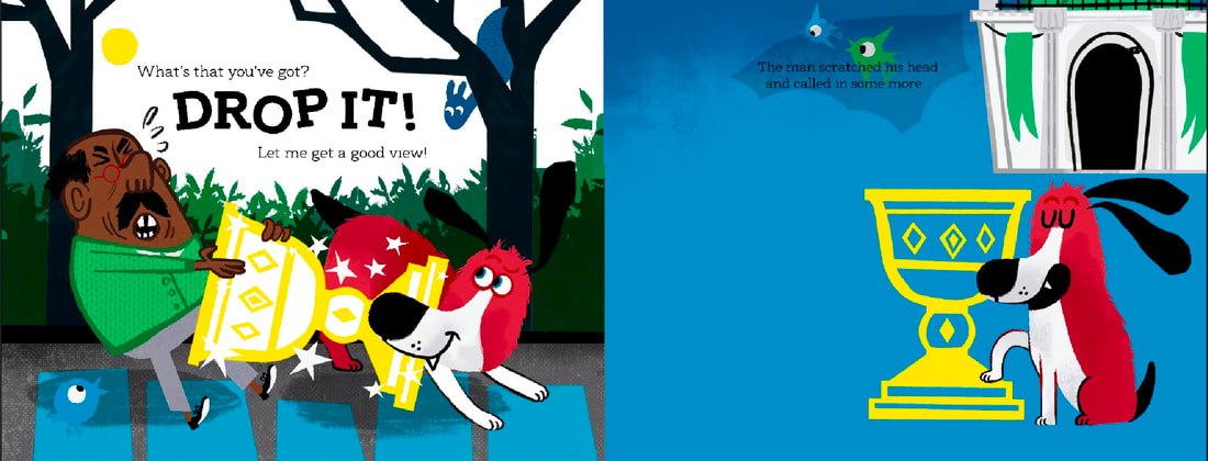
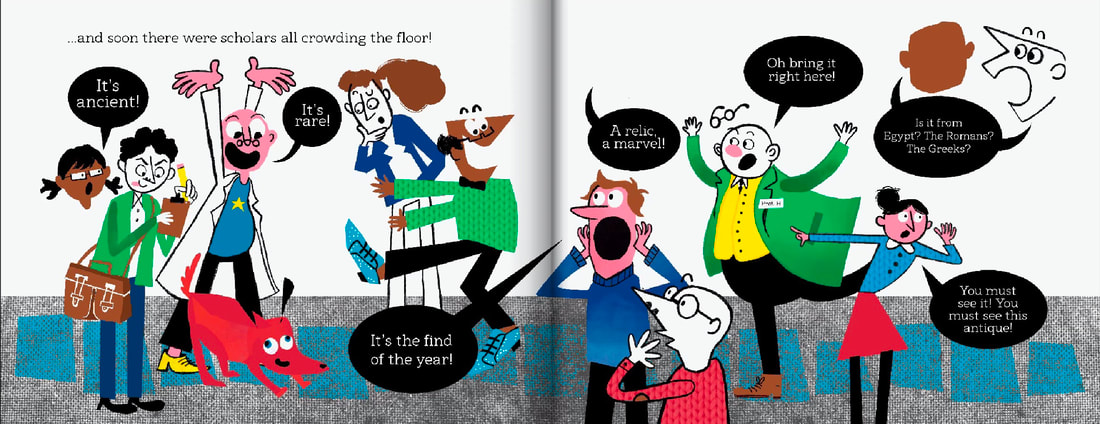
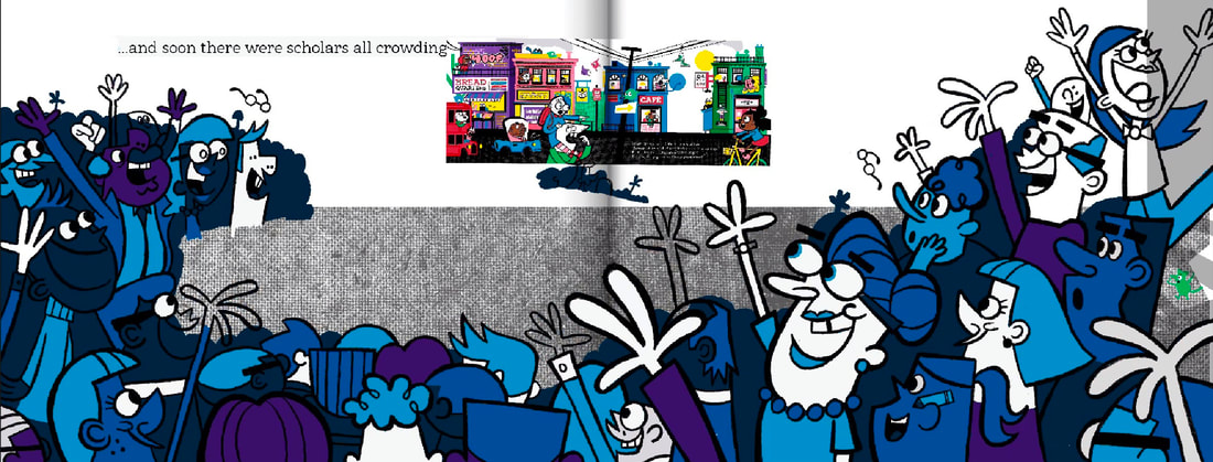
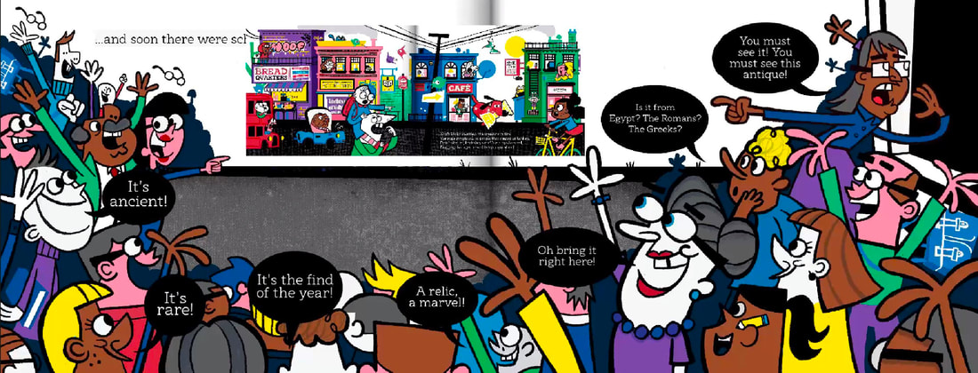
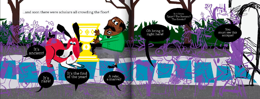
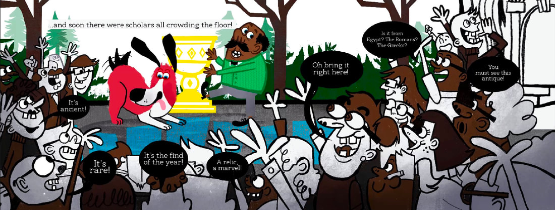
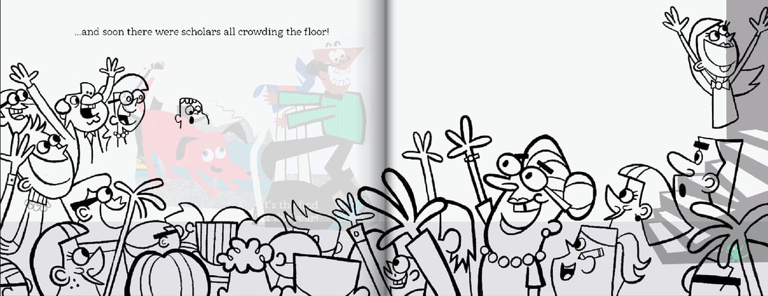
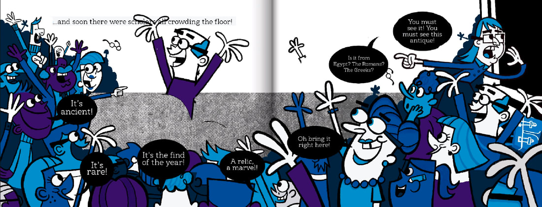
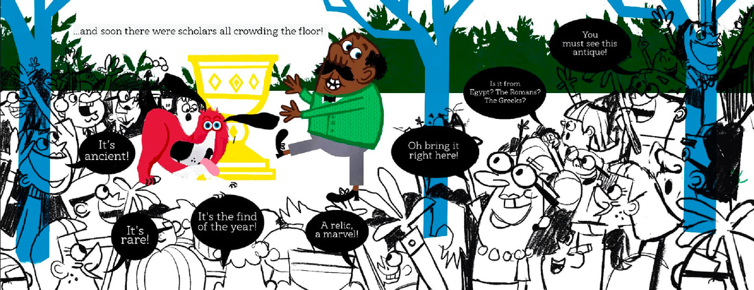
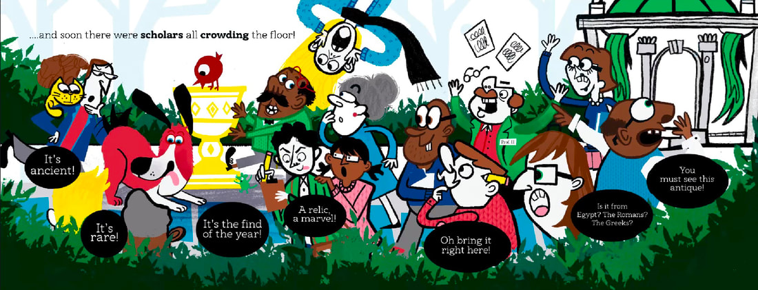
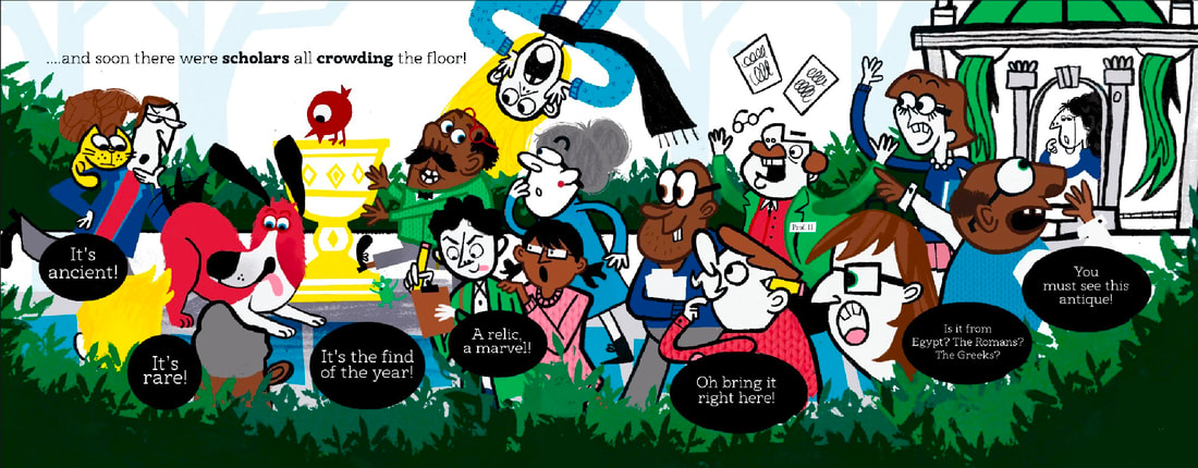
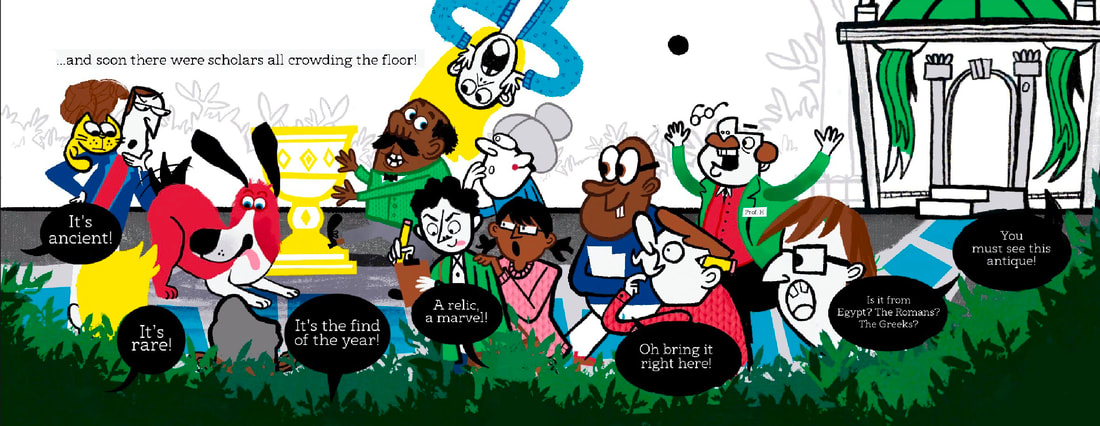
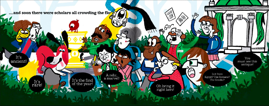
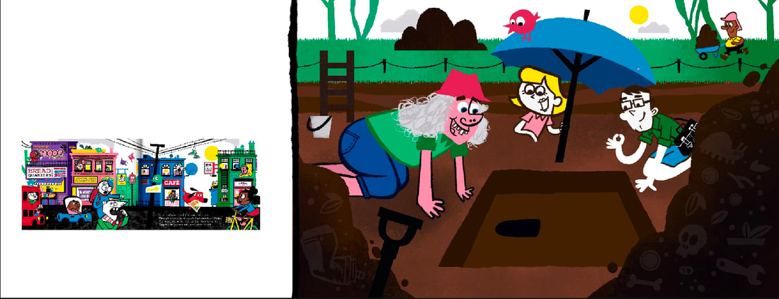
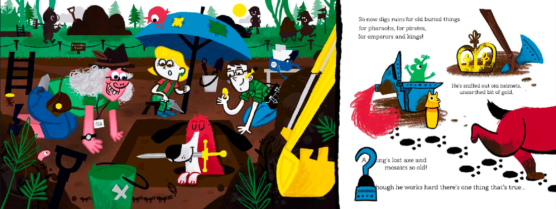
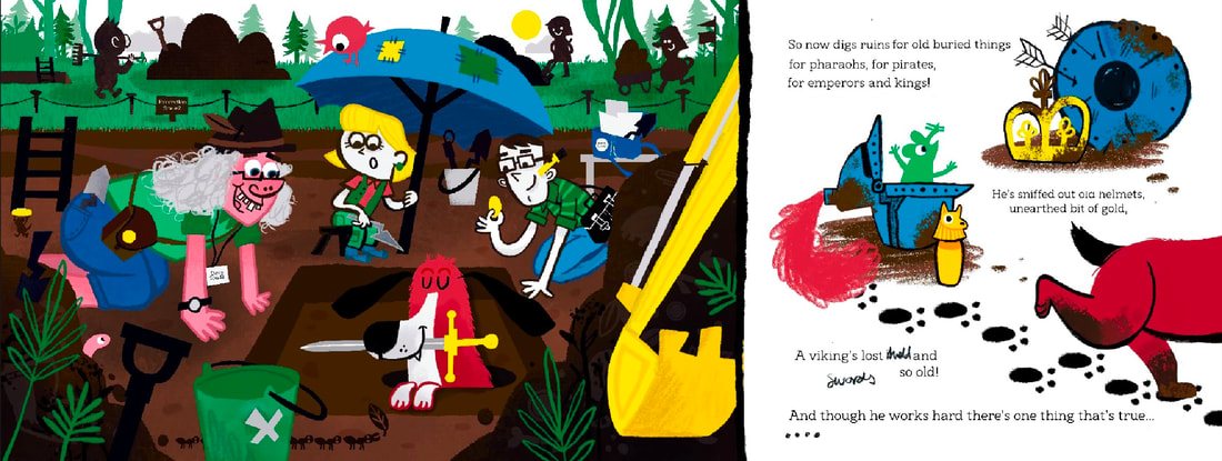
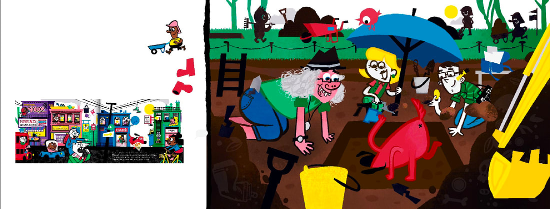
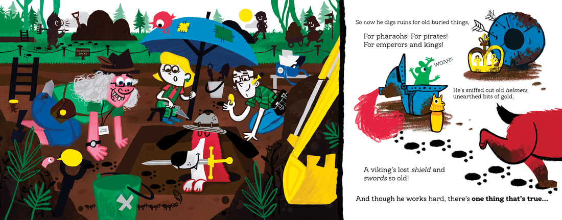
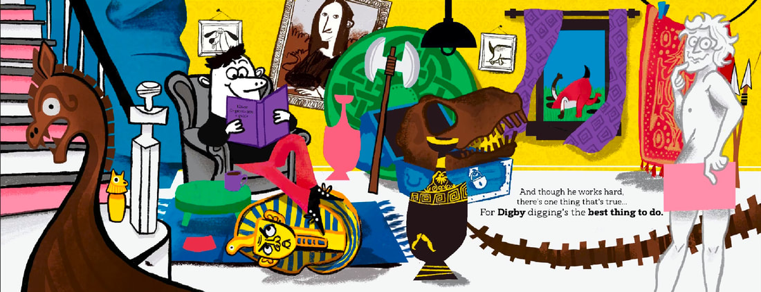
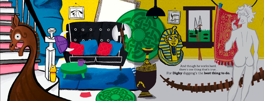
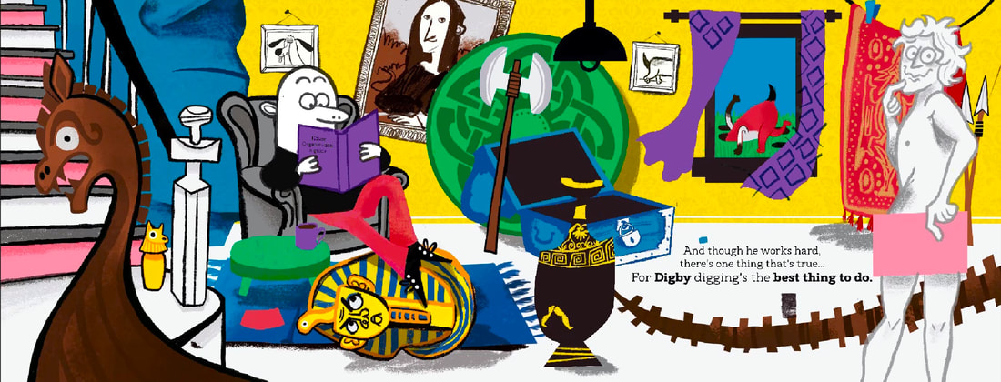
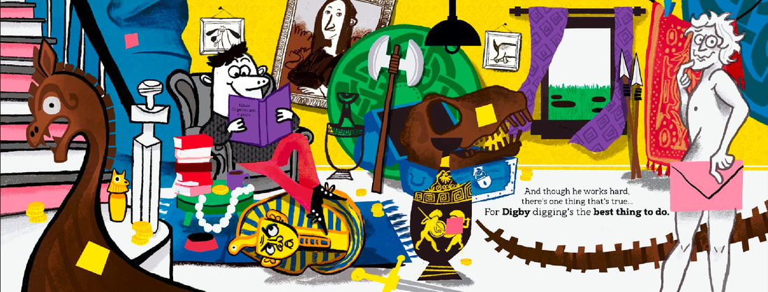
At last stood a building so great,
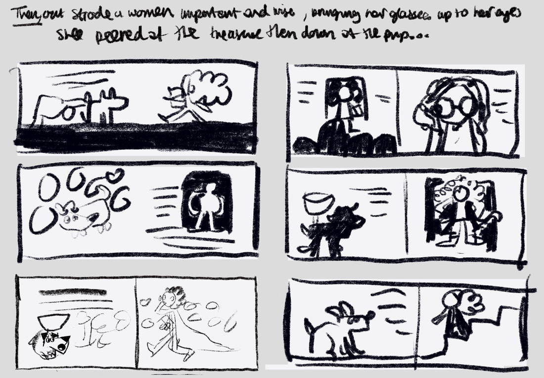
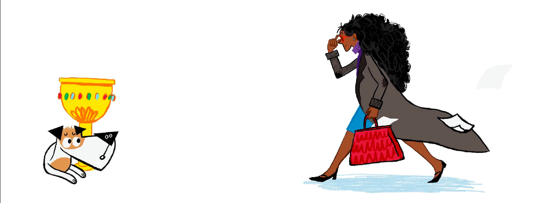
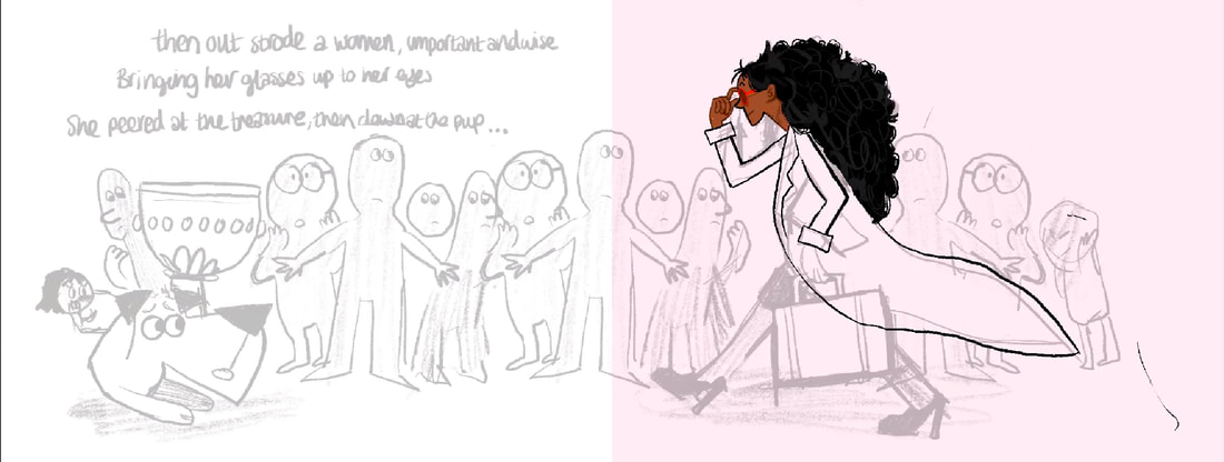
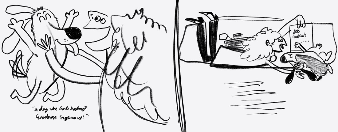
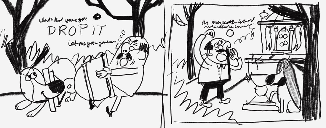
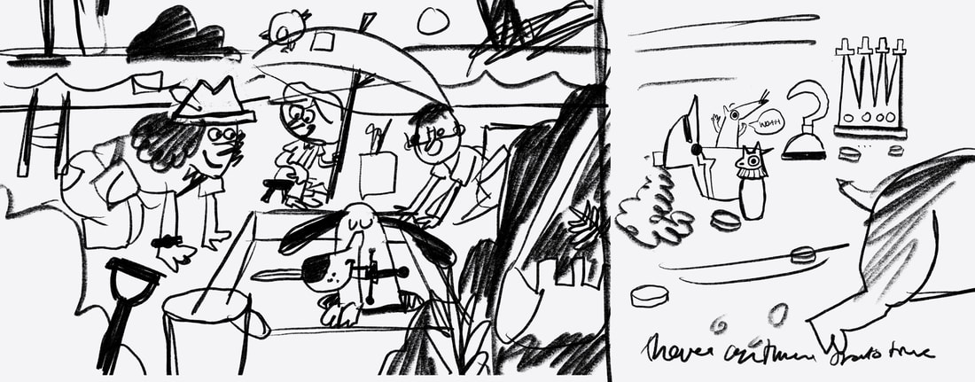
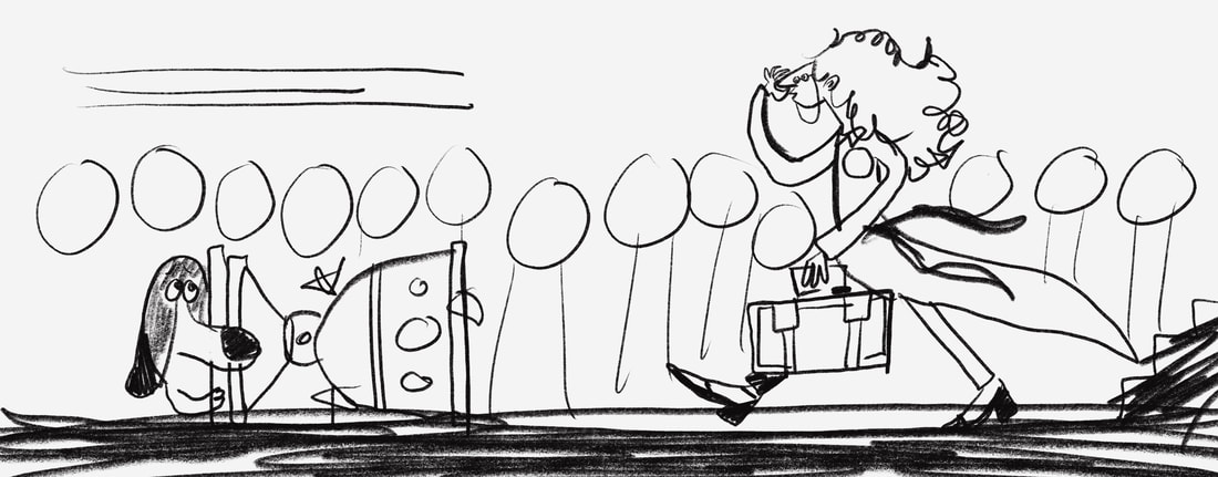
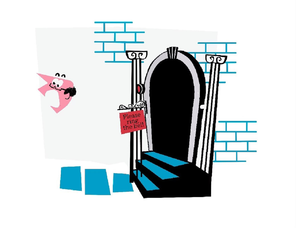
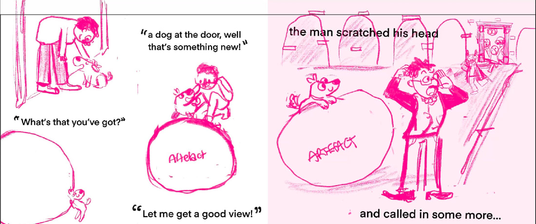
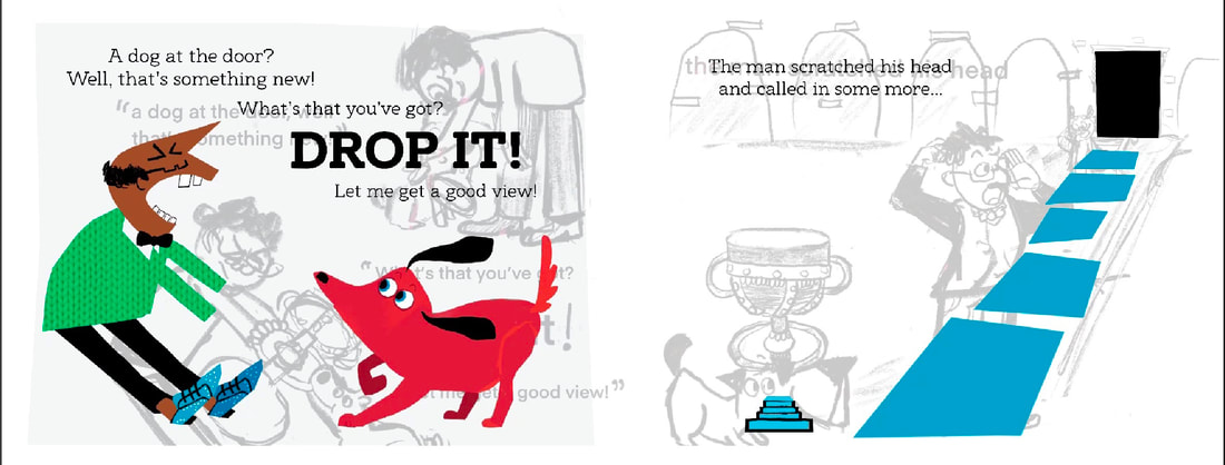
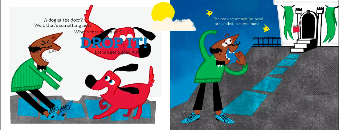
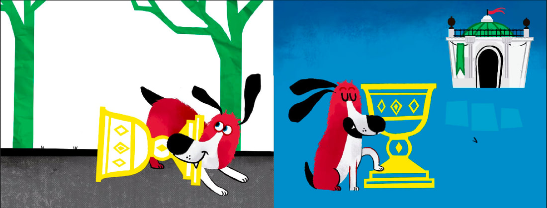
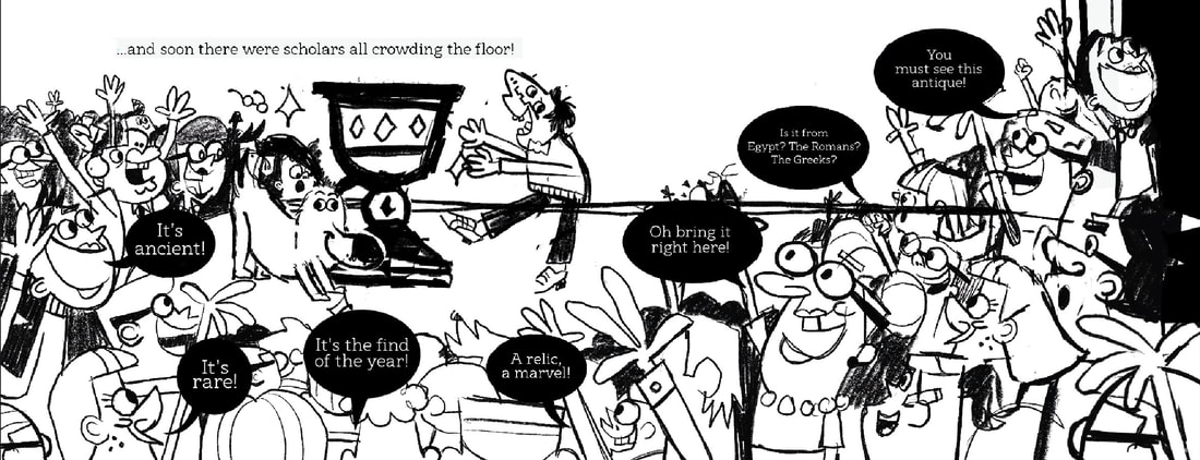
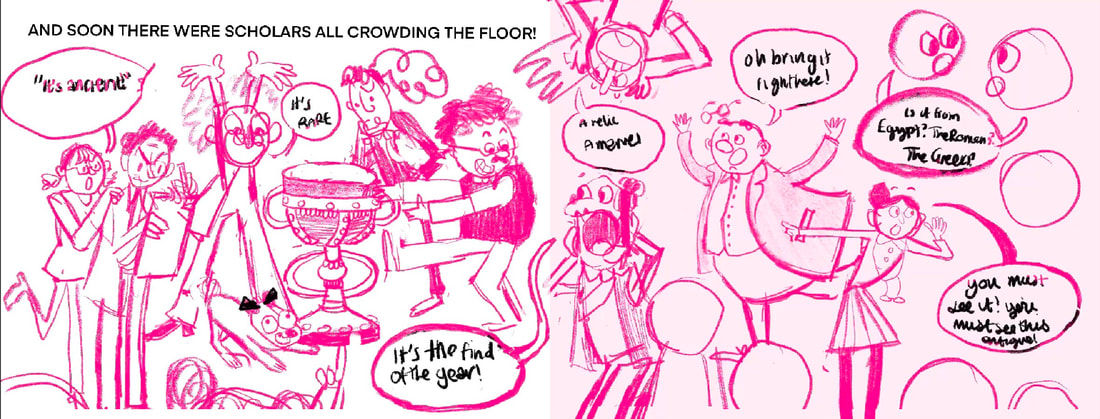
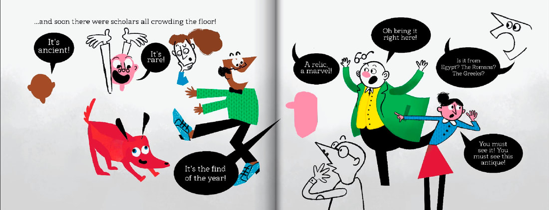
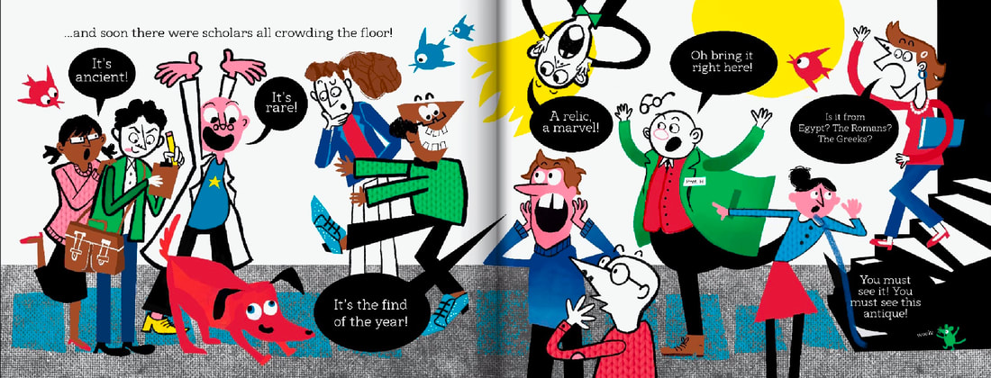
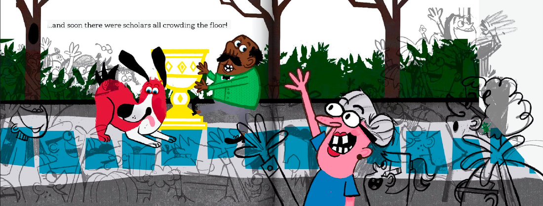
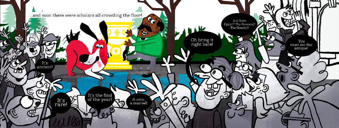
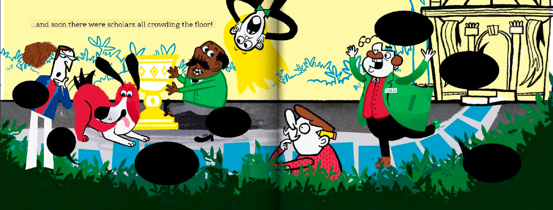
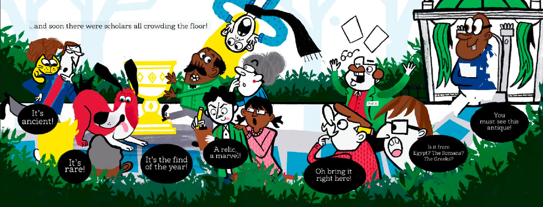
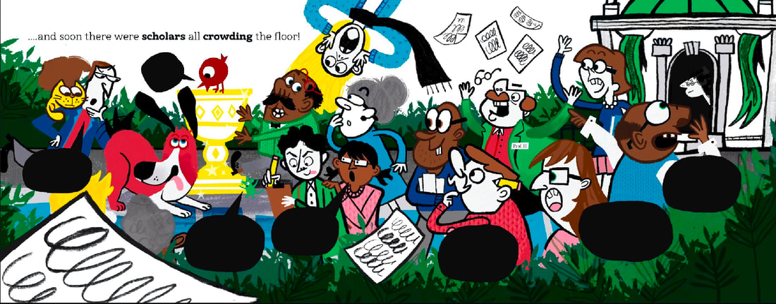
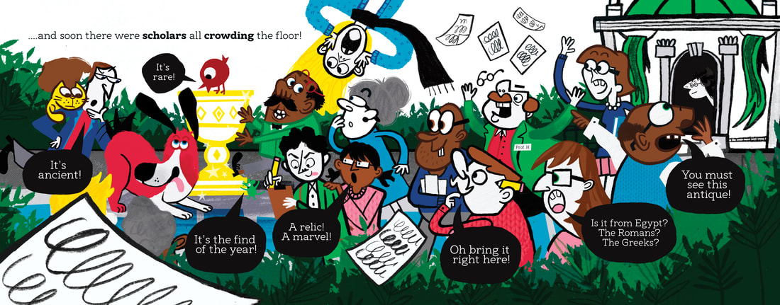
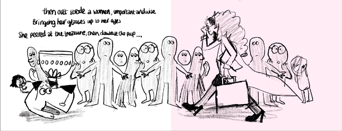
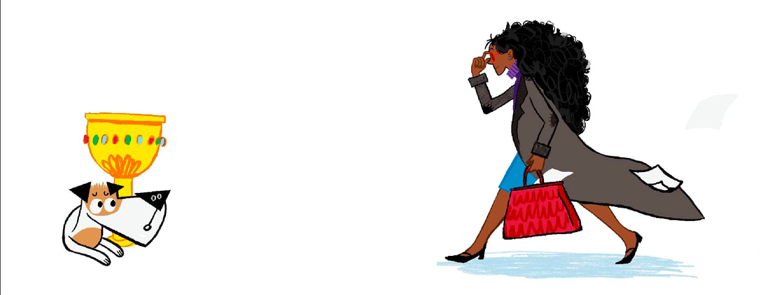
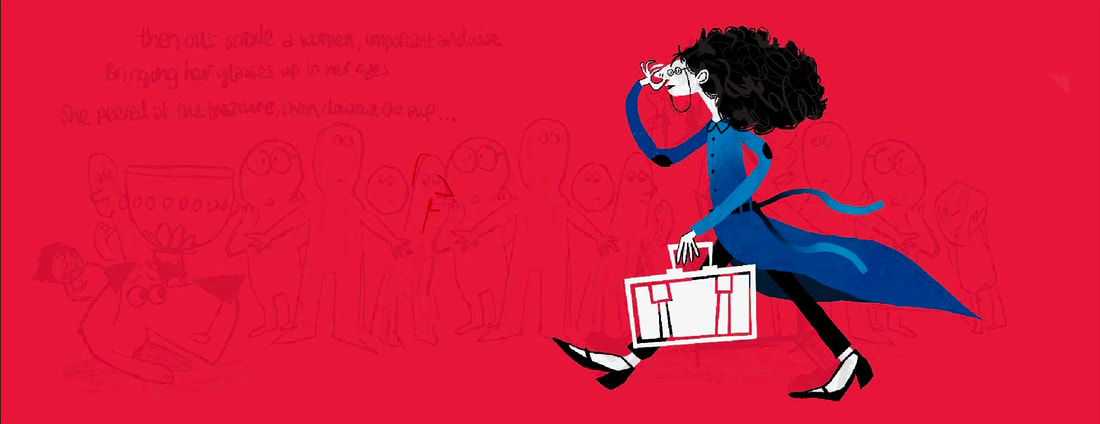
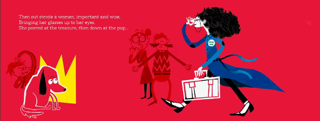
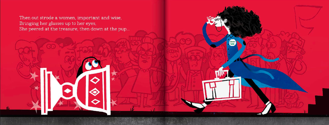
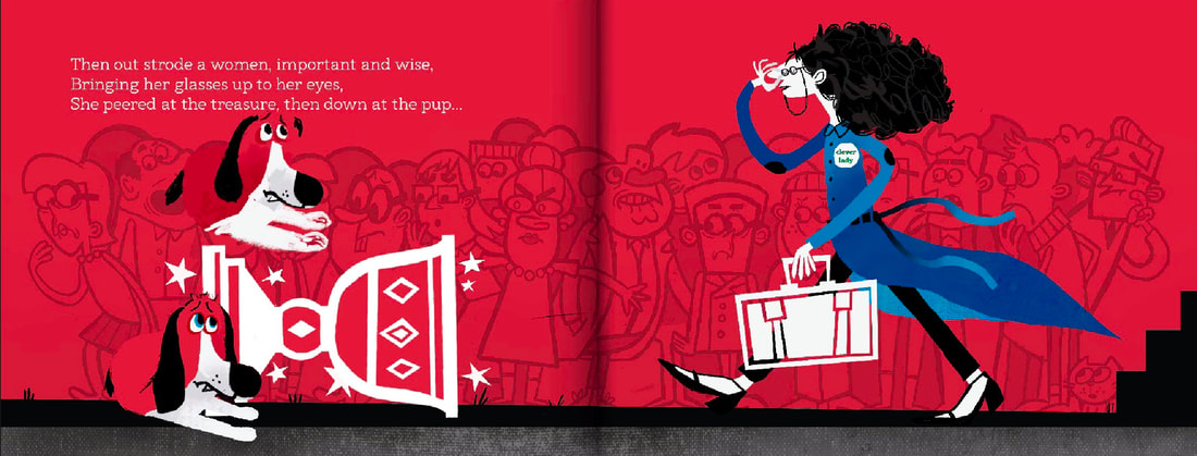
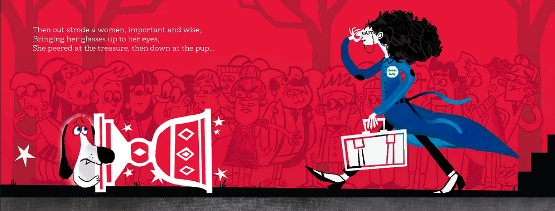
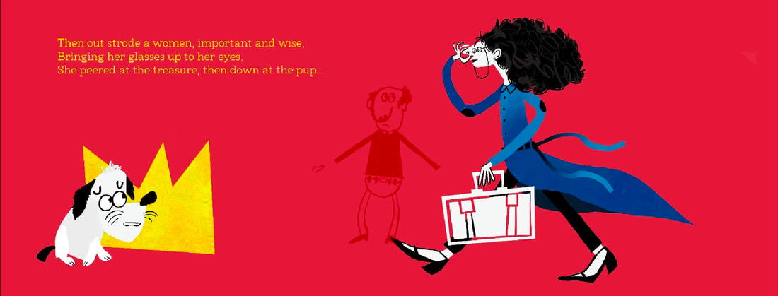
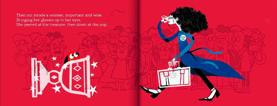
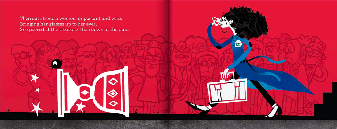
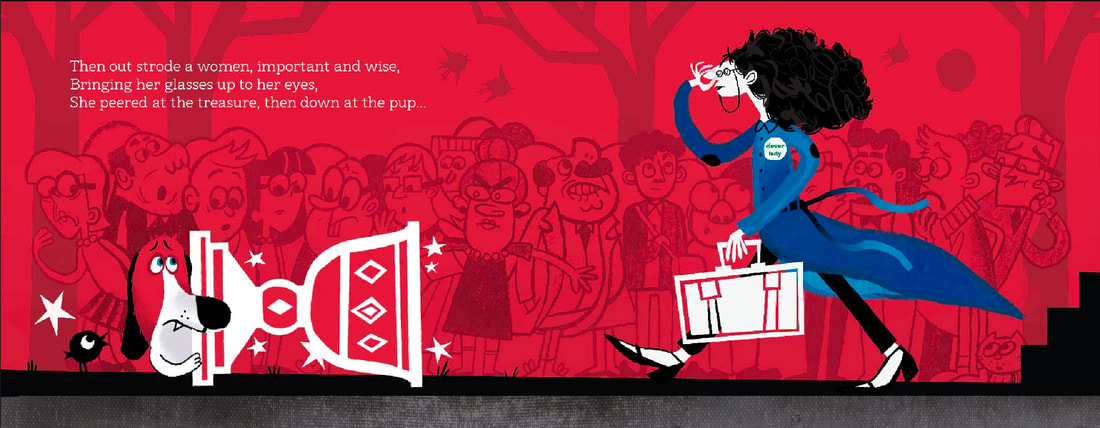
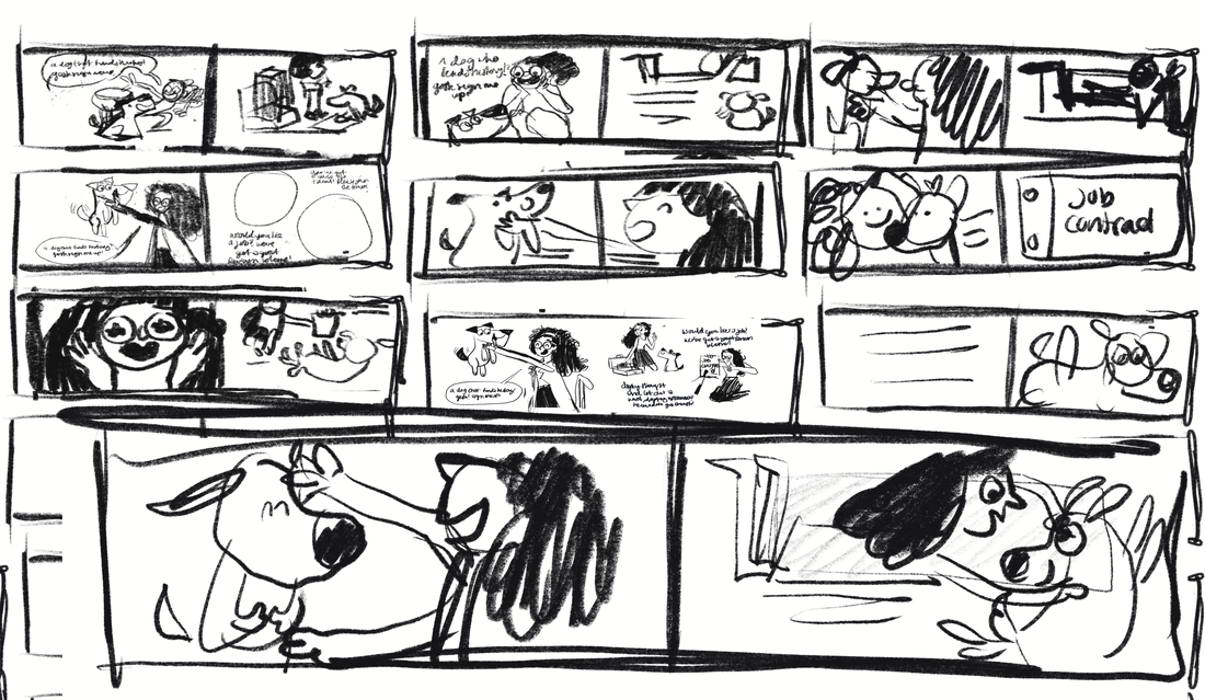
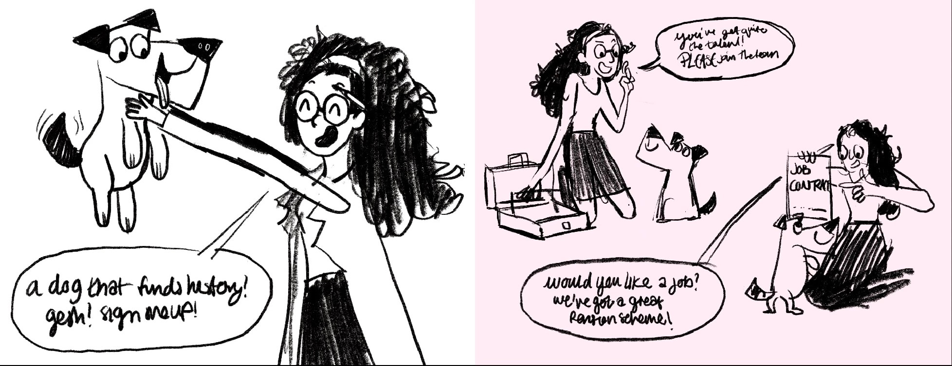
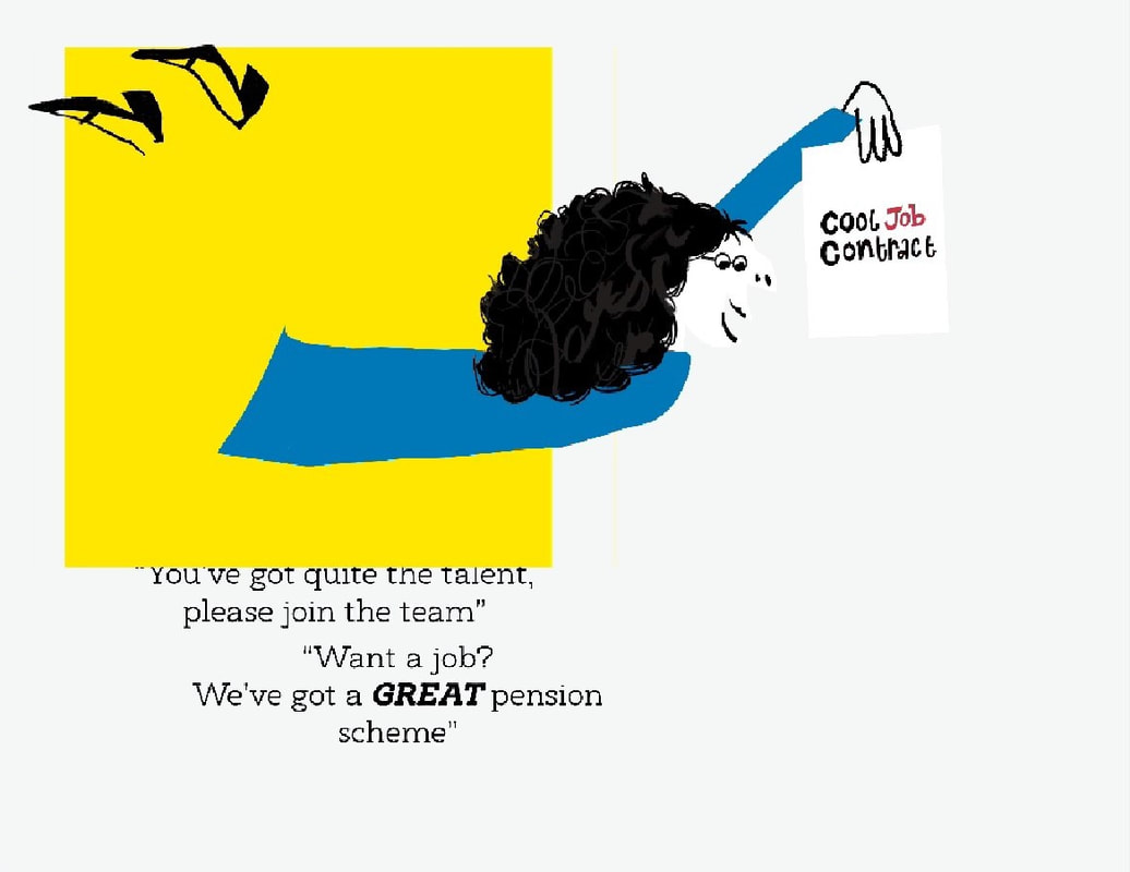
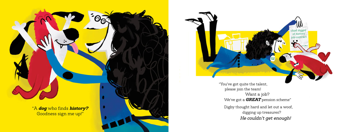
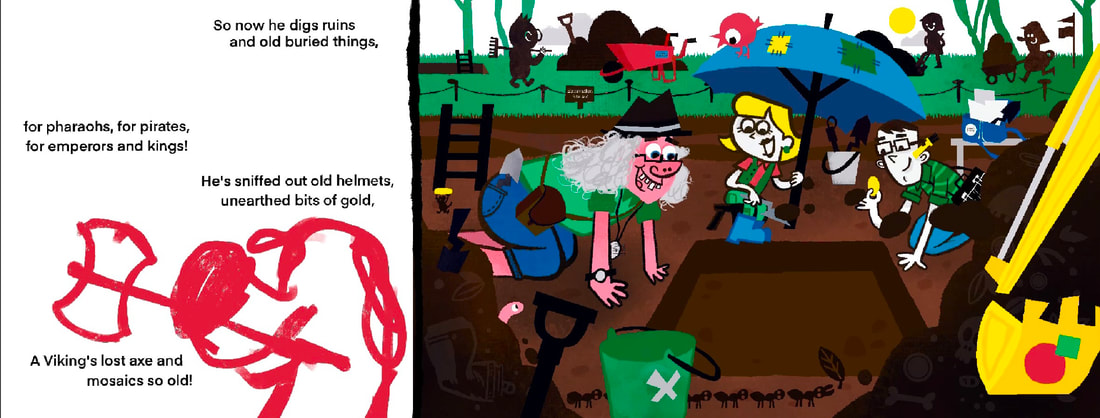
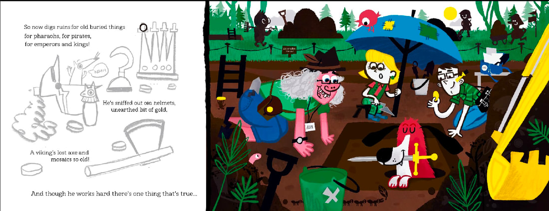
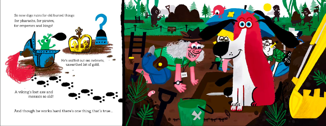
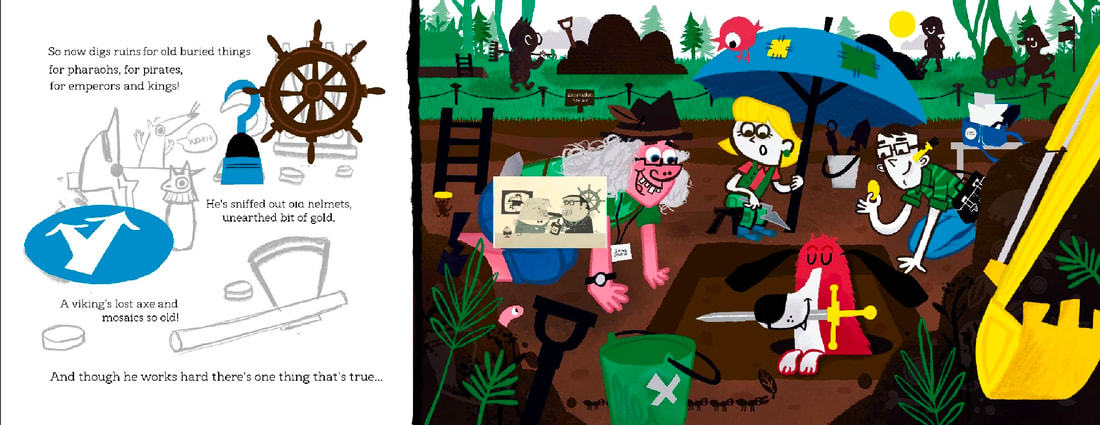
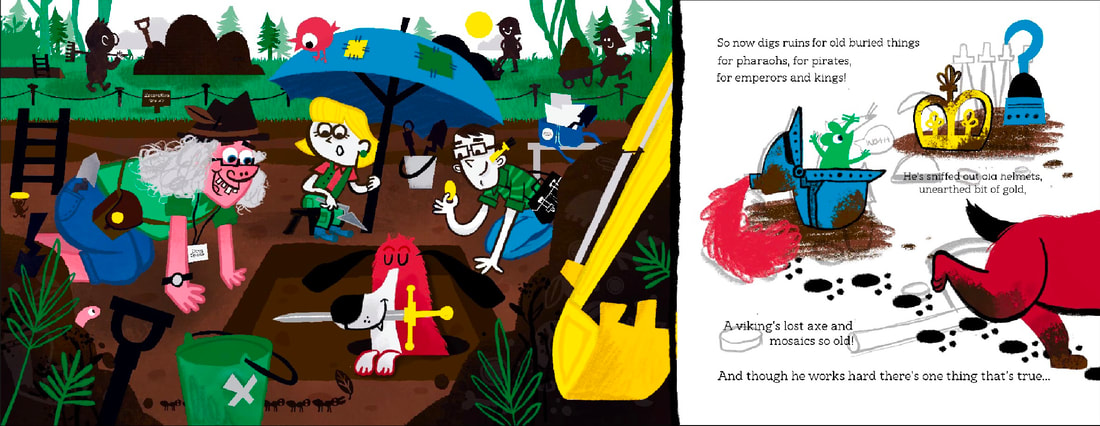
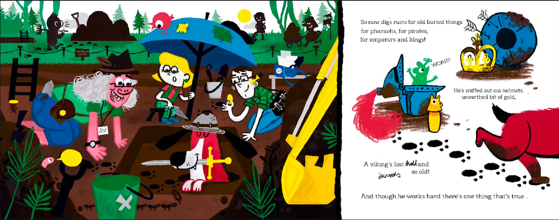
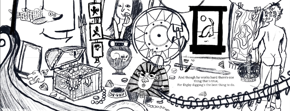
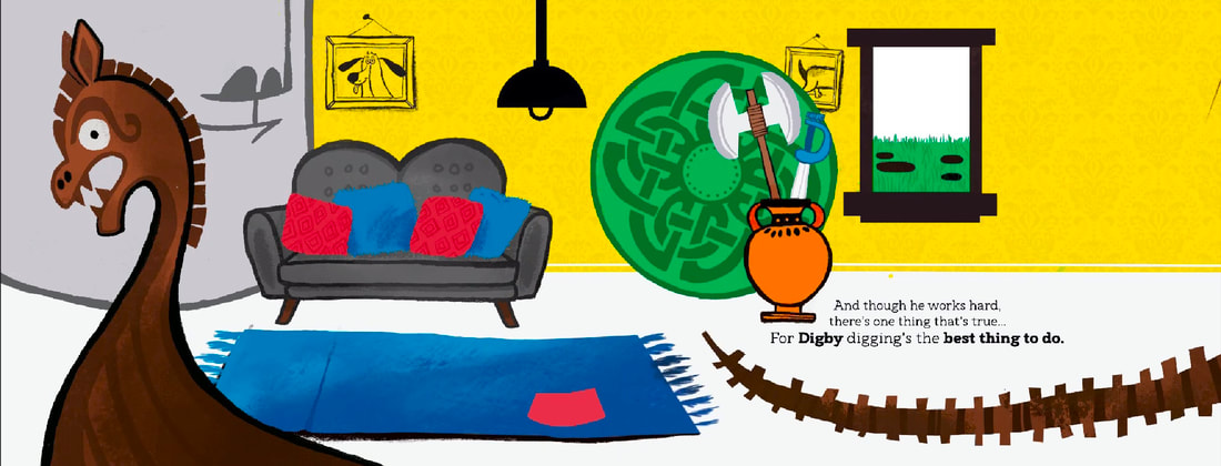
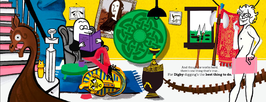
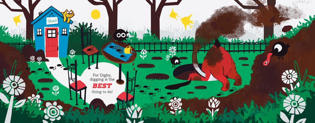
With pillars like giants and a big heavy gate, He gave a loud WOOF and rang the big bell, till out came a man with a quizzical yell. "A dog at the door? Well that's something new! What's that you've got? Let me get a good view!" The man scratched his head and called in some more... And soon their were scholars all crowding the floor "It's ancient!" "It's rare!" "It's the find of the year!" "A relic!" "a marvel" "oh bring it right here!" "is it from Egypt? "the romans?" "the Greeks" "you must see this antique!" Then out strode a women, important and wise, Bringing her glasses up to her eyes, She peered at the treasure then down at the pup... "A dog who finds history? Gosh sign me up!" "You've got quite the talent please join the team" "Would you like a job? We've got a great pension scheme" Digby thought hard then let outa WOOF! Digging up history? He couldn't get enough. SO now he digs ruins and buried old things, For pharaohs! For emperors! For pirates and kings! And though he works hard there's one thing that's true, For Digby, digging's the best thing to do! |
INITIAL RESEARCH
Research is really important for this module. I need to learn about the ins and outs of picture book making before I start.
HOW DO YOU EVEN MAKE A PICTURE BOOK??
Good question! It's quite complicated. I had a look at a bunch of videos and blog posts about it to prepare myself. Not all these people are great illustrators, but they have good tips for planning and productivity.
Good question! It's quite complicated. I had a look at a bunch of videos and blog posts about it to prepare myself. Not all these people are great illustrators, but they have good tips for planning and productivity.
READING BOOKS ON THE TOPIC
I went to the library and checked out a few books about illustrating children's books. I found these a great jumping off point.
|
|
|

|
GOOD SHIP ILLUSTRATION PODCAST
The Good Ship is a great resource for insight into the illustration industry, this helped me a lot with questions I had with how to make a book. I watched new episodes every Friday.
|
|
|
YOUTUBE GUIDES
Anooshya Syed is an illustrator who makes great videos and social media posts guiding new illustrators on the ins and outs of children's publishing. These are just a couple of the videos I watched, but I've spent a lot of time researching through this.
|
|
|
BLOG POSTS
I searched online for helpful blogs and websites about the process of illustrating books. These two were particularly helpful.
|
|
|
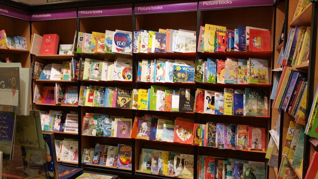
MARKET RESEARCH
WHAT BOOKS ARE AVALIBLE IN SHOPS?
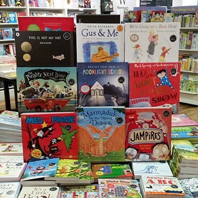
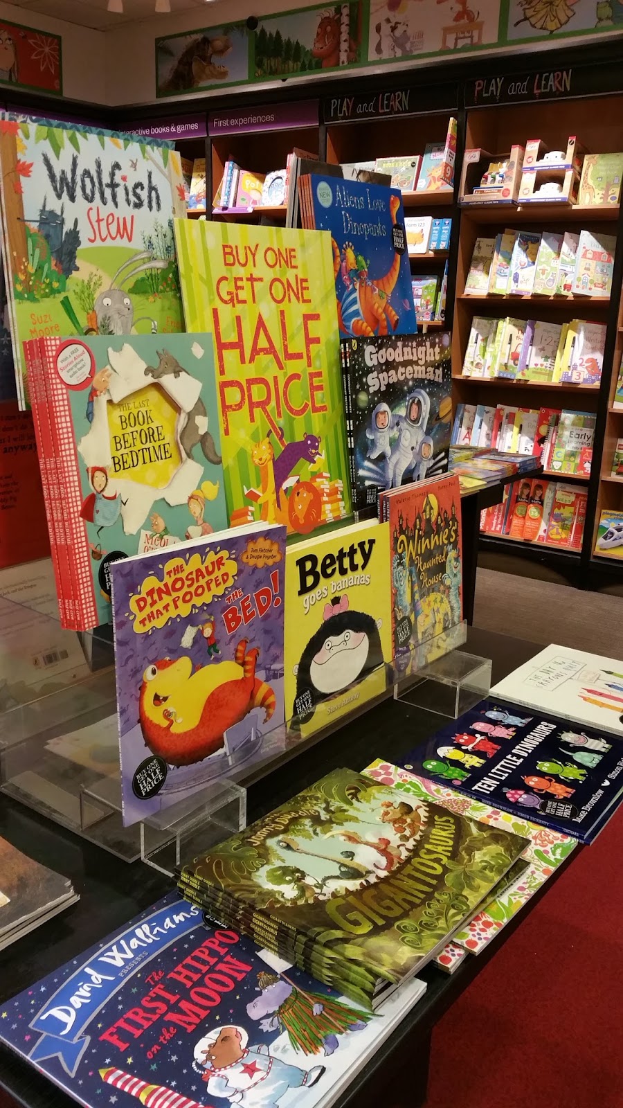
I spent a good chunk of time looking at what books are heavily advertised at physical book shops. I took photos of what books are on display and made notes of common themes.
COMMON THEMES:
- CHARACTER HEAVY DESIGNS
- COLOURFUL BRIGHT COLOURS
- ANIMALS AND CHILDREN
- SIMPLPE LEGIBLE TYPE
- VARIETY OF SIZES AND FORMATS, NO TWO THE SAME
- BOARD BOOKS, PAPER BACK AND HARD BACK OPTIONS

|
|
|
|
|
LEARNING ABOUT PRINTING
As I want the book printed, I need to learn some stuff about that process before I can begin. On my last course when I made a picture book, I completely neglected this and the final product wasn't very polished. It's very important.
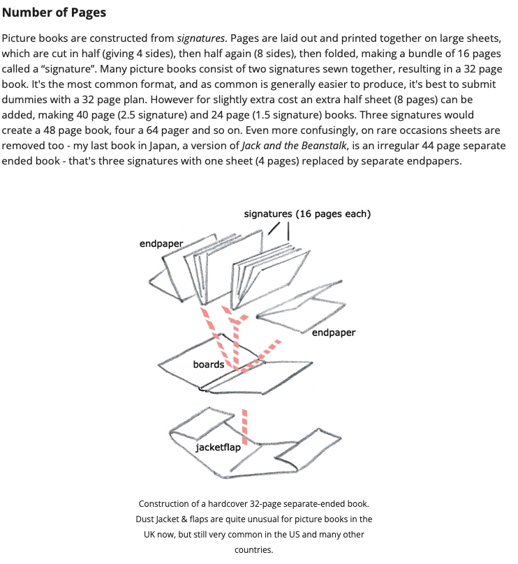
HOW MANY PAGES IS IT GOING TO BE?
I need to figure this out straight away. 32 pages or 16 spreads is the most common format for picture books but 40 pages and 24 page are also very common. I will make the standard 32 page book.
I need to figure this out straight away. 32 pages or 16 spreads is the most common format for picture books but 40 pages and 24 page are also very common. I will make the standard 32 page book.
|


|
BOOK SIZING
Before I begin, I'll start by researching what sizes of books are available for me to work in for printing. I measured my collection of children's books to find common book sizes.
From left to right: 200mm x280mm, 260mm x 260mm, 250mm x275m, 280mm x 250mm.
From left to right: 200mm x280mm, 260mm x 260mm, 250mm x275m, 280mm x 250mm.
|
|
|
|
MIXAM OPTIONS

|
|
The two closest options Mixam offered where 210mm x 280 mm and 216 x 279mm. I decided to opt for the letter setting of (216mm x 279mm) in landscape. I thought about doing a custom size, but the price increased drastically by over £600.
I can now begin sketching in this size format. |
DOCUMENT SETUP
CMYK VS RGB
I've made the mistake in projects before of working in RGB for a project that is inevitably going to be printed. I will set my documents up in CMYK so I don't have to do Photoshop magic at the end and make my colours work. This is REALLY important.
BLEED SETTINGS
When I made my first picture book, I didn't know what bleed was and Mixam had to add it on my behalf after ringing and emailing me lots of times and multiple attempts of me trying to add it. I'll be prepeared this time and set up a bleed in my document.
|
|
|
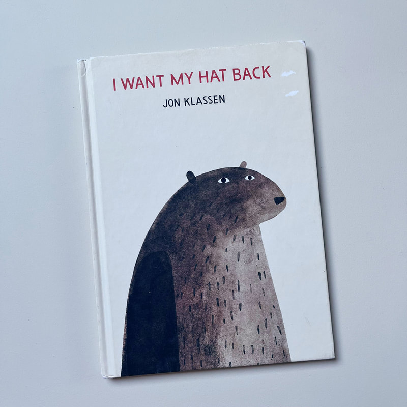
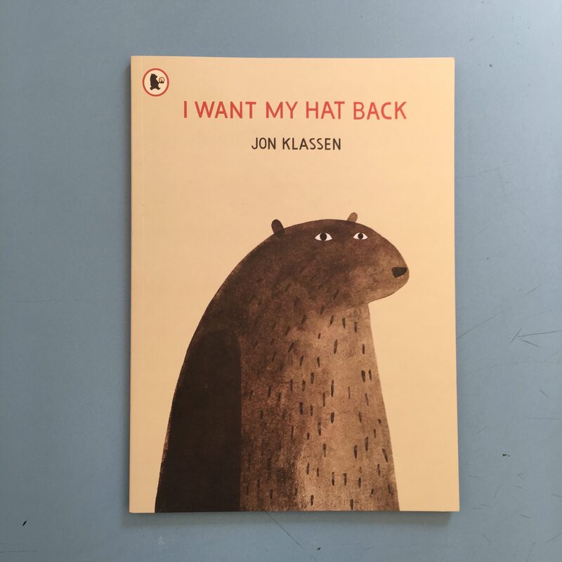
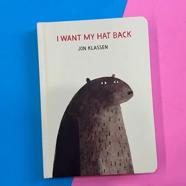
BOARD BOOKS VS PAPER BACKS VS HARDBACK
I need to decide whether to make a board book, hard cover or paper back. I researched the props and cons of each as well as there intended audience.
|
|
|
EXAMPLE OF THE SAME BOOK IN EACH FORMAT:
|
|
|
As the age demographic for my book is 4-6, aboard book is not appropriate. I will print a few of both paper back and hardback, as that's how a real run of books would go.
PAPER TYPES
UNDERSTANDING GSM
Ordering a book when you don't know much about GSM, paper types and finishes is hard. I researched these things.
|
|
|
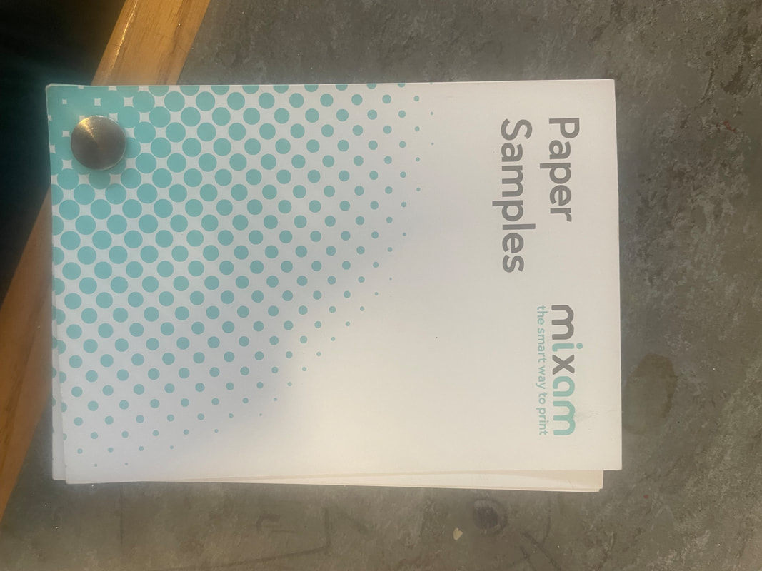
ORDERING SAMPLES
I still felt a bit in the dark, so I ordered some samples through Mixam for everyone in the studio to look at.
|

|

|
WHAT IS MIXAM'S PROCESS?
I looked on the Mixam website and colated all the important information I need to know for printing with them.


OKAY, SO WHAT KIND OF BOOK AM I MAKING?
- 32 PAGE BOOK
- AIMED AT 4-6 YEAR OLDS
- FULL COLOUR CMYK
- MIXAM "LETTER" FORMAT (216 mm X 279 mm) LANDSCAPE
- 150gsm UNCOATED
- MATT LAMNATION OUTSIDE
- 3MM BLEED
- MINIMUM 300DPI
- BOTH HARDCOVER AND PAPER BACK
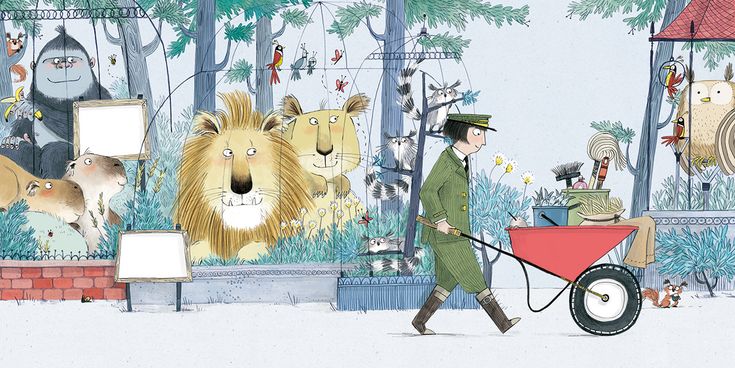
ARTIST RESEARCH
PINTEREST BOARD
I always start a with a Pinterest board at the start of the project. I am always adding throughout the project, collecting ideas and visuals that might be inspiring.

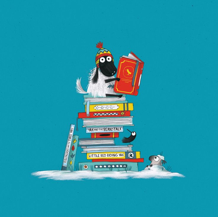
MAIN ARTISTS OF INSPIRATION
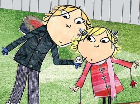
I looked at a lot of artists during tis project, but below are the five I looked at the most.
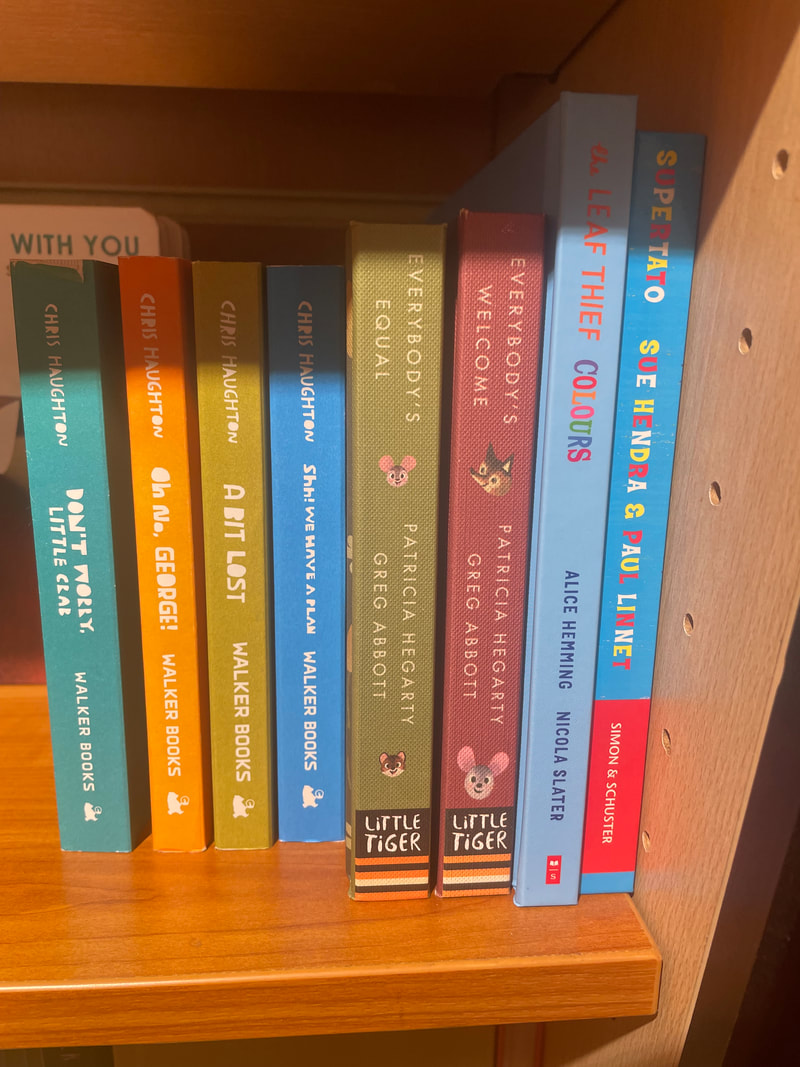
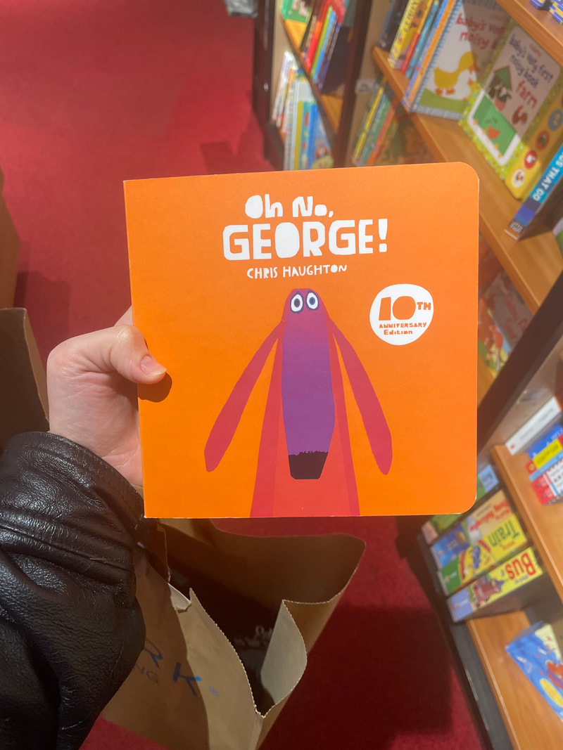
CHRIS HAUGHTON
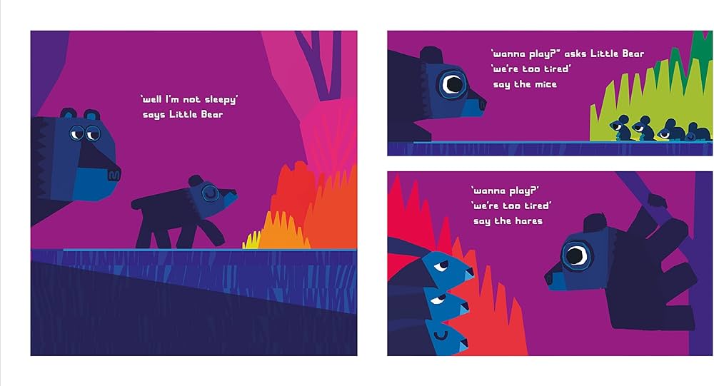
Haughton uses bright bold but simple shapes to communicate. I'd like to replicate this tone in my book.

|
|

|
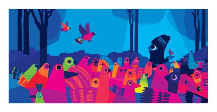
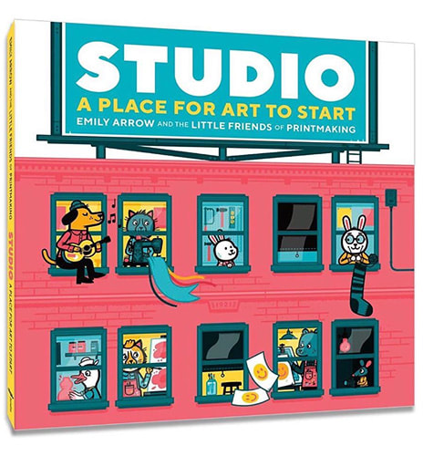
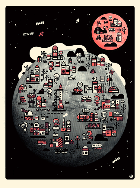
LITTLE FRIENDS OF PRINTMAKING
Married duo of little friends make vibrant screen prints of cartoon animals. They cram lots of fun details in their work, something I'd like to replicate in my own work.
|

|
|
ABNER GRONOFF
I looked at Abner Gronoff, a midcentury illustrator who used colour and silhouette in his work to create vibrant designs.

|

|

|
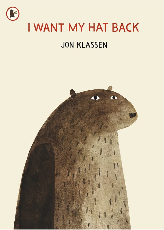
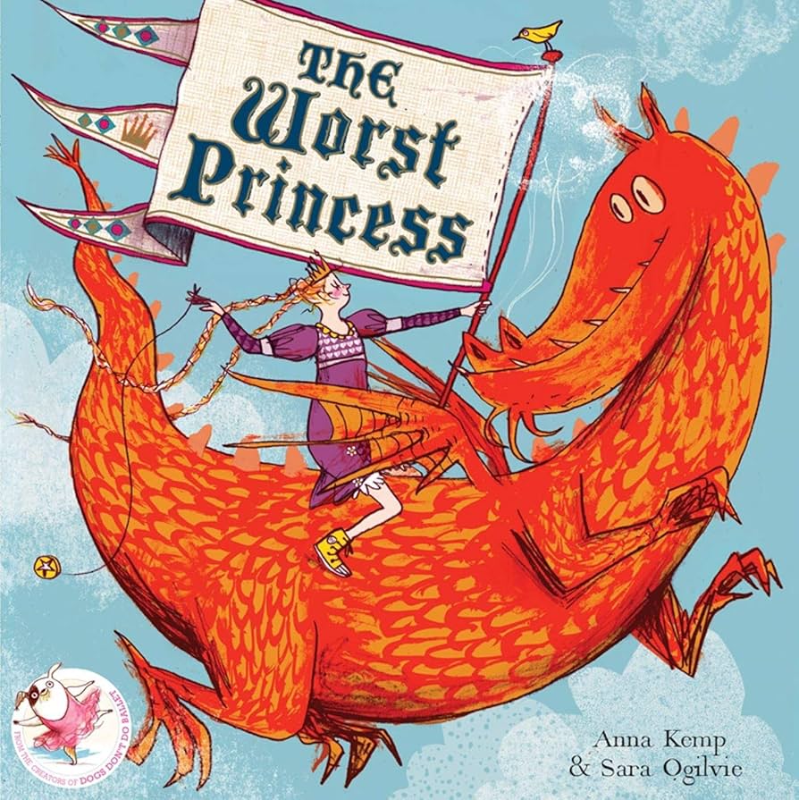
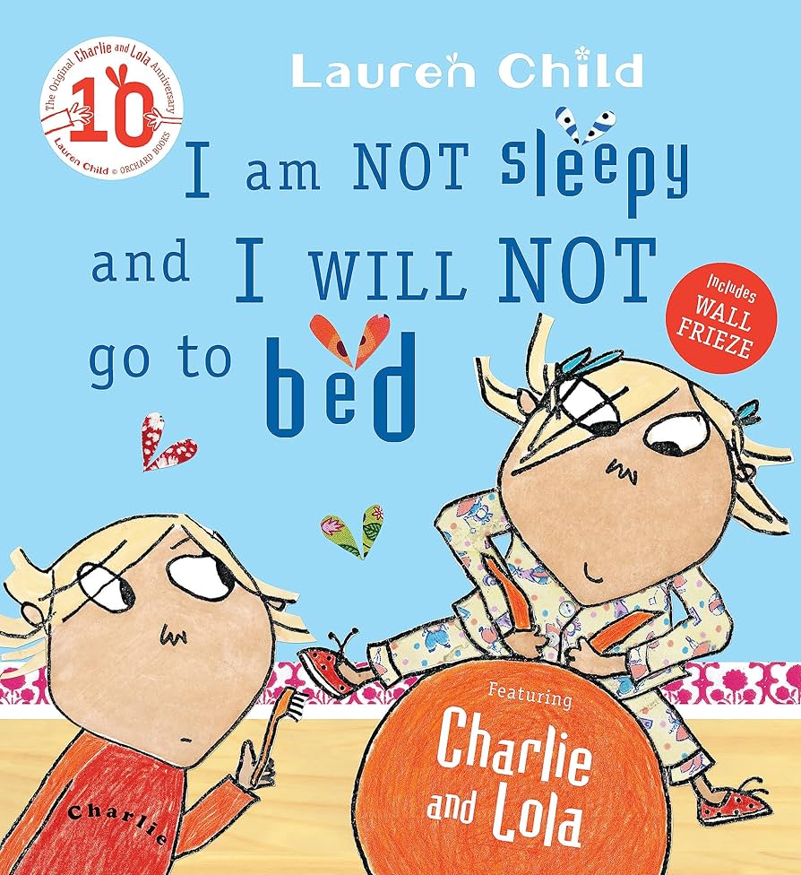
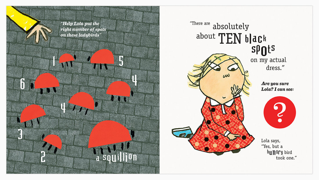
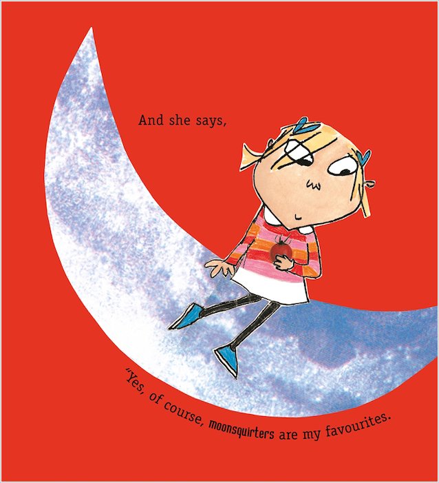
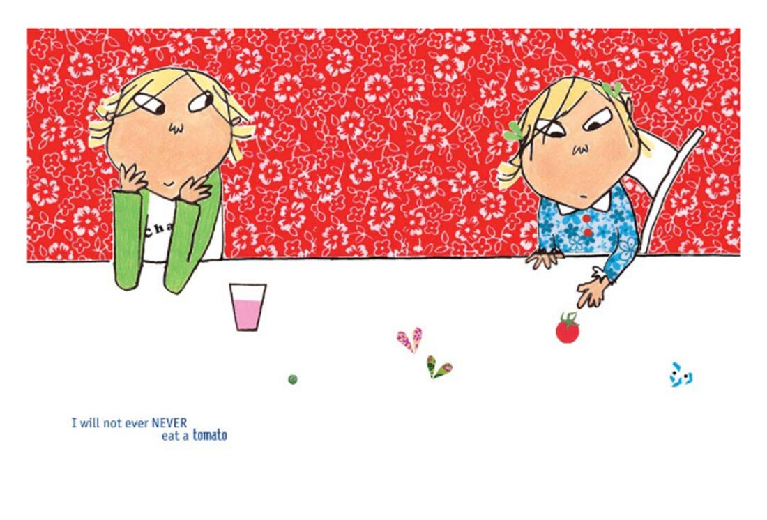
LAUREN CHILD
Child's use of pattern and collage creates a charming and child like look. I like to incorporate this into my designs.
|

|

|
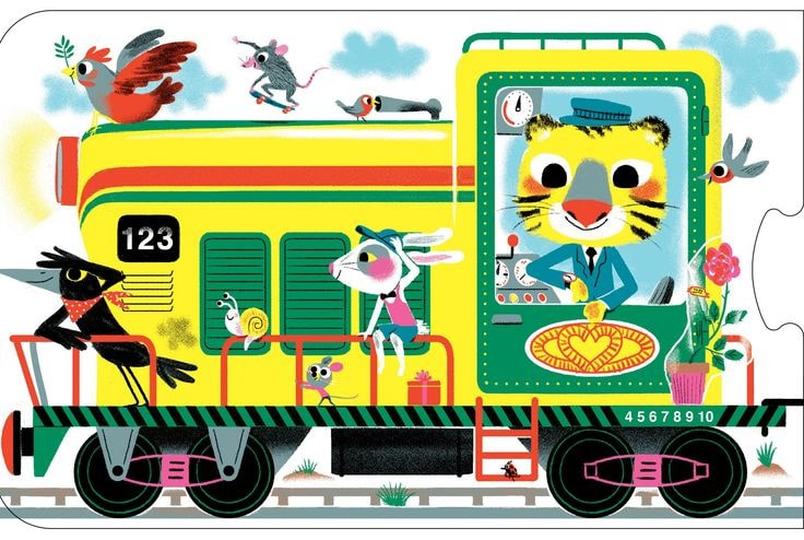
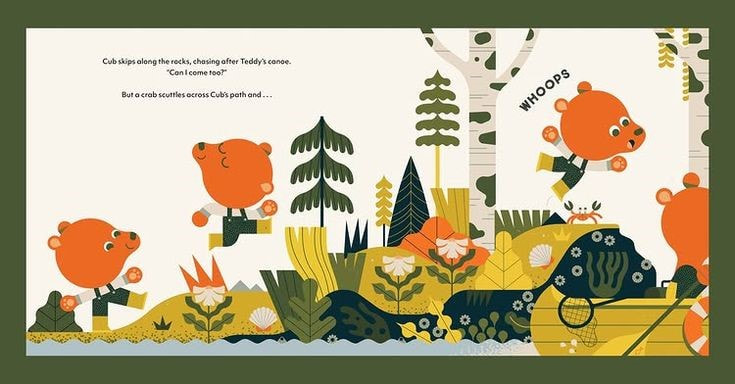
MARC BOUTAVANT
|

|

|
INITIAL IDEAS
SKETCHBOOK EXPLORATION
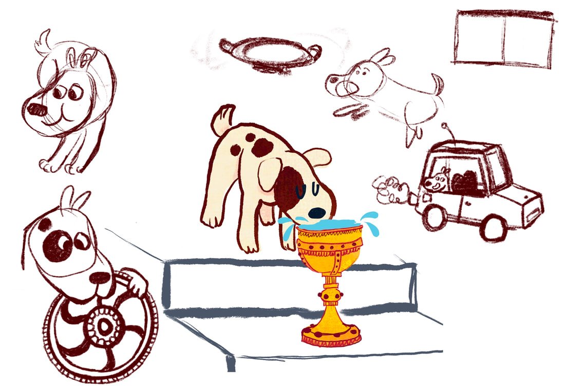
The first thing I've decided to do in response to the text is to sketch ideas. These quick roughs to try and spark some ideas, with focus on the dog and the Holy Grail.


|


|
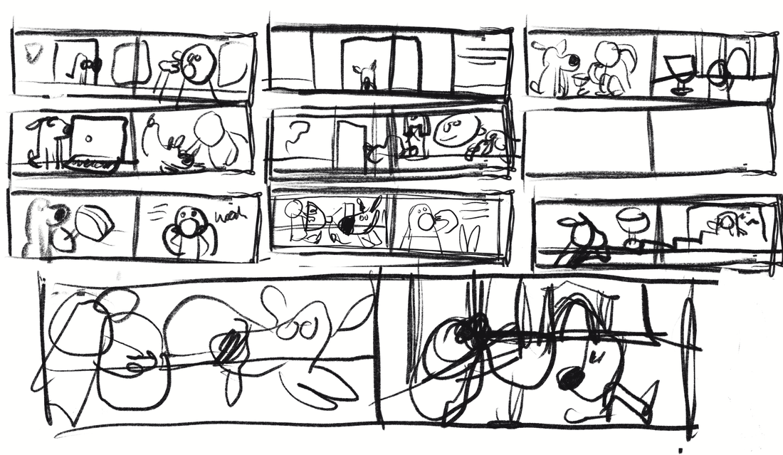
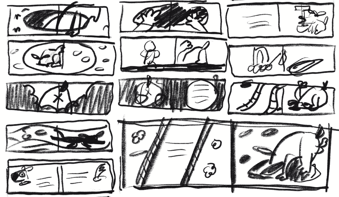
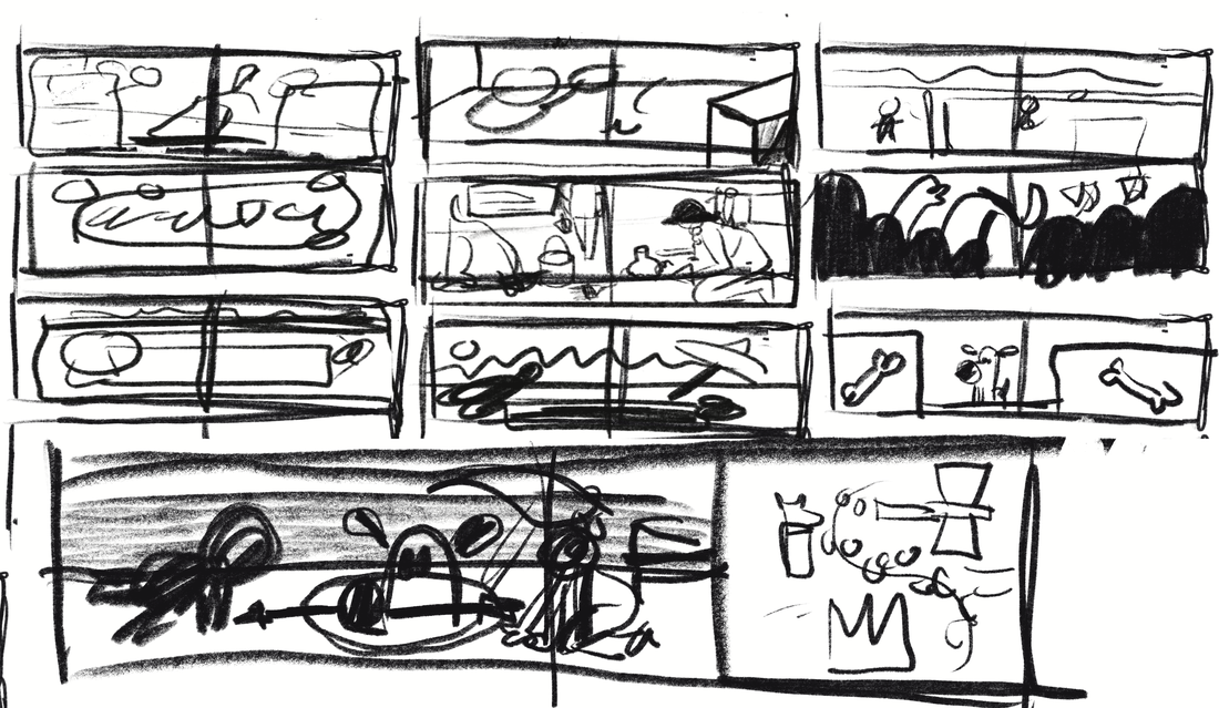
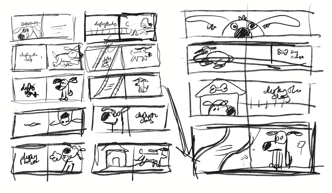
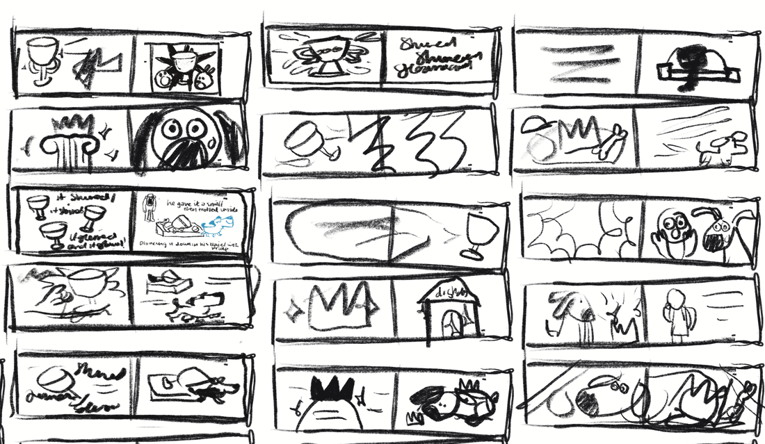
THUMBNAILS
These are a collection of thumbnails I made sketching elements of the story before splitting up the story into spreads. Just generating ideas.


|

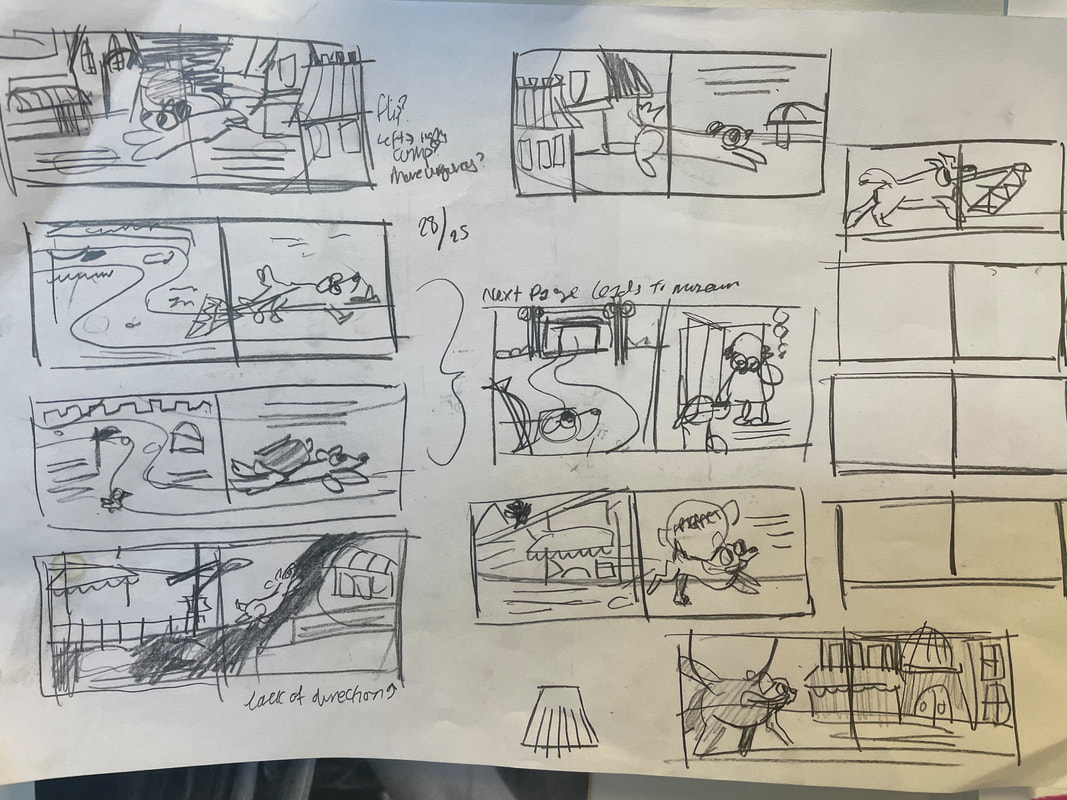
|
MOVING TO DIGITAL THUMBNAILS
|

|

|

|

|
|
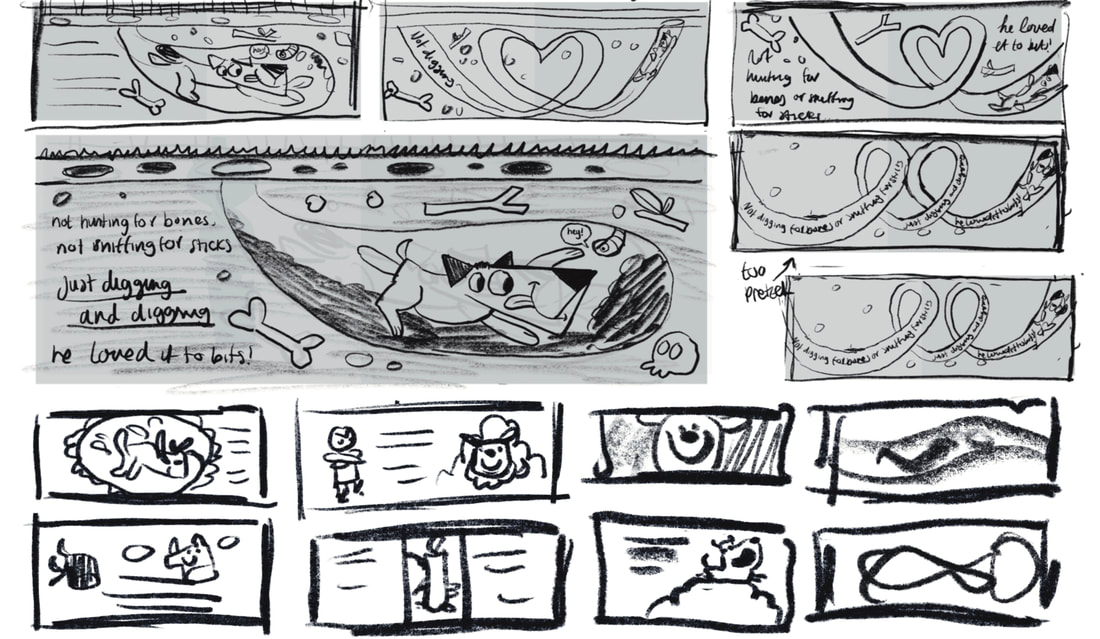
FIRST SET OF WORKED UP THUMBNAILS
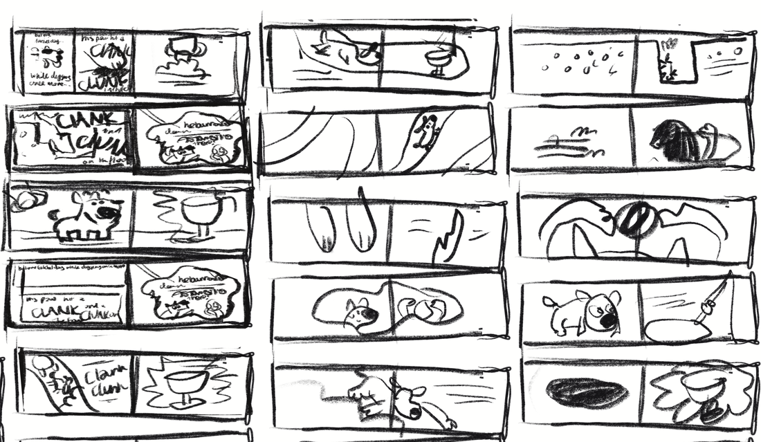
These are the first round of thumbnails showing the whole story. I will show how I got to these when showing the full spread development.
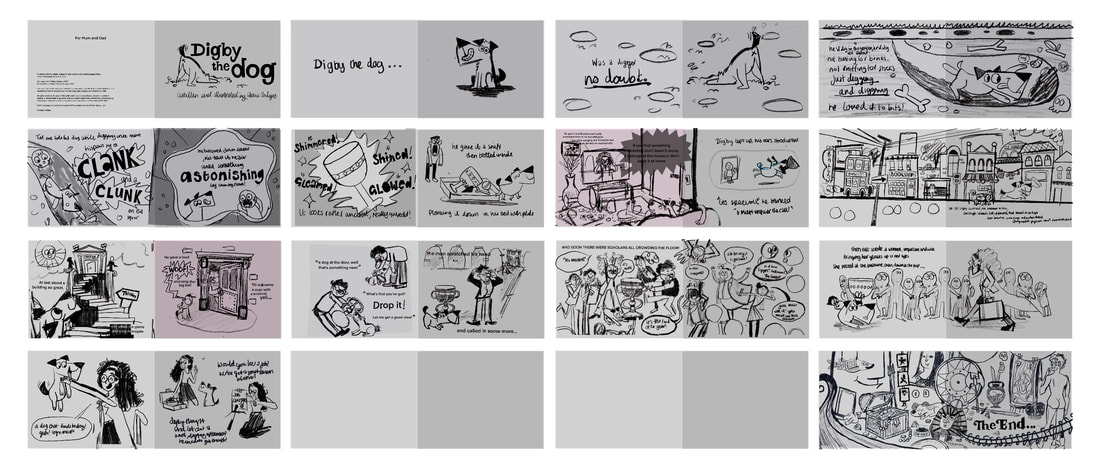
BOOK FLIP THROUGH
I sized up the thumbnails and printed them off at A4 and stuck them together into a dummy book. This really helped me get a feel for the flow of the story. I showed it to Tony and he gave me the go ahead to move onto developing the pages.
DEVELOPMENT
JUST MAKE AN ILLUSTRATION!!!!!
I've been getting in a bit of a tiz because I'm just fed up of sketching and want to make an illustration. So on Thursday Dwayne said just do it! So that's what I've been doing this week. No more sketching, just making some actual illustrations with colour. I doubt these will make it into the final book, but it'll be great just trial some visuals.
TESTING VISUAL LANGUAGE
Having a go at developing some ideas and testing some visual language.
IDEA SKETCH FOR FINAL PAGE
DEVELOEMENT OF ILLUSTRATION
|
|
FINAL ILLUSTRATION

MUSEUM SKETCHES

|
PAGE 16 SKETCH
I'm just not liking how the visual language is looking...
BOOOOORING!! YOU CAN DO BETTER ABBIE!!
I'm just not liking how these are looking! I need to revamp the visual language. My main issues are:
RESEARCH
I'm going to do a bit more research before attempting to redo the thumbnails.
LOOKING AT ARTISTS AGAIN
ROB HODGESON
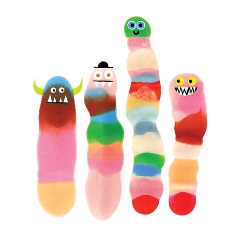
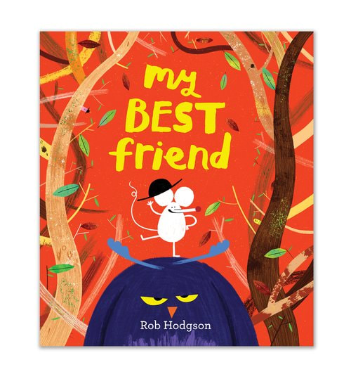
I want to amp up the oddness. Looking at Rob Hodgeson's work inspires me to do just that.
|

YAMAUCHI KAZUAKI
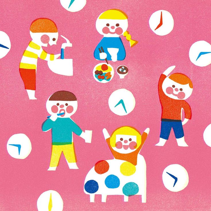
These simple illustrations use colour to be bright and bold. They rely on shape and texture to make impactful illustrations.

|

|

|
|
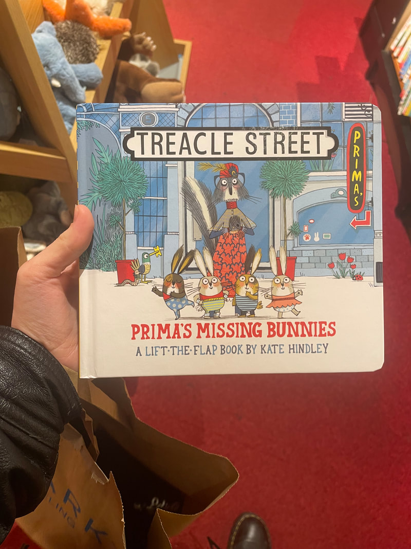
KATE HINDLEY
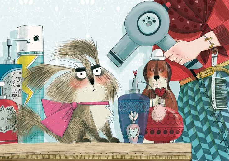
Looking at Hindley's distinctive style and clear analogue influence will be a big help in designing the pages.
|
|
|
REVAMPAMING DOG CHARACTER DESIGN
REFERANCES OF DOGS
I looked at real dogs and had a look at how they worked.
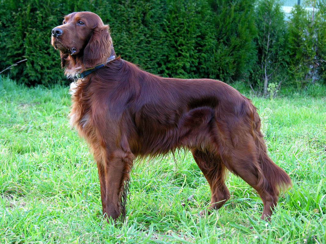
|
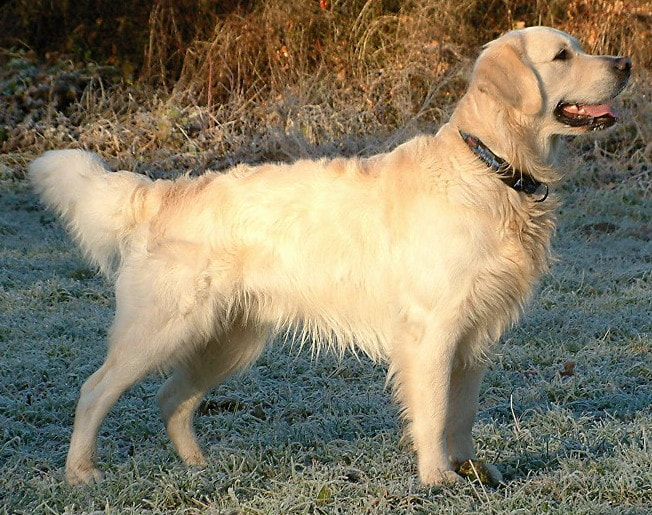
|
|

|
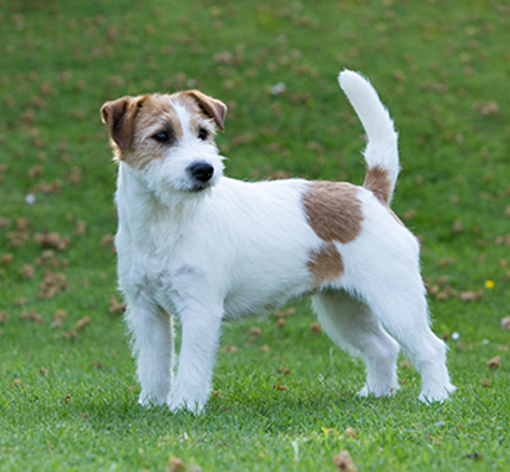
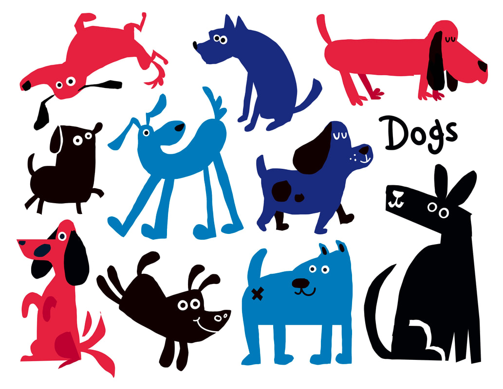
DOGS IN MEDIA
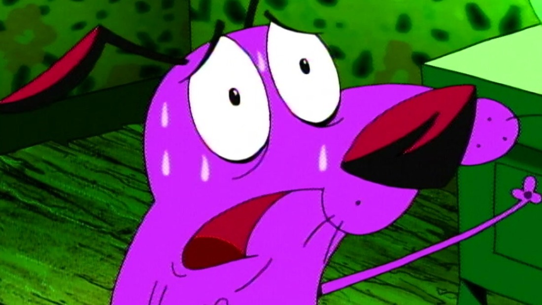
|
|
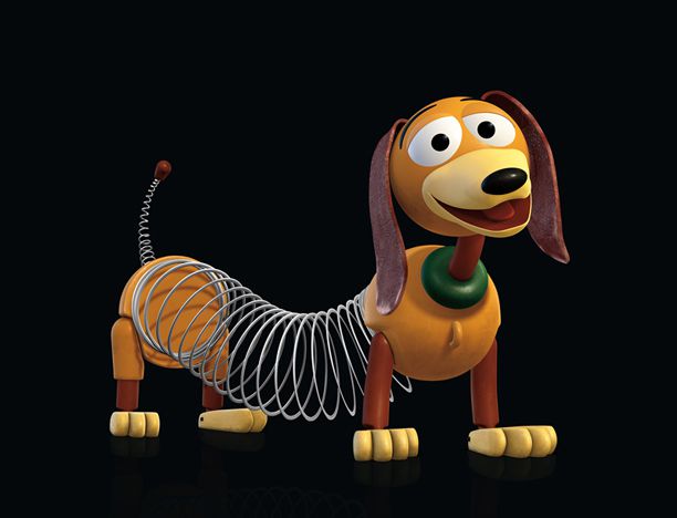
|
|
|
|
I collated images of dogs in media that could inspire my design.
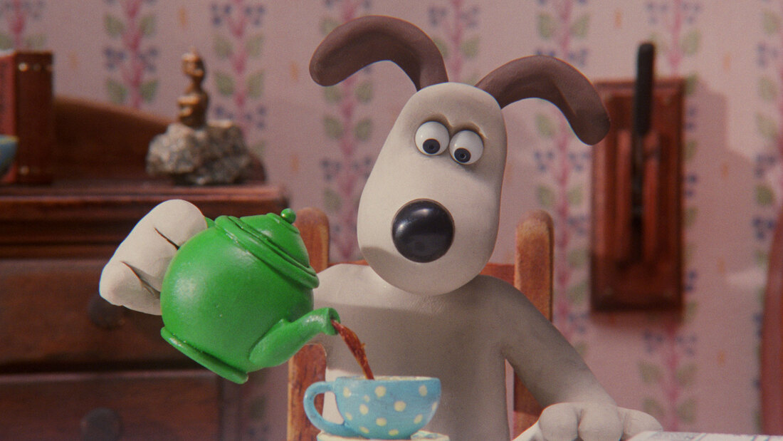
MAKING OF GROMIT IN VENGANCE MOST FOWL
After watching Vengeance Most Fowl, I was impressed with the simple characters and how they could get them so expressive. I watched a few documentaries and behind the scenes focusing on how they made Gromit so full of life with a limited expressions. I found this really insightful for my character design.
|
|
|
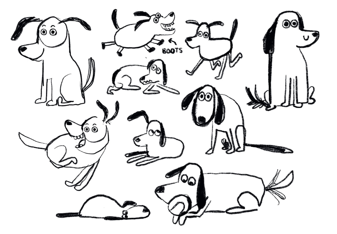
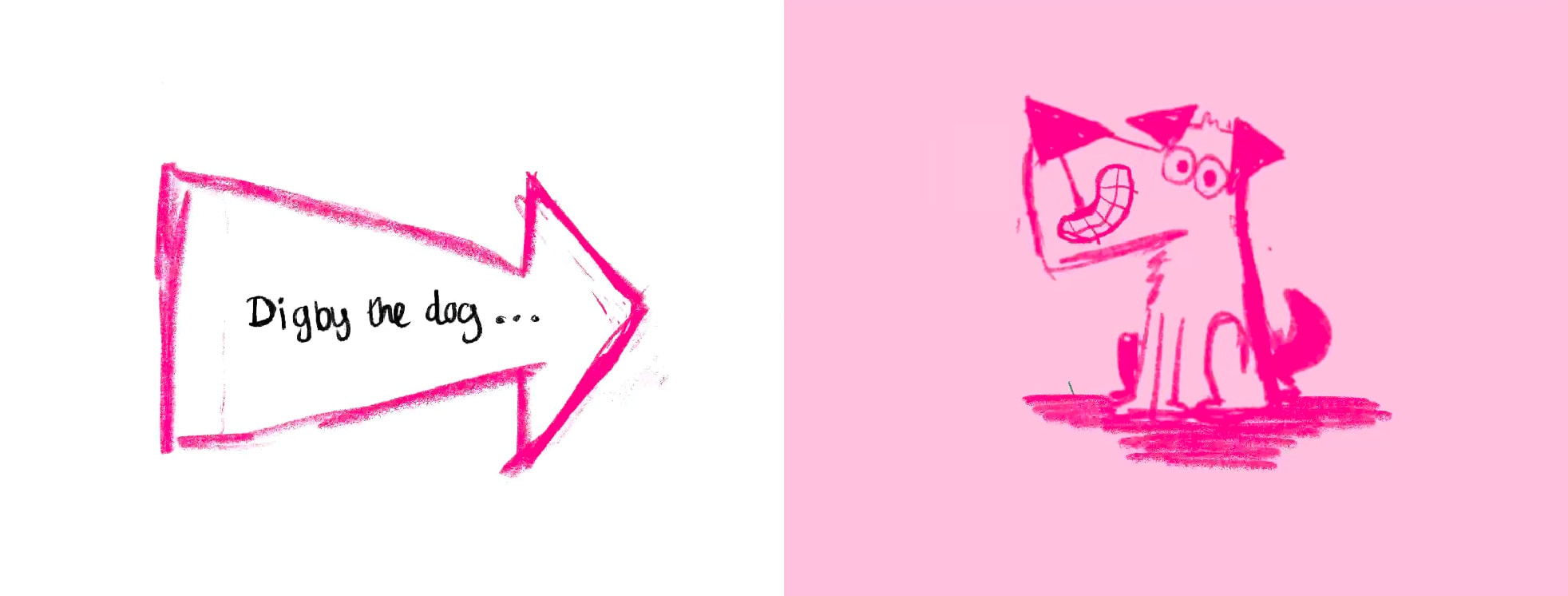
CHARACTER SKETCHING
COLOUR VARIENTS OF DOG SKETCHES
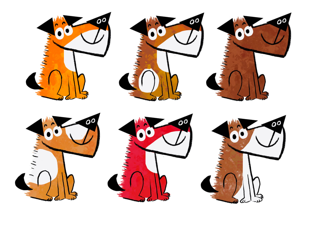
|
|
I moved on to doodling dogs with the selection tool, and once I had basic idea of the shape language I moved forward into drawing him consistently in more poses. I wanted a larger dog with less defined details. Big floppy ears wear important to me.

|
|
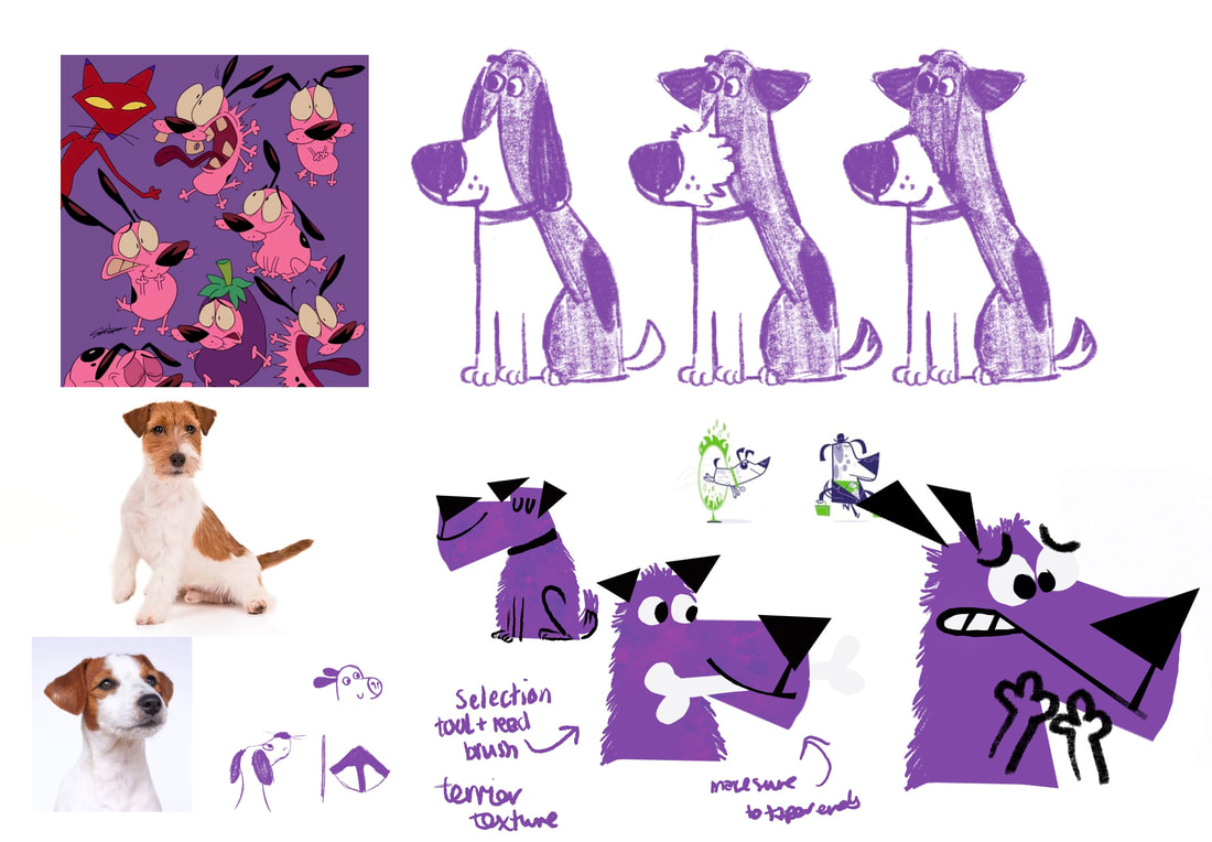
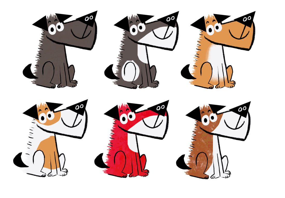
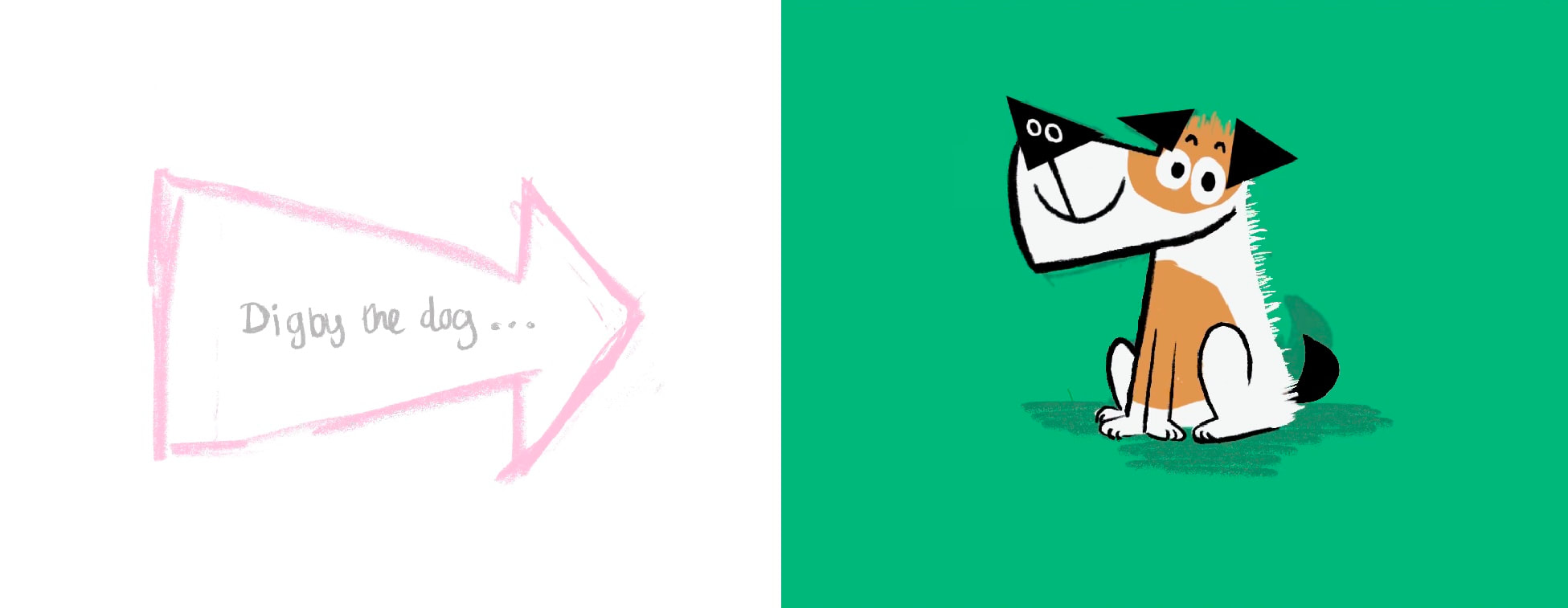
DECIDING ON COLOUR
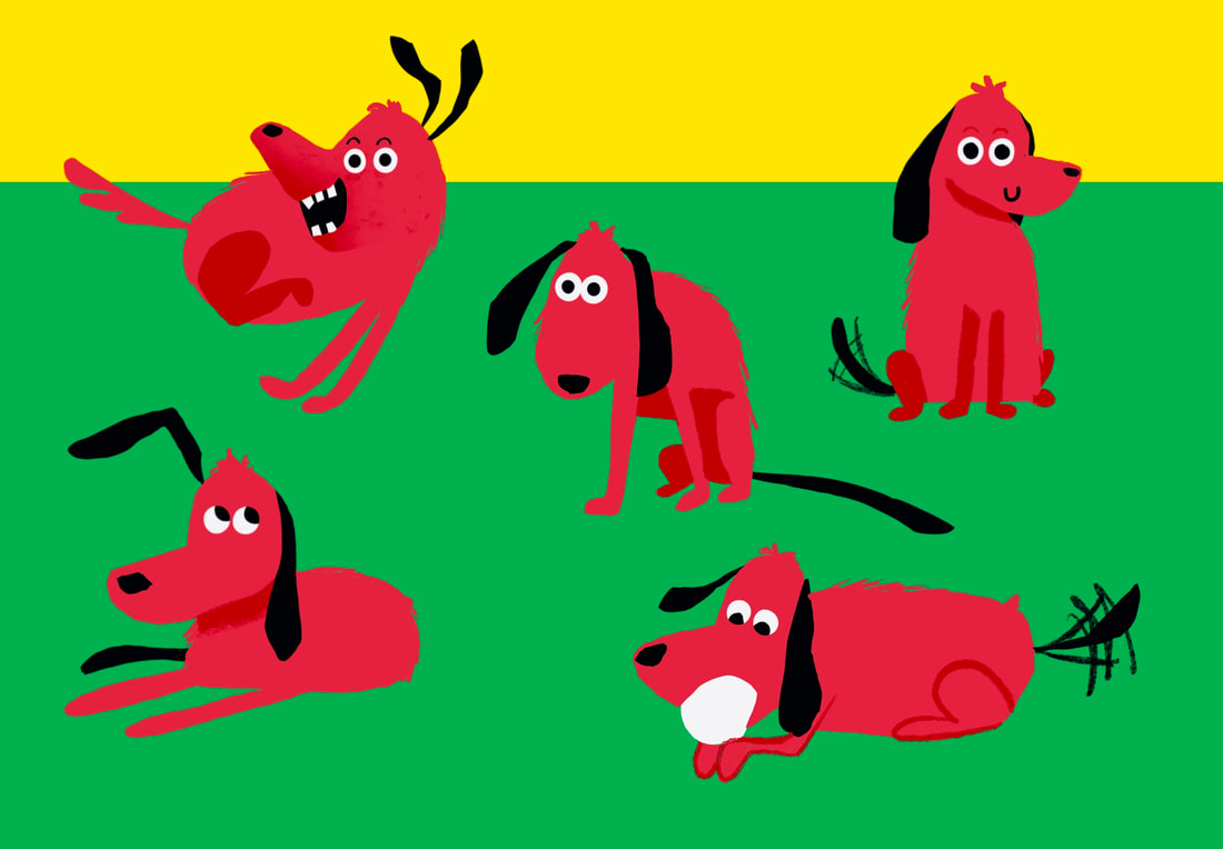
When looking back at this first round of character designs, I remembered the positive feedback I received on the red dog. I think implementing this might make the story less boring and more visually interesting. I made some quick drawings of the dog in a red colorway and really liked it.
|
|
|
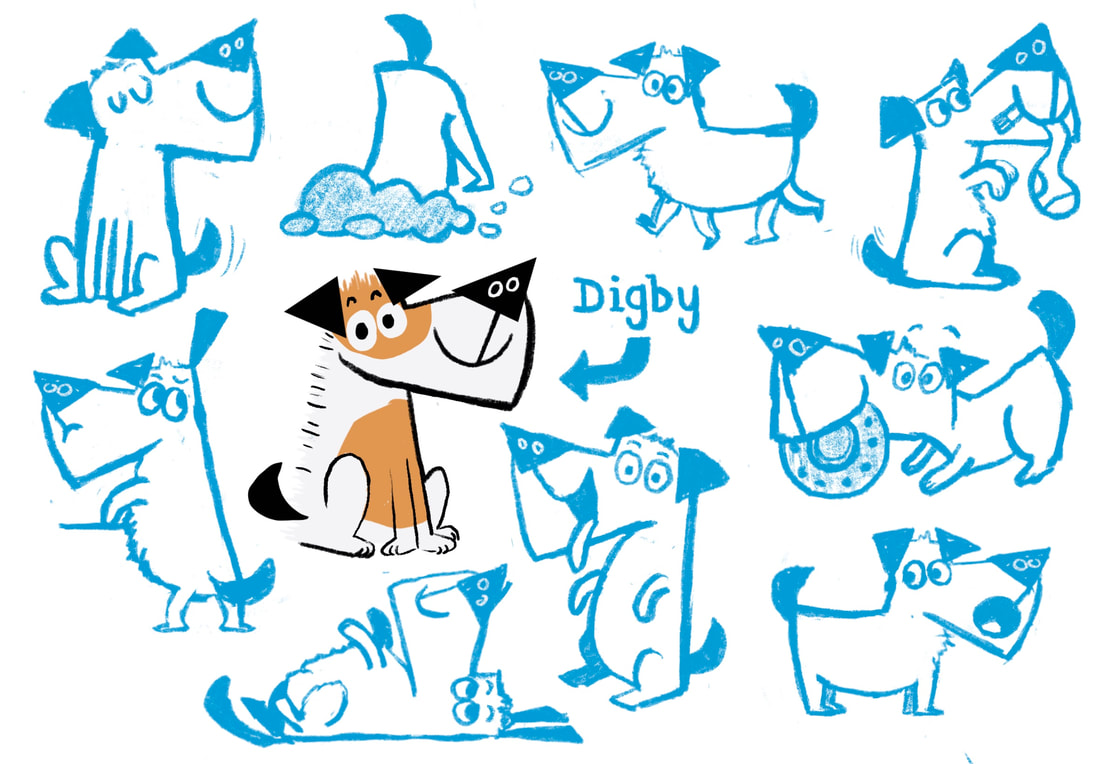
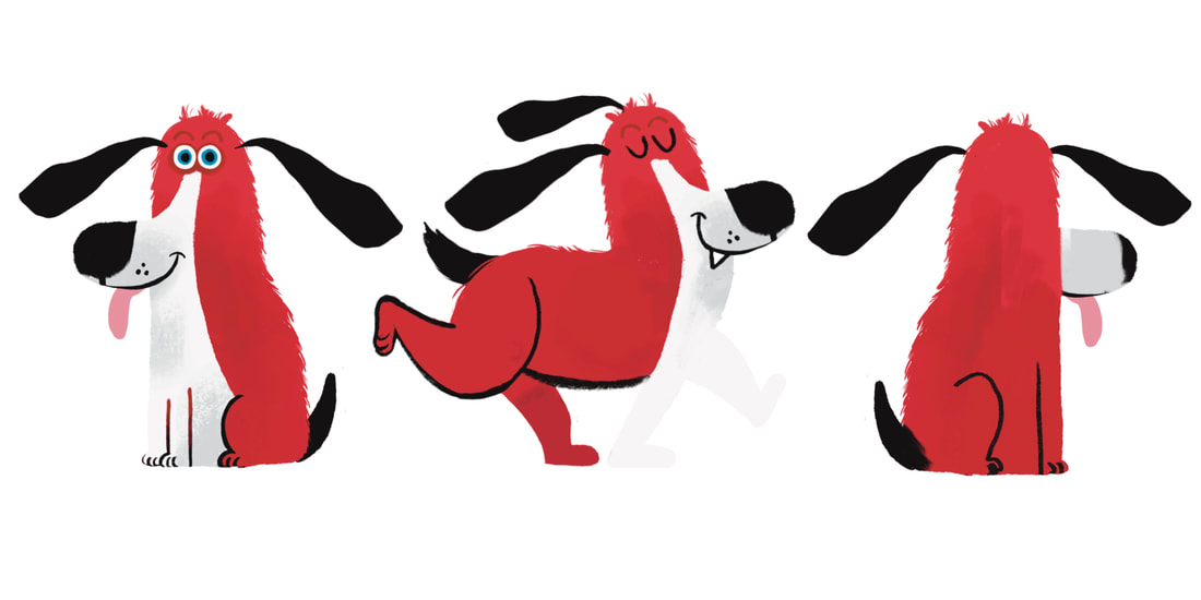
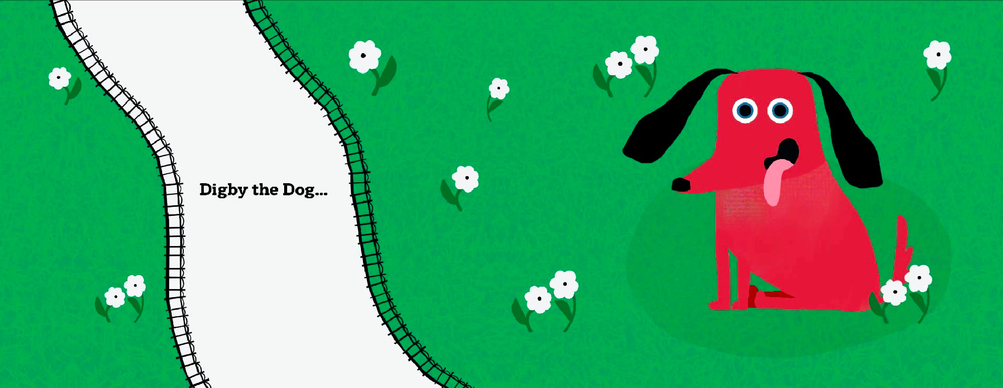
FINAL DOG CHARACTER DESIGN
This is the final Digby I landed on. I want a design with textured elements and sharp digital lines. I created this quick turn around to go back to when drawing him to keep his design consistent.
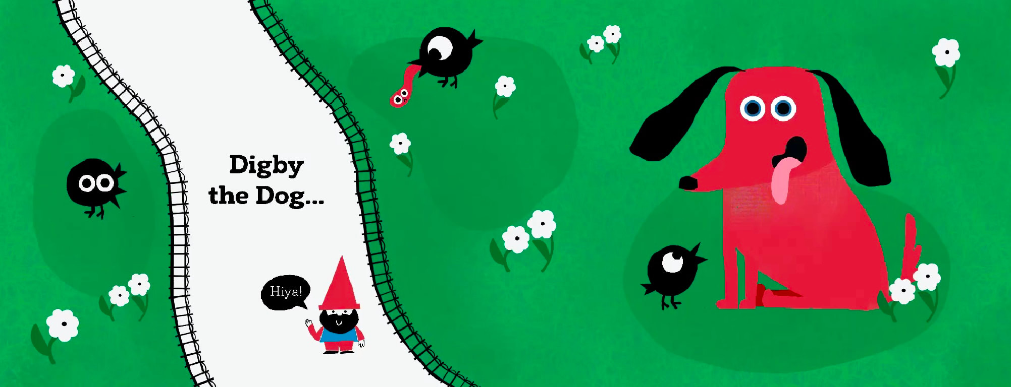
UPDATED THUMBNAIL VISUALS
After revamping the dog character design and exploring other visual languages, I went back and refined my thumbnail visuals to have a more consistent look.
Here are the slides as an overview together, this helped me figure out if all the visuals matched each other. Click to enlarge.

|
|
|
|
Below is a slideshow of the spreads.
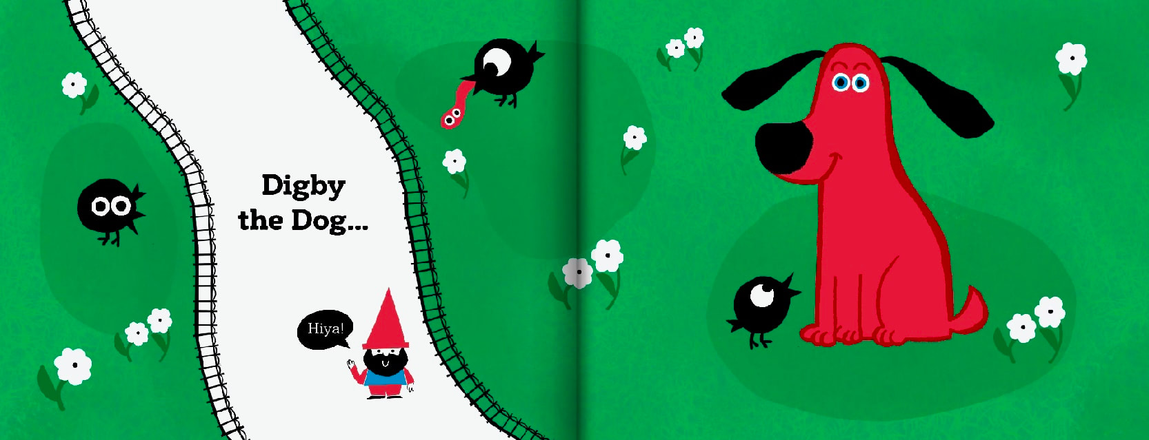
DUMMY BOOK FLIP THROUGH
SPREAD DEVELOPMENT
CHOOSING COLOURS
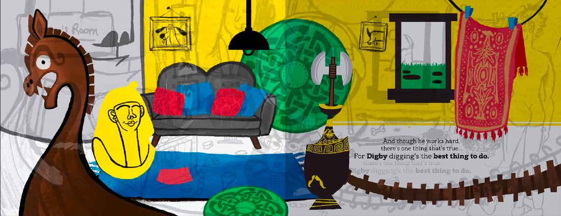
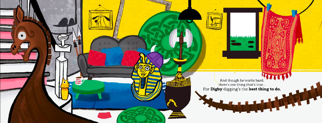
Now I have a more solid idea of the character and visual language, I can give these spreads a proper good kicking. I will document the entire design process for each spread, from initial sketch to thumbnail to final design.
If I had to research niche things for each spread, I have added it in the design process instead of the generalised research section.
If I had to research niche things for each spread, I have added it in the design process instead of the generalised research section.
I've had some feedback to try a different colour palettes. I want to stick to my usual bold colours, but maybe try a bit more of a natural and earthy look considering the book is about digging in mud. I like to make a definitive pallet before I start working because I never work on spreads in order. Here's what I settled on.

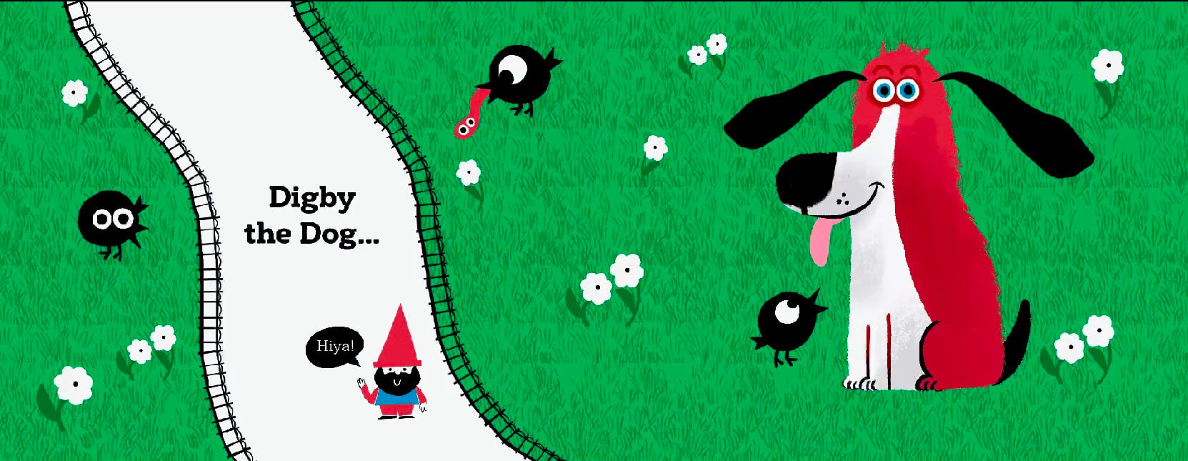
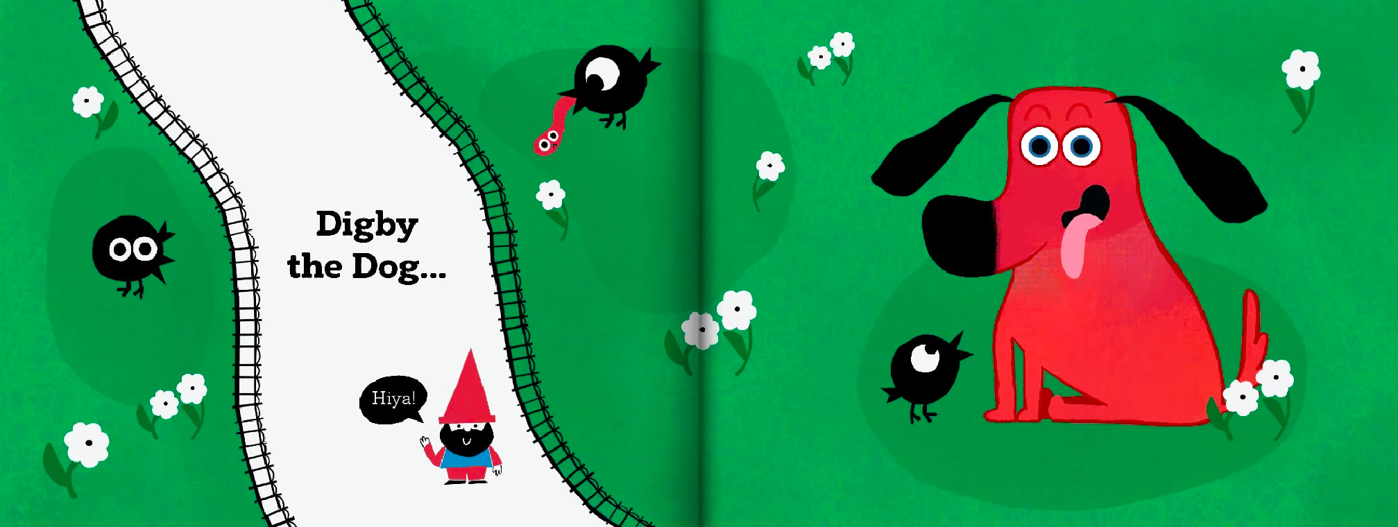
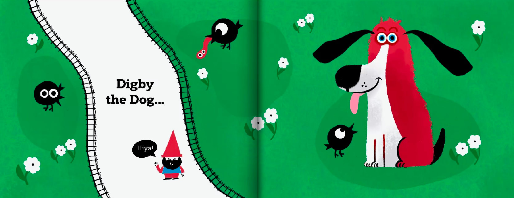
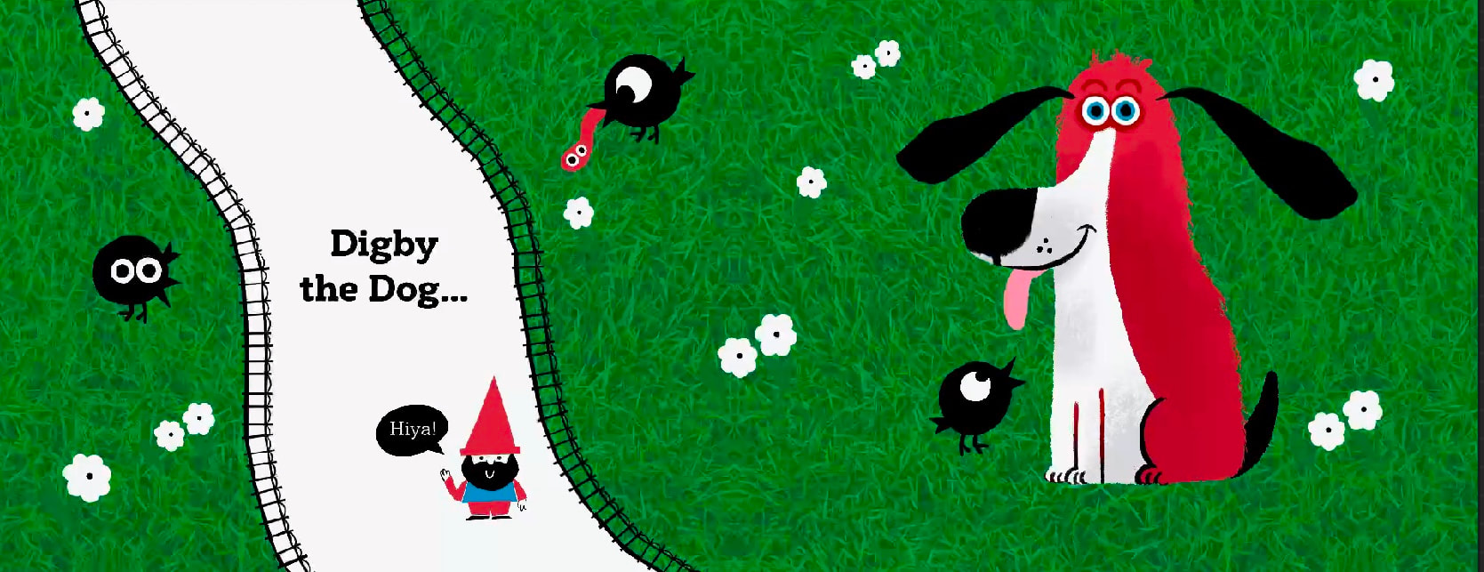
SPREAD ONE DEVELOPMENT
RESEARCH
OWEN DAVEY
He makes very flat one dimensional illustration with emphasis on pattern and shape.

|
|
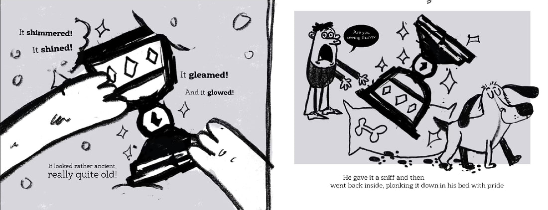
SKETCH
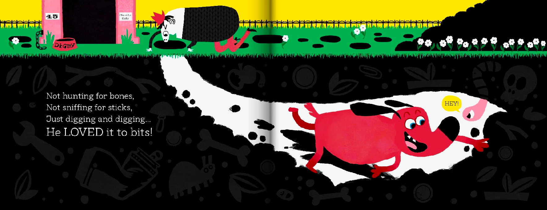
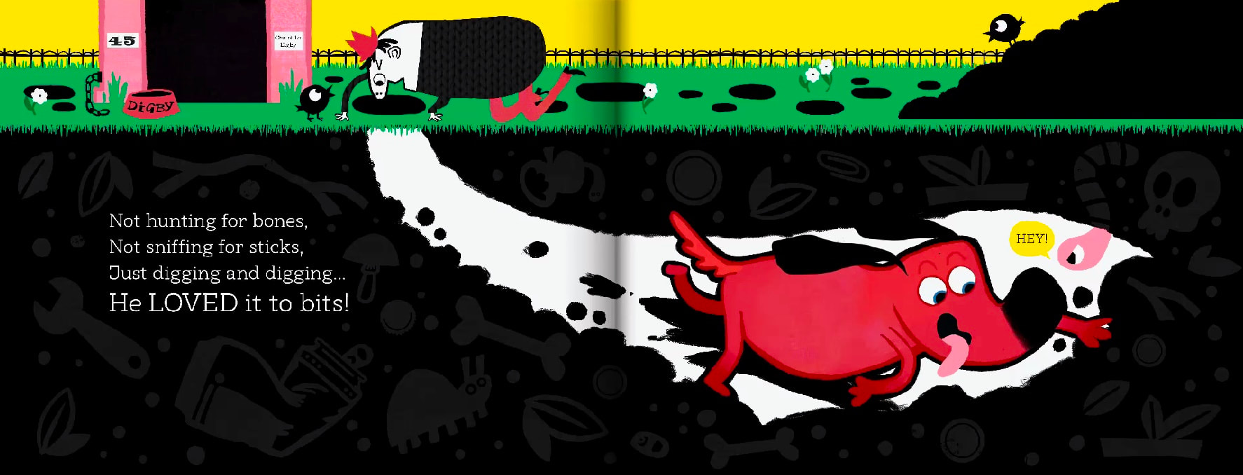
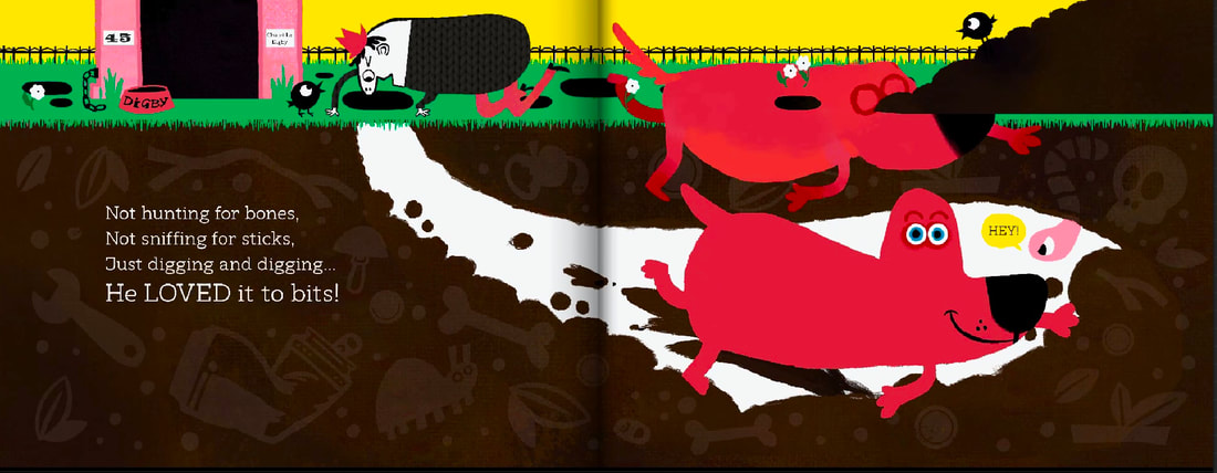
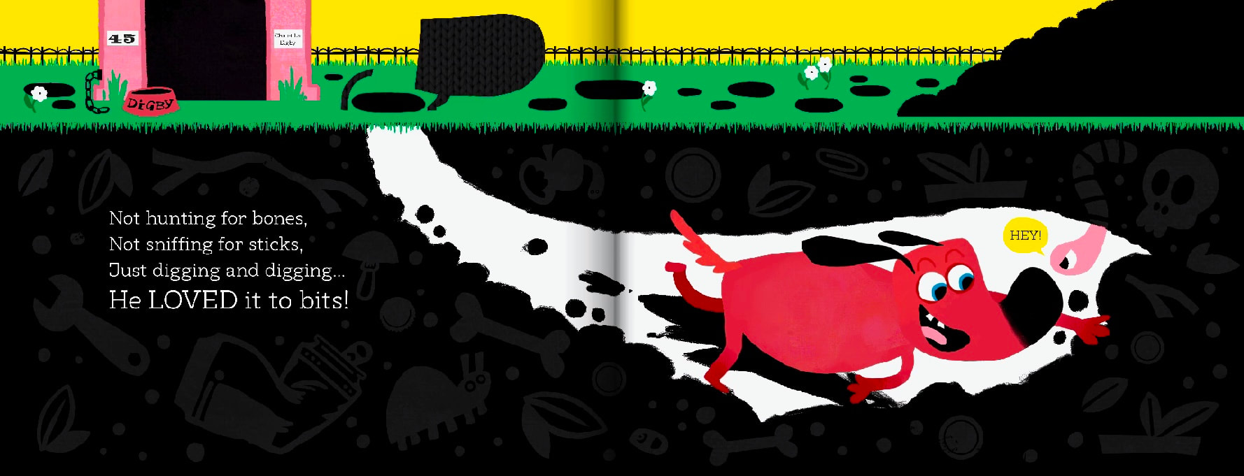
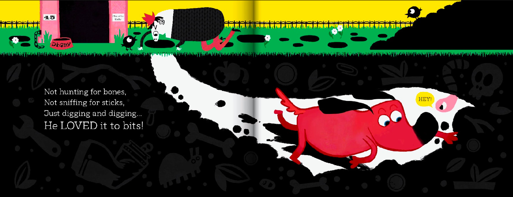
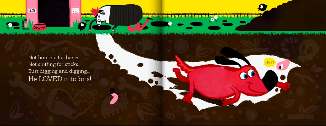
DEVELOPMENT
|

|
|
|

|
|
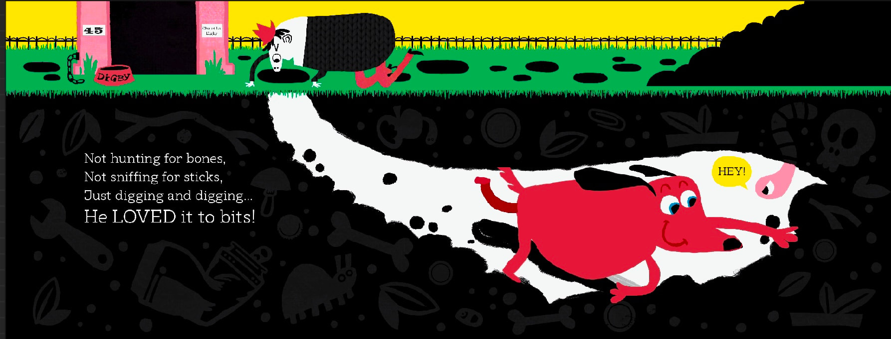
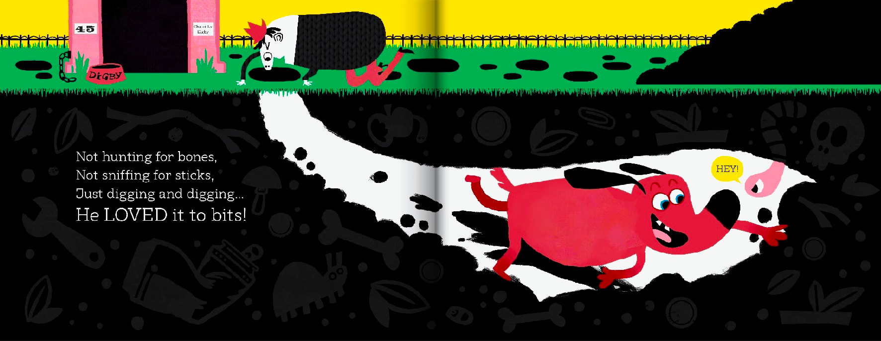
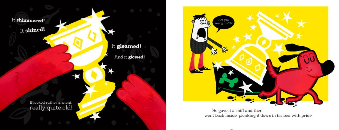
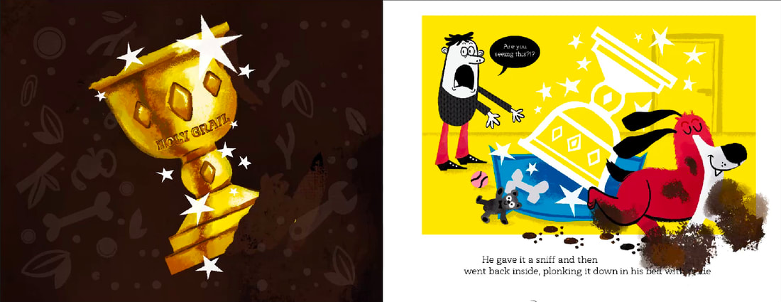
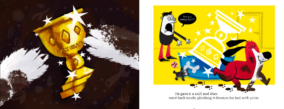
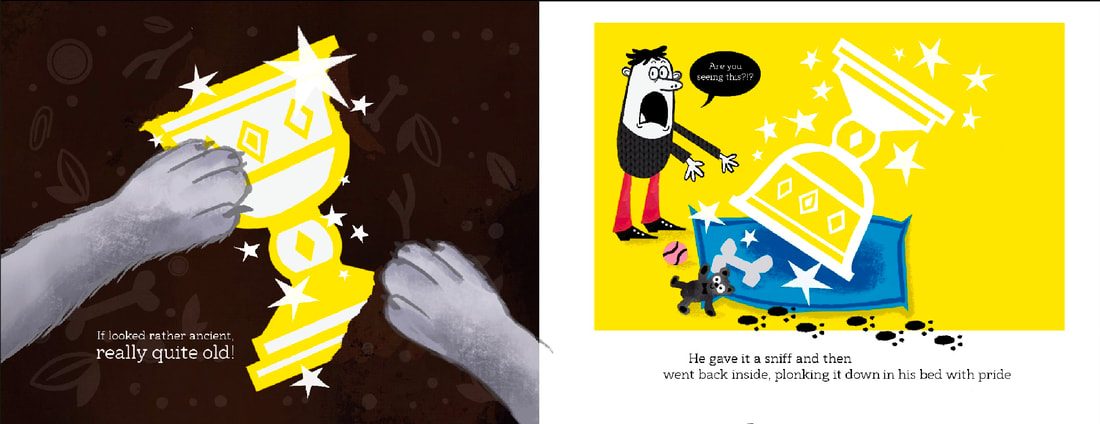
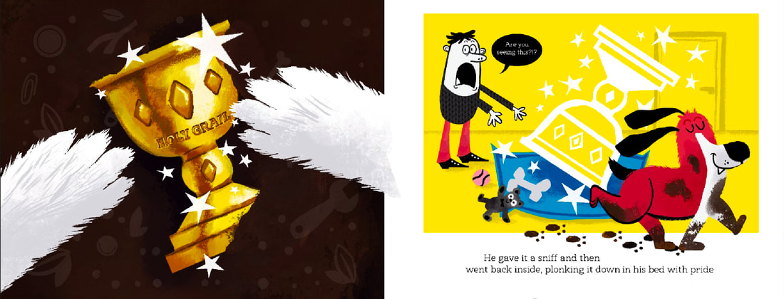
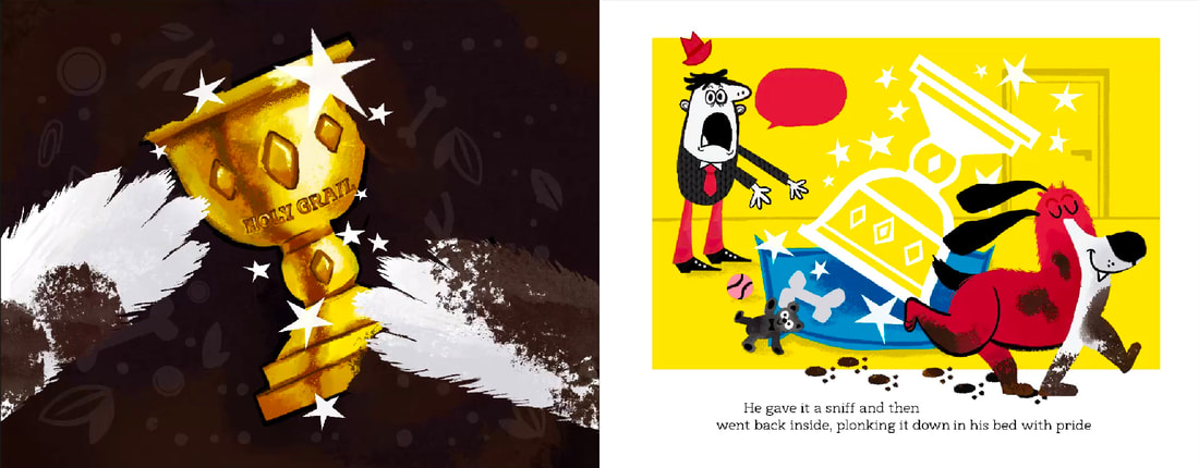
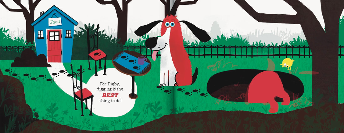
FINAL SPREAD
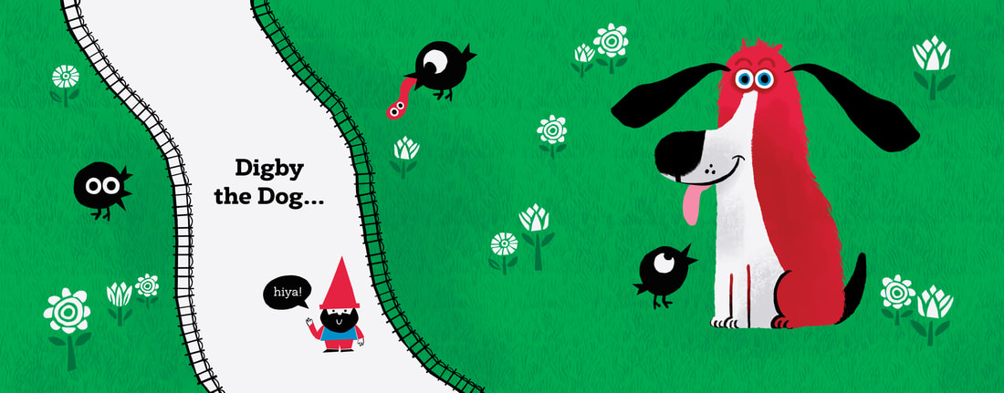
FINAL SPREAD IN CONTEXT
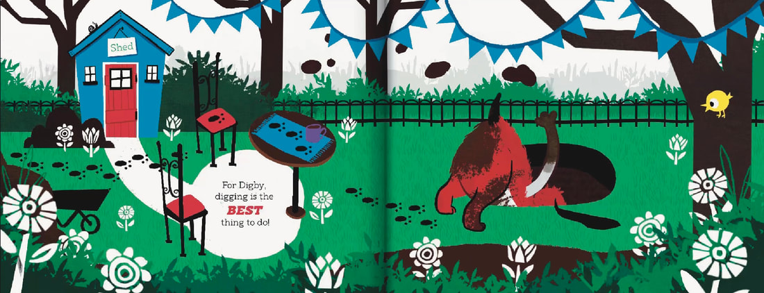
SPREAD 2 DEVELOPMENT
SKETCH

ARTIST RESEARCH
LAUREN CHILD
Lauren Child is an artist I go back to for inspiration very often. Her playful composition and simple shapes are wonderful. I particularly wanted to look at her use of colour and shape for this spread.
|
|
|
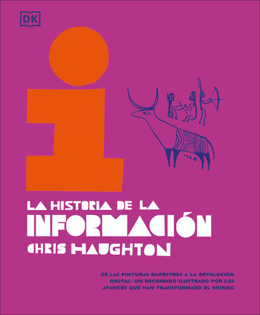
CHRIS HAUGHTON HISTORY OF INFORMATION
This book is wonderful. The vibrancy of the printed colours is phenomenal. I love the contrasting black, I would like to incorporate this kind of effect with the dirt elements of the illustrations in my book.
|
|
|
DEVELOPMENT
|

|
FINAL SPREAD
SPREAD IN CONTEXT
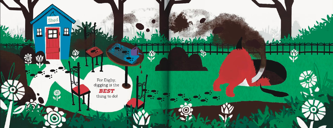
SPREAD THREE DEVELOPMENT
SKETCH
MAKING THE OBJECTS IN THE GROUND
PATCHWORK TATTOOS
I was inspired by how patchwork tattoos fit together to great the underground motifs in the illustration.
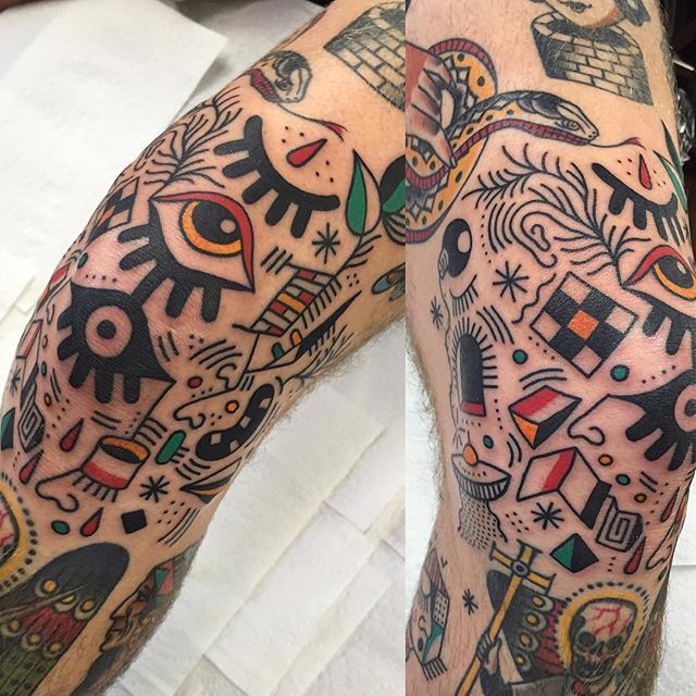
|

|

|
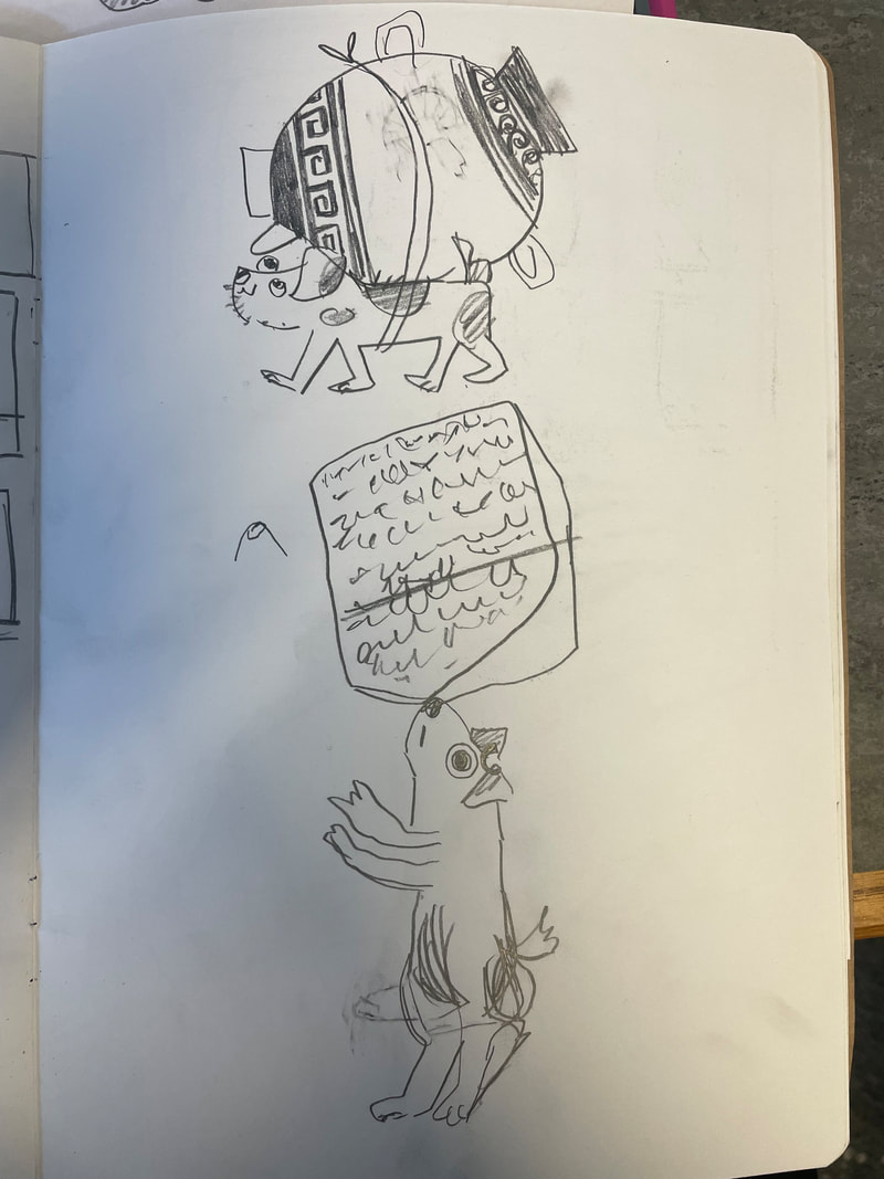
MY COLLECTION OF OBJECTS
I drew a variety of common things you'd expect to dig up after metal detecting.
THUMBNAIL DEVELOPMENT


|
|
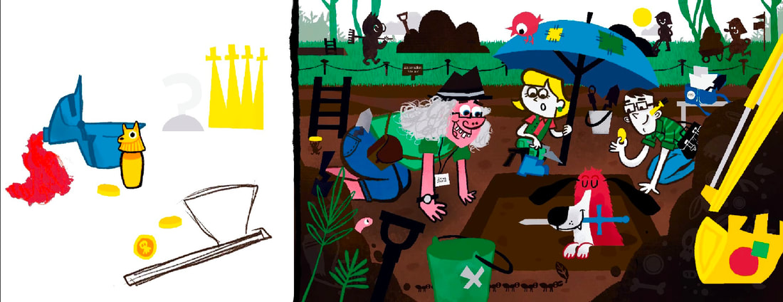
FINAL SPREAD
SPREAD IN CONTEXT
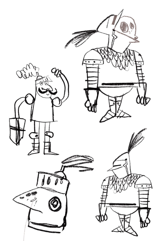
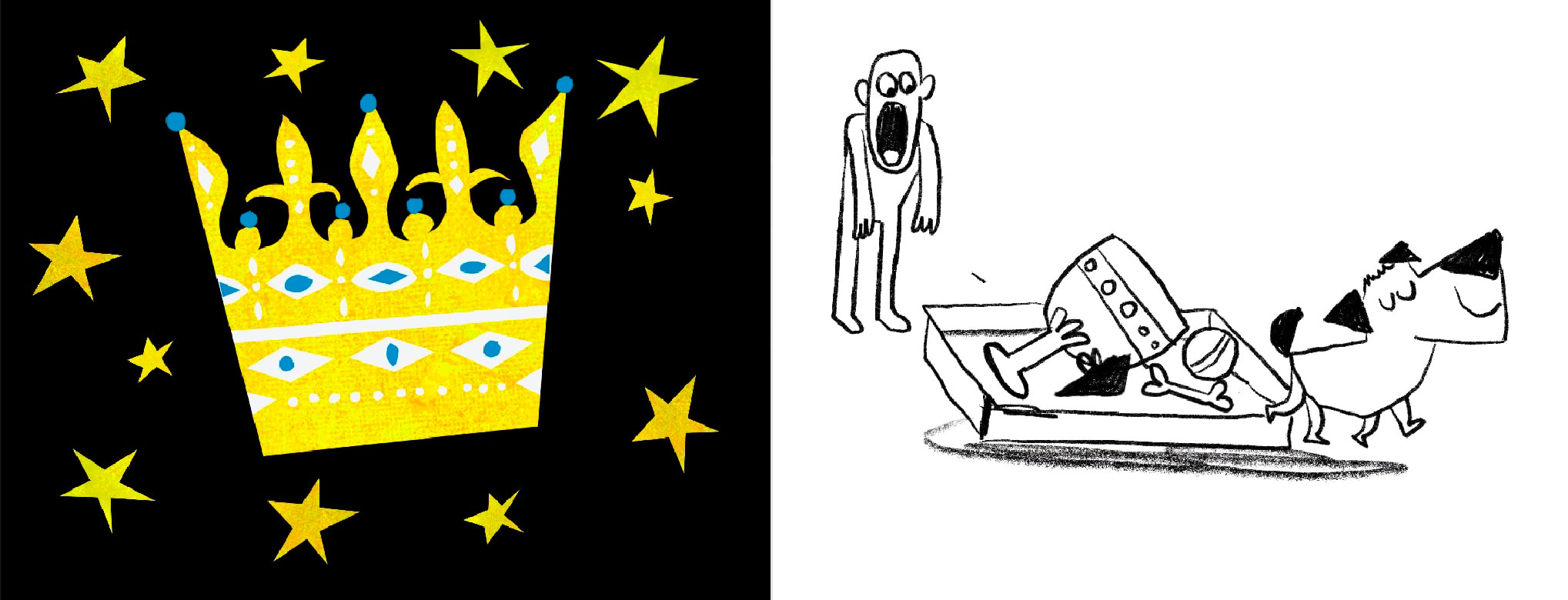
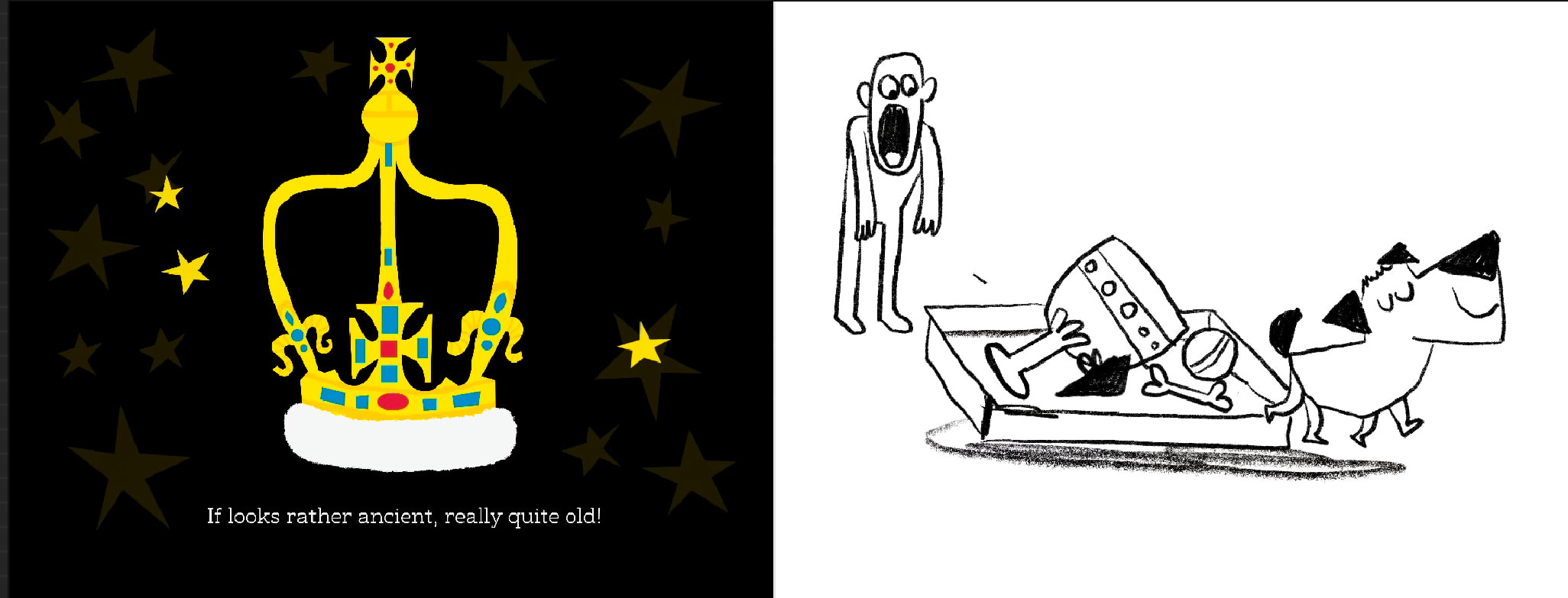
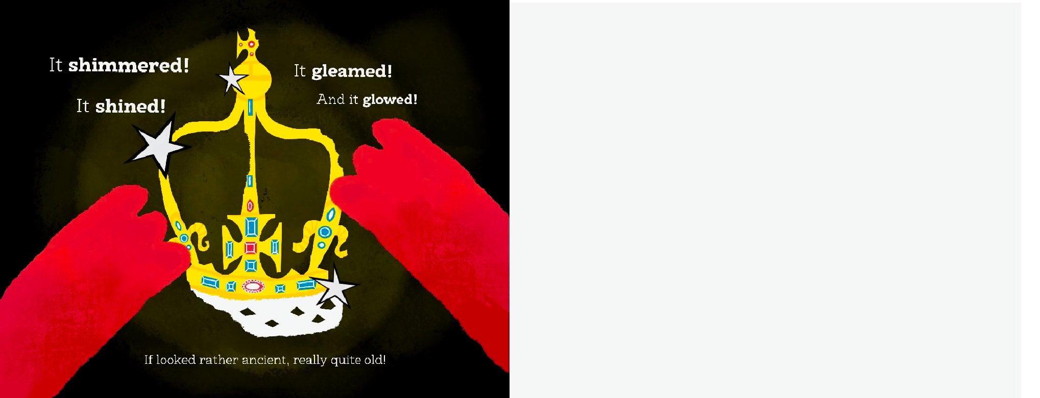
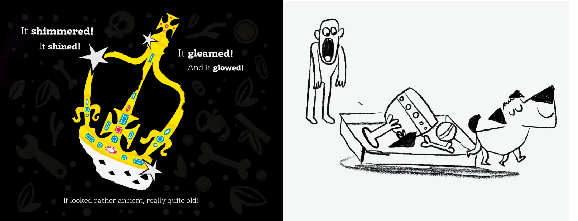
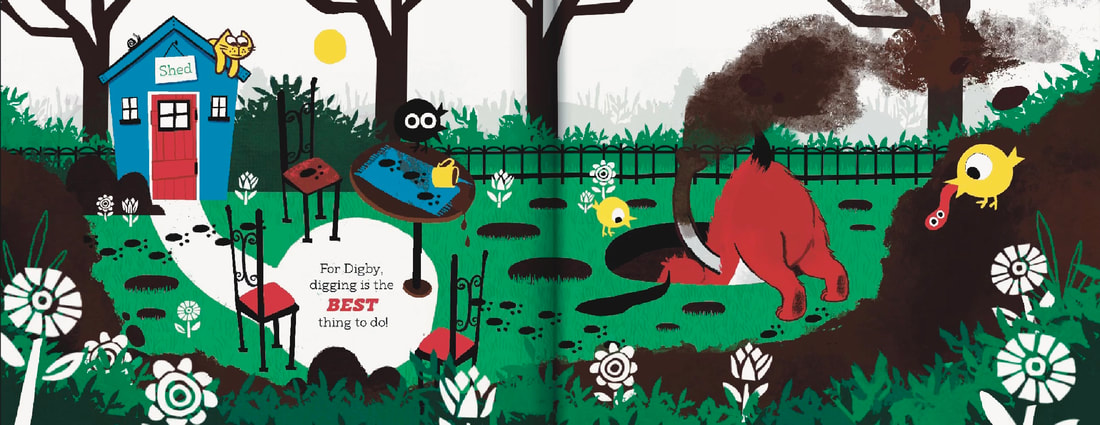
SPREAD FOUR DEVELOPMENT
This spread went through a few composition changes before I settled on the three split idea.
FRANCIS MARTIN
I love Martin's unconventional way to split up space in the Gina Kaminski series, splitting sections into thirds instead of directly in the middle. The thick inky lines also add to this. Very fresh.
|
|
SKETCH
DEVELOPMENT

|
|
FINAL SPREAD
FINAL SPREAD IN CONTEXT
SPREAD FIVE DEVELOPMENT
THUMBNAILS
SKETCH
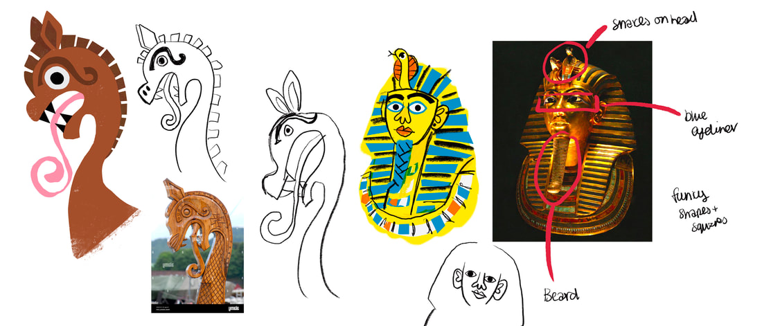
WHAT SHOULD THE ARTEFACT BE?
RESEARCHING WHAT WILL DIGBY DIG UP
MUSEUM VISITS
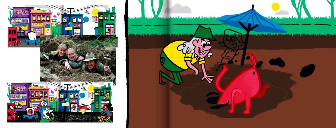
I Decided to visit a few museums across the country to see first hand the wonderful artefacts of the world, thinking this will help me decide what Digby should be holding.
I Decided to visit a few museums across the country to see first hand the wonderful artefacts of the world, thinking this will help me decide what Digby should be holding.
|
TULLIE
Tullie was helpful in finding local, British artefacts. Lots of Roman focus. It was interesting to see the more modern architecture mixed with Old Tullie, a more historic look.
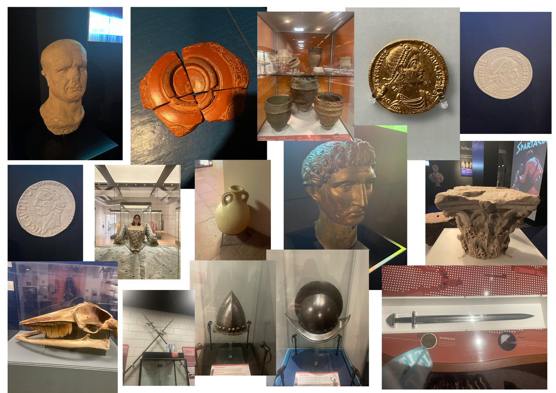
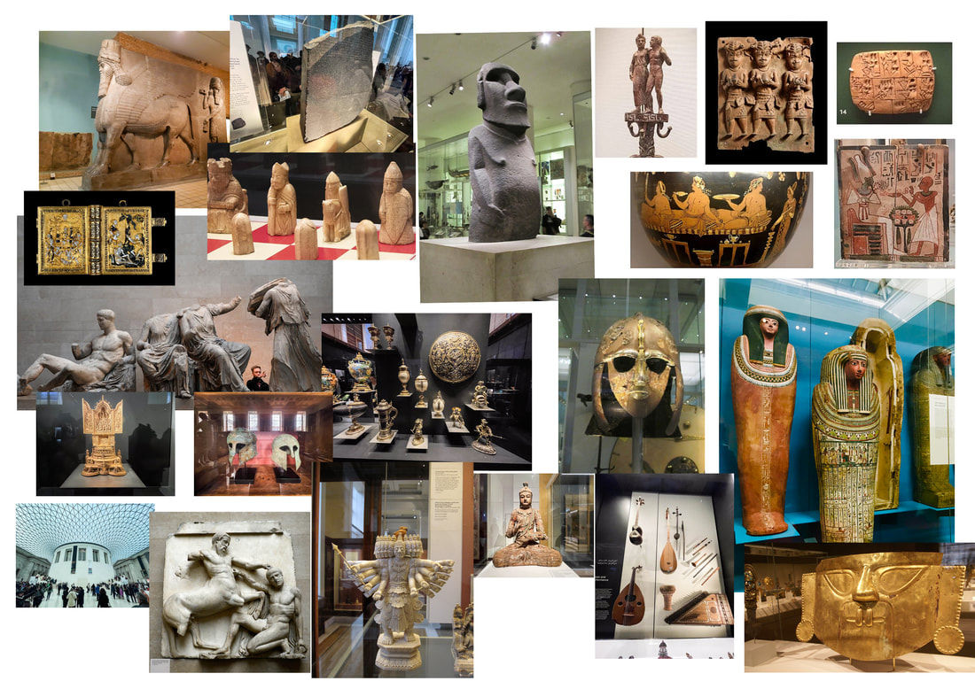
BRITISH MUSEUM
Absolutely amazing to visit, such a varied collection of ancient artefacts from so many different cultures.
|
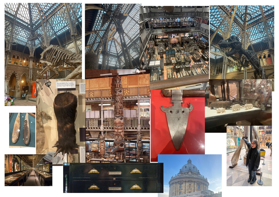
PITTS RIVERS
Lots of (stolen) artefacts from all over the world. Varied. Brillant architecture. Less very important and influential artefacts and more personal objects. Really not sure why we still need all this to be honest.
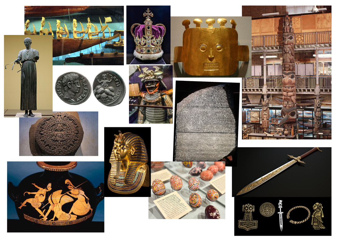
OTHER ARTEFACTS I COULDN'T VISIT IN PERSON
Here are a collection of artefacts I either couldn't visit or photograph myself that I thought would be helpful.
|
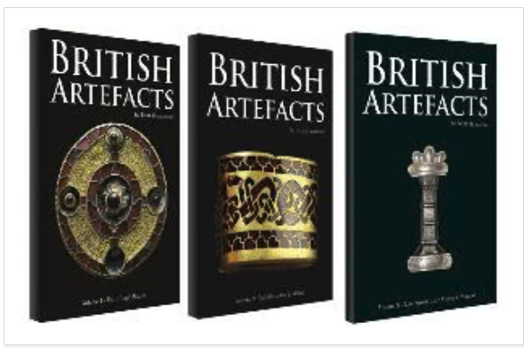
HISTORY BOOKS ON BRITISH ARTEFACTS
I borrowed a few books from other univeristies on British artefacts.
|

|

|
CHILD OPINION SURVEY
|
As this will be a children's book, I decided to poll children from a local school on what they think would be cool for a dog to dig up. I showed them a summary of the story and the responses were:
|
|
TIME TEAM
I spent time watching Time Team, a show about archeology. This helped me come up with visuals and little details about digging I might not have known otherwise, IE trowels.
I spent time watching Time Team, a show about archeology. This helped me come up with visuals and little details about digging I might not have known otherwise, IE trowels.
|
|
|
DEVELOPMENT OF THE ARTEFACT
FIGURING OUT HOW TO DRAW THE ARTEFACT


DEVELOPMENT
|

|
HIGHLY DETAILED CARTOON FREEZE FRAMES
|
|
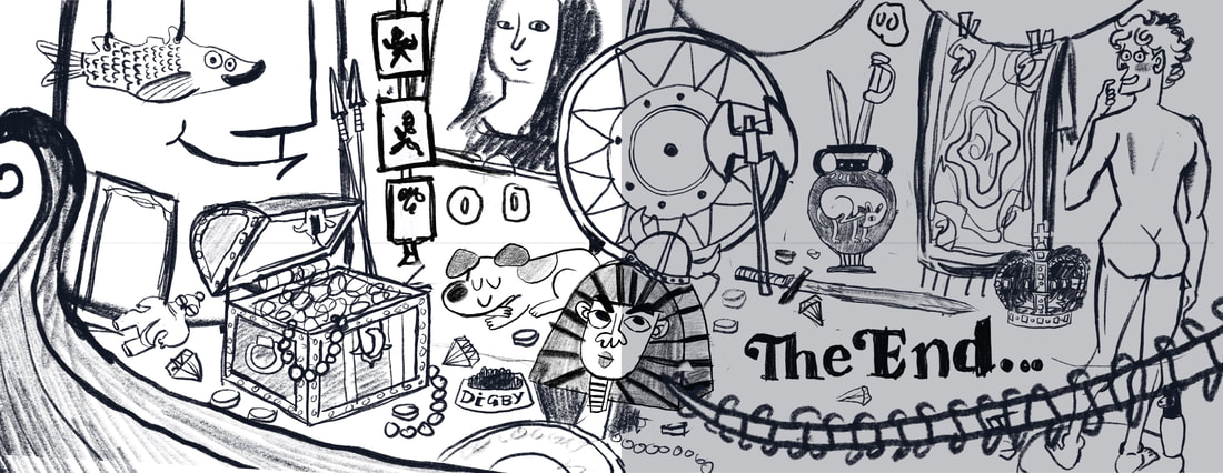
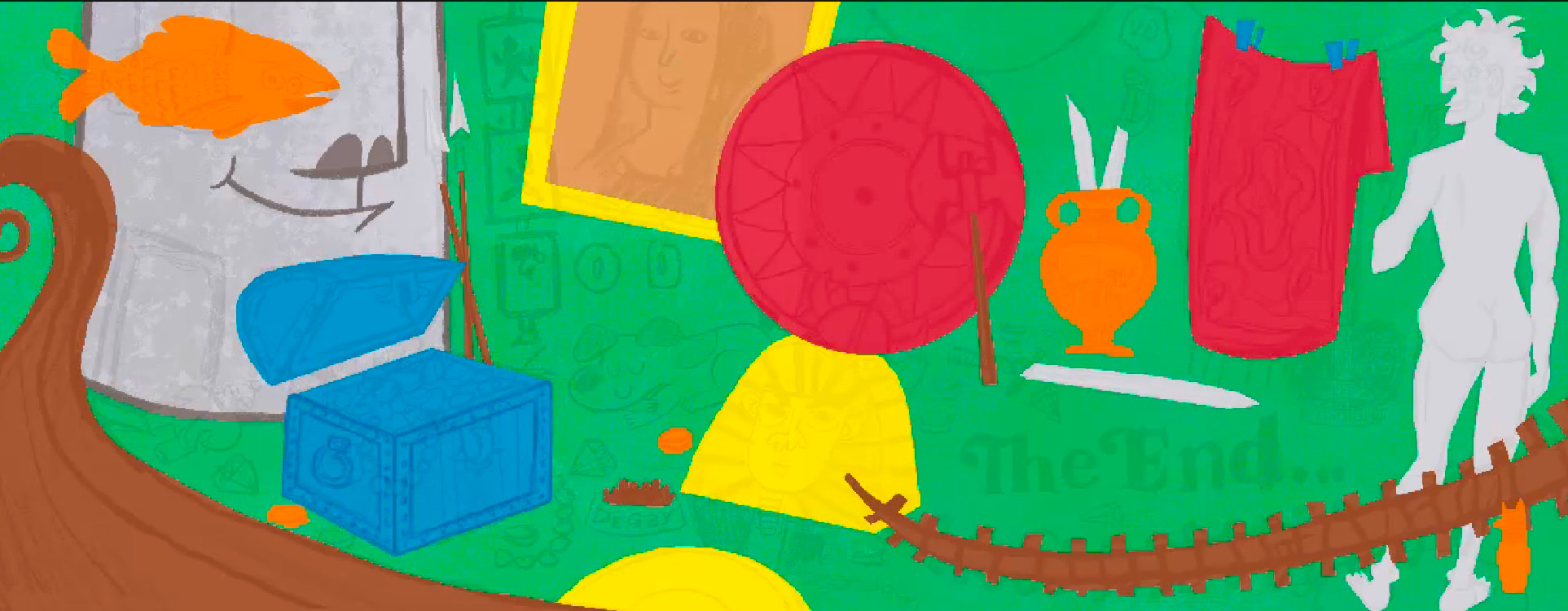
FINAL SPREAD
FINAL SPREAD IN CONTEXT
SPREAD SIX DEVELOPMENT
SKETCH
ARTIST RESEARCH
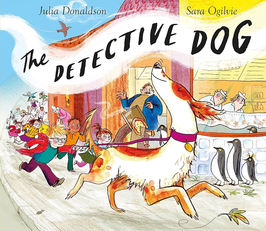
SARAH OGILVIE
Ogilvie splits the page into 1/3 and 2/3 as a sneaky way to mimic the feel of a full page spread but add a spot to balance text or to make the book flow better. This technique will be helpful in the spread.
|
|
DEVELOPMENT
|

|
FINAL SPREAD
SPREAD SEVEN DEVELOPMENT
SKETCH
ART RESEARCH
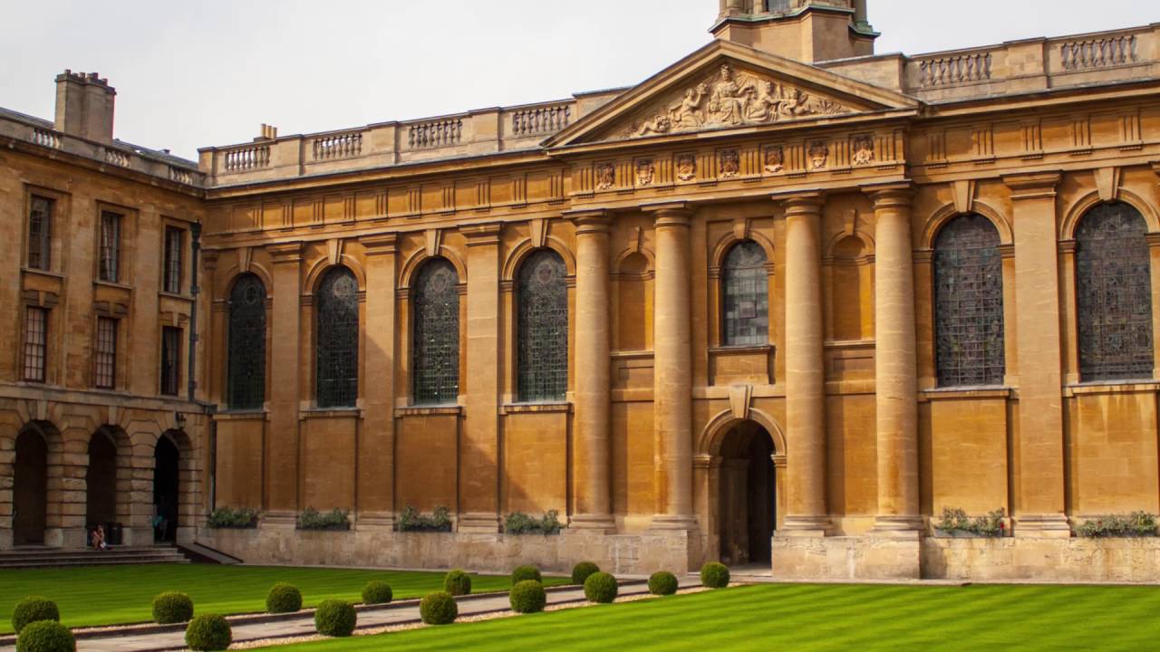
LOOKING BACK AT OXFORD
To try and make the book seem a bit more academic, I want to reference bits of Oxford's architecture that stood out to me on my visits. I've got to put a bicycle in there.
|

|

|
MID CENTURY CHILDREN'S BOOK ARCHITECTURE
During the research and ideas generation phase, I'm realising I'm going to have to draw a lot of buildings and architecture and this isn't something I've tackled AT ALL before. Some of my favourite depictions of buildings are in mid-century illustrations so I'm using those as inspiration for my own work. I find them on Instagram accounts dedicated to forgotten books of this time.
|
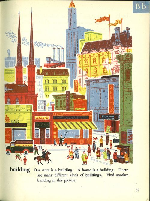
|
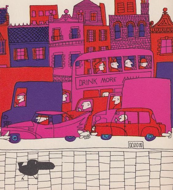
|
DAVE PILKEY'S DOG MAN BUILDINGS
I love the silly humour of Dave Pilkey's comics. The buildings with incredibly specific names always used to make me laugh when I was younger. I want to pay a bit of homage to these in my town.
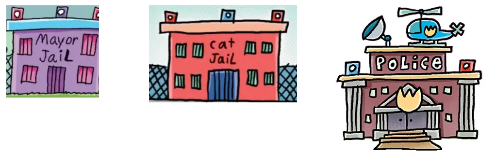
|
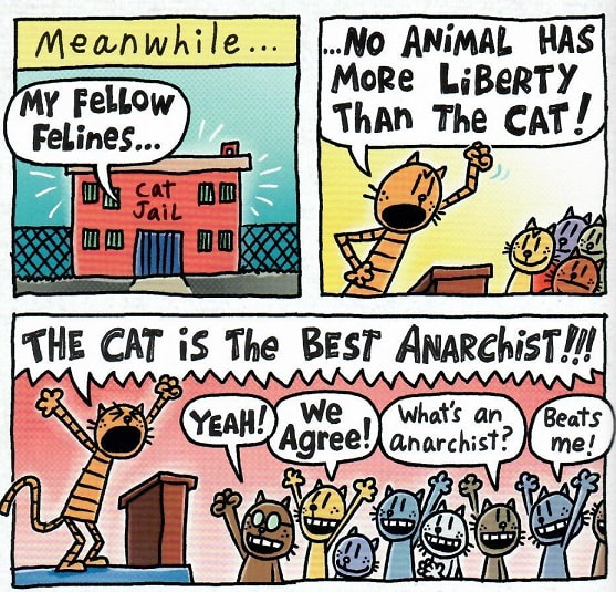
|
|
IDEA DEVELOPMENT
|
|
ADDING CHARACTERS
As I work on a battered old iPad, I can only have s et amount of layers. As a work around, I sometimes export the background and draw chracters and details on top of it. I did this here.
PINTEREST BOARD
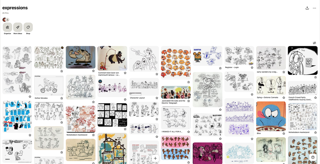
LOOKING AT CARTOON NETWORK/ NICKELODEON CHARACTERS

|
|

|
DESIGN DEVELOPMENT
|
|
FINAL SPREAD
FINAL SPREAD CONTEXT
SPREAD EIGHT
As these are two very detailed illustration and I work on n ancient iPad, I'll work on spread eight on two separate canvases. I will split the development work in two for this.
SPREAD SKETCH
LEFT HAND PAGE DEVELOPMENT

|

|


HAND PAGE DEVELOPMENT


FINAL SPREAD
SPREAD NINE DEVELOPMENT
I'll also split the developemnt up for

SKETCH
DEVELOPMENT
|
|
FINAL SPREAD
SPREAD IN CONTEXT
SPREAD TEN DEVELOPMENT
SKETCH
DEVELOPMENT
|
|
CHANGING THE VISUAL LANGUAGE
|
|
CHANGING THE CROWD AGAIN
|
|
FINAL SPREAD
FINAL SPREAD IN CONTEXT
SPREAD ELEVEN DEVELOPMENT
THUMBNAILS

SKETCH
RESEARCH
CHRIS CHATTERTON

|
I saw this image in a bookshop and thought the technique of having background characters a multiply layer in the background ws really clever. I was inspiration for this spread.
|
DEVELOPMENT
|
|
DRASTIC CHARACTER DESIGN CHANGE
The reason for this big character design change for the Clever Lady, is because I doodled this weird image of a giraffe wearing a wig and thought the shapes were a bit cool. This, along with some mid century and Abner Graboff inspiration, made her look a fair bit different and much more interesting.

|
|

|
DEVELOPMENT
|

|
FINAL SPREAD
SPREAD IN CONTEXT
SPREAD TWELVE DEVELOPMENT
SKETCH
DEVELOPMENT LEFT SIDE
|
|


SIDE RIGHT DEVELOPMENT


FINAL SPREAD
FINAL SPREAD CONTEXT
SPREAD THIRTEEN DEVELOPMENT
IDEAS

SKETCH
DEVELOPMENT
|

|
FINAL SPREAD
FINAL SPREAD CONTEXT
FINAL SPREADS
SPREAD FOURTEEN DEVELOPMENT
SKETCH
DEVELOPMENT
|

|
|
|
|
|
|
|
|
|
|
|
THIS ISN'T WORKING...CHANGING DIRECTIONS
SKETCH
DEVELOPMENT
|
|
FINAL SPREAD
FINAL SPREAD CONTEXT
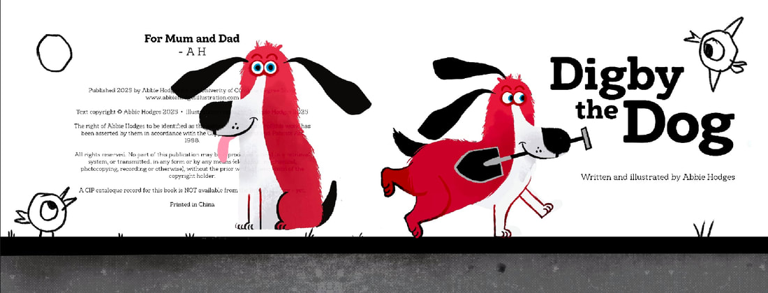
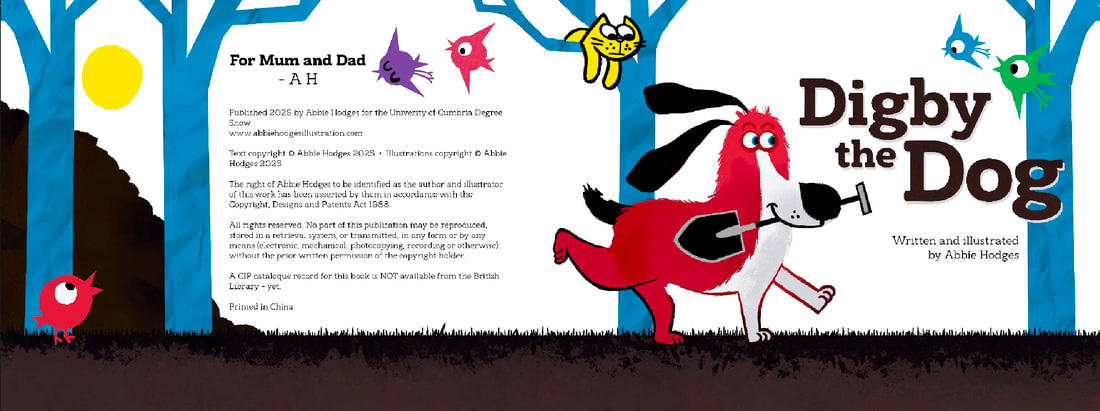
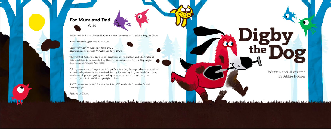
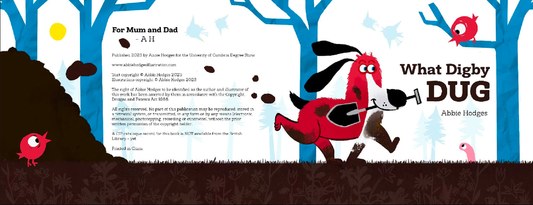
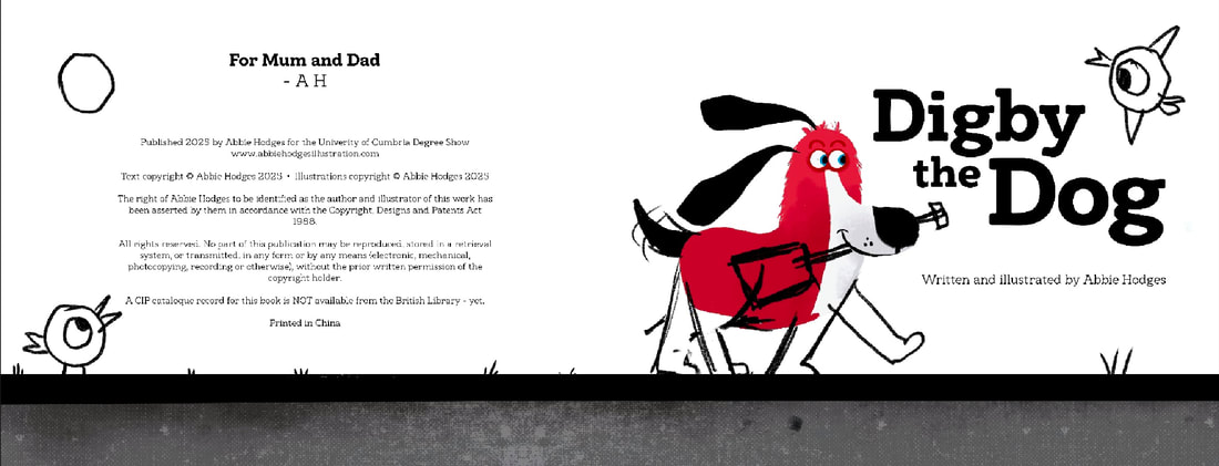
TITLE PAGE SPREAD
SUCCESSFUL TITLE PAGE EXAMPLES
SKETCH

DEVELOPMENT
|
|
|
|
FINAL SPREAD
FINAL SPREAD CONTEXT
FRONT AND BACK COVER
IDEA ONE
|
|
|
IDEA TWO
|
|


|
|
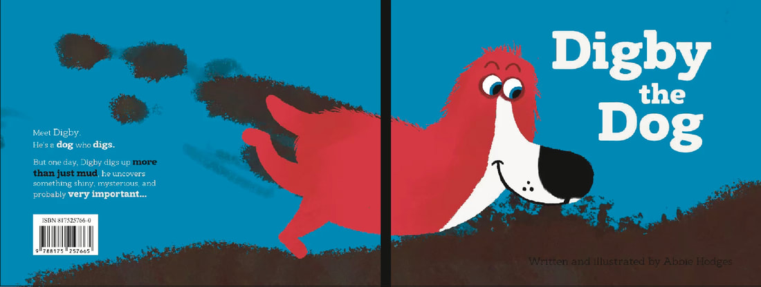
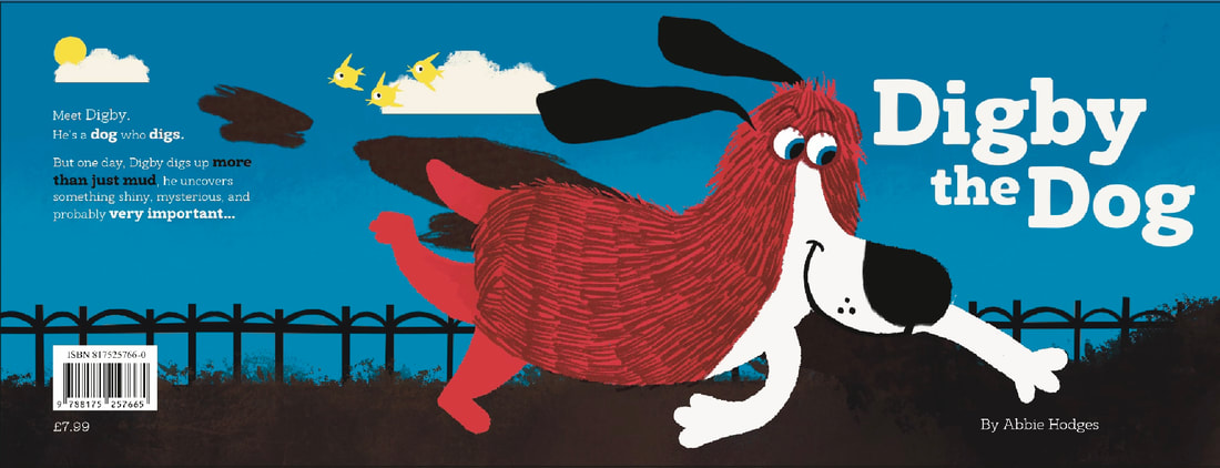
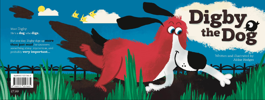
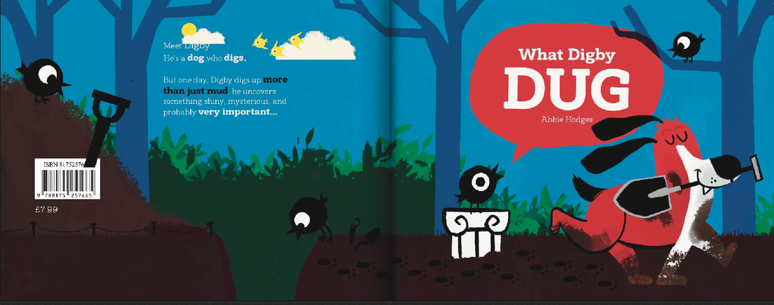
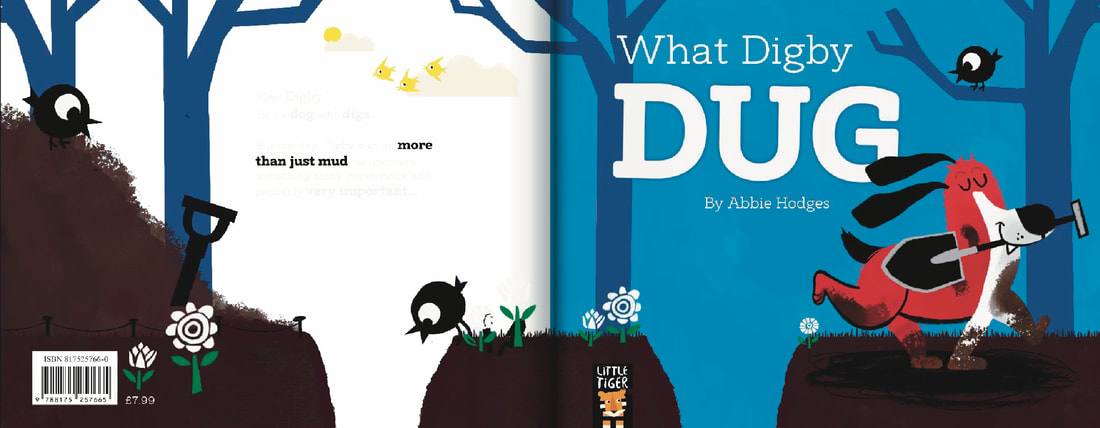
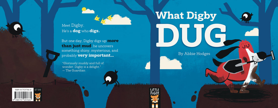
FINAL COVER
FINAL COVER CONTEXT
CHOOSING A FONT
A good font can make or break an illustration. I need to try a bunch and thoroughly research them before settling. I want the font to compliment my illustrations. (NOTE: I did this research during the development stage of the spread, but placed it here to not break up the flow of the website)
LOOKING AT FONTS MARKETED AS "KID" FONTS
These were interesting to look at, but came off as more gimmicky. I really don't want this to distract away from my work but enhance it. I need to look at something else.
CONSULTING PROFESSIONALS AND BLOGS
I found this website REALLY helpful. I tried to embed it but the website won't allow it so I've linked it instead. Here are the key take aways:
- Prioritize Legibility: The foremost criterion for choosing a font is legibility. Ensure that the text is clear and easy to read, avoiding any blurring, smudging, or distortion.
- Understand Serif vs. Sans Serif:
- Serif Fonts: These have small lines at the ends of letters, aiding in reading longer texts.
- Sans Serif Fonts: These lack the extra lines and are often better for shorter texts.
- Serif Fonts: These have small lines at the ends of letters, aiding in reading longer texts.
- Font Size for Picture Books: For picture books, use a font size of 18 pt or larger to ensure readability.
- Consistency in Typography: Unless intentionally designing for artistic effect, maintain consistent font size and style throughout the book.
- Fonts for Dyslexic Readers: Research indicates that certain fonts like Verdana, Garamond, Helvetica, Computer Modern Unicode, Courier, Arial, Times, and Myriad can aid dyslexic readers. Conversely, italic fonts and some designed specifically for dyslexia, like OpenDyslexic, may be harder to read.
- Display Fonts for Covers: For book titles and covers, feel free to use bold and expressive display fonts that match the book's mood. Examples include Charlemagne Std and Lithos Pro.
- Avoid Overcomplicating Font Choices: While it's tempting to use multiple fonts, simplicity often leads to better design and readability.
- Experiment and Test: Ultimately, test different fonts to see what works best for your specific book and audience.
LOOKING AT FONTS IN REAL CHILDREN'S BOOKS
I think the best thing I can do is look at real world examples. Here are some I think are very successful.
CHRIS HAUGHTON
LAUREN CHILD
|
|
|
THE BOOK WITH NO PICTURES BY BJ NOVAK
|
|
|
EXPERIMENTING WITH FONTS
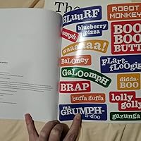
I tried out a LOT of fonts, here are an exmaple of just a few. I gravitated towards rounded ones with a bit of personality.


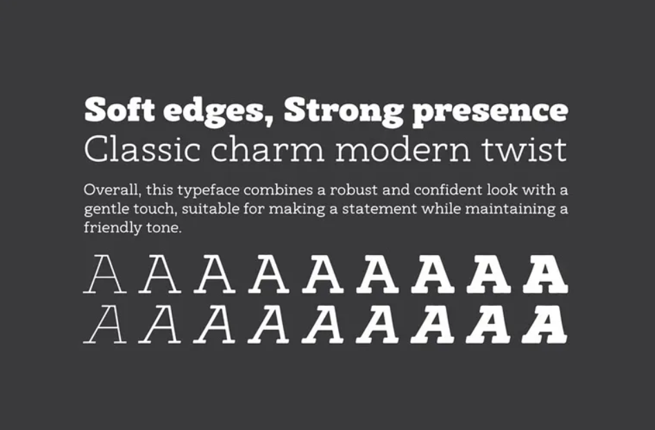
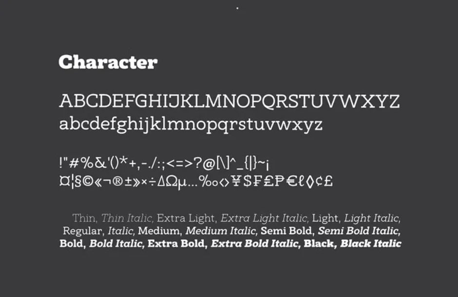
CHOSEN FONT - ARCANITE SLAB
I chose this font. It has lots of weight options, is full of character without being distracting and comes with lots of symbols. I think it elevates my work.
|
|

DUMMY BOOK BEFORE PRINTING
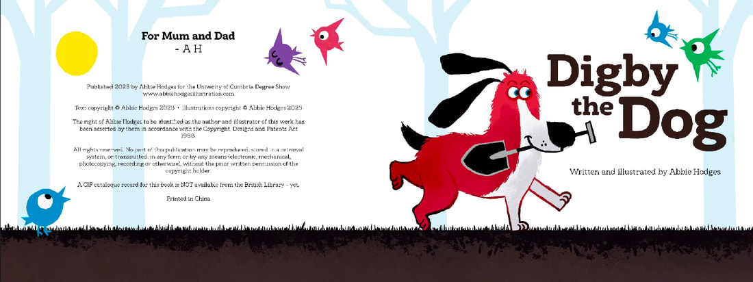
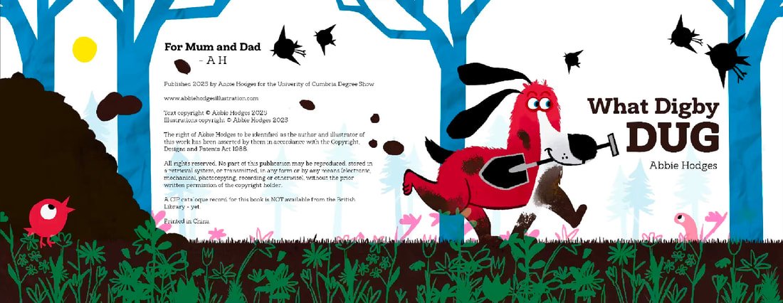
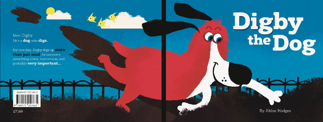
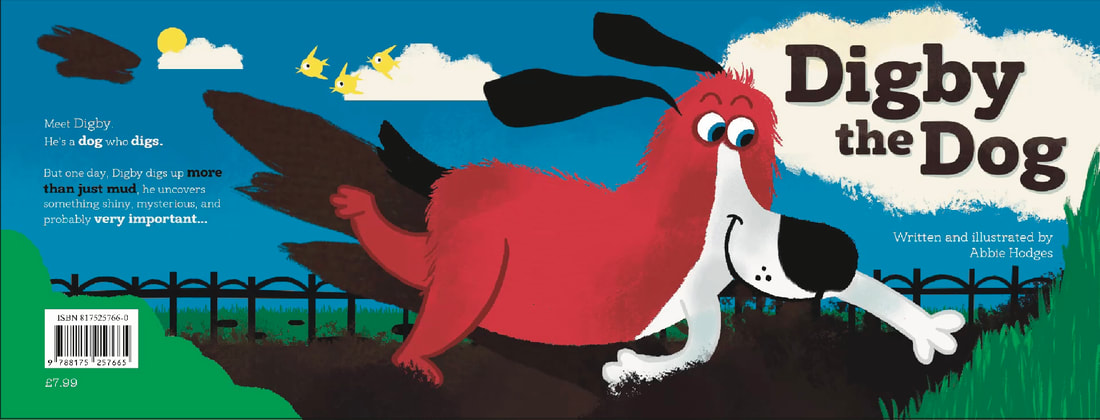
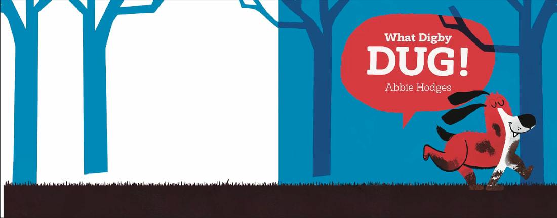
I printed all my spreads up until now and made the final dummy book before printing. The only thing I wanted to change was the cover. I felt I didn't think about it enough and the title page actually is stronger. The dog doesnt even look like he's digging.
REVISITING THE COVER
LOOKING AT OTHER COVERS
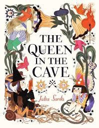
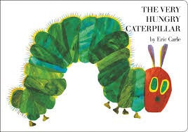
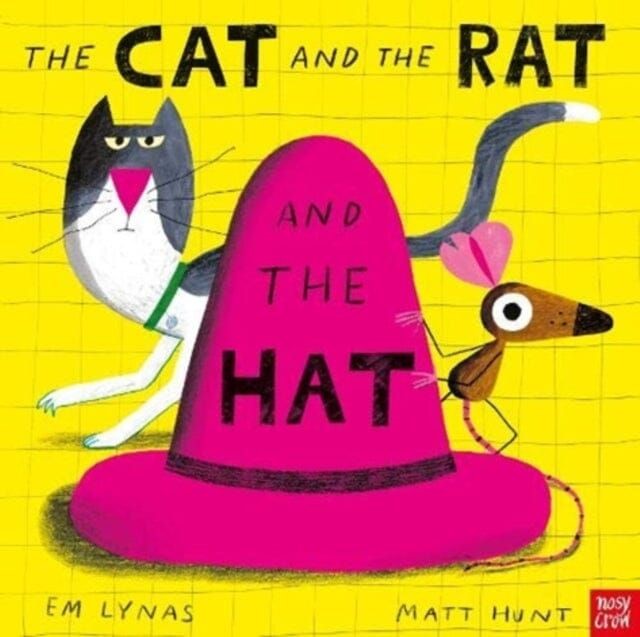
I looked back at my children's book collection and collected images of the ones that I gravitated towards. I liked simple, colour block covers with simple text. I'll take inspiration from this in my design, but no doubt overcrowd it a little bit more than these.
I do still want to include a wrap around motif because I just think they look really cool.
I do still want to include a wrap around motif because I just think they look really cool.


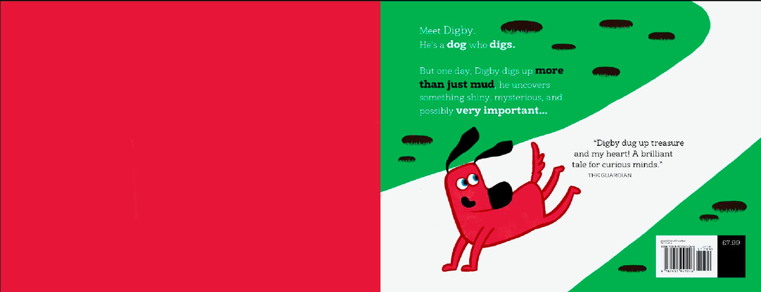
QUICK THUMBNAILS
I made some very rough thumbnails, taking inspirations from the above covers but also my own title page, pictured below.

|
|
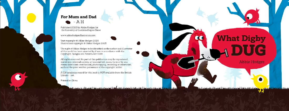
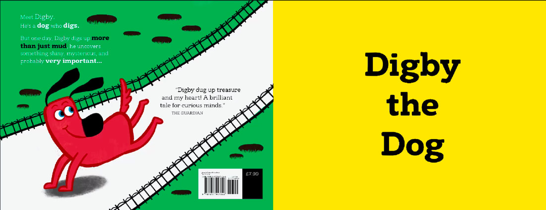
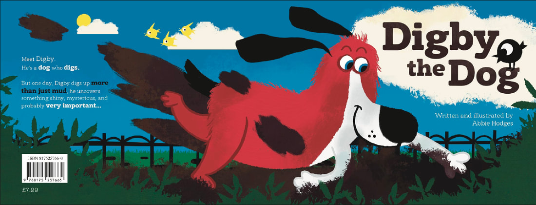
NE COVER DEVELPOMENT


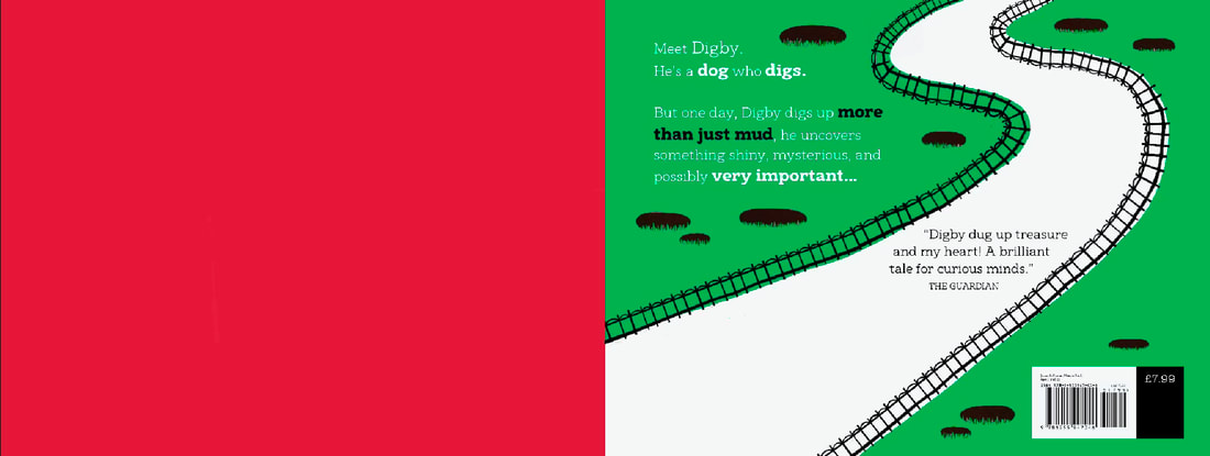
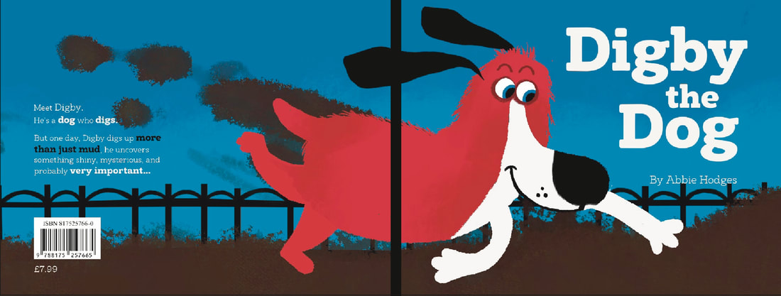
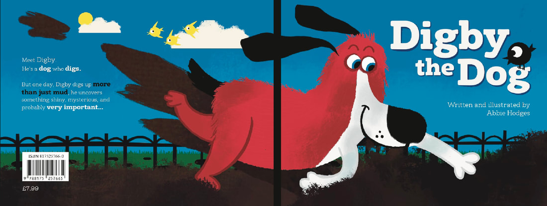
FINAL COVER
DRESSING BOOK UP WITH BOOKISH THINGS
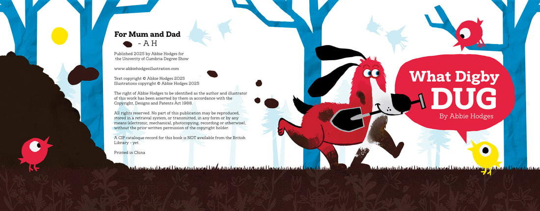
Even though this isn't a publish book, I will copy the formatting of a publisher and add all the bells and whistles that make a real book. This included a fake barcode, a publisher logo, a price etc. I know it might seem funny, but I just want it to look real. Manifesting if you will.
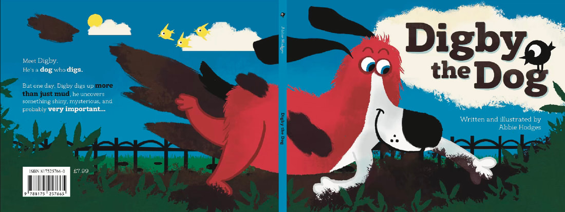
FINAL COVER IN CONTEXT
FINAL BOOK FLIP THROUGH
MY BABY IS FINISHED! This shows the final full book. Now time to get printing.....
GETTING READY TO PRINT
The process for getting the book to print was really easy! I just uploaded each page as a pdf and the Mixam pag put everything in order. Smooooth sailing.
MIXAM PROOF
CHOSEN PAPER SETTINGS
|

|
MAY 16TH: IT'S HERE!
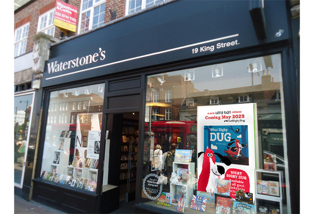
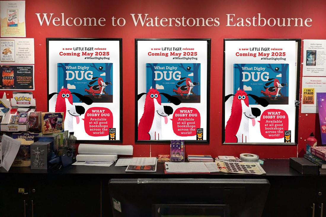
WATERSTONES PHOTOSHOOT
If I wasn't cheeky enough adding a Little Tiger Press logo and barcode to the book, I went to Waterstones, took down their displays and did a Digby photoshoot in there. Makes the book look good though!
MAKING PROMOTIONAL MATERIA FOR THE BOOK
To give the project even more depth, I'm going to make a few promotional materials as if this was an actual book launch.
POSTER
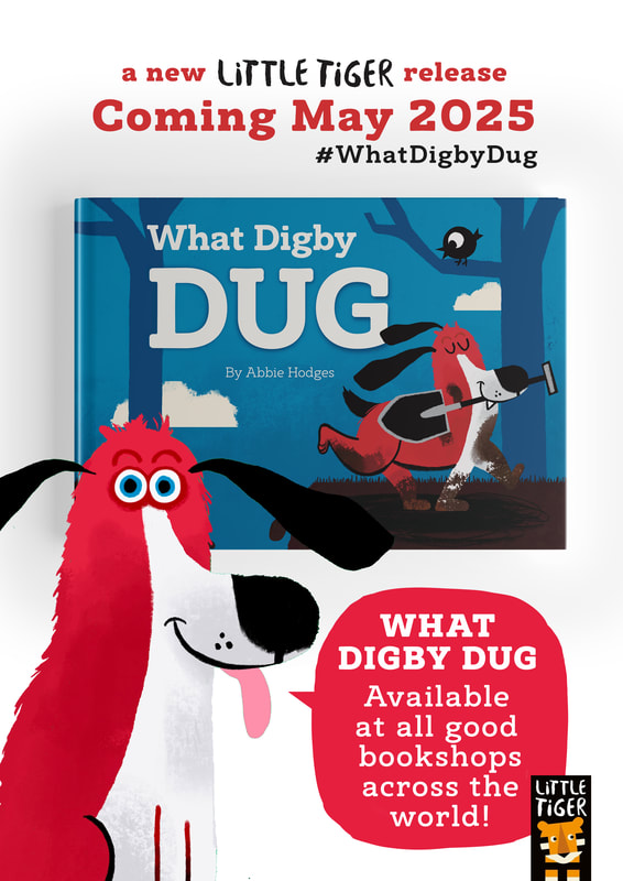
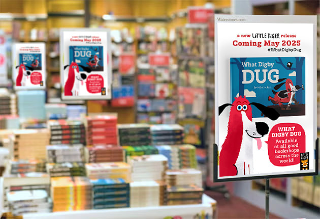
|
|
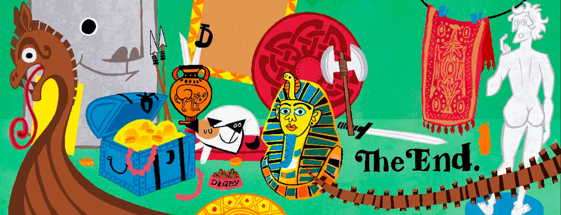
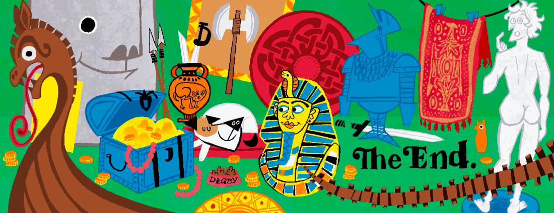
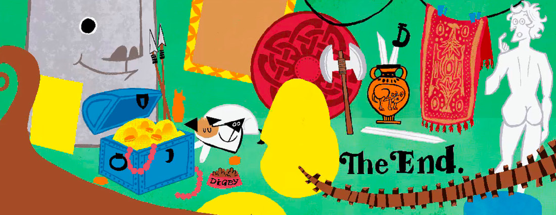
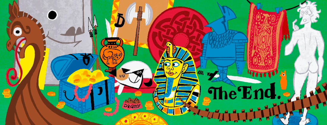
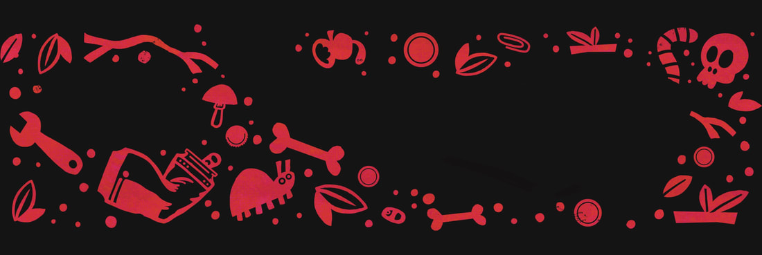
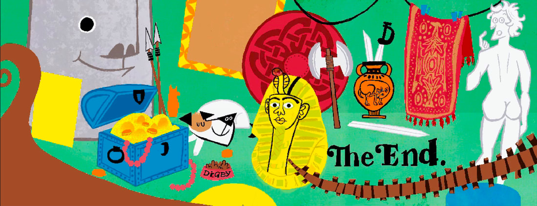
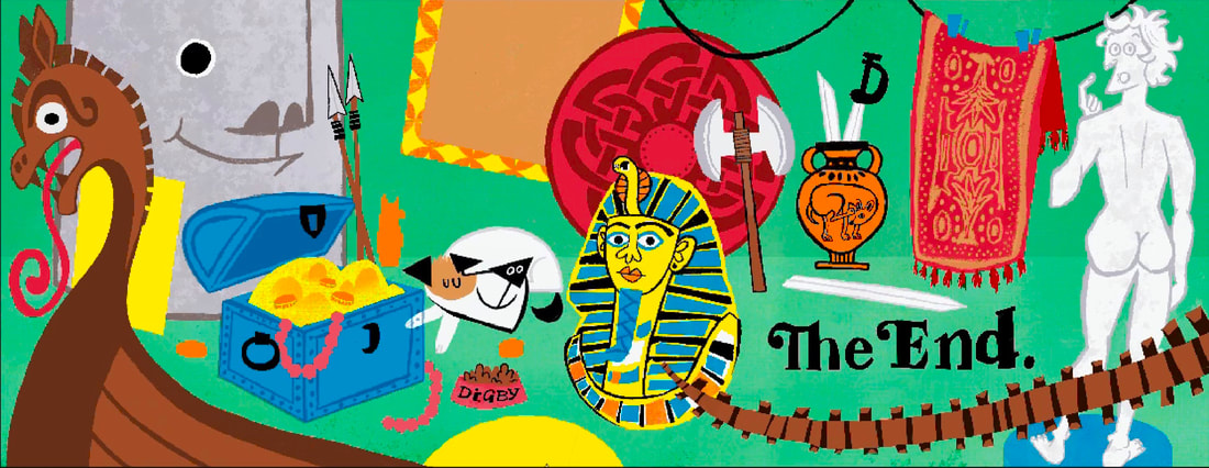
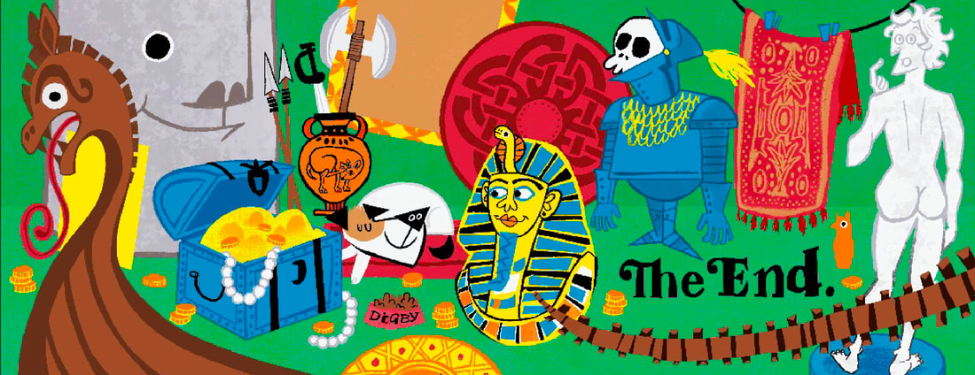
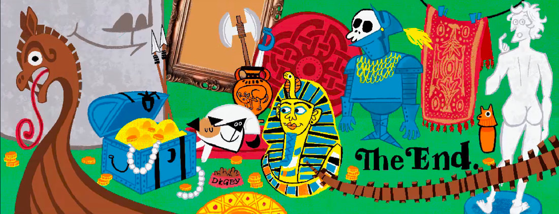
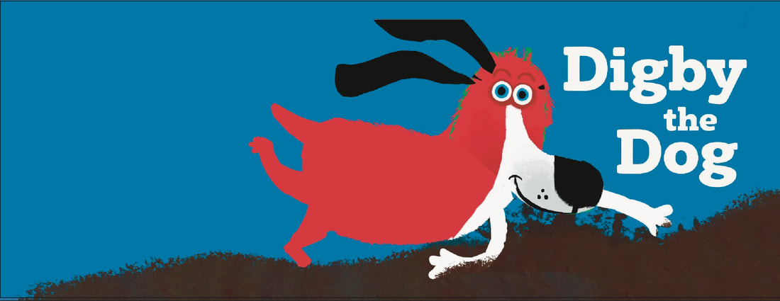
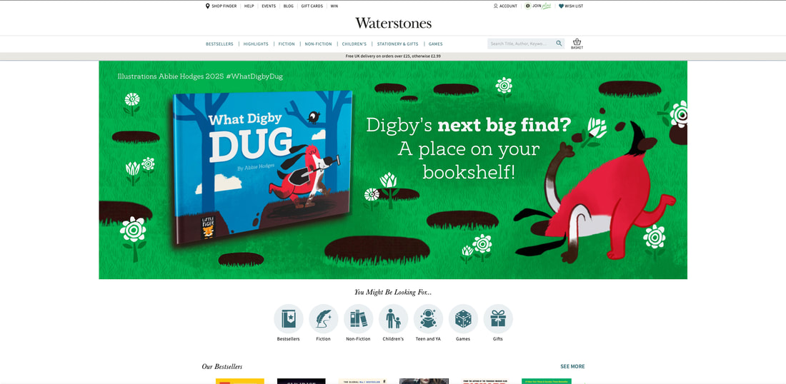
DIGITAL WEBSITE BANNER
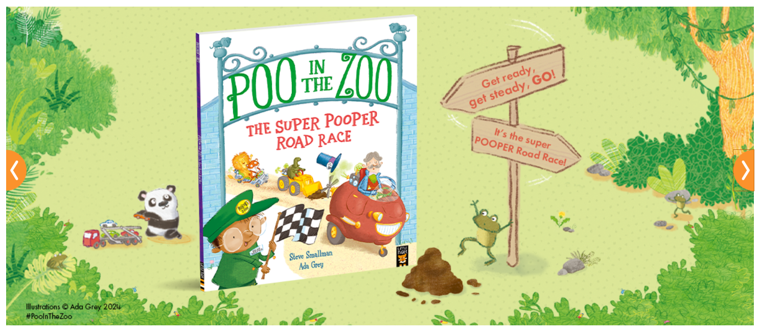
PREEXISTING WEBSITE BANNERS FOR BOOKS ON LITTLE TIGER WEBSITE


PROCESS TIMELAPSE VIDEO
FINAL BANNER
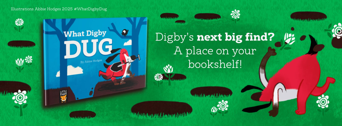
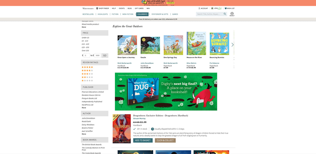
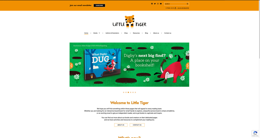
FINAL BANNERS IN CONTEXT
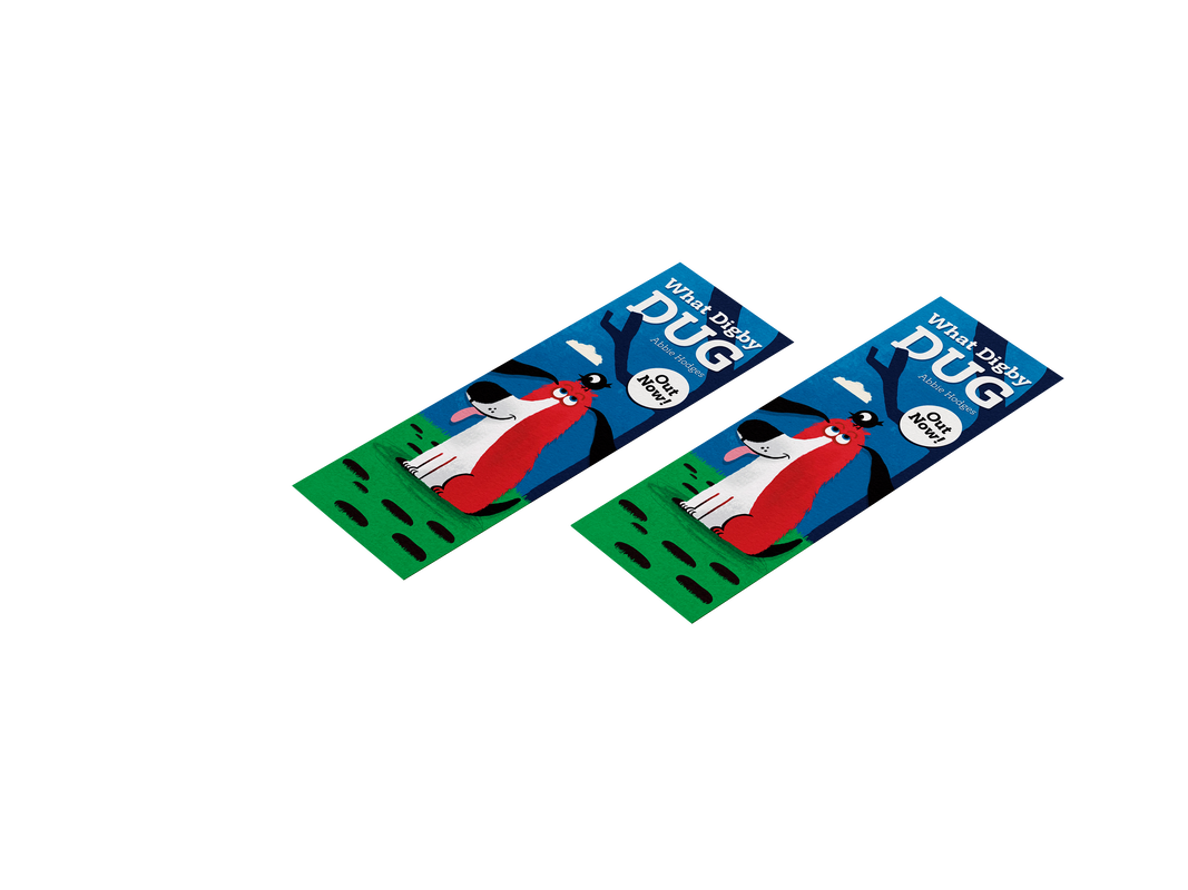
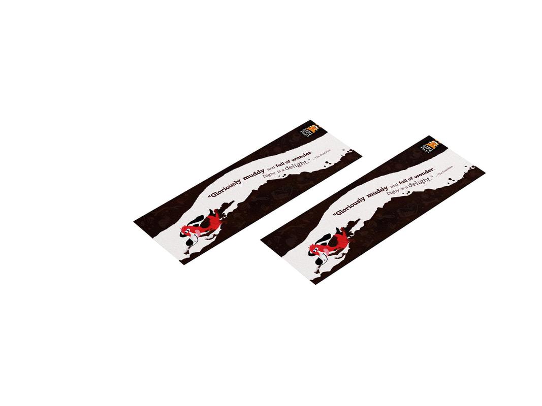
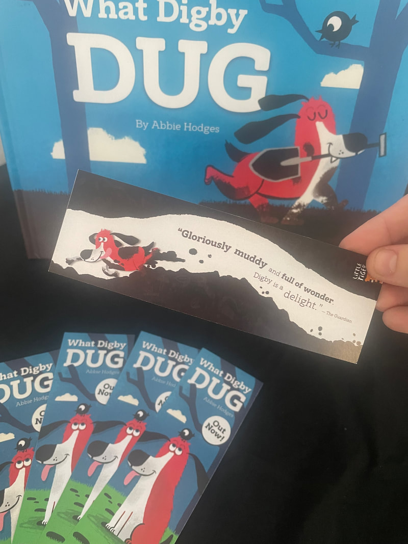
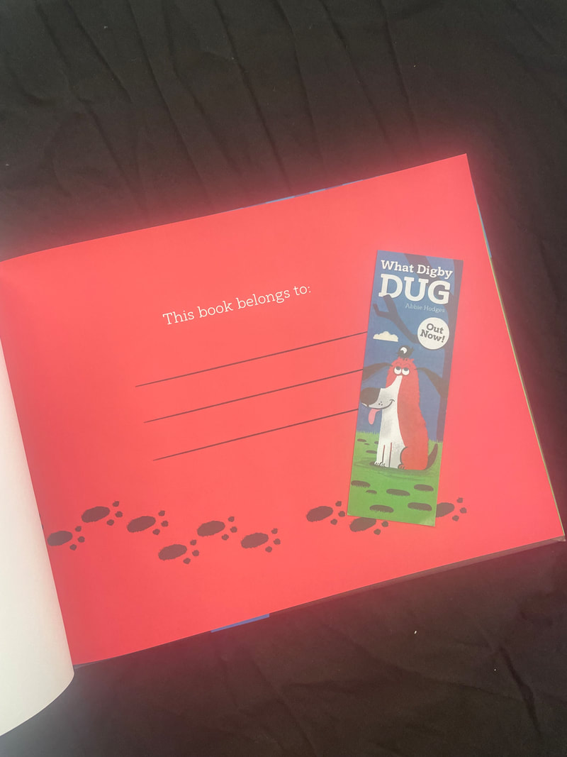
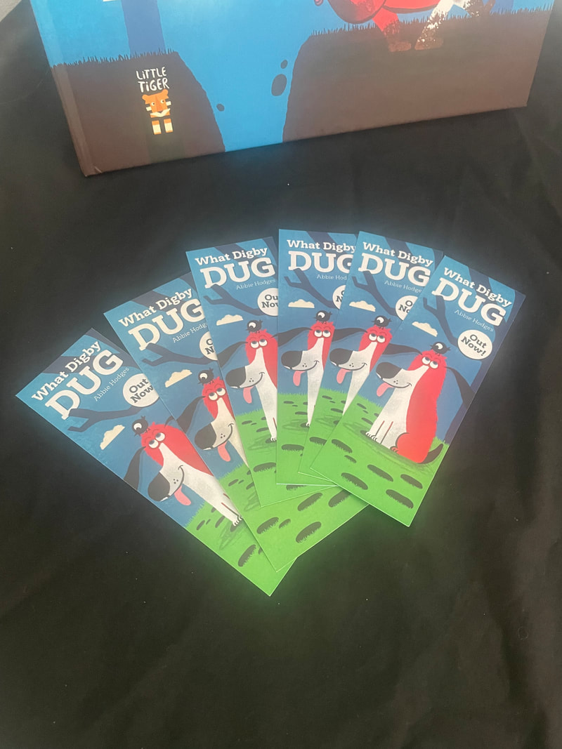
BOOKMARKS

BOOKMARKS IN CONTEXT
|
|
|
|
|