Digital illustration has never been more accessible, with new software challenging Photoshop and Illustrator at a fraction of the cost. In the upcoming four weeks, we'll focus on mastering Photoshop and Illustrator, as they set the standard for other programs. Proficiency in these giants facilitates an easy transition to other software, like Procreate.
Week One & two: photoshop
Over the next two weeks I will be developing my Photoshop skills.
RESEARCH
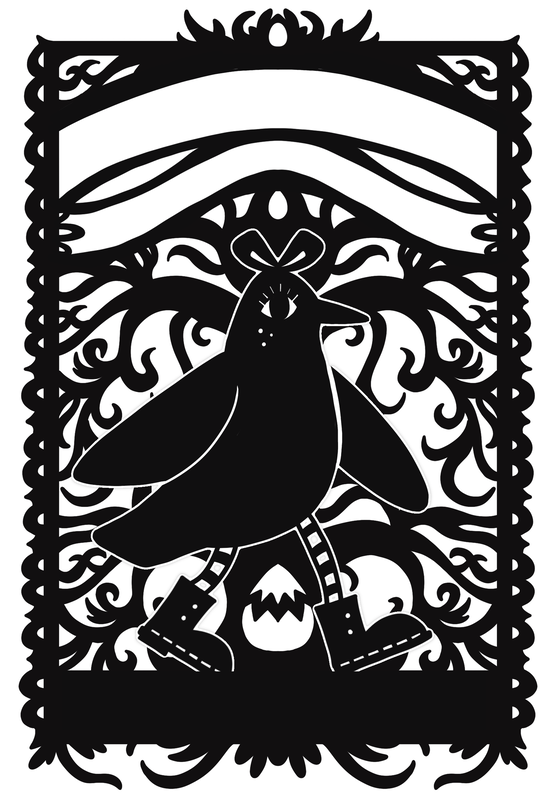
This project is about creating tour posters and merchandise graphics for a band. Band names were distributed randomly. I go the name Endless Eggs. Before I started making any imagery, I needed to decide what kind of band the Endless Eggs were.
DECIDING GENRE
I found this website was particularly useful in finding the names for specific music genres and quickly listening to a collection of the music from each niche genre.
PLAYLIST
I created a playlist on Spotify of the types and genre of songs I think my band would make.
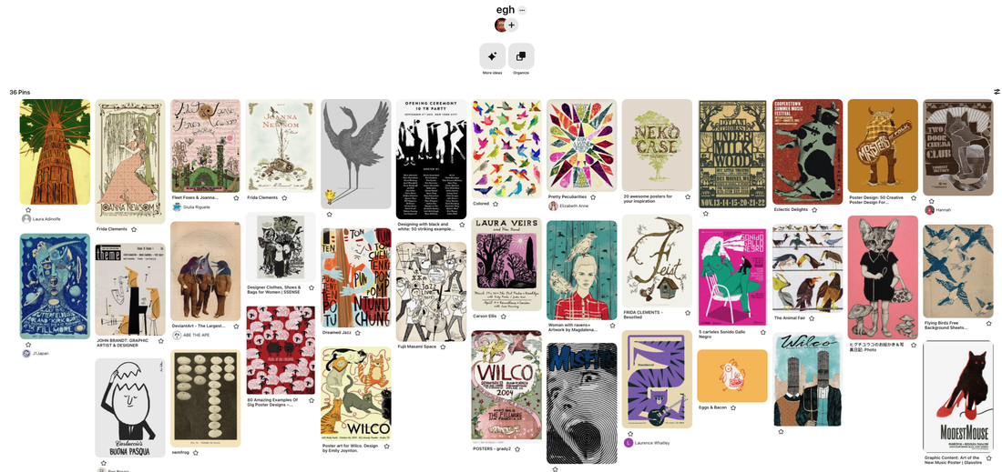
MOODBOARD
I made a moodboard with tour posters from bands and artists that worked within the genre. I noticed themes of handwritten typography, the use of pattern and texture, collage elements and flat colour. The subject matter for lots of the posters included animals and natural forms, two things I had mind mapped. I wanted the concept of "twee" to be a main design point.
"Twee" is an adjective used to describe something that is excessively or affectedly quaint, pretty, or sentimental. It often conveys a sense of overly delicate or precious aesthetics, sometimes associated with a nostalgic or whimsical style. The term is commonly used to describe a certain type of artistic or cultural expression that embraces a deliberately quaint and charming simplicity, often characterized by whimsical, vintage, or childlike elements.
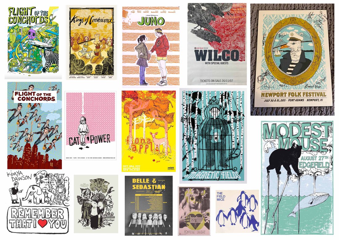
PINTEREST BOARD
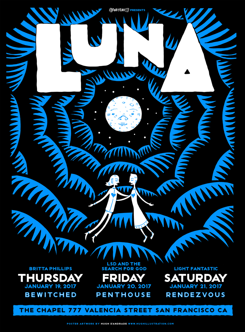
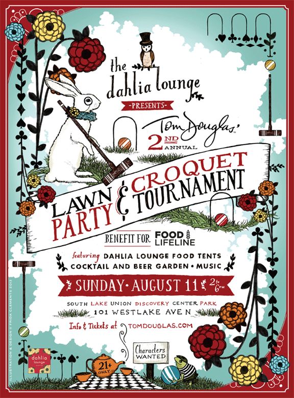
HUGH D'ANDRADE
Hugh D'Andrade, an award-winning illustrator located in Oakland, California, has showcased his talent on various platforms, including young adult book jackets, rock posters, magazines, t-shirts, skateboards, the cover of Communication Arts, and occasional gallery displays. His use of colour and pattern make and funky chunky type really make his designs
|

|

|
|
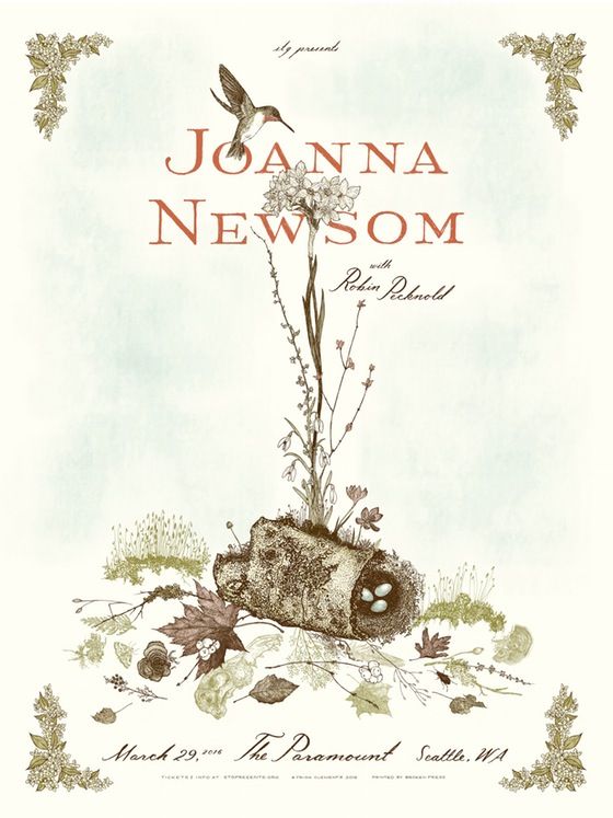
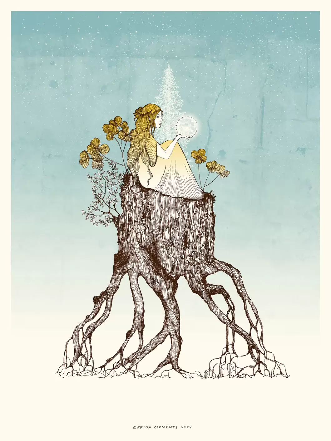
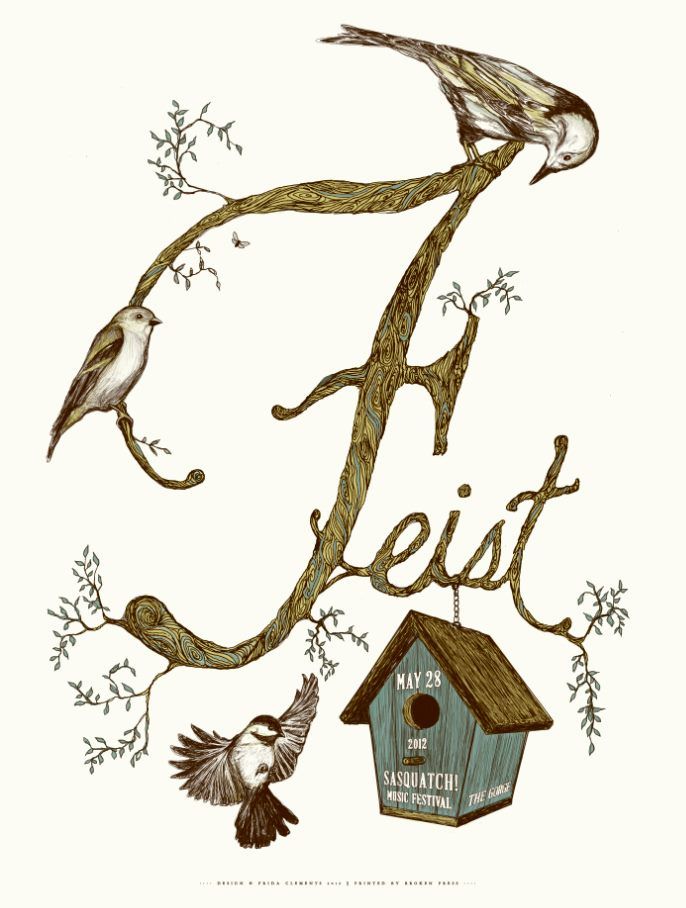
FRIDA CLEMENTS
Frida Clements, a Seattle-based illustrator, has gained recognition for her screen-printed poster designs and the creation of the "Have a Little Pun" line of book and gift products. Her posters have a folky and deleicate look to them.
|
|
|
|
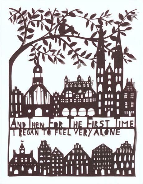
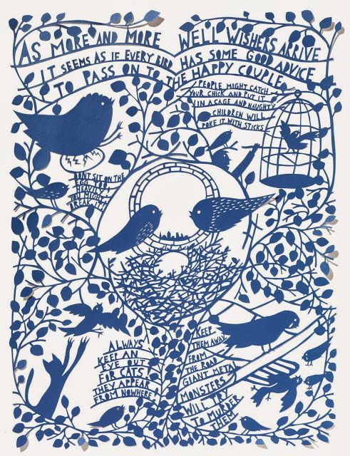
ROB RYAN
Rob Ryan, a British visual artist, specializes in papercutting and screen-printing, gaining renown for his intricate and detailed paper cutouts. While his work could be done on a laser cutter, the hand made aspect is part of the charm. I was articually inspired by the graphic look to his work and the sihloettes like Hugh D'andrade.
|
|
|

|
HELPFUL ARTICLES
I looked at these articles to better understand the concept of "twee", an idea I wanted reflecting in my designs.
|
|
|
THURSDAY PHOTOSHOP TASKS
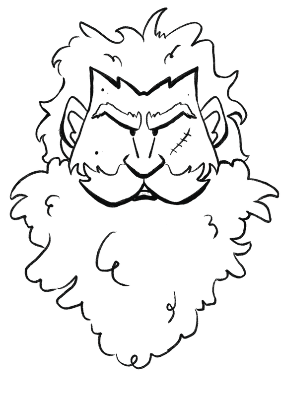
Dwayne's sessions on Thursday's revolved around little tasks to get us comfy with the software. The first task was to create a vintage trading card of a wrestler. I sketched out a design I called "Mr Whiskers" and then digitally coloured and added backgrounde elements and effects like misprints digitally in Photoshop with adjustment layers and blending modes.
|

|
I also created my a shirt design of me. I had seen celebrity versions of these on Etsy and thought it would be funny to make one of me. I was correct. This made me practice all elements of Photoshop.

|

|
ONLINE TUTORIALS
|
|
|
POSTER IDEA DEVELOPMENT
THUMBNAILS
I sketched out a few thumbanails of possible designs.

REFINED SKETCHES/IDEAS
I used Photoshop to compile sketches I had done and experiement with layout and colour.


FURTHER DEVELOPMENT
I created these in Photoshop to use in designs. I didn't end up using the one on the left, but it was a helpful exersise in collaging digital imagery.
|
|
|
BLENDING MODES AND ADJUSTMENTS
These show how using different textures and colours with adjustment can change effects and aid the design.
|
|
|
|
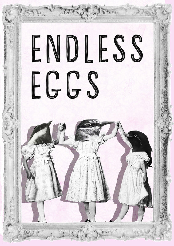
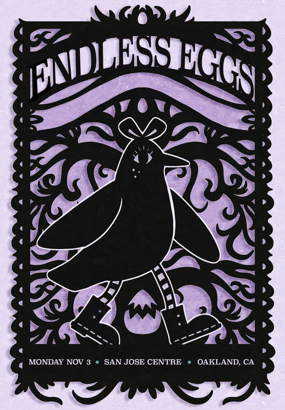
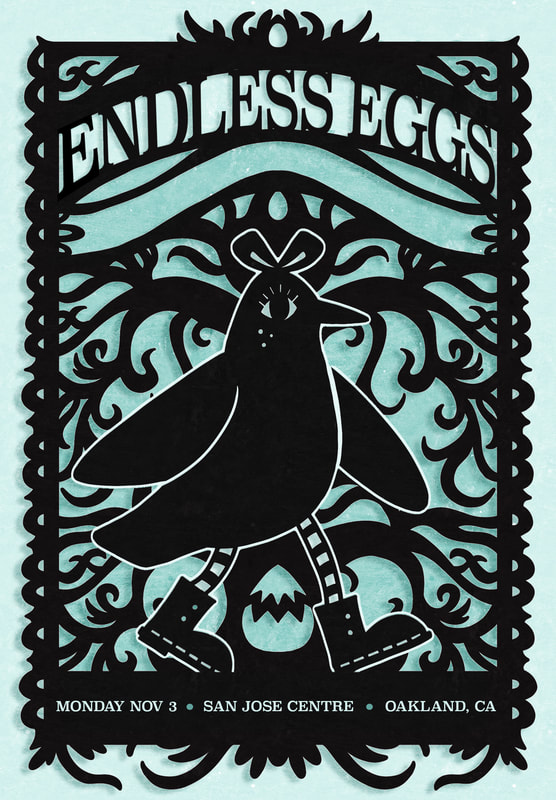
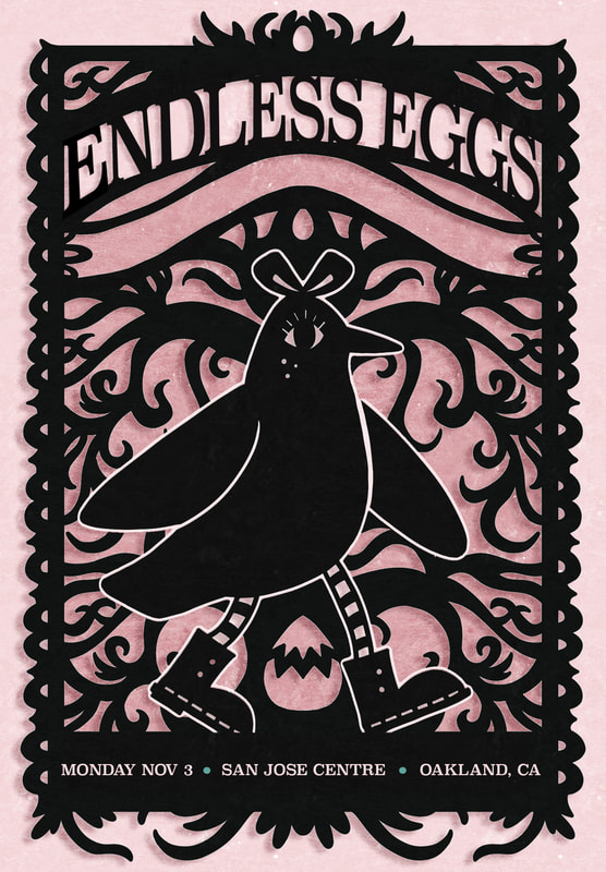
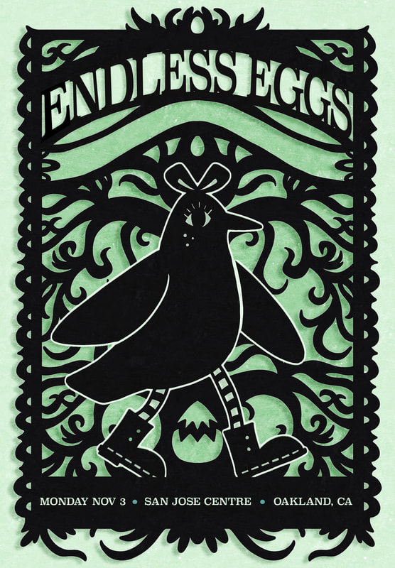
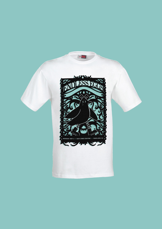
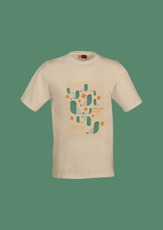
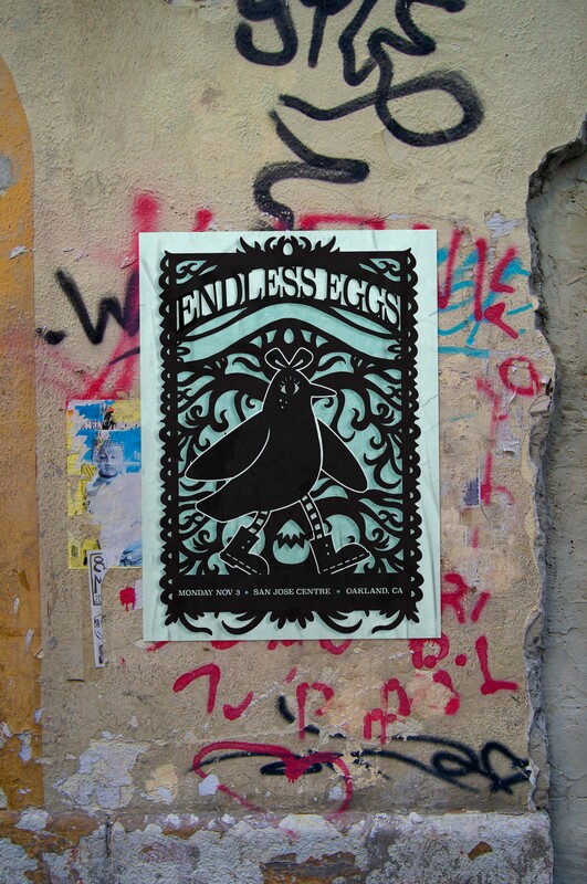
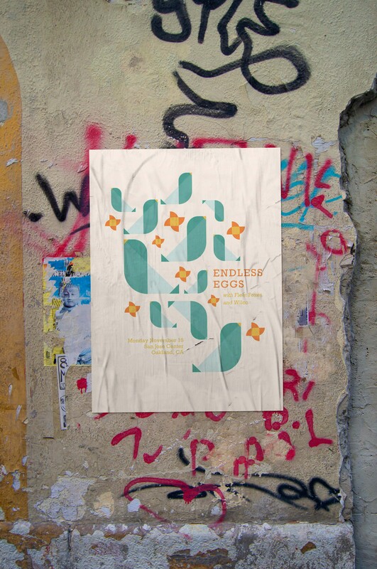
FINAL DESIGNS
These are the two final designs I ended up with. With them, I experiemented with texture overlays, setting type, allinghment tools, blending modes, colour overlays and drop shadow functions. I also created some digital mockups with my designs in context.

|

|
|
|
|
|
WEEK THREE & FOUR: ILLUSTRATOR
This brief is focused around getting comfortable in Illustrator. To do so, I will try and explore as many techniques as I can. The final outcome is to create a set of three pin badges from an existing property.
RESEARCH
HELPFUL VIDEOS
|
|
|
|
|
|
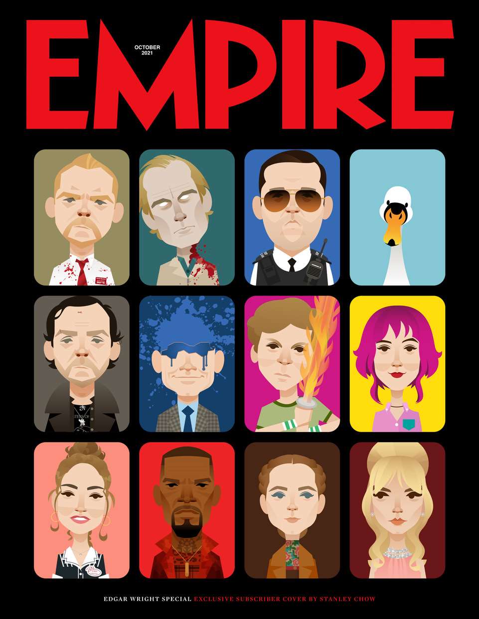
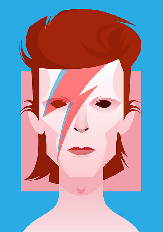
STANLEY CHOW
The early career of Chow involved fashion illustration for teen magazines. However, a significant shift occurred when got acomputer, transforming his workflow by enabling digital submissions to clients. This prompted a transition from traditional drawing and painting to vector-based work using Adobe Illustrator. Chow's focus shifted towards portraiture, specializing in depictions of celebrities across music, television, film, and sports with a simple graphic style made of shapes. I looked at his work when I first was learing Illustrator and revisted him again for this project.
|

|
|

|
INITIAL IDEAS
|
|
MAKING THINGS
I wanted to just start making things in Illustrator. I started making something complicated thinking it would make making simpler things a lot easier. I have also used Illustrator a lot in the past so I'm already pretty at home here in this brief. I experimented with the different line settings, testing out different textured line settings to create more textured work.


PAID WORK OUTSIDE OF UNI
|
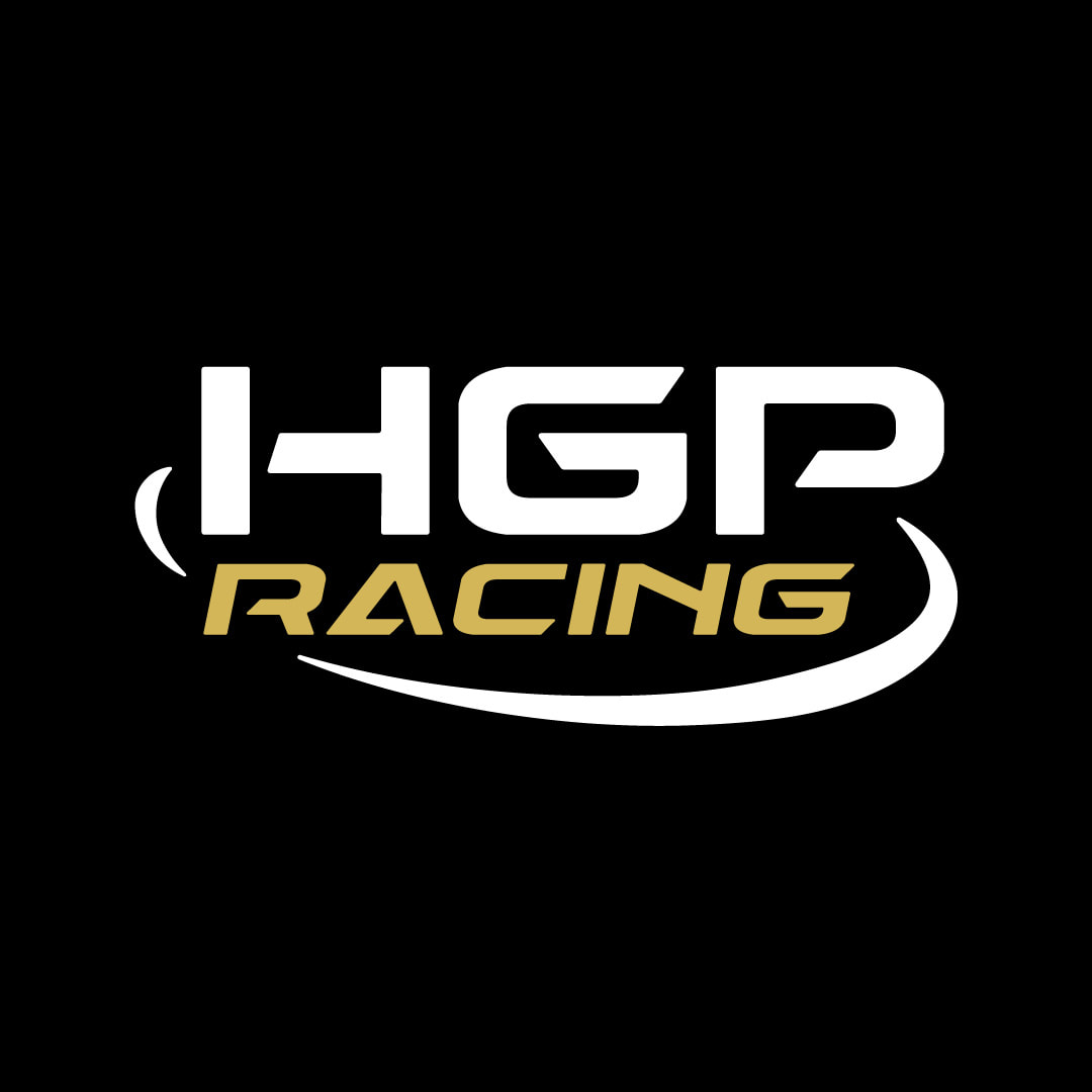
While this project has been going on, coincidently I have been creatinh a logo for a Huddersfield University car racing team. This conincided nicely with the project so I wanted to include one of the final designs and some development work from that project.
|
DESIGN DEVELOPMENT
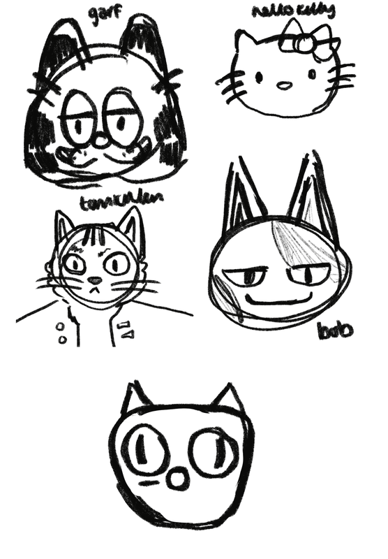
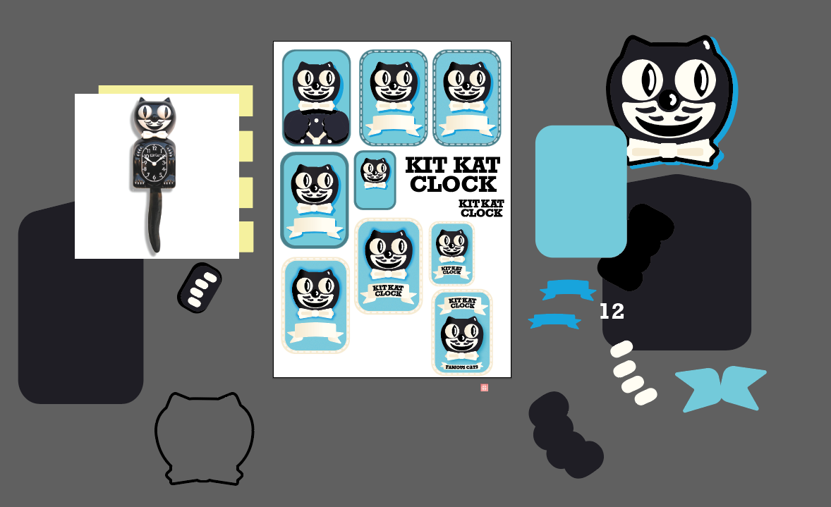
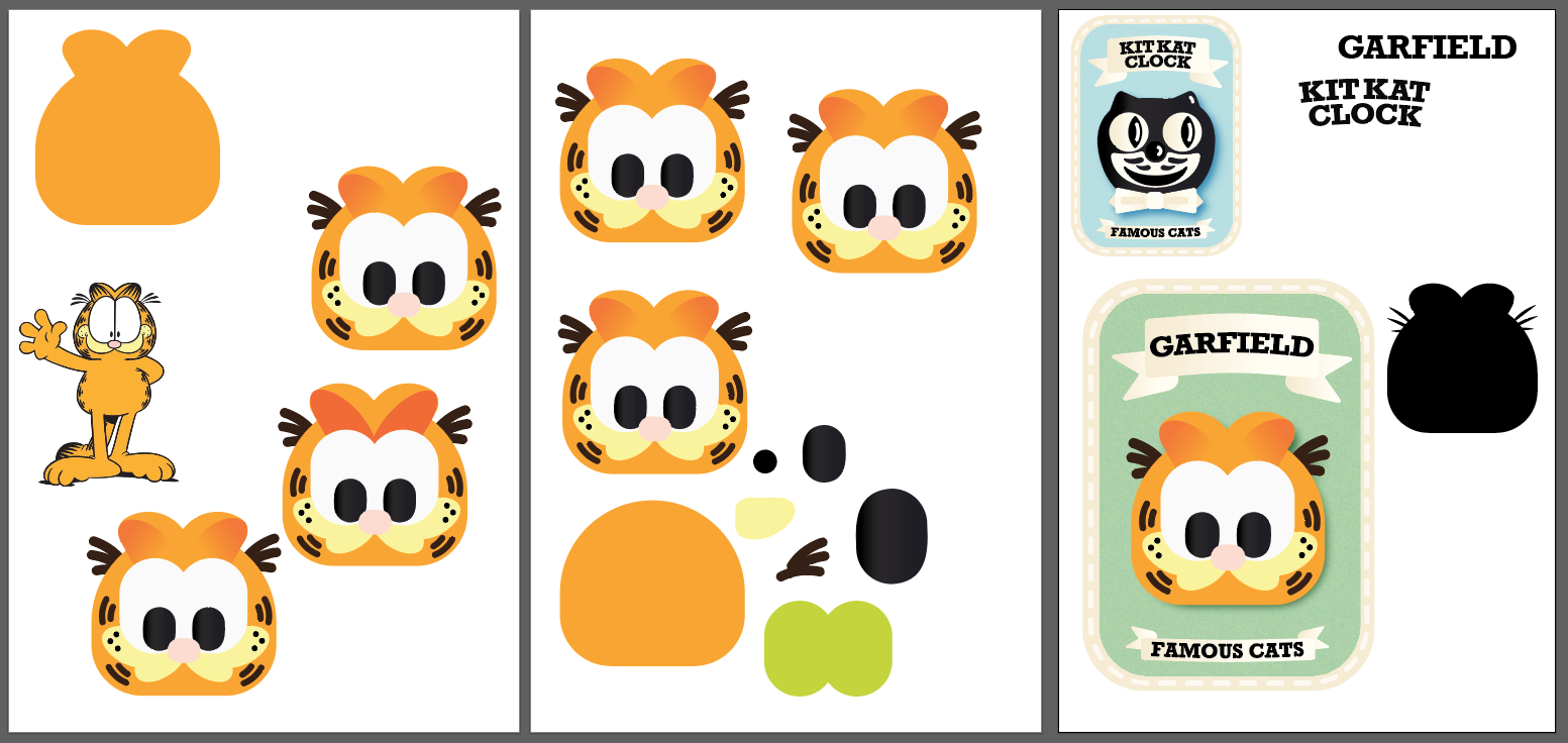
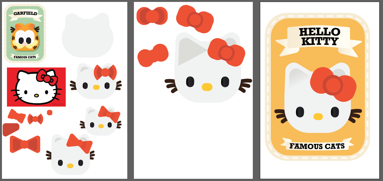
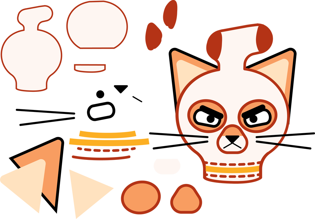
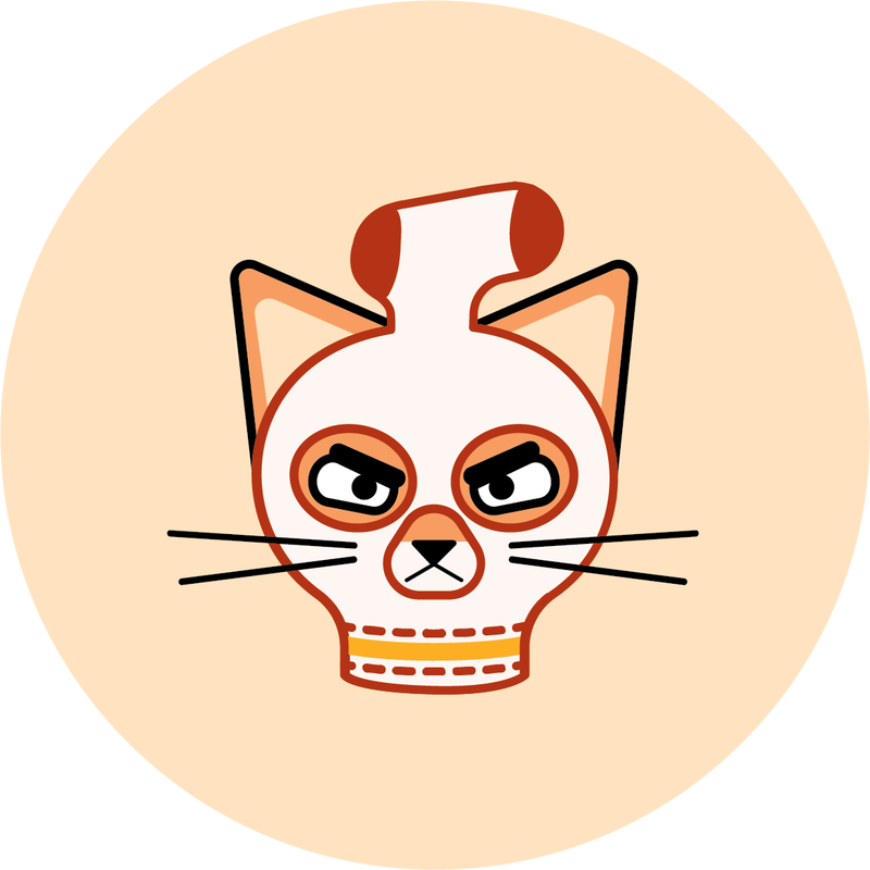
Below show the process for me making a set of badges with the theme "Famous Cats". I tried to utilise making shapes, using drop shadow and colour, experimenting with line weights and experimenting with type in this. I tried to make a simple vintage effect with the backing card, using muted colours and creating a banner and using a slab serif font. I liked these but felt I could take it a step further.

|

.
|

THURSDAY BADGE TASK

|
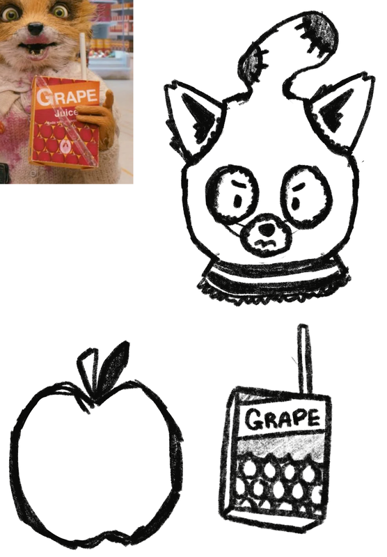
This badge task was to create our own designs for a pin badge to be made during an hour of class time. I made Ash from Fantastic Mr Fox. I included a screenshot of developemnt work, the final piece and to the left is the final badge design. I think it effectively filled the space of the badge and kept legibility. |
BADGE MAKING DEVELOPMENT CONTINUED
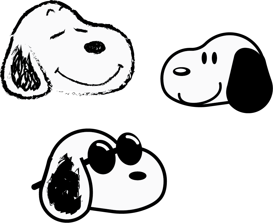
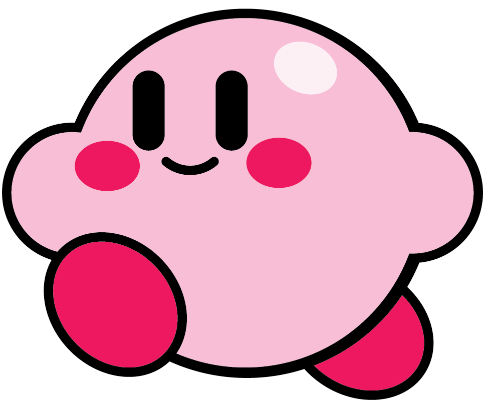
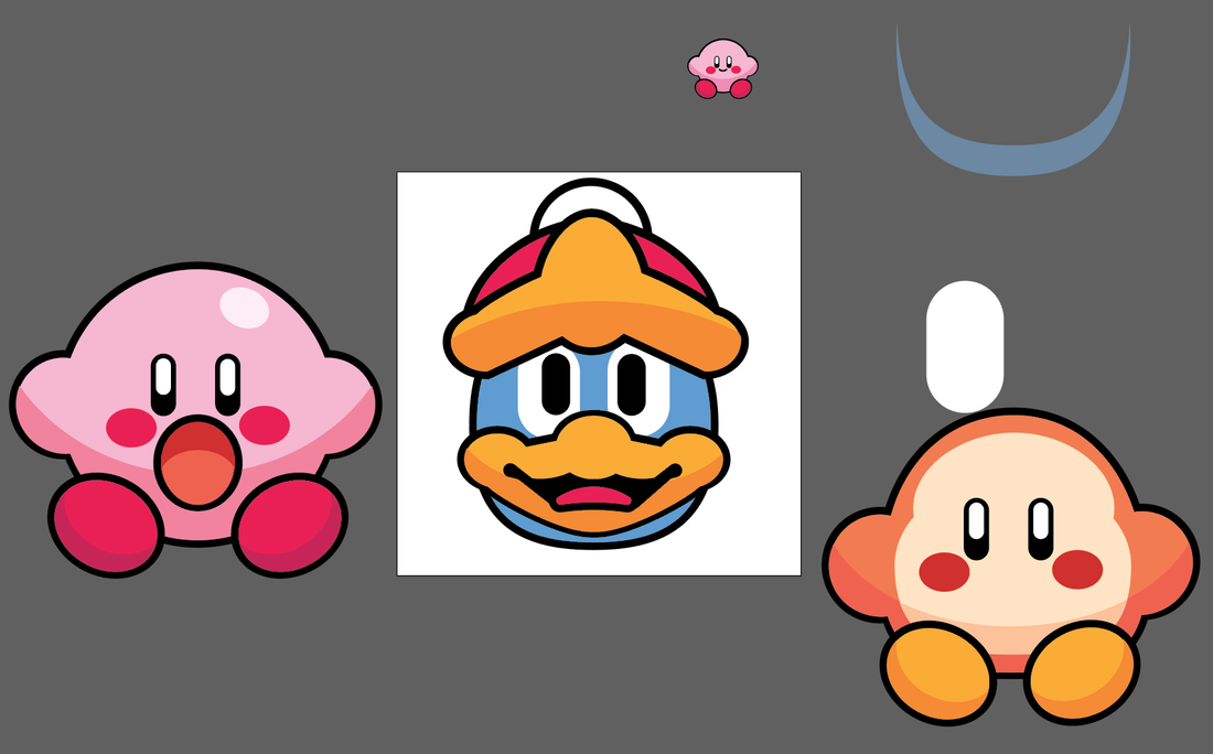
I started this by making a kirby design. I found his shape design lended himslef for how I use the program, so I went further and developed a series of Kirby themed badges. I included making King Dedede as he was made up of more complex shapes and wanted to challenge myself. I had fun designing the backing card. I used the font from the Kirby's Dream Land game for the typography and focused on a pastel colour pallette used in lots of Kirby branding along with star motifs. These were also created in Illustartor.

FINAL DESIGNS

|

|

|