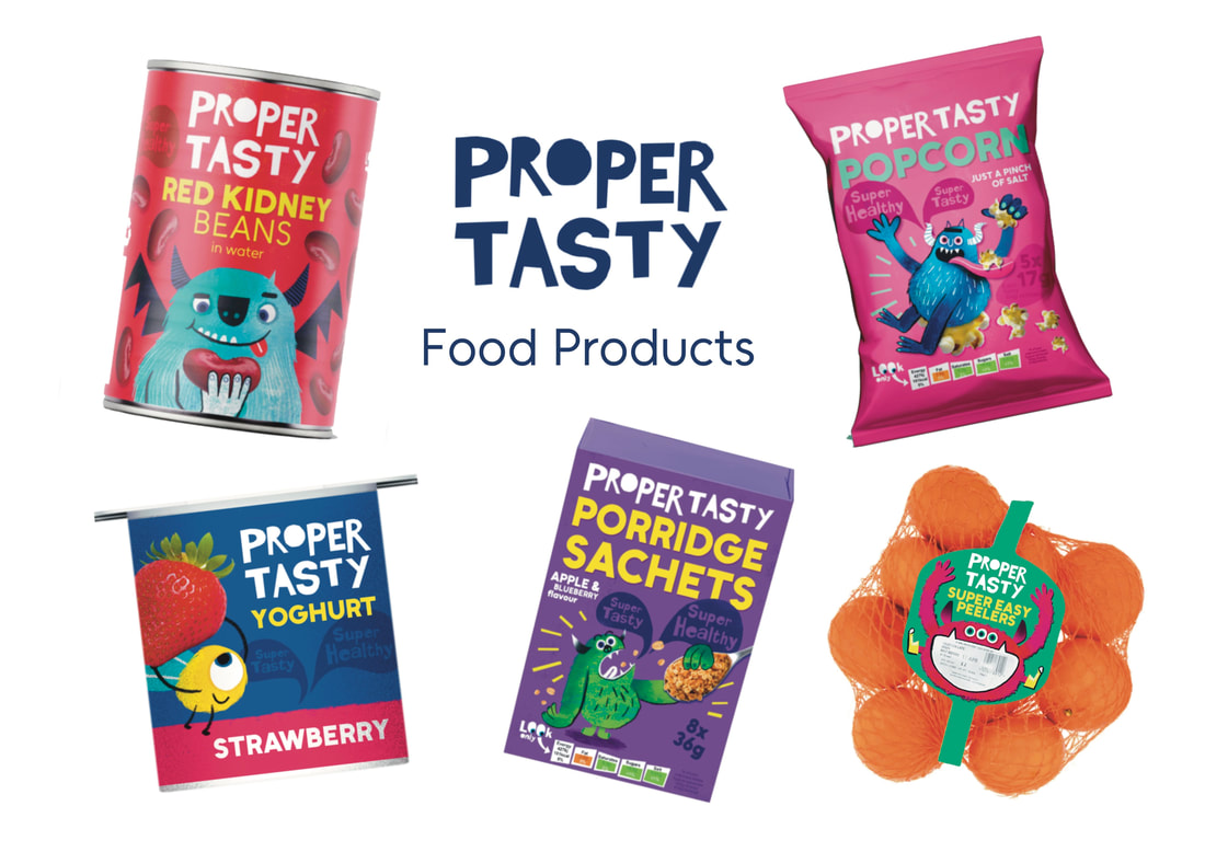
PROPER TASTY
WHAT'S THE BRIEF
This brief is all about coming up with children's food packaging. I want to create a supermarket's own line of healthy food targeted towards young children aged 5-8, making them excited to eat boring but nutritious food. I used the Illustrator's Guide method for coming up with new briefs.
RESEARCH
SUPER MARKETS OWN BRAND
My main inspiration for this brief was super market own brand foods. I think these are some of the most fun designs in supermarkets, and often include simple illustrated motifs.


SAINSBURY'S LITTLE ONES
I'm really inspired by this brand of packaging. I noticed it in the shop and it sparked my idea for this project. I love when illustration is combined with photographs. I don't want my brand to be aimed at babies however, mine will be aimed at 5-8 year olds.


CEREAL MASCOTS
Cereal mascots are one of the only foods that are heavily advertised to children other than sweets. They target a similar age group as my brand. I'll have a look at them for research.


CRUSHA ADS
An ad campaign and food product I remember from childhood was Crusha milkshakes. They were weird and silly and full of animals.
|
|

|
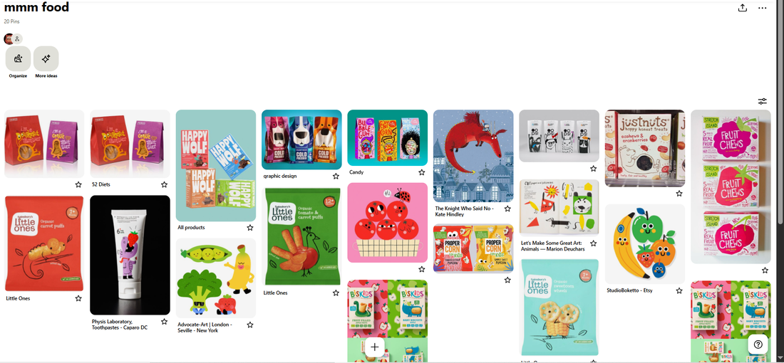
PINTEREST BOARD
ARTIST RESEARCH
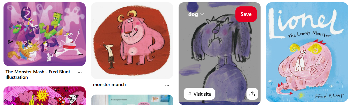
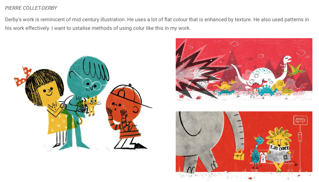
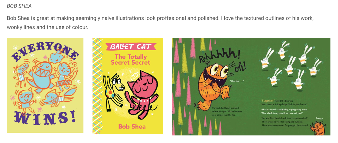
FRED BLUNT
Fred Blunt is an illustrator and character designer. This will mainly be a character design brief, so this will be good to look at.
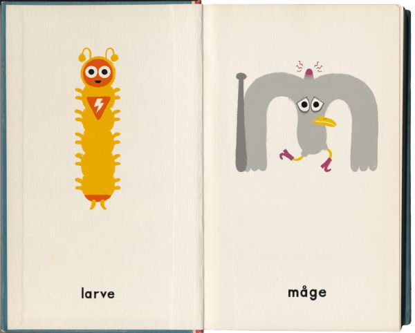
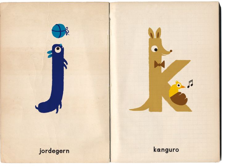
BUBABU BOOK
I love the Bubabu book. I love these weird characters made out of alphabet shapes. These will be big inspiration for me.
|
|

|
IDEAS
Before coming up with illustrated designs, I want to come up with names first.
MAKING THE LOGO
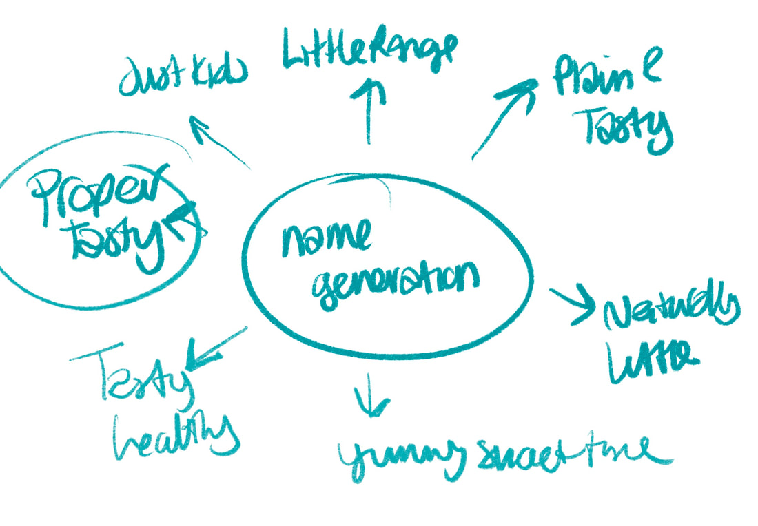
NAME GENERATION AND SKETCHES
I started by making a list of other children's food brands, and then coming up with my own. I wanted to focus on health with real, natural ingredients but also make it seem appealing to children.
I decided to go with Proper Tasty- it checks all my boxes: Connotes containing real ingredients, sounds appealing to eat and has a fun childlike tone. |
|
HAND DRAWN LETTERING
I think it would be appropriate to make a hand drawn logo for this project, which is great because I've wanted to practice doing it.
JILL CALDER
Jill Calder is an illustrator who also known for her hand drawn lettering.


LOOKING AT LETTERING I'VE DONE BEFORE
Each of these images contains hand drawn lettering I've drawn previously. Looking back at this helps me decided what to do for this project.


LOGO SKETCHES
FINAL LOGO
|
|
I'm very happy with this outcome! I think it fits with the brand and still is very me in design.
|
CHOOSING A FONT TO WORK ALONGSIDE IMAGE
I also chose this font to go along side it for the body copy.

|

|
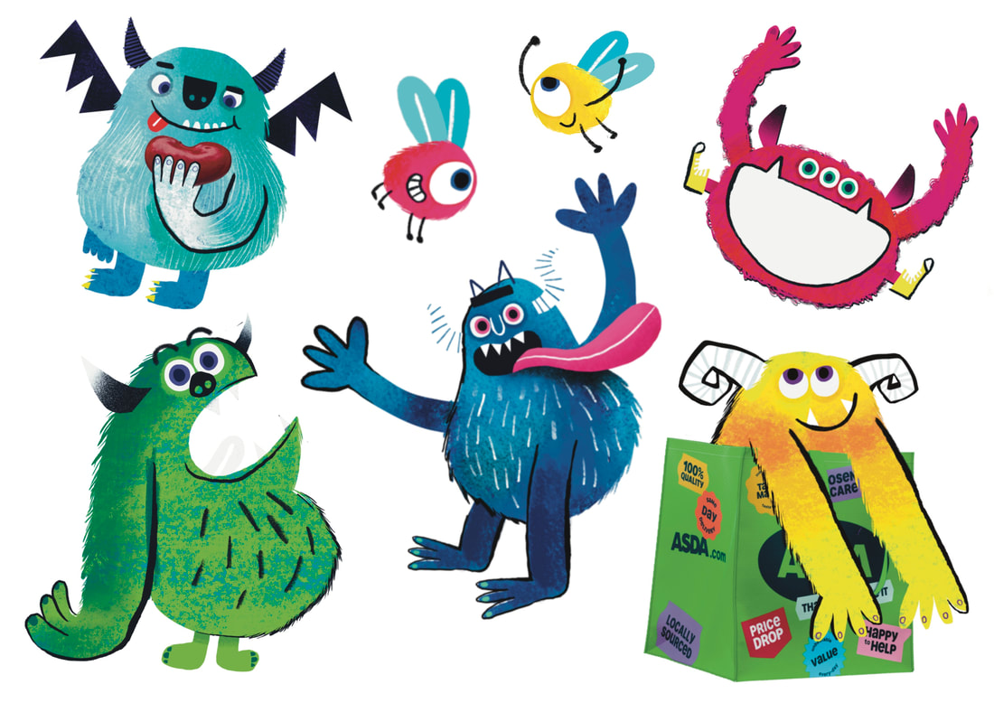
MAKING PACKAGING!
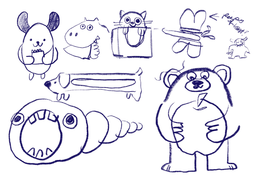
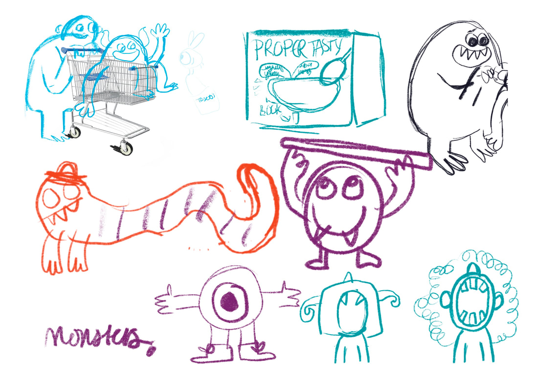
INITIAL SKETCHES AND IDEAS
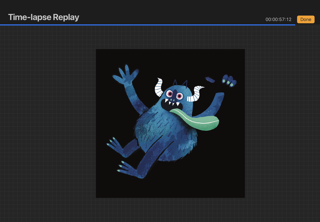
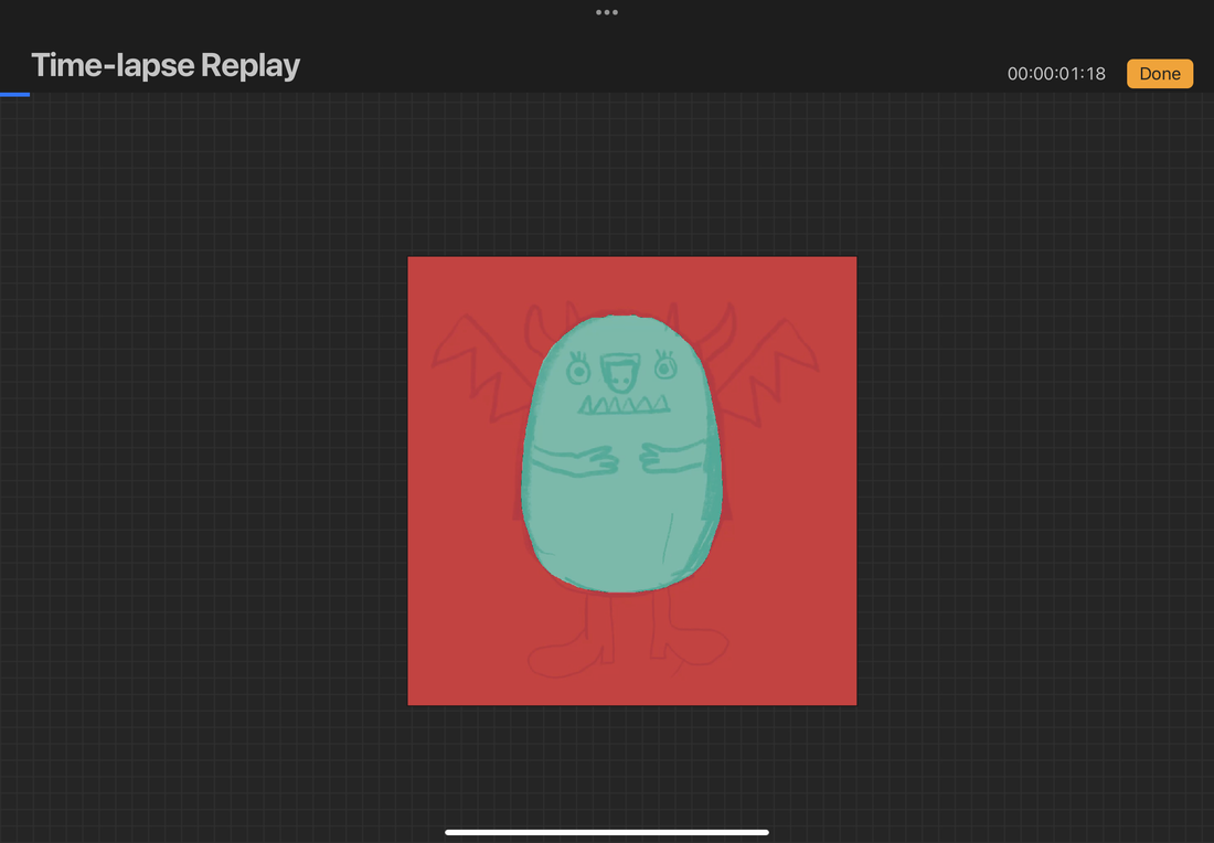
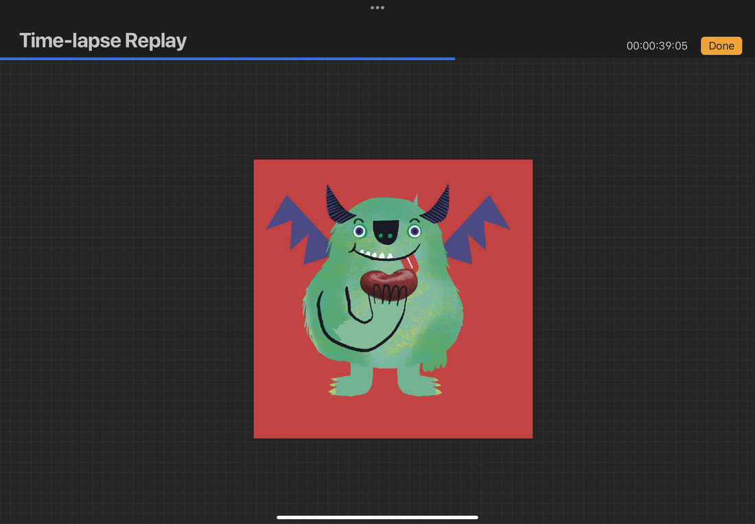
I had a go a doodling some mascots and illustrated elements for the box.I initially was going to go with an animal character design, but I just did that for the book project and also felt it could read too babyish for the target demographic so I quickly decided a monster character motif would be the way forward.
|
|
WHAT FOODS SHOULD I MAKE PACKAGING FOR?
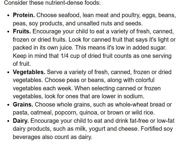
I need to know what experts would think would be the healthiest food for children to eat. I did some research here.
|
After doing this research I decided on this list of foods:
|
MAKING PACKAGING
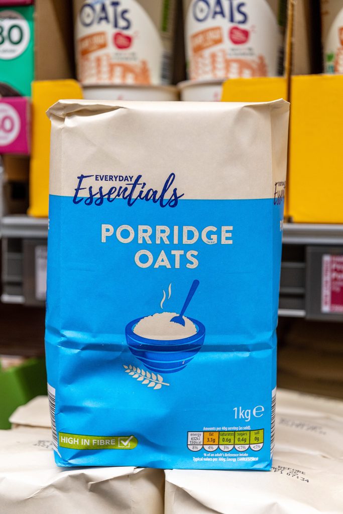
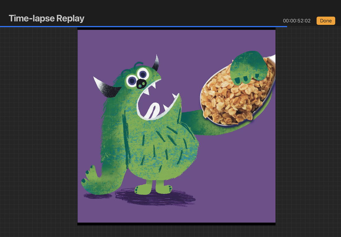
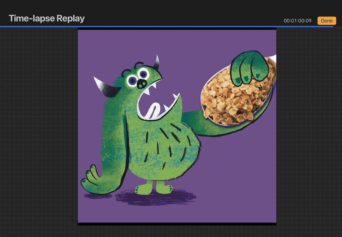
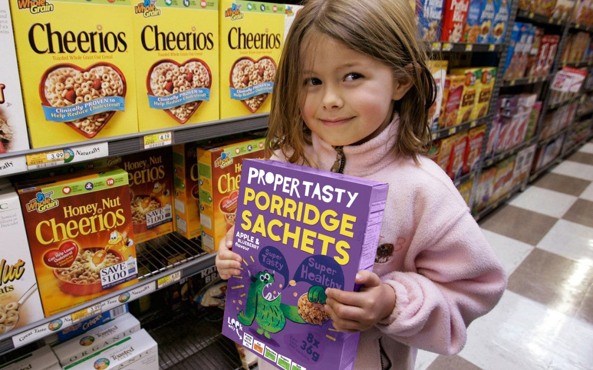
PORRIDGE OATS
RESEARCH
OTHER PORRIDGE PACKAGING
Looking at other porridge packaging, I noticed a lot of them showed either illustrated or actual photos of the food product. Lots of simple colours. Simple blocky font motifs.


ARTIST RESEARCH
SKETCHES
DEVELOPMENT
Here is the full design development process.


FINAL
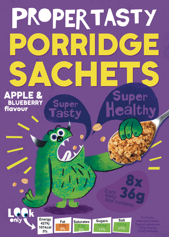
IN CONTEXT
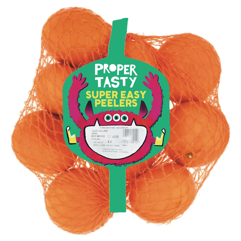
ORANGES
RESEARCH
EXISITING ORANGE PACKAGING
I looked at easy peeler oranges because that would best suit the demographic. They seem to focus on the text element, which is confusing to me as you can fully see what the product is. I might try and change this. Most orange packaging seems to be small label connecting to a net bag. I will do this with my product.


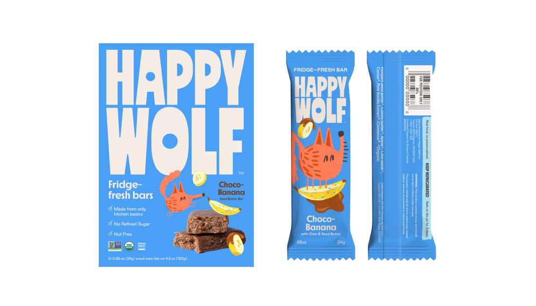
HAPPY WOLF PACKAGING
Happy Wolf are cereal bars aimed at children. I love the colour block backgrounds with a blocky sans serif text element. Each flavour has its own character, though it is very small on the pack. I will take inspiration from this but probably upscale the character.


SKETCH
DEVELOPMENT


FINAL
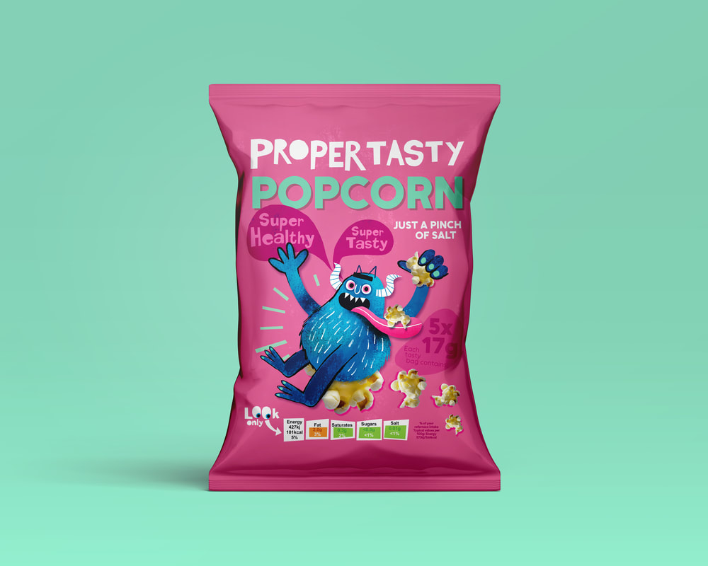
POPCORN
RESEARCH
PRE-EXISTING POPCORN PACKAGING
Colourful packaging with an image of the product on seems to be the norm here.


ARTIST RESEARCH

SKETCH
CHARACTER DEVELOPMENT


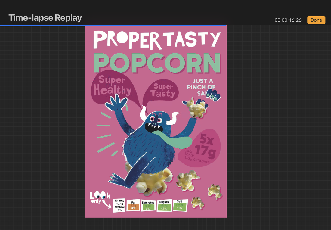

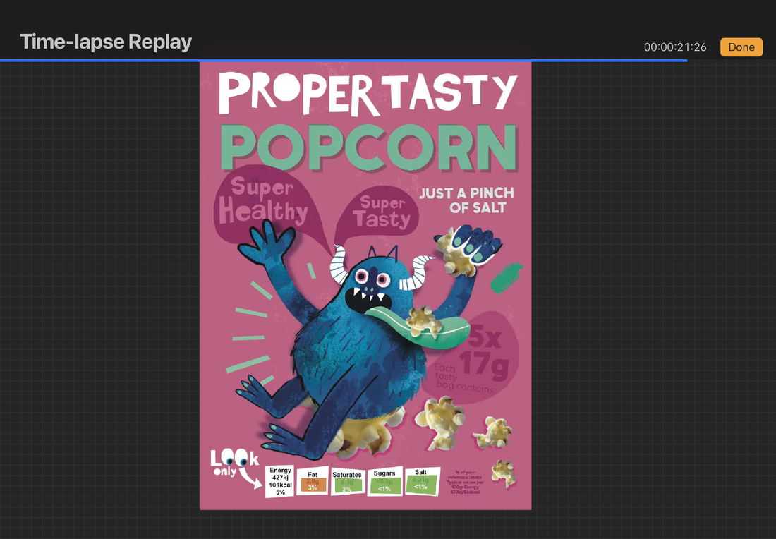

FINAL DESIGN AFTER EDITING IN PHOTOSHOP TO MAKE COLOURS BRIGHT
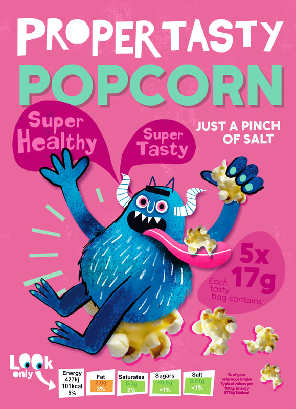
IN CONTEXT
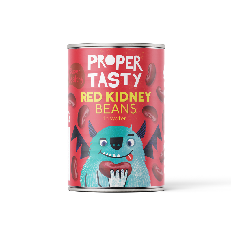
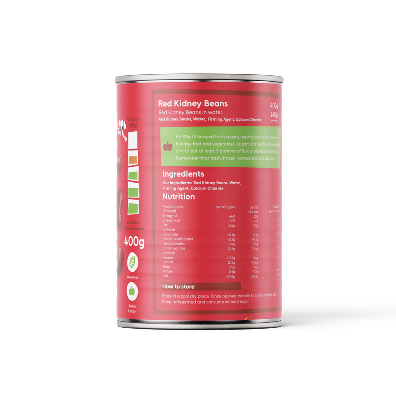
KIDNEY BEANS
RESEARCH
ASDA JUST ESSENTIALS
The cans for Asda just essentials has a simple design: Logo big, title of food product and images of food around it. This is interesting to look at.

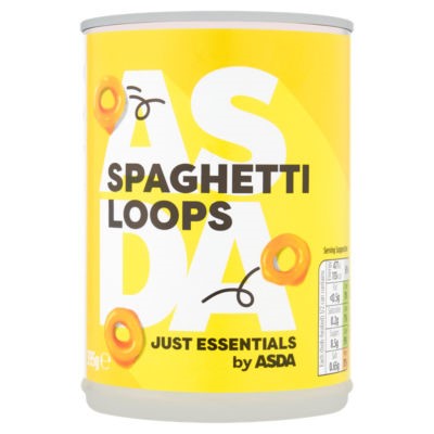


DEVELOPMENT


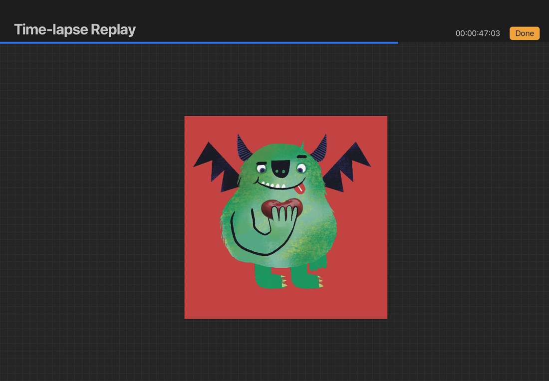


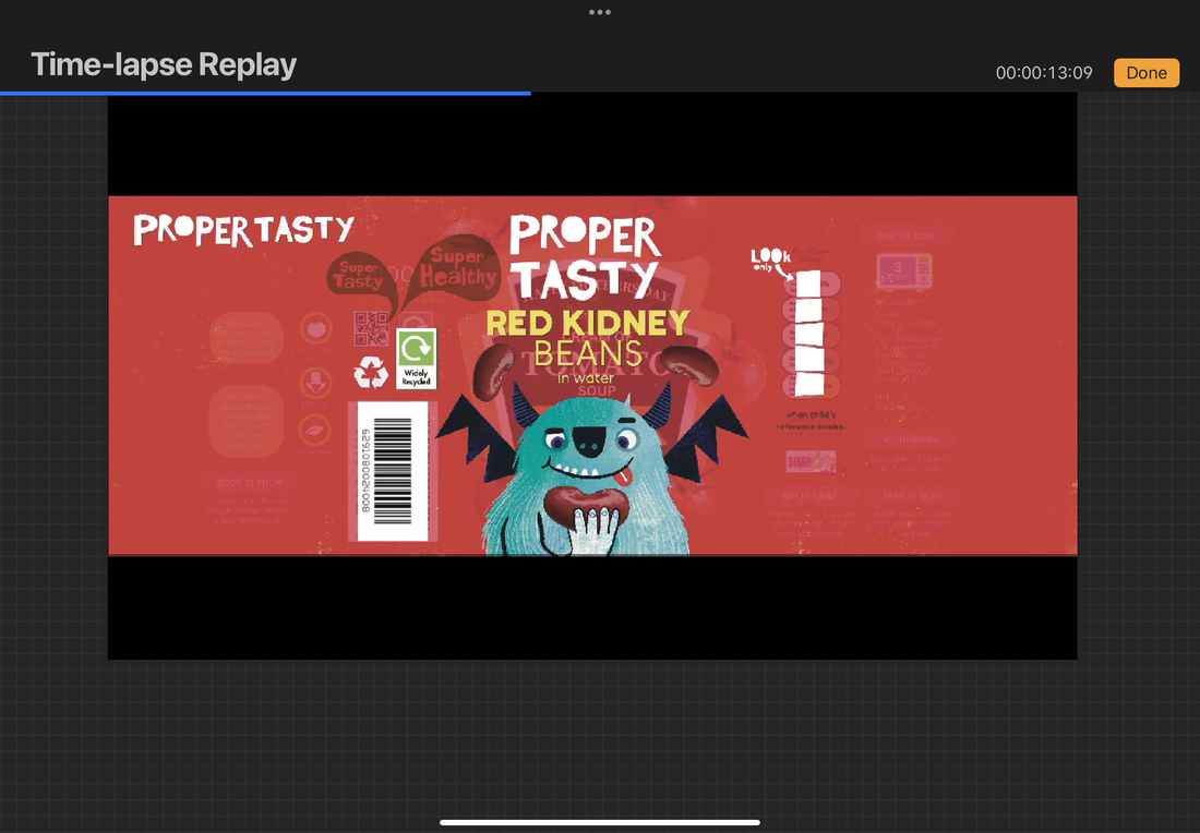


FINAL
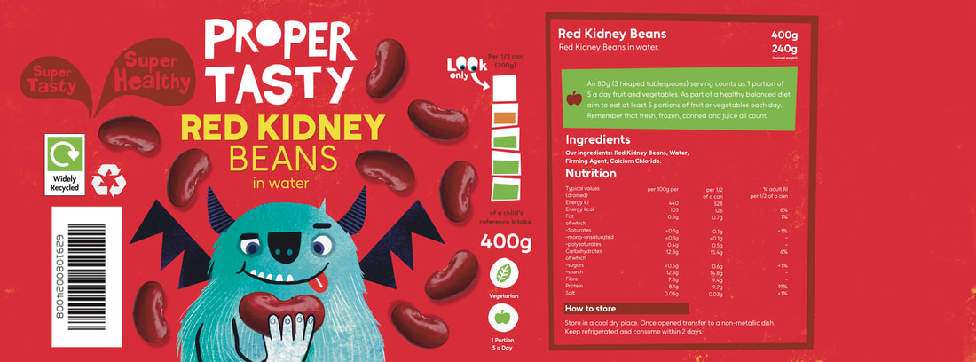

CONTEXT
|
|
FOOD EXTRAS
These are simple extras to bumpf up the collection of food.
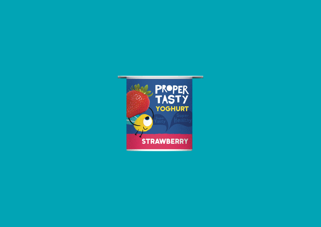
YOGHURT
DEVELOPMENT


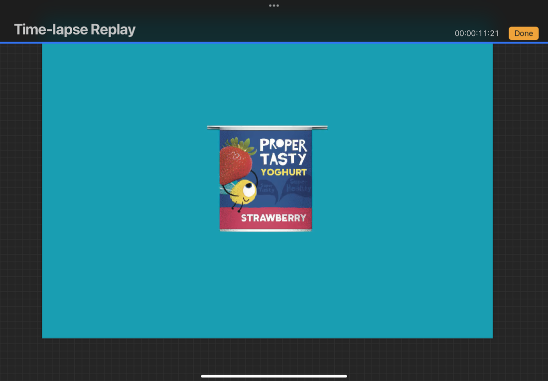
YOGHURT FINAL
PEPPERS
SKETCH

FINAL

ADVERT FOR THE BRAND
To make the project a bit heftier, I wanted to make an advert to advertise the line of food.
MAIN ILLUSTRATION
INSPIRATION

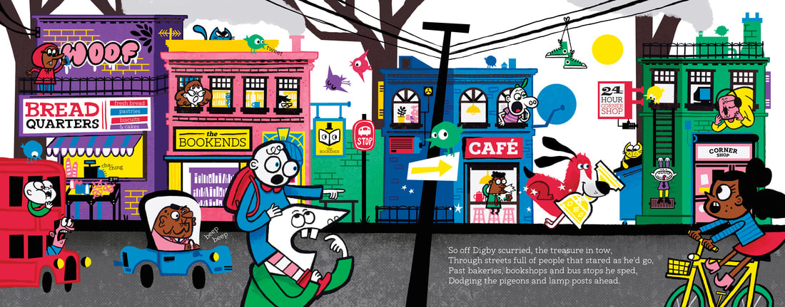
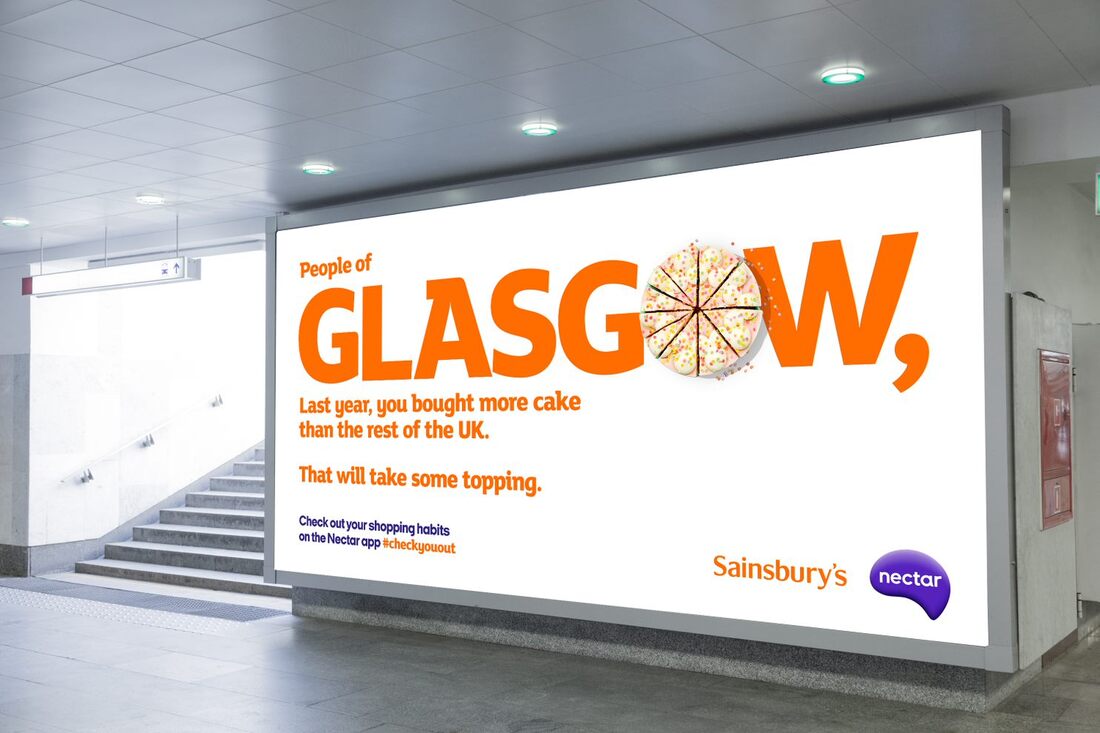
I found this image while reaserching for Digby. I was really inspired to make a project that combines real image and illustration.
SUPER MARKET ADVERTISING CAMPAIGN
What do most supermarket ads have?
- Funny tagline
- Focus on a specific issue
- Bold text
- Focus on price
- Focus on branding of said supermarket


COMING UP WITH A TAGLINE
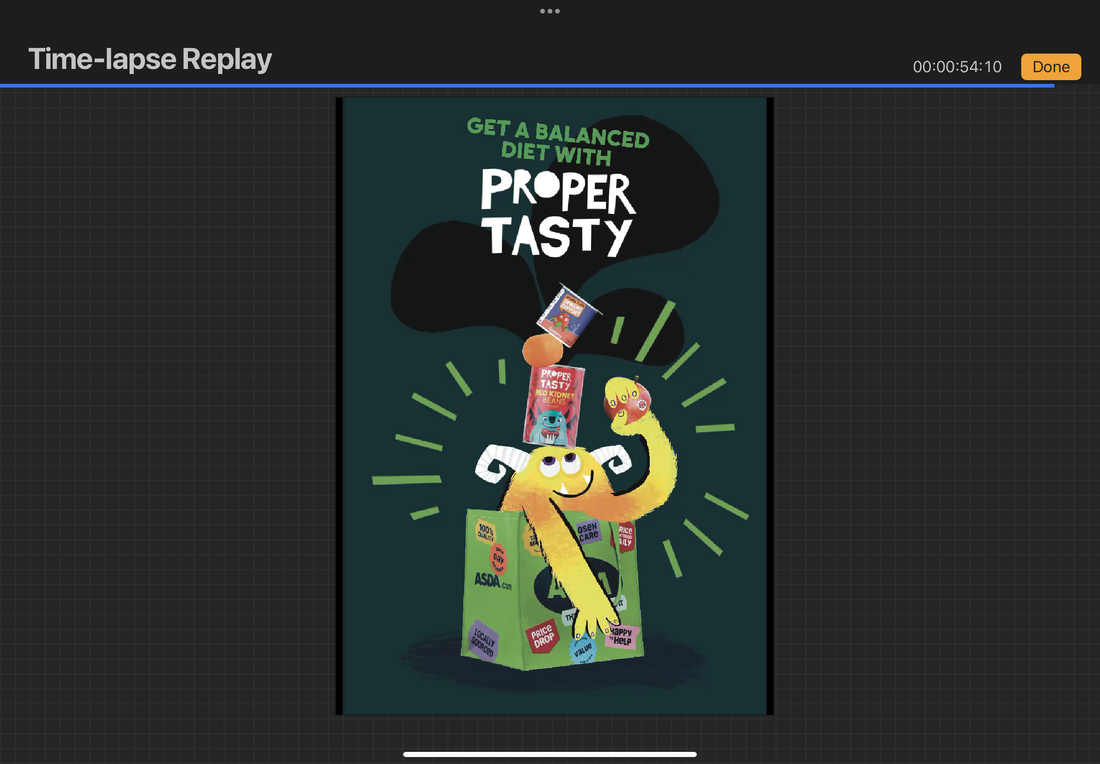
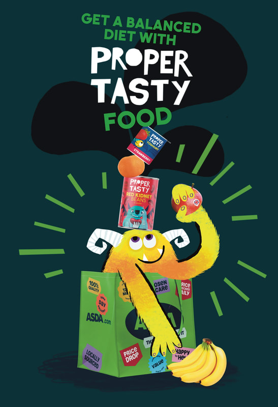
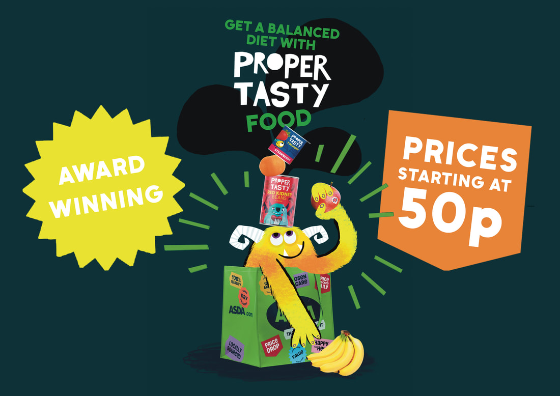
I need a fun catchy tagline. It needs to have a message that aligns with the brand. I settled on "Get a balanced diet with Proper Tasty food". This has the brand name in the tag line, highlights the healthy eating message and has a friendly tone.
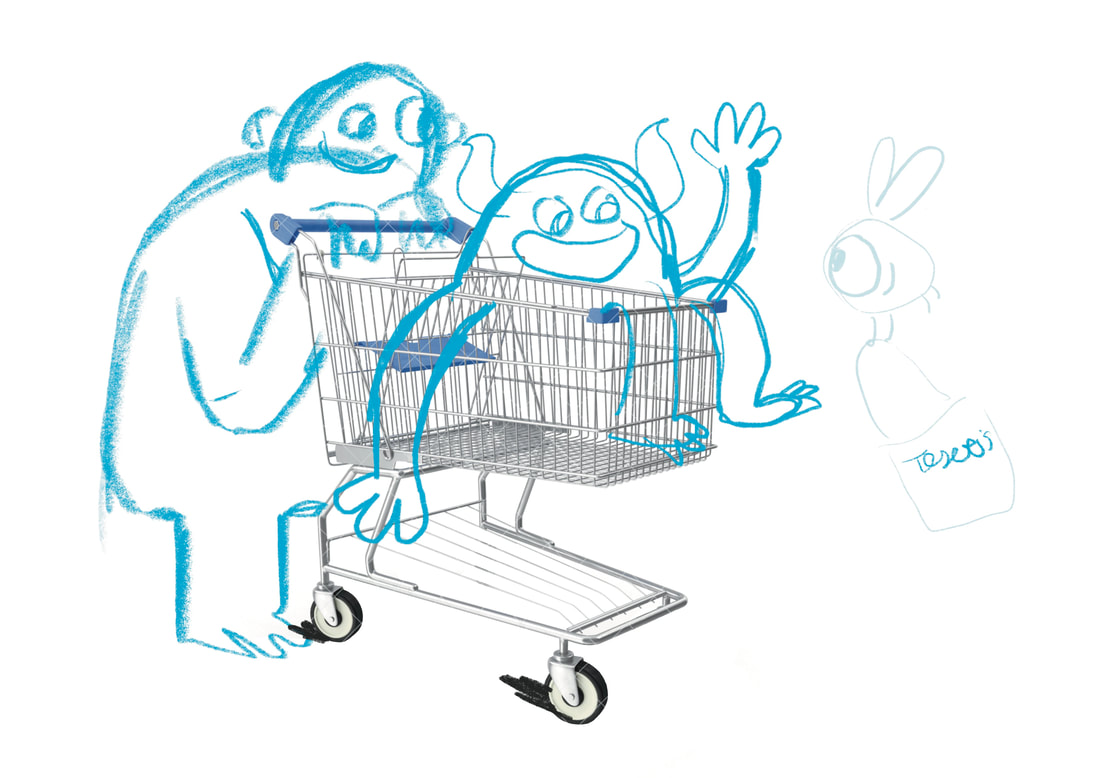
SKETCH
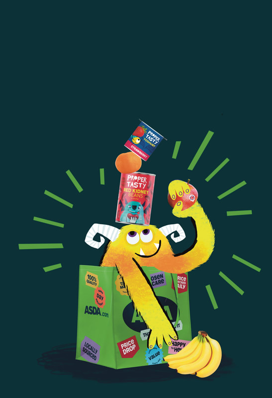
I started with wanting monster in a shopping trolley, but the idea of editing out each metal bit on the trolley sounded like hell, so I switched to a bag.
|
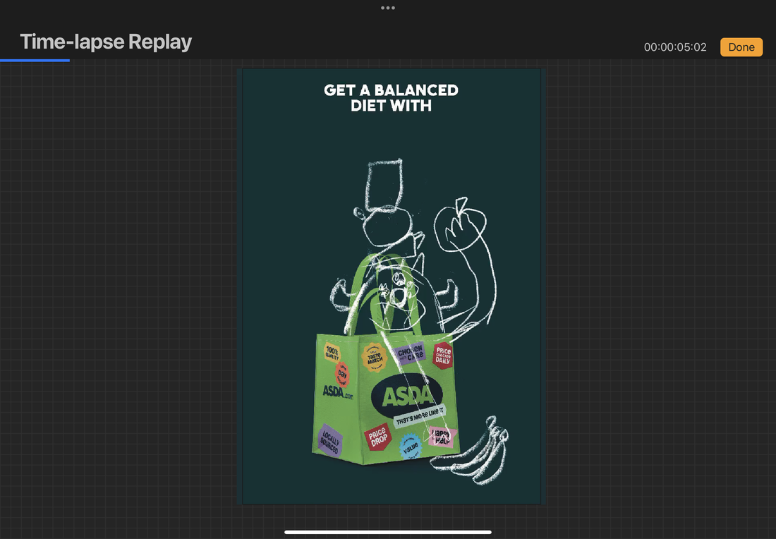
|
DEVELOPMENT


FOOD PNGS
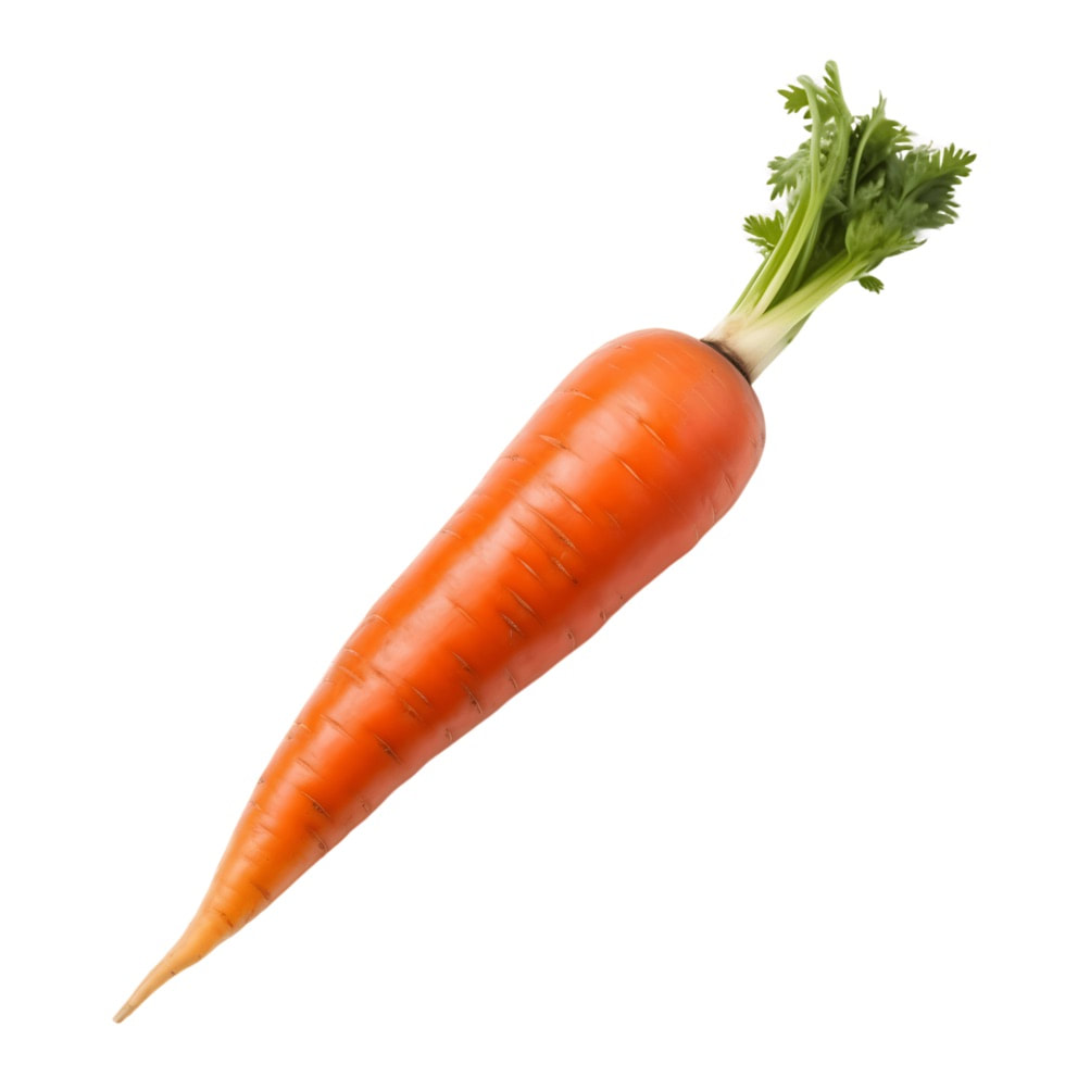
I used a combination of fresh food and my own packaging designs in the ad to make my food line seem real.


FINAL ASSET WITH AND WITHOUT TEXT
I balanced the text on the head of the monster to mirror the tagline, making it more fun and playful. I incorporated the yoghurt and kidney bean designs into the poster, which makes the brand seem more like a real food line. I used the same font (uneago) as the main font as I used that designing the food.
|
|
ASSET USED FOR ADVERTISING
I'm going to use this asset in a few different ways, showing its ability to be a diverse asset that could be used by a super market brand.
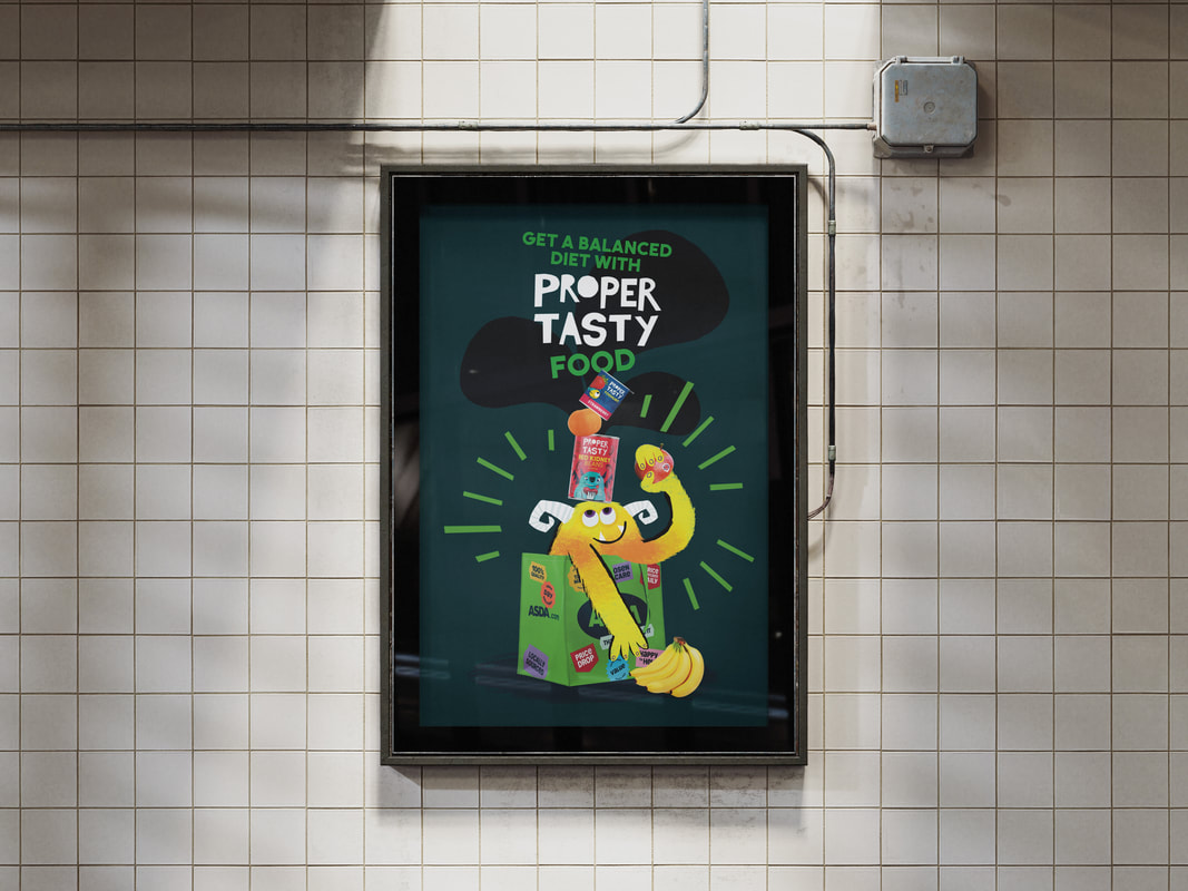
POSTER
It can be most easily transferred into a basic poster. Here it is shown in context.
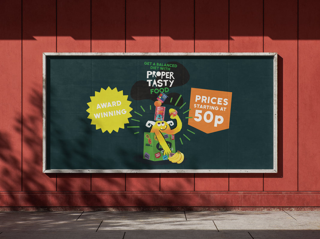
BILLBOARD/ LONG POSTER
I've extended the poster outwards and added shapes to the sides with shorter slogans. This will allow it to fit a landscape poster format.
LONG POSTER IN CONTEXT
BILLBOARD
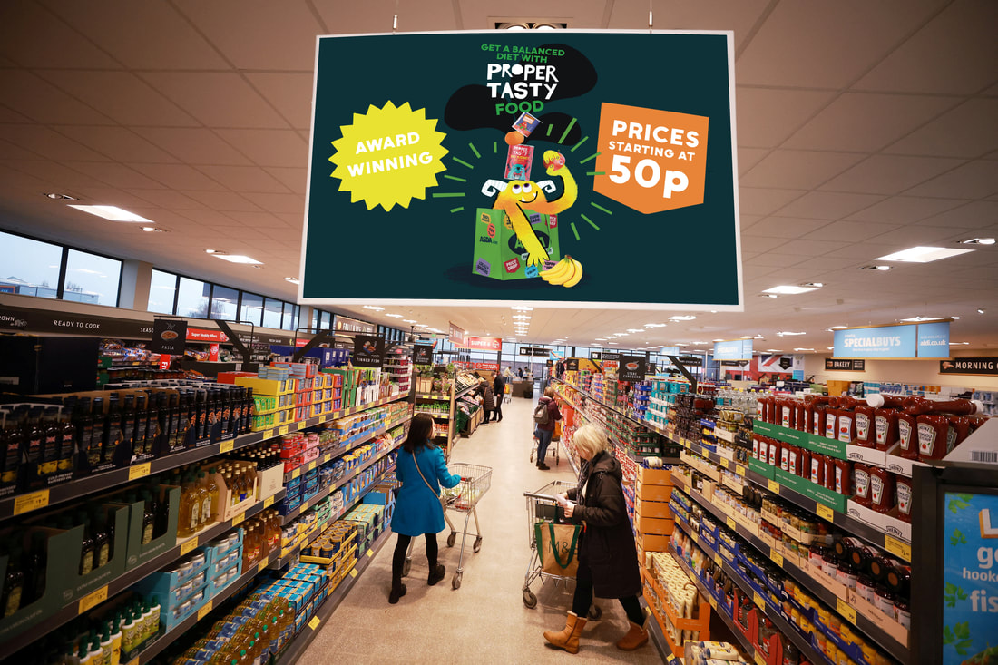
HANGING SHOP SIGN
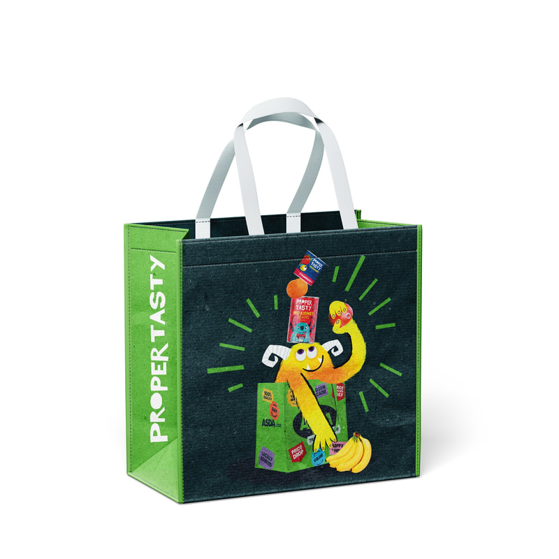
SHOPPING BAG
I think it works best here. Look at him! I'd buy that.
MONSTER DESIGNS TOGETHER
FINAL FOOD PACKAGING TOGETHER