WHAT'S THE BRIEF?
This week explores LITERAL illustration. I have been given the short story attached here and have to create a full illustration and a spot illustration to accompany it and a book cover for the anthology of other short stories.
PERSONAL AIMS
After feedback with tutors in the last project, I found one of my key criticisms was that my personal work and uni work felt very different in tone and style. For this project I want to try and combine the two and really try and explore my own tone as an Illustrator and produce work that excites me.
SPOT ILLUSTRATION
RESEARCH
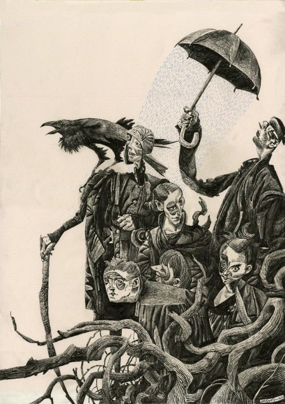
DAVE MCKEAN
|

|
|
|
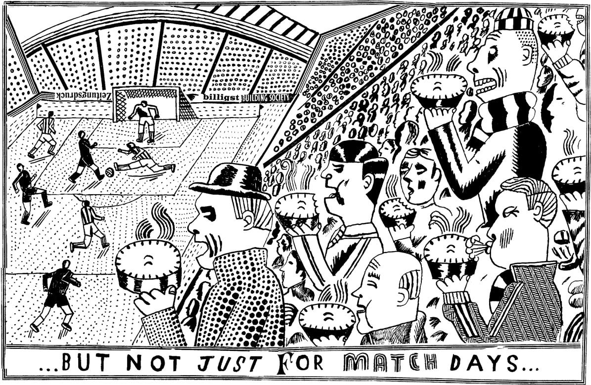
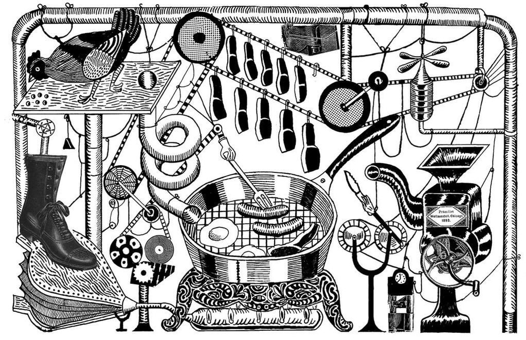
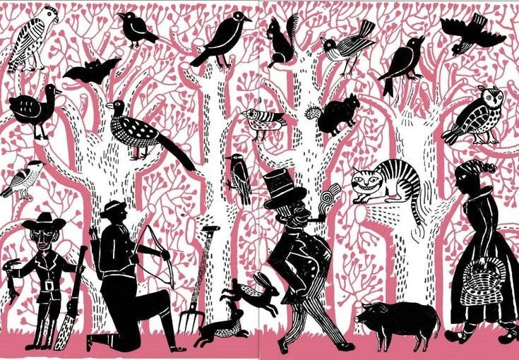
JOHN BRODY
|
|
|
HELPFUL VIDEOS
|
|
|
IDEA ONE
REFERANACE IMAGERY
I've been told in feedback that I should be using reference imagery more often, so I've been more on the ball with gathering specific image banks before starting to create work.
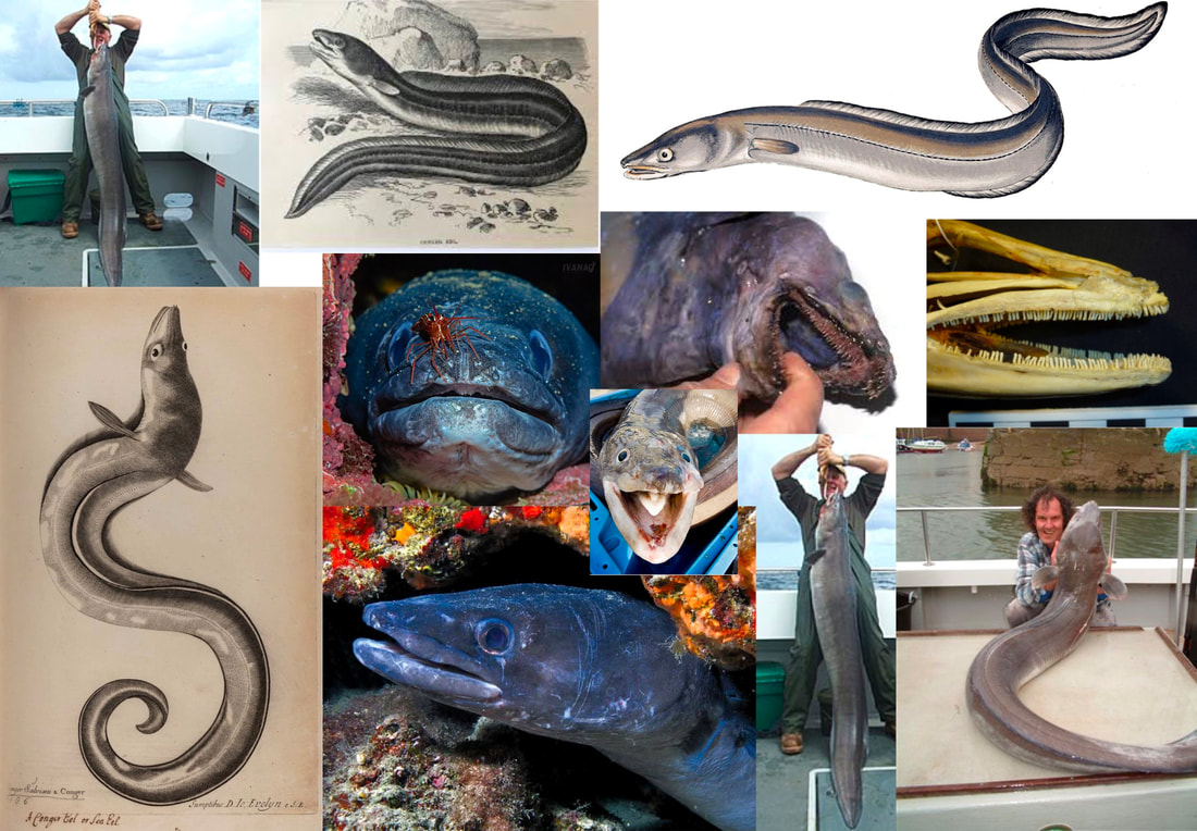
THUMBNAILS and INITIAL IDEAS

SKETCHES AND DEVELOPING IDEAS
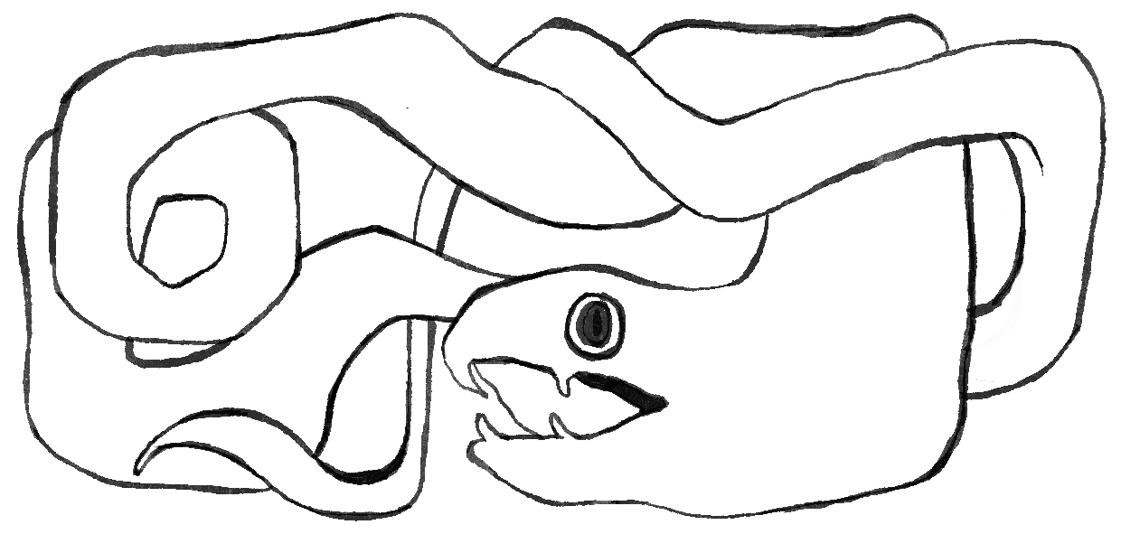
I refined my thumbnails into this sketch of an eel curled over itself. I developed the sketch into something more clear, showing the tone.

|
|

EXPLORING ILLUSTRATOR

|

|

|

|
After experimenting with the idea in Illustrator, i found that the image lacked clarity and was too dark to be printed at small scale on a book page. I'll need to rework the design some more in sketches.
RE-SKETCHING TO ADDING TEXTURE AND DETAIL
I like the sketches before this, but I wanted to add more texture back in and see how it woorks with more detail through pattern.

NEW EEL NEW ME
|
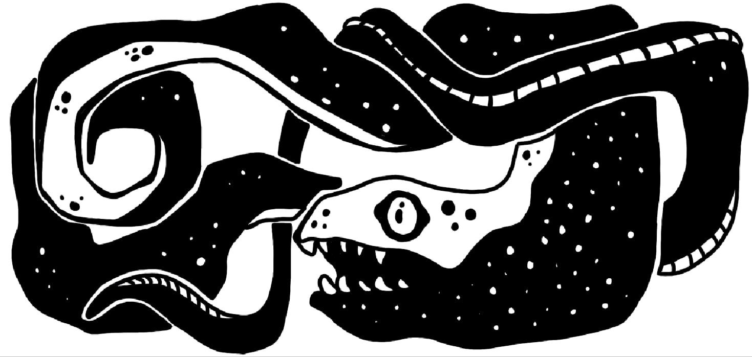
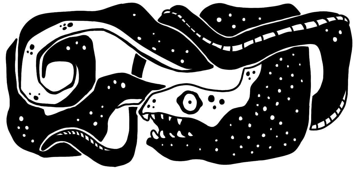
This new rendition was made in Procreate. I used the Monoline brush to give it a crisp outline but I'm unsure if that takes away from the horror element. I got some peer feedback that the eye is "too anime" so I'll do some variations to make it look less cute.
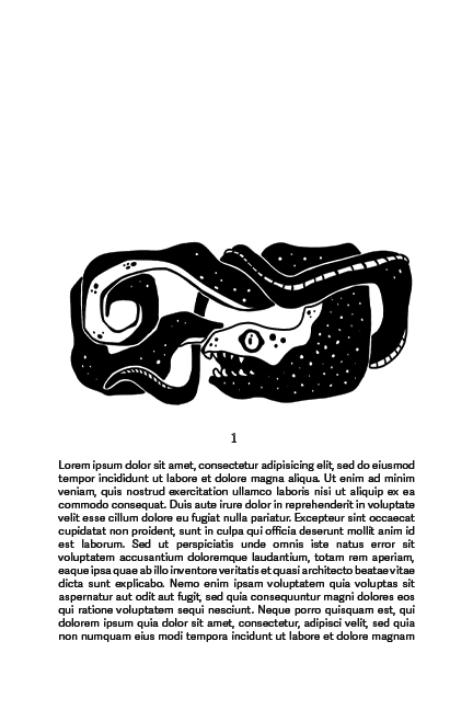
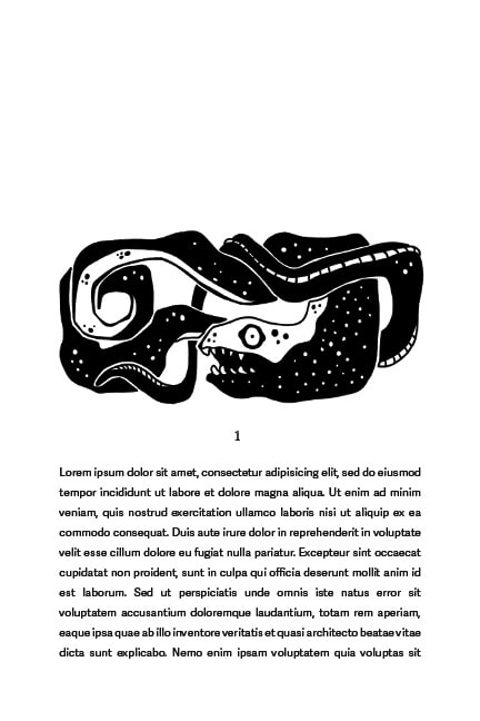
I also very quickly placed the spot on a crude mockup of a book page just to see if the scale the drawing is at effects the legibility. I think some of the spotty texture is getting lost and some of the white separating lines are too thin. I do however think the balance of black and white is quite good, the spot feels contemporary and visually interesting and I think it reflects my style more. |
TWEAKS (and bonus extra anime eel)
|
I think this improves the design. It reads a lot more clear especially in context. I still think this is missing something but I'm going to try another idea and circle back if need be.
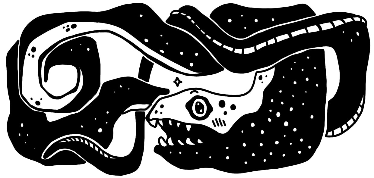
LOOK HOW CUTE IT IS ^_^
|
IDEA TWO
I want to try and create a different look for this next design. I want a simpler idea with a bit more detail.
REFERNACE IMAGERY
ANGELA HARDING
|
|
|
|
|
SOPHIE ELM
|

|

|
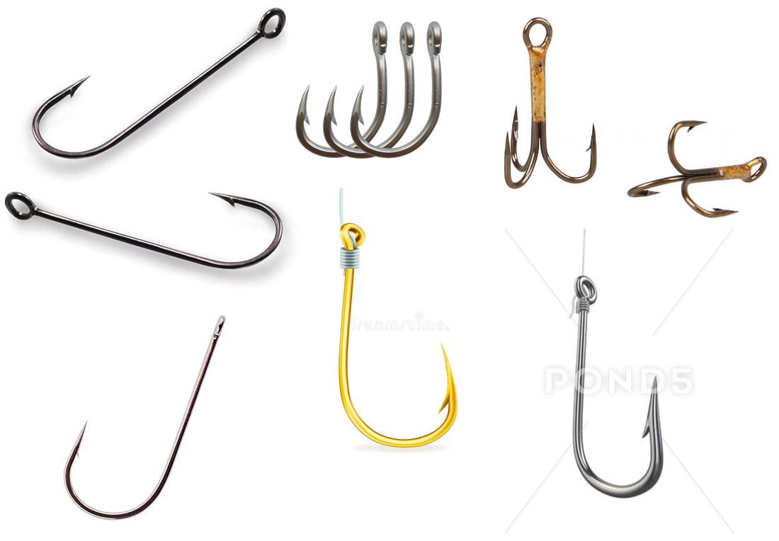
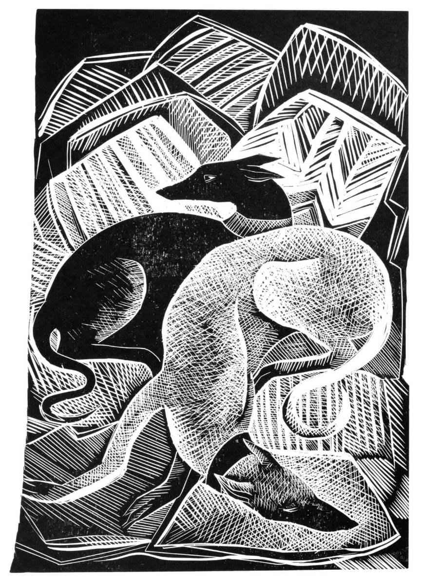
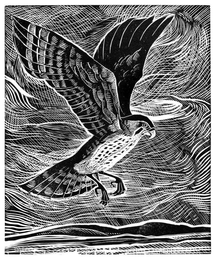
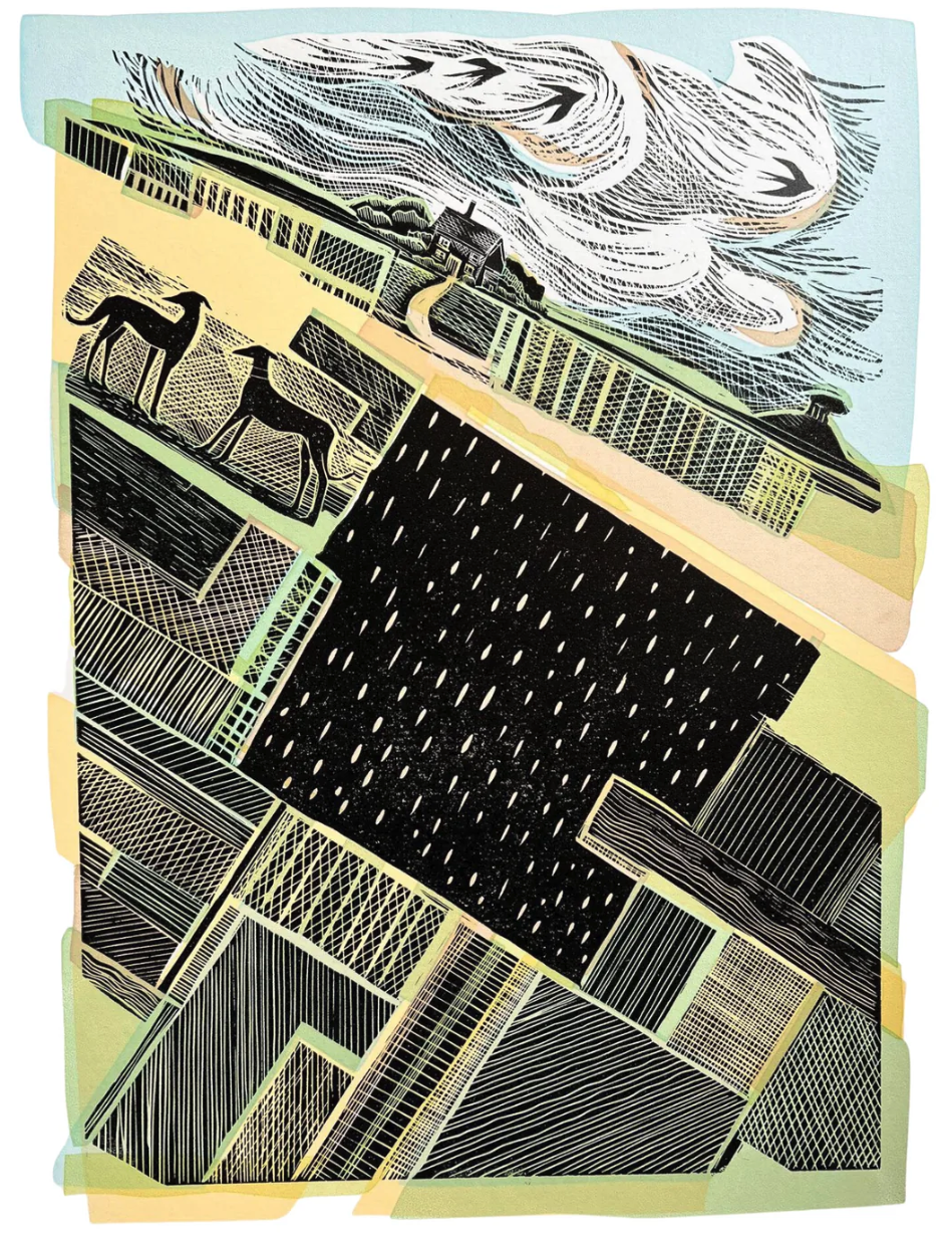
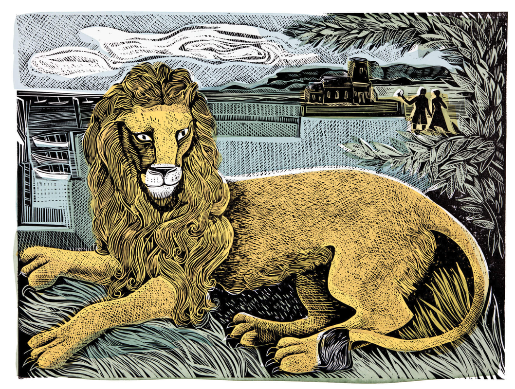
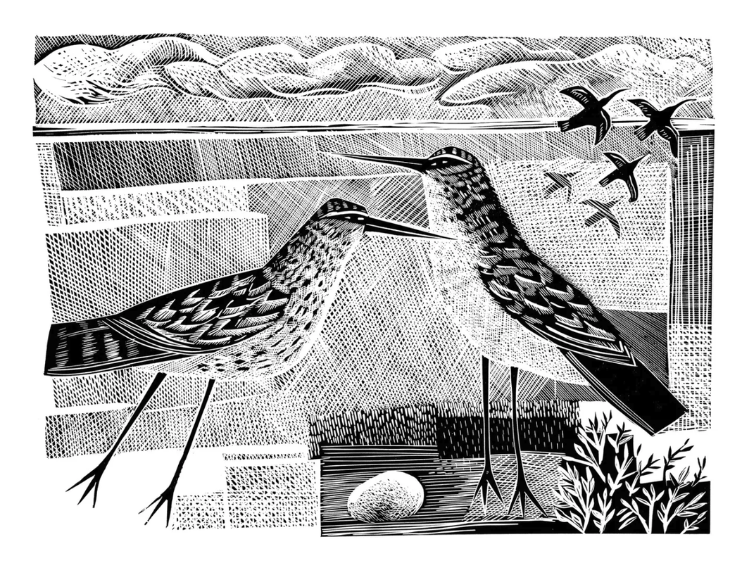
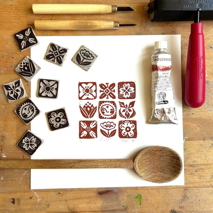
I wanted to create a heavily textured design for the next idea. I looked at etching and lino artists for this reason.
THUMBNAIL IDEAS

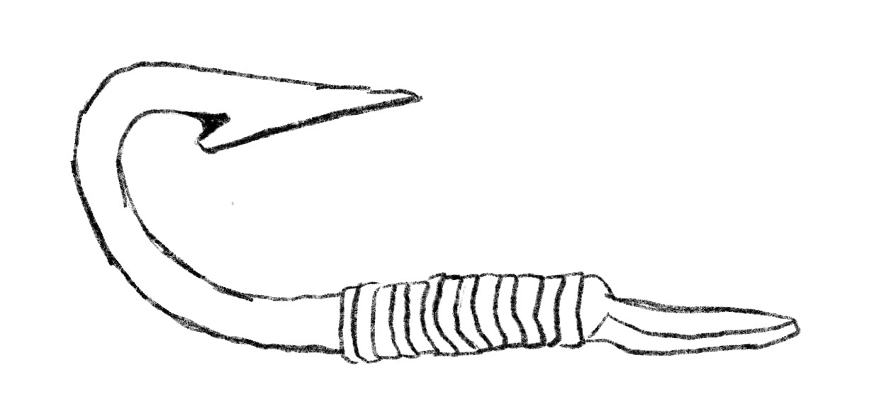
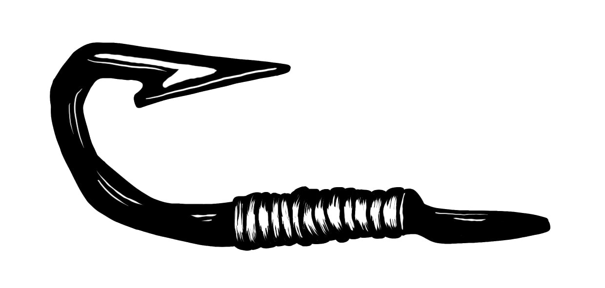
I wanted to try a more simple motif for this idea but with a more detailed execution. I want to replicate the look of lino or etching to give it a nautical feel.
IDEA DEVELOPMENT
|

|
TESTING IDEA
|
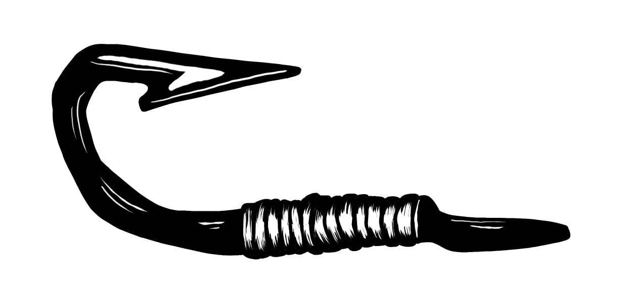
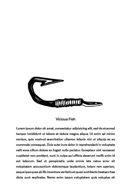
It feels like a really strong design, but I prefer the eel. I think this is definitely a convincing chapter heading, however I don't feel it's very reflective of my style as an Illustrator. I do like the textured look to it though, I want to combine the two ideas for my final spot.
|
FINAL SPOT

|
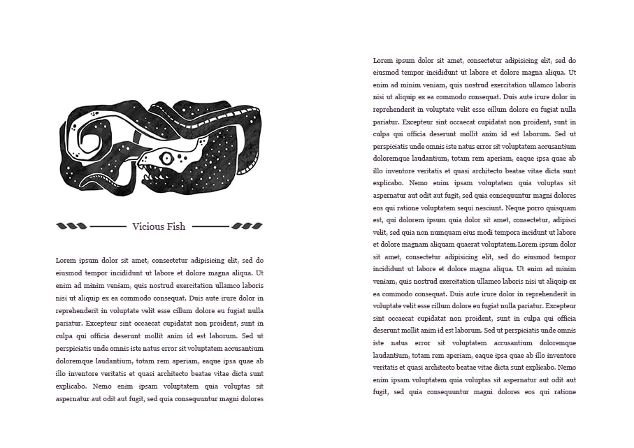
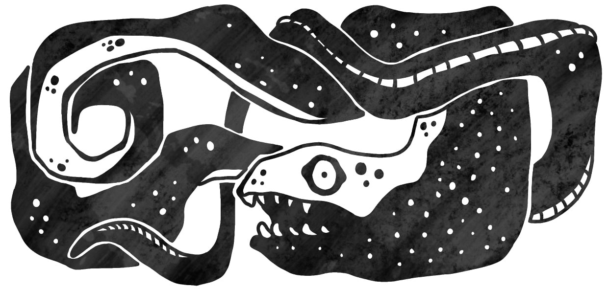
This is the final spot. I went with. I combined the textured look of the hook with the eel illustration. I'm happy with the result.
|
FULL ILLUSTRATION
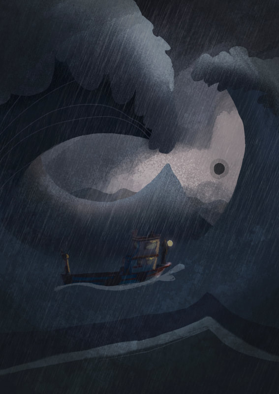
I want to continue with the texture heavy designs for my main illustration.
RESEARCH
REFERANCES
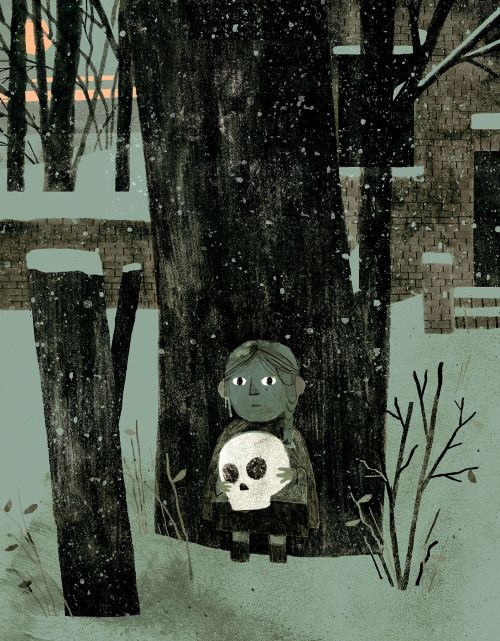
JON KLASSEN
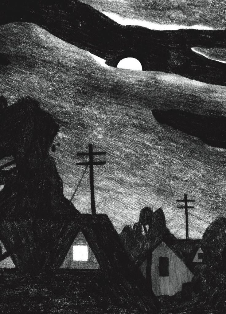
|
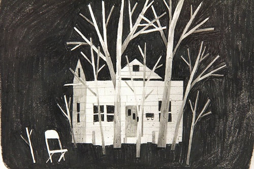
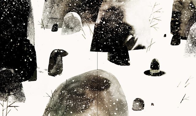
|
|
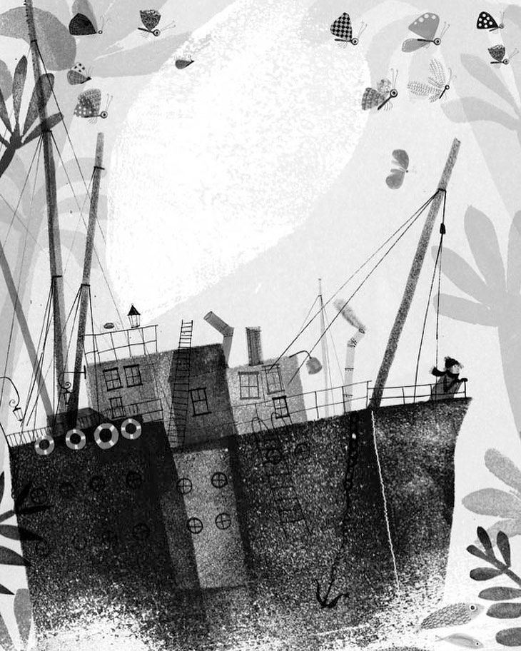
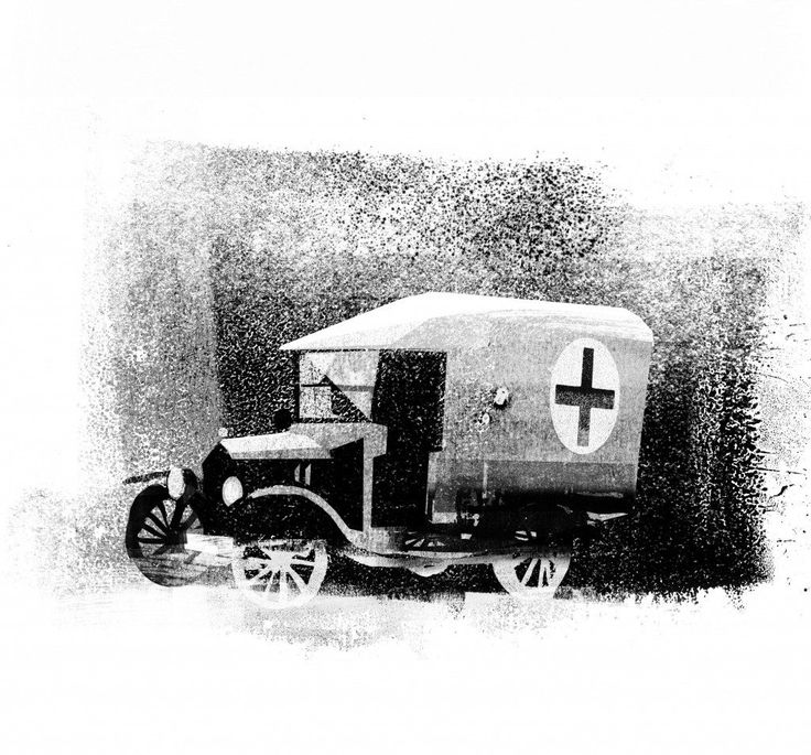
ANUSKA ALLEPUZ
|

|
|
THUMBNAILS
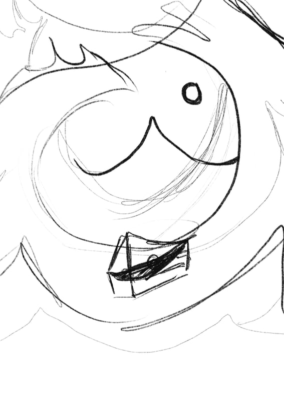
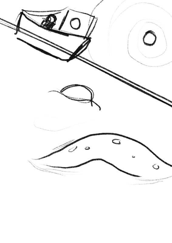
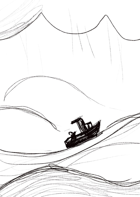
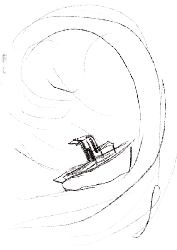
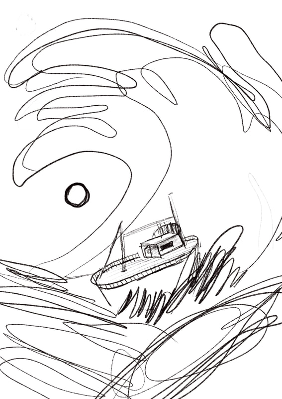
I decided as I used the eel as a motif for the chapter heading, I wanted to make a simpler and more atmospheric design for the main illustration, either focusing on the main characters or the stormy sea.

|

|
SKETCHES
|
|
|
|
|

|
|
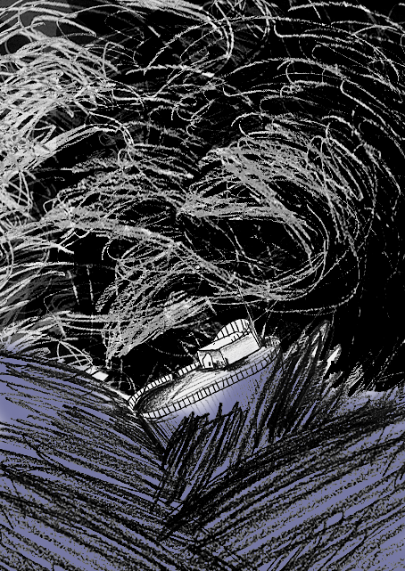
I wanted to capture the roughness of the sea in this illustration.
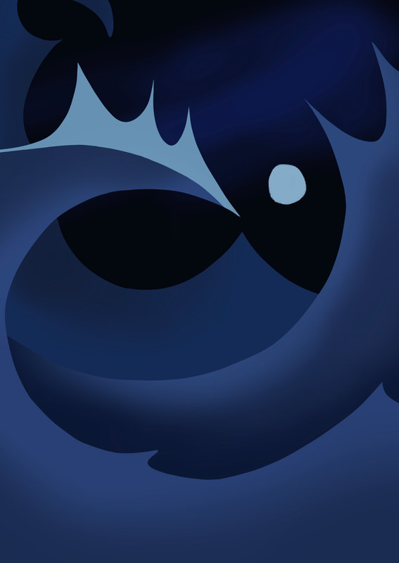
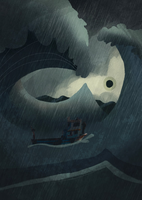
DEVELOPING THE IDEA
|

|
|
ADDING TEXTURE OVERLAYS
|
|
|
One thing I really liked about Klassen's work is his use of texture and simple shapes. I researched different ways to add texture into my work and implemented them.
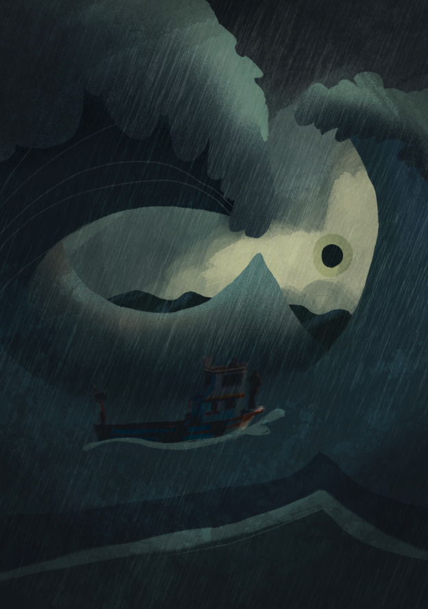
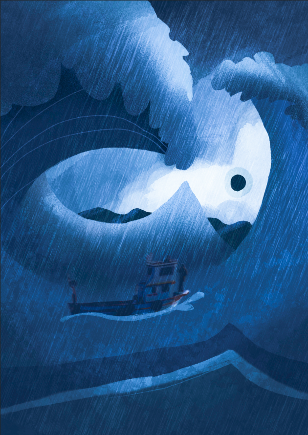
COLOUR VARIATIONS
|
|
|
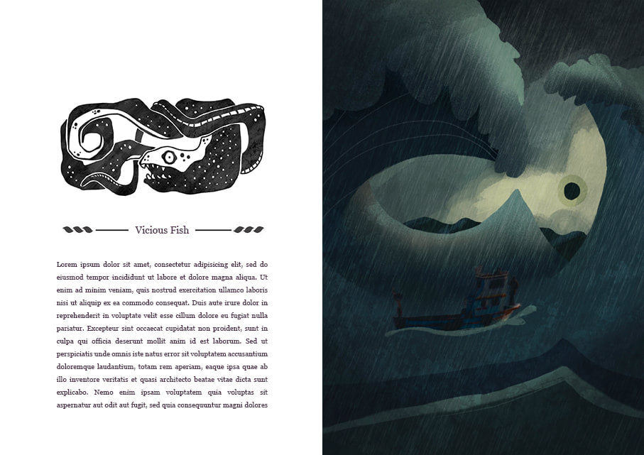
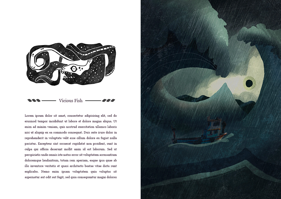
EDITING IN PHOTOSHOP
|
|
FINAL ILLUSTRATION

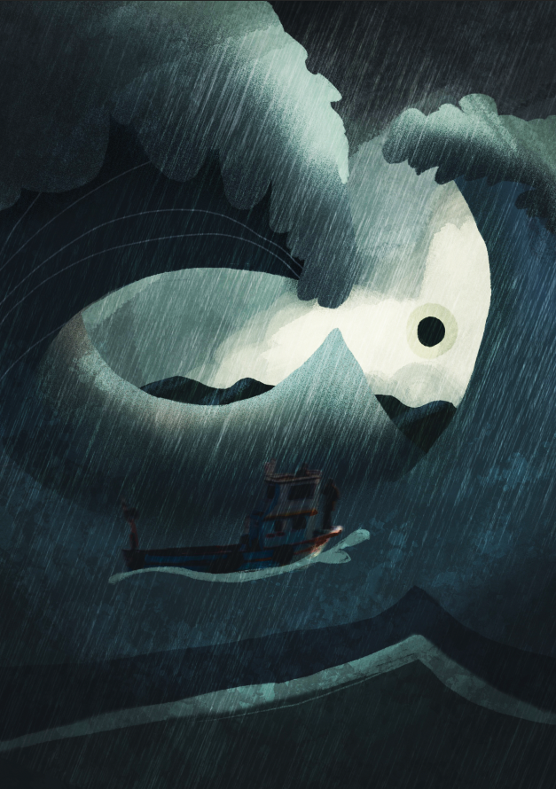
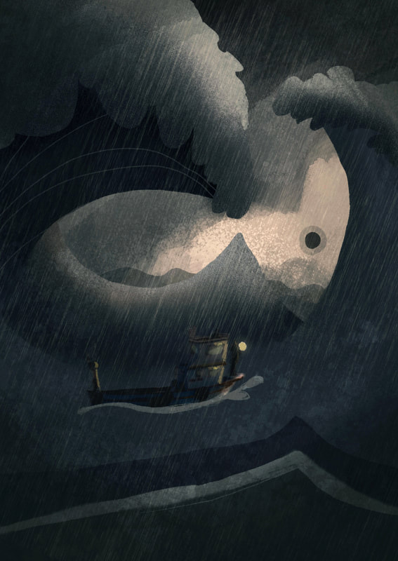
Ultimately, I'm still not happy with the final illustration. I think the image lacks clarity even after editing in Photoshop. I don't think it matches the cover and spot stylistically either. Over Easter break this is one part of the project I want to revisit.
EDITS AFTER FEEDBACK
|
|
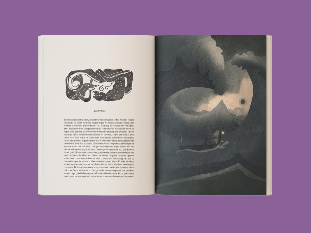
I think adding a lattern to the boat really bringss in back to the composition. I still think it needs work, but this is a step forward in the right direction.
BOOK COVER AND SPINE
RESEARCH
LOOKING AT BOOK COVERS
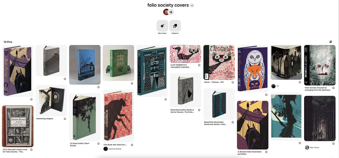
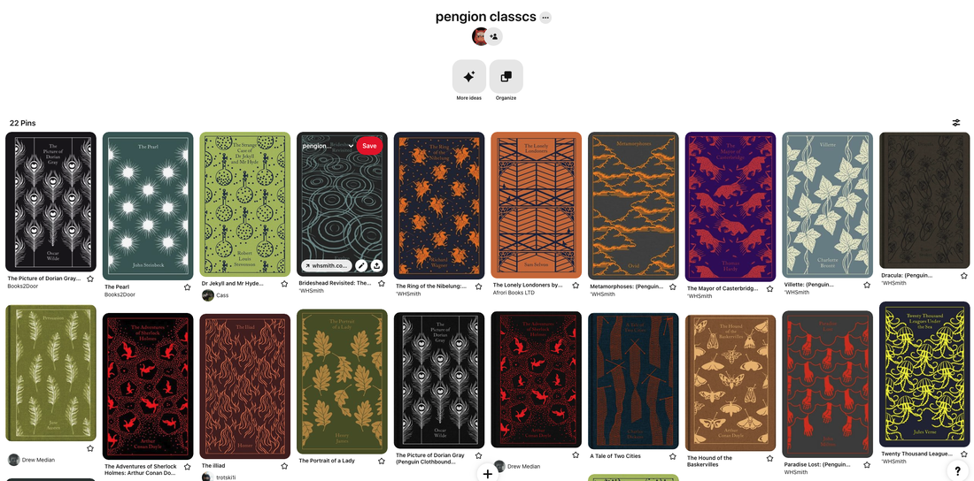
For the book cover research, I looked at other Folio Society covers and the Penguin clothboud classics. I wanted to create a cover that could be a convincing folio society cover.
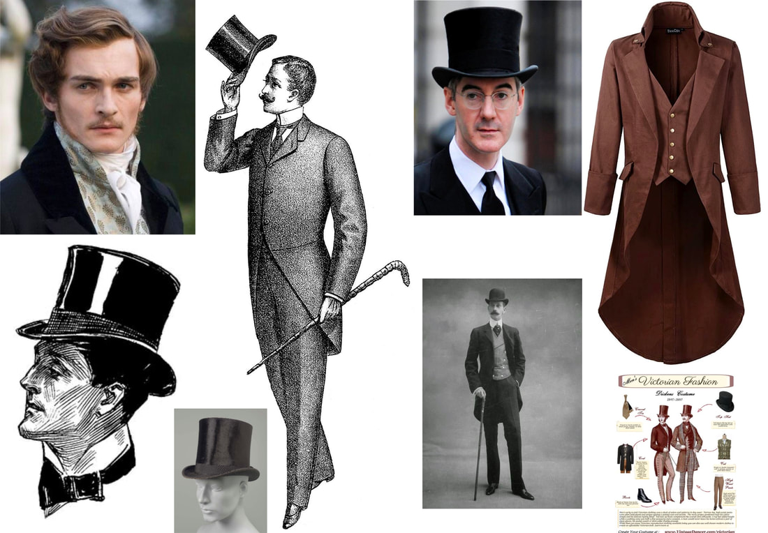
MAN IN BLACK REFERENCES
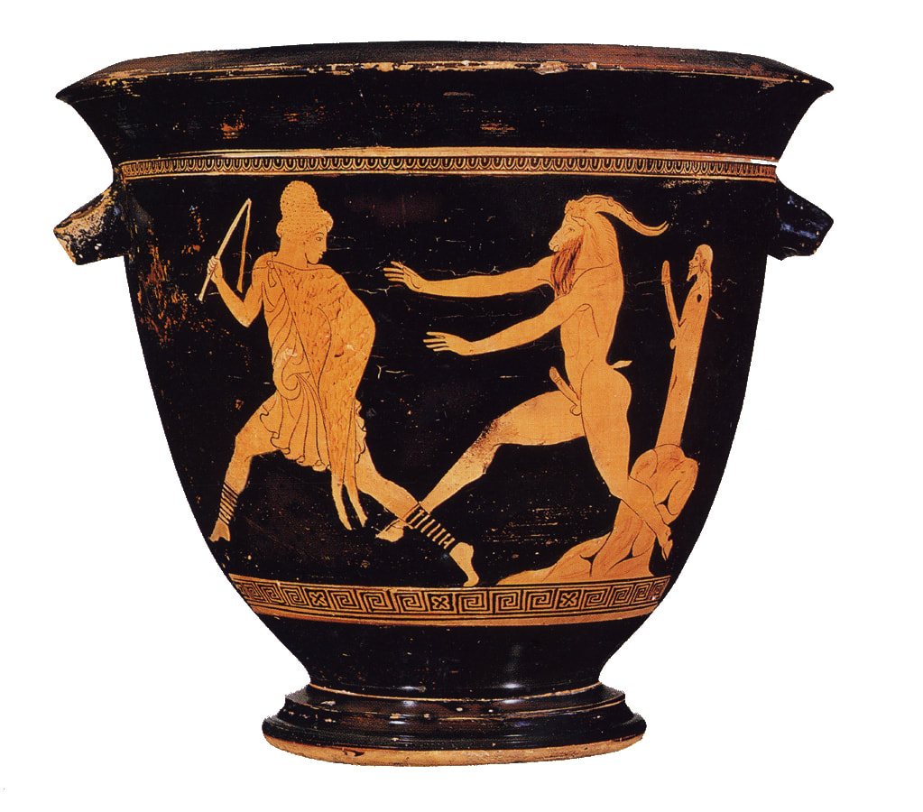
THE PAN PAINTER
|
|
|
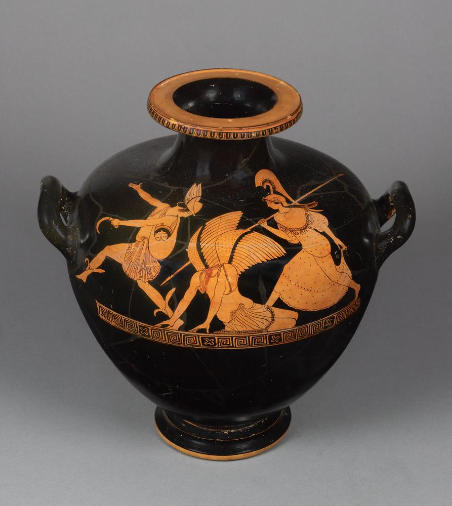
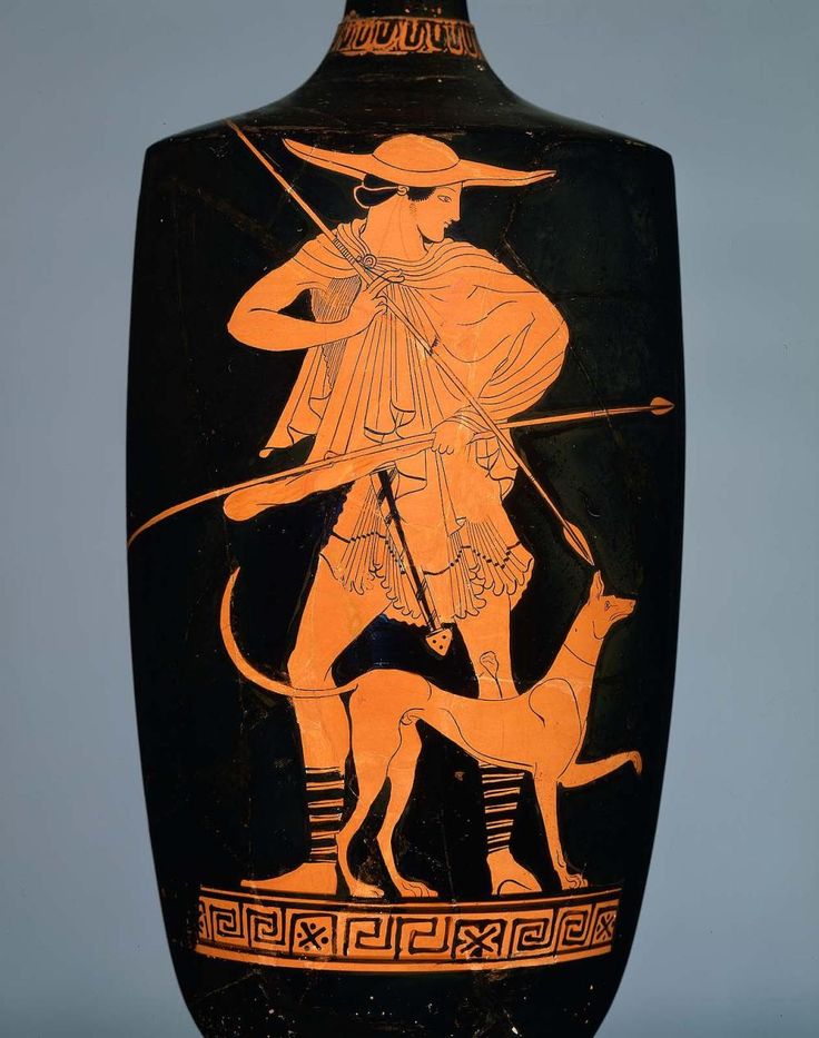
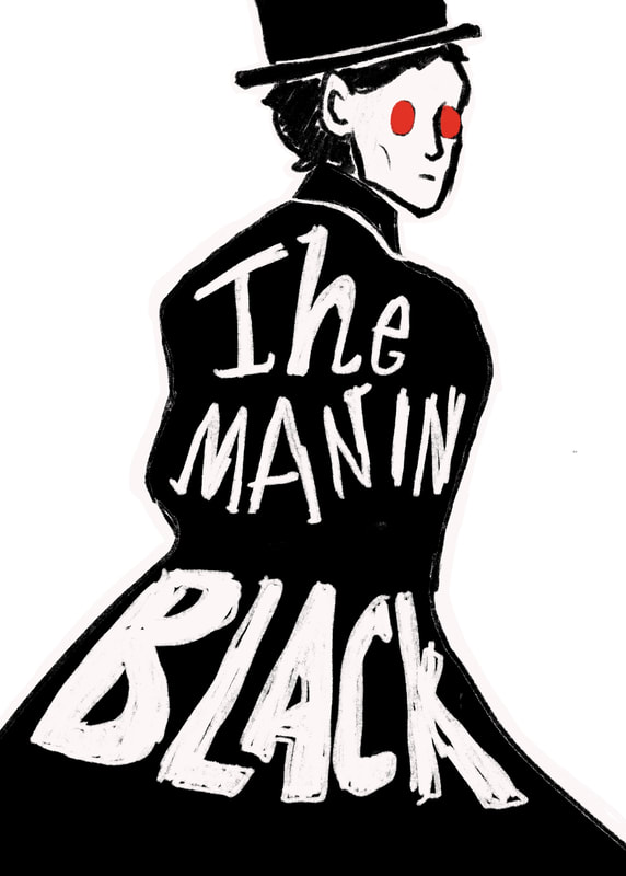
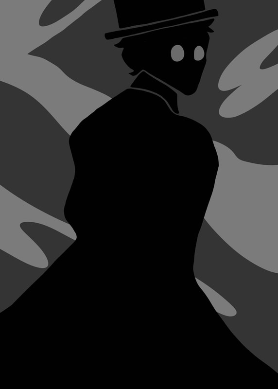
When I read the brief and saw that we could only use three colours for the cover, I instantly thought of Greek vases and the contrasting slip used and very minimal colour palette.
COVER DESIGN
SKETCHES AND THUMBNAILS
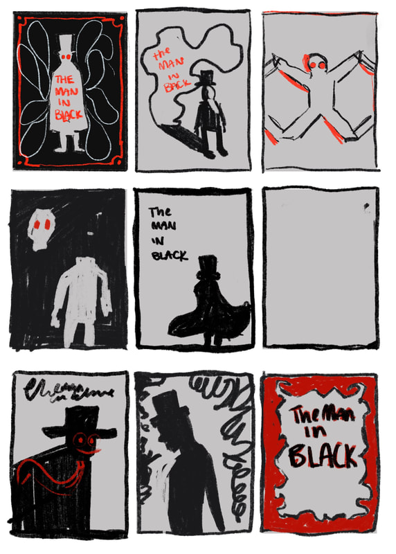
|
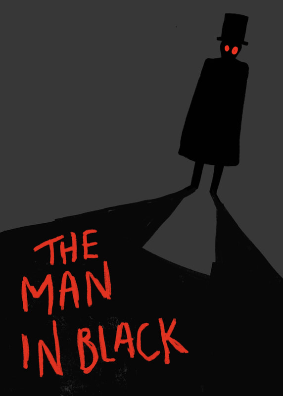
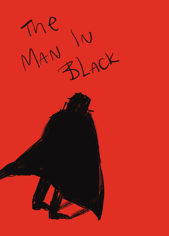
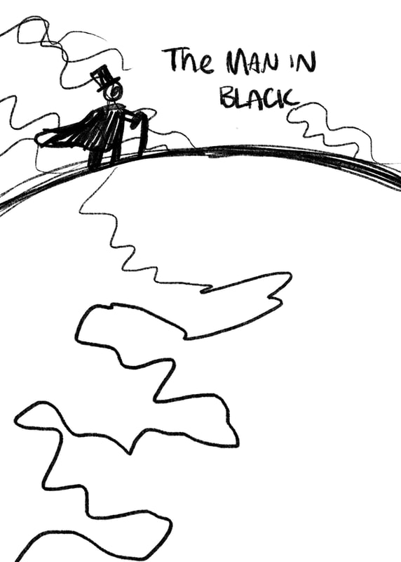
|
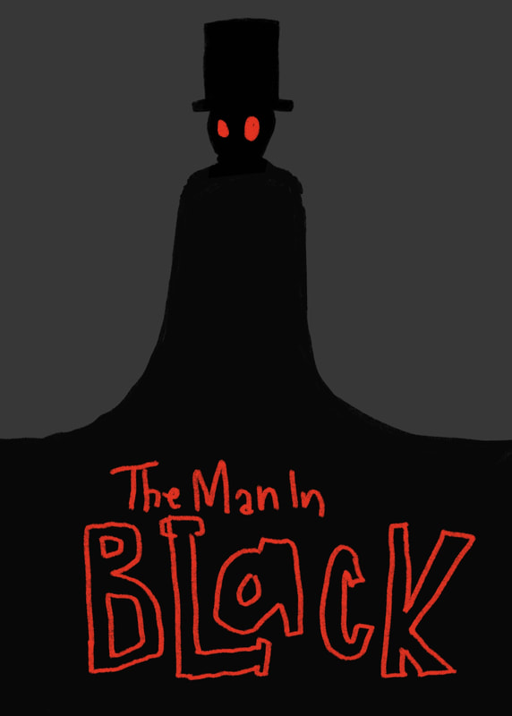
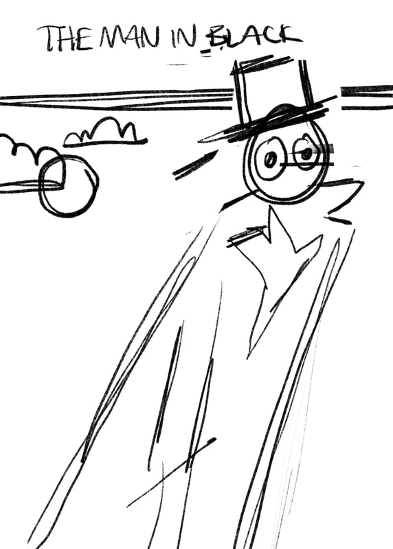
|
DESIGN DEVELOPMENT
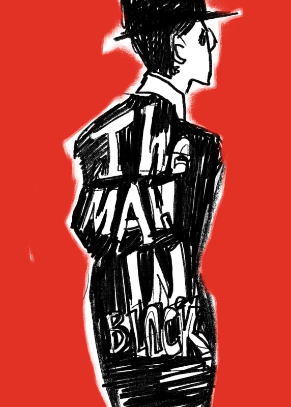
|
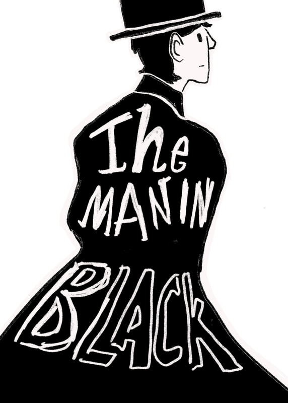
|
|
COLOUR EXPERIMENTS
|
|
|
|
|
|
FINISHED ILLUSTRATIVE ELEMENT
|
|
|
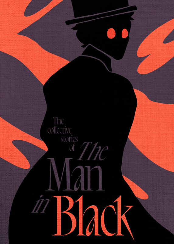
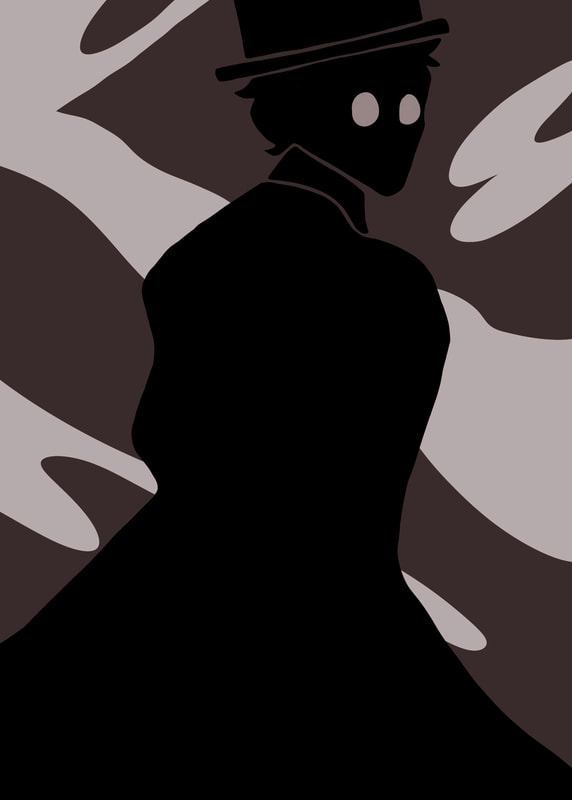
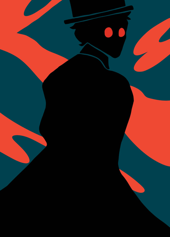
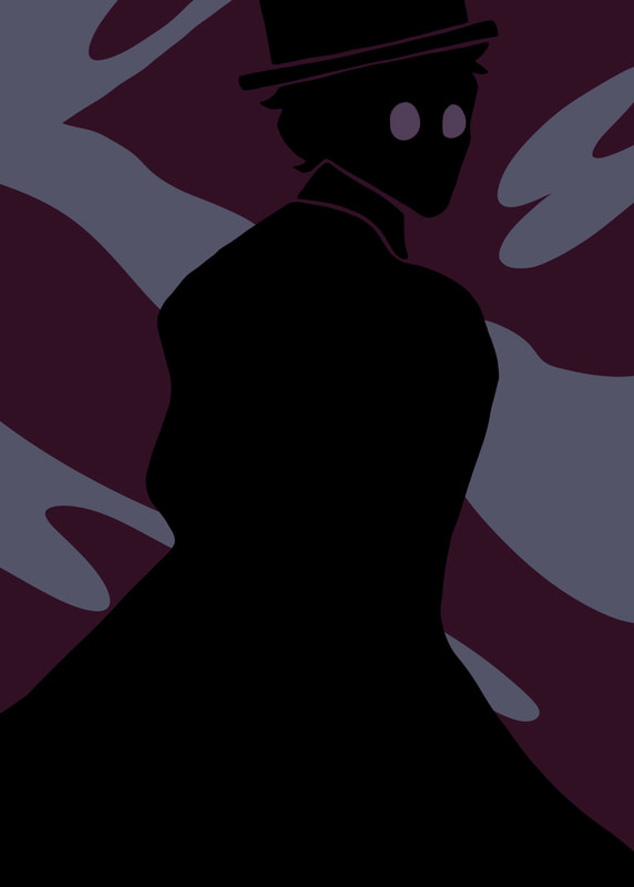
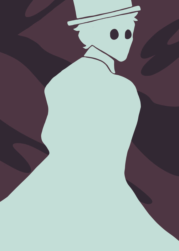
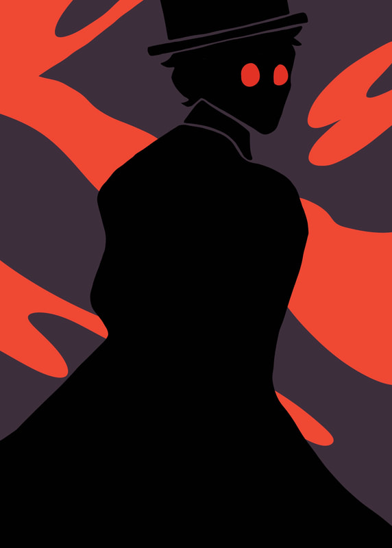
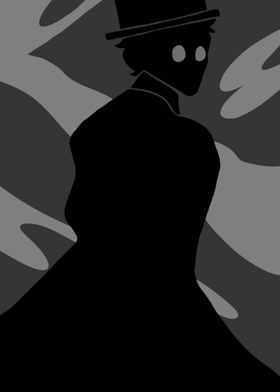
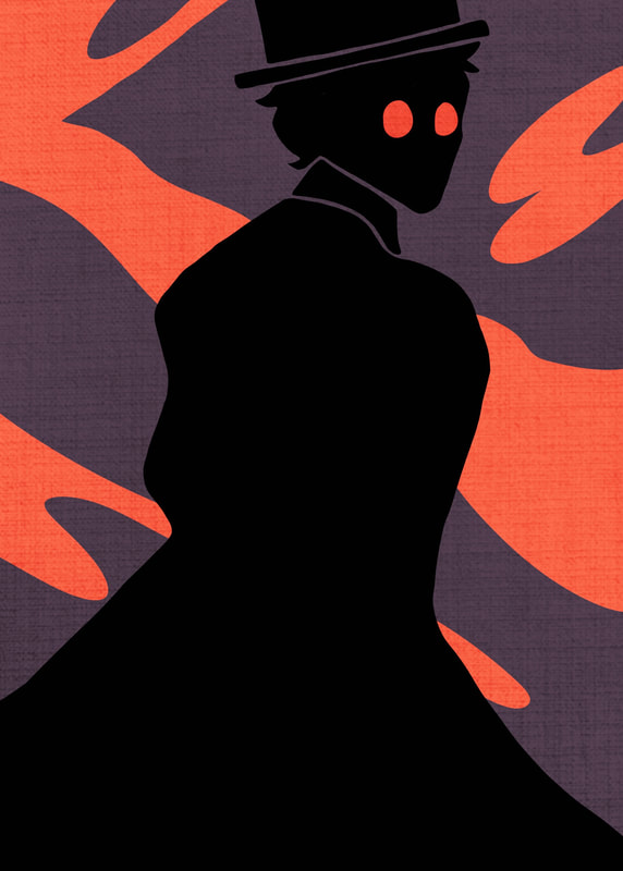
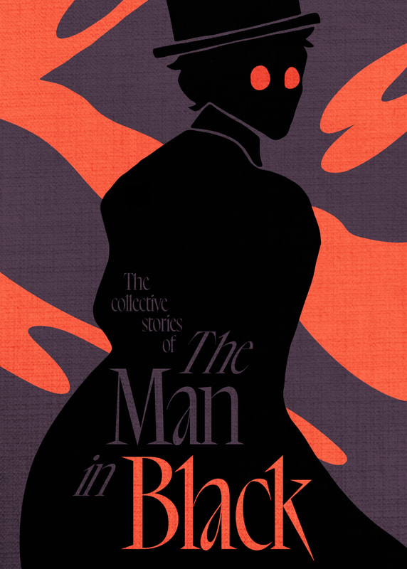
I'm happy with the main illustrative element. I think the colours give a spooky vibe while not being the sterotypical brigth red and black. I captured the essensce of my moodboard and left room for the type to be incorportated tastefully.
TYPOGRAPHY
ENVELOPE DISTORT
|
|
|
|
|
|
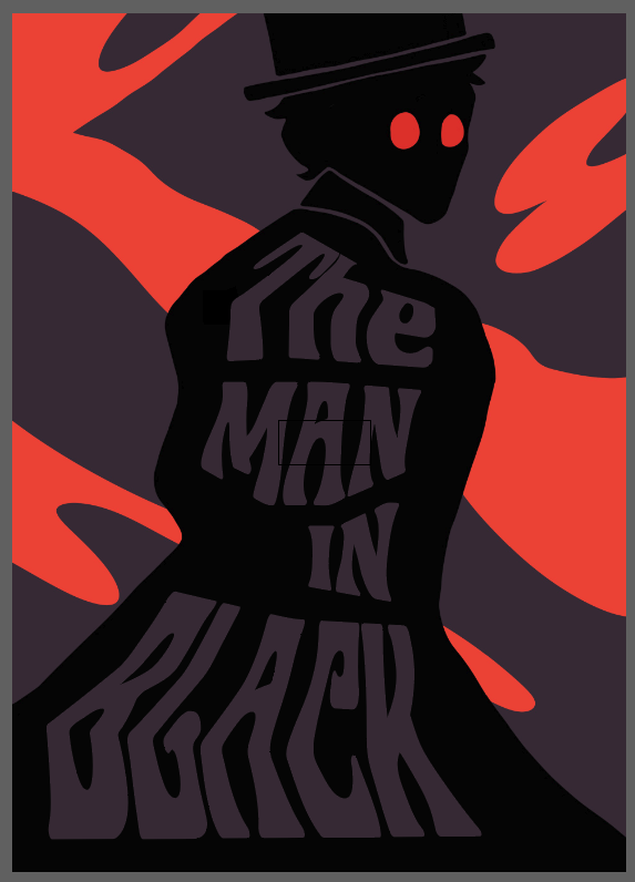
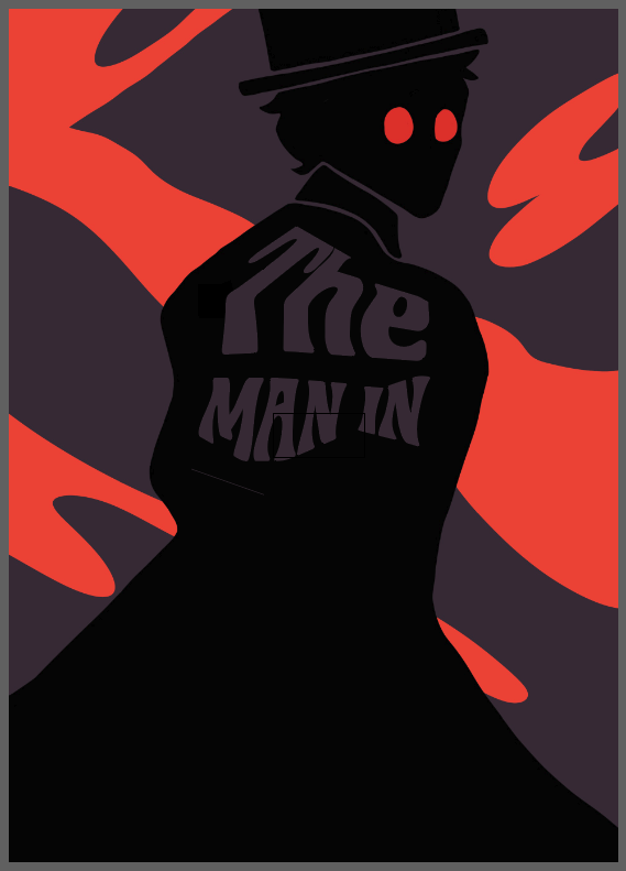
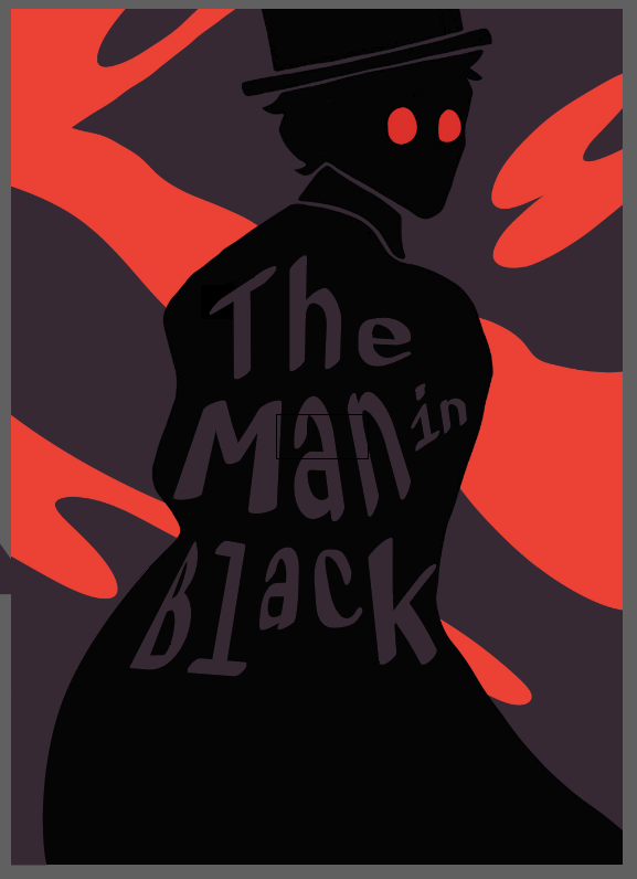
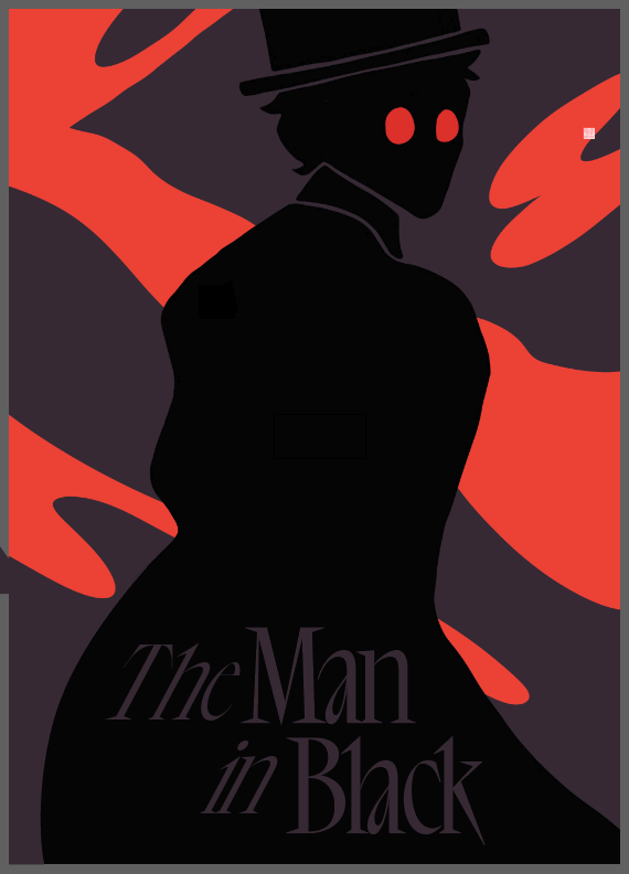
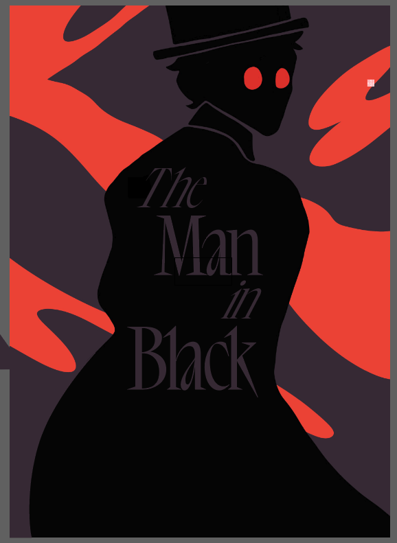
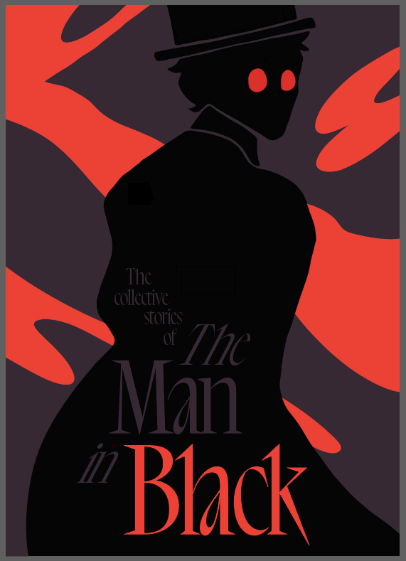
I wanted to try and exprement with the envelope distort tool on illustartor, however I felt it was over complicating the design. I felt moving back to Photoshop was the play here.
|
|
|
|
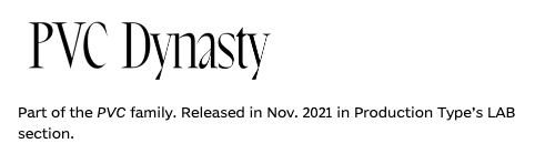
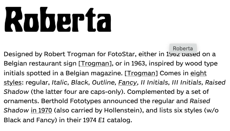
I experimented with different fonts, but settled on PVC dynasty, giving it contrast to the illustration while mainting the victorian theme.
|
FINAL DESIGN

|
|
MAKING THE SPINE


TESTING THE SPINE

|

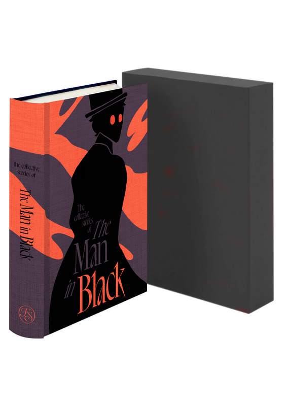
I noticed the cloud element looked strange and disjointed by not connecting on the edge. I copied the original cloud layer (above) so i could trace the shape round. I will also be changing the colours to match the ones on the cover. I also don't like the stacked type on the spine. It just looks like it wasn't done right. I'll try making it more straight in the next edits.
|
SPINE EDITS


FINISHED SPINE
FINISHED BOOK COVER
ALL FINAL OUTCOMES