This module is about adding key skills to your 'illustrator's toolkit', learning about composition, body language and colour to create more interesting and exciting illustrations.
Week One: ACTION! (COMPosition)
This week was an introduction to composition, teaching about how to add dynamism to illustrations to make them more exciting and visually appealing.
TASK IN LECTURE
These are the thumbnails I created in response to the Padlet activity. These served as a learning tool to learn the basics of composition and get some feedback before making or own thumbnails.

|

|
RESEARCH
Research for the section of the project mainly came from artist research and informative YouTube videos on the topic at hand.
HELPFUL VIDEOS
|
|
|
Lee White has a collection of videos on Youtube which provide excellent insights into his workflow as an illustrator - including his process on thumbnails! His video on productivity was also helpful at this stage in the semester as I had begun to run out of steam.
HELPFUL ARTICLES
|
|
|
I found doing research into different composition methods helped me a lot in furthering my understanding. These two websites helped the most.
BERNIE FUCHS
Bernie Fuchs was an American Illustrator known for advertising art, magazine illustration and portraiture. One of the things that makes his work so dynamic and interesting is his use of composition. With figures not fully on the page, it gives a sense of movement to the 2D image. He also masterfully used the golden ratio in his work to create dynamic compositions.


|

|

|
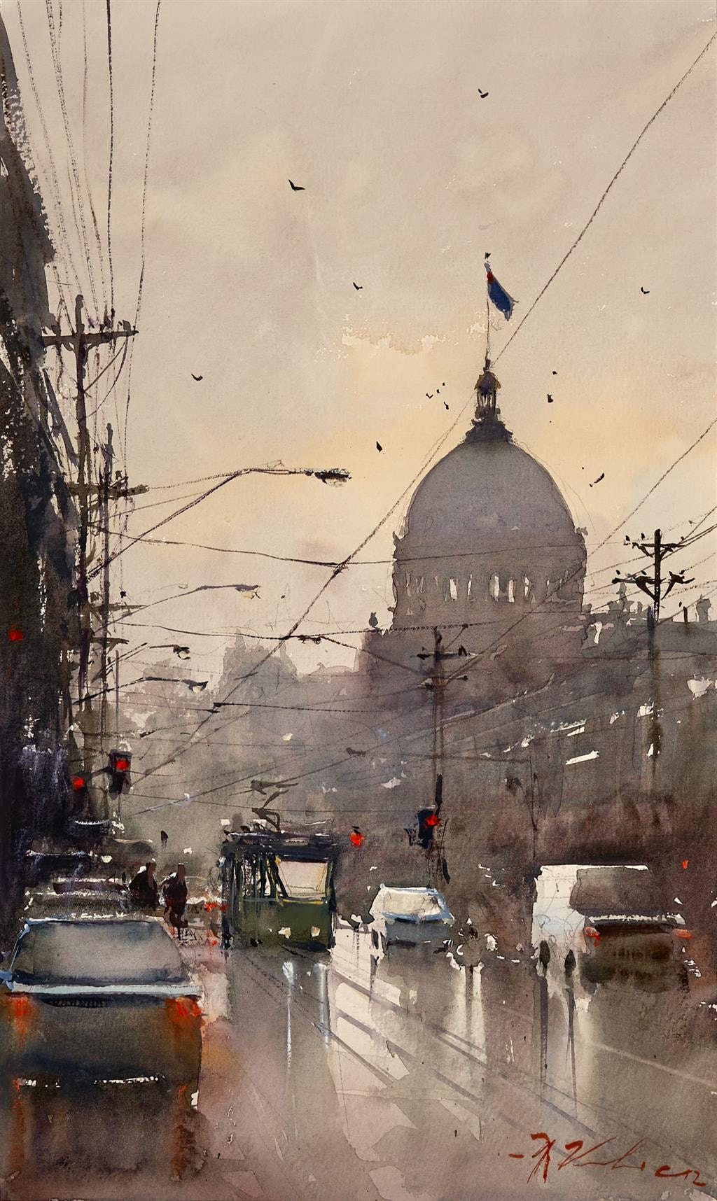
JOSEPH ZBUKVIK
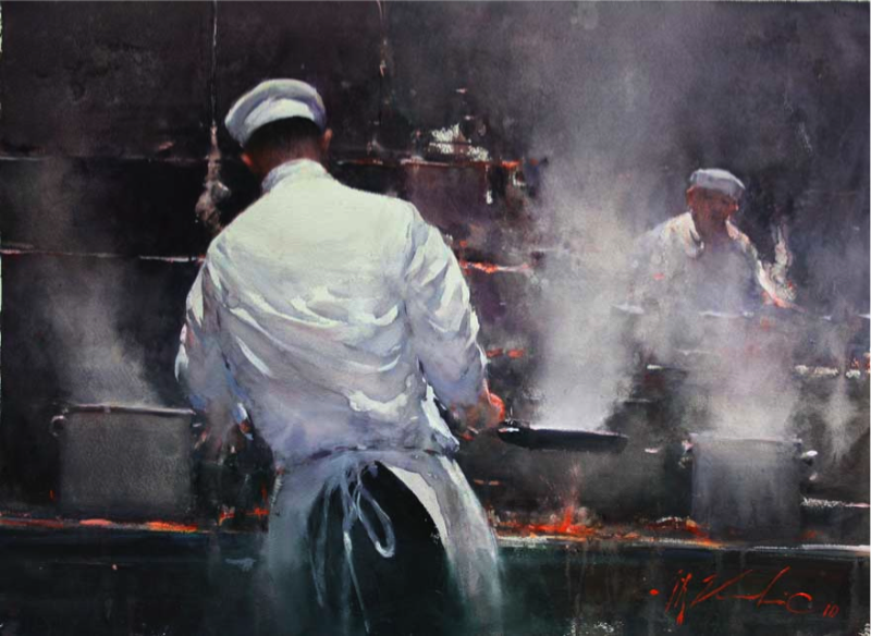
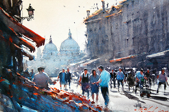
Zbukvic is a contemporary water colour artist whose work utilises composition very well. He focuses on utilising staple composition methods to produce his "on location" watercolour paintings as well as using a mixture of verticals and horizontals in him images.
|

|
|
THUMBNAILS
AMBUSHED

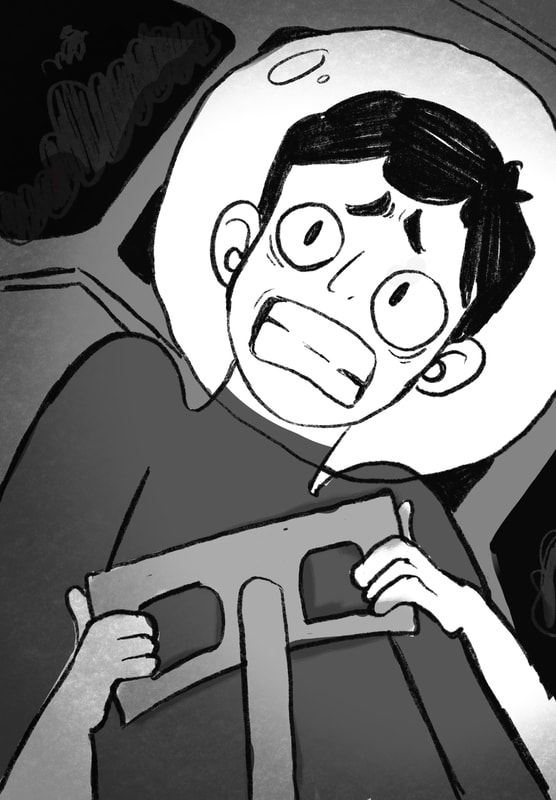
VERTIGO

TANGO

SYSTEM FAILURE

A GIANT LEAP

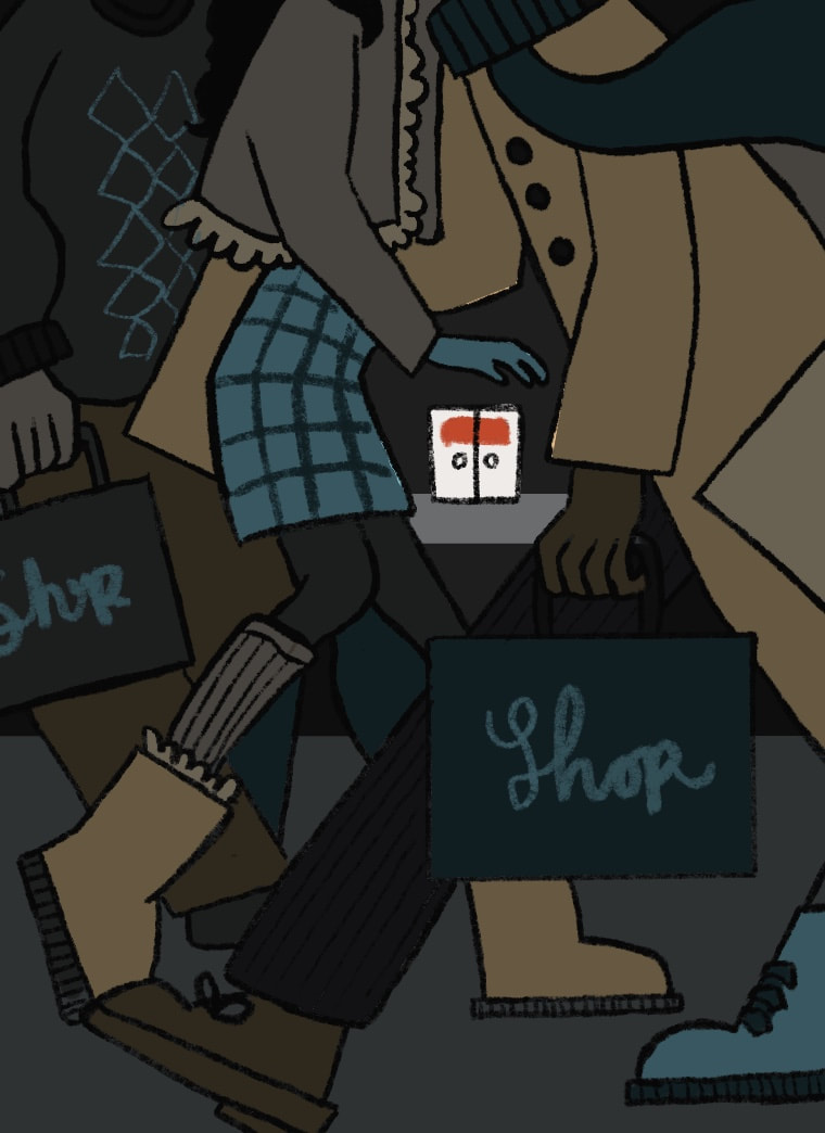
JANUARY SALES

CLIENT VISUALS

|


|

|
WEEK TWO: Body language
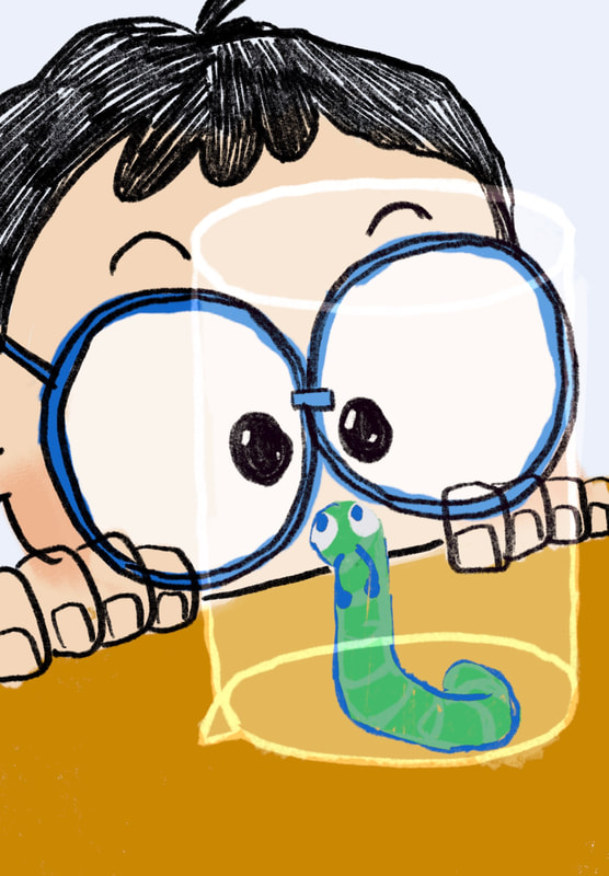
This week was about utilising body language and expression into our work to make effective illustartions.
RESEARCH
HELPFUL VIDEOS
These videos helped making 3D sculptures more approachable. I knew after watching the first video that I wanted to use paper mache.
|
|
|
THUMBNAILS
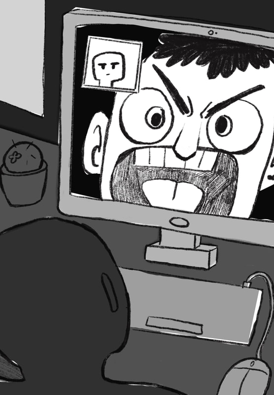
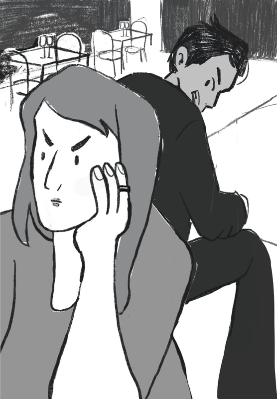
ANGRY BOSS

THE ANNIVERSARY

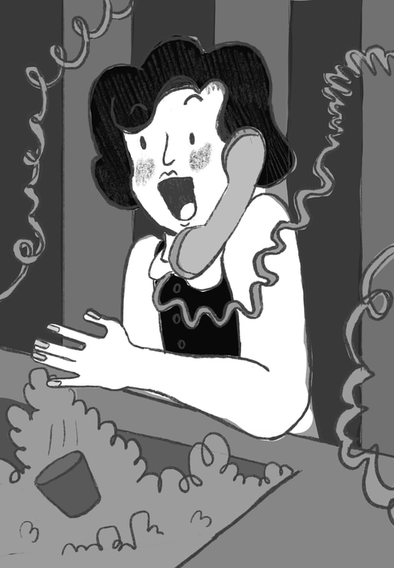
GOOD NEWS

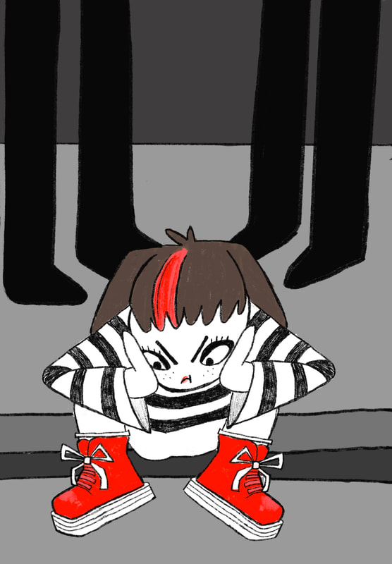
MUM CAN WE GO NOW?

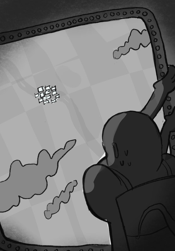
THE BIG JUMP

GENIUS AT WORK

CLIENT VISUALS
|
|
|
WEEK THREE: COLOUR
This week's task was to experiment with colour and combine it with the skills from "Action!" and "Body Language" to create a final piece in response to a set text.
RESEARCH
ISABELLA MAZZANTI

|

|

|

|
INITIAL SKETCHES

|

|
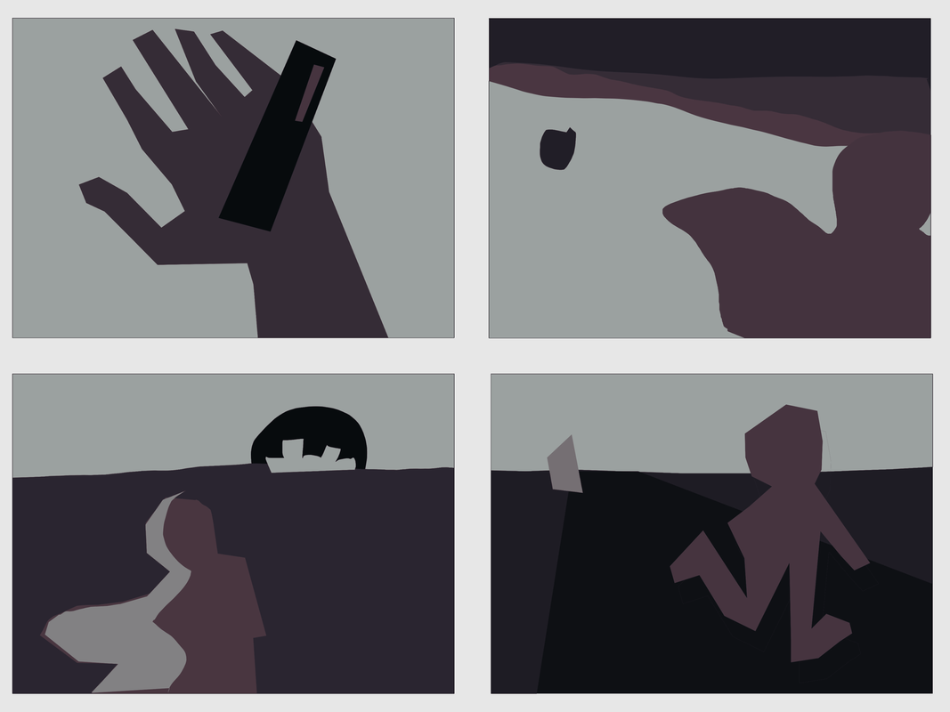
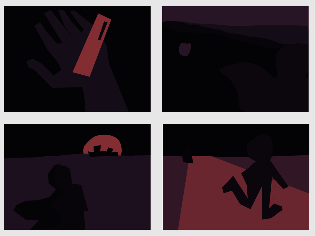
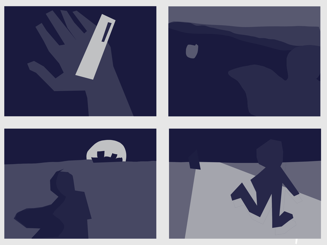
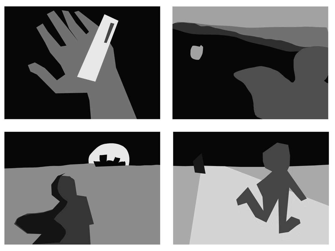
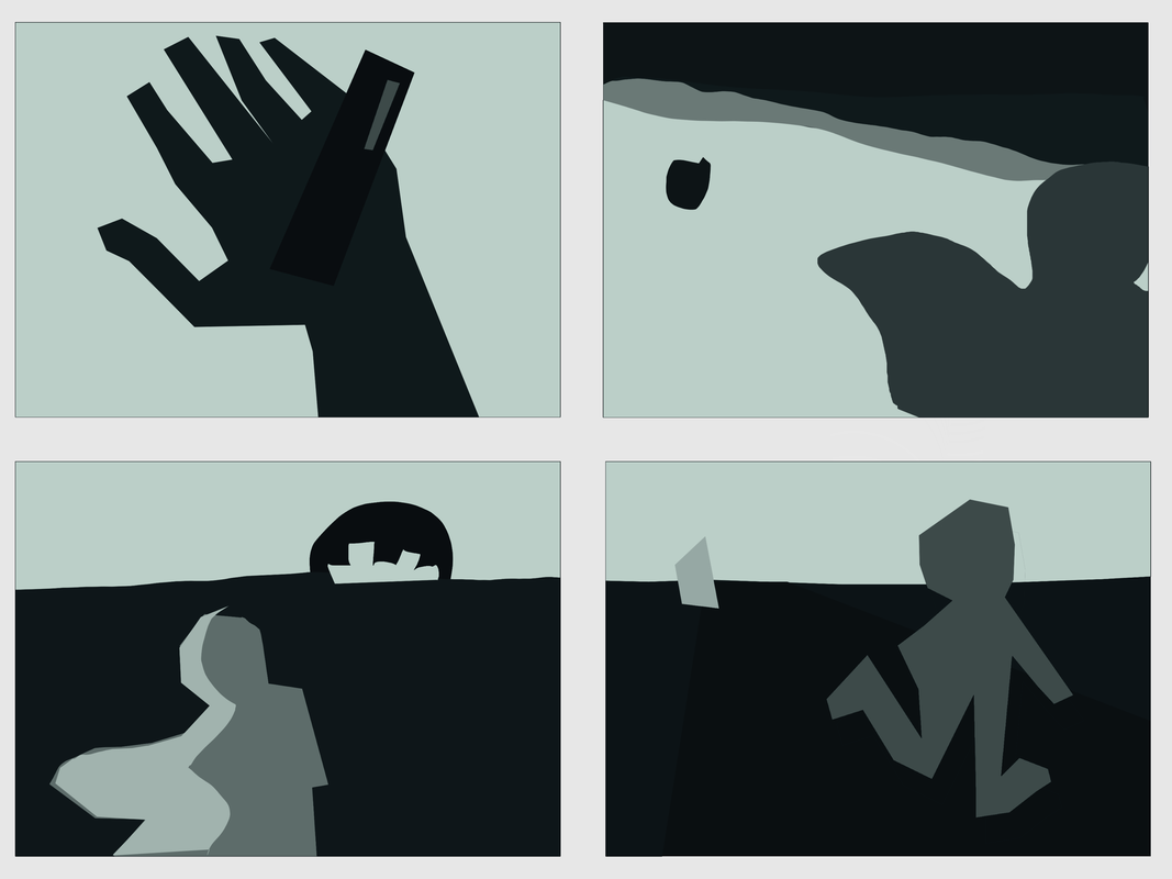
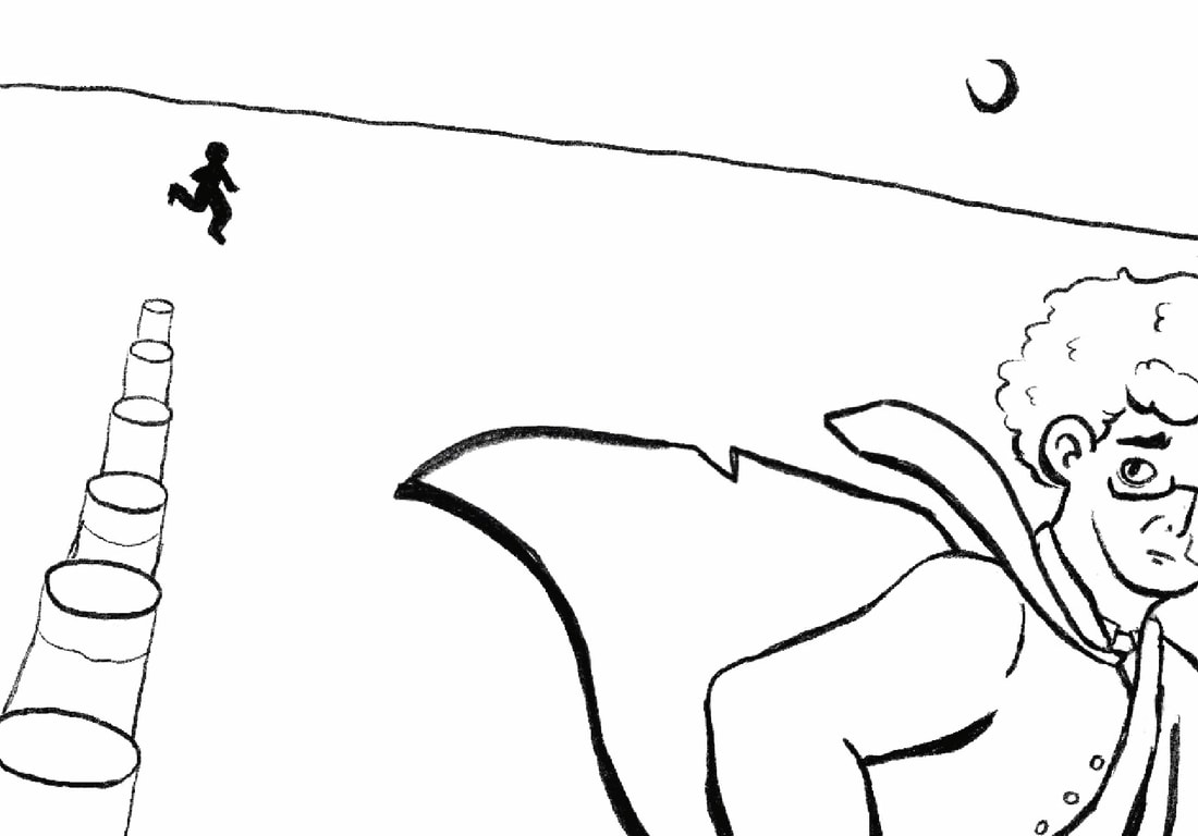
I started the project by making a mind map of key words and phrases in the extract. From there, I thumbnailed some basic ideas.
|
THUMBAIL SKETCHES

|

|
EXPERIMENTING WITH COLOUR AND TONE

|
|
|
DEVELOPING CHOSEN IDEA
|
|
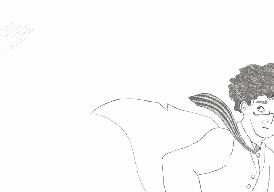
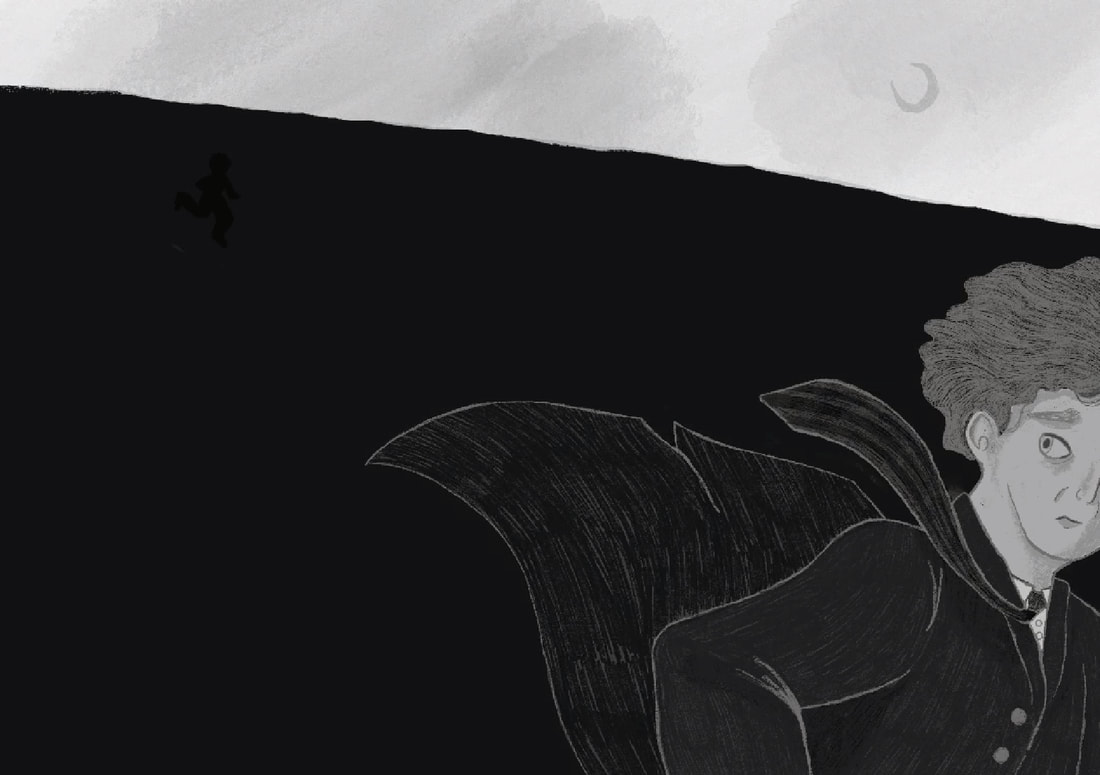
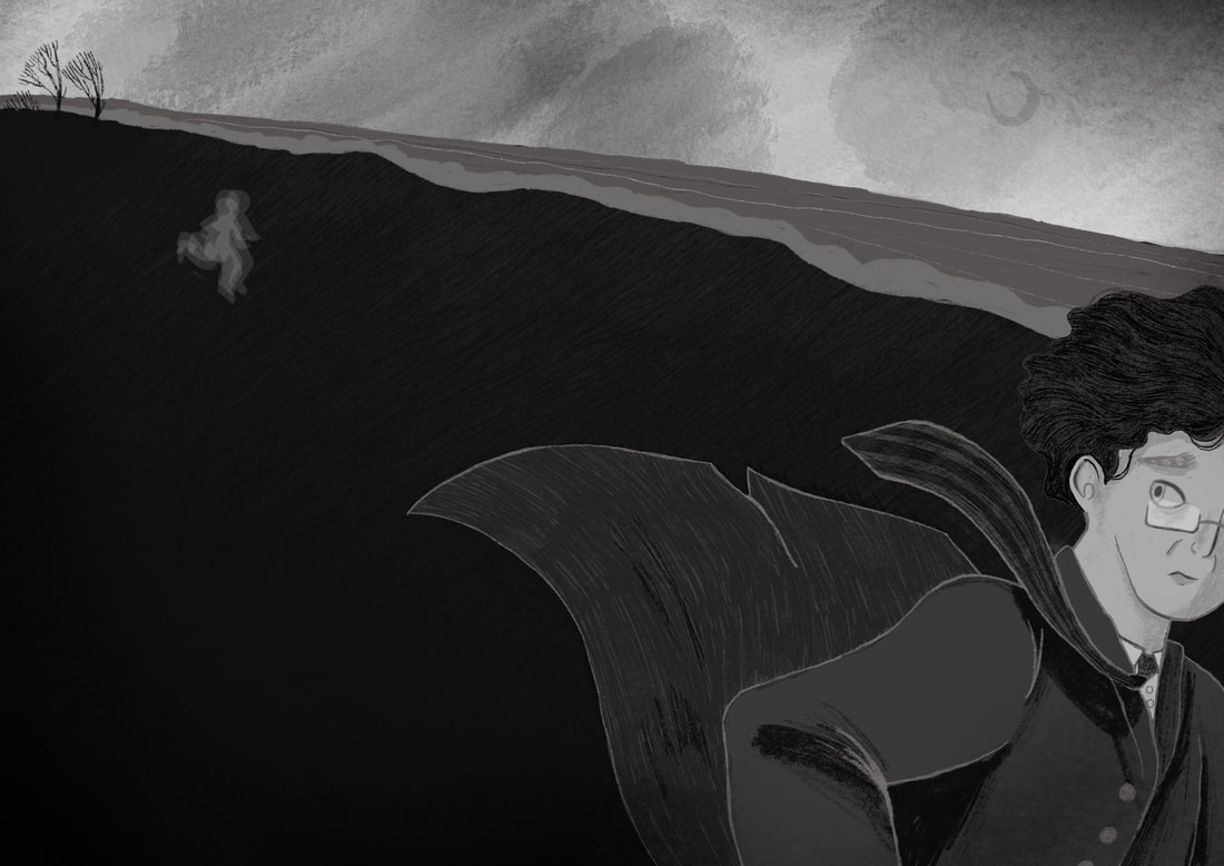
FINAL IDEA DEVELOPMENT
|
|
|
FEEDBACK AND CRITIQUE
After showing my work so far to Tony, I recieved three main peices of critism:
- CHARACTER DESIGN: Main character is suppose to look older, make him match the period and the age of the character in the story.
- ATMOSPHERE: The scene doesn't seem tense enough. The spirit looks too friendly and unmenacing. Sky and trees are atmospheric but other elements need to refelect that. The main character is also drawn too "cutesy". Doesn't reflect the tone enough.
- DIMENSIONS: The format and dimensions of the piece are incorrect. I misread the brief and thought this was suppose to be a double age spread. This is the first thing I will need to correct.
DEVELOPMENT CONTINUED...
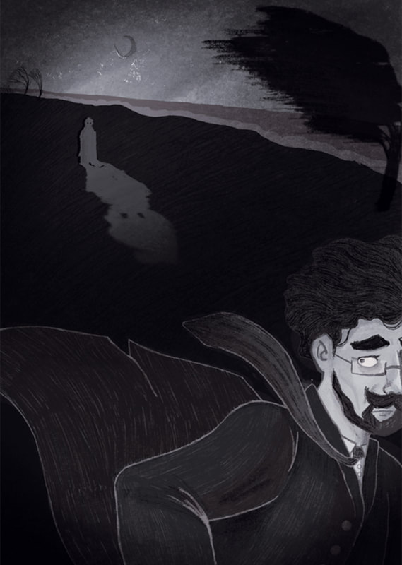
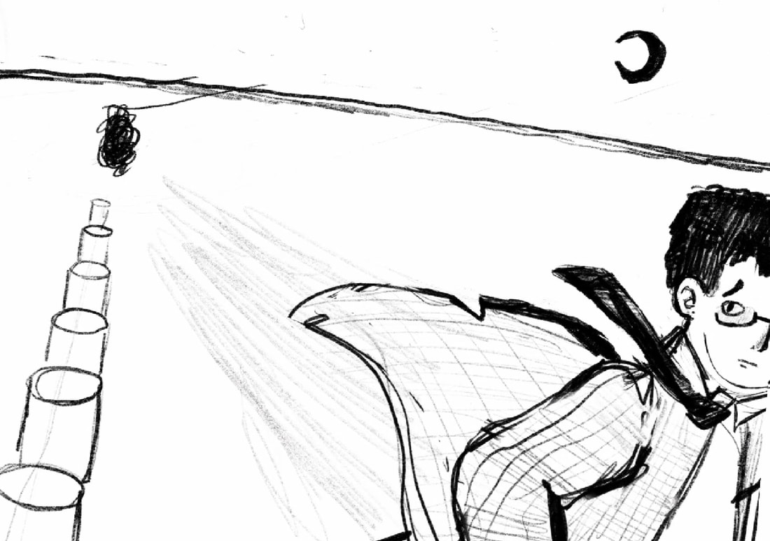
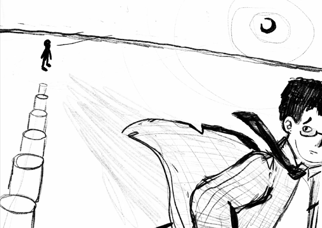
After the feedback, I went back in and developed my piece accordingly.
|
|
This timelapse video shows the improvements I made in response to the feedback. I felt this video would better help summerise the work I did to improve. I changed the style of the figure to make it more menacing, edited the composition and made the main character less "cutesy" while also trying to age him.
|


|
|
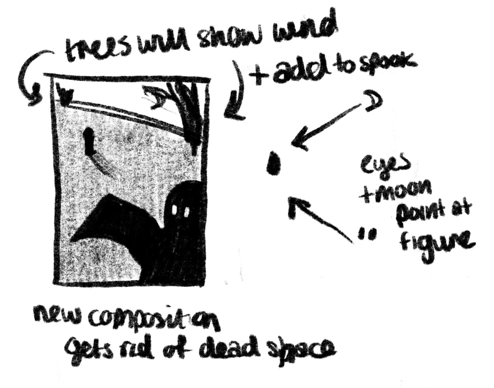
Before attempting to fix my work, I did a bit more research and planning. I first planned my new composition in potrait format. This was and easier fix than I thought and actually helped fix some of the compositional problems I had before. This cut a lot of dead space and made the figure seem more looming.
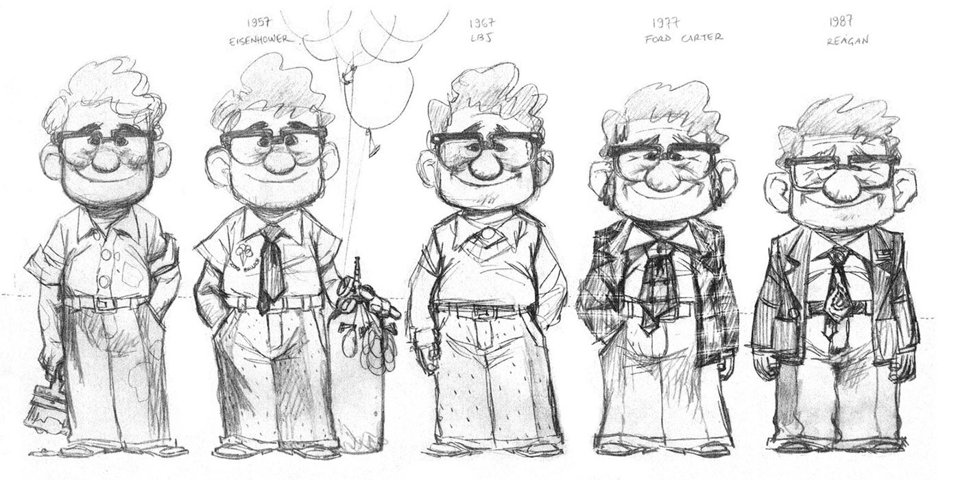
I also did some studies on illustrating older characters. I spent time looking at pixar concept art. This website was particually helpful in refernace imagery. I found features like facial hair, smile lines and big noses would age my character.
I also did some studies on illustrating older characters. I spent time looking at pixar concept art. This website was particually helpful in refernace imagery. I found features like facial hair, smile lines and big noses would age my character.

|
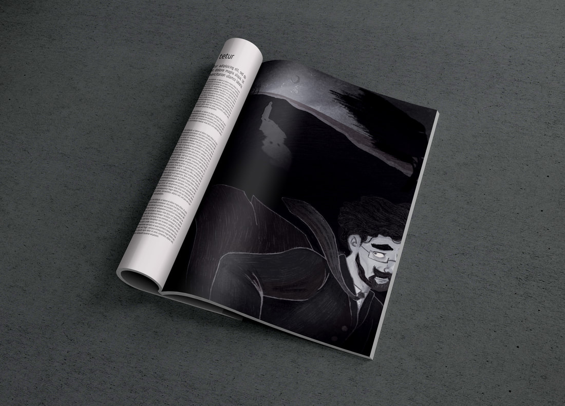
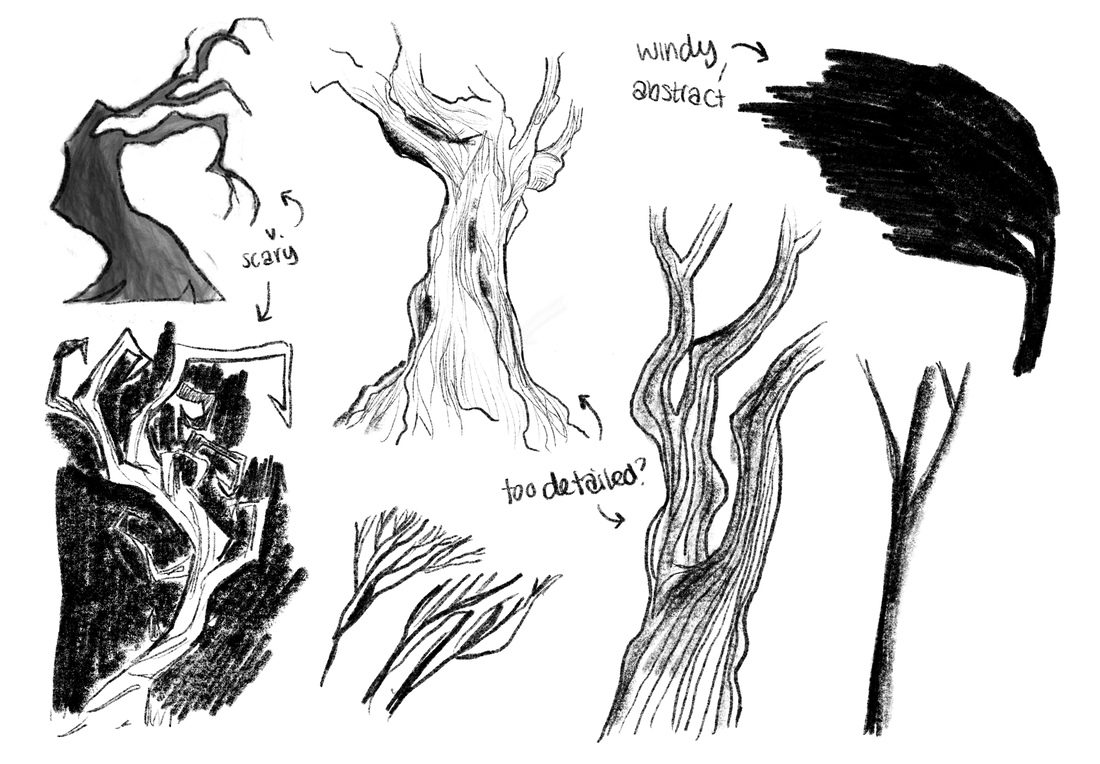
After these changes, this is what the piece looks like. I am much happier with it now and it is correct proportion. I feel it is more eeire and follows the set text more. The character also seems older, though I many work on this more to further age him of I have time. A few more areas I would like to correct would be making the ghostly figure fit into the illustration more and changing the tree on top right to be more atmospheric at tell us more about the narrative. I want to make it seem windier.
|
FINAL ILLUSTRATION