
WHAT'S THE BRIEF?
Create a band gig poster design for your band. Band names where provided usiing a random generator. I was given "Pleb Quota".
research and initial ideas
|

|
|

|

|
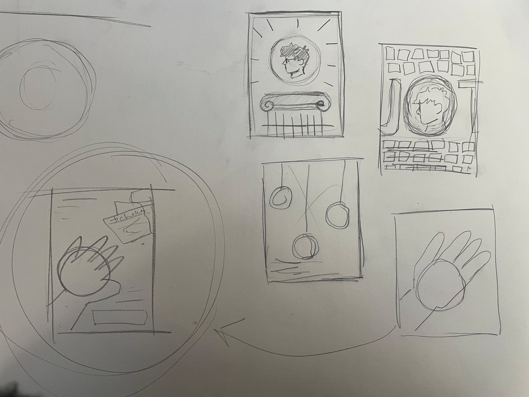
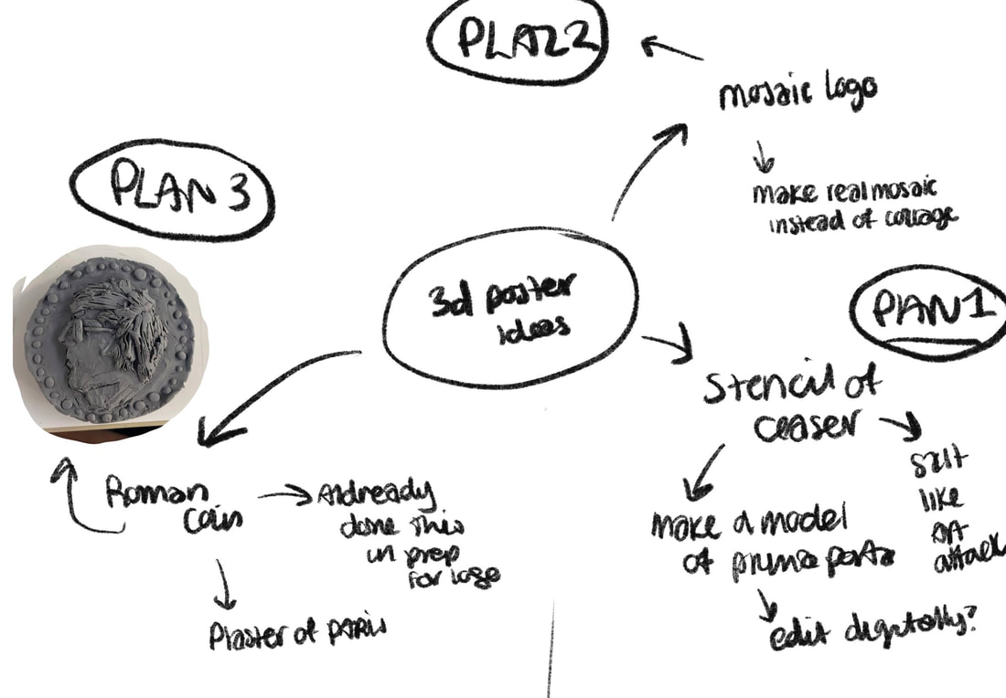
I began mind mapping potential ideas for the poster. I went through typographical and more illustrative options. I wanted to feature the coin I made for the logo in the last section predominately as I didn't use it as the final logo but felt it had potential.
making the coin
|
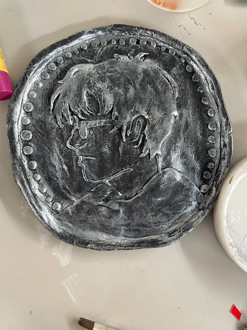
I used air-drying clay to make the coin. This was an easy material to work with and allowed me to sculpt fine details into the piece. After it dried, I painted it with payne's grey and then dry brushed it with silver to bring out the details. I found this technique from the miniature figure painting community found here.
I used my vectorised logo as reference and tried to faithfully replicate it. I removed the text for legebility purposes and because I wanted to combine this and my mosaic logo in the posters. |

|

|
|
making the collumn
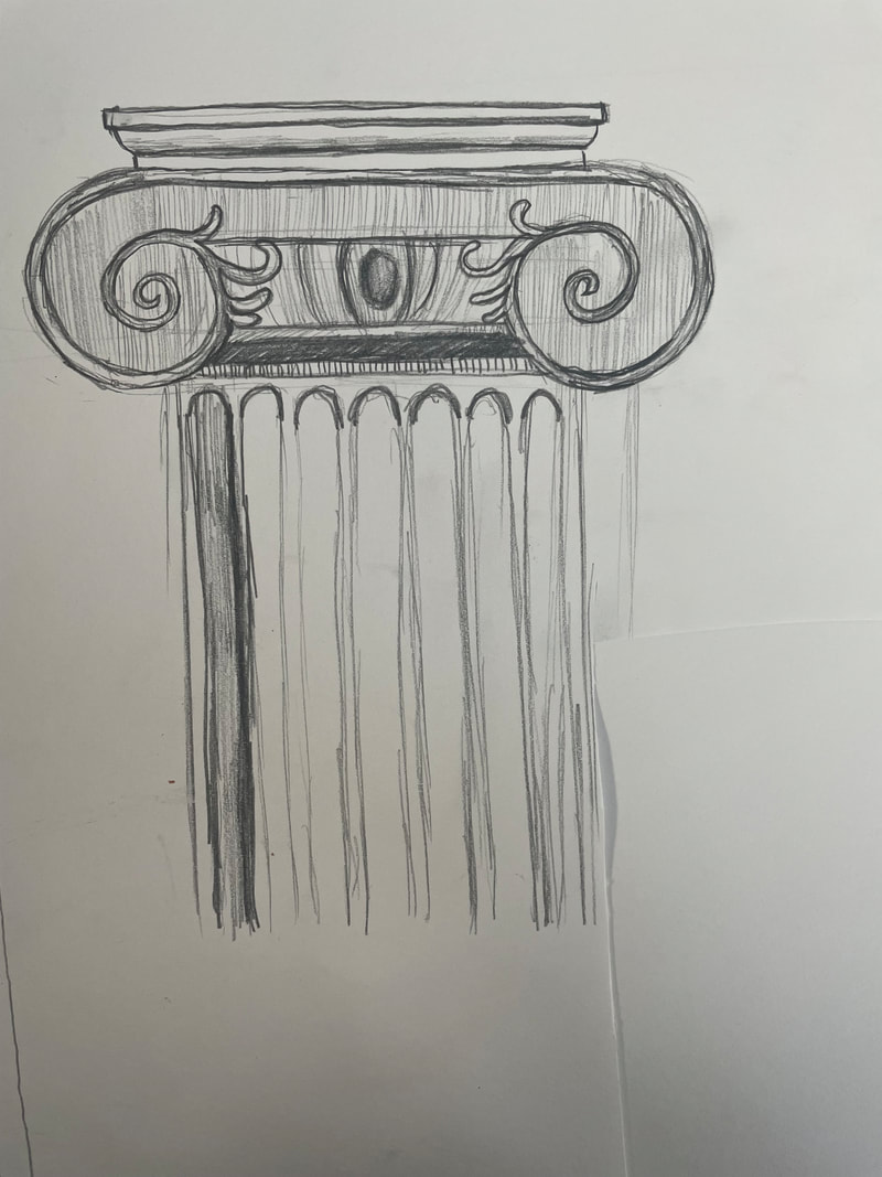
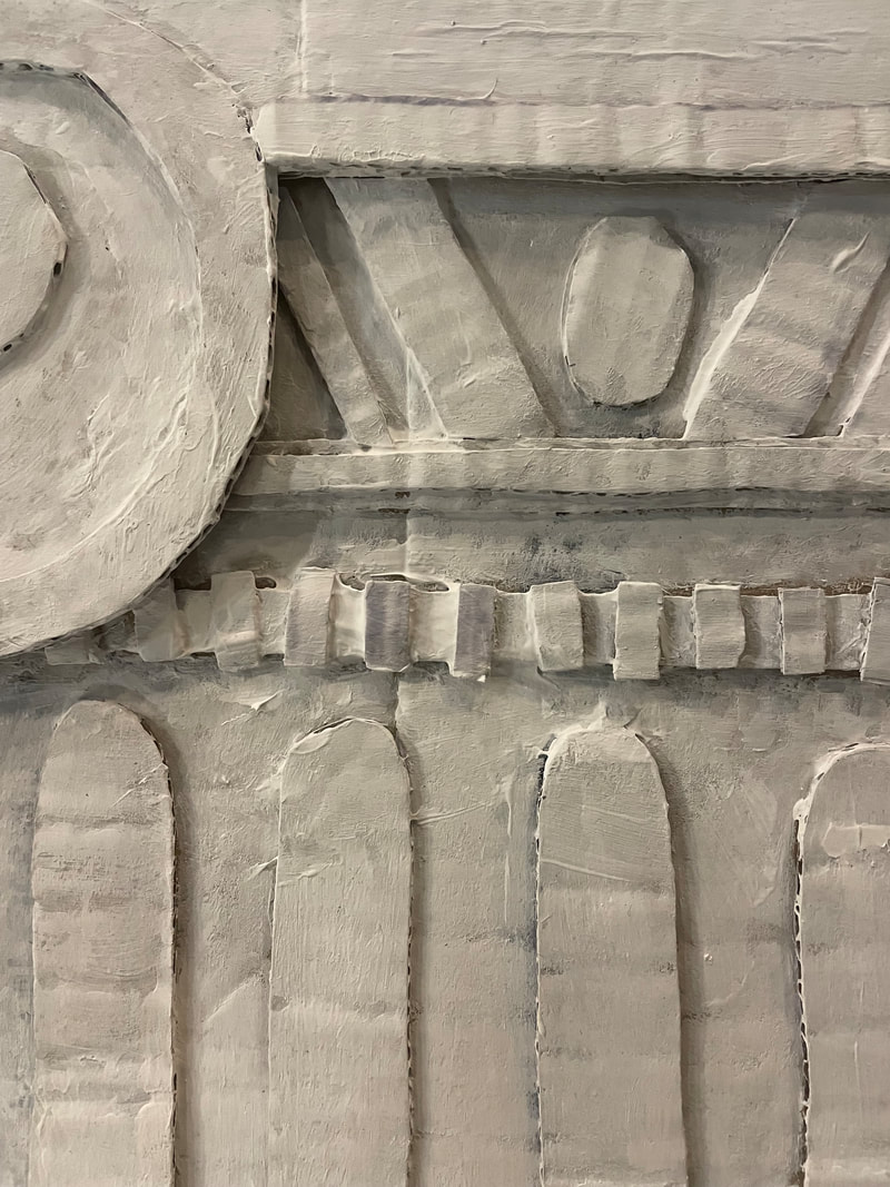
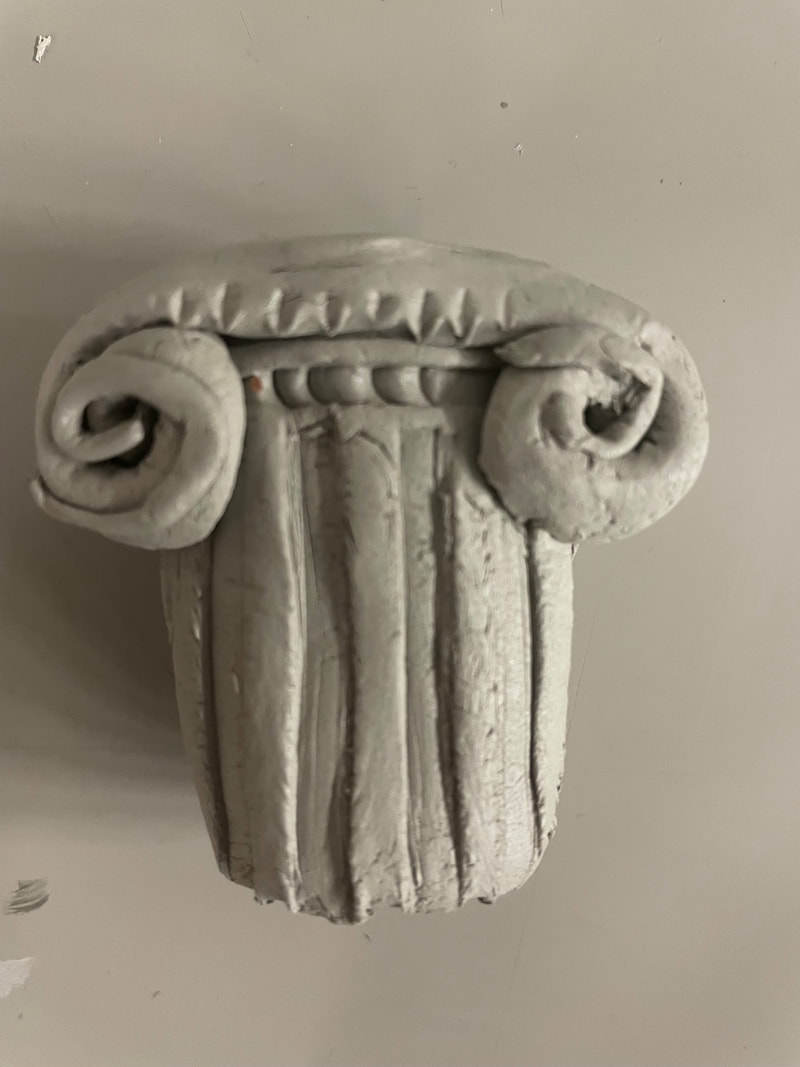
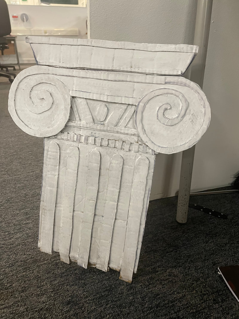
I took inspiration from the visit to the Roman exhibit of the museum when making this. I used Ionic columns as referance as I fend them the most visually interesting. I first began makin g a quick sketch before doing a mockup oin clay. I used corragated carboard in layers to constuct the final piece. It gave a tacatile look to the collum without having to comit to a complex medium such as the clay which didn't work ass well. I used finer peices of cardboard for the details in the masonry. I then coated it with 4-6 coats of acrylic gesso to get the white colour.
|
|

|
vectorising the logo


So I could effectivly implement my final logo on the poster, I vecoristed it using the image trace method on Illustartor. This allowed me to scale the logo and make it more legible. I ssettled on the last varient with negative space for the typography as I felt it was easier to read but kept the mosaic look.
making the tickets

|
|

|
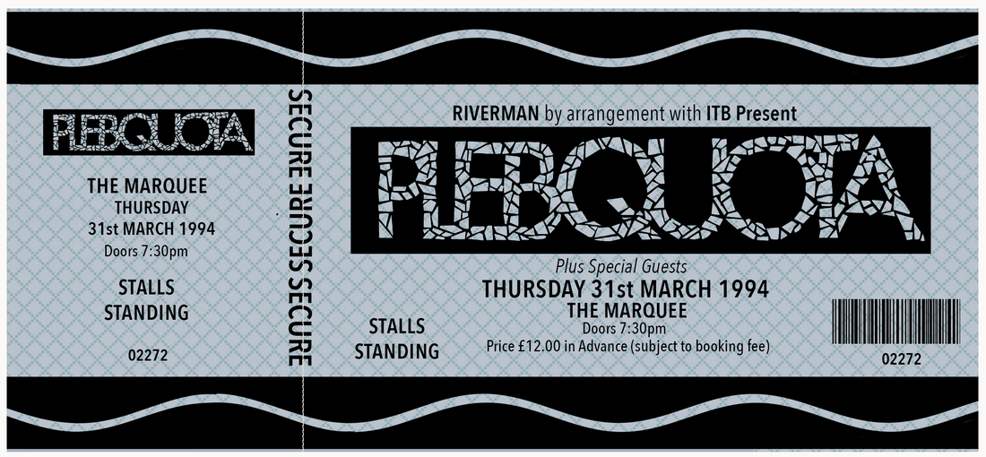
One of my ideas involved a fake ticket to the gig. Before making it I collected an image bank of real tickets from the 90s britpop scene and tried to recreate my own in Photoshop. I felt this successfully replicated the look. I printed them ready to use as props.
contact sheets
|
|
|
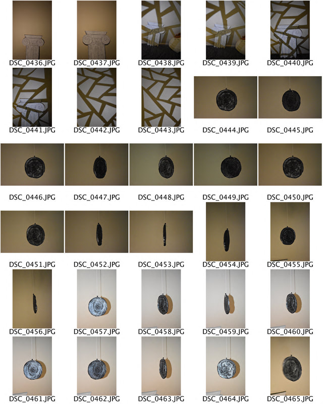
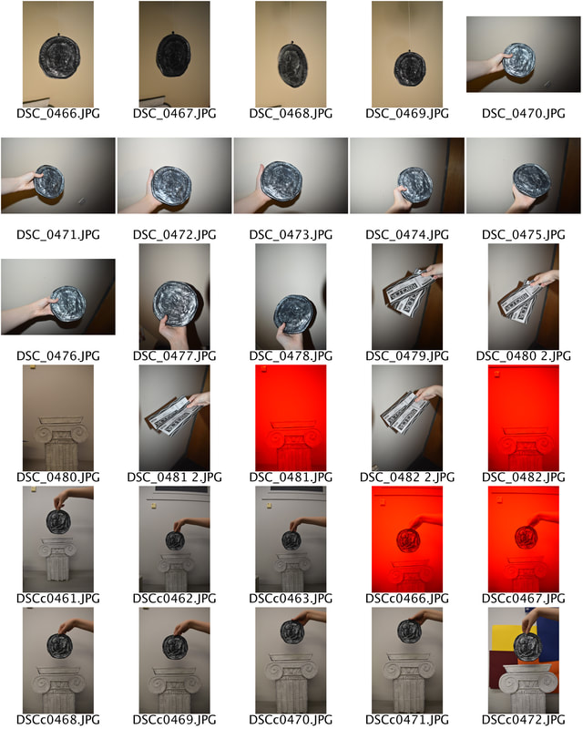
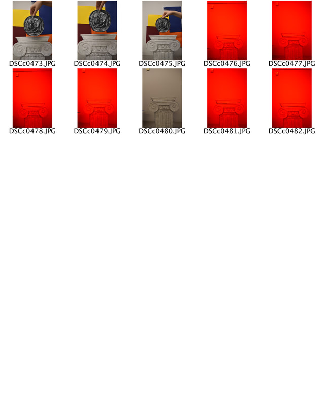
These contact sheets show the photoshoots I completed for the mockup digital posters. I tried different lighting and gels as well as composition.
digital thumbnails
|
|
|
|
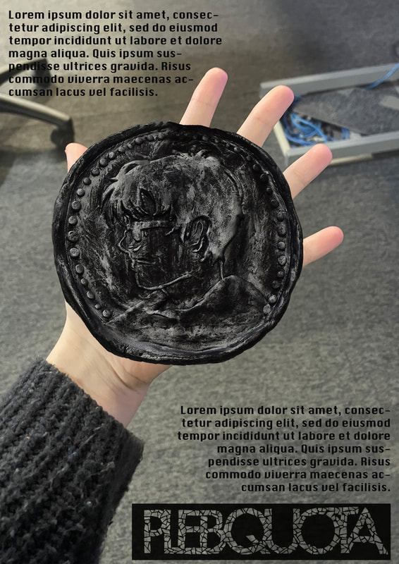
I quickly created these mockups in procreate of basic compositions and layouts I wanted to explore during the real shoot. This helped me have a plan and a jumping of point for the photography side of things.
poster designs
|
|
|
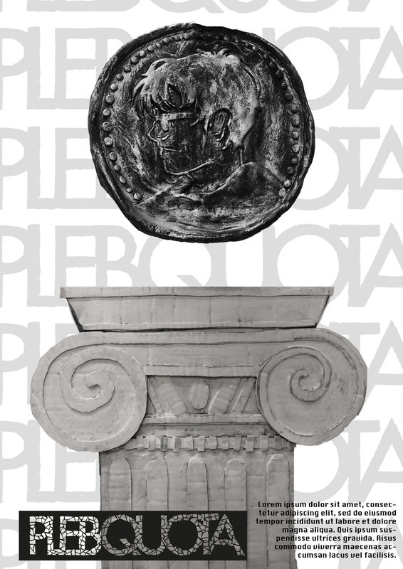
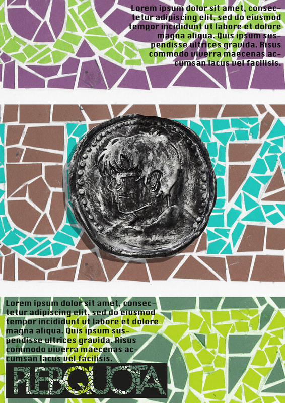
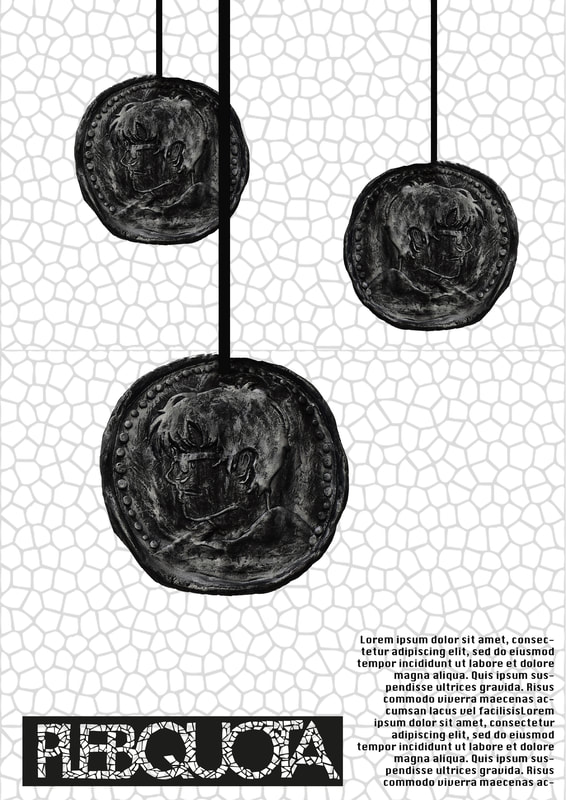
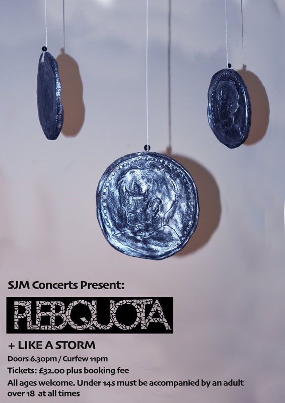
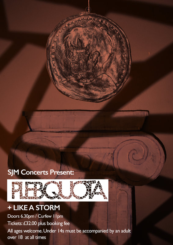
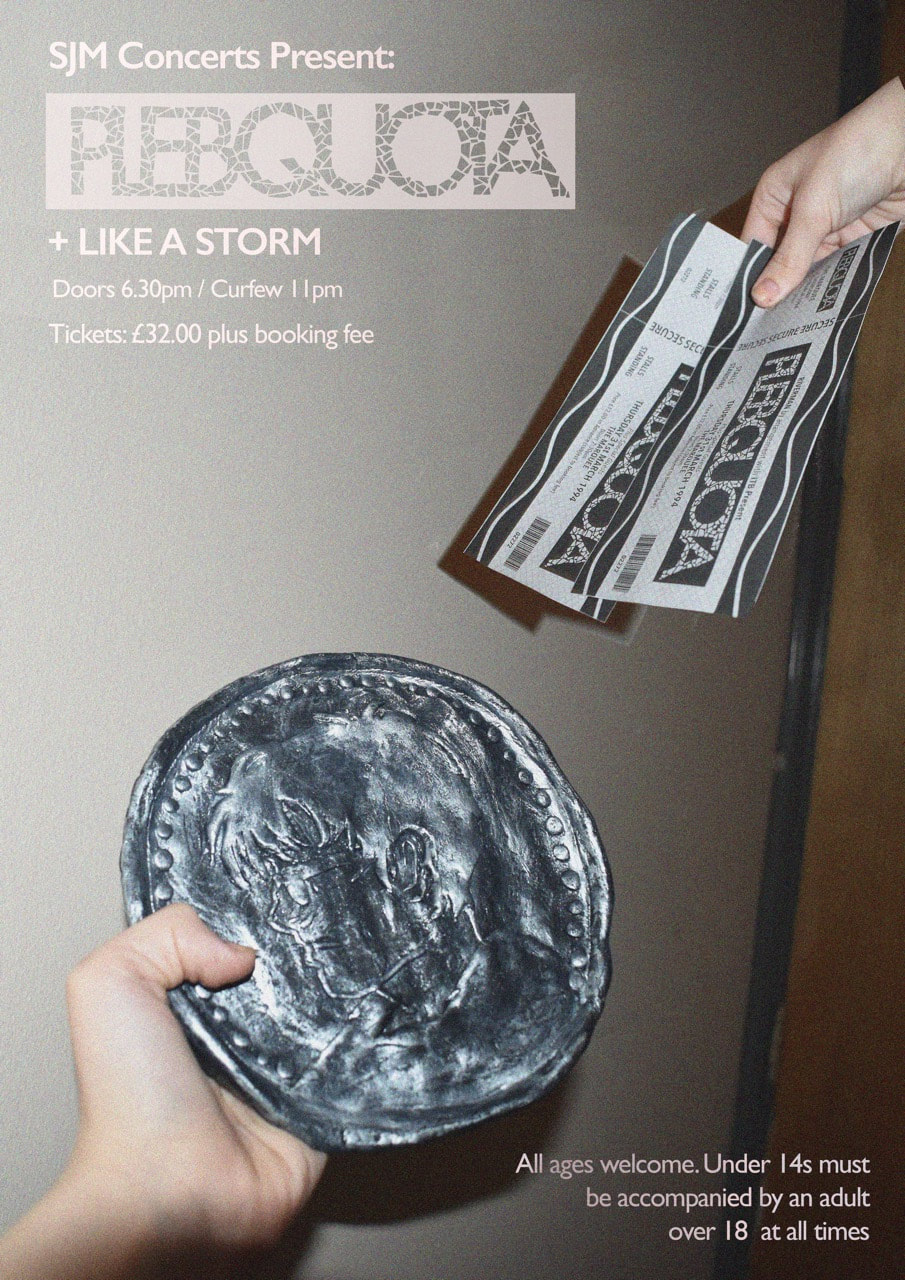
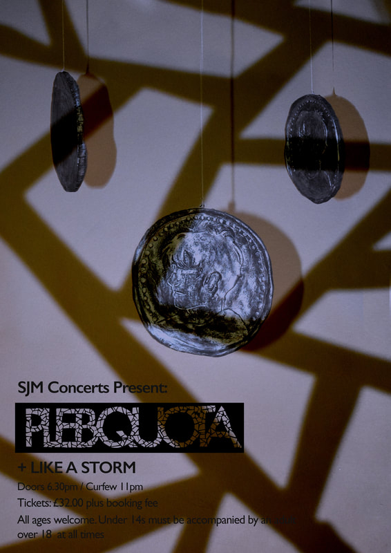
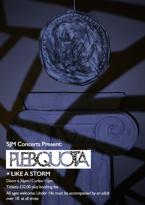
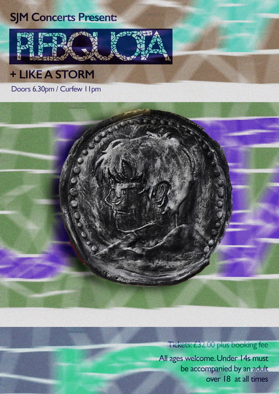
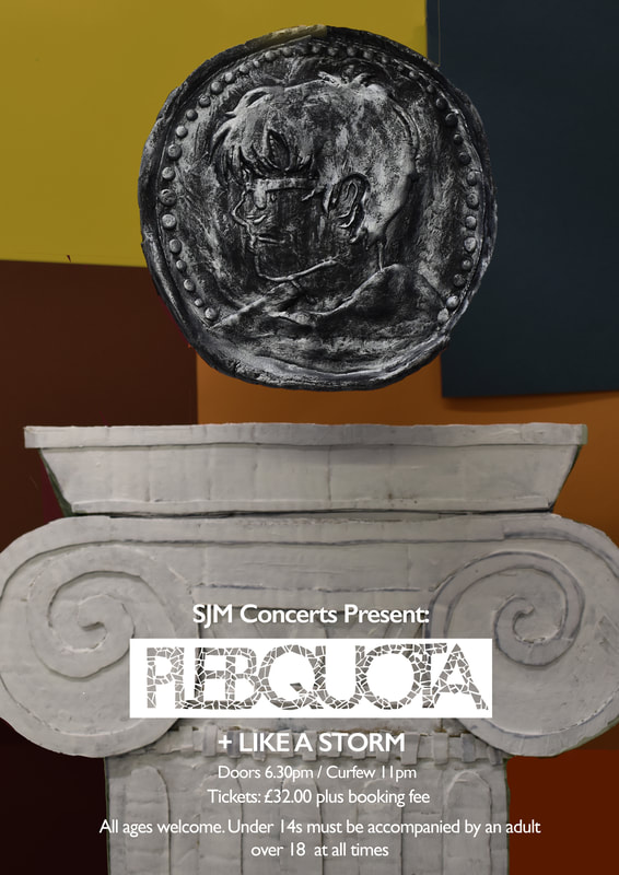
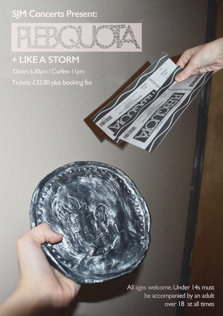
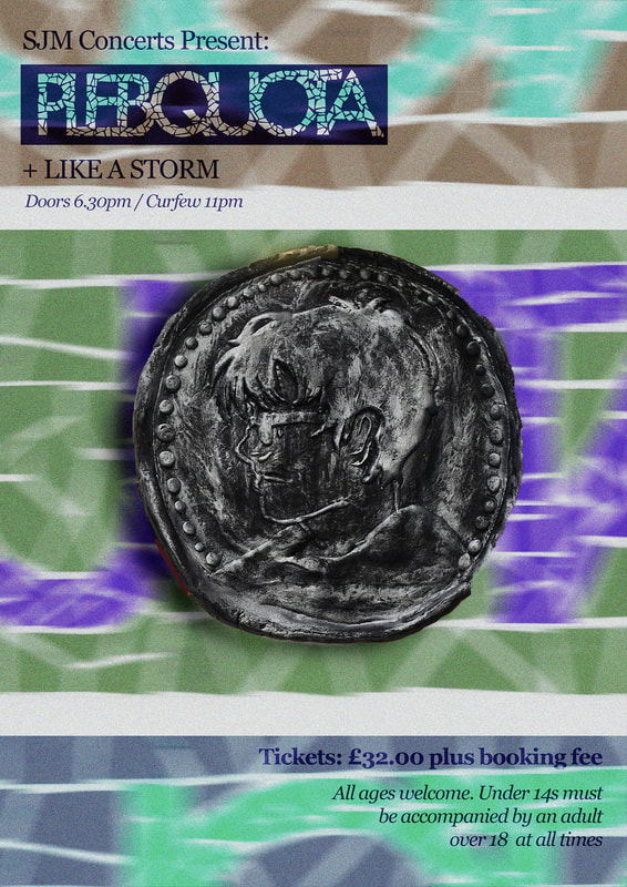
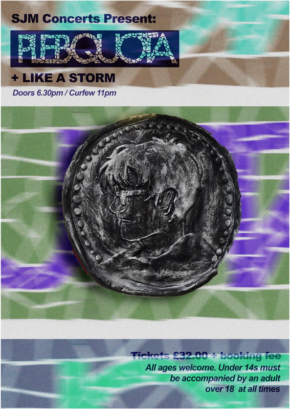
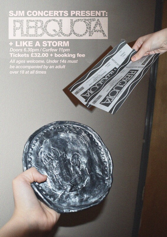
These are the poster designs I came up with initially. I played with lighting and shadow in some of them to keep a grungy, 90s feel. I was inspired by real 90s posters which I documented here. I added grain and noise as well as a sense of movement to reflect what I saw in the poster research. I utalised the vectored logo I created from my mosaic collage and used it with all the designs. I tried to experiment by combining the different eleementds I had created trhoughout while maintaining the coin as the focal point.
tenetive Final three poster designs
|
|
|
|
These were the final posters I brought to the summative feedback session.
updated final posters after summative feedback
|
|
|
|
Final posters in context
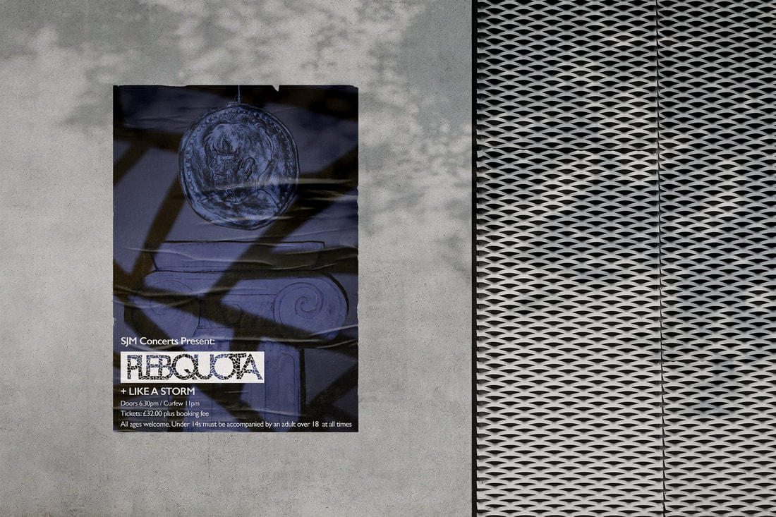
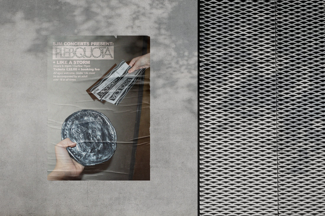
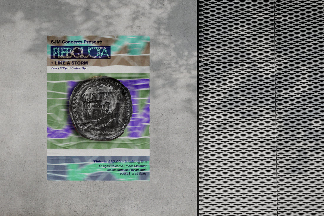
chosen final poster design